NASA, the European Space Agency (ESA), and the Japan Aerospace Exploration Agency (JAXA) have joined forces to create the COVID-19 Earth Observation Dashboard. The web platform combines the collective scientific power of the agencies’ Earth-observing satellites to document changes in the environment and society in response to the pandemic.
The dashboard is a user-friendly tool to track changes in air and water quality, climate change, economic activity, and agriculture.
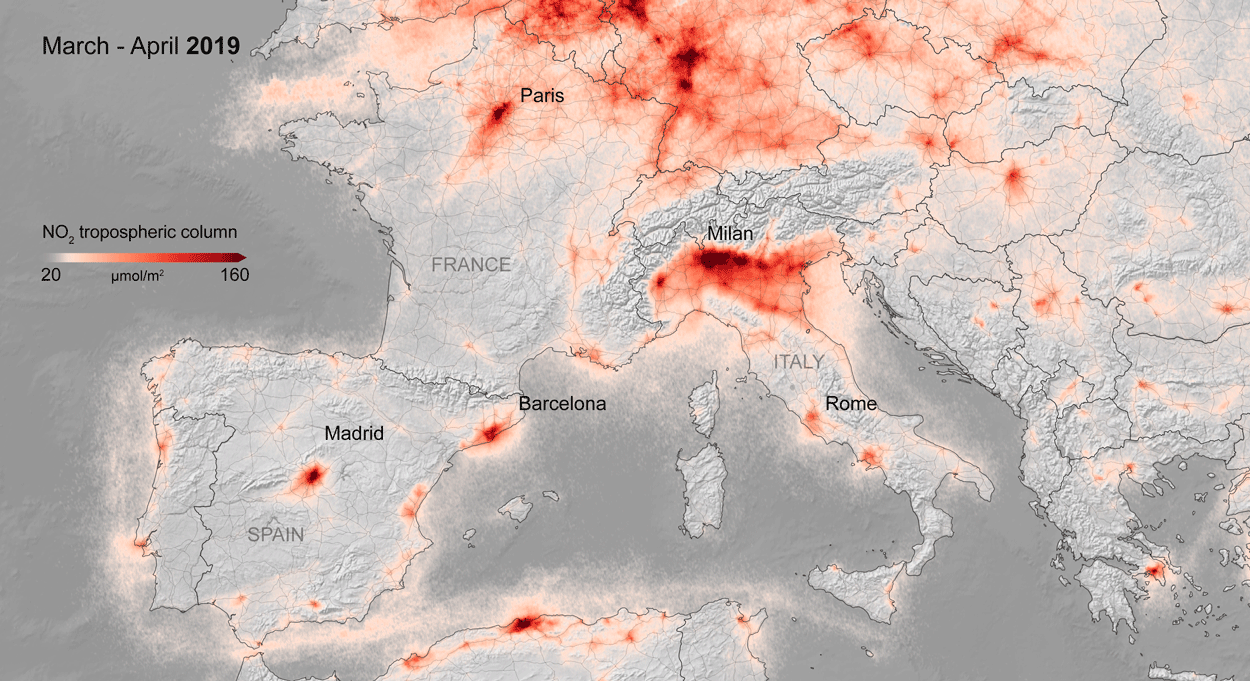
Air quality changes were among the first noticeable impacts of pandemic-related stay-at-home orders, and the resulting reductions in industrial activity, that could be tracked through satellite observations. Reductions in nitrogen dioxide (NO2) levels — primarily related to temporary reductions in the burning of fossil fuels — show up clearly in satellite data.
A preliminary analysis also indicates that planting (farming) activity dropped during the quarantines and lockdowns. For example, the cultivated area of white asparagus in Brandenburg, Germany, has been 20 to 30 percent lower this year, compared to 2019. More information on agricultural productivity changes will be added to the dashboard in the months to come.
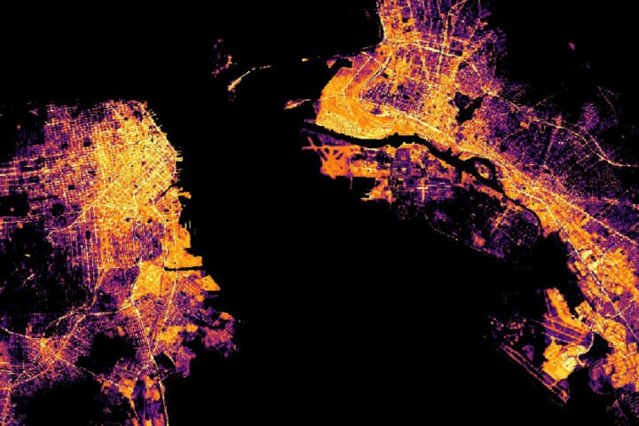
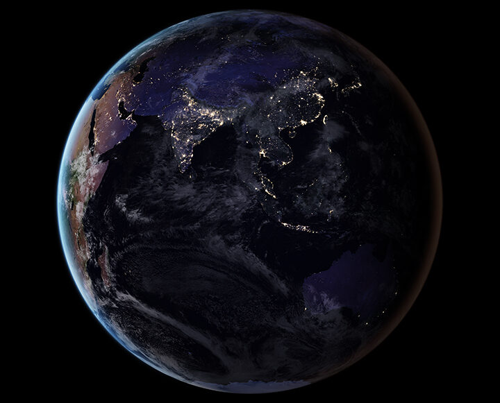
Recent water quality changes have been reported in a few locations that typically have intense industry and tourism — activities that have decreased during the pandemic. Data on ship identification, construction activity, and nighttime lights (above) are featured on the dashboard to keep track of some of the economic ramifications of the virus.
Together, ESA, JAXA, and NASA will continue to add new observations to the dashboard in the coming months to see how these indicators change. Learn more in the NASA press release, the video below, or by exploring the dashboard.
To counter the rapid spread of COVID-19 in the winter and spring of 2020, quarantines and social distancing measures were implemented around the world. Air traffic nearly ceased; non-essential businesses were closed; and the number of vehicles on the road fell well below normal.
Remote sensing scientists have started looking at potential changes in the environment due to these changes in human behavior. They are looking for signs of how environmental factors such as humidity, temperature, and ultraviolet radiation might play a role in the behavior of the virus. Some may also look for data related to access to water resources, which can be critical to the spread or prevention of certain diseases.
NASA’s Earth Science Data Systems program has developed a new web-based tool, the COVID-19 Data Pathfinder, which provides links to datasets that can be used to research changing environmental impacts from modified human behavior patterns, the possibility of seasonal trends in virus transmission, and water availability. The COVID-19 Data Pathfinder is also a resource for participants in NASA’s Space Apps COVID-19 Challenge, providing an intuitive means for new users to find and use NASA data.
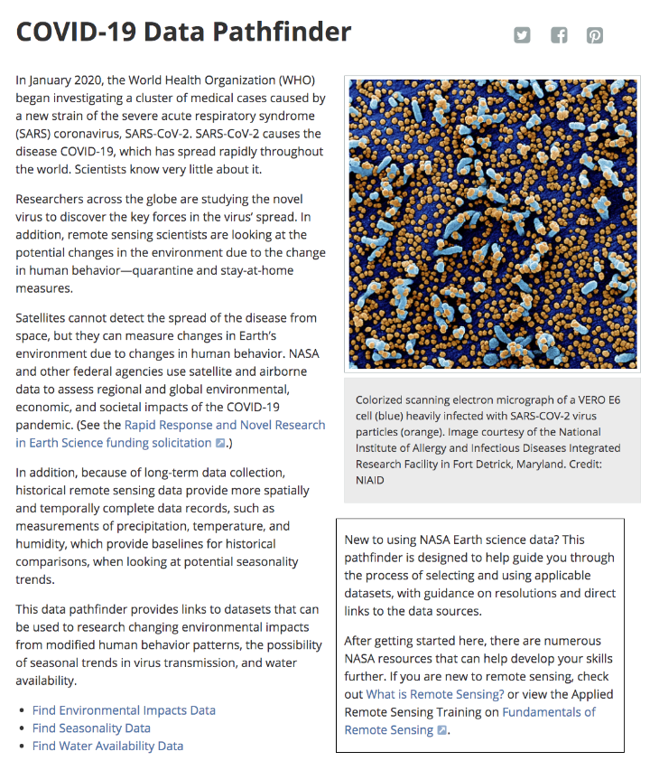
Web view of the COVID-19 Data Pathfinder page
There have been two rounds of voting in Tournament Earth 2020, and two rounds of stunning upsets. Only two of the top eight seeds made it through. Night Lights? Snuffed out. Colorado River? Dried up. Caspian ice? Melted. Aerosols? Cleaned out. A river of tea? Gone cold. Dark side of the Moon? Someone broke the record. Iconic Earthrise? Didn’t make it to dawn.
Every time we run one of these tournaments, we are surprised by what catches the eyes of our readers. It is time to surprise us again. Cast your votes now in round three to pick the best four of the Earthly 8. Voting ends on April 13 at 9 a.m. U.S. Eastern Time. Check out the remaining competitors below.
In round 1, Ocean Sand garnered the most votes overall and wiped out #4 seed and 2014 champion El Hierro Submarine Eruption, winning by the largest margin of any pairing (81 to 19 percent). In round 2, Sand beat the #1 seed, The Dark Side and the Bright Side, by a 57 to 43 percent margin.
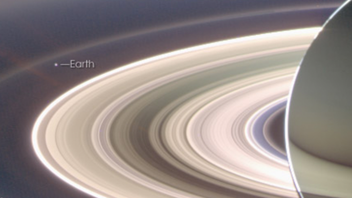
A View from Saturn garnered the second highest vote total in round 1, besting Blooming Baltic Sea by 77 to 23 percent. In the second round, Saturn beat Sensing Lightning from the Space Station, 60 to 40 percent. In case you didn’t notice, Earth is visible in that Saturn image.
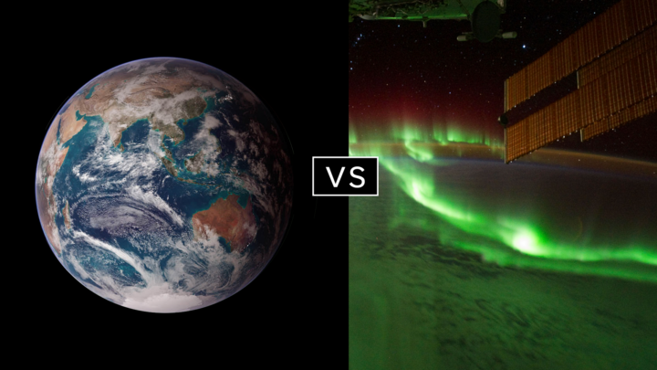
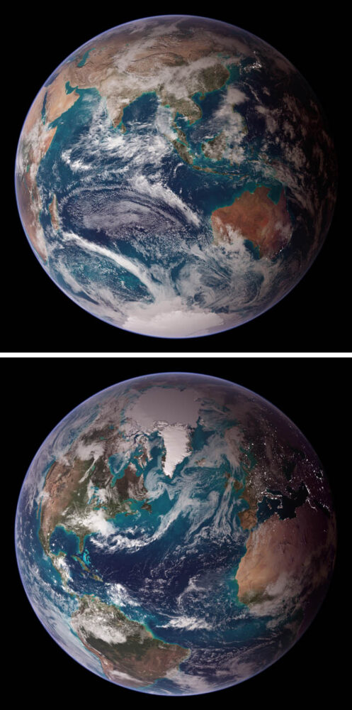
Twin Blue Marbles is the only #1 seed left in the tournament. In round 1, it captured 71 percent of the vote while besting Auroras Light Up the Antarctic Night. In round 2, Blue Marbles was the top overall vote getter and beat the iconic A Voyager Far from Home by 66 to 34 percent.
Fire in the Sky and On the Ground has pulled off two massive upsets. In round 1, it beat #2 seed Night Light Maps Open Up New Applications, 71 to 29 percent. In round 2, Fire beat the sentimental favorite and oldest image in Tournament Earth, All of You on the Good Earth — the original Blue Marble photo (1968) and the inspiration for the first Earth Day (1970). The voters chose the auroral fire over Apollo 8 fame by 57 to 43 percent.
This bracket pairs two low seeds that knocked off highly ranked opponents. #8 seed Where the Dunes End topped #1 A Curious Ensemble of Wonderful Features in round 1 (63 to 37 percent), then topped #4 Roiling Flows on Holuhraun Lava Field (56 to 44).
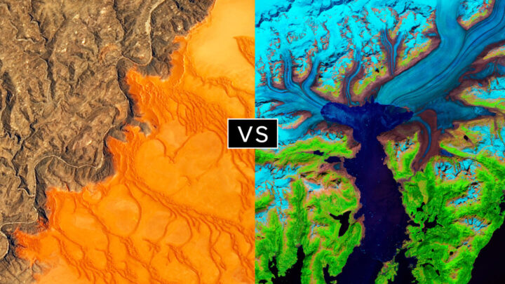
The false-color image Retreat of the Columbia Glacier got 57 percent of the vote to beat Icy Art in the Sanikov Strait in round 1. Round 2 was a close call: Columbia barely eclipsed Antartica Melts Under the Hottest Days on Record (51 to 49 percent).
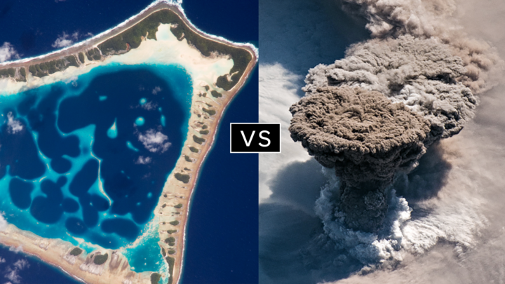
Another pair of Cinderella stories here. Atafu Atoll outclassed #1 seed Some Tea with Your River in round 1 by 75 to 25 percent. In round 2, it collected the second most votes overall, beating #5 Making Waves in the Andaman Sea 62 to 38 percent.
Raikoke erupted in round 1, collecting 72 percent of the vote while beating #3 Awesome, Frightening View of Hurricane Florence. In round 2, the volcanic plume smothered #2 Just Another Day on Aerosol Earth, 61 to 39 percent.
Since its launch on the web in April 1999, NASA Earth Observatory has published more than 15,500 image-driven stories about our planet. In celebration of our 20th anniversary — as well as the 50th anniversary of Earth Day — we want you to help us choose our all-time best image.
For now, we need you to help us brainstorm: what images or stories would you nominate as the best in the Earth Observatory collection? Do you go for the most beautiful and iconic view of our home? the most newsworthy? the most scientifically important? the most inspiring?
Search our site and then post the URLs of your favorite Earth images in the comments section below. Please send your ideas by March 17.
In late March 2020, we will include some of your selections in Tournament Earth, a head-to-head contest to vote for the best of the best from our archives. Each week, readers will pick from pairs of images as we narrow down the field from 32 nominees to one champion.
The all-time best Earth Observatory image will be announced on April 29, 2020, the end of our anniversary year.
If you want some inspiration as you begin your search, take a look at the galleries listed below. Or use our search tool (top left) to find your favorite places, images, and events.
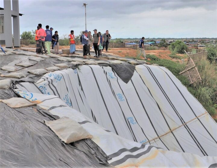
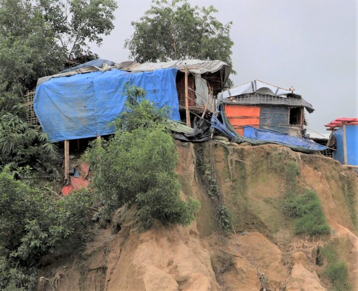
Camp managers and other officials overseeing Rohingya refugee camps in Bangladesh are now incorporating NASA satellite observations into their decision-making. Information like daily rain totals can help inform how to lay out refugee camps and how to store supplies. The goal is to reduce the risk to refugees from landslides and other natural hazards.
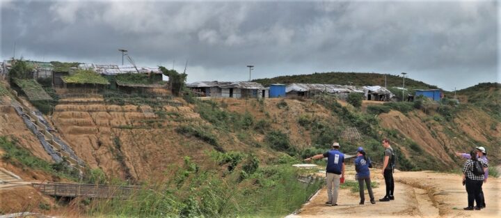
Since August 2017, more than 740,000 Rohingya refugees have fled from Myanmar (Burma) to Bangladesh. Many of them have sought shelter in camps in the hilly countryside, where landslide risks are greatest. When refugee camps were built in the southeastern part of the country, many plants and trees were removed — taking with them the roots that could hold the soil in place and help stabilize the landscape when heavy rains come.
Increasing this danger is Bangladesh’s intense monsoon season. Approximately 80 percent of the country’s yearly rain falls from June to October, bringing with it an increased risk of flash flooding and landslides. For instance, July 2019 storms dropped 14 inches of rain in just 72 hours, causing 26 landslides in Rohingya refugee camps around Cox’s Bazar, Bangladesh. One person was killed and more than 4,500 others were left without shelter.
“We have little information on landslides,” said Hafizol Islam, who is in charge of one of the most densely populated camps at Cox’s Bazar. “It is unpredictable for us and can happen at any time.”
Now Islam and other camp managers have access to maps and a website (updated daily) that provides near real-time NASA data on land use, rainfall, and elevation. Data come from the Global Precipitation Measurement (GPM) mission and the Moderate Resolution Imaging Spectroradiometer (MODIS) instruments on NASA’s Terra and Aqua satellites, among other sources. Taken together, these maps and data provide a clearer picture of when and where landslide hazards are concentrated.
“With landslides, flash floods, and rapid development, the terrain of these camps is constantly changing,” said Robert Emberson, a postdoctoral fellow at NASA’s Goddard Space Flight Center.
Emberson and other researchers from NASA’s Earth Applied Sciences Disasters Program and Columbia University’s International Research Institute for Climate and Society (IRI) are using new approaches to work alongside humanitarian end-users and develop products to address pressing needs in vulnerable settings. The partnership seeks the feedback of the local people affected and develops maps based on their input.
“We need to understand if, why, and when existing risk information is being used,” said Andrew Kruczkiewicz of IRI, one of the principal investigators of the project. “This strengthens the development of data services for humanitarian emergencies, where decisions and priorities change rapidly. Working in teams that bridge traditional professional and disciplinary boundaries gives data and climate scientists the opportunity to learn more about decision-making in specialized contexts.”
The need for coordination is pressing. Bangladesh has seen steadily increasing rainfall totals over the past 50 years. Climate change is making monsoons in Asia more extreme, and it may be doubling the likelihood of extreme rainfall events even before monsoon season begins.
“The partnership with NASA and IRI helps the UN agencies to assess risks like landslides or flash flooding and supports the disaster management in a scientific way to save lives and reduce damages in the refugee camps,” said Cathrine Haarsaker, a project manager for UNDP Disaster Risk Management.
Emberson said seeing the camps in person brought home the importance of connecting with the people on the ground. “Working with satellite data can sometimes feel quite abstract and separate from the people within the images,” he said. “Visiting the camps not only helped us understand more about the specific problems associated with landsliding to help improve our models in the future, but also drove home the human side to this disaster, emphasizing the urgency of our work.”
If you follow science news, this will probably sound familiar.
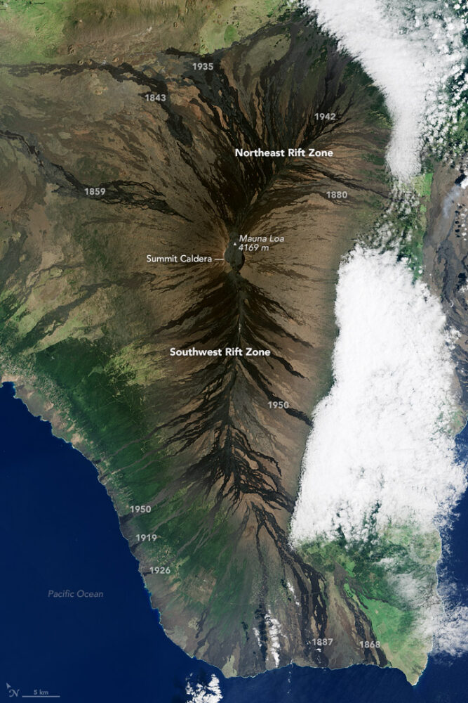
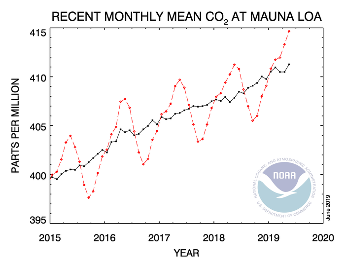
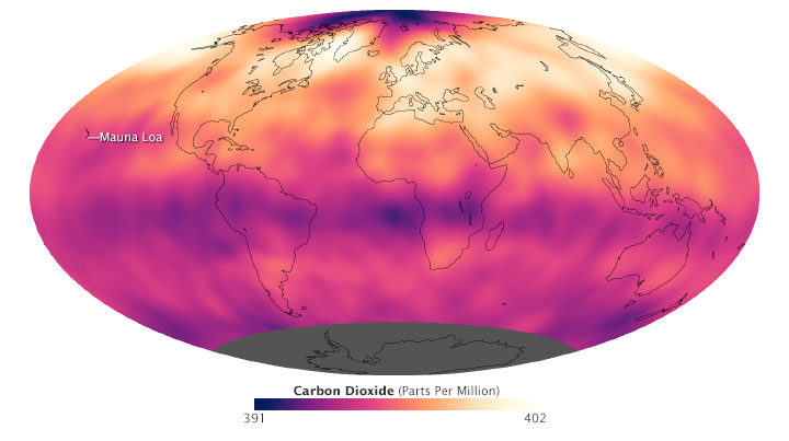
In May 2019, when atmospheric carbon dioxide reached its yearly peak, it set a record. The May average concentration of the greenhouse gas was 414.7 parts per million (ppm), as observed at NOAA’s Mauna Loa Atmospheric Baseline Observatory in Hawaii. That was the highest seasonal peak in 61 years, and the seventh consecutive year with a steep increase, according to NOAA and the Scripps Institution of Oceanography.
The Mauna Loa Observatory has been measuring carbon dioxide since 1958. The remote location (high on a volcano) and scarce vegetation make it a good place to monitor carbon dioxide because it does not have much interference from local sources of the gas. (There are occasional volcanic emissions, but scientists can easily monitor and filter them out.) Mauna Loa is part of a globally distributed network of air sampling sites that measure how much carbon dioxide is in the atmosphere.
The broad consensus among climate scientists is that increasing concentrations of carbon dioxide in the atmosphere are causing temperatures to warm, sea levels to rise, oceans to grow more acidic, and rainstorms, droughts, floods and fires to become more severe. Here are six less widely known but interesting things to know about carbon dioxide.
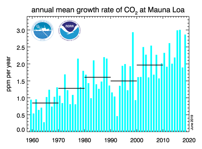
For decades, carbon dioxide concentrations have been increasing every year. In the 1960s, Mauna Loa saw annual increases around 0.8 ppm per year. By the 1980s and 1990s, the growth rate was up to 1.5 ppm year. Now it is above 2 ppm per year. There is “abundant and conclusive evidence” that the acceleration is caused by increased emissions, according to Pieter Tans, senior scientist with NOAA’s Global Monitoring Division.
To understand carbon dioxide variations prior to 1958, scientists rely on ice cores. Researchers have drilled deep into icepack in Antarctica and Greenland and taken samples of ice that are thousands of years old. That old ice contains trapped air bubbles that make it possible for scientists to reconstruct past carbon dioxide levels. The video below, produced by NOAA, illustrates this data set in beautiful detail. Notice how the variations and seasonal “noise” in the observations at short time scales fade away as you look at longer time scales.
Satellite observations show carbon dioxide in the air can be somewhat patchy, with high concentrations in some places and lower concentrations in others. For instance, the map below shows carbon dioxide levels for May 2013 in the mid-troposphere, the part of the atmosphere where most weather occurs. At the time there was more carbon dioxide in the northern hemisphere because crops, grasses, and trees hadn’t greened up yet and absorbed some of the gas. The transport and distribution of CO2 throughout the atmosphere is controlled by the jet stream, large weather systems, and other large-scale atmospheric circulations. This patchiness has raised interesting questions about how carbon dioxide is transported from one part of the atmosphere to another—both horizontally and vertically.
In this animation from NASA’s Scientific Visualization Studio, big plumes of carbon dioxide stream from cities in North America, Asia, and Europe. They also rise from areas with active crop fires or wildfires. Yet these plumes quickly get mixed as they rise and encounter high-altitude winds. In the visualization, reds and yellows show regions of higher than average CO2, while blues show regions lower than average. The pulsing of the data is caused by the day/night cycle of plant photosynthesis at the ground. This view highlights carbon dioxide emissions from crop fires in South America and Africa. The carbon dioxide can be transported over long distances, but notice how mountains can block the flow of the gas.
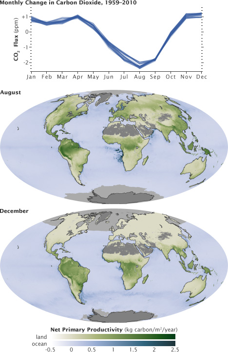
You’ll notice that there is a distinct sawtooth pattern in charts that show how carbon dioxide is changing over time. There are peaks and dips in carbon dioxide caused by seasonal changes in vegetation. Plants, trees, and crops absorb carbon dioxide, so seasons with more vegetation have lower levels of the gas. Carbon dioxide concentrations typically peak in April and May because decomposing leaves in forests in the Northern Hemisphere (particularly Canada and Russia) have been adding carbon dioxide to the air all winter, while new leaves have not yet sprouted and absorbed much of the gas. In the chart and maps below, the ebb and flow of the carbon cycle is visible by comparing the monthly changes in carbon dioxide with the globe’s net primary productivity, a measure of how much carbon dioxide vegetation consume during photosynthesis minus the amount they release during respiration. Notice that carbon dioxide dips in Northern Hemisphere summer.
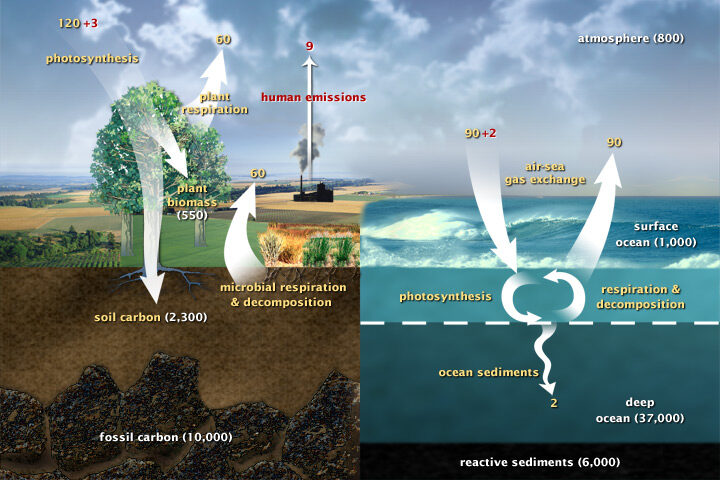
Most of Earth’s carbon—about 65,500 billion metric tons—is stored in rocks. The rest resides in the ocean, atmosphere, plants, soil, and fossil fuels. Carbon flows between each reservoir in the carbon cycle, which has slow and fast components. Any change in the cycle that shifts carbon out of one reservoir puts more carbon into other reservoirs. Any changes that put more carbon gases into the atmosphere result in warmer air temperatures. That’s why burning fossil fuels or wildfires are not the only factors determining what happens with atmospheric carbon dioxide. Things like the activity of phytoplankton, the health of the world’s forests, and the ways we change the landscapes through farming or building can play critical roles as well. Read more about the carbon cycle here.
This is a cross-post of a story by Ellen Gray. It provides deeper insight into our May 23 Image of the Day.
Six months after GRACE launched in March 2002, we got our first look at the data fields. They had these big vertical, pole-to-pole stripes that obscured everything. We’re like, holy cow this is garbage. All this work and it’s going to be useless.
But it didn’t take the science team long to realize that they could use some pretty common data filters to remove the noise, and after that they were able to clean up the fields and we could see quite a bit more of the signal. We definitely breathed a sigh of relief. Steadily over the course of the mission, the science team became better and better at processing the data, removing errors, and some of the features came into focus. Then it became clear that we could do useful things with it.
It only took a couple of years. By 2004, 2005, the science team working on mass changes in the Arctic and Antarctic could see the ice sheet depletion of Greenland and Antarctica. We’d never been able before to get the total mass change of ice being lost. It was always the elevation changes – there’s this much ice, we guess – but this was like wow, this is the real number.
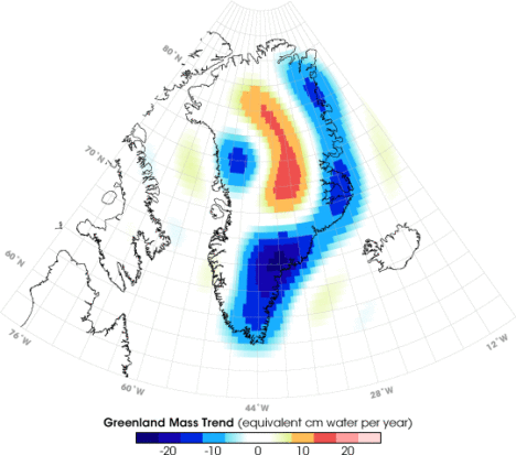
Not long after that we started to see, maybe, that there were some trends on the land, although it’s a little harder on the land because with terrestrial water storage — the groundwater, soil moisture, snow, and everything. There’s inter-annual variability, so if you go from a drought one year to wet a couple years later, it will look like you’re gaining all this water, but really, it’s just natural variability.
By around 2006, there was a pretty clear trend over Northern India. At the GRACE science team meeting, it turned out another group had noticed that as well. We were friendly with them, so we decided to work on it separately. Our research ended up being published in 2009, a couple years after the trends had started to become apparent. By the time we looked at India, we knew that there were other trends around the world. Slowly not just our team but all sorts of teams, all different scientists around the world, were looking at different apparent trends and diagnosing them and trying to decide if they were real and what was causing them.
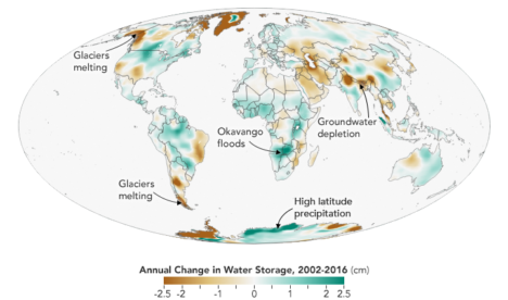
I think the map, the global trends map, is the key. By 2010 we were getting the broad-brush outline, and I wanted to tell a story about what is happening in that map. For me the easiest way was to just look at the data around the continents and talk about the major blobs of red or blue that you see and explain each one of them and not worry about what country it’s in or placing it in a climate region or whatever. We can just draw an outline around these big blobs. Water is being gained or lost. The possible explanations are not that difficult to understand. It’s just trying to figure out which one is right.
Not everywhere you see as red or blue on the map is a real trend. It could be natural variability in part of the cycle where freshwater is increasing or decreasing. But some of the blobs were real trends. If it’s lined up in a place where we know that there’s a lot of agriculture, that they’re using a lot of water for irrigation, there’s a good chance it’s a decreasing trend that’s caused by human-induced groundwater depletion.
And then, there’s the question: are any of the changes related to climate change? There have been predictions of precipitation changes, that they’re going to get more precipitation in the high latitudes and more precipitation as rain as opposed to snow. Sometimes people say that the wet get wetter and the dry get dryer. That’s not always the case, but we’ve been looking for that sort of thing. These are large-scale features that are observed by a relatively new satellite system and we’re lucky enough to be some of the first to try and explain them.
The past couple years when I’d been working the most intensely on the map, the best parts of my time in the office were when I was working on it. Because I’m a lab chief, I spend about half my time on managerial and administrative things. But I love being able to do the science, and in particular this, looking at the GRACE data, trying to diagnose what’s happening, has been very enjoyable and fulfilling. We’ve been scrutinizing this map going on eight, nine years now, and I really do have a strong connection to it.
What kept me up at night was finding the right explanations and the evidence to support our hypotheses – or evidence to say that this hypothesis is wrong and we need to consider something else. In some cases, you have a strong feeling you know what’s happening but there’s no published paper or data that supports it. Or maybe there is anecdotal evidence or a map that corroborates what you think but is not enough to quantify it. So being able to come up with defendable explanations is what kept me up at night. I knew the reviewers, rightly, couldn’t let us just go and be completely speculative. We have to back up everything we say.
The world is a complicated place. I think it helped, in the end, that we categorized these changes as natural variability or as a direct human impact or a climate change related impact. But then there can be a mix of those – any of those three can be combined, and when they’re combined, that’s when it’s more difficult to disentangle them and say this one is dominant or whatever. It’s often not obvious. Because these are moving parts and particularly with the natural variability, you know it’s going to take another 15 years, probably the length of the GRACE Follow-On mission, before we become completely confident about some of these. So it’ll be interesting to return to this in 15 years and see which ones we got right and which ones we got wrong.
You can read about Matt’s research here: https://go.nasa.gov/2L7LXoP.
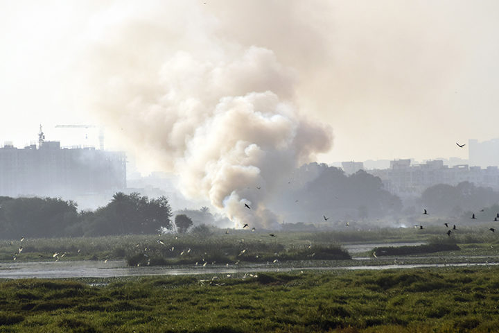
Fire on Bellandur Lake on January 19, 2018. Photo by pee vee.
In Bengaluru, India, one of the city’s lakes is so polluted with sewage, trash, and industrial chemicals that it has an alarming habit of catching on fire. As recently as January 19, 2018, fire broke out on Bellandur Lake and burned for seven hours.
The same lake is notorious for churning up large amounts of white foam that has, at times, spilled from the lake and enveloped nearby streets, cars, and bridges. The water is so polluted that it can’t be used for drinking or bathing or even irrigation.
Bellandur Lake is not the only lake in Bengaluru with water quality problems. During a recent check, not one of the hundreds of lakes that the city tested was clean enough to be used for drinking or bathing.
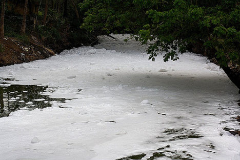
Foamy water flowing into Bellandur Lake. Photo by Kannon B.
I point this out on World Water Day to underscore that Bengaluru’s water woes, though extreme, are not particularly uncommon. According to the United Nations, a quarter of all people on the planet lack access to safely managed drinking water, and 40 percent of people live in areas where water scarcity is a problem. Roughly 80 percent of wastewater flows back into ecosystems untreated. Even in the United States, tens of millions of people may be exposed to unsafe drinking water, according to one recently published study.
Even in the course of reporting for this website from a satellite perspective, we see signs of trouble. Capetown was on the verge of running out of water in February 2018. Drought pushed São Paulo’s reservoirs to near empty in recent years. The GRACE satellites have observed rapid depletion of groundwater in several critical aquifers. On more than one occasion, we have reported on rainbow-colored escaped mine tailings contaminating waterways.
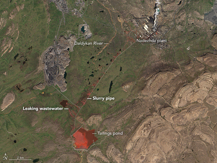
NASA Earth Observatory image by Jesse Allen, using Landsat data from the U.S. Geological Survey. Learn more about the image here.
To push back against such problems, NASA’s Earth Science Division, and particularly its applied sciences program, is doing what it can to marshal the agency’s resources to make countries aware of what NASA resources are available to monitor and reduce the impact of water-related problems.
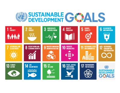
Learn more about the Sustainable Development Goals. Image by the United Nations.
As one piece of its water program, NASA scientists and staff are working with the United Nations to highlight key NASA datasets, tools, and satellite-based monitoring capabilities that may help countries meet the 17 sustainable development goals established by the international body. Goal number 6—that countries ensure the availability and sustainable management of water and sanitation for all—has been a particular focus of the NASA teams.
NASA and NOAA satellites collect several types of data that may be useful for water management. Sensors such as the Moderate Resolution Imaging Spectroradiometer (MODIS) and the Visible Infrared Imaging Radiometer Suite (VIIRS) collect daily data and images of water bodies around the planet that can be used to track the number and extent of lakes and reservoirs.
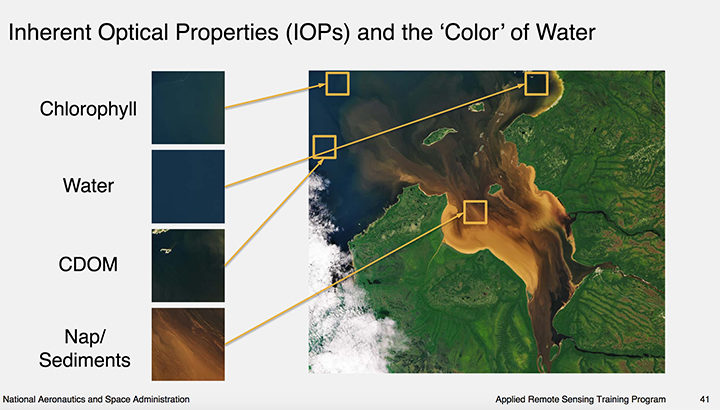
Image courtesy of this NASA ARSET presentation. Learn more about the image here.
The same sensors collect information about water color, which scientists use to detect sediment, chlorophyll-a (a product of phytoplankton and algae blooms), colored dissolved organic matter (CDOM), and other indicators of water quality.
The strength of MODIS and VIIRS is that these sensors collect daily imagery; the downside is that the data is relatively coarse. However, another family of satellites, Landsat, carries sensors that provide more than 10 times as much detail.
The combination of information from multiple satellites collected over time can be powerful. For instance, as we reported previously, a team of scientists based in China used decades of Landsat data to track a 30 percent decrease in the total surface area of lakes in Inner Mongolia between the 1980s and 2010. The scientists attributed the losses to warming temperatures, decreased precipitation, and increased mining and agricultural activity.
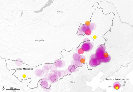
This map above depicts 375 lakes within Inner Mongolia that experienced a loss in water surface area between 1987-2010. The large, purple circles indicate a complete loss of water. Learn more about the map here.
Meanwhile, one of NASA’s scientists, Nima Pahlevan, is in the process of building an early warning system based on Landsat and Sentinel-2 data that will be used to alert water managers in near-real time when satellites detect high levels of chlorophyll-a, an indicator that harmful algal blooms could be present. While some blooms are harmless, outbreaks of certain types of organisms lead to fish kills and dangerous contamination of seafood. His team is working on a prototype system for Lake Mead in Nevada (see below), Indian River Lagoon in Florida, and certain reservoirs in Oregon. Eventually, he hopes to have a tool available that can be used globally.
“The idea is that we can get the information to water managers quickly about where satellites are seeing suspicious blooms, and then folks on the ground will know where to test water to determine if there’s a harmful algae bloom,” said Pahvalen. “We’re not suggesting that satellites can replace on-the-ground sampling, but they can be a great complement and make that work much work more efficient and less costly.”
To learn more about how satellites can be used to aid in the monitoring of water quality, see this workshop report and harmful algal bloom training module from NASA’s ARSET program.
This article was published by NASA’s Jet Propulsion Laboratory on January 23, 2018. NASA is beginning several months of commemoration of the beginning of the Space Age and the evolution of Earth science from space.
Sixty years ago next week, the hopes of Cold War America soared into the night sky as a rocket lofted skyward above Cape Canaveral, a soon-to-be-famous barrier island off the Florida coast.
The date was Jan. 31, 1958. NASA had yet to be formed, and the honor of this first flight belonged to the U.S. Army. The rocket’s sole payload was a javelin-shaped satellite built by the Jet Propulsion Laboratory in Pasadena, California. Explorer 1, as it would soon come to be called, was America’s first satellite.
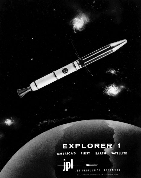
“The launch of Explorer 1 marked the beginning of U.S. spaceflight, as well as the scientific exploration of space, which led to a series of bold missions that have opened humanity’s eyes to new wonders of the solar system,” said Michael Watkins, current director of JPL. “It was a watershed moment for the nation that also defined who we are at JPL.”
In the mid-1950s, both the United States and the Soviet Union were proceeding toward the capability to put a spacecraft in orbit. Yet great uncertainty hung over the pursuit. As the Cold War between the two countries deepened, it had not yet been determined whether the sovereignty of a nation’s borders extended upward into space. Accordingly, then-President Eisenhower sought to ensure that the first American satellites were not perceived to be military or national security assets.
In 1954, an international council of scientists called for artificial satellites to be orbited as part of a worldwide science program called the International Geophysical Year (IGY), set to take place from July 1957 to December 1958. Both the American and Soviet governments seized on the idea, announcing they would launch spacecraft as part of the effort. Soon, a competition began between the Army, Air Force and Navy to develop a U.S. satellite and launch vehicle capable of reaching orbit.
At that time, JPL, which was part of the California Institute of Technology in Pasadena, primarily performed defense work for the Army. (The “jet” in JPL’s name traces back to rocket motors used to provide “jet assisted” takeoff for Army planes during World War II.) In 1954, the laboratory’s engineers began working with the Army Ballistic Missile Agency in Alabama on a project called “Orbiter.” The Army team included Wernher von Braun (who would later design NASA’s Saturn V rocket) and his team of engineers. Their work centered around the Redstone Jupiter-C rocket, which was derived from the V-2 missile Germany had used against Britain during the war.
JPL’s role was to prepare the three upper stages for the launch vehicle, which included the satellite itself. These used solid rocket motors the laboratory had developed for the Army’s Sergeant guided missile. JPL would also be responsible for receiving and transmitting the orbiting spacecraft’s communications. In addition to JPL’s involvement in the Orbiter program, the laboratory’s then-director, William Pickering, chaired the science committee on satellite tracking for the U.S. launch effort overall.
The Navy’s entry, called Vanguard, had a competitive edge in that it was not derived from a ballistic missile program — its rocket was designed, from the ground up, for civilian scientific purposes. The Army’s Jupiter-C rocket had made its first successful suborbital flight in 1956, so Army commanders were confident they could be ready to launch a satellite fairly quickly. Nevertheless, the Navy’s program was chosen to launch a satellite for the IGY.
University of Iowa physicist James Van Allen, whose instrument proposal had been chosen for the Vanguard satellite, was concerned about development issues on the project. Thus, he made sure his scientific instrument payload — a cosmic ray detector — would fit either launch vehicle. Meanwhile, although their project was officially mothballed, JPL engineers used a pre-existing rocket casing to quietly build a flight-worthy satellite, just in case it might be needed.
The world changed on Oct. 4, 1957, when the Soviet Union launched a 23-inch (58-centimeter) metal sphere called Sputnik. With that singular event, the space age had begun. The launch resolved a key diplomatic uncertainty about the future of spaceflight, establishing the right to orbit above any territory on the globe. The Russians quickly followed up their first launch with a second Sputnik just a month later. Under pressure to mount a U.S. response, the Eisenhower administration decided a scheduled test flight of the Vanguard rocket, already being planned in support of the IGY, would fit the bill. But when the Vanguard rocket was, embarrassingly, destroyed during the launch attempt on Dec. 6, the administration turned to the Army’s program to save the country’s reputation as a technological leader.
Unbeknownst to JPL, von Braun and his team had also been developing their own satellite, but after some consideration, the Army decided that JPL would still provide the spacecraft. The result of that fateful decision was that JPL’s focus shifted permanently — from rockets to what sits on top of them.
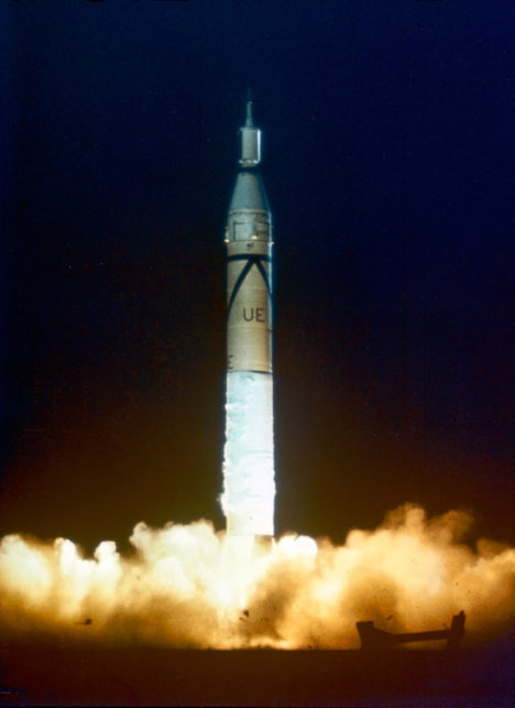
The Army team had its orders to be ready for launch within 90 days. Thanks to its advance preparation, 84 days later, its satellite stood on the launch pad at Cape Canaveral Air Force Station in Florida.
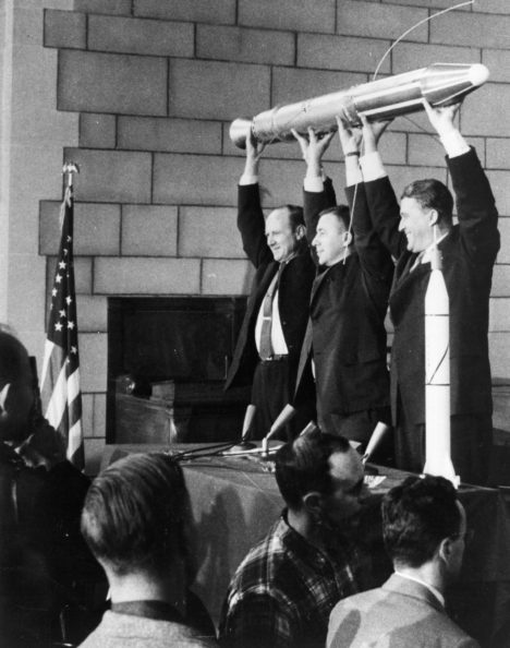
The spacecraft was launched at 10:48 p.m. EST on Friday, Jan. 31, 1958. An hour and a half later, a JPL tracking station in California picked up its signal transmitted from orbit. In keeping with the desire to portray the launch as the fulfillment of the U.S. commitment under the International Geophysical Year, the announcement of its success was made early the next morning at the National Academy of Sciences in Washington, with Pickering, Van Allen and von Braun on hand to answer questions from the media.
Following the launch, the spacecraft was given its official name, Explorer 1. (In the following decades, nearly a hundred spacecraft would be given the designation “Explorer.”) The satellite continued to transmit data for about four months, until its batteries were exhausted, and it ceased operating on May 23, 1958.
Later that year, when the National Aeronautics and Space Administration (NASA) was established by Congress, Pickering and Caltech worked to shift JPL away from its defense work to become part of the new agency. JPL remains a division of Caltech, which manages the laboratory for NASA.
The beginnings of U.S. space exploration were not without setbacks — of the first five Explorer satellites, two failed to reach orbit. But the three that made it gave the world the first scientific discovery in space — the Van Allen radiation belts. These doughnut-shaped regions of high-energy particles, held in place by Earth’s magnetic field, may have been important in making Earth habitable for life. Explorer 1, with Van Allen’s cosmic ray detector on board, was the first to detect this phenomenon, which is still being studied today.
In advocating for a civilian space agency before Congress after the launch of Explorer 1, Pickering drew on Van Allen’s discovery, stating, “Dr. Van Allen has given us some completely new information about the radiation present in outer space….This is a rather dramatic example of a quite simple scientific experiment which was our first step out into space.”
Explorer 1 re-entered Earth’s atmosphere and burned up on March 31, 1970, after more than 58,000 orbits.
For more information about Explorer 1 and the 60 years of U.S. space exploration that have followed it, visit:
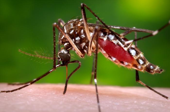
An Aedes aegypti mosquito in the process of acquiring a blood meal. Image Credit: CDC/James Gathany.
Though mosquitoes are small, they are also deadly. Mosquito bites result in the deaths of more than 725,000 people each year—more than any other animal. That compares to about 50,000 deaths from snakes, 25,000 from dogs, 20,000 from tsetse flies, 1,000 from crocodiles, and 500 from hippos.
More than 50 percent of the world’s population lives in areas where mosquito-borne diseases are common, according to the World Health Organization. Malaria is the deadliest disease spread by mosquito, but the bugs also serve as vectors for Chikungunya, Zika, Dengue, West Nile Virus, and Yellow Fever.
NASA and the Global Learning and Observation to Benefit the Environment (GLOBE) Program have a new way of fighting back. The GLOBE Observer Mosquito Habitat Mapper is an app that makes it possible for citizen scientists to collect data on mosquito range and habitat and then feed that information to public health and science institutions trying to combat mosquito-borne illnesses. The app also provides tips on fighting the spread of disease by disrupting mosquito habitats. Specifically, it will help you find potential breeding sites, identify and count larvae, take photos, and clean away pools of standing water where mosquitoes reproduce.
The Crowd & the Cloud, a show hosted by former NASA Chief Scientist Waleed Abdalati, has an excellent segment (video above) that explains how the app works.
Don’t delay. Download the Habitat Mapper for iOS from the iTunes app store or from Google Play for Android now, and start hunting down these blood-sucking killers.
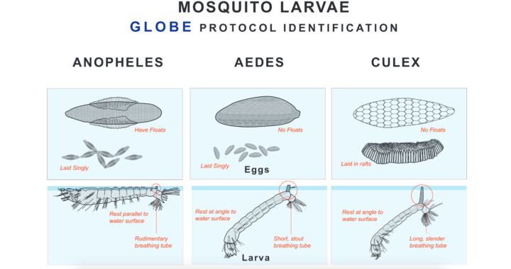
Eggs and larvae of three species of mosquitoes. Image Credit: The Globe Program. Download a larger version.
