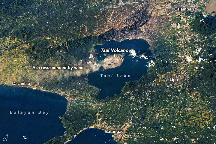
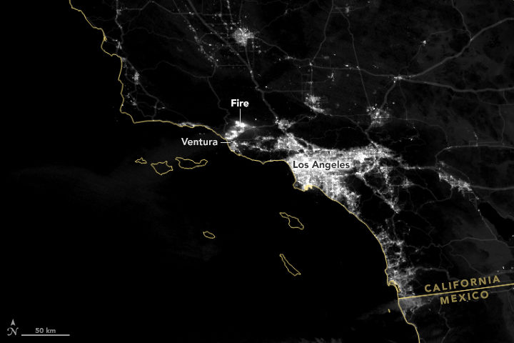
On January 12-13, 2020, Taal Volcano erupted for the first time in more than four decades. On January 22, ash plumes again emanated from Taal—but, this time, not from an eruption (seen above). According to the Philippine Institute of Volcanology and Seismology (PHIVOLCS), strong low-level winds lifted previously deposited ash lying around the volcano to heights of 5,800 meters (19,000 feet).
“Resuspension of volcanic ash is more likely at higher wind speeds, if the ash is dry and if ash particles are small,” said Simon Carn, volcanologist at Michigan Tech. “The ash deposits at Taal may have initially been quite wet, so the fact that ash resuspension is now occurring may indicate that the deposits have dried out.” The Philippines is currently in its dry season.
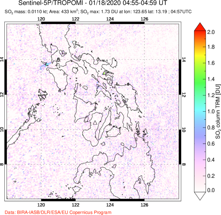
This time it was resuspended ash, but officials are cautious about a potential eruption again. Since its initial eruption, Taal remains on a level 4 alert, with a hazardous eruption still possible. Data show that SO₂ emissions, one of the key parameters for monitoring active volcanoes, have been present, but low, since the initial eruption. Carn said this indicates magma is most likely intruding into the main portion of the volcano, but predicting whether the magma will ultimately erupt is challenging.
If the volcano erupts again, it could look different than the early January event. During that “wet” eruption, water from the nearby crater lake covered the ash particles with water droplets. Wetter eruptions tend to produce finer ash particles. However, nearly all of the water in the main crater is now gone. According to Carn, the lake could have vaporized from the heat of the emanating magma; some could have been physically ejected by the previous eruption; and some could have drained through fractures or fissures in the volcano. In the absence of water, this volcano could produce a “dry” eruption, which would make comparatively larger ash particles.
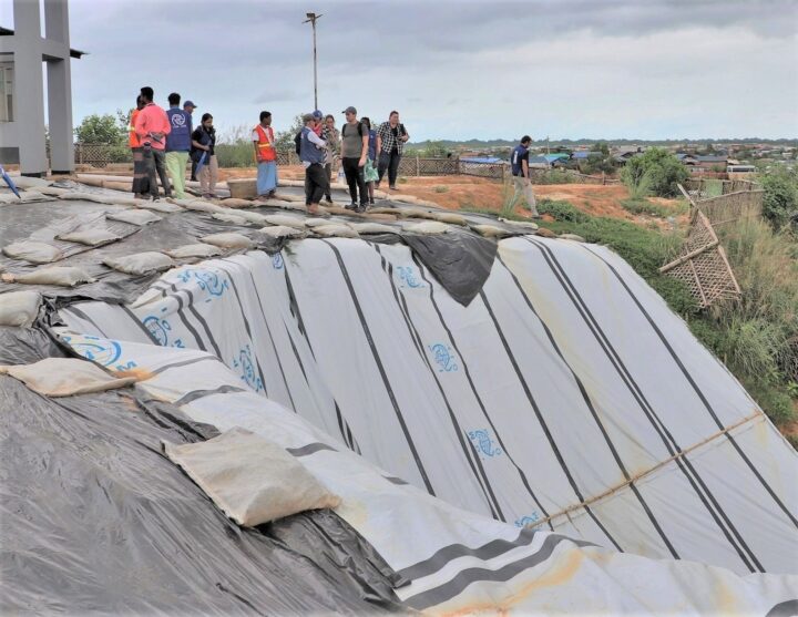
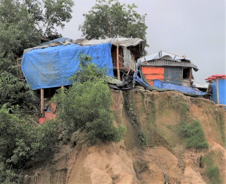
Camp managers and other officials overseeing Rohingya refugee camps in Bangladesh are now incorporating NASA satellite observations into their decision-making. Information like daily rain totals can help inform how to lay out refugee camps and how to store supplies. The goal is to reduce the risk to refugees from landslides and other natural hazards.
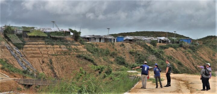
Since August 2017, more than 740,000 Rohingya refugees have fled from Myanmar (Burma) to Bangladesh. Many of them have sought shelter in camps in the hilly countryside, where landslide risks are greatest. When refugee camps were built in the southeastern part of the country, many plants and trees were removed — taking with them the roots that could hold the soil in place and help stabilize the landscape when heavy rains come.
Increasing this danger is Bangladesh’s intense monsoon season. Approximately 80 percent of the country’s yearly rain falls from June to October, bringing with it an increased risk of flash flooding and landslides. For instance, July 2019 storms dropped 14 inches of rain in just 72 hours, causing 26 landslides in Rohingya refugee camps around Cox’s Bazar, Bangladesh. One person was killed and more than 4,500 others were left without shelter.
“We have little information on landslides,” said Hafizol Islam, who is in charge of one of the most densely populated camps at Cox’s Bazar. “It is unpredictable for us and can happen at any time.”
Now Islam and other camp managers have access to maps and a website (updated daily) that provides near real-time NASA data on land use, rainfall, and elevation. Data come from the Global Precipitation Measurement (GPM) mission and the Moderate Resolution Imaging Spectroradiometer (MODIS) instruments on NASA’s Terra and Aqua satellites, among other sources. Taken together, these maps and data provide a clearer picture of when and where landslide hazards are concentrated.
“With landslides, flash floods, and rapid development, the terrain of these camps is constantly changing,” said Robert Emberson, a postdoctoral fellow at NASA’s Goddard Space Flight Center.
Emberson and other researchers from NASA’s Earth Applied Sciences Disasters Program and Columbia University’s International Research Institute for Climate and Society (IRI) are using new approaches to work alongside humanitarian end-users and develop products to address pressing needs in vulnerable settings. The partnership seeks the feedback of the local people affected and develops maps based on their input.
“We need to understand if, why, and when existing risk information is being used,” said Andrew Kruczkiewicz of IRI, one of the principal investigators of the project. “This strengthens the development of data services for humanitarian emergencies, where decisions and priorities change rapidly. Working in teams that bridge traditional professional and disciplinary boundaries gives data and climate scientists the opportunity to learn more about decision-making in specialized contexts.”
The need for coordination is pressing. Bangladesh has seen steadily increasing rainfall totals over the past 50 years. Climate change is making monsoons in Asia more extreme, and it may be doubling the likelihood of extreme rainfall events even before monsoon season begins.
“The partnership with NASA and IRI helps the UN agencies to assess risks like landslides or flash flooding and supports the disaster management in a scientific way to save lives and reduce damages in the refugee camps,” said Cathrine Haarsaker, a project manager for UNDP Disaster Risk Management.
Emberson said seeing the camps in person brought home the importance of connecting with the people on the ground. “Working with satellite data can sometimes feel quite abstract and separate from the people within the images,” he said. “Visiting the camps not only helped us understand more about the specific problems associated with landsliding to help improve our models in the future, but also drove home the human side to this disaster, emphasizing the urgency of our work.”
Lately, it feels like we’re hearing about wildfires erupting in the western United States more often. But how have wildfire occurrences changed over the decades?
Researchers with the NASA-funded Rehabilitation Capability Convergence for Ecosystem Recovery (RECOVER) have analyzed more than 40,000 fires from Colorado to California between 1950 to 2017 to learn how wildfire frequency, size, location, and a few other traits have changed.
Here are six trends they have observed in the western United States:
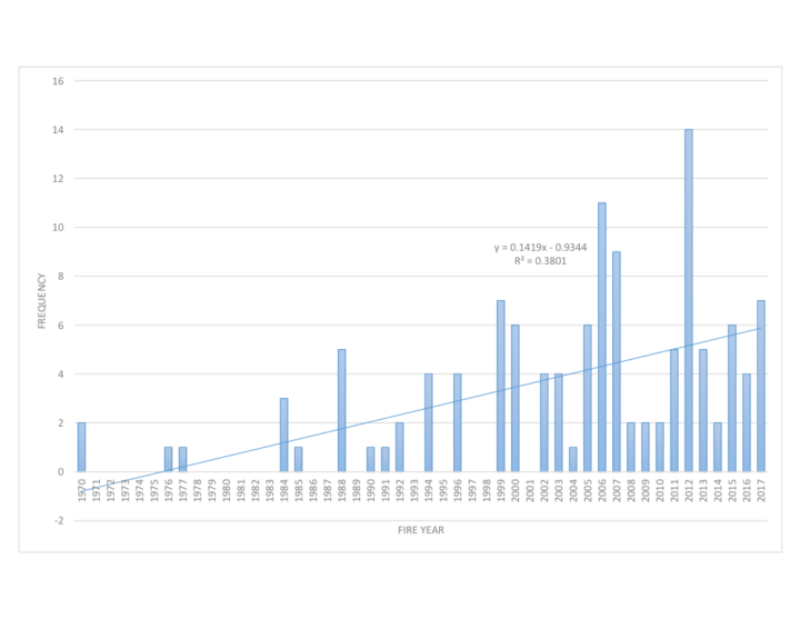
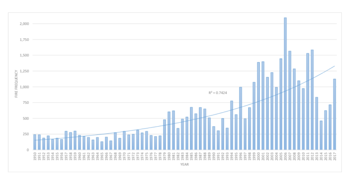
Over the past six decades, there has been a steady increase in the number of fires in the western U.S. In fact, the majority of western fires—61 percent—have occurred since 2000 (shown in the graph below).
Those fires are also burning more acres of land. The average annual amount of acres burned has been steadily increasing since 1950. The number of megafires—fires that burn more than 100,000 acres (156 square miles)—has increased in the past two decades.
Source: NASA RECOVER / Keith Weber
The recent increase in fire frequency and size is likely related to a few reasons, including the rise of global temperatures since the start of the new millennia. Seventeen of the 18 warmest years on record have occurred since 2001.
Global temperatures can affect local fire conditions. Amber Soja, a wildfire expert at NASA’s Langley Research Center, said fire-weather conditions—high temperatures, low relative humidity, high wind speed, and low precipitation—can increase dryness and make vegetation in the west easier to burn. “Those fire conditions all fall under weather and climate,” said Soja. “The weather will change as Earth warms, and we’re seeing that happen.”
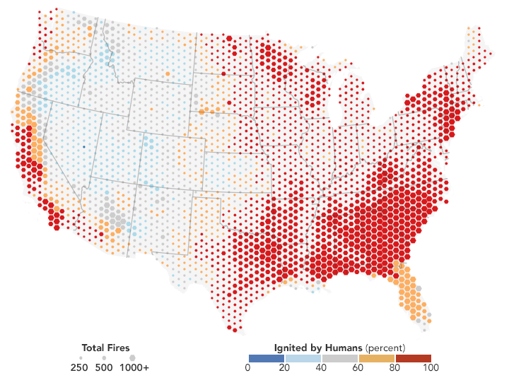
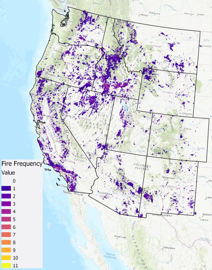
Even though fire frequency and size has increased, only a small percentage of western lands— 11 percent—has burned since 1950. In this map, wildfires are shown in orange. Private lands are shown in purple while public lands are clear (no color). The location of wildfires was random; that is, there was no bias toward fires affecting private or public land.
Keith Weber, a professor at Idaho State University who led the analysis, was surprised at the 11 percent figure. There’s no clear reason yet for why more of the region hasn’t burned. “Some of the 89% may not burn because it has low susceptibility—not dry enough or it has low fuel (vegetation),” said Weber. “Some areas may be really ripe for a fire, but they have not had an ignition source yet.”
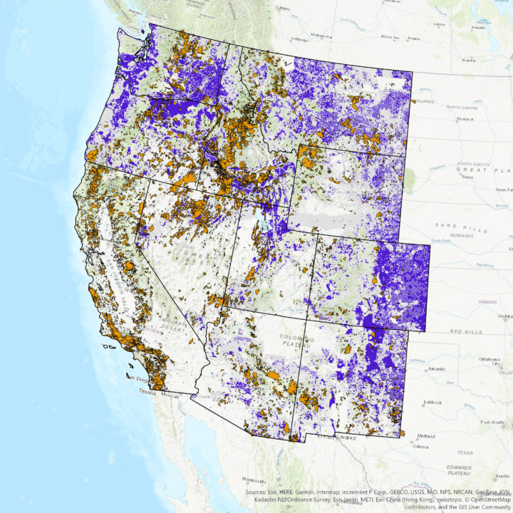
How has only 11 percent of the west burned, yet the annual number of acres burned and the frequency of fire increased? It turns out that many fires are occurring in areas that have already experienced fires, known as burn-on-burn effects. About 3 percent—almost a third of the burned land—has seen repeated fire activity.
The map here shows the locations of repeated fire activity. While you can’t see it at this map’s resolution, some areas have experienced as many as 11 fires since 1950. In those areas, fires occurred about every seven years, said Weber, which is about the amount of time it takes for an ecosystem to build up enough vegetation to burn again.
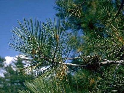
Since 2000, wildfires have shifted from burning shrub-lands to burning conifers. The Southern Rocky Mountains Ponderosa Pine Woodland landscape has experienced the most acres burned—more than 3 million.
The reason might lie within the tree species. Ponderosa Pine is a fire-adapted species. With its thick and flaky bark, the tree can withstand low-intensity surface fires. It also drops branches lower as they age, which deters fire from climbing up the tree and burning their green needles. “The fire will remove forest undergrowth, but will be just fine for the pines,” said Weber. “We are starting to see Ponderosa Pines thrive in those areas.”
Source: National Park Service
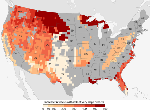
Research suggests that global warming is predicted to increase the number of very large fires (more than 50,000 acres) in the western United States by the middle of the century (2041-2070).
The map below shows the projected increase in the number of “very large fire weeks”—periods where conditions will be conducive to very large fires—by mid-century (2041-2070) compared to the recent past (1971-2000). The projections are based on scenarios where carbon dioxide emissions continue to increase.
According the Fourth National Climate Assessment, wildfires are expected to affect human health and several industries:
More about the source data:
Unless otherwise stated in the article, these data come from NASA’s Rehabilitation Capability Convergence for Ecosystem Recovery. RECOVER is an online mapping tool that pulls together data on 26 different variables useful for fires managers, such as burn severity, land slope, vegetation, soil type, and historical wildfires. In the past, fire managers might need several days or weeks to assemble and present such a large amount of information. RECOVER does so in five minutes, with the help of sophisticated server technologies that gather data from a multitude of sources. Funded by NASA’s Applied Science Program, RECOVER provides these data on specific fires to help fire managers to start rehabilitation plans earlier and implement recovery efforts quickly.
The researchers used the data layer showing historical fires since 1950, which were compiled from comprehensive databases by the U.S. Geological Survey Geospatial Multi-Agency Coordination, National Interagency Fire Center, Bureau of Land Management, U.S. Forest Service, and various state agencies such as the California Department of Forestry and Fire Protection. The historical fires do not include prescribed fires and undocumented fires. Learn more about the RECOVER program and its recent involvement with the Woosley Fire.
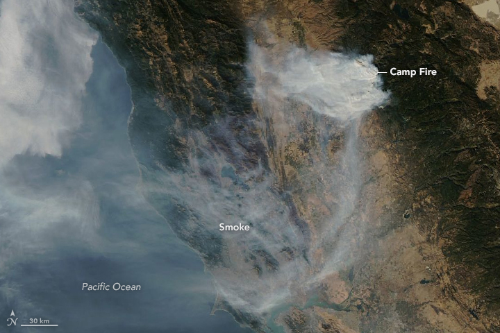
Image Credit: NASA Earth Observatory/Aqua/MODIS
As powerful downslope winds sent the deadly Camp Fire raging through bone-dry vegetation in northern California on November 8, 2018, sensors on the ground and in space began to detect sharp increases in air pollution downwind of the inferno.
From space, the Moderate Resolution Imaging Spectroradiometer (MODIS) and Visible Infrared Imaging Radiometer Suite (VIIRS) sensor observed expansive smoke and aerosol plumes over California’s Central Valley and coast soon after the fire began. Likewise, the Ozone Mapping Profiler Suite (OMPS) on Suomi NPP observed unusually high aerosol levels, and the Measurement of Pollution in the Troposphere (MOPITT) on Terra picked up strong carbon monoxide signals from the fire.
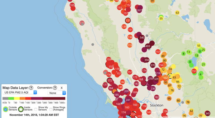
Image Credit: Purple Air
Meanwhile on the ground, atmospheric scientists Pawan Gupta, Robert Levy, Prakash Doraiswamy, and Olga Pikelnaya have been keeping a close eye on air quality data from a network of low-cost sensors distributed throughout the region. These sensors measure the mass concentration of fine particulate matter (PM2.5). Some stations measured PM2.5 values higher than 500 micrograms per cubic meter, which is about 40 times higher than the level considered safe to breathe.
#fires and #smoke in CA continue deteriorating air quality in the region – satellite images from @NASA_NPP #VIIRS #OMPS and low-cost sensor network @purpleairq shows hazardous conditions @NASA_HAQAST @NASAEarthData @iccialtopenburn @Open_AQ @R5_Fire_News @USRAedu @SanGasso pic.twitter.com/lhO08wUg4i
— Pawan Gupta (@pawanpgupta) November 11, 2018
“On November 9th, due to favorable wind direction, most of the smoke was confined to a smaller region north of San Francisco, but the wind direction changed on the 10th, and smoke spread over a much larger region,” noted Gupta, who is based at NASA’s Marshall Space Flight Center and works with NASA’s SERVIR and ARSET programs. “On the 11th and 12th, the wind direction again changed, and most of the smoke blew over the ocean.”
Gupta is involved in an ongoing effort to deploy and test low-cost commercial air quality sensors to see how well their measurements compare with standard EPA measurements and NASA satellite observations. The ground-based sensors that are part of official state and federal government observing networks cost several thousand dollars each, but the new generation of sensors cost just a few hundred dollars—cheap enough that Gupta thinks they could proliferate and potentially be used to help fill in crucial gaps, particularly in countries with few air quality sensors.
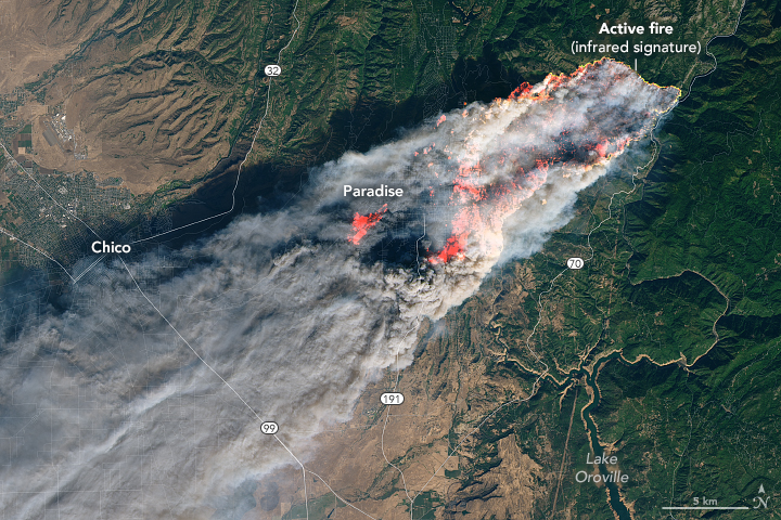
Image Credit: NASA Earth Observatory/Landsat 8/OLI
“The low-cost sensors have performed as expected, though with varying accuracy for certain types of particles,” said Gupta. “Going forward, we hope to use what we learn from them to improve the techniques scientists use to derive levels of particulate matter at the surface from the entire column aerosol measurements observed by satellites.”
So far, Gupta and his colleagues have deployed about 40 low-cost sensors in California. Next summer, they plan to add hundreds of additional sensors in New Delhi, an area that regularly gets hit with dust storms and smoke from agricultural burning. They also plan to deploy sensors in North Carolina, an area with relatively clean air.
Citizen scientists interested in air quality can get involved in the project. Gupta and colleagues from RTI International, South Coast Air Quality Management District, NASA, and other institutions are recruiting volunteers to host the low-cost sensor and share the results with the experts.
Further Reading:
Air Quality Citizen Science, Project Goals and Overview
EOS, New Strategies to Protect People from Smoke During Wildfires
KVPR, NASA’s JPL Using Fresno As A Test Bed For Air Quality Research
Geohealth, Impact of California Fires on Local and Regional Air Quality: The Role of a Low‐Cost Sensor Network and Satellite Observations
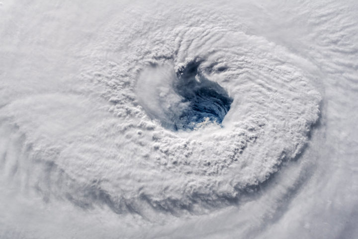
Early on September 12, 2018, astronaut Alex Gerst shot this photograph of Florence’s eye as viewed from the International Space Station. He tweeted: “Ever stared down the gaping eye of a category 4 hurricane? It’s chilling, even from space.” Credit: ISS Photograph by Alex Gerst, European Space Agency/NASA
When Hurricane Florence approached the Carolinas, the NASA Disasters Program began providing a suite of satellite data products to disaster responders, such as the Federal Emergency Management Agency (FEMA) and the National Guard. The goal was to provide the latest information for decision-making on everything from evacuations to supply routes to recovery estimates.
Andrew Molthan is a research meteorologist at NASA’s Marshall Space Flight Center who serves as a “disaster coordinator” for the disasters program. This week, he has been sitting at the FEMA National Response Coordination Center in Washington, D.C., to facilitate coordination of NASA data. We asked him a few questions to better understand the NASA Disaster Program’s role during Hurricane Florence.
What is your role at FEMA this week?
I am here at FEMA to better understand the agency’s geospatial needs during a major disaster, to help improve coordination, and to lend additional remote sensing and/or meteorological expertise where I can.
I am also helping with coordination and data exploitation for the Uninhabited Aerial Vehicle Synthetic Aperture Radar (UAVSAR) instrument aboard NASA’s C-20A aircraft, operated by a pilot. As a team, colleagues from NASA centers all over the country—Marshall, Headquarters, Jet Propulsion Laboratory, Armstrong Flight Research Center, Goddard Space Flight Center, and Langley Research Center—are working collaboratively to help target the UAVSAR instrument for daily radar imaging over the most critical rivers of interest to FEMA, the National Guard, and other partners. Scientists are assisting agencies in the interpretation of the UAVSAR imagery to inform immediate response efforts. They will also further process the data and use it as part of longer-term efforts to improve flood remote sensing and improve streamflow and inundation models.
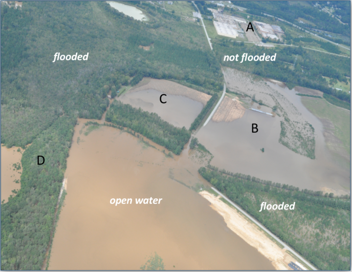
Above: Civil Air Patrol photo taken on September 18, 2018 near Cheraw, SC. Credit: Civil Air Patrol
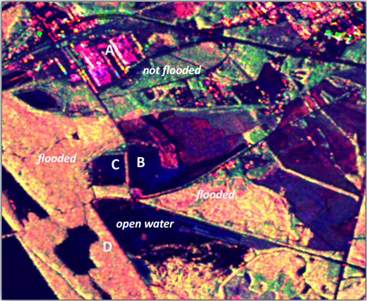
Above: UAVSAR polarimetric decomposition image taken on September 17, 2018 near Cheraw, SC (same area as Civil Air Patrol photo above). Pink denotes urban areas whereas red/orange denotes inundated forests. Dark blue or black are flooded open water; roads can be black even if not flooded. Green, yellow, and light blue color denote areas that are not flooded. Note: Red — Double bounce scattering (flooded forests and urban); Green – Volume scattering (unflooded forests); Blue – specular scatters (dry bare ground, open water). Credit: Yunling Lou/JPL, Bruce Chapman/JPL and Gerald Bawden/HQ
What NASA products are being shared with the National Guard and FEMA?
Most of our activities have focused on helping with the remote sensing of flooded areas following the heavy rains associated with Hurricane Florence. Many river basins in southern Virginia, central and eastern North Carolina, and northeastern South Carolina have experienced widespread river flooding and flash flooding that has affected citizens and need to be monitored for response efforts.
Above: This GPM IMERG visualization shows storm-total accumulated rainfall on the left for 9/12/18 – 9/17/18 vs. a sequence of 3-hour accumulations on the right. Credit: NASA
NASA Marshall team members are producing products and assisting with event coordination including my spot here at FEMA supporting their geospatial team. Scientists with the Jet Propulsion Laboratory (the ARIA team) are routinely generating flood- and damage proxy maps. Goddard researchers are assisting with optical and radar flood detections. The Langley Research Center is assisting with data access and sharing via GIS platforms. NASA Headquarters is supporting overall agency coordination. Johnson Space Center is helping to acquire dramatic footage of the storm and aftermath from astronaut photography.
What instruments are being used?
The extensive cloud cover from the storm has blocked surface views from instruments operating in the visible, near infrared, and thermal wavelengths, so synthetic aperture radar (SAR) information has been critical. SAR has the ability to “see” through clouds, making it an all-weather instrument. These include images from the European Space Agency’s Sentinel-1A/1B platforms, international and commercial partner assets, such as those from the Japan Aerospace Exploration Agency’s ALOS-2, Canadian Space Agency’s Radarsat-2, and the German TerraSARx, which are made available through government partnerships and the International Charter on Space and Major Disasters.
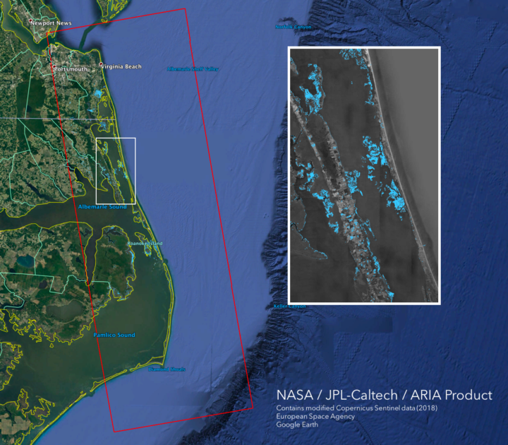
This flood proxy map shows the extent of flooding 36 hours after the hurricane’s landfall (September 15, 2018 18:57 PM local time). The map is derived from Synthetic Aperture Radar (SAR) data from the Copernicus Sentinel-1 satellites, operated by the European Space Agency (ESA).
As skies are now beginning to clear, we’ll also look for opportunities to use other NASA satellite remote sensing assets — including Terra/Aqua MODIS, Suomi-NPP VIIRS, Landsat 8 — and applications to identify water on the surface. We’ll also take a look at nighttime light imaging from Suomi-NPP VIIRS and the day-night band, using the NASA Black Marble and Black Marble HD products generated at Goddard.
Above: The VIIRS instrument on the joint NASA/NOAA Suomi NPP satellite observed Hurricane Florence as it developed in the Atlantic Ocean and made landfall in North Carolina on Sept. 14, 2018. Credits: NASA Worldview
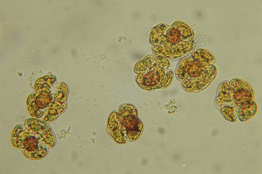
Karenia brevis cells. Image credit: Mote Marine Laboratory
Put a sample of water from the Gulf of Mexico under a microscope, and you will often find cells of Karenia brevis swimming around. The microscopic algae—the species of phytoplankton responsible for Florida’s worst red tide outbreaks—produce brevetoxin, a compound that in high concentrations can kill wildlife and cause neurological, respiratory, and gastrointestinal issues for people.
Under normal conditions, water quality tests find, at most, a few hundred K. brevis cells per liter of water—not enough to cause problems. But in August 2018, in the midst of one of the most severe red tide outbreaks to hit Florida’s Gulf Coast in a decade, water samples regularly contained more than one million K. brevis cells per liter.
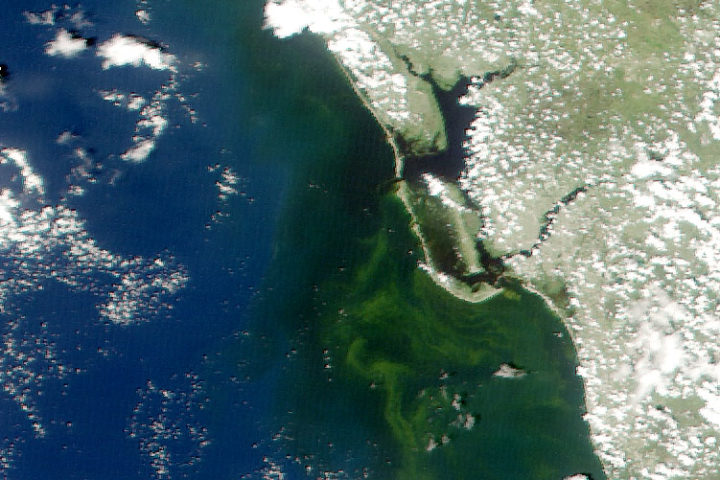
Natural-color MODIS satellite image of algae staining the water off the coast of Fort Myers on August 19, 2018. Image from the University of South Florida Near Real-Time Integrated Red tide Information System (IRIS).
That was enough to stain large swaths of coastal waters shades of green and brownish-red and leave beaches littered with rotting fish carcasses. Roughly 100 manatees, more than 200 sea turtles, and at least 12 dolphins have been killled by red tides, according to preliminary estimates. For much of August, the toxic bloom stretched about 130 miles (200 kilometers) along Florida’s Gulf coast, from roughly Tampa to Fort Myers. Though the bloom has been active since October 2017, it intensified rapidly in July 2018. The damage grew so severe and widespread that Florida’s governor declared a state of emergency in mid-August.
One of the best ways to test for the presence of K. brevis is to analyze water samples collected from boats or beaches. State environmental agencies do this on a regular basis, but understanding the full extent and evolution of fast-changing blooms, or predicting where they will move with ground sampling alone is a challenge.
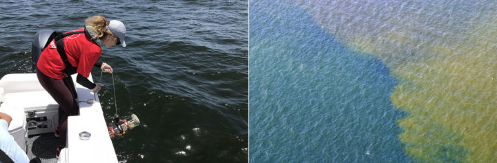
Sampling red tide in 2018 (left). An aerial view of red tide in 2005 (right). Photo credits: Florida Fish and Wildlife Conservation Commission.
That’s why key red tide monitoring systems, such as the National Oceanic and Atmospheric Administration’s (NOAA’s) Harmful Algal Bloom Forecast System and the Near Real-Time Integrated Red Tide Information System (IRIS) from the University of South Florida, make use of satellite data from the Moderate Resolution Imaging Spectroradiometer (MODIS) sensors on NASA’s Aqua and Terra satellites. These sensors pass over Florida’s Gulf Coast twice a day, acquiring data at several wavelengths that can be useful for identifying and mapping the spatial extent of algal blooms. Other satellite sensors such as the Visible Infrared Imaging Radiometer Suite (VIIRS) on Suomi NPP and the Ocean and Land Color Instrument (OCLI) on Sentinel-3 collect information that can be used to monitor red tides as well.
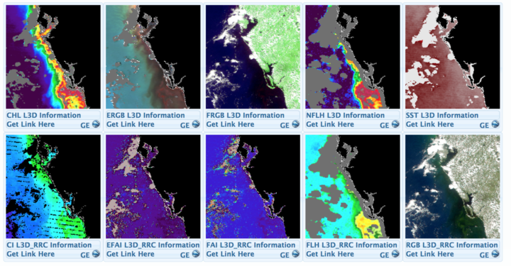
A screenshot from the University of South Florida’s Near Real-Time Integrated Red tide Information System (IRIS). The image shows various types of data captured by MODIS sensor on Terra on August 19, 2018. Solar-stimulated fluorescence data (NFLH) is particularly useful for locating algal blooms. Image Credit: USF/IRIS
Despite the utility of satellite observations, there are some significant challenges to interpreting satellite data of algal blooms in shallow, coastal waters, explained oceanographer Chuanmin Hu of the University of South Florida. Chief among them: it can be quite difficult to distinguish between algal blooms, suspended sediment, and colored dissolved organic matter (CDOM) that flows into coastal areas.
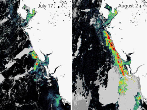
The Karenia brevis bloom expanded and intensified in late-July. This fluorescence data comes from the OCLI sensor on Sentinel 3. Image courtesy of Rick Stumpf, NOAA.
To get around this problem and make satellites better at pinpointing algal blooms, Hu and colleagues at the University of South Florida have developed a red tide monitoring system that makes use of MODIS observations of fluorescence, which algal bloom emit in response to exposure to sunlight. “If we have fluorescence data to go along with a natural-color image from MODIS, we can say with a high degree of confidence where the algal blooms are and where the sensor is just detecting sediment or CDOM,” he said. When fluorescence data is available, the Florida Fish and Wildlife Commission pushes it out to the public as part of its red tide status updates (see the August 21 update below).
Likewise, NOAA has combined a fluorescence method with a long-standing technique that identifies recent increases in chlorophyll concentration, the combination improves the identification of likely K. brevis blooms — information that then gets incorporated in NOAA’s HAB Forecast System, noted Richard Stumpf, an oceanographer with NOAA.
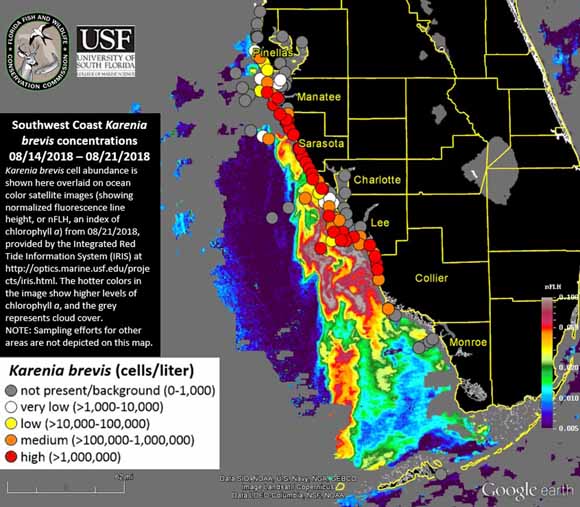
K. brevis cell abundance shown on an ocean color satellite image from the IRIS system. Warmer colors indicate higher levels of chlorophyll a, an indicator of algae. Cloudy areas are gray. Circles indicate locations where officials tested water samples on the ground. Image Credit: FFW/USF/IRIS.
However, that still leaves some big problems—only about ten percent of MODIS passes collect usable fluorescence data. The rest of the time images are marred by either sunglint or clouds. And the algorithm that scientists use to detect algal blooms with MODIS does not work well within one kilometer of the coast—the part that is of the greatest interest to beachgoers and boaters.
The Terra satellite. Image Credit: NASA
To help fill in the gaps, NASA’s Applied Science program is working with several partner institutions on a smartphone app called HABscope. The app, developed by Gulf of Mexico Observing System (GCOOS) researcher Robert Currier, makes it possible for trained water samplers (typically lifeguards who participate in Mote Marine Laboratory’s Beach Conditions Reporting System) to collect video of water using microscopes attached to their smartphones.
After recording, HABscope uploads videos to a cloud-based server for automatic analysis by computer software. The software rapidly counts the number of K. brevis cells in a water sample by using technology similar to that found in facial recognition apps. But rather than focusing on facial features, the software looks for a particular pattern in the movement of K. brevis cells.
K. brevis are vigorous swimmers, often using a pair of long, whip-like flagella to migrate vertically about 10 to 20 meters (33 to 66 feet) each day. They chart a zig-zagging, corkscrew-shaped path that allows the software to easily pick them out amidst the cast of other phytoplankton found in Gulf of Mexico water samples.
The data about K. brevis abundance at various locations along the coast is then fed into a respiratory distress forecasting tool managed by NOAA. “Respiratory distress forecasts can now be produced 1 to 2 times per day for specific beaches along the Florida Gulf Coast,” said Stumpf. “Previous to this project, these forecasts were issued at most twice a week, and only as general statements about risk within a county. The combination of earth observations with rapid field monitoring will increase the accuracy and usefulness of the forecasts.”
The research team that developed the HABscope app included oceanographers, ecologists, computer application developers, and public health experts. Photo Credit: Mote Marine Laboratory.
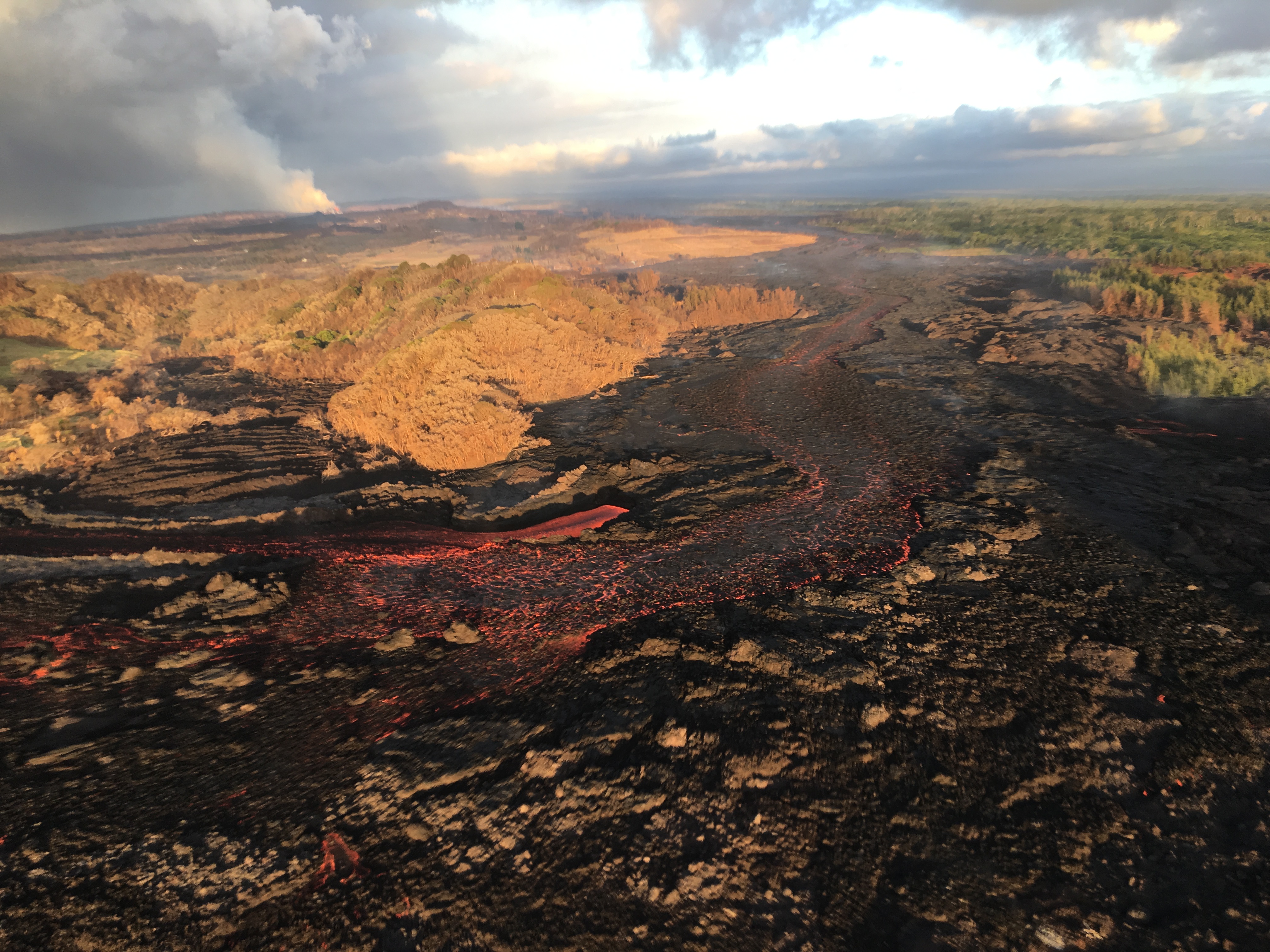
For more than two months, lava has been pouring from part of Hawaii’s Kilauea volcano, destroying homes and remaking the land surface. More data and imagery of the eruption is flowing in from satellites, drones, and ground-based sensors than Earth Observatory can cover, but here are a few striking images that we would be remiss not to share.
By The Lava’s Early Light 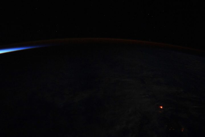
NASA Astronaut Ricky Arnold tweeted this nighttime photograph of lava on June 20, 2018. If the Star Spangled Banner had been composed in Hawaii rather than Baltimore, maybe “lava’s early light” would have made it into the lyrics. Credit: NASA
The Wrong Side of the Lava Flow
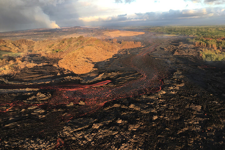
Notice the stark differences in landscapes on the northern and southern sides of the lava channel. With trade winds blowing heat and volcanic gases to the southwest, the north side remained green. Vegetation on the south side, yellowed and brown, took a battering. This aerial photograph was taken on July 10, 2018. Image Credit: USGS.
A Colorful Satellite Perspective on a Collapsing Caldera
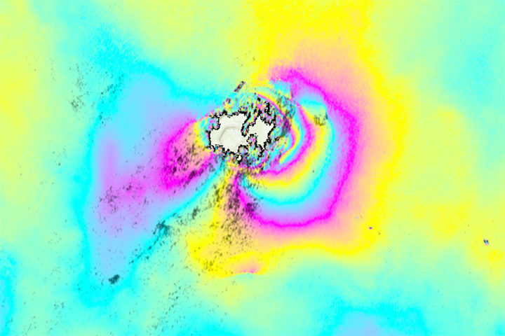
As lava flows from some parts of Kilauea, other parts of the volcano have been sinking. In the case of the summit caldera, the rate of subsidence has been dramatic. This interferometric synthetic aperature radar (InSAR) image, or interferogram, shows surface movement at the summit caldera between June 9 and June 23. Each cycle of yellow-blue-purple indicates approximately 5 inches (13 centimeters) of movement. Areas where the colorful lines are the closest have shifted the most. The data was collected by Advanced Land Observing Satellite-2 (ALOS-2), a Japanese Aerospace Exploration Agency (JAXA) mission. Read more about this image and type of data from NASA’s Disasters Program. Image Credit: NASA/JAXA.
The Same Caldera Collapse Seen from the Ground
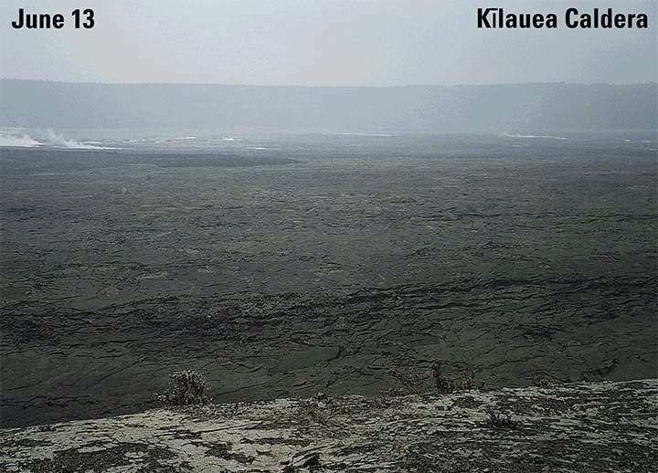
This sequence of images shows rapid subsidence of the caldera floor, along with the development of scarps. One photograph is shown per day between June 13 and 24. The photos were taken from the southern caldera rim, near Keanakāko‘i Crater, and face north. Image Credit: USGS.
Laze Billows into the Air as Lava Pours into the Sea
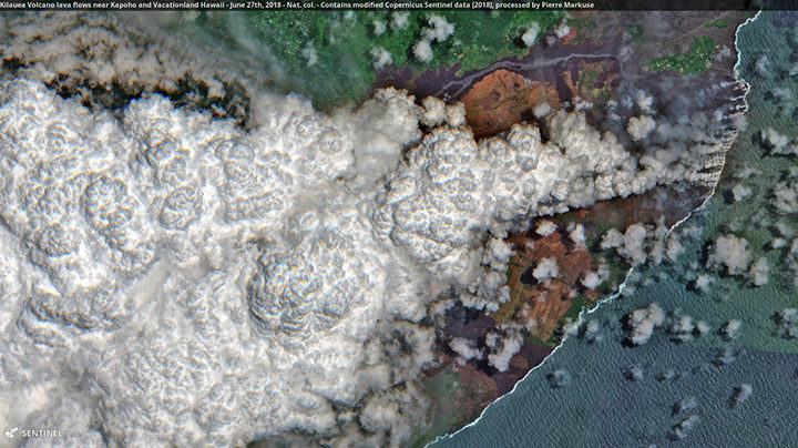
In this Sentinel-2 image, a large plume of laze—steam, volcanic gases, and shards of glass—blows west over Hawaii as lava poured into the sea on June 27, 2018. Pierre Markuse created this image using data from Sentinel-2, a satellite managed by the European Space Agency. He regularly downloads and processes Sentinel and Landsat satellite data and has posted dozens of Kilauea images on Flickr. Image Credit: ESA/Sentinel-2/Markuse
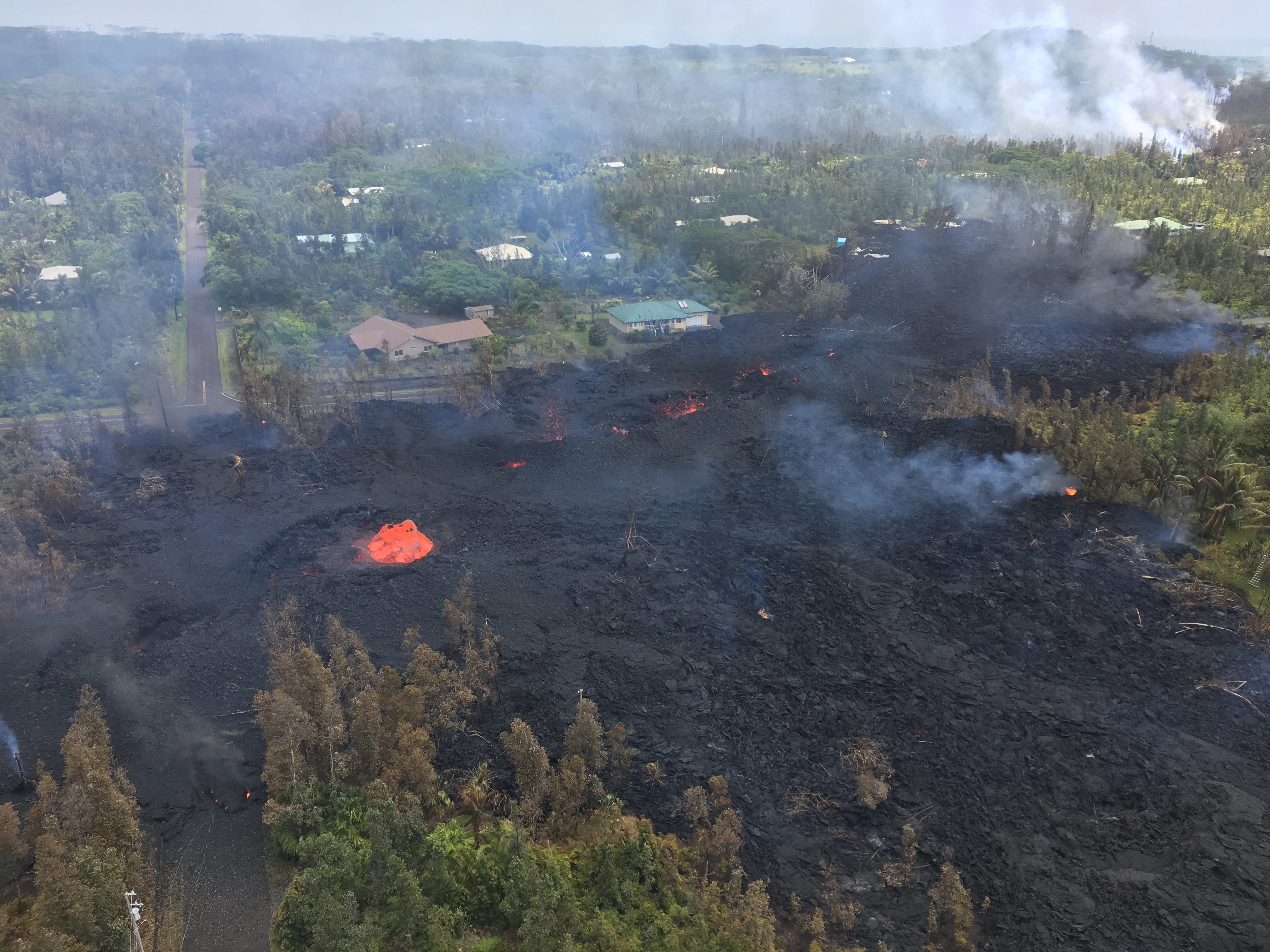
An active fissure in Leilani Estates subdivision. This photo shows fissure 7 on May 5, 2018. Image Credit: U.S. Geological Survey
You have probably seen dramatic images and videos of several new fissure eruptions cracking open the land surface in Hawaii, emitting plumes of gas, and spitting up fountains of lava in the middle of a residential neighborhood.
If you are tracking Kilauea’s eruptions, the U.S. Geological Survey Hawaiian Volcano Observatory (HVO) and Hawaii County Civil Defense are the best sources for the latest information. HVO releases status reports, photos, videos, maps, and near-real time data that are invaluable to understanding what is happening. Hawaii County issues frequent alerts with details about evacuations, road closures, and the status of utilities.
If you want to dig into the science of this eruption, HVO and the Smithsonian Global Volcanism Program both have informative summaries that synthesize what scientists know of Kilauea’s geologic history. There are also knowledgeable volcanologists tracking the eruption closely and offering science-based commentary. Janine Krippner of Concord University (@janinekrippner) is a trained volcanologist who tweets regularly about developments. Ken Rubin @kenhrubin), based at the University of Hawaii, does the same. Erik Klemetti, a volcanologist at Denison University, is reporting on the eruption on his Rocky Planet blog.
To extend the scientific conversation, Earth Matters reached out to a handful of researchers from NASA and elsewhere who are monitoring the volcano. Among those who responded were Simon Carn (Michigan Technological University), Ashley Davies (NASA Jet Propulsion Laboratory), Jean-Paul Vernier (NASA Langley Research Center), Verity Flower (Universities Space Research Association/NASA Goddard Space Flight Center) and Krippner.
NASA astronaut Drew Feustel tweeted this photograph of a volcanic plume at the summit of Kilauea on May 13, 2018. Image Credit: NASA
Can you briefly describe the steps that happen in an eruption like we’re seeing with Kīlauea?
“First, USGS HVO tiltmeters recorded inflation of the volcano. This was caused by magma moving up from depth, causing the volcano to bulge outwards. The lava lake level in the summit caldera (Halema’uma’u) rose, an indication of the influx of magma into the volcanic plumbing system. Local seismic activity increased due to rock breaking as magma forces its way upwards, and as the broader volcanic edifice adjusted and reacted to the changing stress field. As magma rose, more volcanic gas (including sulfur dioxide) was released. As magma moved into the near surface East Rift Zone, the summit started to deflate, and the lava lake level dropped. There were structural adjustments along the rift, from the summit, to Pu’u O’o, and along the rift, causing earthquakes. Then lava erupted, the whole system began to depressurize, and deflation continued.”
– Ashley Davies
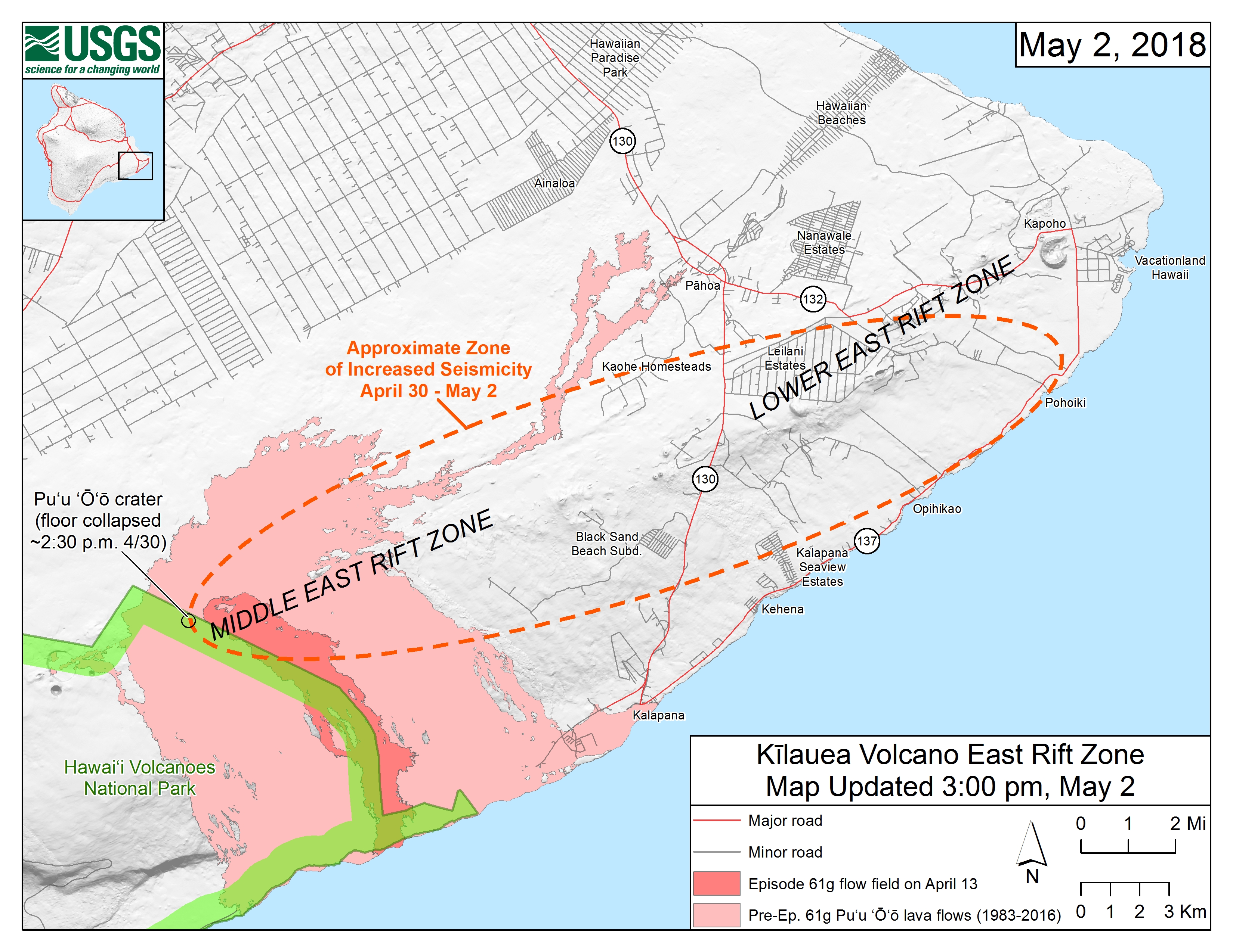
Starting on the afternoon of Monday, April 30, 2018, magma beneath Pu‘u ‘Ō‘ō drained and triggered the collapse of the crater floor. Within hours, earthquakes began migrating east of Pu‘u ‘Ō‘ō, signaling an intrusion of magma along the middle and lower East Rift Zone. Map credit: U.S. Geological Survey. More maps here.
How would you describe the significance or scope of this eruption?
“This eruption is part of the normal life cycle of Kilauea volcano and is comparable to past activity. In fact, 90 percent of the surface of Kilauea is less than 1,000 years old — very young on a geologic time scale. The significance of this eruption is that it is directly occurring in the Leilani community. These people need help and support. Even though we all live with natural hazards, no matter where we are, we don’t often imagine it happening to us.” — Janine Krippner
What can we expect to happen next? Is the fissure eruption likely to persist for a long time?
“It could be a major risk to the Leilani Estates area if the eruption continues. So far, the lava flows have not traveled very far from the eruptive fissure. If this changes or the fissure extends in length, then more property will be destroyed and major roads could be cut.”
— Simon Carn
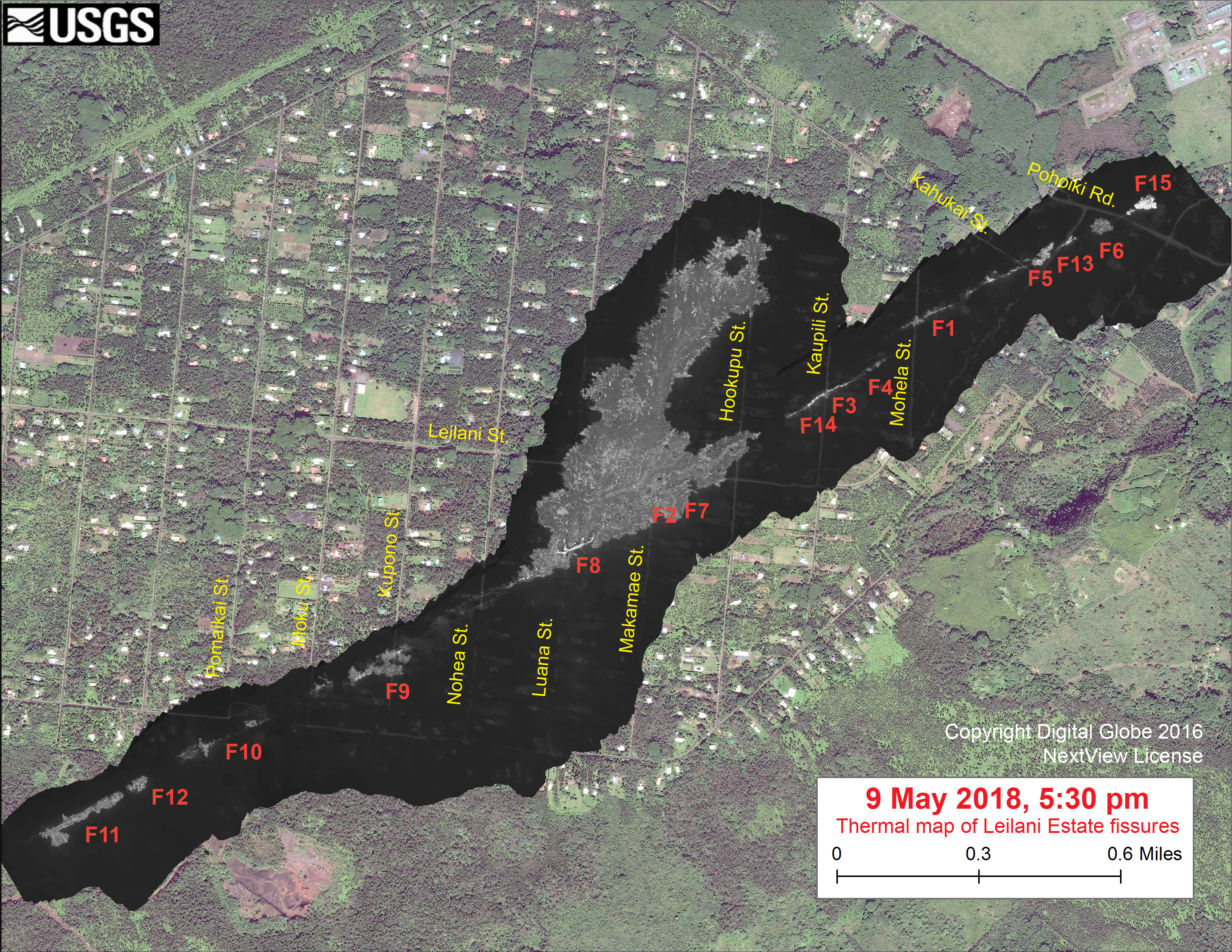
This map overlays a georegistered mosaic of thermal images collected during a U.S. Geological Survey helicopter overflight of the fissures in Leilani Estates on May 9, 2018. The base is a copyrighted satellite image (used with permission) provided by Digital Globe. Temperature in the thermal image is displayed as gray-scale values, with the brightest pixels indicating the hottest areas (white shows active breakouts). Image: Courtesy of USGS, Copyright Digital Globe, NextView License.
“This eruption could persist for quite a while, but it is impossible to tell how long. This is a dynamic situation, and new fissures could start and stop with little to no warning. The risk of lava inundation is real and significant, depending on where lava is extruded at the surface and how much.” — Janine Krippner
Can you address the health hazards associated with sulfur dioxide?
“The problem with sulfur dioxide is that if you breathe it in, it can combine with water in the lungs to create an acid. With sulfur dioxide issuing from the fissures in an inhabited area, it makes for unhealthy concentrations locally. HVO has more on this here.” — Ashley Davies
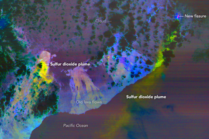
This false-color ASTER image was acquired on May 6, 2018. It shows the sulfur dioxide plume in yellow and yellow-green coming from new activity in Leilani Estates. A smaller, but thicker, sulfur dioxide plume can be seen coming from Kilauea’s main vent. Image Credit: NASA/ASTER
“Sulfur dioxide is a common occurrence in Hawaii, as vog (volcanic smog), which is a mixture of sulfur and aerosols. Sulfur dioxide and/or vog can cause irritation to eyes and airways, causing coughing, wheezing, headaches, and sore throats. People with preexisting conditions, such as asthma, are more at risk. Sulfur dioxide levels have been measured at dangerous and deadly levels near the fissures.” — Janine Krippner
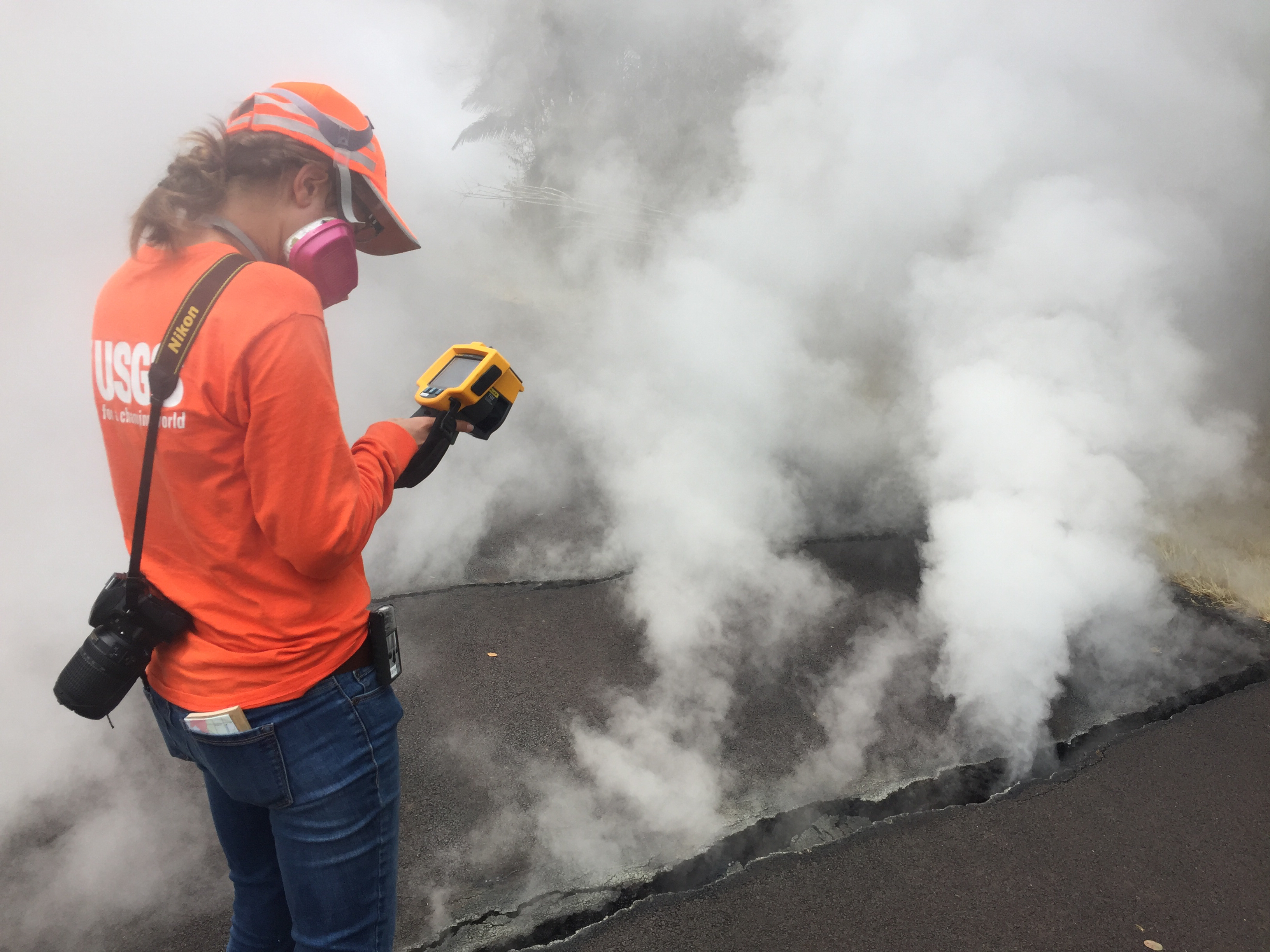
Volcanic gases rise from a fissure on Nohea Street, Leilani Estates. An HVO geologist measured a temperature of 103 degrees C (218 degree F). The asphalt road was describes as “mushy” from the heat. Image Credit: U.S. Geological Survey.
Which satellites sensors are making observations of Kilauea’s plume?
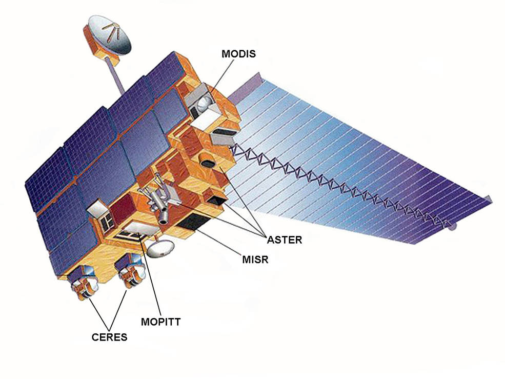
There are several. The Multi-angle Imaging SpectroRadiometer (MISR) can measure the height of plumes from stereo imagery, and makes observations of the size and shape of the particles, which is useful for determining the degree to which the plume is rich in liquid sulfate and water particles versus solid, angular ash particles. The Moderate Resolution Imaging Spectroradiometer (MODIS) and Visible Infrared Imaging Radiometer Suite (VIIRS) are collecting daily snapshots of the amount of particulate matter in the plume — as well as making observations of the sulfur dioxide plumes based on their thermal bands. The Operational Land Imager (OLI) and Advanced Spaceborne Thermal Emission and Reflection Radiometer (ASTER) provide more detailed images, though overpasses are less frequent. Finally, synthetic aperture radar on Sentinel 1 is tracking how much the land deforms as the eruption progresses.
— Verity Flower
To what degree are satellites sensors like OMPS and OMI useful for monitoring sulfur dioxide emissions?
Satellites provide unique information on the total sulfur dioxide mass and spatial distribution in a plume ‘snapshot’, but provide minimal information on sulfur dioxide at ground level. Other techniques provide more localized measurements but can detect surface concentrations. — Simon Carn
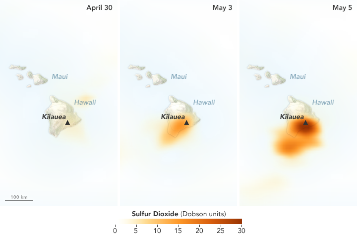
The Ozone Mapping Profiler Suite (OMPS) detected increasing concentrations of sulfur dioxide over Hawaii in May 2018. Image Credit: NASA Earth Observatory. Learn more about this map.
Are there other reasons to monitor volcanic plumes aside from health hazards?
The particles in volcanic ash have sharp, angular edges that can abrade aircraft windows hindering the pilots ability to navigate. Where these ash particles enter aircraft engines the high temperatures cause ash to melt, coating the rotors, air intakes and casings that can lead to engine failure. Plumes can also have effects—sometimes even positive effects—on the wider environment. Ash falls can destroy crops and damage infrastructure during an eruption, but they can also add nutrients to the ocean that fuel phytoplankton blooms and nutrients to the soil that make farmland more fertile on longer timescales. — Verity Flower
Can you tell me anything about the wind patterns around Hawaii?
So far, northwesterly trade winds, which are common in this area, have kept the plume over the ocean. The winds do occasionally shift for short periods, which could bring more volcanic pollution over populated areas. — Verity Flower
What has NASA been doing in response to the eruption?
“The NASA Disasters Program is working with several teams to assess the eruption and make information available to first responders and others. We are working with several instrument teams to monitor the sulfur dioxide plume. We are also looking at thermal imagery from VIIRS to detect the position of the new fissures. The VIIRS thermal anomaly is usually used for fire detection, but it appears to be a useful tool for detecting the fissure events in Leilani Estates. We are also using ASTER thermal anomaly data in near-real time to detect the fissures. You can find imagery and data from several sources showing different aspects of the eruption here.” — Jean-Paul Vernier
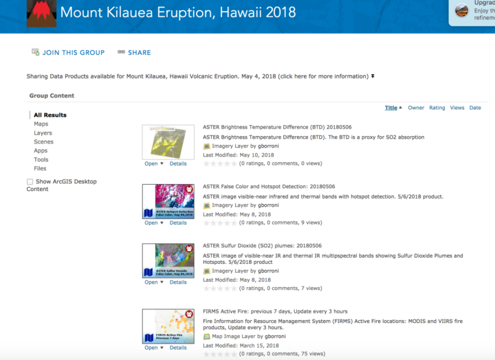
A screenshot from a repository of maps and images related to the eruption compiled by the NASA Earth Science Disasters Program. Image Credit: NASA
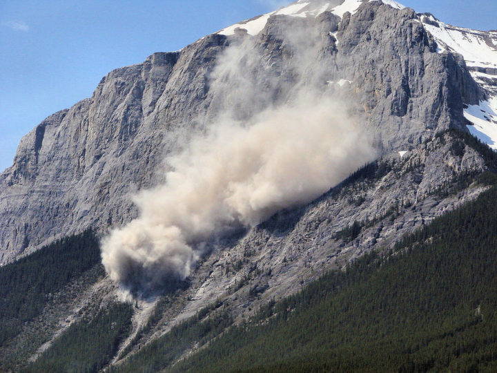
This landslide occurred on June, 1, 2007 on a mountain near Canmore in Alberta, Canada. The Flickr photo was taken by Sheri Teris (Creative Commons)
Landslides cause thousands of deaths and billions of dollars in property damage each year. Surprisingly, very few centralized global landslide databases exist, especially those that are publicly available.
Now NASA scientists are working to fill the gap—and they want your help collecting information. In March 2018, NASA scientist Dalia Kirschbaum and several colleagues launched a citizen science project that will make it possible to report landslides you have witnessed, heard about in the news, or found on an online database. All you need to do is log into the Landslide Reporter portal and report the time, location, and date of the landslide—as well as your source of information. You are also encouraged to submit additional details, such as the size of the landslide and what triggered it. And if you have photos, you can upload them.
Kirschbaum’s team will review each entry and submit credible reports to the Cooperative Open Online Landslide Repository (COOLR) — which they hope will eventually be the largest global online landslide catalog available.
Landslide Reporter is designed to improve the quantity and quality of data in COOLR. Currently, COOLR contains NASA’s Global Landslide Catalog, which includes more than 11,000 reports on landslides, debris flows, and rock avalanches. Since the current catalog is based mainly on information from English language news reports and journalists tend to cover only large and deadly landslides in densely populated areas, many landslides never make it into the database. Landslide Reporter should help change this because it makes it possible for people to submit reports, including first-hand accounts, from anywhere in the world.
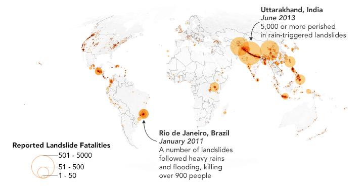
This map shows 2,085 landslides with fatalities as reported in the Global Landslide Catalog, which is currently included in the Cooperative Open Online Landslide Repository (COOLR). NASA Earth Observatory images by Joshua Stevens, using landslide susceptibility data provided by Thomas Stanley and Dalia Kirschbaum (NASA/GSFC).
Kirschbaum plans to use this database to improve the algorithm for her team’s landslide prediction model. The model, known as the Landslide Hazard Assessment for Situational Awareness (LHASA) model, analyzes rainfall and land characteristics in an area that might make a landslide more susceptible. The model produces forecasts of potential landslide activity every 30 minutes. In some cases, however, the model predicts more or less potential activity.
“With more ground data to validate the model, we can create a better tool for improving situational awareness and research for this pervasive hazard. We could better anticipate and forecast where landslides may impact populations,” said Kirschbaum.
Check out posts by Caroline Juang on Discover magazine’s citizen science blog and by David Petley on American Geophysical Union’s Landslide Blog to find out more. You can also follow the project on Twitter (@LandslideReport) and Facebook.
NASA Earth Observatory image by Joshua Stevens, using MODIS data from LANCE/EOSDIS Rapid Response.
With thousands of homes threatened by intense wildfires burning in southern California, NASA Earth Observatory checked in with Jet Propulsion Laboratory scientist Natasha Stavros to learn more about the destructive blazes.
Earth Observatory (EO): Why have these fires been so fast-moving and destructive? Are fierce Santa Ana winds the key factor? Are anomalous temperatures, rainfall, ENSO conditions, bark beetle activity, or other factors playing an important role?
There are absolutely other factors. Santa Ana winds definitely played a role in spreading the fires, but the late fire season is a more complex story. Last year, we had a lot of heavy rains, and this increased fuel connectivity by enabling grasses and annual shrubs to flourish (hence the green hills last spring). However, we had a lot of record-breaking heat waves this year.
In fact, a recent study we conducted with NASA DEVELOP and the National Park Service in the Santa Monica Mountains showed that the number of days over 95 degrees Fahrenheit stressed established vegetation and contributed to massive die-off. Even though the drought is over, the trees are still recovering from the stress of reduced water availability for such an extended period. They are in a fragile state and their defenses are down. This means that they are even more susceptible to infestation, mortality, and ultimately fire danger.
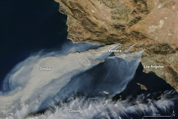
EO: We have published MODIS (top of the page), Sentinel-2 (below), and nighttime VIIRS (bottom of the page) satellite imagery of these fires. Is there anything that you find particularly interesting or notable about these images?
To me, the noteworthy thing is that the plume is going over the ocean and not the continental United States (as we saw earlier this year). This has to do with the Santa Ana winds coming from the desert and pushing particulates, ozone, carbon monoxide, and other toxic pollutants away from where people live.
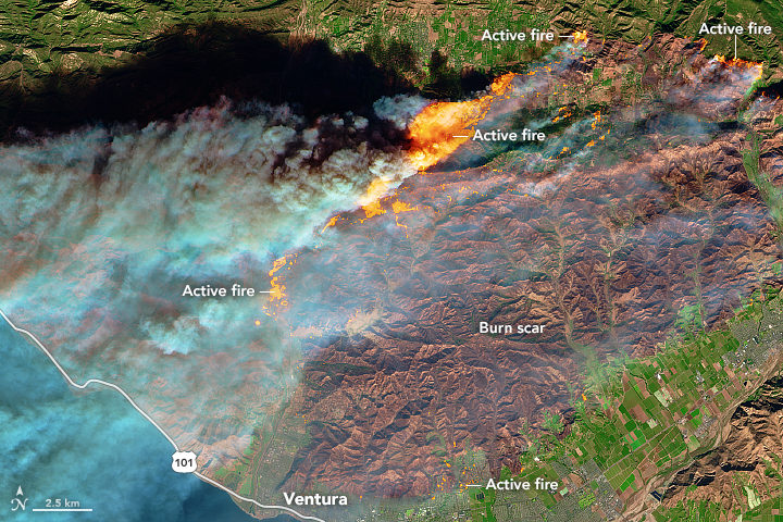
NASA Earth Observatory image by Joshua Stevens, using modified Copernicus Sentinel data (2017) processed by the European Space Agency.
As for the Sentinel-2 image, this is a great shot in that it really shows the value of remote sensing in monitoring fire. Flames that look like that are tens of meters tall. The flame length is proportional to the heat released from the flame, so these fires are very hot. Just like you would not want to stand too close to a bonfire with flames tens of meters tall, fire management does not want to put personnel in the path of those flames.
Images like these and fire behavior models help inform how we think the fire will move across the landscape. There is still a lot we do not know; our models are based on what we do know, so as fires become more intense, the models do not work as well, so this is an area of active research.
NASA Earth Observatory images by Joshua Stevens using VIIRS day-night band data from the Suomi National Polar-orbiting Partnership.
EO: Is there anything to say about how these fires fit into longer term trends and/or changing climate patterns?
Fire regimes are changing. There is no question about that, and there are a lot of things contributing to it: climate change, a century of fire exclusion, and a growing wildland urban interface (WUI). As we move into the future, we expect there to be an increase in very large fire events. Also, and this is relevant for the events happening now, there will be longer fire seasons. Also, note that many of the fires that ignite close to where people live are actually caused by people. This is particularly true in Southern California.
As we move forward, we need to think about how to support smart fire management practices. By that I mean: what can we proactively do to reduce fire risk (i.e. the threat to valuable resources)?
Most fires on the coasts are lit by people. NASA Earth Observatory map by Joshua Stevens, using fire data courtesy of Balch, J. et al. (2017).
EO: What about JPL’s response to these fires? I was intrigued by the megafire project described here. Will your group be responding to this fire in any way?
We just received approval from NASA Headquarters to fly the Airborne Visible/Infrared Imaging Spectrometer (AVIRIS) over these fires. This sensor has been useful for investigating fuel load type and subsequent effects on emission types, fire behavior, and post-fire analysis (e.g., safety, erosion, area burned, fire severity or the amount of environmental change caused the fire, etc.) and is often analyzed in interagency and federal-academic coordination to improve our understanding of fire.
Another effort to support fire management includes work being done from JPL in coordination with the National Interagency Fire Center (NIFC) to help them develop metrics of fire danger using NASA satellites that provide hydrologic variables (e.g., soil moisture and vapor pressure deficit—the difference between the amount of moisture in the air vs how much it can hold). These metrics have a one-month forecast to help allocate fire management resources nationally, which is particularly important as our fire seasons extend throughout the year in multiple places at the same time.

Natasha Stavros. Image courtesy of N. Stavros.
