NASA Earth Observatory images by Jesse Allen, using VIIRS data from the Suomi National Polar-orbiting Partnership.
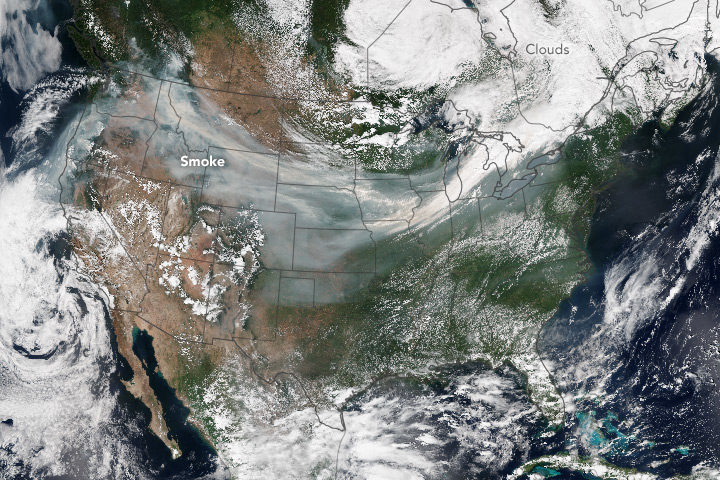
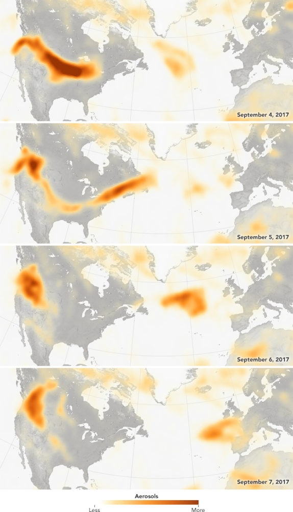
You have probably heard or read that it has been rather smoky out West this year. Dozens of large wildfires have raged through forests in British Columbia, Alberta, Washington, Oregon, Idaho, California, and other states this fire season. Intense blazes are lofting up so much smoke that huge plumes have been blowing across the country—and even turning up in Europe. We checked with a few scientists who specialize in studying wildfires for an update on what is going on.
EO: How does this fire season compare to past years?
The western fire season has been quite active this year. British Columbia has surpassed its greatest burned area in the modern era. While its unlikely that this season will be record-breaking in the western U.S., it is above normal relative to the past decade, which has seen abundant fire activity.
— John Abatzoglou, University of Idaho
EO: Is climate change exacerbating these fires?
Because we have let fuels build up in the western U.S., it is difficult to tell in many ecosystems what is weather-driven vs. climate-driven until we get back to normal fuel loads. This 2013 PNAS paper tries to answer the climate question given the artificially increased fuel loadings. They found that climate change is responsible for 55 percent of the observed increasing fuel aridity. — Jessica McCarty, Miami University
EO: Are bark beetles making these fires worse?
No, the bark beetle outbreaks have little-to-no relationship with trends in area burned or the ecological severity of fires. I think this continues to be a big misconception with the public, which is understandable because climate is a key driver of both bark beetle outbreaks and wildfires. Many people jump to the conclusion that bark beetle outbreaks are causing fires. But it is likely a classic case of correlation without causation. — Brian Harvey, University of Washington
EO: If there was one thing you wished Americans understood about wildfires in the West, what would it be?
Be careful with fire. Smokey the Bear is trying to educate you on the risk—listen. Heed fire risk and fire weather warnings. Don’t build campfires unless you have to. Don’t go off-roading during droughts and heat waves. Be careful with your cigarette butts. — Jessica McCarty, Miami University
Even though no one is a fan of widespread smoke, wildfires aren’t inherently “bad” [when they are in unpopulated areas]. One continuing challenge is figuring out how to live with fire as part of the system as more people settle in the region during an era of changing environmental conditions. — John Abatzoglou, University of Idaho
NASA Earth Observatory images by Jesse Allen and Jeff Schmaltz, using Suomi NPP OMPS data provided courtesy of Colin Seftor (SSAI).
A June snowstorm just topped off the already thick layer of white stuff atop the Sierra Nevadas. California’s snow water equivalent rose to a heaping 170 percent of normal. But not so long ago, the state was in the midst of a deep drought; its mountains were bare and brown, and water levels plummeted in reservoirs.
Throughout, satellites were watching. Check out the California drought and its aftermath in a video from NASA Earth Observatory:
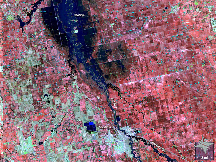
Image by the NASA GSFC Landsat/LDCM EPO Team using Landsat 5 data from the U.S. Geological Survey.
Twenty years ago this month, a hundred-year flood inundated cities along the Red River. The waters rose through April and May 1997, inundating 2,200 square miles (5,700 square kilometers) of North Dakota and Minnesota—a footprint twice as big as Rhode Island. The river spilled over its banks in Winnipeg, Canada, as well.
The false-color Landsat 5 image above shows Grand Forks, North Dakota, as it appeared on May 4, 1997. At that point, flood waters had mostly retreated, but the river still appeared swollen, with water lingering in floodplains just north of the city. Water appears dark blue, while structures are off-white.
There have been a several other notable floods since 1997. The river also overflowed its banks in 2006, 2009, and 2011.
In early May 2017, the river’s levels are average, and its water output holds steady, according to ground-based measurements taken at Grand Forks. Yet, the country as a whole just experienced its second-wettest April on record, with severe floods along the Mississippi River.
The U.S. Geological Survey has additional satellite imagery and a gallery of ground photographs of the flood. The Star Tribune has a good story that looks at how Grand Forks has fared since 1997.
In Hawaii, land of palm trees, pineapples, and year-round surfing, a full-blown blizzard hit last week. The early March storm brought more than 8 inches (20 centimeters) to the top of Mauna Kea volcano, leading authorities to shut the road to the peak.
The snow was all the more surprising given how little has fallen in more traditionally snowy locales. Hawaii received more snow that day than Denver has accumulated over the past seven weeks. The Colorado city got 1.6 inches (4 centimeters) in the past 51 days, according to local news.
The island archipelago also got more white stuff than Chicago. That city, famed for its bitter winters, is currently in the midst of a snow drought, with a mere 0.6 inches (1.5 centimeters) falling in 2017. That’s the least on record since the late 1800s. To put that into perspective: Chicago averages 37 inches (94 cm) of yearly snowfall. By contrast, Hawaii gets a yearly average of 3.7 inches (9 cm).
Thanks to their height, the peaks of Mauna Kea and Mauna Loa volcanoes do receive a dusting now and again. But that snow rarely sticks around for more than a few days, according to Ken Rubin, an assistant professor of geology and geophysics at the University of Hawaii.

Mauna Kea in December 2016. Image: NASA Earth Observatory/Jesse Allen, using Landsat data from the U.S. Geological Survey.
Regular readers of our site may have noticed our recent piece on the Antarctic Peninsula. That Aqua MODIS shot was made possible by a weather pattern that brings clearer skies to the peninsula in January or February most years. You can see the same pattern in finer detail with a mosaic of Landsat scenes from early 2016.
But that was last year: what are things like this year?
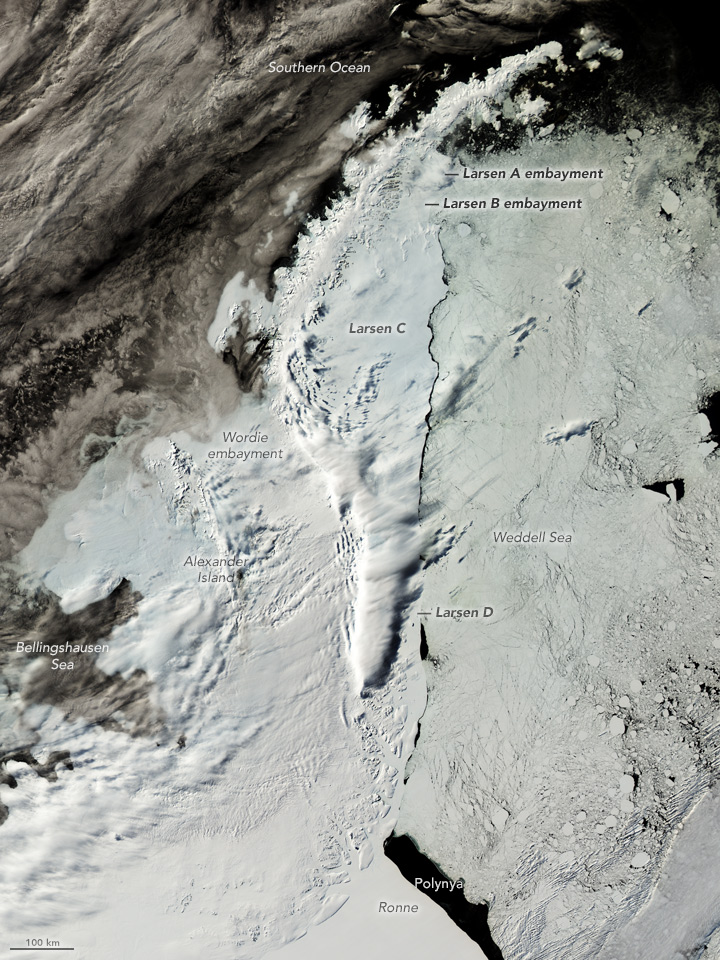
Here’s the best shot of the peninsula this year during the “clear skies” season. It comes from the Aqua MODIS instrument and was acquired on February 7, 2017.
You can quickly see that it is not as clear as the best view from early 2016. The western side of the Peninsula and its neighboring islands are clouded in. On the other side, there’s a clearer edge to the eastern ice shelves because the wind has been blowing the loose sea ice in the Weddell Sea away from the coast, leaving a narrow gap of open water along the edges of the shelves. The distinction between the Larsen C and D shelves and the sea ice is much more clear than it was last year.
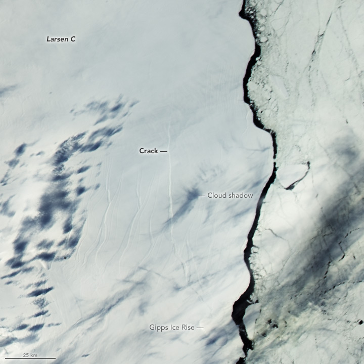
In a closer view, you can also see the crack in the Larsen C ice shelf. In August 2016, the crack extended from the Gipps Ice Rise northward for 130 kilometers (80 miles), and the crack has continued to grow since.

NASA image by Jeff Schmaltz, LANCE/EOSDIS Rapid Response.
Almost every volcano is interesting from a scientific perspective, but there are just too many eruptions for us to cover every single one. Instead we tend to focus on eruptions that have the potential to affect people. Or, occasionally our satellites return images that simply look so unique that we find the time to cover them. The plume recently ejected from Alaska’s Bogoslof Volcano was noteworthy for both reasons.
Bogoslof, which has been erupting since mid-December 2016, gave rise to a compelling two-tone plume. Are materials being ejected from a vent that is still under water? (Most of the volcano is below the surface of the sea.) The volcano’s interaction with seawater explains the white steam. But if the vent is not yet above water, then how did such a large, dark plume of ash reach so high in the atmosphere? Scientists at the Alaska Volcano Observatory continue to monitor the remote volcano and perhaps answers will be forthcoming as the eruption evolves.
Also intriguing are the swirls of blue visible in the image above. The Visible Infrared Imaging Radiometer Suite (VIIRS) on the Suomi NPP satellite captured the image on January 7, 2017. My first thought was that the color was caused by a bloom of phytoplankton. The milky blue color looked about right. And iron from eruptions have previously been shown to provide the nutrients needed for blooms to flourish. But when I asked the experts, the general consensus was that while you can’t rule out a bloom, there was another more likely explanation for the swirls.
According to ocean scientist Norman Kuring of NASA’s Goddard Space Flight Center:
“Phytoplankton don’t normally bloom in the Bering Sea during winter because there’s not a lot of sunlight and because winter storms deepen the mixed layer which also keeps the plankton more in the dark. Wave action can resuspend bottom sediments, and that may be happening farther east along the Aleutian chain in the January 7 image where the water is relatively shallow. Bogoslof Island is beyond the shelf break, however, so bottom resuspension is less likely. Ash in the water seems most probable…. I wouldn’t expect the Bering Sea to be nutrient limited in the winter, so I don’t expect an ash-based phytoplankton boost.”
In short, the swirls are probably ash in the water. The phenomenon is not unprecedented. We have previously published images of the occurrence here and here. But as Kuring reminds us, “the only way to know for sure would be to sample the water directly.”

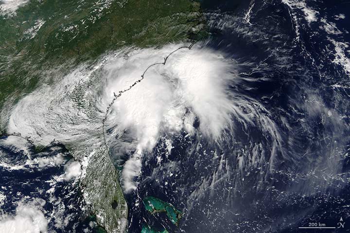
After Hurricane Matthew ripped through Haiti, it blew through the Southeast. From above, NASA satellites, aircraft, and astronauts kept watch on the storm. The Earth Observatory published several images of the destructive storm (thumbnails above). The below includes a sampling of other notable images and maps related to the storm.
Soil Moisture
Matthew drenched the Carolinas, breaking records for single day rainfall in six places, The Washington Post reported. The Southeast received a total of 13.6 trillion gallons of water—that’s three-fourths the volume of the Chesapeake Bay. Hard-hit areas of North Carolina received 15 inches (38 centimeters) of rain.
That downpour saturated the area, causing values for soil moisture to increase substantially. The North American Land Data Assimilation System (NLDAS) mapped these values for October 1, 2016.
Even before the storm arrived, the ground in many areas was saturated. Eastern North Carolina and northeastern South Carolina have localized areas over the 98th percentile. That means that on October 1, the soil was wetter than it was on that date in 98 percent of previous years. The already-wet soils and heavy precipitation from Matthew led to significant flooding in these areas.

Image: NASA
Temperature and Precipitation
The Jet Propulsion Laboratory (JPL) HAMSR instrument flew above Hurricane Matthew on October 7, 2016, aboard a NASA Global Hawk aircraft. The image below shows atmospheric temperatures overlaid atop ground-based radar and satellite visible images, according to a JPL release. Reds tones show a lack of clouds, whereas blue tones show ice and heavy precipitation. At the top left is an image taken from the Global Hawk.

Image: JPL/NASA
Clouds Swirling from Above
Expedition 49 astronaut Kate Rubins took the photograph below from the International Space Station at 21:05 Universal Time, on October 4, 2016, as the hurricane approached the Florida coast. Hurricane clouds fill the shot, which includes the station’s solar arrays.

Photo: NASA/Kate Rubins
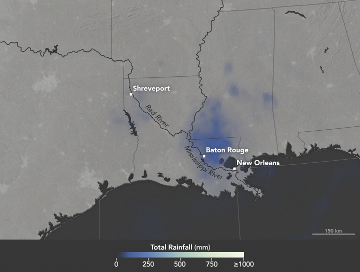
Heavy rains fell on Louisiana in August 2016, causing record-high crests for a number of rivers in the area. Map by Joshua Stevens/NASA Earth Observatory.
In the United States, we say “it’s raining cats and dogs” when we get a heavy downpour. In South Africa, it rains “women with clubs.” In Slovakia, a good soak means “tractors are falling.”
World languages brim with rainy day idioms. But when it comes to describing copious amounts of wet stuff, meteorologists do not encourage wordplay. Researchers are particularly adamant about one expression that does not work: the “rain bomb.”
The summer of 2016 brought extreme rain to multiple parts of the U.S., taking lives and causing billions in property damage. In July, thunderstorms dumped more than six inches of rain on Elicott City, Maryland in roughly two hours, causing flash floods that upended cars and lives. In May, nearly eight inches of rain fell in two days, among a series of heavy rains to inundate Texas. Most recently in Louisiana, more than 30 inches of rain fell in three days, stranding 20,000 people and killing nine.
The Louisiana storm didn’t meet the criteria of a tropical depression as defined by the National Hurricane Center: a tropical cyclone in which the maximum sustained surface wind speed is 38 miles per hour (62 kilometers per hour) or less. In another instance of precise wording, 2012’s Hurricane Sandy technically ceased to be a “hurricane” a few hours before it made landfall, turning into a “post-tropical cyclone.”
For some in the media, “tropical depression” lacks pizzazz and conviction. It lacks the visceral pelting of tractors falling out of the sky or of women with clubs beating down on the Earth. Some news organizations referred to the Louisiana event as a rain bomb. So what should we call severe rain?
NASA scientists George Huffman and Owen Kelley parsed some of the commonly-used rain terminology.
For one, there’s the “rain shaft.” A rain shaft is a centralized column of precipitation—not necessarily heavy rain. “The rain shaft […] is any rain event, no matter how modest or foreboding, that can be seen stretching from the cloud to the ground,” wrote Huffman, a research meteorologist at NASA’s Goddard Space Flight Center.
Then, there are “microbursts.” These are severe wind events caused by a “small column of exceptionally intense and localized sinking air that results in a violent outrush of air at the ground,” according to AccuWeather. Microbursts are smaller than 2.5 miles (4 kilometers) in size.
Be careful of mixing rain shafts with microbursts, Huffman cautioned.
“Just as you don’t have a microburst with every rain shaft, you don’t necessarily have an identifiable rain shaft with every microburst,” wrote Huffman in an email. “The really interesting dynamics of microbursts are a bit rare, and frequently not present in flooding rains.”
There’s also a size distinction between the different systems, NASA scientists said. A rain shaft comes out of an individual convective cell, making it roughly five to ten kilometers across. (By contrast, tropical depressions measure roughly 100 to 500 kilometers across.)
But in some cases, like Louisiana’s, the term “tropical depression” works, said Owen Kelley. “You don’t need to appeal to rain shafts, microbursts, or rain bombs to explain this system,” Kelley wrote in an email. The storm in Louisiana was “just a plain-old tropical depression that got stuck in one place for several days in a row and therefore dumped a lot of rain in one place.” That weather system did display some of the common signs of a tropical system. For instance, Huffman notes that it had low pressure at low and middle altitudes, and high pressure at the top, “implying some degree of warm core.” (Mid-latitude systems have a cold core, with the most negative pressure deviation at the system’s top.)
Researchers agree, though, about one term, “rain bomb,” which appeared in a couple of articles this summer in reference to extreme rainfall events. Don’t use it, scientists said. While it makes for a catchy headline, “rain bomb” is not an established meteorological term.
For extreme rain, Kelley suggested yet another phrase: “vigorous convective cells.” These severe rainstorms can take on various forms: super-cells, squall lines, isolated cells.
Microbursts, rain shafts, vigorous convective cells. At the end, isn’t it all just wet stuff coming out of the sky? Yes and no, scientists say. Terms used to describe extreme rain should be used with an eye on precision. As extreme rains (and extreme weather, in general) become more frequent, so will the terms we use to describe them.
Tropical Storm Julia made headlines in September 2016, but not in the usual way. It wasn’t a particularly strong or destructive storm, although it brought heavy rainfall to coastal areas of the eastern United States from Florida to Virginia. The unusual aspect was where it formed: Julia became a tropical storm while over land, not over the ocean.
The image above, acquired at 11:55 a.m. Eastern Daylight Time (15:55 Universal Time) on September 14, 2016, with the Moderate Resolution Imaging Spectroradiometer (MODIS) on NASA’s Terra satellite, shows Julia over the southeastern United States. At the time, the storm was moving toward the east and had maximum sustained winds of about 55 kilometers (35 miles) per hour.
A NASA-funded study in 2013 by meteorologists Theresa Andersen and Marshall Shepherd described a new category of storm—one that draws energy from water on land. The research showed that some storms can derive energy from the evaporation of abundant soil moisture. Since publishing the research, Shepherd and colleagues have received frequent inquiries as to whether a particular storm was influenced by this “brown ocean” effect. In the case of Julia, the answer is not clear.
“I personally find it overly speculative to make that linkage right now,” Shepherd said. “Frankly, the Baton Rouge floods may have more of a link to the brown ocean than this event, which experienced quite a bit of moisture advection from the ocean.”
The uncertainty in Julia’s case comes from its position. Although the storm developed its center while over land, it was still too close to the ocean for scientists to distinguish an influence from land-based water. Read Shepherd’s full explanation here.

Image from MODIS/NASA Earth Observatory.
The 2015 fire season was the most severe ever observed by NASA Earth Observing System satellites, a new study shows. As we reported in December, 2015 was an intense fire season in Indonesia because the drying effects of El Niño exacerbated seasonal fires lit by growers. Many farmers lost control of fires, which then spread through dried-out peat deposits. Peat fires produce thick, acrid smoke rich with greenhouse gases.
Since our story was published, scientists tracking fire activity with several satellite sensors have further analyzed the 2015 data and compared the 2015 fire season with 2006, another severe burning season. The group of scientists looked at measurements of carbon monoxide from the Measurement of Pollution in the Troposphere (MOPITT), the Microwave Limb Sounder (MLS), and the Atmospheric Infrared Sounder (AIRS). They tracked aerosol pollution with Moderate Resolution Imaging Spectroradiometer (MODIS) and the Ozone Monitoring Instrument (OMI). They also used MODIS to track the number of actively burning fires. Finally, they used the Tropical Rainfal Measuring Mission (TRMM) to track rainfall.
Some of the results from their analysis are shown in the chart below. Note that red lines indicate trends in 2006 (also a severe fire year); blacks lines indicate 2015. The tick marks on the X-axis indicate the month of the year. Comparing the two years, it is clear that 2015 was the more severe fire season. The sensors generally detected higher levels (or longer duration of emissions) of each pollutant in 2015. The peak number of fires observed by MODIS was slightly higher in 2006, but the sensor detected more fires overall in 2015. In both 2006 and 2015, fire activity increased rapidly as rainfall decreased.

Figure from Field et al. PNAS, 2016.
To see how the 2015 fires compared to severe fire seasons before the Earth Observing System satellites were in space, Goddard Institute for Space Studies scientist Robert Field looked back at longer-term records of visibility collected at Indonesian airports. The chart below compares visibility in 2015 with 1997 and 1991—two other years that were dry because of El Niño. (Note: Bext stands for extinction coefficient; a higher extinction coefficient means more smoke was in the air. The upper part of the chart shows how much rain fell. .) By that measure, 1997 was a far more severe fire season. In Sumatra, visibility was also lower in 1991, though in Kalimantan. visibility was about the same in 2015 and 1991.

Figure from Field et al. PNAS, 2016.
Still, greenhouse gas emissions from the 2015 Indonesian fires were considerable. Using the Global Fire Emissions Database, the scientists estimate that 2015 released 380 teragrams of carbon—which is roughly more than the annual fossil fuel emissions of Japan.
“Without significant reforms in land use and the adoption of early warning triggers tied to precipitation forecasts, these intense fire episodes will reoccur during future droughts, usually associated with El Niño events,” the authors emphasized.
+Read a NASA press release about the study here.
+Read a more detailed story about the 2015 fires here.

In Indonesia, dry weather can mean fire. September 2015 data from the TRMM satellite shows lack of rainfall in the areas where fire broke out. Image by NASA Earth Observatory.
