Starting this month, you can be part of a project to create more detailed satellite-based global maps of land cover by sharing photos of the world around you in a new NASA citizen science project.
The project is a part of GLOBE Observer, a citizen science program that lets you contribute meaningful data to NASA and the science community. The GLOBE Observer app, introduced in 2016, includes a new “Land Cover: Adopt a Pixel” module that enables citizen scientists to photograph with their smartphones the landscape, identify the kinds of land cover they see (trees, grass, etc.), and then match their observations to satellite data. Users can also share their knowledge of the land and how it has changed.
“Adopt a Pixel” is designed to fill in details of the landscape that are too small for global land-mapping satellites to see.
“Even though land cover is familiar to everyone on the planet, the most detailed satellite-based maps of global land cover are still on the order of hundreds of meters per pixel. That means that a park in a city may be too small to show up on the global map,” says Peder Nelson, a land cover scientist at Oregon State University.
Holli Kohl, coordinator for the project says: “Citizen scientists will be contributing photographs focused on a 50-meter area in each direction, adding observations of an area up to about the size of a soccer field. This information is important because land cover is critical to many different processes on Earth and contributes to a community’s vulnerability to disasters like fire, floods or landslides.”
To kickstart the data collection, GLOBE Observer is challenging citizen scientists to map as much land as possible between Sept. 22, Public Lands Day, and Oct. 1, NASA’s 60th anniversary. The 10 citizen scientists who map the most land in this period will be recognized on social media and will receive a certificate of appreciation from GLOBE Observer.
The free GLOBE Observer app is available from Google Play or the App Store. Once you download the app, register, and open the Land Cover module, an interactive tutorial will teach you how to make land cover observations.
“We created GLOBE Observer Land Cover to be easy to use,” says Kohl. “You can simply take photos with your smartphone, submit them, and be done, if you like. But if you want to take it a step further, you can also classify the landscape in your photo and match it to satellite data.”
Scientists like Nelson anticipate using the photographs and associated information to contribute to more detailed land cover maps of Earth.
“Some parts of the world do have high spatial resolution maps of land cover, but these maps do not exist for every place, and the maps are not always comparable. Efforts like GLOBE Observer Land Cover can fill in local gaps, and contribute to consistent global maps,” says Allison Leidner, GLOBE program manager at NASA Headquarters in Washington.
Changes in land cover matter because land cover can alter temperatures and rainfall patterns. Land cover influences the way water flows or is absorbed, potentially leading to floods or landslides. Some types of land cover absorb carbon from the atmosphere, and when subject to changes, such as a forest burned in a wildfire, result in more carbon entering the atmosphere. Improved land cover maps will provide a better baseline to study all of these factors at both global and local scales, particularly as scientists integrate improved land cover maps into global models.
The data aren’t just for scientists. “Everyone will have access to this data to understand local change,” says Nelson. Citizen scientists who participate will be creating their own local land cover map. The data will be available to anyone through the GLOBE web site.
To learn more, follow GLOBE Observer on Facebook @nasa.globeobserver or Twitter @NASAGO or visit the GLOBE Observer web site. Read the full story here.
September 2016 was the warmest September in 136 years of modern record-keeping, according to a monthly analysis of global temperatures by scientists at NASA’s Goddard Institute for Space Studies (GISS) in New York.
NASA Earth Observatory chart by Joshua Stevens, based on data from the NASA Goddard Institute for Space Studies.
September 2016’s temperature was a razor-thin 0.004 degrees Celsius warmer than the previous warmest September in 2014. The margin is so narrow those two months are in a statistical tie. Last month was 0.91 degrees Celsius warmer than the mean September temperature from 1951-1980.
The record-warm September means 11 of the past 12 consecutive months dating back to October 2015 have set new monthly high-temperature records. Updates to the input data have meant that June 2016, previously reported to have been the warmest June on record, is, in GISS’s updated analysis, the third warmest June behind 2015 and 1998 after receiving additional temperature readings from Antarctica. The late reports lowered the June 2016 anomaly by 0.05 degrees Celsius to 0.75.
“Monthly rankings are sensitive to updates in the record, and our latest update to mid-winter readings from the South Pole has changed the ranking for June,” said GISS director Gavin Schmidt. “We continue to stress that while monthly rankings are newsworthy, they are not nearly as important as long-term trends.”
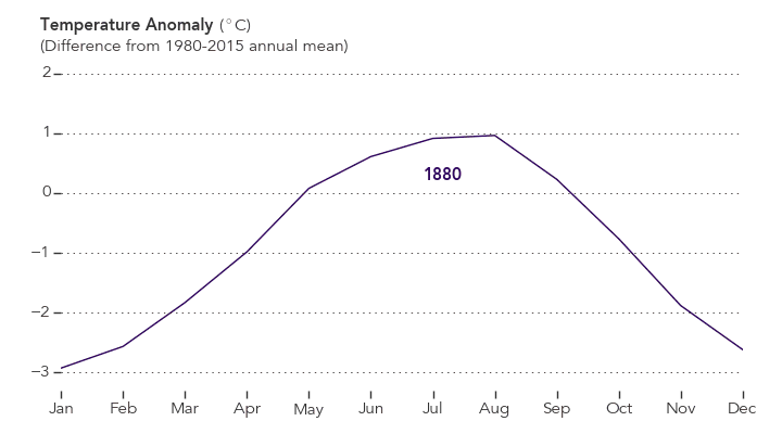
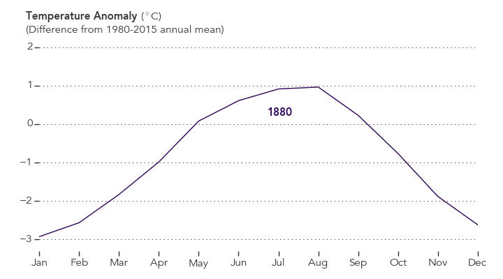
The monthly analysis by the GISS team is assembled from publicly available data acquired by about 6,300 meteorological stations around the world, ship- and buoy-based instruments measuring sea surface temperature, and Antarctic research stations. The modern global temperature record begins around 1880 because previous observations didn’t cover enough of the planet. Monthly analyses are updated when additional data become available, and the results are subject to change.
Related Links
+ For more information on NASA GISS’s monthly temperature analysis, visit: data.giss.nasa.gov/gistemp.
+ For more information about how the GISS analysis compares to other global analysis of global temperatures, visit:
http://earthobservatory.nasa.gov/blogs/earthmatters/2015/01/21/why-so-many-global-temperature-records/
+ To learn more about climate change and global warming, visit:
http://earthobservatory.nasa.gov/Features/GlobalWarming/
August 2016 was the warmest August in 136 years of modern record-keeping, according to a monthly analysis of global temperatures by scientists at NASA’s Goddard Institute for Space Studies (GISS).
Although the seasonal temperature cycle typically peaks in July, August 2016 wound up tied with July 2016 for the warmest month ever recorded. August 2016’s temperature was 0.16 degrees Celsius warmer than the previous warmest August (2014). The month also was 0.98 degrees Celsius warmer than the mean August temperature from 1951-1980.
NASA Earth Observatory chart by Joshua Stevens, based on data from the NASA Goddard Institute for Space Studies.
“Monthly rankings, which vary by only a few hundredths of a degree, are inherently fragile,” said GISS Director Gavin Schmidt. “We stress that the long-term trends are the most important for understanding the ongoing changes that are affecting our planet.” Those long-term trends are apparent in the plot of temperature anomalies above.
The record warm August continued a streak of 11 consecutive months (dating to October 2015) that have set new monthly temperature records. The analysis by the GISS team is assembled from publicly available data acquired by about 6,300 meteorological stations around the world, ship- and buoy-based instruments measuring sea surface temperature, and Antarctic research stations. The modern global temperature record begins around 1880 because previous observations didn’t cover enough of the planet.
Related Links
+ For more information on NASA GISS’s monthly temperature analysis, visit: data.giss.nasa.gov/gistemp.
+ For more information about how the GISS analysis compares to other global analysis of global temperatures, visit:
http://earthobservatory.nasa.gov/blogs/earthmatters/2015/01/21/why-so-many-global-temperature-records/
+ To learn more about climate change and global warming, visit:
http://earthobservatory.nasa.gov/Features/GlobalWarming/
Related Reading in the News
+ Mashable: Earth sets record for hottest August, extending warm streak another month
http://mashable.com/2016/09/12/earth-warmest-august-hottest-summer/#ivXnyy8yusqu
+ XKCD: A Timeline of Earth’s Average Temperature
http://xkcd.com/1732/
+ Climate Central: August Ties July as Hottest Month Ever on Record
http://www.climatecentral.org/news/august-ties-july-as-hottest-month-on-record-20691
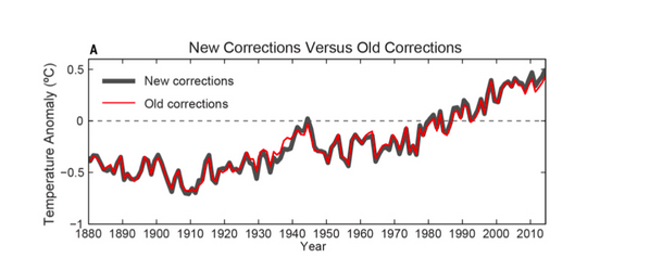
From Karl et al, 2015.
The first thing to know about the new study authored by NOAA scientists about the global warming “slowdown” or “hiatus” over the past decade is that the new analysis gets pretty deep into the details and will mainly be of interest to specialists who study climate science. In fact, for most casual readers, it doesn’t affect the overall story much at all and shouldn’t change what you think about global warming.
As I see it, interest in climate science is a bit like interest in cars. The vast majority of people couldn’t care less about the details of how their car works. They don’t know the difference between a caliper and a camshaft, and they don’t really care to know. They just want the car to run smoothly. Then there is that small but enthusiastic minority — the aficionados and grease monkeys — who not only can name every part of their engine, but who also want to be able to take it apart and fix it without the help of a mechanic. This latest study is really for the grease monkeys of climate science, the folks who know the difference between GISTEMP, HadCRUT4, and can tell you what ERSST stands for without googling it.
For the casual readers among you, here is the extent of what you’ll probably want to know about the study: the NOAA scientists who assess global temperatures have updated their analysis so that it now includes some new data that they think offers a slight improvement. The key thing to understand — for casual readers and data geeks alike — is that the changes are quite subtle. Don’t believe me? Just look at the figure at the top of this page, which shows how the old version of the NOAA analysis compares to the new one. Their newly corrected global temperature trend is the black line. The earlier version of the trend is the red line.
If you look closely, you will see the changes make the temperatures appear slightly warmer in the last decade, and thus make the idea that there has been a slowdown or “hiatus” in warming less credible. Still, that graph also makes it abundantly clear that the changes are quite minor when you look at the bigger picture. As Gavin Schmidt, director of NASA’s Goddard Institute for Space Studies, put it in a post on the Real Climate blog: “The ‘selling point’ of the paper is that with the updates to data and corrections, the trend over the recent decade or so is now significantly positive. This is true, but in many ways irrelevant.” As he has pointed out many times (as has this blog), it’s the long term trend that matters more than a handful of years here or there.
Still, there is plenty to dig into about the study for climate data geeks. The NOAA team makes the case that they’ve improved their analysis by making some updates to both the sea surface temperature and land surface temperature datasets that are at the core of the analysis. Specifically, they have included the data from the International Surface Temperature Initiative database, which more than doubles the number of weather stations available for the analysis. They have also updated the sea surface temperature by turning to a new version of the Extended Reconstructed Sea Surface Temperature dataset, which does a better job of correcting for differences in temperature measurements collected by floating buoys versus ships. Buoys are known for getting slightly cooler — and more accurate — readings than ships, but ships were the main way data was collected prior to the 1970s. The NOAA team also took a fresh look at how ship-based measurements taken with wooden buckets as opposed to engine intake thermometers compare, and how the differences might affect the overall analysis.
Not enough detail for you? If you want even more info about the study and want to know how the NOAA team came to its conclusion that there has not been a slowdown in warming over the last decade or so, you will find links to a few places where you can start your reading below the chart.

+ The full study as published in Science:
http://www.sciencemag.org/content/early/2015/06/03/science.aaa5632.full
+ Commentary by Gavin Schmidt:
http://www.realclimate.org/index.php/archives/2015/06/noaa-temperature-record-updates-and-the-hiatus/
+ NOAA Press Release about the study:
http://www.ncdc.noaa.gov/news/recent-global-surface-warming-hiatus
+ Doug McNeall (of the UK Met Office) commentary about the study:
https://dougmcneall.wordpress.com/2015/06/04/on-the-existence-of-the-hiatus
+Victor Venema (University of Bonn) commentary:
http://variable-variability.blogspot.com/2015/06/NOAA-uncertainty-monster-karl-et-al-2015.html
+ Nature news article about the study:
http://www.nature.com/news/climate-change-hiatus-disappears-with-new-data-1.17700
+Peter Thorne (International Surface Temperature Initiative) commentary:
http://surfacetemperatures.blogspot.de/2015/06/the-karl-et-al-science-paper-and-isti.html
+ Jay Lawrlmore (NOAA) commentary about the study
http://theconversation.com/improved-data-set-shows-no-global-warming-hiatus-42807
+ Washington Post article about the study:
http://www.washingtonpost.com/news/energy-environment/wp/2015/06/04/federal-scientists-say-there-never-was-any-global-warming-slowdown/

If you follow Earth and climate science closely, you may have noticed that the media is abuzz every December and January with stories about how the past year ranked in terms of global temperatures. Was this the hottest year on record? In fact, it was. The Japanese Meteorological Agency released data on January 5, 2015, that showed 2014 was the warmest year on its record. NASA and NOAA made a similar announcement on January 16. The UK Met Office, which maintains the fourth major global temperature record, ranked 2014 as tied with 2010 for being the hottest year on record on January 26.
Astute readers then ask a deeper question: why do different institutions come up with slightly different numbers for the same planet? Although all four science institutions have strong similarities in how they track and analyze temperatures, there are subtle differences. As shown in the chart above, the NASA record tends to run slightly higher than the Japanese record, while the Met Office and NOAA records are usually in the middle.
There are good reasons for these differences, small as they are. Getting an accurate measurement of air temperature across the entire planet is not simple. Ideally, scientists would like to have thousands of standardized weather stations spaced evenly all around Earth’s surface. The trouble is that while there are plenty of weather stations on land, there are some pretty big gaps over the oceans, the polar regions, and even parts of Africa and South America.
The four research groups mentioned above deal with those gaps in slightly different ways. The Japanese group leaves areas without plenty of temperature stations out of their analysis, so its analysis covers about 85 percent of the globe. The Met Office makes similar choices, meaning its record covers about 86 percent of Earth’s surface. NOAA takes a different approach to the gaps, using nearby stations to interpolate temperatures in some areas that lack stations, giving the NOAA analysis 93 percent coverage of the globe. The group at NASA interpolates even more aggressively—areas with gaps are interpolated from the nearest station up to 1,200 kilometers away—and offers 99 percent coverage.
See the chart below to get a sense of where the gaps are in the various records. Areas not included in the analysis are shown in gray. JMA is Japan Meteorological Agency data, GISTEMP is the NASA Goddard Institute for Space Studies data, HadCrut4 is the Met Office data, UAH is a satellite-based record maintained by the University of Alabama Huntsville (more on that below), NCDC is the NOAA data, and NCEP/NCAR is a reanalysis of weather model data from the National Center for Atmospheric Research.
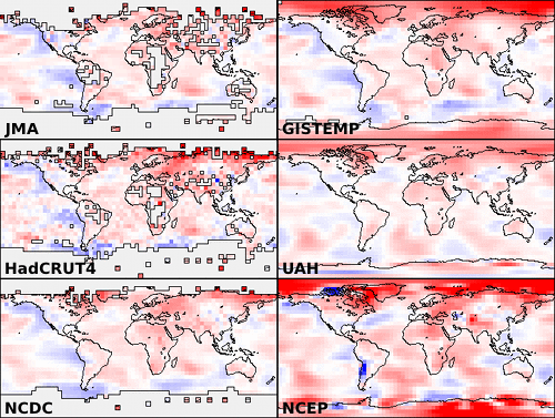
Chart from Skeptical Science.
If you’re a real data hound, you may have heard about other institutions that maintain global temperature records. In the last few years, a group at UC Berkeley — a group that was initially skeptical of the findings of the other groups — developed yet another approach that involved using data from even more temperature stations (37,000 stations as opposed to the 5,000-7,000 used by the other groups). For 2014, the Berkeley group came to the same conclusion: the past year was the warmest year on record, though their analysis has 2014 in a virtual tie with 2005 and 2010.
Rather than coming up with a way to fill the gaps, a few other groups have tried using a completely different approach. A group from the University of Alabama-Huntsville maintains a record of temperatures based on microwave sounders on satellites. The satellite-based record dates back 36 years, and the University of Alabama group has ranked 2014 as the third warmest on that record, though only by a very small margin. Another research group from Remote Sensing Systems maintains a similar record based on microwave sounders on satellites, although there are a few differences in the way the Remote Sensing Systems and University of Alabama teams handle gaps in the record and correct for differences between sensors. Remote Sensing Systems has 2014 as the 6th warmest on its record.
But let’s get back to the original question: why are there so many temperature records? One of the hallmarks of good science is that observations should be independently confirmed by separate research groups using separate methods when possible. And in the case of global temperatures, that’s exactly what is happening. Despite some differences in the year-to-year rankings, the trends observed by all the groups are roughly the same. They all show warming. They all find the most recent decade to be warmer than previous decades.
You may observe some hand-wringing and contrarian arguments about how one group’s ranking is slightly different than another and about how scientists cannot agree on the “hottest year” or the temperature trend. Before you get caught up in that, know this: the difference between the hottest and the second hottest or the 10th hottest and 11th hottest year on any of these records is vanishingly small. The more carefully you look at graph at the top of this page, the more you’ll start to appreciate that the individual ranking of a given year hardly even matters. It’s the longer term trends that matter. And, as you can see in that chart, all of the records are in remarkably good agreement.
That said, if you are still interested in the minutia of how these these data sets are compiled and analyzed, as well as how they compare to one other, wade through the links below. Some of the sites will even explain how you can access the data and calculate the trends yourself.
+ UCAR’s Global Temperature Data Sets Overview and Comparison page.
+ NASA GISS’s GISTEMP and FAQ page.
+ NOAA’s Global Temperature Analysis page.
+ Met Office’s Hadley Center Temperature page.
+ Japan Meteorological Agency’s Global Average Surface Temperature Anomalies page.
+ University of Alabama Huntsville Temperature page.
+Remote Sensing Systems Climate Analysis, Upper Air Temperature, and The Recent Slowing in the Rise of Global Temperatures pages.
+ Berkley Earth’s Data Overview page.
+ Moyhu’s list of climate data portals.
+ Skeptical Science’s Comparing All the Temperature Records, The Japan Meteorological Agency Temperature Records, Satellite Measurements of the Warming in the Troposphere, GISTEMP: Cool or Uncool, and Temperature Trend Calculator posts.
+ Tamino’s comparing Temperature Data Sets post.
+NOAA/NASA 2014 Warmest Year on Record powerpoint.
+James Hansen’s Global Temperature in 2014 and 2015 update posted on his Columbia University page.
+The Carbon Brief’s How Do Scientists Measure Global Temperature?
+Yale’s A Deeper Look: 2014’s Warming Record and the Continued Trend Upwards post.

NASA and NOAA announced today that 2014 brought the warmest global temperatures in the modern instrumental record. But what did the year look like on a more regional scale?
According to the Met Office, the United Kingdom experienced it warmest year since 1659. Despite the record-breaking temperatures, however, no month was extremely warm. Instead, each month (with the exception of August) was consistently warm. The UK was not alone. Eighteen other countries in Europe experienced their hottest year on record, according to Vox.
The contiguous United States, meanwhile, only experienced the 34th warmest year since 1895, according to a NOAA analysis. The Midwest and the Mississippi Valley were particularly cool, while unusually warm conditions gripped the West. California, for instance, went through its hottest year on record. Meanwhile, temperatures in Alaska were unusually warm; in Anchorage, temperatures never dropped below 0 degrees Fahrenheit.
James Hansen, a retired NASA scientist, underscored this point in an update on his Columbia University website: “Residents of the eastern two-thirds of the United States and Canada might be surprised that 2014 was the warmest year, as they happened to reside in an area with the largest negative temperature anomaly on the planet, except for a region in Antarctica.”
According to Australia’s Bureau of Meteorology, 2014 was the third warmest year on record in that country. “Much of Australia experienced temperatures very much above average in 2014, with mean temperatures 0.91°C above the long-term average,” said the bureau’s assistant director of climate information services.
The map at the top of this page depicts global temperature anomalies in 2014. It does not show absolute temperatures, but instead shows how much warmer or cooler the Earth was compared to a baseline average from 1951 to 1980. Areas that experienced unusually warm temperatures are shown in red; unusually cool temperatures are shown in blue.
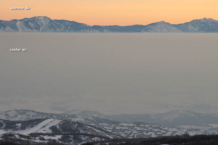
Levels of particulate pollution rose above 130 micrograms per cubic meter in Salt Lake City on January 23, 2013. That’s three times the federal clean-air limit, according to the U.S. Environmental Protection Agency. Or, as the Associated Press put it, roughly equivalent to Los Angeles air on a bad day.
“The Salt Lake Valley has some of the worst wintertime pollution episodes in the West due to the combination of its increasing population and urbanization, as well as its geometry, with the valley sandwiched between mountain ranges to the west and east,” University of Utah atmospheric scientist John Horel explained in a recent story published by the National Center for Atmospheric Research (NCAR).
Normally temperatures decline with altitude, but meteorological conditions across the Great Basin set up a situation in which the opposite occurred for a prolonged period. For much of January, temperatures increased with altitude, creating what’s known as a temperature inversion. During the peak of the inversion, temperatures were -15.5ºC (4.1ºF) at the surface and 7.6ºC (45.7ºF) at 2,130 meters (6,988 feet), University of Utah meteorologist Jim Steenburgh reported on his blog.
The result? The layer of warm air on top functioned like a lid, trapping pollutants in the valleys and preventing winds from dispersing the haze. The photograph above, taken by Roland Li on January 19, shows the sharp boundary an inversion can create.
Air quality problems caused by temperature inversions are not unique to Salt Lake City. Cities in California (including Bakersfield, Fresno, Hanford, Los Angeles, Modesto) and Pittsburgh, Pennsylvania, have some of the most severe short-term particle pollution problems in the nation, according to a list published by the American Lung Association.
Such events are a reminder that the United States is not immune from dangerous spikes in particulate pollution, though particulate levels don’t get as high as they do in some other parts of the world. (See this map of fine particulates for a global perspective.) Eastern China, for example, recently suffered through an extreme pollution event that was far more potent than the Salt Lake City event.
More:
Utah Department of Environmental Quality: About Inversions
Salt Lake City Office of the National Weather Service: What Are Weather Inversions?
Jeff Masters: Dangerous Air Pollution Episode in Utah
On September 16, 2012, the extent of sea ice in the Arctic Ocean dropped to 3.41 million square kilometers (1.32 million square miles). The National Snow and Ice Data Center (NSIDC) issued a preliminary announcement on September 19 noting that it was likely the minimum extent for the year and the lowest extent observed in the 33-year satellite record.
This year’s Arctic sea ice minimum was 760,000 square kilometers (290,000 square miles) below the previous record set on September 18, 2007. (For a sense of scale, that’s an ice-area loss larger than the state of Texas.)
The previous record minimum, set in 2007, was 4.17 million square kilometers, or 1.61 million square miles. The September 2012 minimum was 18 percent below the 2007 minimum, and 49 percent below the 1979–2000 average minimum.
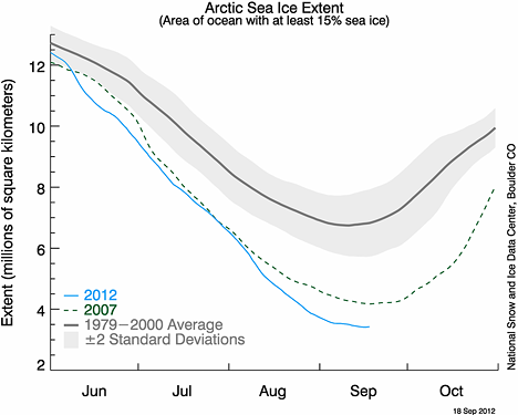
Graph courtesy National Snow and Ice Data Center.
Arctic sea ice typically reaches is minimum extent in mid-September, then begins increasing through the Northern Hemisphere fall and winter. The maximum extent usually occurs in March. Since the last maximum on March 20, 2012, the Arctic has lost a total of 11.83 million square kilometers (4.57 million square miles) of sea ice.
NSIDC uses a five-day running average for sea ice extent, and calculations of sea ice extent have been refined from those of previous years. For more information on Arctic sea ice in 2012, visit NSIDC’s Arctic Sea Ice News and Analysis blog and the NASA news release on the observation. To learn more about sea ice basics, see the sea ice fact sheet.
This week’s Earth Indicator is 4 million…as in 4 million square kilometers. It’s a number that scientists studying sea ice never thought they would see.
Every year, the sea ice at the top of our planet shrinks and grows with the seasons. But because ocean water lags behind the atmosphere in warming up and cooling down, Arctic sea ice reaches its maximum extent in March, and its minimum in September.
Since 1979, satellites have observed Arctic sea ice shrinking and growing, and scientists at the National Snow and Ice Data Center (NSIDC) have recorded the minimum and maximum extents, adding them to a growing archive of data about Earth’s frozen places. In tracking sea ice, NSIDC uses a five-day average to smooth out bumps in the daily sea ice extents. The numbers have been refined over time with the adoption of new processing and quality control measures, but the ballpark numbers have remained the same.
Ten years ago, NSIDC scientists noted that Arctic sea ice set a new record minimum at 5.64 million square kilometers on September 14, 2002. New records followed: 5.32 million square kilometers on September 22, 2005; and 4.17 million square kilometers on September 18, 2007. In August 2007, Arctic sea ice extent dropped so rapidly that it set a new record before the usual end of the melt season. (Researchers at the University of Bremen declared a new record in 2011, based on slightly different calculation methods.)
In the summer of 2012, not only was the 2007 record broken, but within days, the passed another barrier. As of August 28, 2012, the five-day running average of Arctic sea ice fell below 4 million square kilometers (1.54 million square miles). NSIDC director Mark Serreze remarked: “It’s like breaking the four-minute mile. Nobody thought we could do that, but here we are.”
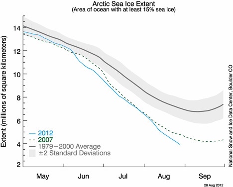
Arctic sea ice extent graph. Courtesy National Snow and Ice Data Center.
But whereas the four-minute mile was a milestone of human achievement, 4 million square kilometers of sea ice is not so inspiring. “Arctic sea ice extent is declining faster than it used to, and we can expect a continuing decline overall, with some inter-annual variability,” said NSIDC lead scientist Ted Scambos. “We have a less polar pole.”
The low sea ice extent for 2012 fits within a larger pattern. For the past several years, September Arctic sea ice extent numbers have remained well below the 1979–2000 average of 6.70 million square kilometers. The low extent from 2012 is no outlier.
Arctic sea ice minimum extents (million square kilometers)
September 22, 2005: 5.32
September 17, 2006: 5.78
September 18, 2007: 4.17
September 20, 2008: 4.59
September 13, 2009: 5.13
September 21, 2010: 4.63
September 11, 2011: 4.33
Reflecting on sea ice extent falling below 4 million square kilometers, NSIDC scientist Walt Meier remarked: “It’s just a number, but it signifies a changing Arctic.”
Is that a three omicron? Nope. Three, rho? Strike two. Our latest Earth Indicator is three-sigma.
In Greek, sigma (σ) is the 18th letter of the alphabet. In statistics, it’s a symbol for standard deviation, a measure of how spread out a set of data points are from the average (which is often called the mean by statisticians). Data with a low standard deviation indicates that the data points are bunched up and close to the mean. A high standard deviation indicates the points are spread over a wide range of values.
In a standard bell curve, most data points (68 percent) fall within one standard deviation (1σ) of the mean (see the pink section in the graph below). The vast majority (95 percent, the combined pink and red sections of the graph) fall within two standard deviations (2σ). An even higher percentage (99.7 percent, the combined pink, red, and blue sections) fall within three standard deviations (3σ) of the mean. Just a tiny fraction of points are outliers that are more than three standard deviations from the mean. (See the parts of the graph with arrows pointing to 0.15%).
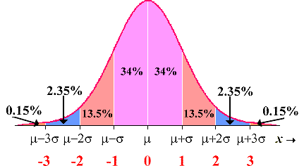
Now imagine that instead of generic data points on a generic bell curve the values are actually measurements of summer temperatures. That will give you a foundation for understanding the statistical analysis that James Hansen published this week in the Proceedings of the National Academy of Sciences.
One of his main findings: as seen in the graph above, is that the range of observed surface temperatures on Earth has shifted over time, meaning that rare 3-sigma temperature events (which represent times when temperatures are abnormally warm) have grown more frequent because of global warming.
Here’s how Hansen puts it:
We have shown that these “3-sigma” (3σ) events, where σ is the standard deviation — seasons more than three standard deviations removed from “normal” climate — are a consequence of the rapid global warming of the past 30 years. Combined with the well-established fact that the global warming is a result of increasing atmospheric CO2 and other greenhouse gases, it follows that the increasingly extreme climate anomalies are human-made.
Want to learn more? A press release is available here. And Hansen has also published a summary of his paper (pdf) and an accompanying Q & A (pdf) that offer more details.
