Energy from the Sun warms our planet, and changes in sunlight can also cause changes in temperature, clouds, and wind. Clouds are ever changing and give you clues and information on what is happening in the atmosphere. Clouds can tell you if air is moving vertically (or upward) when you see cumulus type clouds growing in the distance. Clouds can also tell you which direction the wind is blowing when you see clouds move at different levels in the atmosphere. They can even tell you how much moisture or water vapor is available just by the presence of clouds, especially by the presence of high cirrus clouds.
Let’s look at the process by which clouds form.
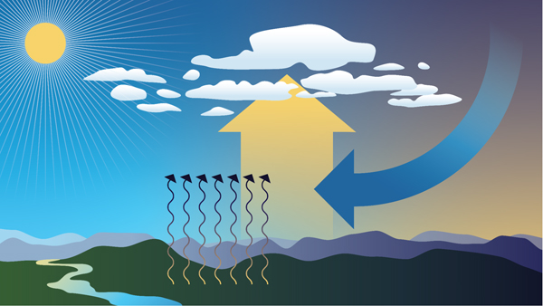
Clouds form when air cools and water vapor condenses. There are four ways that cause air to rise in our atmosphere, which is necessary to initiate the formation of a cloud.
1) Convection
This process starts when the Sun warms the surface of the Earth. The air right above the surface is warmer than the rest of the air and it starts to rise. If this portion or parcel of air rises enough to cool to the dew point, condensation occurs and a cloud forms. You see this most often on hot summer days when beautiful cumulus towers develop and grow.
Comparison Example: You may have experienced convection when you sat around a campfire, and felt the warmth of the heat coming from right above the fire.
2) Convergence
This process happens when air at the surface comes together or converges and leads to air moving up. These clouds are not puffy cumulus like those seen through convection.
3) Fronts
Weather fronts, like a strong cold front, pushes air upward quite drastically and can produce strong cumulonimbus clouds that can lead to severe weather conditions. Different types of fronts lead to different lifting depending on the conditions. Dry lines* can also produce quite an amount of lifting that can lead to severe weather out in the Southwest.
*Dry lines are similar to a cold or warm front, but instead of being a boundary separating different types of temperatures, it is a boundary separating dry air from moist air. They occur frequently in the Southwest United States (Texas and Oklahoma) when moist air from the Gulf of Mexico meets dry desert air from the Southwest.
4) Topography
Lifting (or the movement of air upward) can also be caused by slopes and mountains. You may have seen how an area that is mostly flat can experience some clouds always around the one area that has some slope. Scientists call this process orographic lifting, meaning the movement of air influenced by mountains in that region. You will always see clouds and even rain developing on the side of the mountain facing the wind or the windward side and it will be very dry on the other side of the mountain, the leeward side.

But, what if you were able to stop or block the Sun from shining? What would happen to the clouds? A total solar eclipse is exactly that, a natural experiment where you stop or block the Sun from shining for a short amount of time. In general, during a solar eclipse, clouds produced by convection will be the most impacted. As the Moon blocks the light from the Sun, the convection process is reduced, resulting in cloud dissipation or the disappearance of clouds. Note that clouds produced due to frontal boundaries, like a strong cold front, will show little to no change.
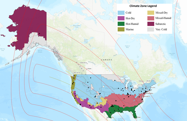
During the upcoming eclipse on April 8, 2024, scientists will be looking at cloud and temperature changes to see if there are any variations across the different climate regions the eclipse will impact. This research is being led by NASA scientist Ashlee Autore at NASA’s Langley Research Center in Hampton, Virginia. Autore has been looking at citizen scientist observations collected during the 2023 annular eclipse that occurred on October 14, 2023, and has been comparing them to nearby automated surface observing system (ASOS) observations. So far, she has been considering how cloud coverage changes during an eclipse. Using the U.S. climate zones, as defined by the International Energy Conservation Code, she divided citizen scientist and ASOS observations into their respective climate zones and noted some initial findings.
Of the citizen scientist and ASOS sites that reported no overall cloud change between the beginning and end of the eclipse, the majority saw overcast skies. Clear skies were also likely to remain unchanged during the eclipse. Warmer climate zones (hot-humid, hot-dry) reported the greatest percentage of clear skies that remained clear, while colder climate zones (cold, marine) reported the greatest percentage of overcast skies that remained overcast. The mixed-humid climate zone also reported a high percentage of continuous overcast skies. These cases of continuous clear skies and continuous overcast skies also were among the locations with the best citizen scientist/ASOS agreement, meaning that citizen scientists reported the same cloud conditions as the nearby ASOS sites. In hot-dry climate zones—such as Los Angeles, California, and Carlsbad, New Mexico—ASOS stations had good agreement with citizen scientists reporting continuous clear skies. In the cold climate zones—such as Toledo, Ohio, and Indianapolis, Indiana—ASOS stations had good agreement with citizen scientists reporting continuous overcast skies. Newark, New Jersey, and Philadelphia, Pennsylvania, which are in the mixed-humid climate zone, also had good agreement with citizen scientists reporting continuous overcast skies.
The upcoming “GLOBE Eclipse Challenge: Clouds and Our Solar-Powered Earth” asks people from around the world to volunteer and collect cloud observations throughout the day. Participants can collect cloud observations from March 15 to April 15, 2024, and make observations at different times of the day. For those experiencing any portion of the solar eclipse on Monday, April 8, 2024, we ask that you collect air temperature and cloud observations at least an hour before and an hour after maximum eclipse for your location. We will use all these observations to study how clouds change throughout the day and how they are impacted by changes in sunlight and temperature (such as by an eclipse). This year’s eclipse will give scientists more data points and will allow for further analysis.
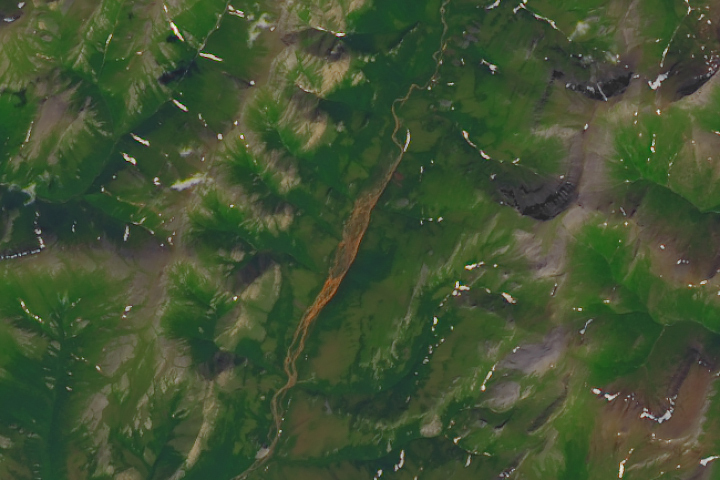
Update on January 23, 2023: This image shows Tukpahlearik Creek in northwest Alaska. Congratulations to Luis Martinez for being the first to correctly identify the feature and its location. Special mention to Steve, who provided a reason for the creek’s unusual color. Read more about the image in our Image of the Day story, which describes several hypotheses for the creek’s orange hue.
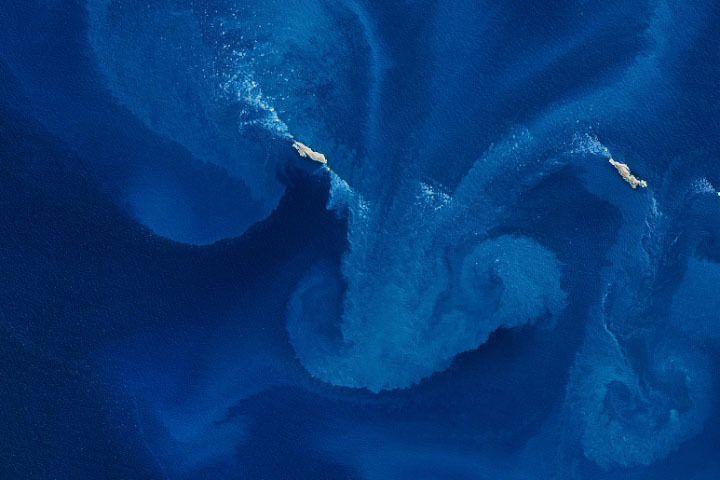
Every month on Earth Matters, we offer a puzzling satellite image. The January 2024 puzzler is shown above. Your challenge is to use the comments section to tell us where it is, what we are looking at, and why it is interesting.
How to answer. You can use a few words or several paragraphs. You might simply tell us the location, or you can dig deeper and offer details about what satellite and instrument produced the image, what spectral bands were used to create it, or what is compelling about some obscure feature. If you think something is interesting or noteworthy, tell us about it.
The prize. We cannot offer prize money or a trip on the International Space Station, but we can promise you credit and glory. Well, maybe just credit. Within a week after a puzzler image appears on this blog, we will post an annotated and captioned version as our Image of the Day. After we post the answer, we will acknowledge the first person to correctly identify the image at the bottom of this blog post. We also may recognize readers who offer the most interesting tidbits of information. Please include your preferred name or alias with your comment. If you work for or attend an institution that you would like to recognize, please mention that as well.
Recent winners. If you have won the puzzler in the past few months, or if you work in geospatial imaging, please hold your answer for at least a day to give less experienced readers a chance.
Releasing comments. Savvy readers have solved some puzzlers after a few minutes. To give more people a chance, we may wait 24 to 48 hours before posting comments. Good luck!
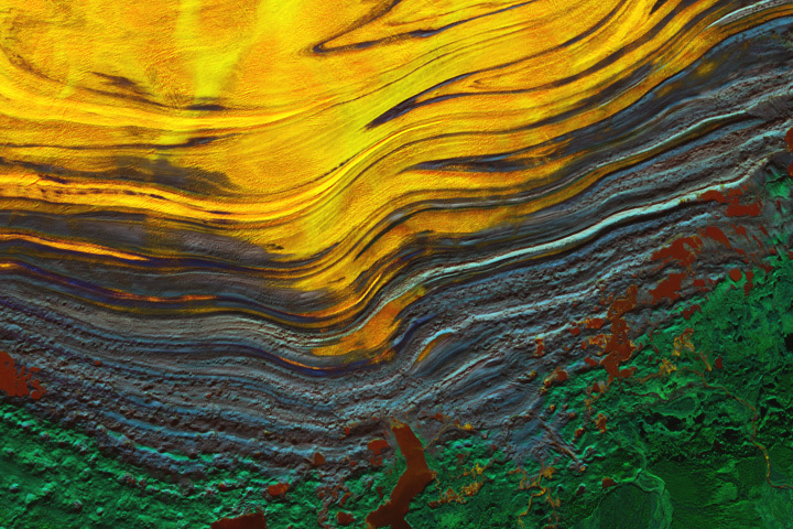
Update on November 27, 2023: This false color image shows the terminus of southeastern Alaska’s Malaspina Glacier, the largest piedmont glacier in the world. Congratulations to Juan Antolin Arnau for being the first to correctly identify the feature and its location. Read more about the image in our Image of the Day story.
Every month on Earth Matters, we offer a puzzling satellite image. The November 2023 puzzler is shown above. Your challenge is to use the comments section to tell us where it is, what we are looking at, and why it is interesting.
How to answer. You can use a few words or several paragraphs. You might simply tell us the location, or you can dig deeper and offer details about what satellite and instrument produced the image, what spectral bands were used to create it, or what is compelling about some obscure feature. If you think something is interesting or noteworthy, tell us about it.
The prize. We cannot offer prize money or a trip on the International Space Station, but we can promise you credit and glory. Well, maybe just credit. Within a week after a puzzler image appears on this blog, we will post an annotated and captioned version as our Image of the Day. After we post the answer, we will acknowledge the first person to correctly identify the image at the bottom of this blog post. We also may recognize readers who offer the most interesting tidbits of information. Please include your preferred name or alias with your comment. If you work for or attend an institution that you would like to recognize, please mention that as well.
Recent winners. If you have won the puzzler in the past few months, or if you work in geospatial imaging, please hold your answer for at least a day to give less experienced readers a chance.
Releasing comments. Savvy readers have solved some puzzlers after a few minutes. To give more people a chance, we may wait 24 to 48 hours before posting comments. Good luck!
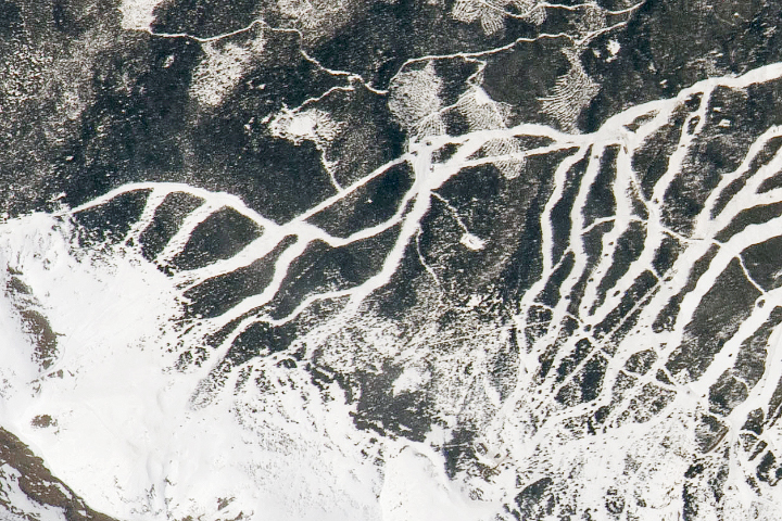
UPDATE on May 17, 2021 — This puzzling image shows part of Breckenridge Ski Resort in Colorado’s Tenmile Range. Congratulations to Steve Bassett, who guessed the correct location and deduced that the photo was shot from the International Space Station. The detailed view pictured here shows the resort’s newer slopes, which opened to skiers and snowboarders for the 2013-2014 winter season. See the full image and story in our Image of the Day, published on May 15.
Every month on Earth Matters, we offer a puzzling satellite image. The May 2021 puzzler is above. Your challenge is to use the comments section to tell us what we are looking at, where it is, and why it is interesting.
How to answer. You can use a few words or several paragraphs. You might simply tell us the location, or you can dig deeper and explain what satellite and instrument produced the image, what spectral bands were used to create it, or what is compelling about some obscure feature. If you think something is interesting or noteworthy, tell us about it.
The prize. We cannot offer prize money or a trip to Mars, but we can promise you credit and glory. Well, maybe just credit. Roughly one week after a puzzler image appears on this blog, we will post an annotated and captioned version as our Image of the Day. After we post the answer, we will acknowledge the first person to correctly identify the image at the bottom of this blog post. We also may recognize readers who offer the most interesting tidbits of information about the geological, meteorological, or human processes that have shaped the landscape. Please include your preferred name or alias with your comment. If you work for or attend an institution that you would like to recognize, please mention that as well.
Recent winners. If you’ve won the puzzler in the past few months, or if you work in geospatial imaging, please hold your answer for at least a day to give less experienced readers a chance.
Releasing Comments. Savvy readers have solved some puzzlers after a few minutes. To give more people a chance, we may wait 24 to 48 hours before posting comments. Good luck!
Through May 15, 2021, the GLOBE Program is hosting the 2021 Trees Community Challenge, a project aimed at making science better together by encouraging participants to collect data and learn about trees.
Using the Trees Challenge Activity Tracker, participants can pick and choose activities – or complete all of them – to become members of the NASA citizen science community. Activities include taking a tree height observation, writing a tree poem, and sharing stories about trees that are special to you on social media
Trees are diverse and tree height can tell us a lot about Earth’s ecosystems. Satellites and ground-based measurements are used to track tree growth, monitor how well an ecosystem supports trees, and estimate how much carbon is stored by trees. The GLOBE community encourages #CitizenScientists to use the GLOBE Observer app to take tree height measurements with their smartphones.
Read more about the challenge and how to participate.
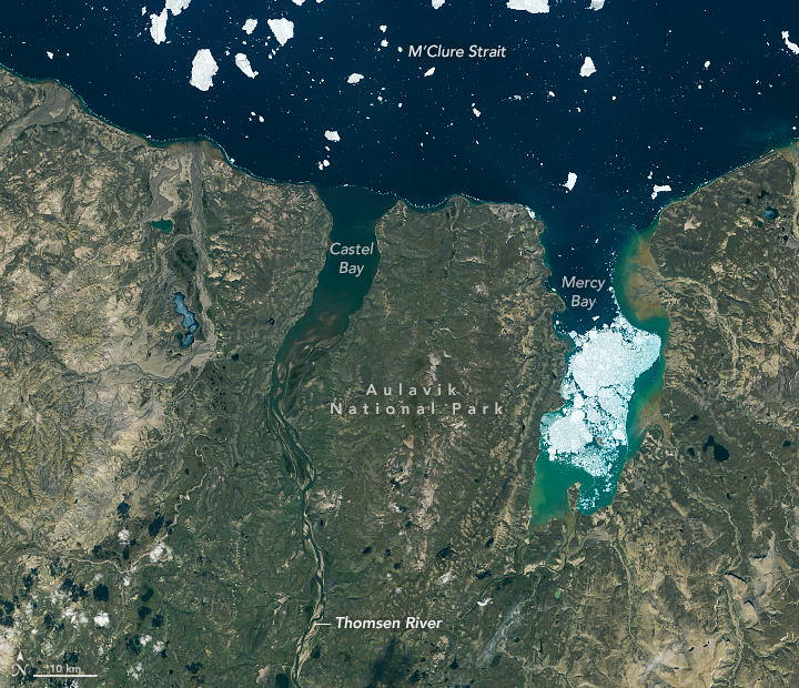
In a typical year, perhaps a dozen people visit Auluvik National Park in Canada’s Northwest Territories. Luckily, one of those visitors brought back some outstanding photos.
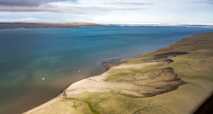
In November 2020, we highlighted a few compelling features around the Thomsen River estuary on Banks Island, including lines of sea ice tracing the shoreline and the braided pattern of the river. But there’s so much more to explore across this remote lowland tundra and river valley.
Robie Macdonald, a scientist at the University of Manitoba, shared some photos that he shot while doing fieldwork in the region between 2014 and 2016. The purpose of that project, led by Matt Alkire of the University of Washington, was to collect geochemical measurements from small rivers across the Canadian Arctic Archipelago.
“I really do love working in these places,” Macdonald said. “Once the aircraft has landed, one is bathed in a tremendous silence broken only by waves breaking on shingle. Then you have this incredible tundra spreading out toward the hills that define the river floodplain.”
Here are ten of Macdonald’s favorite photographs.
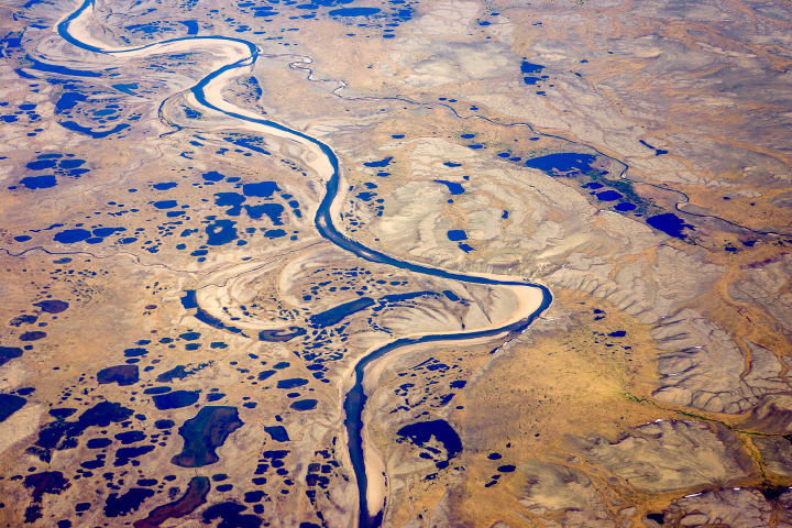
“Numerous ponds of all sizes populate the drainage basins of Banks Island, and you can see several clusters of them in the satellite image (top), especially along the small river to the west of the Thomsen. This photograph provides a closer look at one such pond cluster. In the image, you can also see textbook oxbows, which have become the setting for more ponds.”
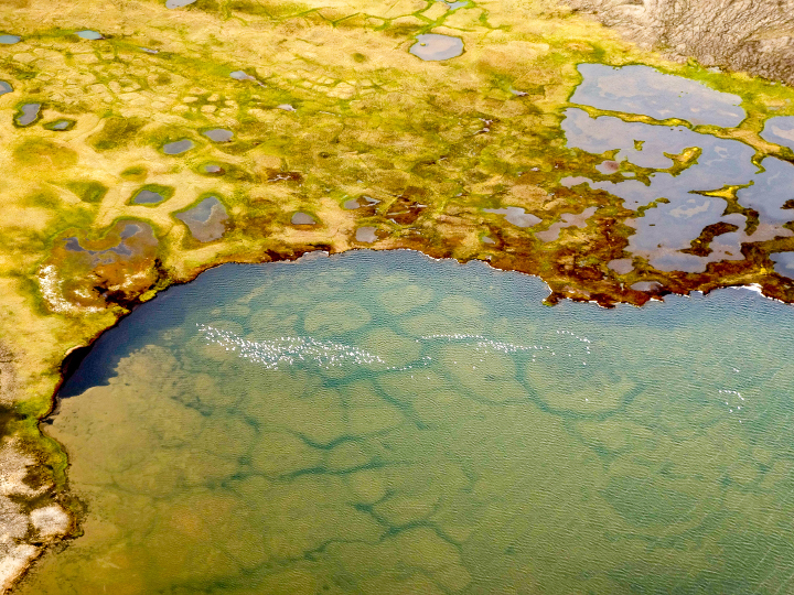
“During breeding season, it seems like almost every pond on Banks Island has its own population of snow geese (visible in this photo). You can also see old permafrost polygons that are now submerged within the pond. Polygons are widespread features of the permafrost in soil-rich locations and are produced over time by freeze-thaw cycles of the surface active layer. Permafrost thaw is widely impacting these regions, leading to feedbacks in the carbon system (CO2, CH4).”
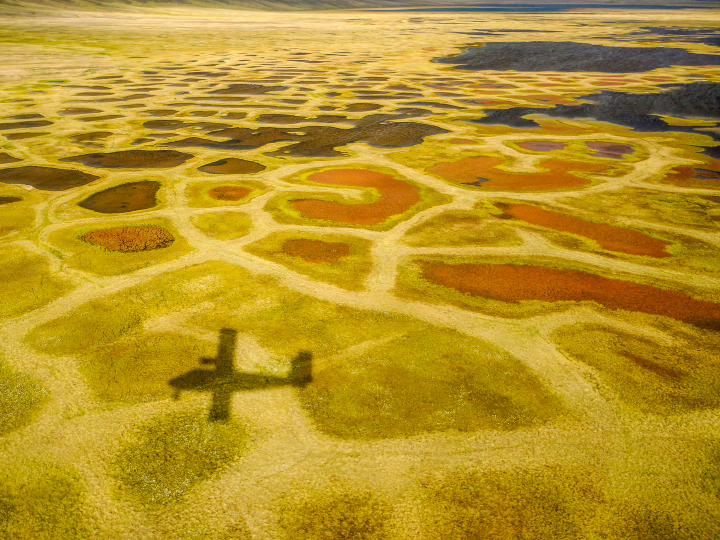
“Perhaps the most surprising characteristic of the valley bottoms in this ‘Arctic desert’ is the vibrant color of the vegetation: yellows, greens, and reds mark a dense ground cover that can be seen on the satellite image as areas with a yellowish-brownish cast.”
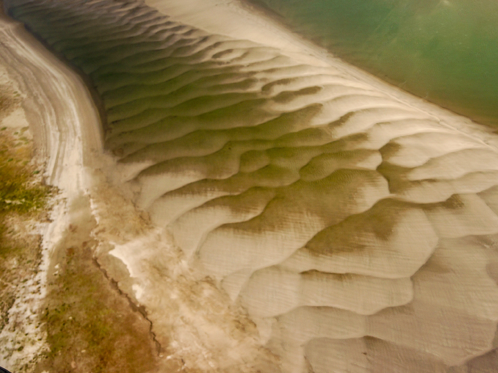
“As a result of the strong sediment supply, the large embayment at the Thomsen River mouth has been practically filled with sediment. The shallow water reveals itself in the satellite image by the lighter-greenish tone compared to water out in the channel north of Banks Island. More evidence of the ample sediment supply can be seen in beautiful displays of sand/silt ripples in the lower river between the islands. In the satellite image (top), the ripples are almost visible as grey zones between the islands before the river enters the open bay.”
“When walking on these islands near the river mouth, you can see evidence of bank erosion and ‘ice shoves.’ These are produced when wind forces newly formed ice to ride up over the river bank and gouge out the top layer of the silty material that makes up these islands. Unfortunately, ice shoves are too small to show on the satellite image.”
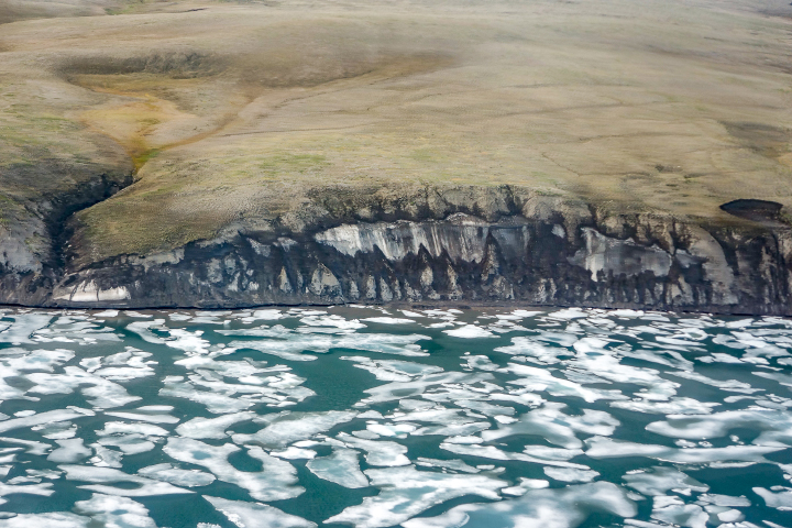
“Global warming and the extensive loss of sea-ice cover in late summer have helped accelerate coastal erosion and permafrost slumping. This image shows a section of coastline just to the east of the Thomsen River mouth that consists of a lot of frozen ice. This sort of permafrost is especially vulnerable to the changing temperature regime.”
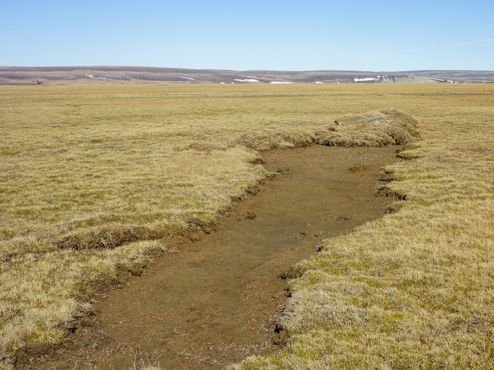
“Thaw slumps are also a sign of the permafrost warming. These can be seen just barely in the satellite image as small dark regions along cliff faces–both facing the ocean and within the river drainage basins. Erosion and slumping expose ancient organic carbon to the air and the hydrosphere, thus providing an extensive positive feedback to climate warming.”
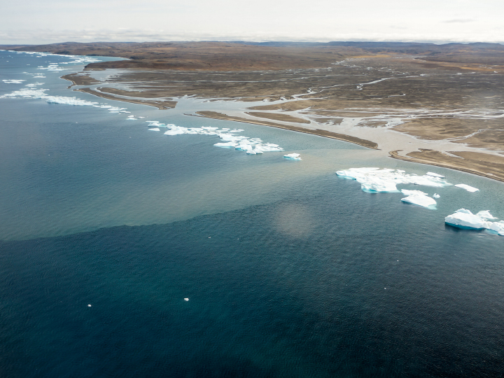
“Lines of bergy bits has collected along a thin shore margin at the point where the sea bottom rapidly deepens below ice keel depths, likely at approximately 2-4 meters. Although the grounded ice bits are continually melting, they are resupplied by more ice chunks shed from the permanent pack out in the channel. Two turbid plumes supplied by a river to the west of the Thomsen easily pass through the necklace of ice.”

“When we were sampling the water in this region, we found this ice barrier to be a bit more of a problem to navigate in our small inflatable boats, but ice along the shore did make it simple to sample sea ice. This image shows Greg Lehn preparing to launch our boat.”
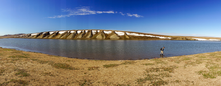
Sampling in the Thomson River itself was somewhat simpler, once we had found a suitable place to land the plane. This image shows Greg Lehn scoping out the shore of the Thomsen River near its mouth.”
Every month on Earth Matters, we offer a puzzling satellite image. The November 2020 puzzler is above. Your challenge is to use the comments section to tell us what we are looking at, where it is, and why it is interesting.
How to answer. You can use a few words or several paragraphs. You might simply tell us the location, or you can dig deeper and explain what satellite and instrument produced the image, what spectral bands were used to create it, or what is compelling about some obscure feature. If you think something is interesting or noteworthy, tell us about it.
The prize. We cannot offer prize money or a trip to Mars, but we can promise you credit and glory. Well, maybe just credit. A few days after a puzzler image appears on this blog, we will post an annotated and captioned version as our Image of the Day. After we post the answer, we will acknowledge the first person to correctly identify the image at the bottom of this blog post. We also may recognize readers who offer the most interesting tidbits of information about the geological, meteorological, or human processes that have shaped the landscape. Please include your preferred name or alias with your comment. If you work for or attend an institution that you would like to recognize, please mention that as well.
Recent winners. If you’ve won the puzzler in the past few months, or if you work in geospatial imaging, please hold your answer for at least a day to give less experienced readers a chance.
Releasing Comments. Savvy readers have solved some puzzlers after a few minutes. To give more people a chance, we may wait 24 to 48 hours before posting comments. Good luck!
UPDATE on November 9 — The answer is a phytoplankton bloom near the Jason Islands, an archipelago off of the Falkland (Malvinas) Islands. Read more about it here. Evzen Schulc quickly identified that it was an ocean bloom, though no one managed to identify the location.
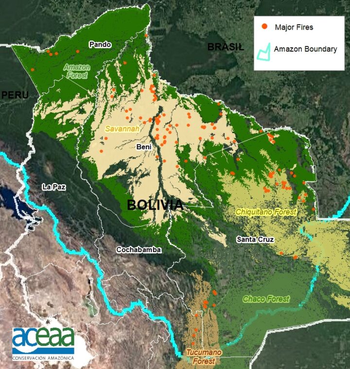
For the second year in a row, fierce fires have burned throughout Bolivia. They are the product of a prolonged drought, which has supercharged the fires that are lit seasonally by farmers and ranchers to maintain grazing land and to clear forest and woodlands for agricultural production.
Sensors on NASA and NOAA satellites – including the Moderate Resolution Imaging Spectroradiometer (MODIS) and Visible Infrared Imaging Radiometer Suite (VIIRS) – map where fires are actively burning on Earth each day. For instance, the map from NASA’s Fire Information for Resource Management System (FIRMS) below shows all of the fire detections in Bolivia that VIIRS observed on October 16, 2020.
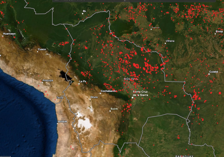
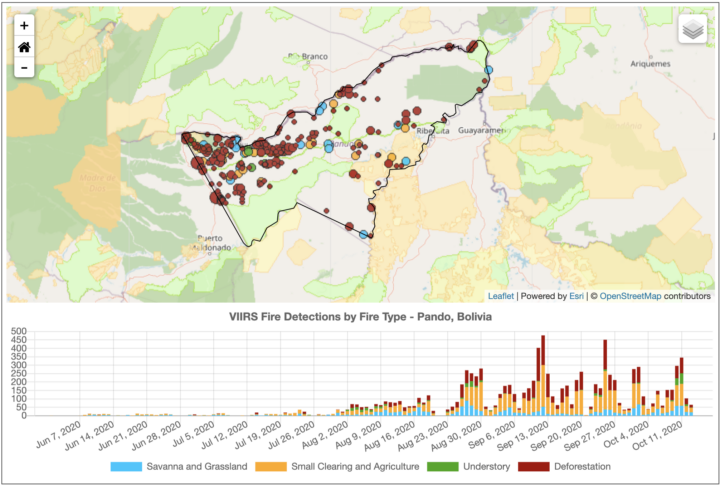
But not all the red dots on the map are of equal ecological significance. As these screenshots (below) from NASA’s Amazon fire dashboard make clear, there is a lot of variety in the types of fires that have burned in Bolivia in recent months, and they vary by region and ecosystem.
Many fires in the region are short-lived grassland and savanna fires; these burn vegetation that regrows quickly, and there is usually little ecological damage and minimal carbon emissions. Likewise, many others are small-scale land clearing and agricultural fires that do not cause substantial new damage to intact tropical forests.
On the other hand, some of those red dots are long-lasting, intense deforestation fires that were lit specifically to burn trees as part of land-clearing processes. These fires turn patches of tropical forests into pasture or cropland, fragmenting the remaining forests and altering ecosystems for decades.
Others are low-intensity understory fires that typically begin in cleared areas as agricultural fires, but then escape into neighboring forests. Even a low-intensity fire may kill half of the trees, unleashing a cascade of ecological changes that can transform tropical forests into open-canopy woodlands over time.
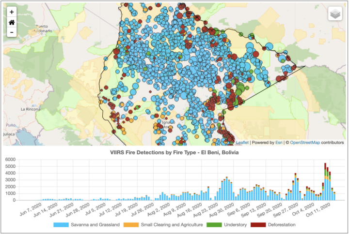
The charts above highlight the types and trends of fire type for three states (departments) in Bolivia. The northerly Pando department is still dominated by intact tropical rainforest. Satellites have detected large numbers of deforestation and agricultural fires burning there since August 2020, particularly along Highway 13. With more grasslands and fewer forests, El Beni has a higher proportion of the less-damaging fire types. The large Santa Cruz department, home to the Chiquitano dry forest and Pantanal grasslands, has comparatively large numbers of understory and grass fires.
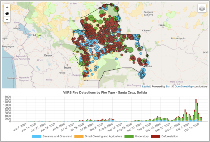
“The goal of our new classification system is to provide real-time information on what types of fires are burning across the Amazon region every day. With thousands of individual fires burning at this point in the dry season, the question is how to prioritize regional efforts for fire suppression to best protect communities and ecosystems. Understory fires are particularly devastating in Amazon forests that are not adapted to fire,” said Douglas Morton, chief of the Biospheric Sciences Laboratory at NASA’s Goddard Space Flight Center. “However, it is worth pointing out that our real-time classification system for Amazon fires is not the only way of categorizing fires. We are working closely with state and national agencies across the Amazon to improve the classification, based on feedback from field crews.”
| School is starting and NASA’s Earth Observatory has resources for children and teachers! |
EO Kids – Come Explore Earth with EO Kids! Read all about different topics in NASA Earth science and try out the hands-on activities. Each issue helps students learn how NASA’s fleet of satellites help us understand and plan for our changing world. Issues are available as printable PDFs. Educators can print and distribute to students with limited access to technology. Parents can print issues for their children so they can actively learn while taking a break from screen-time.
For students on computers, check out EO Kids videos of some of the cool activities featured in our issues. At EO Kids we are committed to making Earth science fun and engaging. Come explore our Earth with us!
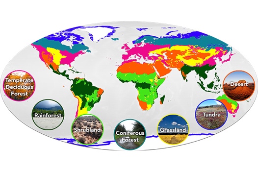
Mission: Biomes – In celebration of 20 years since its first release, the Earth Observatory has updated the Mission: Biomes activity to support interactive learning and awareness of seven terrestrial biomes: rainforest, grassland, temperate deciduous forest, coniferous forest, desert, tundra, and shrubland. After reading about each biome, users can enter “The Great Graph Match” and test their biome knowledge. After mastering “The Great Graph Match”, users can enter the “To Plant or Not to Plant?” mission, read about 19 plants growing all over the world, and match those plants to the biome they prefer. Visit the Teacher Resources page to learn more about the Mission: Biomes goals, expected outcomes for students, the Next Generation Science Standards alignment, general tips for navigating the site, additional activities to learn, and more!
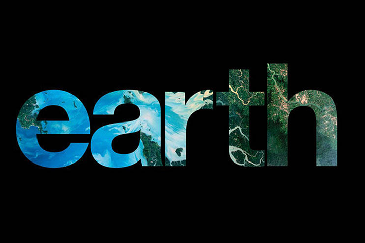
Earth, a photo essay – NASA’s Earth is a fantastic resource for students to practice their reading skills while learning about Earth through stunning images of our planet. Through this book students appreciate science as art, part of STEAM (Science, Technology, Engineering, Art, and Math) focused curriculums.
The Earth Observatory team hopes that you all have an inspiring and informative school year!
There have been two rounds of voting in Tournament Earth 2020, and two rounds of stunning upsets. Only two of the top eight seeds made it through. Night Lights? Snuffed out. Colorado River? Dried up. Caspian ice? Melted. Aerosols? Cleaned out. A river of tea? Gone cold. Dark side of the Moon? Someone broke the record. Iconic Earthrise? Didn’t make it to dawn.
Every time we run one of these tournaments, we are surprised by what catches the eyes of our readers. It is time to surprise us again. Cast your votes now in round three to pick the best four of the Earthly 8. Voting ends on April 13 at 9 a.m. U.S. Eastern Time. Check out the remaining competitors below.

In round 1, Ocean Sand garnered the most votes overall and wiped out #4 seed and 2014 champion El Hierro Submarine Eruption, winning by the largest margin of any pairing (81 to 19 percent). In round 2, Sand beat the #1 seed, The Dark Side and the Bright Side, by a 57 to 43 percent margin.
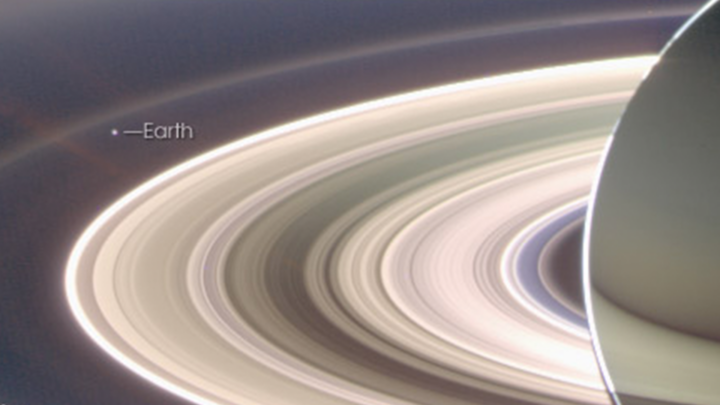
A View from Saturn garnered the second highest vote total in round 1, besting Blooming Baltic Sea by 77 to 23 percent. In the second round, Saturn beat Sensing Lightning from the Space Station, 60 to 40 percent. In case you didn’t notice, Earth is visible in that Saturn image.
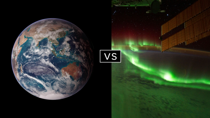
Twin Blue Marbles is the only #1 seed left in the tournament. In round 1, it captured 71 percent of the vote while besting Auroras Light Up the Antarctic Night. In round 2, Blue Marbles was the top overall vote getter and beat the iconic A Voyager Far from Home by 66 to 34 percent.
Fire in the Sky and On the Ground has pulled off two massive upsets. In round 1, it beat #2 seed Night Light Maps Open Up New Applications, 71 to 29 percent. In round 2, Fire beat the sentimental favorite and oldest image in Tournament Earth, All of You on the Good Earth — the original Blue Marble photo (1968) and the inspiration for the first Earth Day (1970). The voters chose the auroral fire over Apollo 8 fame by 57 to 43 percent.
This bracket pairs two low seeds that knocked off highly ranked opponents. #8 seed Where the Dunes End topped #1 A Curious Ensemble of Wonderful Features in round 1 (63 to 37 percent), then topped #4 Roiling Flows on Holuhraun Lava Field (56 to 44).
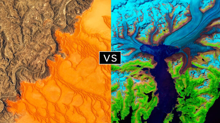
The false-color image Retreat of the Columbia Glacier got 57 percent of the vote to beat Icy Art in the Sanikov Strait in round 1. Round 2 was a close call: Columbia barely eclipsed Antartica Melts Under the Hottest Days on Record (51 to 49 percent).
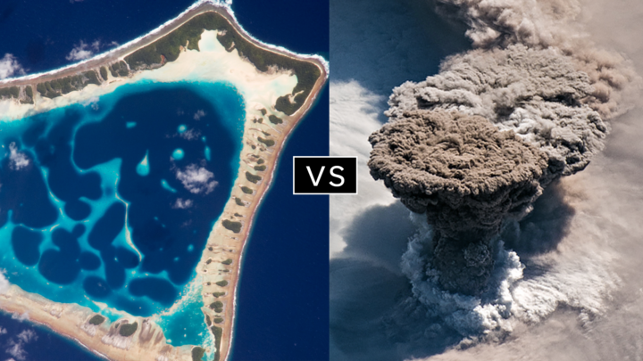
Another pair of Cinderella stories here. Atafu Atoll outclassed #1 seed Some Tea with Your River in round 1 by 75 to 25 percent. In round 2, it collected the second most votes overall, beating #5 Making Waves in the Andaman Sea 62 to 38 percent.
Raikoke erupted in round 1, collecting 72 percent of the vote while beating #3 Awesome, Frightening View of Hurricane Florence. In round 2, the volcanic plume smothered #2 Just Another Day on Aerosol Earth, 61 to 39 percent.
