Compared to Earth, the planet Jupiter is about 11 times larger in circumference, 5 times farther from the Sun, 4 times colder, and it rotates 2.5 times faster. Based on the numbers, this gas giant wouldn’t seem to have much in common with our planet. But spend a moment looking at these detailed images of vortices in Earth’s oceans and in the atmosphere on Jupiter. You might struggle to tell the difference.
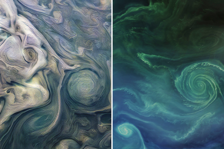
In 2019 we published this side-by-side comparison of Jupiter and Earth. The image of Jupiter (left) shows ammonia-rich clouds swirling in the outermost layers of the planet’s atmosphere. The eddies trace disturbances caused by the planet’s fast rotation and by high temperatures deeper in the atmosphere. The image of Earth (right) shows a green phytoplankton bloom tracing the edges of a vortex in the Baltic Sea. Turbulent processes in the oceans are important for moving heat, carbon, and nutrients around the planet.
Scientists are paying attention to the similarities. Lia Siegelman, a physical oceanographer at Scripps Institution of Oceanography, became interested in NASA’s Juno mission when images of Jupiter reminded her of the turbulent oceans she was studying on Earth. She presented the following examples at the December 2021 meeting of the American Geophysical Union.
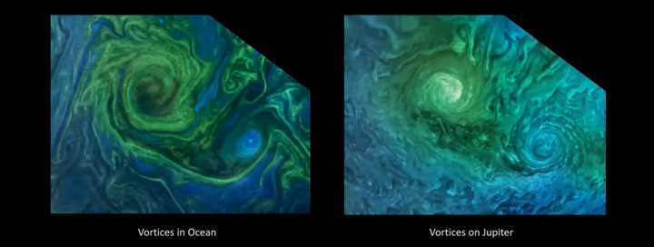
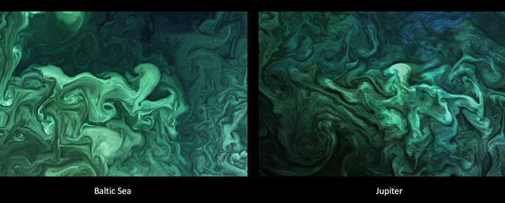
Notice how the swirls and vortices in the Norwegian Sea (top-left) and Baltic Sea (bottom-left) resemble vortices in Jupiter’s atmosphere (top- and bottom-right). Siegelman noted that although the scales are different–the vortex on Jupiter is about ten times larger than the one in the Baltic–they are generated by the same sort of fluid dynamics.
By studying these naturally emerging patterns, scientists are learning more about atmospheric processes on Jupiter. Someday, such comparisons might even tell us something new about our home planet.
The Juno spacecraft, which has been gathering data on the gas giant since July 2016, completed its 38th close pass by Jupiter in November 2021. You can find more information about the Juno mission here and here.
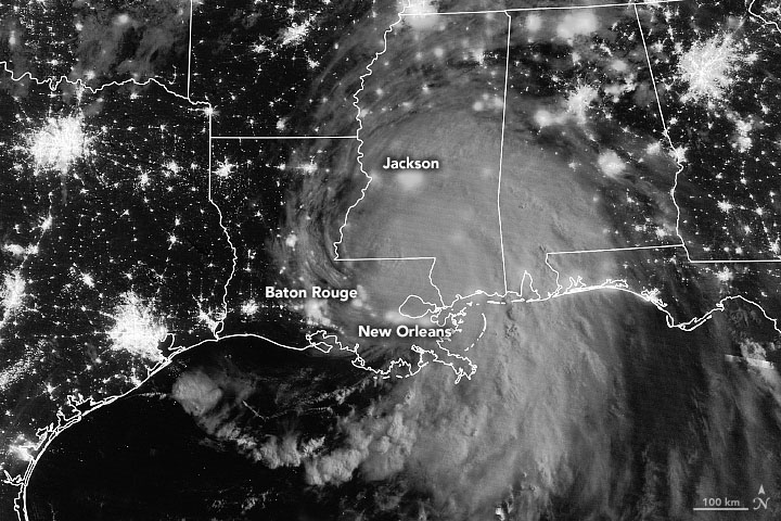
NASA will launch four Earth science missions in 2022 to provide scientists with more information about fundamental climate systems and processes including extreme storms, surface water and oceans, and atmospheric dust. Scientists will discuss the upcoming missions at the American Geophysical Union’s (AGU) 2021 Fall Meeting, hosted in New Orleans between Dec. 13 and 17.
NASA has a unique view of our planet from space. NASA’s fleet of Earth-observing satellites provides high-quality data on Earth’s interconnected environment, from air quality to sea ice. These four missions will enhance the ability to monitor our changing planet:
Measuring Tropical Cyclones – Time-Resolved Observations of Precipitation structure and storm Intensity with a Constellation of Smallsats (TROPICS)
NASA’s TROPICS mission aims to improve observations of tropical cyclones. Six TROPICS satellites will work in concert to provide microwave observations of a storm’s precipitation, temperature, and humidity as quickly as every 50 minutes. Scientists expect the data will help them understand the factors driving tropical cyclone intensification and will contribute to weather forecasting models.
In June 2021, the first pathfinder, or proof of concept satellite of the constellation started collecting data, including from Hurricane Ida in August 2021. The TROPICS satellites will be deployed in pairs of two over three different launches, expected to be completed by July 31, 2022.
Each satellite is about the size of a loaf of bread and carries a miniaturized microwave radiometer instrument. Traveling in pairs in three different orbits, they will collectively observe Earth’s surface more frequently than current weather satellites making similar measurements, greatly increasing the data available for near real-time weather forecasts.
The TROPICS team is led by Principal Investigator Dr. William Blackwell at MIT’s Lincoln Laboratory in Lexington, Massachusetts, and includes researchers from NASA, the National Oceanic and Atmospheric Administration (NOAA), and several universities and commercial partners. NASA’s Launch Services Program, based at the agency’s Kennedy Space Center in Florida, will manage the launch service.
“The coolest part of this program is its impact on helping society,” Blackwell said. “These storms affect a lot of people. The higher frequency observations provided by TROPICS have the potential to support weather forecasting that may help people get to safety sooner.”
Studying Mineral Dust — Earth Surface Mineral Dust Source Investigation (EMIT)
Winds kick up dust from Earth’s arid regions and transport the mineral particles around the world. The dust can influence the radiative forcing — or the balance between the energy that comes toward Earth from the Sun, and the energy that Earth reflects back out into space — hence the temperature of the planet’s surface and atmosphere. Darker, iron-laden minerals tend to absorb energy, which leads to heating of the environment, while brighter, clay-containing particles scatter light in a way that may lead to cooling. In addition to affecting regional and global warming of the atmosphere, dust can affect air quality and the health of people worldwide, and when deposited in the ocean, can also trigger blooms of microscopic algae.
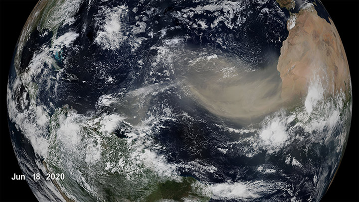
The goal of the Earth Surface Mineral Dust Source Investigation (EMIT) mission is to map where the dust originates and estimate its composition so that scientists can better understand how it affects the planet. Targeted to launch in 2022, EMIT has a prime mission of one year and will be installed on the International Space Station. EMIT will use an instrument called an imaging spectrometer that measures visible and infrared light reflecting from surfaces below. This data can reveal the distinct light-absorbing signatures of the minerals in the dust that helps to determine their composition.
“EMIT will close a gap in our knowledge about arid land regions of our planet and answer key questions about how mineral dust interacts with the Earth system,” said Dr. Robert Green, EMIT principal investigator at NASA’s Jet Propulsion Laboratory.
Observing Earth’s Storms — Joint Polar Satellite System (JPSS)
Forecasting extreme storms many days in advance requires capturing precise measurements of the temperature and moisture in our atmosphere, along with ocean surface temperatures. The NOAA/NASA Joint Polar Satellite System satellites provide this critical data, which is used by forecasters and first responders. The satellites also tell us about floods, wildfires, volcanoes, smog, dust storms, and sea ice.
“JPSS satellites are a vital component of the global backbone of numerical weather prediction,” said JPSS Program Science Adviser Dr. Satya Kalluri.
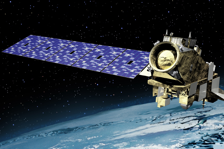
The JPSS satellites circle Earth from the North to the South Pole, taking data and images as they fly. As Earth rotates under these satellites, they observe every part of the planet at least twice a day.
The Suomi-NPP (National Polar orbiting-Partnership) and NOAA-20 satellites are currently in orbit. The JPSS-2 satellite is targeted to launch in 2022 from Vandenberg Space Force Base in California on a United Launch Alliance Atlas V rocket. Three more satellites will launch in the coming years, providing data well into the 2030s. NASA’s Launch Services Program, based at the agency’s Kennedy Space Center in Florida, will manage the launch service.
The Surface Water and Ocean Topography (SWOT) mission will help researchers determine how much water Earth’s oceans, lakes, and rivers contain. This will aid scientists in understanding the effects of climate change on freshwater bodies and the ocean’s ability to absorb excess heat and greenhouse gases like carbon dioxide.
NASA’s Launch Services Program, based at the agency’s Kennedy Space Center in Florida, will manage the launch service, which is targeted for November 2022. SWOT will launch on a SpaceX Falcon 9 rocket from Vandenberg Space Force Base in California.

The SUV-size satellite will measure the height of water using its Ka-band Radar Interferometer, a new instrument that bounces radar pulses off the water’s surface and receives the return signals with two different antennas at the same time. This measurement technique allows scientists to precisely calculate the height of the water. The data will help with tasks like tracking regional shifts in sea level, monitoring changes in river flows and how much water lakes store, as well as determining how much freshwater is available to communities around the world.
“SWOT will address the ocean’s leading role in our changing weather and climate and the consequences on the availability of freshwater on land,” said Dr. Lee-Lueng Fu, SWOT project scientist at NASA’s Jet Propulsion Laboratory.
The mission is a collaboration between NASA and the French space agency Centre National d’Etudes Spatiales, with contributions from the Canadian Space Agency and the United Kingdom Space Agency.
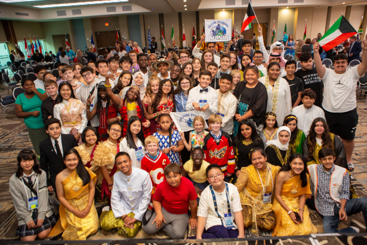
The NASA-sponsored Global Learning and Observations to Benefit the Environment (GLOBE) Program has received the American Geophysical Union (AGU) 2021 Excellence in Earth and Space Science Education Award. According to AGU, the annual award honors an individual, group, or team committed to promoting excellent geophysical education.
Through GLOBE, people around the world learn how to document and share useful information about their local environment with scientists. Launched on Earth Day in 1995, GLOBE connects scientists, teachers, and students in 126 countries with hands-on scientific activities.
“GLOBE is a phenomenal program that has a special place at NASA,” said Dr. Allison Leidner, program manager for education and communication in the Earth Science Division of NASA’s Science Mission Directorate. “Enabling students and citizen scientists to investigate our home planet gives them a greater appreciation of our environment, ignites their interest in science-related careers, and connects them to the international Earth science community. We are so happy to see AGU recognize GLOBE with this award.”
Through teachers that have been trained in GLOBE protocols, students learn how to conduct scientific investigations and collect data in their community. GLOBE science protocols were developed with Earth scientists and many protocols have connections to NASA’s satellite missions. So far, GLOBE participants have gathered and shared more than 200 million Earth science observations.
“The GLOBE Program has made outstanding achievements and contributions by pushing the frontiers of our science forward,” said AGU President Susan Lozier in a statement, on behalf of the AGU Earth and space science community. “GLOBE has also embodied AGU’s shared vision of a thriving, sustainable and equitable future for all, powered by discovery, innovation, and action. And you did this with integrity, respect, diversity, and collaboration while creating deep engagement in education and outreach.”
In addition to being sponsored by NASA, GLOBE is supported by the National Science Foundation (NSF), National Oceanic and Atmospheric Administration (NOAA), and the U.S. Department of State.
Dr. Tony Murphy, GLOBE Implementation Office director, and Dr. Caryn Long, middle school science teacher at Montverde Academy (Florida), share more about the program and its recent recognition. Their responses have been edited for clarity.
Tony Murphy: GLOBE has a strong community of citizen scientists, students, and teachers all over the world who are eager to contribute to Earth system science research. GLOBE allows people to contribute to data collection and submission, to understand the scientific research process and the work of scientists, and to see how their local environment fits into the regional and global environment.
Caryn Long: I have used GLOBE in my classroom for five years now. GLOBE is different from other science education programs because it educates students while also immersing them in the practical and applied nature of science. Knowing they are contributing to real research with NASA scientists is a powerful motivational tool to get them to practice the skills of observation, data collection, and analysis in a real and meaningful way. They want to practice the skills they are developing because what they are doing is valued.
Long: Our classroom participates in the Cloud, Aerosols and Hydrology Protocols and the Surface Temperature Field Campaign at the lake behind our school. We are adding more protocols each year. Each time I share with my students that we are learning a new protocol to add to their toolbox, they are excited to get started. What my students have enjoyed most about GLOBE is meeting some of the scientists that are involved with the program. Another highlight for them is gathering the cloud data because it involves NASA satellites. Receiving the email matches with the satellites is exciting to the kids because they love comparing what they saw from a ground level to what the satellite has viewed.
Murphy: Seeing students communicate their research at meetings, and especially at the two GLOBE Learning Expeditions I have attended, has been truly amazing. GLOBE Learning Expeditions are week-long, student-focused events held every few years at sites around the world. I gave a scientific presentation at a national science competition in Ireland when I was in middle school. That experience had a major influence on my life, so it’s incredible to see so many GLOBE participants have a similar opportunity.
Murphy: The GLOBE community has grown tremendously from a small number of countries in 1995 to 126 countries today with a database of over 200 million measurements for use in research by students and scientists. New technology advancements including the GLOBE Program’s app, GLOBE Observer, have impacted the ways in which the program is implemented and enables citizen scientists to participate. The GLOBE community worldwide, including students, country coordinators, teachers, program support staff, government officials, and program sponsors, have allowed GLOBE to earn this recognition.
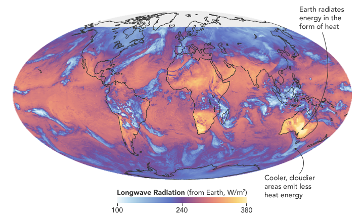
Researchers have found that Earth’s energy imbalance approximately doubled during the 14-year period from 2005 to 2019.
Earth’s climate is determined by a delicate balance between how much of the Sun’s radiative energy is absorbed in the atmosphere and at the surface and how much thermal infrared radiation Earth emits to space. A positive energy imbalance means the Earth system is gaining energy, causing the planet to heat up. The doubling of the energy imbalance is the topic of a recent study published June 15 in Geophysical Research Letters.
Scientists at NASA and the National Oceanic and Atmospheric Administration compared data from two independent sets of measurements. NASA’s Clouds and the Earth’s Radiant Energy System (CERES) satellite sensors measure how much energy enters and leaves Earth’s system. A global array of ocean floats, called Argo, provide data to enable an accurate estimate of the rate at which the world’s oceans are warming. Since approximately 90 percent of the excess energy from an energy imbalance ends up in the ocean, the overall trends of incoming and outgoing radiation should broadly agree with changes in ocean heat content.
“The two very independent ways of looking at changes in Earth’s energy imbalance are in really, really good agreement, and they’re both showing this very large trend, which gives us a lot of confidence that what we’re seeing is a real phenomenon and not just an instrumental artifact,” said Norman Loeb, lead author for the study and principal investigator for CERES at NASA’s Langley Research Center. “The trends we found were quite alarming in a sense.”
“It’s likely a mix of anthropogenic forcing and internal variability,” said Loeb. “And over this period they’re both causing warming, which leads to a fairly large change in Earth’s energy imbalance. The magnitude of the increase is unprecedented.”
Increases in emissions of greenhouse gases such as carbon dioxide and methane trap heat in the atmosphere, capturing outgoing radiation that would otherwise escape into space. The warming drives other changes, such as the melting of snow and ice, increased water vapor, and cloud changes that can further enhance the warming. Earth’s energy imbalance is the net effect of all these factors.
In order to determine the factors driving the imbalance, the investigators examined changes in clouds, water vapor, trace gases, the output of light from the Sun, Earth’s surface albedo (the amount of light reflected by the surface), atmospheric aerosols, and changes in surface and atmospheric temperature distributions.
The scientists found that the doubling of the energy imbalance is partially the result an increase in greenhouse gases from human activity, also known as anthropogenic forcing. It can also be attributed to increases in water vapor, which traps more outgoing longwave radiation and further contributes to Earth’s energy imbalance. The related decrease in clouds and sea ice also lead to more absorption of solar energy.
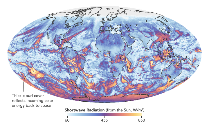
The authors also found that a flip of the Pacific Decadal Oscillation (PDO) from a cool phase to a warm phase likely played a major role in the intensification of the energy imbalance. The PDO is a pattern of Pacific climate variability in which a massive wedge of water in the eastern Pacific goes through cool and warm phases. This naturally occurring internal variability in the ocean can have far-reaching effects on weather and climate. An intensely warm PDO phase that began around 2014 and continued until 2020 caused a widespread reduction in cloud coverage over the ocean and a corresponding increase in the absorption of solar radiation.
“The lengthening and highly complementary records from Argo and CERES have allowed us both to pin down Earth’s energy imbalance with increasing accuracy, and to study its variations and trends with increasing insight, as time goes on,” said Gregory Johnson, co-author on the study and physical oceanographer at NOAA’s Pacific Marine Environmental Laboratory. “Observing the magnitude and variations of this energy imbalance are vital to understanding Earth’s changing climate.”
Loeb cautions that the study is only a snapshot relative to long-term climate change, and that it is not possible to predict with any certainty what the coming decades might look like for Earth’s energy budget. The study does conclude, however, that unless the rate of heat uptake subsides, greater changes in climate should be expected.
| School is starting and NASA’s Earth Observatory has resources for children and teachers! |
EO Kids – Come Explore Earth with EO Kids! Read all about different topics in NASA Earth science and try out the hands-on activities. Each issue helps students learn how NASA’s fleet of satellites help us understand and plan for our changing world. Issues are available as printable PDFs. Educators can print and distribute to students with limited access to technology. Parents can print issues for their children so they can actively learn while taking a break from screen-time.
For students on computers, check out EO Kids videos of some of the cool activities featured in our issues. At EO Kids we are committed to making Earth science fun and engaging. Come explore our Earth with us!
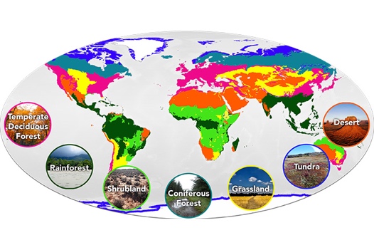
Mission: Biomes – In celebration of 20 years since its first release, the Earth Observatory has updated the Mission: Biomes activity to support interactive learning and awareness of seven terrestrial biomes: rainforest, grassland, temperate deciduous forest, coniferous forest, desert, tundra, and shrubland. After reading about each biome, users can enter “The Great Graph Match” and test their biome knowledge. After mastering “The Great Graph Match”, users can enter the “To Plant or Not to Plant?” mission, read about 19 plants growing all over the world, and match those plants to the biome they prefer. Visit the Teacher Resources page to learn more about the Mission: Biomes goals, expected outcomes for students, the Next Generation Science Standards alignment, general tips for navigating the site, additional activities to learn, and more!
Earth, a photo essay – NASA’s Earth is a fantastic resource for students to practice their reading skills while learning about Earth through stunning images of our planet. Through this book students appreciate science as art, part of STEAM (Science, Technology, Engineering, Art, and Math) focused curriculums.
The Earth Observatory team hopes that you all have an inspiring and informative school year!
A series of research papers in recent months shows that we know more than ever before about the ice on our land and covering the seas. In case you missed them, here’s a look at some of the notable findings. Many are based on data from NASA’s ICESat-2 satellite, which just over a year ago released to the public more than a trillion new measurements of Earth’s height. With these and other satellite data scientists have …
Earlier this month we wrote about how the data were used to make the first maps of snow depth on sea ice. The research, published in JGR Oceans, shows how elevation measurements from ICESat-2 can be combined with data from ESA’s Cryosat-2 to get maps like these:
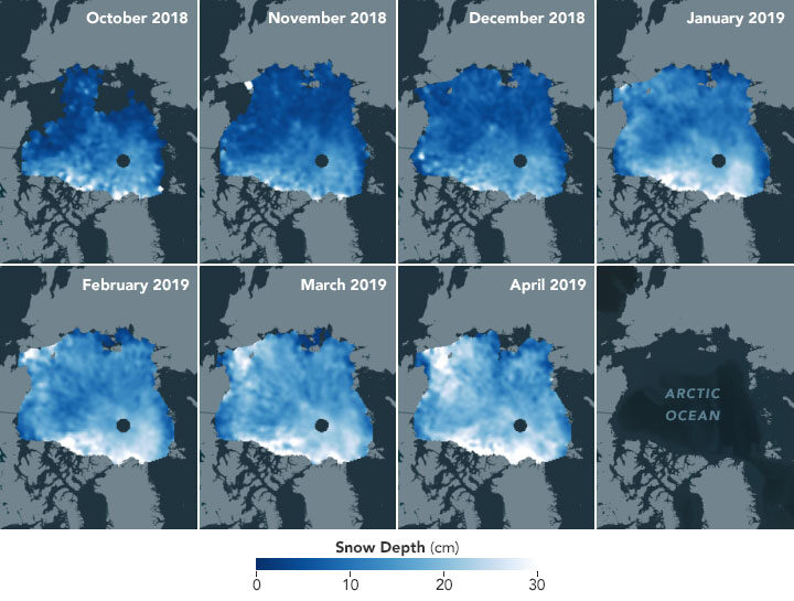
The snow layer is an important component of the sea ice system, affecting how the ice cover grows and melts. With additional years of observations, such maps could help scientists assess how climate change affects precipitation and the accumulation of snow.
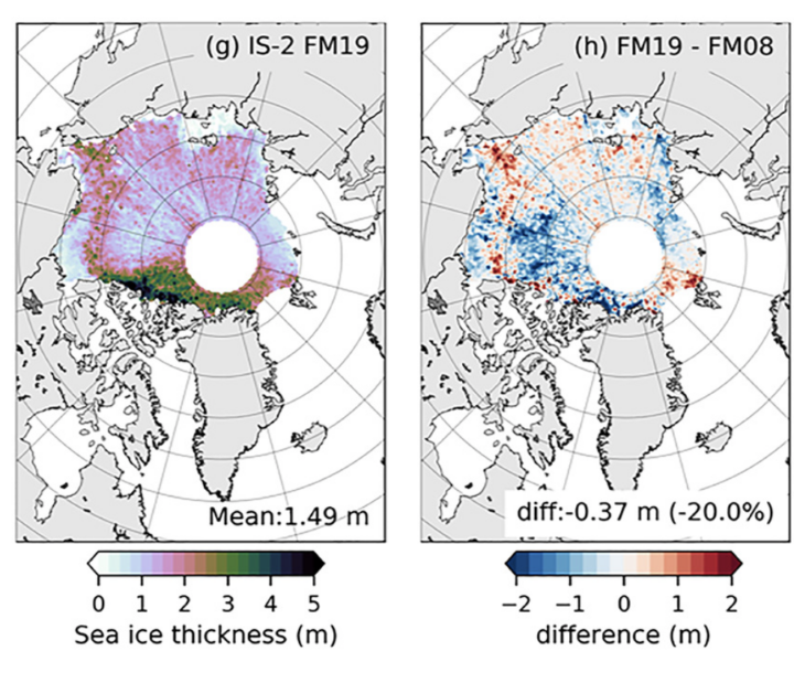
In another paper, scientists described how they used ICESat-2 data and a new model to estimate the thickness of Arctic sea ice. Comparing the new estimates to those made with the first ICESat mission (2003-2009), they found that sea ice in winter has thinned by as much as 20 percent in the past 11 years. The bottom-left map shows the February-March 2019 thickness estimate; the bottom-right map shows how much thickness has changed between 2008 and 2019. Read more about that study here.
Other research outlined the changes happening to ice on land. In a paper published April 2020 in Science, scientists chronicled 16-years of change to the Greenland and Antarctic ice sheets.
ICESat-2 data from 2019 showed that Greenland’s ice sheet had lost an average of 200 million metric tons of ice per year since the original ICESat started collecting data in 2003. Antarctica’s ice sheet lost an average of 118 million metric tons of ice per year during the same period.
But the beauty of the new measurements from ICESat-2 is that scientists can show details of where the changes are happening. Not only can they discern where the ice sheets have been thinning or thickening, but they can see changes on the scales of individual glaciers and, for the first time, across floating ice shelves. Read this story for more details, or check out the video below.
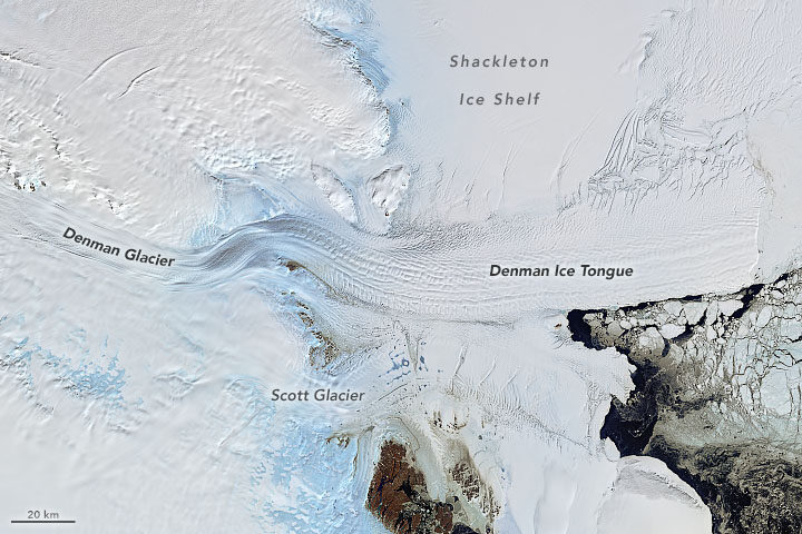
The ice in East Antarctica is generally thought to be less vulnerable than the ice in West Antarctica and the Antarctic Peninsula. Research in 2018, however, pointed to a number of glaciers along East Antarctica’s coastline that appear to be destabilizing. A new paper published March 2020 detailed the changes happening to Denman Glacier. The stability of Denman is a concern because this one glacier in East Antarctica holds as much ice as half of West Antarctica.
Scientists used satellite radar data from the Italian COSMO‐SkyMed constellation to detect the retreat of the glacier’s grounding line—the point at which a glacier last touches the seafloor and begins to float. If the grounding line continues to retreat, warm seawater could eventually penetrate upstream and beneath the glacier, continuing to melt it from below and destabilizing it. Read the full story here.
Sometimes multiple satellites can tell you more than a single satellite. In research published in Nature, scientists used observations from 11 satellite missions to calculate losses from the Antarctic and Greenland ice sheets since the 1990s. They show that the ice sheets together lost 81 billion metric tons per year in the 1990s, compared with 475 billion metric tons of ice per year in the 2010s—a sixfold increase.
The meltwater associated with the ice loss boosted global sea levels by 17.8 millimeters (0.7 inches), according to a story about the research.
Some losses are directly affecting the freshwater resources available to people. In the 20thcentury, the largest contributors to sea level rise came from melting ice caps and glaciers in Alaska, the Canadian Arctic Archipelago, the Southern Andes, High Mountain Asia, the Russian Arctic, Iceland, and Svalbard.
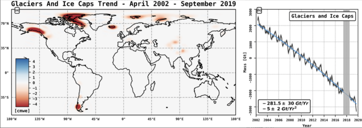
Researchers used the GRACE and GRACE-FO satellites to determine that these seven regions lost (on average) more than 280 billion metric tons of ice per year between 2002 and 2019. The losses contributed 13 millimeters (0.5 inches) to global sea level rise. The losses also deplete a freshwater resource for communities that depend on the ice to provide meltwater for agriculture and drinking water. You can read more about the research, published April 2020 in GRL, in this story.
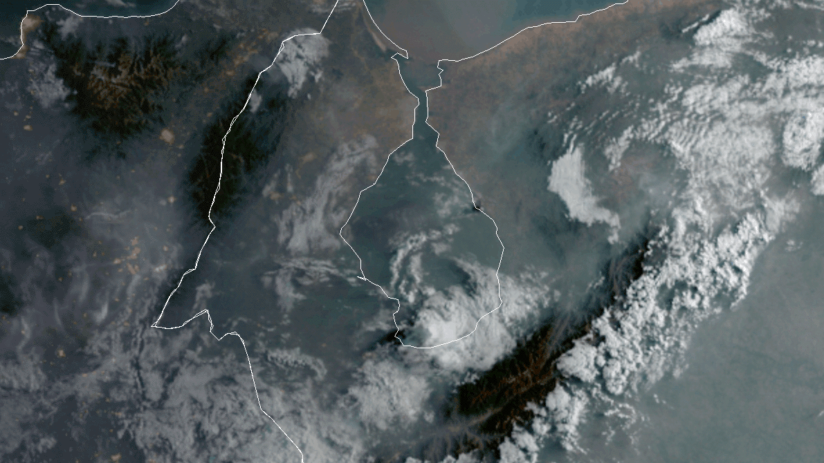
As noted in a recent Image of the Day (“A Fiery Month in Zulia”) satellites have detected lots of fire activity in western Venezuela in recent weeks. Just as we were finishing that story, a surprisingly large, dark smoke plume appeared in VIIRS and MODIS imagery. It bore little resemblance to the smaller, gray plumes that we had been watching. Forest and crops fires had caused the earlier plumes; the new black smoke was caused by a brush fire that had spread into a crude oil storage area, according to news reports.
The animation above shows the progression of the plume on the morning of April 25, 2020. The images were collected at 10 minute intervals by the Advanced Baseline Imager (ABI) on NOAA’s GOES-16 satellite. Sensors on other satellites caught glimpses of the short-lived plume as well, including the Multispectral Instrument (MSI) on the European Space Agency’s Sentinel-2 satellite and the Ozone Monitoring Instrument (OMI) on NASA’s Aura satellite.
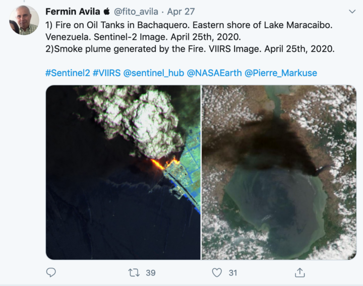
With dozens of firefighters battling the blaze, it was extinguished by the next day. On April 26, 2020, there were no signs of smoke or active fires visible in MODIS and VIIRS images of that area.

“As you take this constant drumbeat of new information and research in, remember that this virus is new to science and people have only just started studying it. Doing high-quality, definitive science takes time, sometimes a long time. The appetite for answers is understandably intense, but we also have to try to balance that hunger with patience.”
– Benjamin Zaitchik, a Johns Hopkins University researcher working to understand whether environmental factors are affecting the spread of coronavirus.
Ever since a new and deadly strain of coronavirus (SARS-CoV-2) emerged in China and then spread around the world, the virus has upended life in many countries. Scientists at NASA and other institutions have hustled to track and make sense of our new reality with every tool and technique at their disposal, including satellite data.
As several comprehensive NASA-funded research projects get started, here is a quick roundup of some of the more interesting satellite-related findings about the science of coronavirus and its effects on the environment.
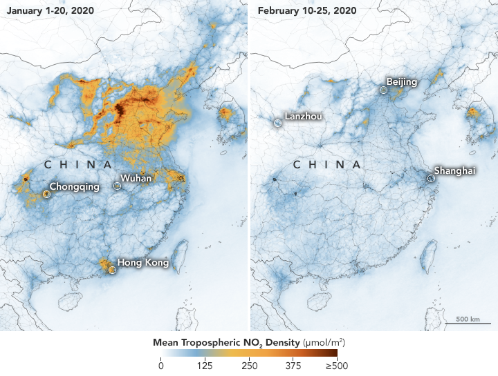
Much of the news about the new coronavirus is grim, but observations of air quality offer a breath of fresh air. Several satellite sensors have detected drops in air pollutants — including nitrogen dioxide, carbon monoxide, and fine particles — following restrictions on travel and economic activity. Teams of scientists have spotted changes in China, Europe, the U.S. Northeast and Southeast, and India.
Look here for some tips on how to find and visualize changes in nitrogen dioxide, one of the gases that most clearly shows the effects of quarantines and economic shutdowns. Also, look here for nitrogen dioxide data for cities all around the world. But beware: As University of Georgia meteorologist Marshall Shepherd has pointed out, clouds and rain can create confusing changes in nitrogen dioxide that have nothing to do coronavirus restrictions.
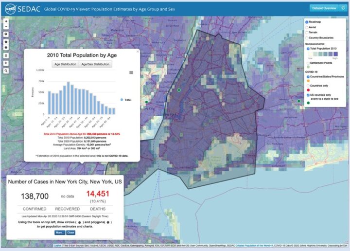
Given how much the virus has changed daily life, many of us find ourselves turning into armchair epidemiologists, trying to make sense of how the virus is spreading and what it means for our local area. If you are interested in taking a close look at new data as it comes in, this simple-to-use mapping tool from NASA’s Socioeconomic Data and Applications Center (SEDAC) might be of interest. It features demographic data, along with regularly updated information on reported global cases of the novel coronavirus (COVID-19). There is a short user guide here.
One of the key unknowns about the new coronavirus is whether environmental conditions — such as temperature, humidity, and exposure to ultraviolet light — have any effect on how the virus spreads or on the severity of the symptoms. NASA-funded researchers are starting to investigate this in several ways, while others are using NASA data in their models and analyses.
Some controlled laboratory research has suggested that exposure to warm air may make it more difficult for the virus to survive and spread. That has led many researchers around the world to start analyzing epidemiological and meteorological data to see if certain environmental factors have a significant impact on the virus in the real world. At this point it is too early to say, declared the National Academy of Sciences in a report on April 7, 2020, but the research continues.
Billions of people are facing something that NASA astronauts have plenty of experience with—living in social isolation for long periods with just a few other people. Here are some tips from astronaut Anne McClain and psychologist Tom Williams.
If you follow science news, this will probably sound familiar.
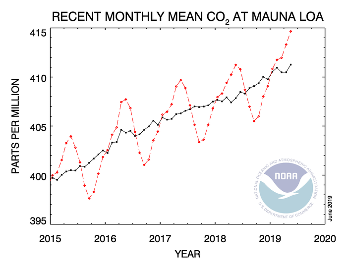
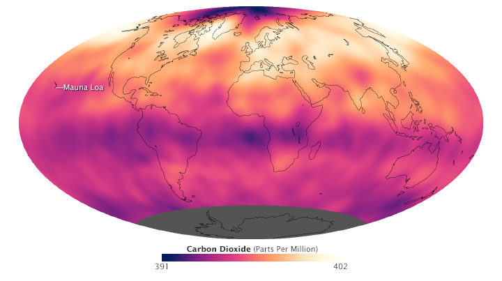
In May 2019, when atmospheric carbon dioxide reached its yearly peak, it set a record. The May average concentration of the greenhouse gas was 414.7 parts per million (ppm), as observed at NOAA’s Mauna Loa Atmospheric Baseline Observatory in Hawaii. That was the highest seasonal peak in 61 years, and the seventh consecutive year with a steep increase, according to NOAA and the Scripps Institution of Oceanography.
The Mauna Loa Observatory has been measuring carbon dioxide since 1958. The remote location (high on a volcano) and scarce vegetation make it a good place to monitor carbon dioxide because it does not have much interference from local sources of the gas. (There are occasional volcanic emissions, but scientists can easily monitor and filter them out.) Mauna Loa is part of a globally distributed network of air sampling sites that measure how much carbon dioxide is in the atmosphere.
The broad consensus among climate scientists is that increasing concentrations of carbon dioxide in the atmosphere are causing temperatures to warm, sea levels to rise, oceans to grow more acidic, and rainstorms, droughts, floods and fires to become more severe. Here are six less widely known but interesting things to know about carbon dioxide.
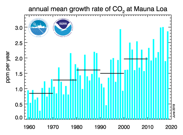
For decades, carbon dioxide concentrations have been increasing every year. In the 1960s, Mauna Loa saw annual increases around 0.8 ppm per year. By the 1980s and 1990s, the growth rate was up to 1.5 ppm year. Now it is above 2 ppm per year. There is “abundant and conclusive evidence” that the acceleration is caused by increased emissions, according to Pieter Tans, senior scientist with NOAA’s Global Monitoring Division.
To understand carbon dioxide variations prior to 1958, scientists rely on ice cores. Researchers have drilled deep into icepack in Antarctica and Greenland and taken samples of ice that are thousands of years old. That old ice contains trapped air bubbles that make it possible for scientists to reconstruct past carbon dioxide levels. The video below, produced by NOAA, illustrates this data set in beautiful detail. Notice how the variations and seasonal “noise” in the observations at short time scales fade away as you look at longer time scales.
Satellite observations show carbon dioxide in the air can be somewhat patchy, with high concentrations in some places and lower concentrations in others. For instance, the map below shows carbon dioxide levels for May 2013 in the mid-troposphere, the part of the atmosphere where most weather occurs. At the time there was more carbon dioxide in the northern hemisphere because crops, grasses, and trees hadn’t greened up yet and absorbed some of the gas. The transport and distribution of CO2 throughout the atmosphere is controlled by the jet stream, large weather systems, and other large-scale atmospheric circulations. This patchiness has raised interesting questions about how carbon dioxide is transported from one part of the atmosphere to another—both horizontally and vertically.
In this animation from NASA’s Scientific Visualization Studio, big plumes of carbon dioxide stream from cities in North America, Asia, and Europe. They also rise from areas with active crop fires or wildfires. Yet these plumes quickly get mixed as they rise and encounter high-altitude winds. In the visualization, reds and yellows show regions of higher than average CO2, while blues show regions lower than average. The pulsing of the data is caused by the day/night cycle of plant photosynthesis at the ground. This view highlights carbon dioxide emissions from crop fires in South America and Africa. The carbon dioxide can be transported over long distances, but notice how mountains can block the flow of the gas.
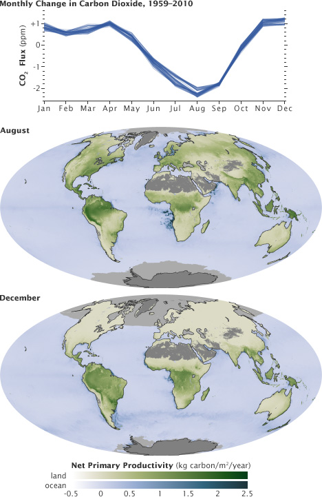
You’ll notice that there is a distinct sawtooth pattern in charts that show how carbon dioxide is changing over time. There are peaks and dips in carbon dioxide caused by seasonal changes in vegetation. Plants, trees, and crops absorb carbon dioxide, so seasons with more vegetation have lower levels of the gas. Carbon dioxide concentrations typically peak in April and May because decomposing leaves in forests in the Northern Hemisphere (particularly Canada and Russia) have been adding carbon dioxide to the air all winter, while new leaves have not yet sprouted and absorbed much of the gas. In the chart and maps below, the ebb and flow of the carbon cycle is visible by comparing the monthly changes in carbon dioxide with the globe’s net primary productivity, a measure of how much carbon dioxide vegetation consume during photosynthesis minus the amount they release during respiration. Notice that carbon dioxide dips in Northern Hemisphere summer.
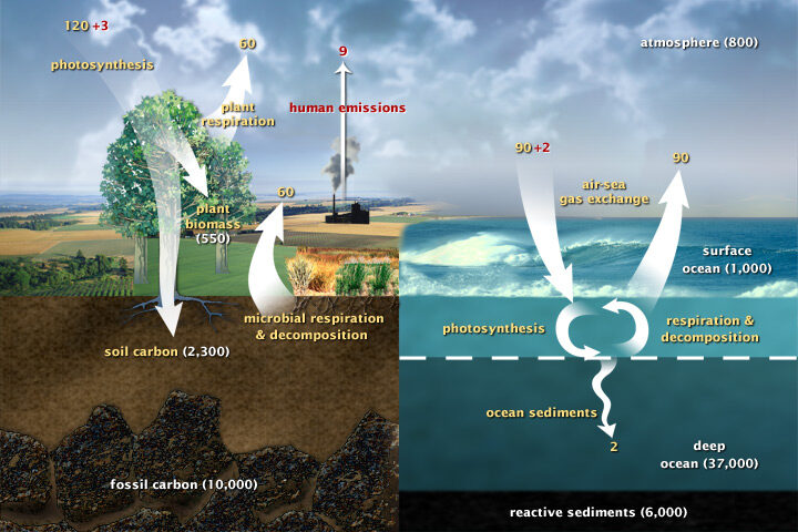
Most of Earth’s carbon—about 65,500 billion metric tons—is stored in rocks. The rest resides in the ocean, atmosphere, plants, soil, and fossil fuels. Carbon flows between each reservoir in the carbon cycle, which has slow and fast components. Any change in the cycle that shifts carbon out of one reservoir puts more carbon into other reservoirs. Any changes that put more carbon gases into the atmosphere result in warmer air temperatures. That’s why burning fossil fuels or wildfires are not the only factors determining what happens with atmospheric carbon dioxide. Things like the activity of phytoplankton, the health of the world’s forests, and the ways we change the landscapes through farming or building can play critical roles as well. Read more about the carbon cycle here.
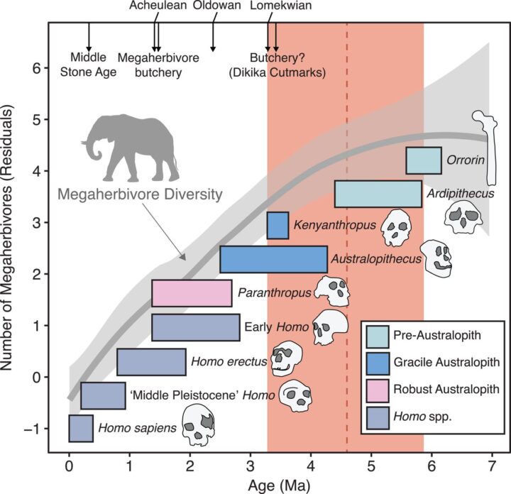
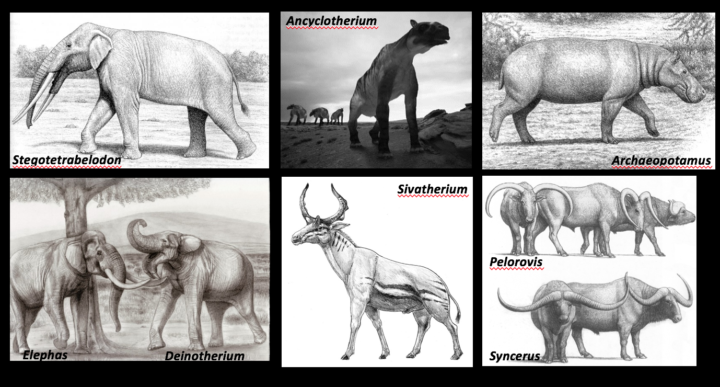
Seven million years ago, some truly spectacular creatures roamed the woodlands of East Africa. There was a moose-like giraffe called Shiva’s beast. There were giant buffalo with horns wider than the animals were tall. And the lumbering creatures known as anthracotheres defy easy categorization.
“Whenever I ask colleagues who study anthracotheres how they describe them, they always say: hippo-pig,” laughed Tyler Faith, curator of archaeology at the Natural History Museum of Utah. As for the buffalo: “This was a horn span of 3 meters (10 feet). I mean this was an awesome buffalo.”
These and several dozen variations of more recognizable African megaherbivores — elephants, rhinos, hippos, and giraffes — all went extinct within the past several million years. For decades, archaeologists have pinned the blame on early humans, particularly Homo erectus, a species that emerged 2 million years ago, walked upright, and had a body plan similar to modern humans. Since Homo erectus made stone weapons and was capable of butchering large game, many archaeologists assumed that it hunted Africa’s megaherbivores into extinction — much like the fossil record suggests Homo sapiens (modern humans) did to the large mammals of North and South America some 11,000 years ago.
But nobody rigorously tested whether this “overkill hypothesis” fit with the fossil record. “Speculation had been repeated often enough that it just graduated into fact; it became the truth,” Tyler explained during a recent colloquium at NASA’s Goddard Space Flight Center. To check more rigorously, Tyler and colleagues analyzed fossil assemblages from 101 sites in Eastern Africa.
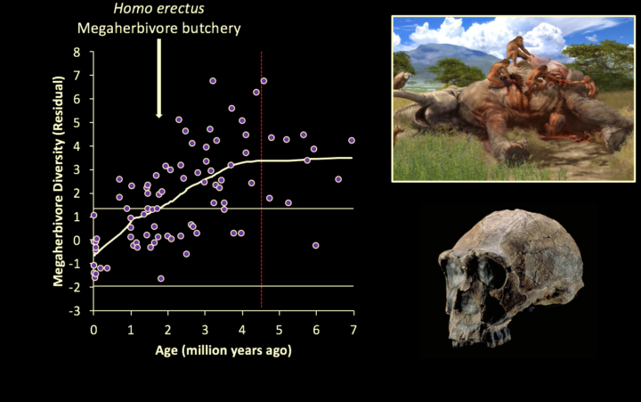
What they found was a surprise. Megaherbivores began disappearing about 4.6 million years ago — long before Homo erectus came on the scene (1.8 million years ago). And there was no increase in the rate of extinctions even when Homo erectus and butchering showed up in fossil records.
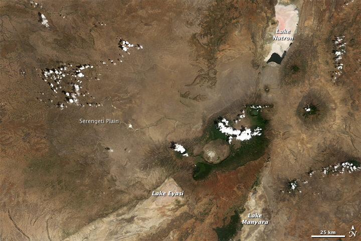
However, when the researchers looked at some key indicators of past environmental conditions, they found one key change — the expansion of grasslands — lined up with the extinctions almost perfectly. Five million years ago, classic open grasslands like today’s Serengeti Plain did not exist in East Africa. Trees and shrubs were a much more dominant part of that African landscape then, explained Tyler.
But as carbon dioxide levels declined, mainly due to orbital variations and changes in the amount of Earth covered by ice, forests retreated and grasslands became dominant. Since many of the megaherbivores fed mainly on woody vegetation, they likely faded away along with their food sources. Meanwhile, other familiar species thrived. The ancestors of wildebeest, hartebeests, Thompson gazelles, oryx, plains zebras, and warthogs — all grazers that live in open habitats — proliferated.
Faith’s bottom line is that it is time to stop blaming Homo erectus for something they didn’t do. “In the search for ancient hominid impacts on ancient African ecosystems, we must focus our attention on the one species known to be capable of causing them – us, Homo sapiens, over the past 300,000 years,” he said.