Antarctic iceberg A-68A, which broke from the Larsen C Ice Shelf in 2017, has been floating solo in recent years. Not anymore. The colossal iceberg finally fractured in late April 2020, spawning a new companion named A-68C.
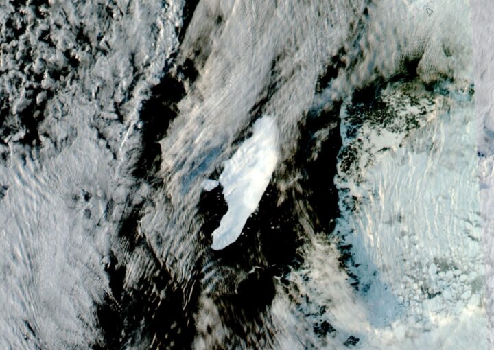
The break was not exactly surprising. A few weeks ago, we published this image (above) showing Iceberg A-68A on April 9, 2020. The iceberg on that day was still intact, but it had drifted north into dangerously warm waters. Christopher Readinger of the U.S. National Ice Center (USNIC) noted at the time:
“I’m surprised at how well it’s sticking together. It’s been in warmer water for a few months now and it’s not exactly a very thick berg, so I expect it will break up sometime soon, but it’s showing no signs of that yet.”
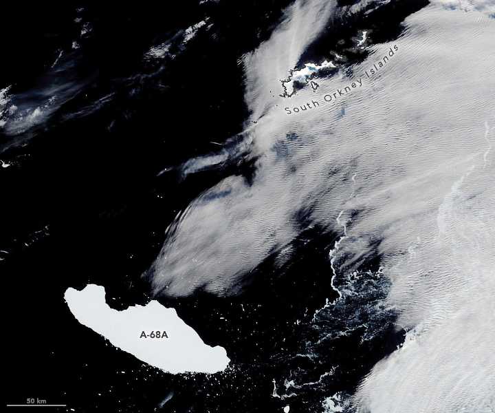
Less than two weeks later, that’s exactly what happened. Satellite images on April 22 showed that a new iceberg had broken off from A-68A. The pair is now drifting at the edge of the Weddell Sea and South Atlantic Ocean, near the South Orkney Islands. The image below, acquired by the Visible Infrared Imaging Radiometer Suite (VIIRS) on the NASA-NOAA Suomi-NPP satellite, shows the bergs on May 3, 2020.
Iceberg A-68C measures about 11 nautical miles long and 7 nautical miles wide (20 by 13 kilometers). That’s small compared to its parent berg A-68A, which now measures 82 by 26 nautical miles (152 by 48 kilometers), but it is large enough to be named and tracked by the U.S. National Ice Center.
Even after shedding the sizable piece of ice, A-68A is still the largest iceberg currently floating anywhere on Earth. It has calved only one other named berg, forming A-68B in July 2017 just after the initial calving event from the ice shelf.
To see where the iceberg duo goes from here, you can follow them in satellite imagery available on Worldview.
The UK’s Antarctic Place-names Committee has agreed that seven ice features in western Antarctica should be named for Earth-observation satellites. One of them is Landsat Ice Steam.
The new designations were announced on June 7, 2019. The ice features are all located in Western Palmer Land on the southern Antarctic Peninsula.
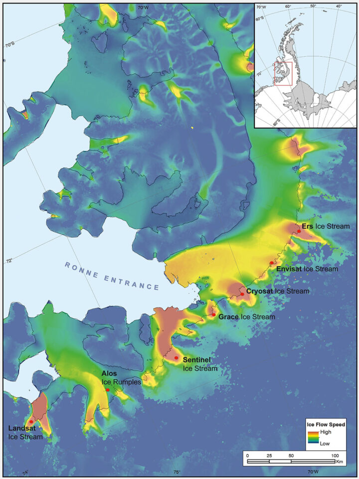
The seven features ring George VI Sound like pearls on a necklace. The new names, as officially entered into the British Antarctic Territory Gazetteer, are (from west to east): Landsat Ice Steam, ALOS Ice Rumples, Sentinel Ice Stream, GRACE Ice Stream, Envisat Ice Stream, Cryosat Ice Stream, and ERS Ice Stream.
The UK has submitted the new names for the fast-moving ice features to Scientific Committee on Antarctic Research (SCAR), which maintains a gazetteer or registry, of names officially adopted by individual nations. Under the Antarctic Treaty, signatory nations confer on geographic feature names, but each nation’s naming authority formally adopts new names. The U.S. Board on Geographic Names will meet in July and may discuss at that meeting whether the names adopted by the UK also will be adopted by the US. The question of using the term “glacier” for the ice features instead of “ice stream” is also part of each nation’s naming decision.
The new names were proposed by Anna Hogg, a glaciologist with the Center for Polar Observation and Modelling at the University of Leeds. In research published in 2017, Hogg found that glaciers draining from the Antarctic Peninsula were accelerating, thinning, and retreating, with implications for global sea level rise. The fast-moving glaciers that Hogg and colleagues tracked with radar and optical satellite imagery were unnamed. In her paper, the glaciers had to be designated by latitude and longitude.
Satellites had enabled Hogg and her team to clock the speed of these nameless ice features—some with rates faster than 1.5 meters/day. In tribute to the spaceborne instruments, Hogg came up with a way to describe the fast-moving ice features more succinctly—name them after the satellites that had helped her understand their behavior.
Hogg proposed to the U.K.’s Antarctic Place-names Committee that the features should be named for Landsat, Sentinel, ALOS PALSAR, ERS, GRACE, CryoSat, and Envisat. She was notified in early June that the committee had agreed to adopt the names, which provide a way to recognize international collaboration, as fifteen space agencies currently collaborate on Antarctic data collection.
“Satellites are the heroes in my science of glaciology,” Hogg told the BBC. “They’ve totally revolutionized our understanding, and I thought it would be brilliant to commemorate them in this way.”
Naming the glaciers after satellites is also a celebration of data fusion. “Our understanding of ice velocities and ice sheet mass balance has come from putting many different remote sensing data sets together—optical, radar, gravity, and laser altimetry,” said Jeff Masek, the NASA Landsat 9 Project Scientist. “Landsat has been a key piece in assembling that larger puzzle. Naming an ice stream after Landsat is a fitting way to recognize the value of long-term Earth Observation data for measuring changes in Earth’ polar regions.”
Read more from NASA’s Landsat science and outreach team, including the history of Antarctic observation with Landsat. Read more about all of the glaciers and their namesake satellites, as told by the European Space Agency. And read about the island discovered by and named for Landsat, and the woman who discovered it.
Correction, June 27, 2019: SCAR’s role in the Antarctic naming process was incorrectly described in the earlier version of this article. Updates were provided by Dr. Scott Borg, Deputy Assistant Director of the National Science Foundation’s Directorate for Geosciences, and Peter West, the Outreach Program managers for NSF’s Office of Polar Programs, to correctly describe the naming process.
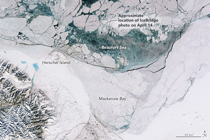
With springtime comes sunlight and warmth that advance the melting and breakup of Arctic sea ice. Varied patterns and textures appear across the icescape, and many are visible in this image, which was our Image of the Day on April 30. This satellite image includes the area photographed a day earlier by Operation IceBridge—the same photograph that sparked discussion on our blog and on news and social media about what might have caused the holes in the ice.
The holes were not a research focus of the mission; scientists were flying that day to measure the thickness of sea ice. Rather, as some scientists explain below, the holes were simply a sign of spring, and just one of the many interesting and photogenic sights seen from the aircraft in 10 years of research flights over the Arctic.
Nathan Kurtz, IceBridge project scientist
“The main purpose of these IceBridge flights is to measure the thickness of the sea ice. Ice thickness is an important factor which allows us to assess the health of the pack and its ability to survive the summer melt. It is also an important regulator in the exchange of energy and moisture between the ocean and the atmosphere.”
“While on the flights, I’ll stare out the windows for hours looking at the surface. The movement of the ice leads to huge variability over small scales, with many interesting scenes and patterns visible and a variety of color shades. But there’s only so much that can be discerned with human eyes. That is why we have the sensitive instrument suite on the plane: to map the intricacies of the ice cover which may otherwise be invisible to us and to quantify parameters for scientific interpretation.”
Chris Shuman, UMBC glaciologist based at NASA’s Goddard Space Flight Center
“Well back into March, satellites show a whole series of relatively clear images over Mackenzie Bay, indicating lots of sunshine coming in. The ‘holes’ in the sea ice are just a sign of spring, augmented by some particular process—‘submarine groundwater discharge,’ large mammals, algae growth, brine pockets draining, or something else entirely. Attributing any particular area of open water to a particular process is speculation. There is always a lot going on in the spring sea ice pack of the Beaufort Sea.”
John Sonntag, IceBridge mission scientist
“As scientists, we have the privilege of witnessing the beauty and mystery of the cryosphere firsthand, even as we work to collect that data. The Beaufort “ice circles” were among those. We have heard a number of plausible explanations for those fascinating features. In a more personal sense, I have been genuinely gratified to see the high level of interest from the public in the ice circles. The public’s clear enthusiasm for the puzzles of nature matches my own. It’s why I like my job!”
Remember the year 2000? Bill Clinton was president of the United States, Faith Hill and Santana topped Billboard music charts, and the world’s computers had just “survived” the Y2K bug. It also was the year that NASA’s Terra satellite began collecting images of Earth.
Eighteen years later, the versatile satellite — with five scientific sensors — is still operating. For all of that time, the satellite’s Moderate Resolution Imaging Spectroradiometer (MODIS) has been collecting daily data and imagery of the Arctic — and the rest of the planet, too.
If you knew where to look and were willing to wait patiently for file downloads, the images have always been available on specialized websites used by scientists. But there was no quick-and-easy way for the public to browse the imagery. With the recent addition of the full record of MODIS data into NASA’s Worldview browser, checking on what was happening anywhere in the world on any day since 2000 has gotten much easier.
Say you want to check on the weather in your hometown on the day you or your child was born. Just navigate to the date on Worldview, and make sure that the MODIS data layer is turned on. (In the image below, you can tell the Terra MODIS data layer is on because it is light gray.)
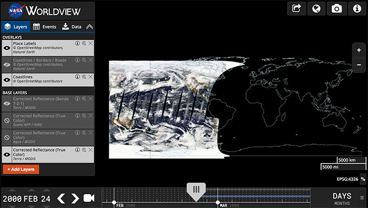
This Worldview screenshot shows the first day that Terra MODIS collected data — February 24, 2000. The very first Terra scene showed northern Argentina and Chile. Credit: EOSDIS.
One of the things I love about having all this MODIS data at my fingertips is that it makes it possible to see the passage of relatively long periods of time in just a few minutes. Look, for instance, at the animation at the top of this page, generated by Delft University of Technology ice scientist Stef Lhermitte using Worldview.
Lhermitte summoned every natural-color MODIS image of the Arctic that Terra and Aqua (which also has a MODIS instrument) have collected since April 2003. The result — a product of 71,000 satellite overpasses — is a remarkable six-minute time capsule of swirling clouds, bursts of wildfire smoke, the comings and goings of snow, and the ebb and flow of sea ice.
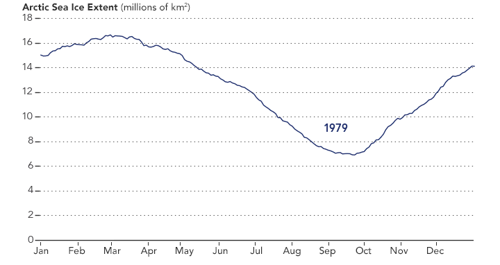
Though beautiful, Lhermitte’s animation also has a troubling side to it. If you look carefully, you can see the downward trend in sea ice extent. Look, for instance, at mid-August and September 2012 — the period when Arctic sea ice extent hit a record-low minimum of 3.4 million square miles. Between the heavy cloud cover, you will see lots of dark open water. Compare that to the same period in 2003, when the minimum extent was 6.2 million square miles. Scientists attribute the loss of sea ice to global warming.
NASA Earth Observatory chart by Joshua Stevens, using data from the National Snow and Ice Data Center.
Earth Matters had a conversation with Lhermitte to find why he made the clip and what stands out about it. MODIS images of notable events that Lhermitte mentioned are interspersed throughout the interview. All of the images come from the archives of NASA Earth Observatory, a website that was founded in 1999 in conjunction with the launch of Terra.
What prompted you to create this animation?
The extension of the MODIS record back to the beginning of the mission in the Worldview website triggered me to make the animation. As a remote sensing scientist, I often use Worldview to put things into context (e.g. for studying changes over ice sheets and glaciers). Previously, Worldview only had data until 2010.
What do you think are the most interesting events or patterns visible in the clip?
I think the strength of the video is that it contains so many of them, and it allows you to see them all in one video. The ones that are most striking to me are:
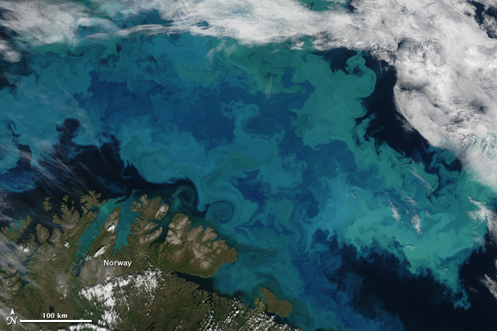
An Aqua MODIS image of a bloom in the Barents Sea on August 14, 2011. Image by Jeff Schmaltz, MODIS Rapid Response Team at NASA GSFC.
+ algal blooms in the Barents Sea
+ declining sea ice extent. You can see this both annually and over the longer term.
+ changing snow extent. You can see this each summer, especially over Canada and Siberia.
+ summer wildfire smoke in Canada (2004, 2005, 2009, 2014, 2017) and Russia (2006, 2011, 2012, 2013, 2014, 2016)
+ albedo reductions (reduction in brightness) over the Greenland Ice Sheet in 2010 and 2012 related to strong melt years.
+ overall eastward atmospheric circulation
+ the Grímsvötn ash plume (21 May 2011)
How did you make it? Was it difficult from a technical standpoint?
It was simple. I just downloaded the MODIS quicklook data from the Worldview archive using an automated script. Afterwards, I slightly modified the images for visualization purposes (e.g. overlaying country borders, clipping to a circular area). and stitched everything together in a video.
When you sit back and watch the whole video, how does it make you feel?
On the one hand, I am fascinated by the beauty and complexity of our planet. On the other hand, as a scientist, it makes me want to understand its processes even better. The video shows so many different processes at different scales, from natural processes (annual changes in snow cover and the Vatnajökull ash plume) to climate change related changes (e.g. the long term decrease in sea ice).
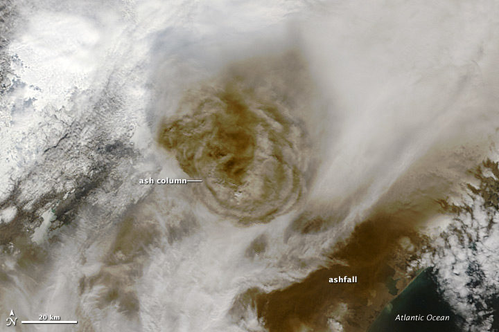
Terra MODIS image of the eruption of Grímsvötn Volcano in Iceland on May 22, 2011. NASA image by Jeff Schmaltz, MODIS Rapid Response Team.
There are some gaps during the winter where the extent of the sea ice abruptly changes. Can you explain why?
I used the standard reflectance products, which show the reflected sunlight. I decided to leave all dates out where part of the Arctic is without sunlight during satellite overpasses (approximately 10:30 a.m. and 1:30 p.m. local time). The missing data due to the polar night are very prominent if you compile the complete record including winter months, and I did not want it to distract the viewer from the more subtle changes in the video.
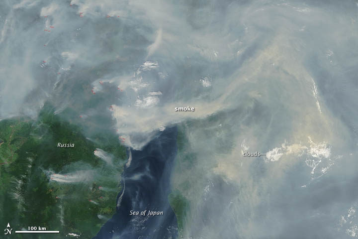
A Terra MODIS image of smoke and fires in Siberia on June 29, 2012. NASA image by Jeff Schmaltz, LANCE MODIS Rapid Response.
In the course of your day job as a scientist, do you use MODIS imagery? For what purpose?
Yes, as a polar remote sensing scientist, I tend to work with a range of satellite data sets. MODIS is a unique data product, given its global daily coverage and its long record. Besides the fact that I use MODIS frequently to monitor ice shelves and outlet glaciers, my colleagues and I use it to study snow and ice-albedo processes, snow cover in mountainous areas, vegetation recovery after wildfires, and ecosystem processes. One MODIS animation of ice calving from a glacier in Antarctica actually made it into the Washington Post recently.
In May 2017, NASA’s Operation IceBridge concluded its annual survey of Arctic ice. After 10 weeks, 39 research flights, and hundreds of terabytes of data collected, scientists have more information than ever to help them understand changes to the region’s sea- and land ice.
Notable this year were measurements of a crack growing across the ice shelf of Petermann Glacier. Also, the mission flew for the first time over the Eurasian half of the Arctic Basin.
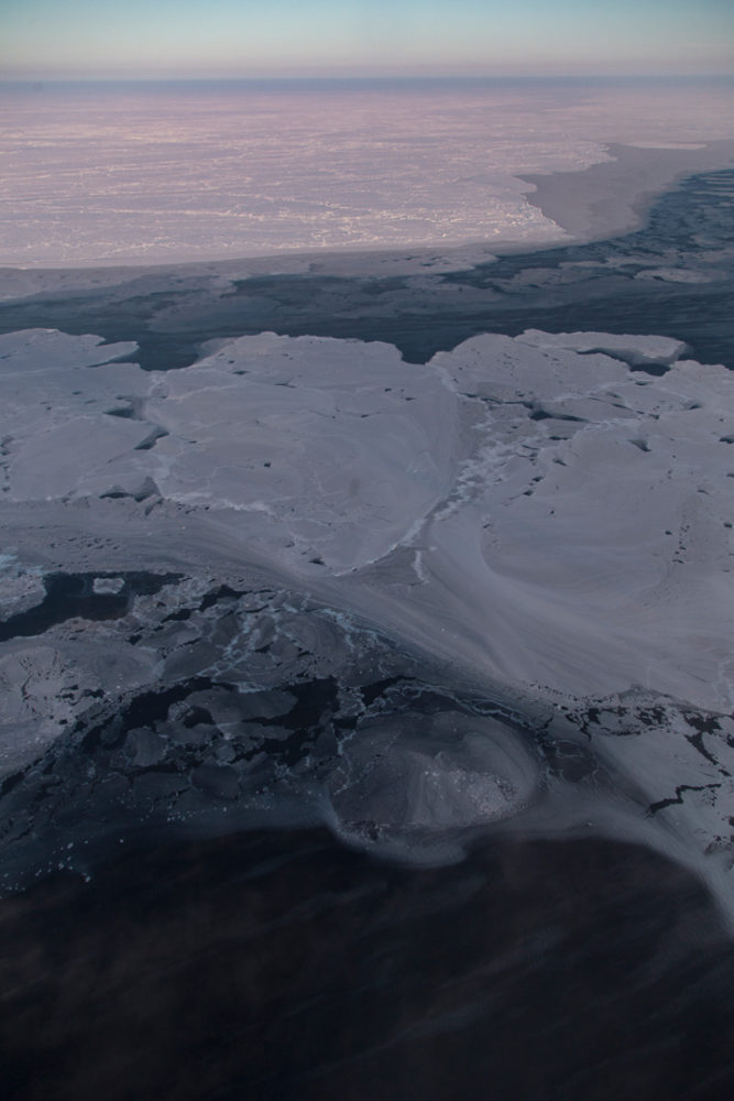
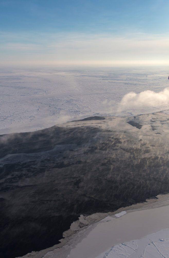
The research flight on April 3 explored glaciers in Greenland, before transiting to Longyearbyen, Norway, which would become the base of operations for the week. These images, snapped by NASA’s Jeremy Harbeck, show some of the highlights from that flight, featuring plenty of interesting glaciers, landforms, and even some wildlife.
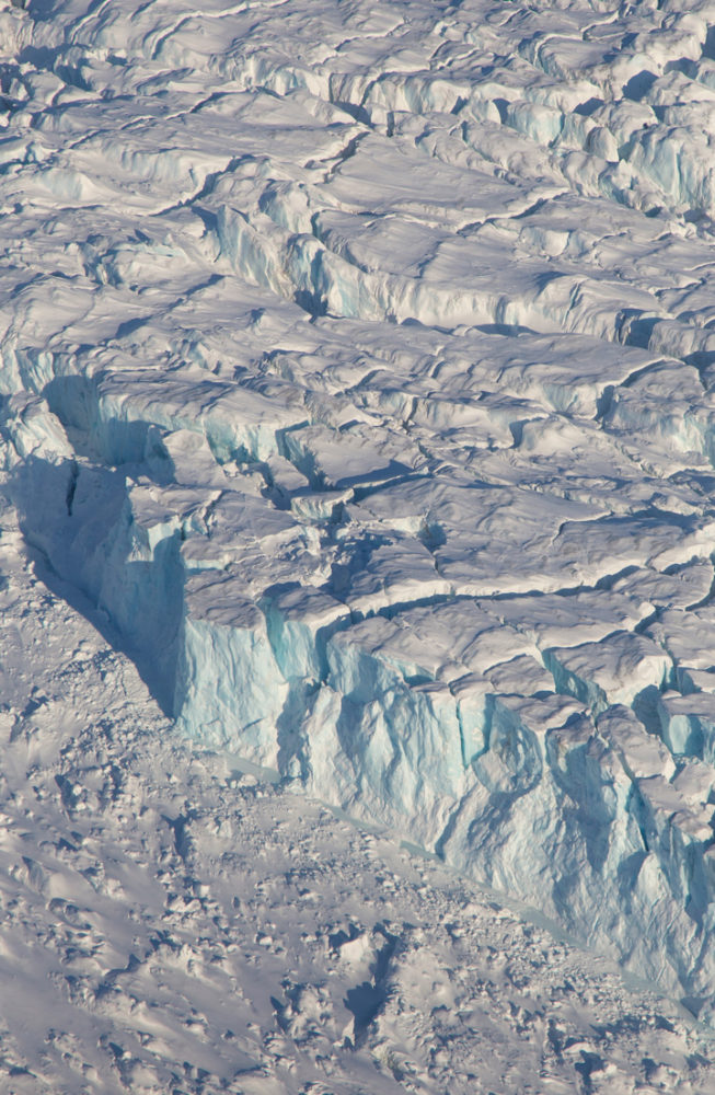
An iceberg near the calving front of Zachariah Glacier. Photo by Jeremy Harbeck.
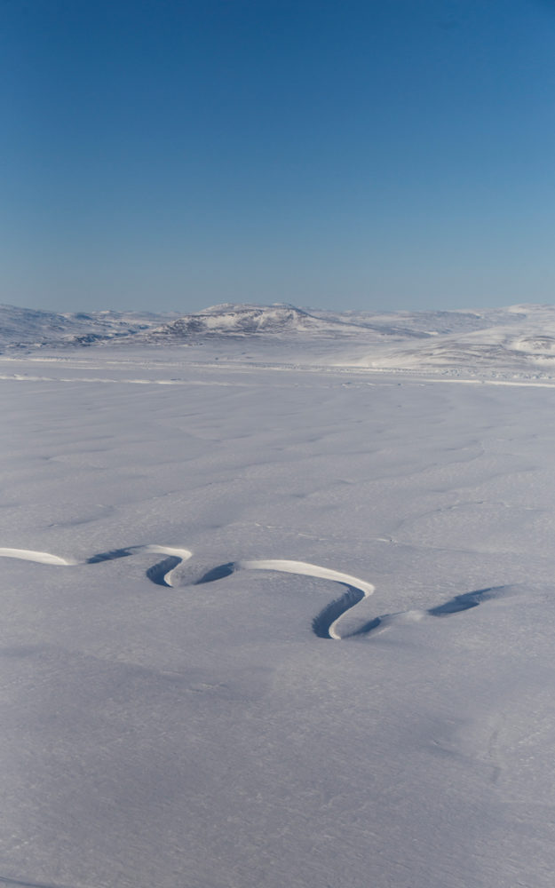
A sinuous meltwater channel on 79 North Glacier. Photo by Jeremy Harbeck.

A snowy, frozen landscape just north of 79 N Glacier. Photo by Jeremy Harbeck.
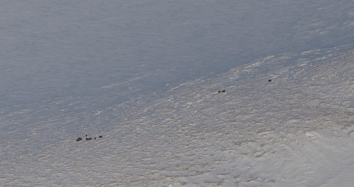
Musk ox from the P-3, between Zachariae and 79 N glaciers. Photo by Jeremy Harbeck.
On April 6, researchers flew from Svalbard and surveyed sea ice atop the eastern Arctic Ocean. Below are a few of Harbeck’s favorite photographs from that flight, highlighting the variability of sea ice.
Some very interesting nilas and grease ice patterns. Photo by Jeremy Harbeck.
The low sun angle highlights the moisture going into the atmosphere from this lead. Photo by Jeremy Harbeck.
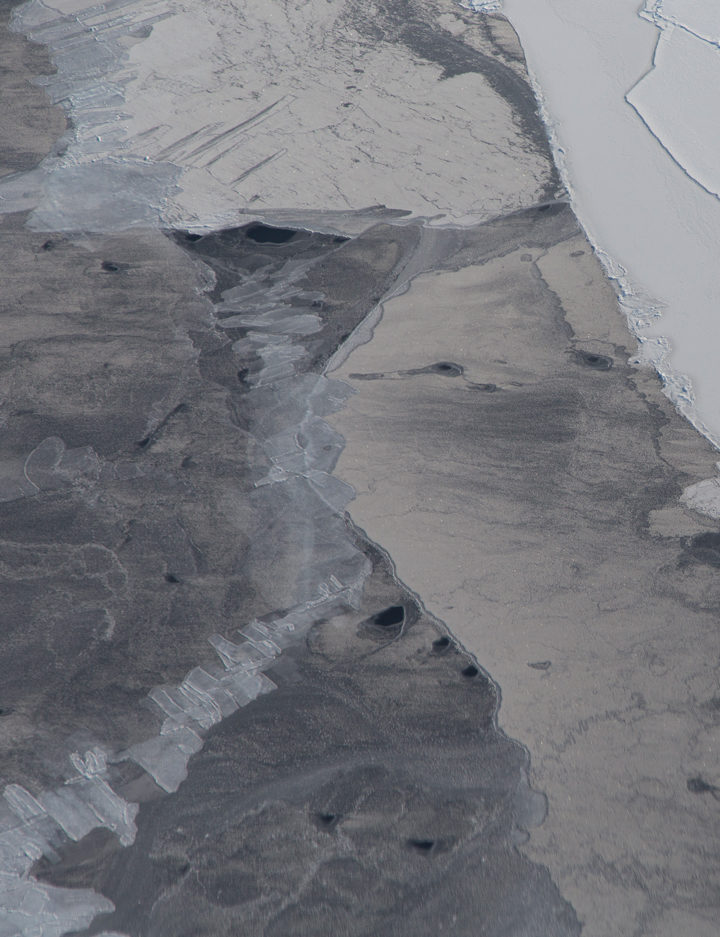
Some finger-rafted nilas along with some thicker snow-covered ice. Photo by Jeremy Harbeck.
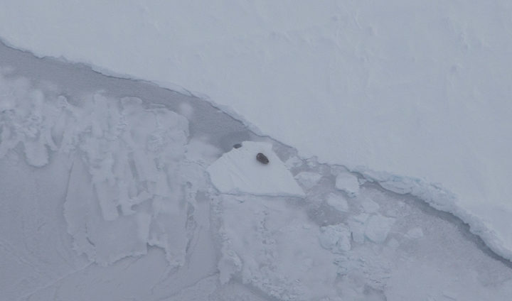
A seal on the sea ice, just northeast of Svalbard. Photo by Jeremy Harbeck.
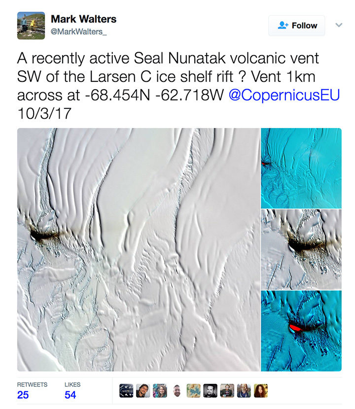
On April 4, 2017, archaeologist Mark Walters tweeted an intriguing set of satellite images of a dark smear on the Larsen C Ice Shelf. Was it volcanic ash from a recently active volcanic vent, he wondered?
The tweet — and especially a bright, red spot in an infrared image (lower right in the screenshot) — generated interest among folks who follow Earth science, Antarctica, and volcanoes. New volcanic activity in this area would be surprising and newsworthy. While there is some evidence of volcanic activity near this part of the Larsen Ice Shelf, the most recent reports date back to 1980.
Some remote sensing experts who saw the images were skeptical. “I looked through about four months of satellite images before/after and never saw anything that resembled a plume. Think it’s dust on ice,” tweeted Erik Klemetti, an associate professor at Denison University and author of Wired’s Eruptions blog.
Later, CNRS scientist Simon Gascoin weighed in, noting that the underlying geology in that area was sedimentary rock—a sign that volcanic activity wasn’t likely. Then he shared even stronger evidence against the idea of volcanic activity.
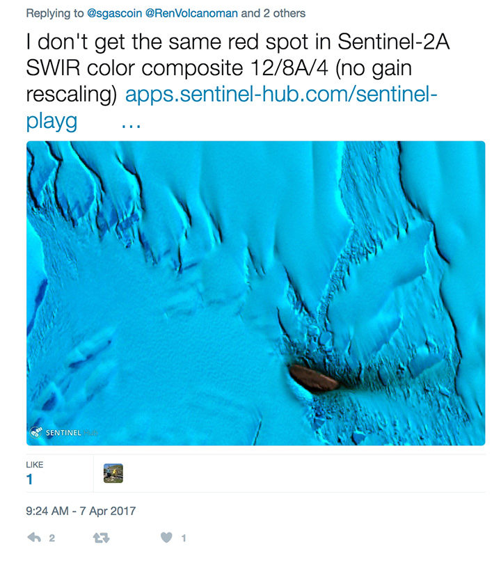
In an email, I asked Gascoin to clarify what he meant by “no gain rescaling” and why his image from the Sentinel Playground looked so different in comparison to the image from Land Viewer.
His reply: “Mark Walters used the Land Viewer, I just checked and found out that the ‘contrast stretching‘ is computed on each RGB band separately. Hence you can get strange results, especially in cases where a single rock island is surrounded by snow and ice which have a very distinct reflectance signature.”
In other words, Gascoin is saying that the image-processing algorithm that drives the Land Viewer browser amplified the reflectance signal from the dust in a way that made it appear stronger in the infrared than it actually was. Sentinel Playground uses a different image processing approach (adjusting the contrast of the image “bands” all at once rather than individually) to avoid the problem.
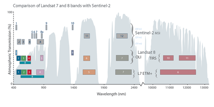
Satellite instruments carry many sensors that are each tuned to a narrow range, or “band,” of wavelengths (just red or green light, for instance). This chart shows how the bands of sensors on the Sentinel-2, Landsat 7, and Landsat 8 satellites compare. To make a satellite image, three different bands are represented in tones of red, green, or blue. A false-color image uses at least one non-visible wavelength, though that band is still represented in red, green, or blue. Read this story to learn more about how observations made in the infrared are displayed in false-color images.
Meanwhile, experts from the Smithsonian’s Global Volcanism Program had arrived at a similar conclusion. “It seems unlikely that this is an eruption for a few reasons,” emailed Benjamin Andrews. “First, Table Nunatak is formed of Cretaceous rocks, with no evidence of recent activity. Second, it is located pretty far from any other volcanoes, and there doesn’t appear to be a good tectonic explanation for current magmatism at Table Nunatak.”
So, the mystery appears to be solved. As interesting as it would have been, there is no new volcanic activity happening in this part of Larsen C.
