It has been a tough month on Earth. Good news has been scarce. But here’s at least one update ― from one million miles away ― to appreciate.
The Deep Space Climate Observatory (DSCOVR) satellite, which had been out of commission for about nine months due to a technical problem, is fully operational again, according to NOAA. Issues with the satellite’s attitude control system prompted engineers to put the satellite into a “safe hold” in June 2019, but they recently developed a software fix for the problem.
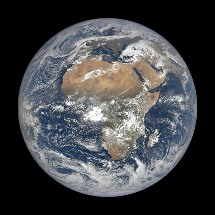
And that means that the satellite’s Earth Polychromatic Imaging Camera (EPIC) is once again taking beautiful full-disk images of our home several times each day. NASA’s EPIC instrument acquired the image of Africa and Europe (above) on March 19, 2020.
Head over to the science team page for EPIC and take a few moments to savor some imagery of our ever-changing planet. If Twitter is more your style, check out @DSCOVRDaily. Look carefully and you’ll see clouds and storm fronts coming and going, plumes of dust or smoke rising and fading, and whole continents greening and browning as the seasons change.
The EPIC view is a potent reminder of something that Frank White, author of The Overview Effect, said recently on a NASA podcast. (The book explores how seeing Earth from space causes many astronauts to dramatically change their outlook on our planet and life itself.)
“[One of the] conclusions they draw is that we are really all in this together,” he said. “Our fate is bound up with people that we may think are really different from [us]. We may have different religions, we may have different politics. But ultimately, we are connected. Totally connected.”
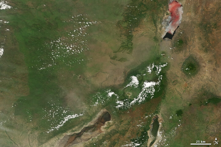
As satellites track Australian wildfire smoke from above, GLOBE Observer citizen scientists have been keeping tabs on hazy skies from the ground.
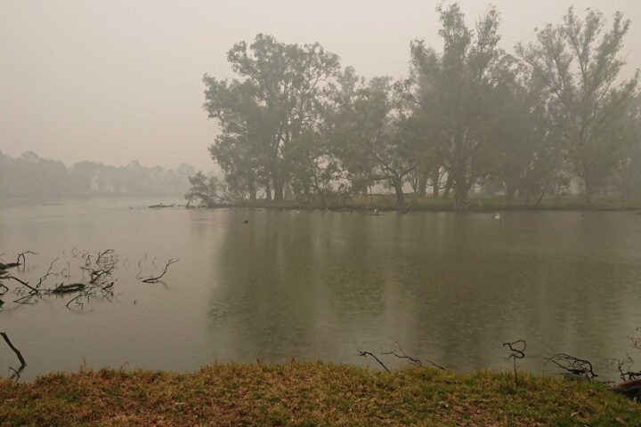
The photograph above shows smoke blanketing Horseshoe Lagoon in New South Wales on January 6, 2020, a day when clouds limited what sensors on Terra, Aqua, and Suomi NPP could observe as they passed over.
The video below, based on photographs taken by GLOBE citizen scientist Glenn Evans, juxtaposes satellite images and photographs taken of the sky at roughly the same place and time. The contrasting perspectives underscore how easy it can be to miss the forest for the trees — or, rather, the smoke plume for the clouds — if you aren’t careful. Kristen Weaver, the deputy coordinator for GLOBE Observer, compiled the photos and matched them with the corresponding MODIS satellite images.
Victoria and New South Wales are in the midst of one of the most severe fire seasons either state has seen in decades. After months of unusually hot, dry weather, hundreds of fires have charred an area larger than West Virginia, destroying thousands of homes and resulting in dozens of deaths.
GLOBE Observer is a citizen science project that is part of the Global Learning and Observations to Benefit the Environment (GLOBE) Program. Through a free app for their mobile device, anyone in participating countries can make environmental observations of clouds, trees, land cover, and mosquito habitats that complement NASA satellite observations.
More than 20 years ago, NASA scientist Ralph Kahn authored a column for the Los Angeles Times anticipating the launch of a new satellite — and ultimately a whole fleet of satellites — that would study Earth.
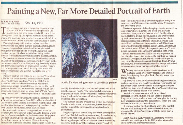
“We want a picture of Earth that is more specific about what is happening to the climate, which after all is what makes the planet habitable,” he wrote. And that picture needed to be rich with detail. “Precisely where are deserts encroaching on grasslands? In what regions is it raining more than usual? Exactly how much are glaciers shrinking, and at what rate is the sea level rising?” he asked.
The first satellite, Terra (originally named EOS-AM), roared into space on December 18, 1999, began collecting data in February and March 2000, and collected its first complete day of MODIS data on April 19, 2000.
“About every seven weeks, the satellite archives will receive as much data from EOS-AM as are held in all the volumes of the Library of Congress. And the EOS-AM satellite alone is supposed to keep pouring numbers down from the sky, relentlessly, for at least six years,” Kahn wrote.
Amazingly, all those numbers from Terra continue to pour down 20 years later. Over time, the flood of data from Terra and several other satellites has turned into scientific discoveries. Bit by bit, the questions Kahn initially posed in his column have been answered.
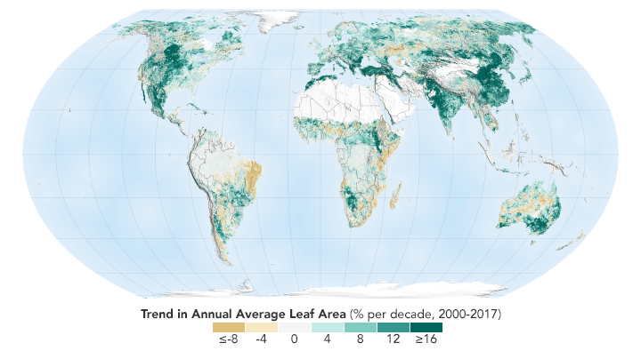
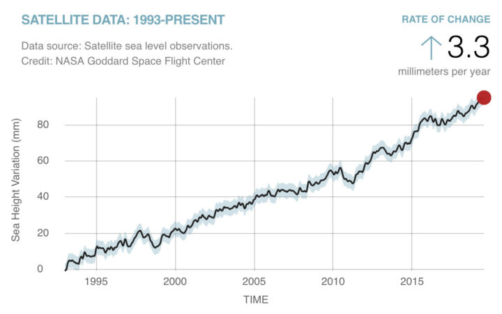
We can say now that sea level is rising at 3.3 millimeters (.13 inches) per year. We can show you a map of where exactly green vegetation has become more common and where it has faded. We can point you to a long-term dataset that will show you precisely where rain has fallen over the past two decades. And we can give you a tour of the world’s glaciers that shows you where they are and many examples of where they are shrinking.
The question to grapple with now: what do we with all this information?
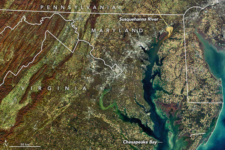
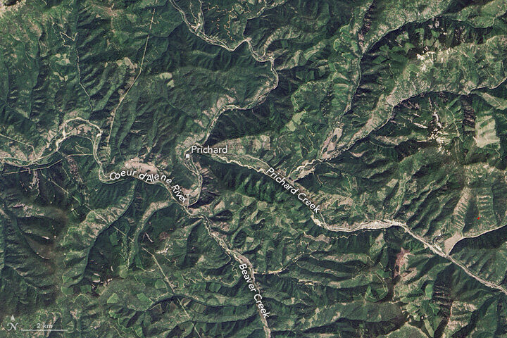
In November 2019, we highlighted this Landsat 8 image showing a glut of sediment flowing down the Susquehanna River into Chesapeake Bay. It was a striking, timely image, but one of the realities of publishing new content every day is that sometimes good information comes in after a deadline has passed.
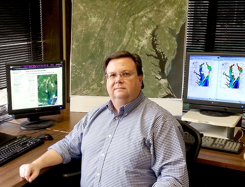
In this case, Mark Trice, a water quality expert with the Maryland Department of Natural Resources, pointed out a few things about Susquehanna sediment after our story was out that seem worth passing on.
Among them: a link to a recent report that synthesizes and summarizes what scientists have learned about the ecological effects of high sediment flows on the Susquehanna River and the role of the Conowingo Dam. While the dam trapped most sediment and associated nutrient pollution (nitrogen and phosphorus) when it was first built, enough material has piled up behind the dam now that significant amounts of sediment and nutrients now flow past it during storms. A University of Maryland press release summarized the findings this way:
Most sediment and particulate nutrient impacts to the Bay occur during high-flow events, such as during major storms, which occur less than 10 percent of the time. Loads delivered to the upper Chesapeake Bay during low flows have decreased since the late 1970s, while loads during large storm events have increased. Most of these materials are retained within the upper Bay but some can be transported to the mid-Bay during major storm events, where their nutrients could become bioavailable.
The potential impact of reservoir sediments to Bay water quality are limited due to the low reactivity of scoured material, which decreases the impact of total nutrient loading even in extreme storms. Most of this material would deposit in the low salinity waters of the upper Bay, where rates of nitrogen and phosphorus release from sediments into the water are low.
“While storm events can have major short-term impacts, the Bay is actually really resilient, which is remarkable,” said the study’s lead author Cindy Palinkas, associate professor at the University of Maryland Center for Environmental Science. “If we are doing all of the right things, it can handle the occasional big input of sediment.”
Trice’s colleagues at the Maryland Department of Natural Resources (DNR) underscored the Bay’s resiliency to sediment as well when I asked about the recent event. “Although these high flow events routinely occur, the Bay is resilient and continues to show improvement due to the commitment by the Bay watershed partners to have all pollution reduction strategies implemented by 2025 to have a healthy Chesapeake Bay,” said Bruce Michael of Maryland DNR.
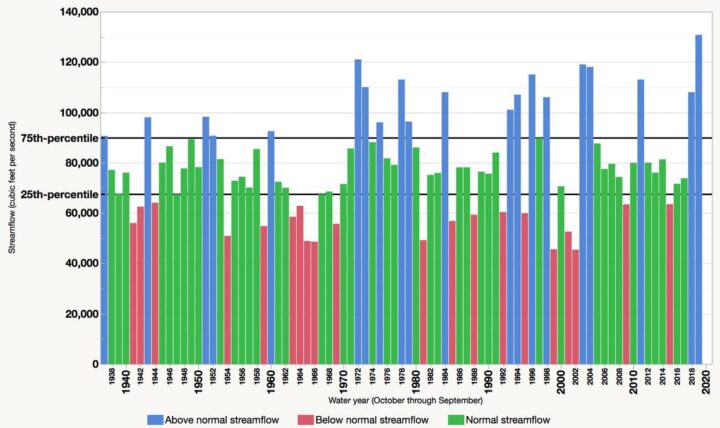
Also worth mentioning: the 2019 water year (October 1, 2018, to September 30, 2019) brought a record-breaking flow of freshwater into the Bay, Trice noted. “The annual average freshwater flow into the Chesapeake Bay during water year 2019 was 130,750 cubic feet per second, which is the highest annual amount since 1937, the first year for which data are available,” the U.S Geological Survey said.
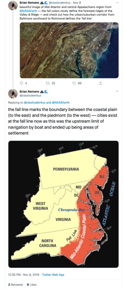
Finally, thank you to Virginia Tech geology professor Brian Romans (@clasticdetritus) for pointing out something about the image that is unrelated to sediment but fascinating: the line of cities and suburbs running from Baltimore, Md., to Richmond, Va., marks the boundary between two key geologic zones: the flat Coastal Plain to the east and the more rugged Piedmont to the west. Interestingly, many cities are located along this “fall line” because rapids prevented boats from traveling any farther upstream when they were first settled.
The UK’s Antarctic Place-names Committee has agreed that seven ice features in western Antarctica should be named for Earth-observation satellites. One of them is Landsat Ice Steam.
The new designations were announced on June 7, 2019. The ice features are all located in Western Palmer Land on the southern Antarctic Peninsula.
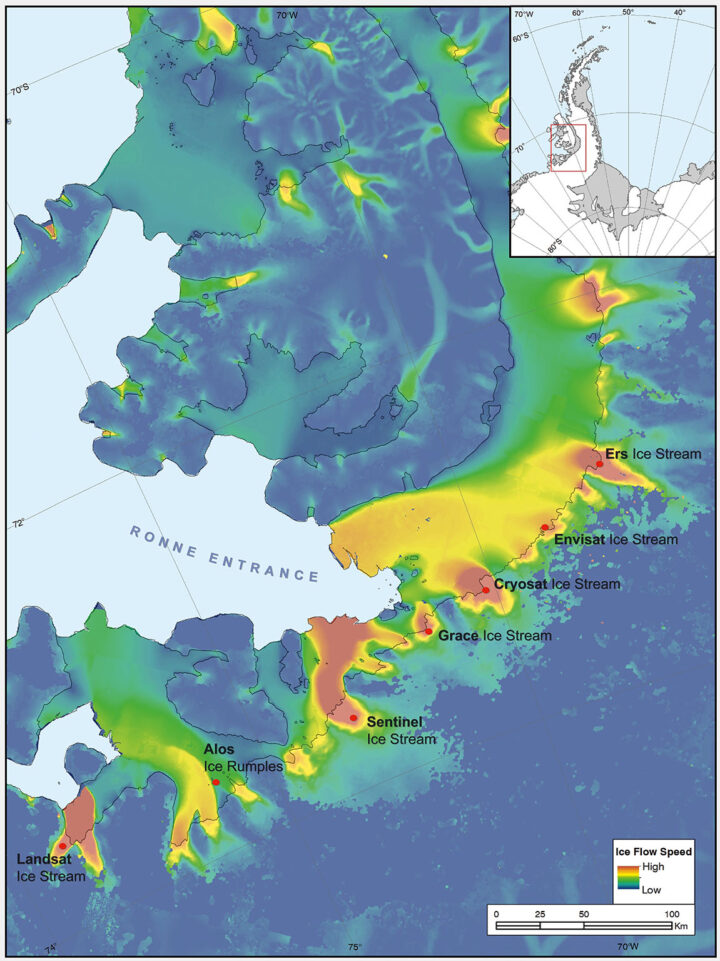
The seven features ring George VI Sound like pearls on a necklace. The new names, as officially entered into the British Antarctic Territory Gazetteer, are (from west to east): Landsat Ice Steam, ALOS Ice Rumples, Sentinel Ice Stream, GRACE Ice Stream, Envisat Ice Stream, Cryosat Ice Stream, and ERS Ice Stream.
The UK has submitted the new names for the fast-moving ice features to Scientific Committee on Antarctic Research (SCAR), which maintains a gazetteer or registry, of names officially adopted by individual nations. Under the Antarctic Treaty, signatory nations confer on geographic feature names, but each nation’s naming authority formally adopts new names. The U.S. Board on Geographic Names will meet in July and may discuss at that meeting whether the names adopted by the UK also will be adopted by the US. The question of using the term “glacier” for the ice features instead of “ice stream” is also part of each nation’s naming decision.
The new names were proposed by Anna Hogg, a glaciologist with the Center for Polar Observation and Modelling at the University of Leeds. In research published in 2017, Hogg found that glaciers draining from the Antarctic Peninsula were accelerating, thinning, and retreating, with implications for global sea level rise. The fast-moving glaciers that Hogg and colleagues tracked with radar and optical satellite imagery were unnamed. In her paper, the glaciers had to be designated by latitude and longitude.
Satellites had enabled Hogg and her team to clock the speed of these nameless ice features—some with rates faster than 1.5 meters/day. In tribute to the spaceborne instruments, Hogg came up with a way to describe the fast-moving ice features more succinctly—name them after the satellites that had helped her understand their behavior.
Hogg proposed to the U.K.’s Antarctic Place-names Committee that the features should be named for Landsat, Sentinel, ALOS PALSAR, ERS, GRACE, CryoSat, and Envisat. She was notified in early June that the committee had agreed to adopt the names, which provide a way to recognize international collaboration, as fifteen space agencies currently collaborate on Antarctic data collection.
“Satellites are the heroes in my science of glaciology,” Hogg told the BBC. “They’ve totally revolutionized our understanding, and I thought it would be brilliant to commemorate them in this way.”
Naming the glaciers after satellites is also a celebration of data fusion. “Our understanding of ice velocities and ice sheet mass balance has come from putting many different remote sensing data sets together—optical, radar, gravity, and laser altimetry,” said Jeff Masek, the NASA Landsat 9 Project Scientist. “Landsat has been a key piece in assembling that larger puzzle. Naming an ice stream after Landsat is a fitting way to recognize the value of long-term Earth Observation data for measuring changes in Earth’ polar regions.”
Read more from NASA’s Landsat science and outreach team, including the history of Antarctic observation with Landsat. Read more about all of the glaciers and their namesake satellites, as told by the European Space Agency. And read about the island discovered by and named for Landsat, and the woman who discovered it.
Correction, June 27, 2019: SCAR’s role in the Antarctic naming process was incorrectly described in the earlier version of this article. Updates were provided by Dr. Scott Borg, Deputy Assistant Director of the National Science Foundation’s Directorate for Geosciences, and Peter West, the Outreach Program managers for NSF’s Office of Polar Programs, to correctly describe the naming process.
If you follow science news, this will probably sound familiar.
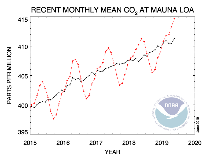
In May 2019, when atmospheric carbon dioxide reached its yearly peak, it set a record. The May average concentration of the greenhouse gas was 414.7 parts per million (ppm), as observed at NOAA’s Mauna Loa Atmospheric Baseline Observatory in Hawaii. That was the highest seasonal peak in 61 years, and the seventh consecutive year with a steep increase, according to NOAA and the Scripps Institution of Oceanography.
The Mauna Loa Observatory has been measuring carbon dioxide since 1958. The remote location (high on a volcano) and scarce vegetation make it a good place to monitor carbon dioxide because it does not have much interference from local sources of the gas. (There are occasional volcanic emissions, but scientists can easily monitor and filter them out.) Mauna Loa is part of a globally distributed network of air sampling sites that measure how much carbon dioxide is in the atmosphere.
The broad consensus among climate scientists is that increasing concentrations of carbon dioxide in the atmosphere are causing temperatures to warm, sea levels to rise, oceans to grow more acidic, and rainstorms, droughts, floods and fires to become more severe. Here are six less widely known but interesting things to know about carbon dioxide.
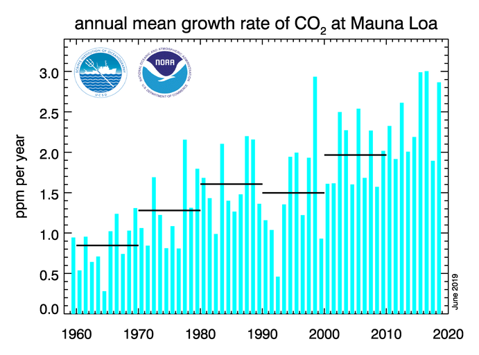
For decades, carbon dioxide concentrations have been increasing every year. In the 1960s, Mauna Loa saw annual increases around 0.8 ppm per year. By the 1980s and 1990s, the growth rate was up to 1.5 ppm year. Now it is above 2 ppm per year. There is “abundant and conclusive evidence” that the acceleration is caused by increased emissions, according to Pieter Tans, senior scientist with NOAA’s Global Monitoring Division.
To understand carbon dioxide variations prior to 1958, scientists rely on ice cores. Researchers have drilled deep into icepack in Antarctica and Greenland and taken samples of ice that are thousands of years old. That old ice contains trapped air bubbles that make it possible for scientists to reconstruct past carbon dioxide levels. The video below, produced by NOAA, illustrates this data set in beautiful detail. Notice how the variations and seasonal “noise” in the observations at short time scales fade away as you look at longer time scales.
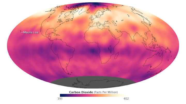
Satellite observations show carbon dioxide in the air can be somewhat patchy, with high concentrations in some places and lower concentrations in others. For instance, the map below shows carbon dioxide levels for May 2013 in the mid-troposphere, the part of the atmosphere where most weather occurs. At the time there was more carbon dioxide in the northern hemisphere because crops, grasses, and trees hadn’t greened up yet and absorbed some of the gas. The transport and distribution of CO2 throughout the atmosphere is controlled by the jet stream, large weather systems, and other large-scale atmospheric circulations. This patchiness has raised interesting questions about how carbon dioxide is transported from one part of the atmosphere to another—both horizontally and vertically.
In this animation from NASA’s Scientific Visualization Studio, big plumes of carbon dioxide stream from cities in North America, Asia, and Europe. They also rise from areas with active crop fires or wildfires. Yet these plumes quickly get mixed as they rise and encounter high-altitude winds. In the visualization, reds and yellows show regions of higher than average CO2, while blues show regions lower than average. The pulsing of the data is caused by the day/night cycle of plant photosynthesis at the ground. This view highlights carbon dioxide emissions from crop fires in South America and Africa. The carbon dioxide can be transported over long distances, but notice how mountains can block the flow of the gas.
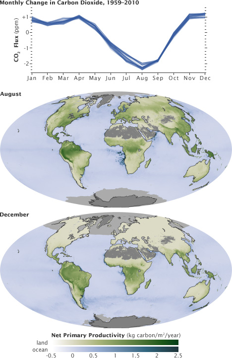
You’ll notice that there is a distinct sawtooth pattern in charts that show how carbon dioxide is changing over time. There are peaks and dips in carbon dioxide caused by seasonal changes in vegetation. Plants, trees, and crops absorb carbon dioxide, so seasons with more vegetation have lower levels of the gas. Carbon dioxide concentrations typically peak in April and May because decomposing leaves in forests in the Northern Hemisphere (particularly Canada and Russia) have been adding carbon dioxide to the air all winter, while new leaves have not yet sprouted and absorbed much of the gas. In the chart and maps below, the ebb and flow of the carbon cycle is visible by comparing the monthly changes in carbon dioxide with the globe’s net primary productivity, a measure of how much carbon dioxide vegetation consume during photosynthesis minus the amount they release during respiration. Notice that carbon dioxide dips in Northern Hemisphere summer.
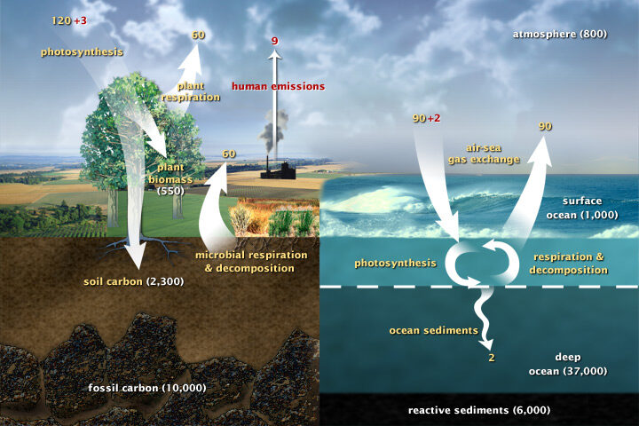
Most of Earth’s carbon—about 65,500 billion metric tons—is stored in rocks. The rest resides in the ocean, atmosphere, plants, soil, and fossil fuels. Carbon flows between each reservoir in the carbon cycle, which has slow and fast components. Any change in the cycle that shifts carbon out of one reservoir puts more carbon into other reservoirs. Any changes that put more carbon gases into the atmosphere result in warmer air temperatures. That’s why burning fossil fuels or wildfires are not the only factors determining what happens with atmospheric carbon dioxide. Things like the activity of phytoplankton, the health of the world’s forests, and the ways we change the landscapes through farming or building can play critical roles as well. Read more about the carbon cycle here.
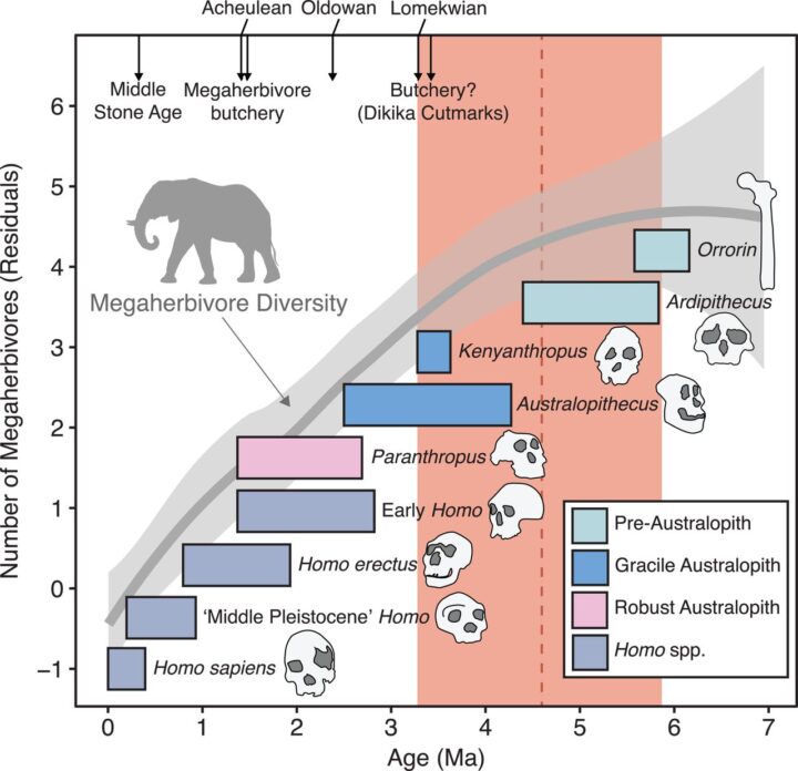
Seven million years ago, some truly spectacular creatures roamed the woodlands of East Africa. There was a moose-like giraffe called Shiva’s beast. There were giant buffalo with horns wider than the animals were tall. And the lumbering creatures known as anthracotheres defy easy categorization.
“Whenever I ask colleagues who study anthracotheres how they describe them, they always say: hippo-pig,” laughed Tyler Faith, curator of archaeology at the Natural History Museum of Utah. As for the buffalo: “This was a horn span of 3 meters (10 feet). I mean this was an awesome buffalo.”
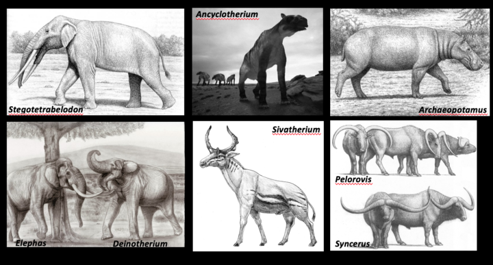
These and several dozen variations of more recognizable African megaherbivores — elephants, rhinos, hippos, and giraffes — all went extinct within the past several million years. For decades, archaeologists have pinned the blame on early humans, particularly Homo erectus, a species that emerged 2 million years ago, walked upright, and had a body plan similar to modern humans. Since Homo erectus made stone weapons and was capable of butchering large game, many archaeologists assumed that it hunted Africa’s megaherbivores into extinction — much like the fossil record suggests Homo sapiens (modern humans) did to the large mammals of North and South America some 11,000 years ago.
But nobody rigorously tested whether this “overkill hypothesis” fit with the fossil record. “Speculation had been repeated often enough that it just graduated into fact; it became the truth,” Tyler explained during a recent colloquium at NASA’s Goddard Space Flight Center. To check more rigorously, Tyler and colleagues analyzed fossil assemblages from 101 sites in Eastern Africa.
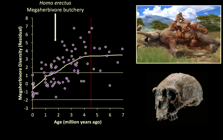
What they found was a surprise. Megaherbivores began disappearing about 4.6 million years ago — long before Homo erectus came on the scene (1.8 million years ago). And there was no increase in the rate of extinctions even when Homo erectus and butchering showed up in fossil records.
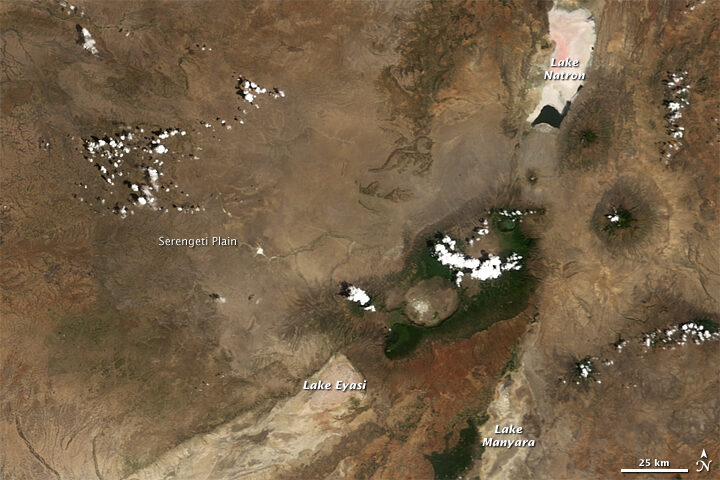
However, when the researchers looked at some key indicators of past environmental conditions, they found one key change — the expansion of grasslands — lined up with the extinctions almost perfectly. Five million years ago, classic open grasslands like today’s Serengeti Plain did not exist in East Africa. Trees and shrubs were a much more dominant part of that African landscape then, explained Tyler.
But as carbon dioxide levels declined, mainly due to orbital variations and changes in the amount of Earth covered by ice, forests retreated and grasslands became dominant. Since many of the megaherbivores fed mainly on woody vegetation, they likely faded away along with their food sources. Meanwhile, other familiar species thrived. The ancestors of wildebeest, hartebeests, Thompson gazelles, oryx, plains zebras, and warthogs — all grazers that live in open habitats — proliferated.
Faith’s bottom line is that it is time to stop blaming Homo erectus for something they didn’t do. “In the search for ancient hominid impacts on ancient African ecosystems, we must focus our attention on the one species known to be capable of causing them – us, Homo sapiens, over the past 300,000 years,” he said.
In the early 19th century, Meriwether Lewis and William Clark led an ambitious expedition across the western United States. They greatly expanded our knowledge of the country’s geography and biological diversity through their specimen collection, mapping of the landscape, and detailed journal entries.
This year NASA and the National Park Service are encouraging the public to follow in the footsteps of Lewis and Clark through a new citizen science challenge. From June 1 to September 2, citizens are invited to use their smart phones and the NASA GLOBE Observer app to map land cover along the Lewis and Clark National Historic Trail to assist scientists studying environmental changes.
Land cover–such as grass, pavement, or trees–influences the water and energy cycles and influences a community’s vulnerability to natural disasters. NASA studies land cover changes from space as part of its mission to better understand our planet and improve lives.
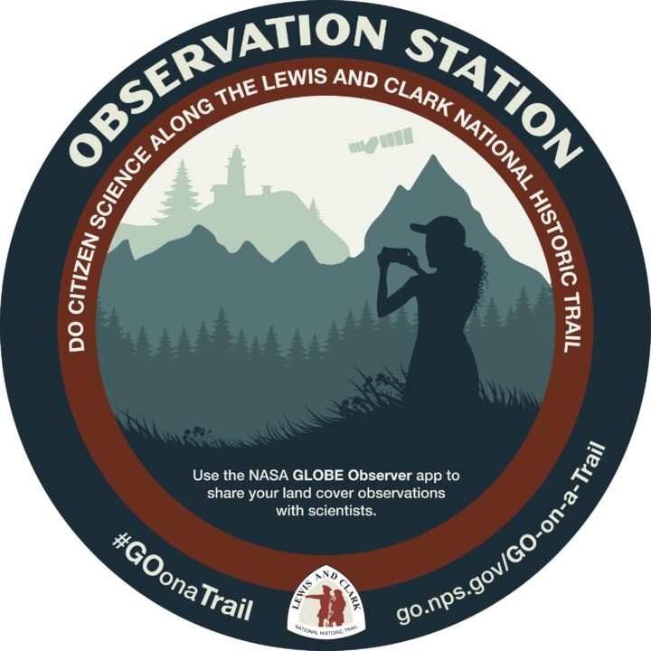
To participate in the “GO on a Trail” challenge, download the free GLOBE Observer app from the Apple App Store or Google Play. Use the Land Cover tool to make observations of the landscape. Any observation made along the 5,000-mile-long Lewis & Clark trail from Pittsburgh to the mouth of the Columbia River earns points. The top participants will receive recognition and GO on a Trail commemorative material.
A good place to get started is at an observation station marked with a large sticker (image above) at Lewis and Clark visitor centers and museums. To navigate to sites of interest along the trail, the Lewis and Clark National Historic Trail and GLOBE Observer teams have provided an online map.
“We hope that by becoming involved with this project, people will care about the trail and become its stewards,” said Dan Wiley, chief of integrated resource stewardship for the Lewis and Clark National Historic Trail. Wiley notes that the challenge will both spark a general interest in science and show the public how it can be involved in collecting vital information for decision makers.
GLOBE Observer is an app-based citizen science program active in more than 120 countries. The program invites citizens to contribute land cover, cloud, mosquito, and tree height observations to NASA and the science community. NASA-funded scientists are eager to see citizen science observations of land cover along this trail because of its wide range of ecological regions. Data collected during the challenge could help improve satellite-based mapping of land cover across the continent.
“We are observing and monitoring our changing home planet from space to better understand how it is changing and what are the main drivers of change,” said Eric Brown de Colstoun, a scientist at NASA Goddard Space Flight Center. “The view from the ground provided by the challenge participants is one component that helps us verify the space-based data.”
Even if you are not able to visit the Lewis and Clark Trail this summer, you can still join the GO on a Trail challenge from any of the more than 120 countries where GLOBE Observer is active. Just get outdoors and map the land cover around you. The top participants from beyond the trail will also receive recognition and commemorative material.
“Lewis and Clark and their team were exploring a totally new environment to them,” said Brown de Colstoun. “We invite you to get out and explore, and document the places you know and care about. Go on a trail and do science along with us.”
NASA GLOBE Observer and Lewis and Clark National Historic Trail will provide regular updates about the GO on a Trail challenge via social media throughout the summer with the hashtag #GOonaTrail. Follow GLOBE Observer on Facebook @nasa.globeobserver or Twitter @NASAGO. Follow the Lewis and Clark National Historic Trail on Facebook @lewisandclarknht, Twitter @lewisclarktrail, and Instagram @lewisandclarknht or visit the website at: https://www.nps.gov/lecl/index.htm.
On April 29, 1999, NASA Earth Observatory (EO) started delivering science stories and imagery to the public through the Internet. So much has changed in those 20 years…
+ In 1999, about 3 to 5 percent of the world had Internet access. About 41 percent of American adults used the World Wide Web, most often to look at the weather. Today an estimated 56 percent of the world’s population (4.3 billion people) are active on the Internet.
+ At the end of the 20th century, all EO readers came to us through a computer, mostly desktops. One third of them were connecting via dial-up modem. Today, about 40 percent of our audience arrives to the web site via mobile phones and tablets on public wifi and cellular networks. Yet even now, 65,000 of our most loyal followers subscribe to our newsletters. Many others subscribe to our RSS feeds.
+ In 1999, “social” media mostly consisted of chatrooms and newsgroups. Even by 2005, only 5 percent of Americans were using social media. Today about 69 percent of adults use social media, and people are just as likely to see Earth Observatory content on social platforms as on our web site. Ten million people follow EO and NASA Earth science on Facebook, with 1.3 million more on Twitter, and 500,000 on Instagram.
+ When EO launched, images from Earth science satellites were generally available about a month after acquisition. Public access to science data and imagery was extremely limited, highly filtered, and sometimes required a fee. Two decades later, many NASA Earth science observations are available freely on the web within hours of acquisition.
+ On our first day online, the site got 400 pageviews–most of them were likely colleagues and relatives. Today we get about 50,000 views per day.
+ In our first year, we published 35 “Images of the Week” and 9 feature stories. By 2001, we started delivering an Image of the Day. Since launch, we have published more than 6,900 Images of the Day, 8,300 natural hazards images, and 450 features and videos. Yes, more than 15,000 image-driven stories, and all of them are still available in our archive.
+ In 1999, two members of our staff were in elementary school and three were in high school. The readers of EO Kids were not born yet.
The technology of science and the Internet has changed in a generation, and our site has evolved and grown with the changes. But our core values have not changed. You find us on more platforms and with some new approaches, but you can still count on us to deliver beautiful, newsworthy, interesting, and scientifically important images and stories. Our editorial team has more than 110 years of experience in science communication and data visualization, and we bring that depth of knowledge to every story, 365 days a year.
None of this would be possible without the many scientists, engineers, communicators, data hounds, patrons, and friends inside and outside of NASA who review our work, tip us off to stories and images, share their scientific insights, and inspire and challenge us. Thank you.
As we celebrate our 20th year, we are going to share some looks back and some looks ahead. In the next twelve months, look for…
If you have been with us for many (or all) of our 20 years, thank you. We have some of the most engaged, challenging, and thoughtful readers on the planet, and we work hard to live up to your trust and interest. If you are new to the site, bring a friend. We have 15,000 stories about Earth to share, with more being added every day.
Related Links and References
Earth Observatory 10th Anniversary
Pew Research Center (2018) World Wide Web Timeline
Internet World Stats (2019) Internet Growth Statistics
Wikipedia (2019) Global Internet Usage
For Earth Day 2019, NASA invites you to celebrate the planet we call home with our #PictureEarth social media event.
NASA studies Earth as part of its mission. Our satellites and instruments #PictureEarth daily. Some take visible light photos, much like your camera. Others peer into the infrared, microwave, ultraviolet, or radio spectrums, which human eyes cannot see. Each satellite image or data set reveals a small detail of the land, water, atmosphere, and life on Earth.
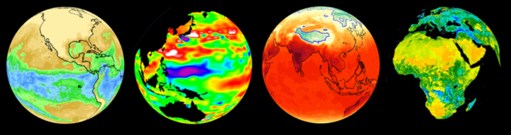
How do you #PictureEarth?
Show NASA how you see your planet by posting photos on social media. Focus on the details around you with close-up images.
What makes your location special?
What are the textures, colors, or patterns in your surroundings?
Look for Earth’s dynamism, motion, and beauty: blooming flowers, crashing waves, sturdy trees, furry and feathered animals, molten lava, puffy clouds, smooth ice, and warm sunlight.
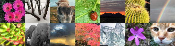
Share your best Earth photo!
On Earth Day — April 22, 2019 — share your best photos of Earth on social media with the hashtag #PictureEarth. Be sure to tell us where your photo was taken. We love to read posts from around the world because NASA Earth data is available to everyone – we all live on this planet together.
We’ll be watching on Instagram, Twitter, and our Facebook event page for your images and messages. As with our previous Earth Day events, we’ll select some of the publicly-shared photos to showcase in videos and composite images featuring your beautiful imagery.
Then download the NASA Earth photo book
To see how we #PictureEarth from space, download the new Earth photo book or read it online: https://earthobservatory.nasa.gov/features/earth-book-2019
