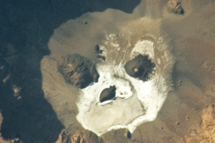
Update on October 31, 2023: This puzzler image shows Trou au Natron, a deep caldera and soda lake in northern Chad. Congratulations to Warren Hansen for being the first to correctly identify the feature and its location. Read more about the image in our Image of the Day story.
Every month on Earth Matters, we offer a puzzling satellite image. The October 2023 puzzler is shown above. Your challenge is to use the comments section to tell us where it is, what we are looking at, and why it is interesting.
How to answer. You can use a few words or several paragraphs. You might simply tell us the location, or you can dig deeper and offer details about what satellite and instrument produced the image, what spectral bands were used to create it, or what is compelling about some obscure feature. If you think something is interesting or noteworthy, tell us about it.
The prize. We cannot offer prize money or a trip on the International Space Station, but we can promise you credit and glory. Well, maybe just credit. Within a week after a puzzler image appears on this blog, we will post an annotated and captioned version as our Image of the Day. After we post the answer, we will acknowledge the first person to correctly identify the image at the bottom of this blog post. We also may recognize readers who offer the most interesting tidbits of information. Please include your preferred name or alias with your comment. If you work for or attend an institution that you would like to recognize, please mention that as well.
Recent winners. If you have won the puzzler in the past few months, or if you work in geospatial imaging, please hold your answer for at least a day to give less experienced readers a chance.
Releasing comments. Savvy readers have solved some puzzlers after a few minutes. To give more people a chance, we may wait 24 to 48 hours before posting comments. Good luck!
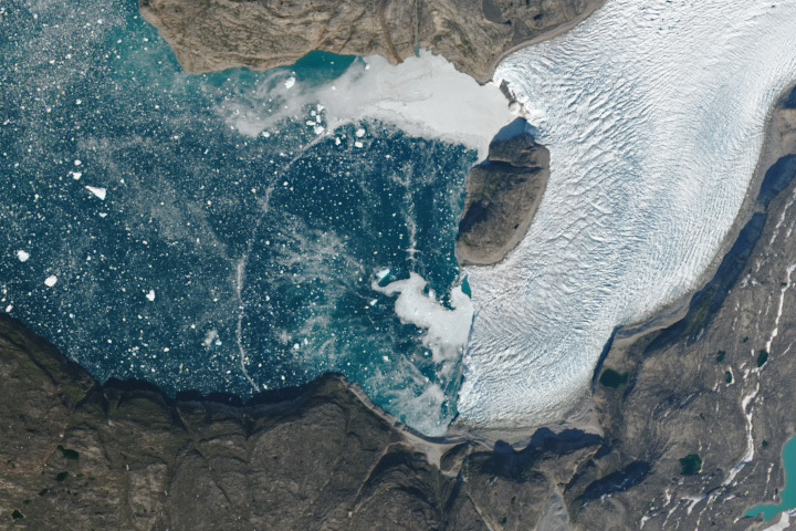
Update on September 26, 2023: This puzzler image shows an ephemeral arc spanning a fjord in Greenland. It may have been caused by a wave from a calving iceberg or an underwater plume of freshwater rising to the surface. Read more about the image in our Image of the Day story.
Every month on Earth Matters, we offer a puzzling satellite image. The September 2023 puzzler is shown above. Your challenge is to use the comments section to tell us where it is, what we are looking at, and why it is interesting.
How to answer. You can use a few words or several paragraphs. You might simply tell us the location, or you can dig deeper and offer details about what satellite and instrument produced the image, what spectral bands were used to create it, or what is compelling about some obscure feature. If you think something is interesting or noteworthy, tell us about it.
The prize. We cannot offer prize money or a trip on the International Space Station, but we can promise you credit and glory. Well, maybe just credit. Within a week after a puzzler image appears on this blog, we will post an annotated and captioned version as our Image of the Day. After we post the answer, we will acknowledge the first person to correctly identify the image at the bottom of this blog post. We also may recognize readers who offer the most interesting tidbits of information. Please include your preferred name or alias with your comment. If you work for or attend an institution that you would like to recognize, please mention that as well.
Recent winners. If you have won the puzzler in the past few months, or if you work in geospatial imaging, please hold your answer for at least a day to give less experienced readers a chance.
Releasing comments. Savvy readers have solved some puzzlers after a few minutes. To give more people a chance, we may wait 24 to 48 hours before posting comments. Good luck!
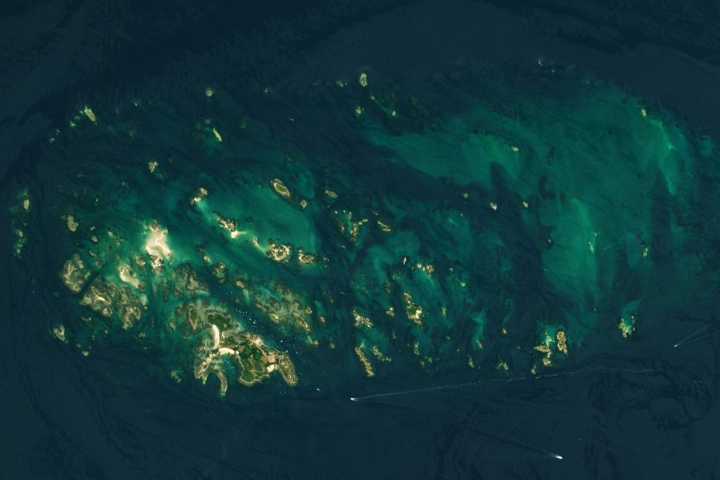
Update on June 13, 2023: This puzzler image shows France’s Chausey Islands (Îles Chausey), around low tide on July 22, 2018. The islands are subject to some of the largest tidal ranges on Earth. Congratulations to Michelangelo Grillo, who was the first to identify the correct location. Grillo was also the first to mention the region’s extreme tides. View the same area during high tide in our Image of the Day story.
Every month on Earth Matters, we offer a puzzling satellite image. The May 2023 puzzler is shown above. Your challenge is to use the comments section to tell us where it is, what we are looking at, and why it is interesting.
How to answer. You can use a few words or several paragraphs. You might simply tell us the location, or you can dig deeper and offer details about what satellite and instrument produced the image, what spectral bands were used to create it, or what is compelling about some obscure feature. If you think something is interesting or noteworthy, tell us about it.
The prize. We cannot offer prize money or a trip on the International Space Station, but we can promise you credit and glory. Well, maybe just credit. Within a week after a puzzler image appears on this blog, we will post an annotated and captioned version as our Image of the Day. After we post the answer, we will acknowledge the first person to correctly identify the image at the bottom of this blog post. We also may recognize readers who offer the most interesting tidbits of information. Please include your preferred name or alias with your comment. If you work for or attend an institution that you would like to recognize, please mention that as well.
Recent winners. If you have won the puzzler in the past few months, or if you work in geospatial imaging, please hold your answer for at least a day to give less experienced readers a chance.
Releasing Comments. Savvy readers have solved some puzzlers after a few minutes. To give more people a chance, we may wait 24 to 48 hours before posting comments. Good luck!
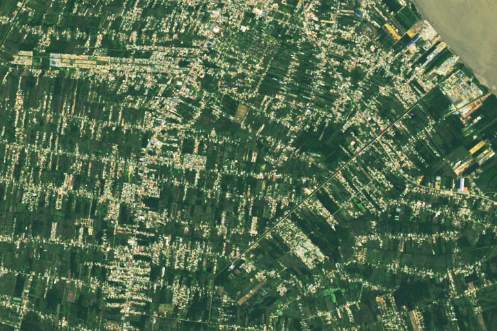
Update on June 28, 2022: Drumroll please…..?????? ….the answer is….PARAMARIBO, SURINAME. The natural-color image was acquired in June 2022 by the satellite’s Operational Land Imager on Landsat 8. Read more about Paramaribo in our June 27 Image of the Day. Congratulations to Firdous Khodabaks, Corey TM, and Nerdonna for being among the first readers to correctly identify the location. Thanks also for sharing interesting details about oil refining, recent flooding, and the presidential palace.
Every month on Earth Matters, we offer a puzzling satellite image. The June 2022 puzzler is shown above. Your challenge is to use the comments section to tell us where it is, what we are looking at, and why it is interesting.
How to answer. You can use a few words or several paragraphs. You might simply tell us the location, or you can dig deeper and offer details about what satellite and instrument produced the image, what spectral bands were used to create it, or what is compelling about some obscure feature. If you think something is interesting or noteworthy, tell us about it.
The prize. We cannot offer prize money or a trip on the International Space Station, but we can promise you credit and glory. Well, maybe just credit. Within a week after a puzzler image appears on this blog, we will post an annotated and captioned version as our Image of the Day. After we post the answer, we will acknowledge the first person to correctly identify the image at the bottom of this blog post. We also may recognize readers who offer the most interesting tidbits of information. Please include your preferred name or alias with your comment. If you work for or attend an institution that you would like to recognize, please mention that as well.
Recent winners. If you have won the puzzler in the past few months, or if you work in geospatial imaging, please hold your answer for at least a day to give less experienced readers a chance.
Releasing Comments. Savvy readers have solved some puzzlers after a few minutes. To give more people a chance, we may wait 24 to 48 hours before posting comments. Good luck!
Every month on Earth Matters, we offer a puzzling satellite image. The January 2022 puzzler is shown above. Your challenge is to use the comments section to tell us where it is, what we are looking at, and why it is interesting.
How to answer. You can use a few words or several paragraphs. You might simply tell us the location, or you can dig deeper and offer details about what satellite and instrument produced the image, what spectral bands were used to create it, or what is compelling about some obscure feature. If you think something is interesting or noteworthy, tell us about it.
The prize. We cannot offer prize money or a trip on the International Space Station, but we can promise you credit and glory. Well, maybe just credit. Within a week after a puzzler image appears on this blog, we will post an annotated and captioned version as our Image of the Day. After we post the answer, we will acknowledge the first person to correctly identify the image at the bottom of this blog post. We also may recognize readers who offer the most interesting tidbits of information. Please include your preferred name or alias with your comment. If you work for or attend an institution that you would like to recognize, please mention that as well.
Recent winners. If you have won the puzzler in the past few months, or if you work in geospatial imaging, please hold your answer for at least a day to give less experienced readers a chance.
Releasing Comments. Savvy readers have solved some puzzlers after a few minutes. To give more people a chance, we may wait 24 to 48 hours before posting comments. Good luck!
February 1 update: The answer is suspended sediment in the Gulf of Khambhat, off the northwest coast of India. Congratulations to K Suraj, who correctly identified the Gujarat region of India and the Arabian Sea coast. Read more in this Image of the Day.
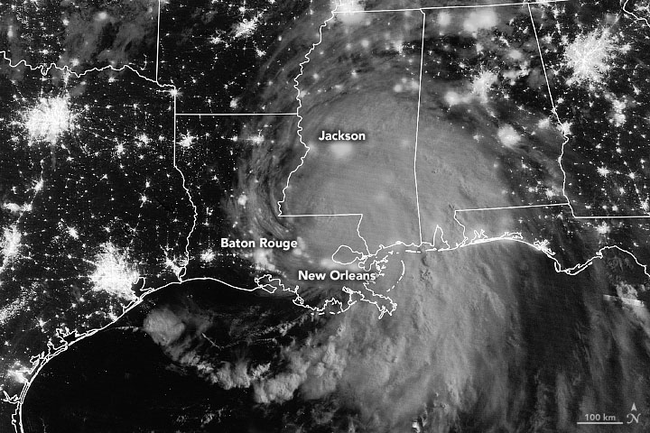
NASA will launch four Earth science missions in 2022 to provide scientists with more information about fundamental climate systems and processes including extreme storms, surface water and oceans, and atmospheric dust. Scientists will discuss the upcoming missions at the American Geophysical Union’s (AGU) 2021 Fall Meeting, hosted in New Orleans between Dec. 13 and 17.
NASA has a unique view of our planet from space. NASA’s fleet of Earth-observing satellites provides high-quality data on Earth’s interconnected environment, from air quality to sea ice. These four missions will enhance the ability to monitor our changing planet:
Measuring Tropical Cyclones – Time-Resolved Observations of Precipitation structure and storm Intensity with a Constellation of Smallsats (TROPICS)
NASA’s TROPICS mission aims to improve observations of tropical cyclones. Six TROPICS satellites will work in concert to provide microwave observations of a storm’s precipitation, temperature, and humidity as quickly as every 50 minutes. Scientists expect the data will help them understand the factors driving tropical cyclone intensification and will contribute to weather forecasting models.
In June 2021, the first pathfinder, or proof of concept satellite of the constellation started collecting data, including from Hurricane Ida in August 2021. The TROPICS satellites will be deployed in pairs of two over three different launches, expected to be completed by July 31, 2022.
Each satellite is about the size of a loaf of bread and carries a miniaturized microwave radiometer instrument. Traveling in pairs in three different orbits, they will collectively observe Earth’s surface more frequently than current weather satellites making similar measurements, greatly increasing the data available for near real-time weather forecasts.
The TROPICS team is led by Principal Investigator Dr. William Blackwell at MIT’s Lincoln Laboratory in Lexington, Massachusetts, and includes researchers from NASA, the National Oceanic and Atmospheric Administration (NOAA), and several universities and commercial partners. NASA’s Launch Services Program, based at the agency’s Kennedy Space Center in Florida, will manage the launch service.
“The coolest part of this program is its impact on helping society,” Blackwell said. “These storms affect a lot of people. The higher frequency observations provided by TROPICS have the potential to support weather forecasting that may help people get to safety sooner.”
Studying Mineral Dust — Earth Surface Mineral Dust Source Investigation (EMIT)
Winds kick up dust from Earth’s arid regions and transport the mineral particles around the world. The dust can influence the radiative forcing — or the balance between the energy that comes toward Earth from the Sun, and the energy that Earth reflects back out into space — hence the temperature of the planet’s surface and atmosphere. Darker, iron-laden minerals tend to absorb energy, which leads to heating of the environment, while brighter, clay-containing particles scatter light in a way that may lead to cooling. In addition to affecting regional and global warming of the atmosphere, dust can affect air quality and the health of people worldwide, and when deposited in the ocean, can also trigger blooms of microscopic algae.
The goal of the Earth Surface Mineral Dust Source Investigation (EMIT) mission is to map where the dust originates and estimate its composition so that scientists can better understand how it affects the planet. Targeted to launch in 2022, EMIT has a prime mission of one year and will be installed on the International Space Station. EMIT will use an instrument called an imaging spectrometer that measures visible and infrared light reflecting from surfaces below. This data can reveal the distinct light-absorbing signatures of the minerals in the dust that helps to determine their composition.
“EMIT will close a gap in our knowledge about arid land regions of our planet and answer key questions about how mineral dust interacts with the Earth system,” said Dr. Robert Green, EMIT principal investigator at NASA’s Jet Propulsion Laboratory.
Observing Earth’s Storms — Joint Polar Satellite System (JPSS)
Forecasting extreme storms many days in advance requires capturing precise measurements of the temperature and moisture in our atmosphere, along with ocean surface temperatures. The NOAA/NASA Joint Polar Satellite System satellites provide this critical data, which is used by forecasters and first responders. The satellites also tell us about floods, wildfires, volcanoes, smog, dust storms, and sea ice.
“JPSS satellites are a vital component of the global backbone of numerical weather prediction,” said JPSS Program Science Adviser Dr. Satya Kalluri.
The JPSS satellites circle Earth from the North to the South Pole, taking data and images as they fly. As Earth rotates under these satellites, they observe every part of the planet at least twice a day.
The Suomi-NPP (National Polar orbiting-Partnership) and NOAA-20 satellites are currently in orbit. The JPSS-2 satellite is targeted to launch in 2022 from Vandenberg Space Force Base in California on a United Launch Alliance Atlas V rocket. Three more satellites will launch in the coming years, providing data well into the 2030s. NASA’s Launch Services Program, based at the agency’s Kennedy Space Center in Florida, will manage the launch service.
The Surface Water and Ocean Topography (SWOT) mission will help researchers determine how much water Earth’s oceans, lakes, and rivers contain. This will aid scientists in understanding the effects of climate change on freshwater bodies and the ocean’s ability to absorb excess heat and greenhouse gases like carbon dioxide.
NASA’s Launch Services Program, based at the agency’s Kennedy Space Center in Florida, will manage the launch service, which is targeted for November 2022. SWOT will launch on a SpaceX Falcon 9 rocket from Vandenberg Space Force Base in California.

The SUV-size satellite will measure the height of water using its Ka-band Radar Interferometer, a new instrument that bounces radar pulses off the water’s surface and receives the return signals with two different antennas at the same time. This measurement technique allows scientists to precisely calculate the height of the water. The data will help with tasks like tracking regional shifts in sea level, monitoring changes in river flows and how much water lakes store, as well as determining how much freshwater is available to communities around the world.
“SWOT will address the ocean’s leading role in our changing weather and climate and the consequences on the availability of freshwater on land,” said Dr. Lee-Lueng Fu, SWOT project scientist at NASA’s Jet Propulsion Laboratory.
The mission is a collaboration between NASA and the French space agency Centre National d’Etudes Spatiales, with contributions from the Canadian Space Agency and the United Kingdom Space Agency.
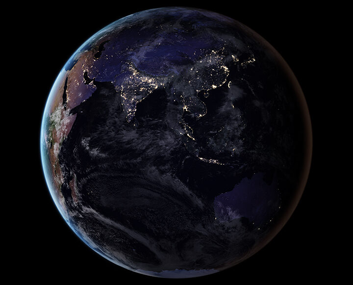
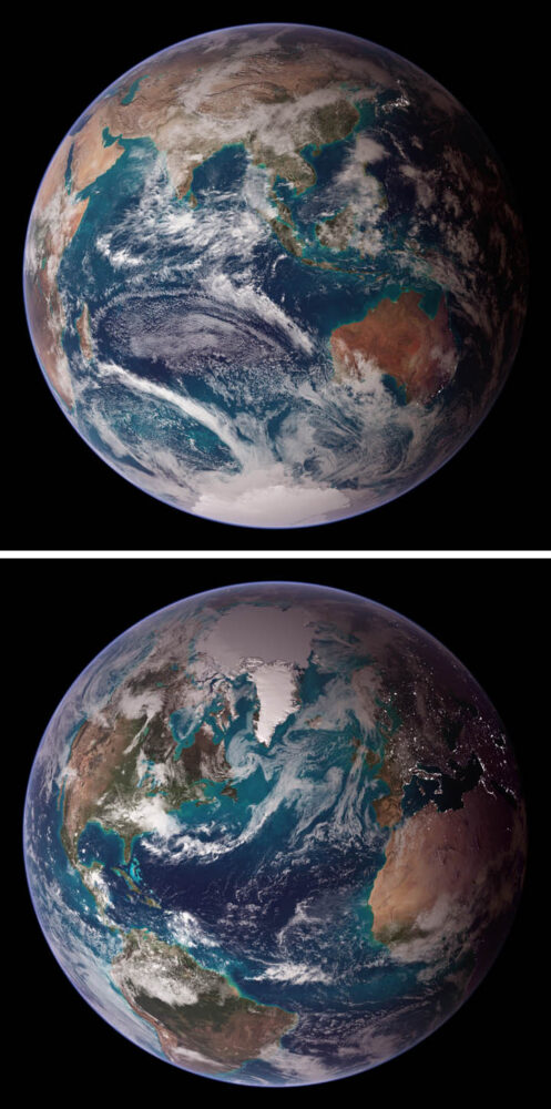
Since its launch on the web in April 1999, NASA Earth Observatory has published more than 15,500 image-driven stories about our planet. In celebration of our 20th anniversary — as well as the 50th anniversary of Earth Day — we want you to help us choose our all-time best image.
For now, we need you to help us brainstorm: what images or stories would you nominate as the best in the Earth Observatory collection? Do you go for the most beautiful and iconic view of our home? the most newsworthy? the most scientifically important? the most inspiring?
Search our site and then post the URLs of your favorite Earth images in the comments section below. Please send your ideas by March 17.
In late March 2020, we will include some of your selections in Tournament Earth, a head-to-head contest to vote for the best of the best from our archives. Each week, readers will pick from pairs of images as we narrow down the field from 32 nominees to one champion.
The all-time best Earth Observatory image will be announced on April 29, 2020, the end of our anniversary year.
If you want some inspiration as you begin your search, take a look at the galleries listed below. Or use our search tool (top left) to find your favorite places, images, and events.
More than 20 years ago, NASA scientist Ralph Kahn authored a column for the Los Angeles Times anticipating the launch of a new satellite — and ultimately a whole fleet of satellites — that would study Earth.
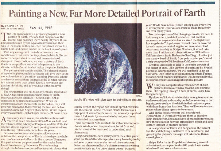
“We want a picture of Earth that is more specific about what is happening to the climate, which after all is what makes the planet habitable,” he wrote. And that picture needed to be rich with detail. “Precisely where are deserts encroaching on grasslands? In what regions is it raining more than usual? Exactly how much are glaciers shrinking, and at what rate is the sea level rising?” he asked.
The first satellite, Terra (originally named EOS-AM), roared into space on December 18, 1999, began collecting data in February and March 2000, and collected its first complete day of MODIS data on April 19, 2000.
“About every seven weeks, the satellite archives will receive as much data from EOS-AM as are held in all the volumes of the Library of Congress. And the EOS-AM satellite alone is supposed to keep pouring numbers down from the sky, relentlessly, for at least six years,” Kahn wrote.
Amazingly, all those numbers from Terra continue to pour down 20 years later. Over time, the flood of data from Terra and several other satellites has turned into scientific discoveries. Bit by bit, the questions Kahn initially posed in his column have been answered.
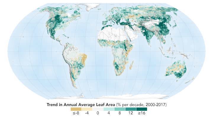
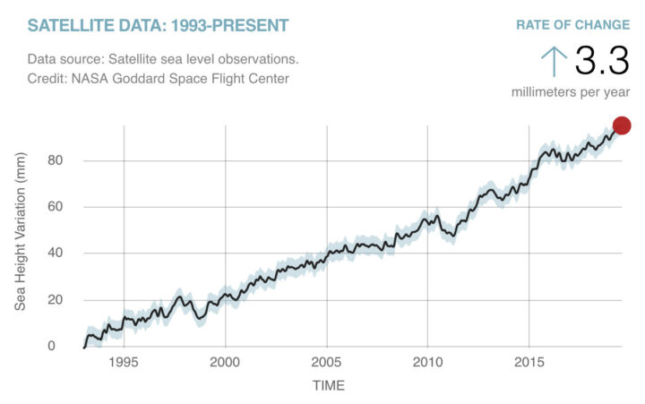
We can say now that sea level is rising at 3.3 millimeters (.13 inches) per year. We can show you a map of where exactly green vegetation has become more common and where it has faded. We can point you to a long-term dataset that will show you precisely where rain has fallen over the past two decades. And we can give you a tour of the world’s glaciers that shows you where they are and many examples of where they are shrinking.
The question to grapple with now: what do we with all this information?
The UK’s Antarctic Place-names Committee has agreed that seven ice features in western Antarctica should be named for Earth-observation satellites. One of them is Landsat Ice Steam.
The new designations were announced on June 7, 2019. The ice features are all located in Western Palmer Land on the southern Antarctic Peninsula.
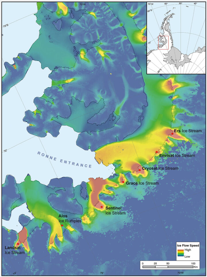
The seven features ring George VI Sound like pearls on a necklace. The new names, as officially entered into the British Antarctic Territory Gazetteer, are (from west to east): Landsat Ice Steam, ALOS Ice Rumples, Sentinel Ice Stream, GRACE Ice Stream, Envisat Ice Stream, Cryosat Ice Stream, and ERS Ice Stream.
The UK has submitted the new names for the fast-moving ice features to Scientific Committee on Antarctic Research (SCAR), which maintains a gazetteer or registry, of names officially adopted by individual nations. Under the Antarctic Treaty, signatory nations confer on geographic feature names, but each nation’s naming authority formally adopts new names. The U.S. Board on Geographic Names will meet in July and may discuss at that meeting whether the names adopted by the UK also will be adopted by the US. The question of using the term “glacier” for the ice features instead of “ice stream” is also part of each nation’s naming decision.
The new names were proposed by Anna Hogg, a glaciologist with the Center for Polar Observation and Modelling at the University of Leeds. In research published in 2017, Hogg found that glaciers draining from the Antarctic Peninsula were accelerating, thinning, and retreating, with implications for global sea level rise. The fast-moving glaciers that Hogg and colleagues tracked with radar and optical satellite imagery were unnamed. In her paper, the glaciers had to be designated by latitude and longitude.
Satellites had enabled Hogg and her team to clock the speed of these nameless ice features—some with rates faster than 1.5 meters/day. In tribute to the spaceborne instruments, Hogg came up with a way to describe the fast-moving ice features more succinctly—name them after the satellites that had helped her understand their behavior.
Hogg proposed to the U.K.’s Antarctic Place-names Committee that the features should be named for Landsat, Sentinel, ALOS PALSAR, ERS, GRACE, CryoSat, and Envisat. She was notified in early June that the committee had agreed to adopt the names, which provide a way to recognize international collaboration, as fifteen space agencies currently collaborate on Antarctic data collection.
“Satellites are the heroes in my science of glaciology,” Hogg told the BBC. “They’ve totally revolutionized our understanding, and I thought it would be brilliant to commemorate them in this way.”
Naming the glaciers after satellites is also a celebration of data fusion. “Our understanding of ice velocities and ice sheet mass balance has come from putting many different remote sensing data sets together—optical, radar, gravity, and laser altimetry,” said Jeff Masek, the NASA Landsat 9 Project Scientist. “Landsat has been a key piece in assembling that larger puzzle. Naming an ice stream after Landsat is a fitting way to recognize the value of long-term Earth Observation data for measuring changes in Earth’ polar regions.”
Read more from NASA’s Landsat science and outreach team, including the history of Antarctic observation with Landsat. Read more about all of the glaciers and their namesake satellites, as told by the European Space Agency. And read about the island discovered by and named for Landsat, and the woman who discovered it.
Correction, June 27, 2019: SCAR’s role in the Antarctic naming process was incorrectly described in the earlier version of this article. Updates were provided by Dr. Scott Borg, Deputy Assistant Director of the National Science Foundation’s Directorate for Geosciences, and Peter West, the Outreach Program managers for NSF’s Office of Polar Programs, to correctly describe the naming process.
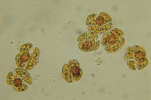
Karenia brevis cells. Image credit: Mote Marine Laboratory
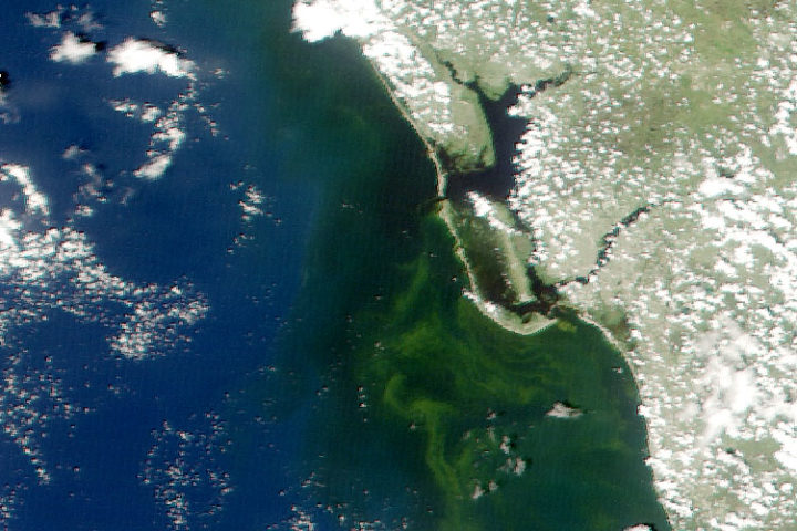
Put a sample of water from the Gulf of Mexico under a microscope, and you will often find cells of Karenia brevis swimming around. The microscopic algae—the species of phytoplankton responsible for Florida’s worst red tide outbreaks—produce brevetoxin, a compound that in high concentrations can kill wildlife and cause neurological, respiratory, and gastrointestinal issues for people.
Under normal conditions, water quality tests find, at most, a few hundred K. brevis cells per liter of water—not enough to cause problems. But in August 2018, in the midst of one of the most severe red tide outbreaks to hit Florida’s Gulf Coast in a decade, water samples regularly contained more than one million K. brevis cells per liter.
Natural-color MODIS satellite image of algae staining the water off the coast of Fort Myers on August 19, 2018. Image from the University of South Florida Near Real-Time Integrated Red tide Information System (IRIS).
That was enough to stain large swaths of coastal waters shades of green and brownish-red and leave beaches littered with rotting fish carcasses. Roughly 100 manatees, more than 200 sea turtles, and at least 12 dolphins have been killled by red tides, according to preliminary estimates. For much of August, the toxic bloom stretched about 130 miles (200 kilometers) along Florida’s Gulf coast, from roughly Tampa to Fort Myers. Though the bloom has been active since October 2017, it intensified rapidly in July 2018. The damage grew so severe and widespread that Florida’s governor declared a state of emergency in mid-August.
One of the best ways to test for the presence of K. brevis is to analyze water samples collected from boats or beaches. State environmental agencies do this on a regular basis, but understanding the full extent and evolution of fast-changing blooms, or predicting where they will move with ground sampling alone is a challenge.
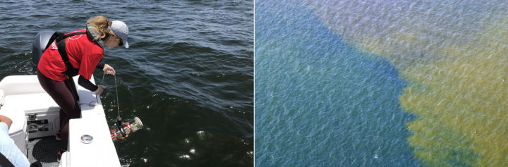
Sampling red tide in 2018 (left). An aerial view of red tide in 2005 (right). Photo credits: Florida Fish and Wildlife Conservation Commission.
That’s why key red tide monitoring systems, such as the National Oceanic and Atmospheric Administration’s (NOAA’s) Harmful Algal Bloom Forecast System and the Near Real-Time Integrated Red Tide Information System (IRIS) from the University of South Florida, make use of satellite data from the Moderate Resolution Imaging Spectroradiometer (MODIS) sensors on NASA’s Aqua and Terra satellites. These sensors pass over Florida’s Gulf Coast twice a day, acquiring data at several wavelengths that can be useful for identifying and mapping the spatial extent of algal blooms. Other satellite sensors such as the Visible Infrared Imaging Radiometer Suite (VIIRS) on Suomi NPP and the Ocean and Land Color Instrument (OCLI) on Sentinel-3 collect information that can be used to monitor red tides as well.
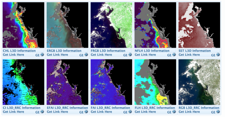
A screenshot from the University of South Florida’s Near Real-Time Integrated Red tide Information System (IRIS). The image shows various types of data captured by MODIS sensor on Terra on August 19, 2018. Solar-stimulated fluorescence data (NFLH) is particularly useful for locating algal blooms. Image Credit: USF/IRIS
Despite the utility of satellite observations, there are some significant challenges to interpreting satellite data of algal blooms in shallow, coastal waters, explained oceanographer Chuanmin Hu of the University of South Florida. Chief among them: it can be quite difficult to distinguish between algal blooms, suspended sediment, and colored dissolved organic matter (CDOM) that flows into coastal areas.
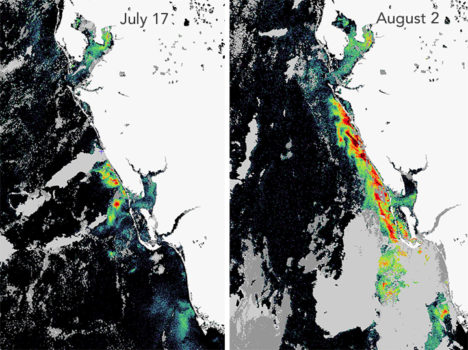
The Karenia brevis bloom expanded and intensified in late-July. This fluorescence data comes from the OCLI sensor on Sentinel 3. Image courtesy of Rick Stumpf, NOAA.
To get around this problem and make satellites better at pinpointing algal blooms, Hu and colleagues at the University of South Florida have developed a red tide monitoring system that makes use of MODIS observations of fluorescence, which algal bloom emit in response to exposure to sunlight. “If we have fluorescence data to go along with a natural-color image from MODIS, we can say with a high degree of confidence where the algal blooms are and where the sensor is just detecting sediment or CDOM,” he said. When fluorescence data is available, the Florida Fish and Wildlife Commission pushes it out to the public as part of its red tide status updates (see the August 21 update below).
Likewise, NOAA has combined a fluorescence method with a long-standing technique that identifies recent increases in chlorophyll concentration, the combination improves the identification of likely K. brevis blooms — information that then gets incorporated in NOAA’s HAB Forecast System, noted Richard Stumpf, an oceanographer with NOAA.
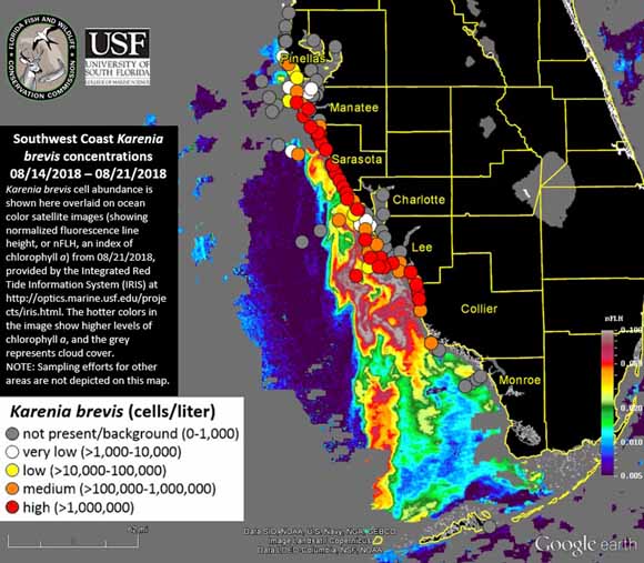
K. brevis cell abundance shown on an ocean color satellite image from the IRIS system. Warmer colors indicate higher levels of chlorophyll a, an indicator of algae. Cloudy areas are gray. Circles indicate locations where officials tested water samples on the ground. Image Credit: FFW/USF/IRIS.
However, that still leaves some big problems—only about ten percent of MODIS passes collect usable fluorescence data. The rest of the time images are marred by either sunglint or clouds. And the algorithm that scientists use to detect algal blooms with MODIS does not work well within one kilometer of the coast—the part that is of the greatest interest to beachgoers and boaters.
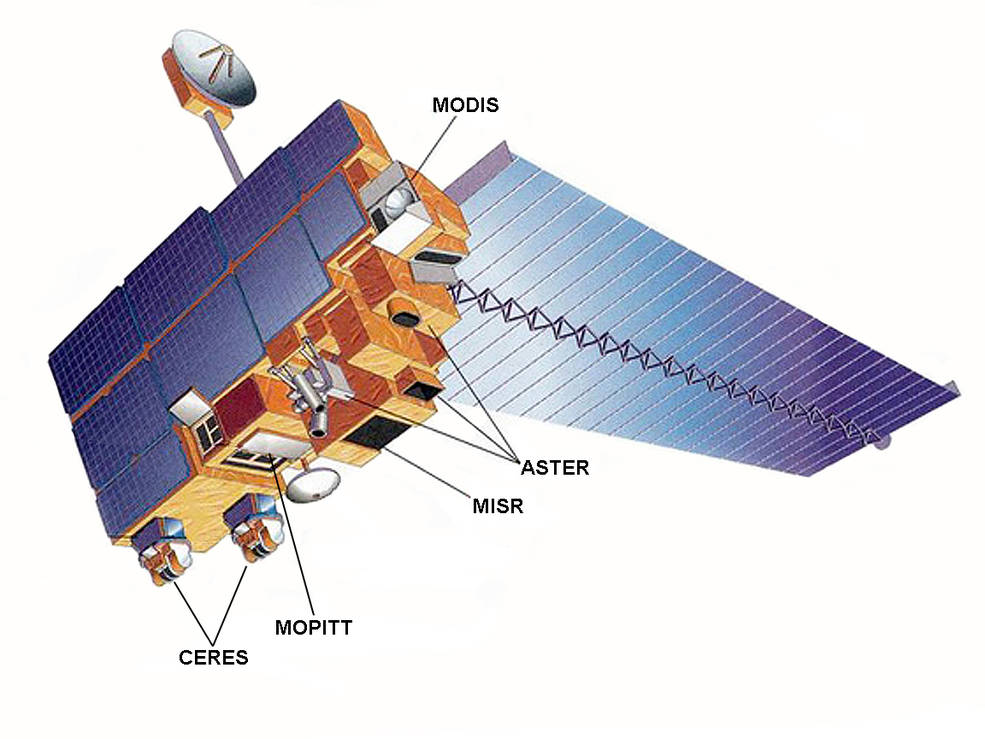
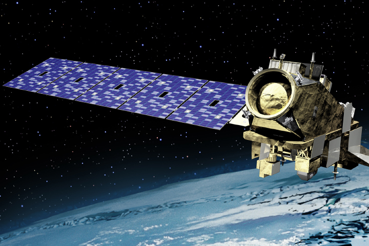
The Terra satellite. Image Credit: NASA
To help fill in the gaps, NASA’s Applied Science program is working with several partner institutions on a smartphone app called HABscope. The app, developed by Gulf of Mexico Observing System (GCOOS) researcher Robert Currier, makes it possible for trained water samplers (typically lifeguards who participate in Mote Marine Laboratory’s Beach Conditions Reporting System) to collect video of water using microscopes attached to their smartphones.
After recording, HABscope uploads videos to a cloud-based server for automatic analysis by computer software. The software rapidly counts the number of K. brevis cells in a water sample by using technology similar to that found in facial recognition apps. But rather than focusing on facial features, the software looks for a particular pattern in the movement of K. brevis cells.
K. brevis are vigorous swimmers, often using a pair of long, whip-like flagella to migrate vertically about 10 to 20 meters (33 to 66 feet) each day. They chart a zig-zagging, corkscrew-shaped path that allows the software to easily pick them out amidst the cast of other phytoplankton found in Gulf of Mexico water samples.
The data about K. brevis abundance at various locations along the coast is then fed into a respiratory distress forecasting tool managed by NOAA. “Respiratory distress forecasts can now be produced 1 to 2 times per day for specific beaches along the Florida Gulf Coast,” said Stumpf. “Previous to this project, these forecasts were issued at most twice a week, and only as general statements about risk within a county. The combination of earth observations with rapid field monitoring will increase the accuracy and usefulness of the forecasts.”
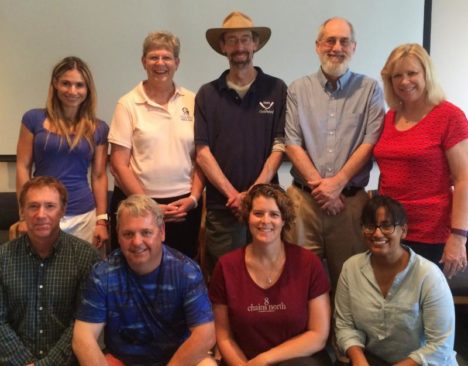
The research team that developed the HABscope app included oceanographers, ecologists, computer application developers, and public health experts. Photo Credit: Mote Marine Laboratory.
