Who knew that being a scientist could be as easy as pointing your phone at the sky? This month, NASA and the GLOBE Program are asking citizen scientists to take out their phones and report what kinds of clouds they see above them.
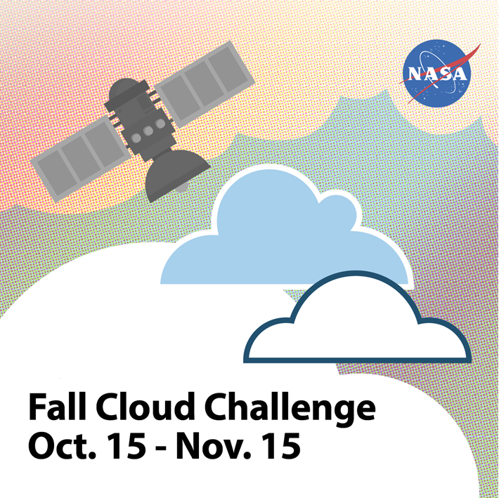
From October 15 to November 15 citizen scientists young, old, and in-between can submit up to ten cloud observations per day using the GLOBE Observer app or one of GLOBE’s other data entry options (for trained members). Participants with the most observations will receive a personalized thank you from a NASA scientist.
“What excites researchers about GLOBE observations is the ability to see what’s up in the sky from volunteers’ perspectives all over the world,” said Marilé Colón Robles, lead for the GLOBE Clouds Team at NASA’s Langley Research Center. “What our eyes can see is difficult to fully duplicate with instruments. Merging these views is what makes a complete and impactful story.”
“We want to do a data challenge in the fall and see if there are any differences from what was observed during the spring data challenge of 2018,” said Colón Robles. “From thin, high clouds that are hard for satellites to detect to dust storms that impact our daily lives, these observations play an important role in better understanding our atmosphere.”
At NASA, scientists work with a suite of satellite instruments known as the Clouds and the Earth’s Radiant Energy System (CERES). Though they have these highly sensitive instruments, it can sometimes be difficult for scientists to distinguish features such as cirrus clouds from snow cover in their imagery because both are cold and bright from a satellite perspective. By comparing satellite images from a particular area with data submitted by citizen scientists, researchers can differentiate between the two.
Lucky GLOBE observers might make an observation while the Cloud-Aerosol Lidar and Infrared Pathfinder Satellite Observation (CALIPSO) is overhead. CALIPSO is a joint mission between NASA and the French space agency (CNES) that uses laser pulses to measure clouds and atmospheric aerosols. Citizen scientists who make observations at the same time and place as CALIPSO will receive an emailed satellite comparison of CALIPSO’s measurements showing features such as high clouds, dust, and smoke. Scientists are especially interested in these observations in order to improve their understanding of dust storms. During the challenge, make sure you turn on daily satellite notifications in the app or use this satellite overpass website to see the schedule for your location.
“Last year’s challenge gave researchers special glimpses into cloud types around the world,” said Colón Robles. “Photographs provided by observers gave insight into events such as dust storms and wildfires. Our hope is to once again learn from the community and together study our atmosphere.”
The 2018 data challenge, which took place in the spring, received more than 56,000 cloud observations from more than 15,000 locations in 99 countries and Antarctica.
NASA is a sponsor of GLOBE, an international science and education program that provides students and the public with the opportunity to participate in data collection and the scientific process. NASA GLOBE Observer is a free smartphone app that lets anyone make citizen science observations from the palm of their hand.
Cloud Identification Resources and Tips
Data collection and data entry help
Every month on Earth Matters, we offer a puzzling satellite image. The August 2019 puzzler is above. Your challenge is to use the comments section to tell us what we are looking at, where it is, and why it is interesting.
How to answer. You can use a few words or several paragraphs. You might simply tell us the location. Or you can dig deeper and explain what satellite and instrument produced the image, what spectral bands were used to create it, or what is compelling about some obscure feature in the image. If you think something is interesting or noteworthy, tell us about it.
The prize. We can’t offer prize money or a trip to Mars, but we can promise you credit and glory. Well, maybe just credit. Roughly one week after a puzzler image appears on this blog, we will post an annotated and captioned version as our Image of the Day. After we post the answer, we will acknowledge the first person to correctly identify the image at the bottom of this blog post. We also may recognize readers who offer the most interesting tidbits of information about the geological, meteorological, or human processes that have shaped the landscape. Please include your preferred name or alias with your comment. If you work for or attend an institution that you would like to recognize, please mention that as well.
Recent winners. If you’ve won the puzzler in the past few months or if you work in geospatial imaging, please hold your answer for at least a day to give less experienced readers a chance.
Releasing Comments. Savvy readers have solved some puzzlers after a few minutes. To give more people a chance, we may wait 24 to 48 hours before posting comments.
Good luck!
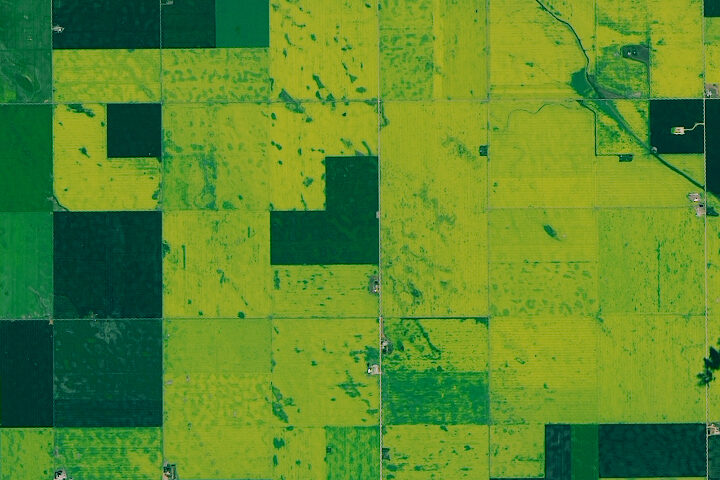
See our Canadian Canola Fields Image of the Day for the answer. Congratulations to Rebecca Evermon for being the first reader to recognize that the image showed canola fields.
Every month on Earth Matters, we offer a puzzling satellite image. This month we are skipping the natural-color satellite image and showing something out of the ordinary. But we assure you: it came from a NASA satellite. Your challenge is to use the comments section to tell us what we are looking at, where it is, and why it is interesting.
How to answer. You can use a few words or several paragraphs. You might simply tell us the location. Or you can dig deeper and explain what satellite and instrument produced the image, what spectral bands were used to create it, or what is compelling about some obscure feature in the image. If you think something is interesting or noteworthy, tell us about it.
The prize. We can’t offer prize money or a trip to Mars, but we can promise you credit and glory. Well, maybe just credit. Roughly one week after a puzzler image appears on this blog, we will post an annotated and captioned version as our Image of the Day. After we post the answer, we will acknowledge the first person to correctly identify the image at the bottom of this blog post. We also may recognize readers who offer the most interesting tidbits of information about the geological, meteorological, or human processes that have shaped the landscape. Please include your preferred name or alias with your comment. If you work for or attend an institution that you would like to recognize, please mention that as well.
Recent winners. If you’ve won the puzzler in the past few months or if you work in geospatial imaging, please hold your answer for at least a day to give less experienced readers a chance.
Releasing Comments. Savvy readers have solved some puzzlers after a few minutes. To give more people a chance, we may wait 24 to 48 hours before posting comments.
Good luck!
Even after 50 years, the day of Apollo 11 Moon landing remains a vivid memory in many minds. But even generations that were not born before July 20, 1969, can appreciate the monumental achievement through numerous historical accounts, video, and photographs.
Inspection of EO’s 20-year archive turned up numerous occasions on which we have celebrated the Apollo program and the Moon—Earth’s only natural satellite. Below we highlight a few of our favorites. Still hungry for more Earth and Moon imagery? Check out our gallery “Earth From Afar.”
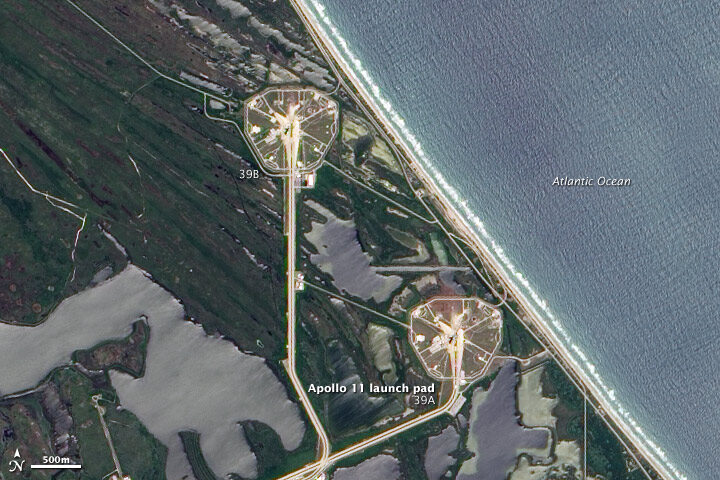
On July 16, 1969, Apollo 11 lifted off from launch pad 39A at Cape Canaveral, a headland along Florida’s Atlantic coast. Neil Armstrong, “Buzz” Aldrin, and Michael Collins began their journey to the Moon. On June 9, 2002, the Advanced Land Imager (ALI) on NASA’s Earth Observing-1 satellite captured this true-color image of launch pad 39A and neighboring pad 39B.
By launching from the east coast of Florida, NASA took advantage of both geography and physics. Rockets could aim eastward and fly over the Atlantic Ocean, far away from heavily populated areas should anything go wrong. And within the continental United States, Florida is closest to the Equator. Launching from a locality close to the Equator enables the rocket to harness Earth’s orbital energy to boost its own trajectory. Read more.
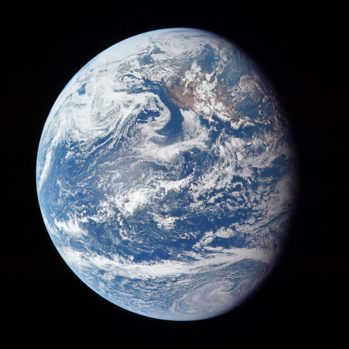
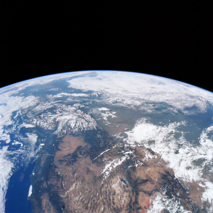
These two photographs were taken by the crew on their outbound journey from Earth to the Moon. Apollo 11 launched from Cape Canaveral at 9:32 a.m. on July 16, 1969, and these photos were captured that day. The top view shows the full disk of Earth, with bits of California, the Pacific Northwest coast, and Alaska peeking through the cloud cover in a scene otherwise dominated by the Pacific Ocean. The second, closer view shows more of the western United States and Canada, with the Rocky Mountains filling much of the center of the scene and the Arctic ice cap at the top. Read more.
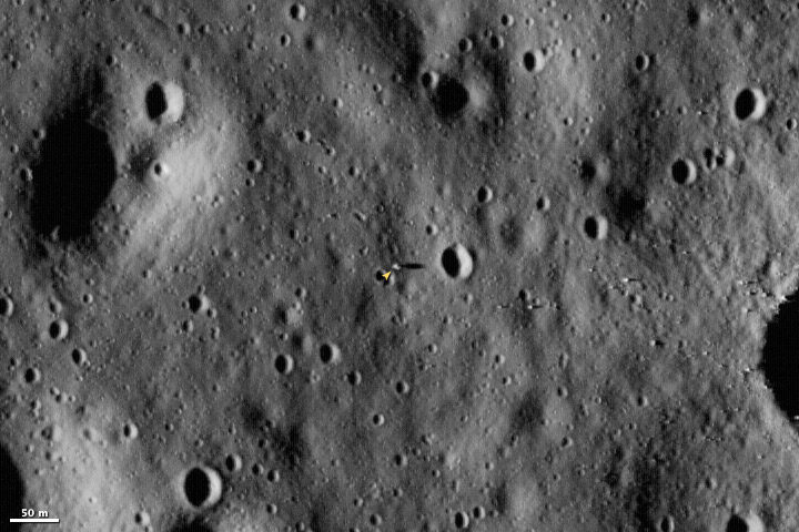
The Lunar Reconnaissance Orbiter launched on June 18, 2009, and began sending back images of the Moon on June 23. Launched to map the surface of the Moon, LRO was still moving towards its near-surface orbit when it acquired this image of the Apollo 11 landing site. When the orbiter reaches its final orbit, it will image the Moon’s surface at a resolution of 0.5 meters, providing an image that is about two times more detailed than the one shown here. Read more.
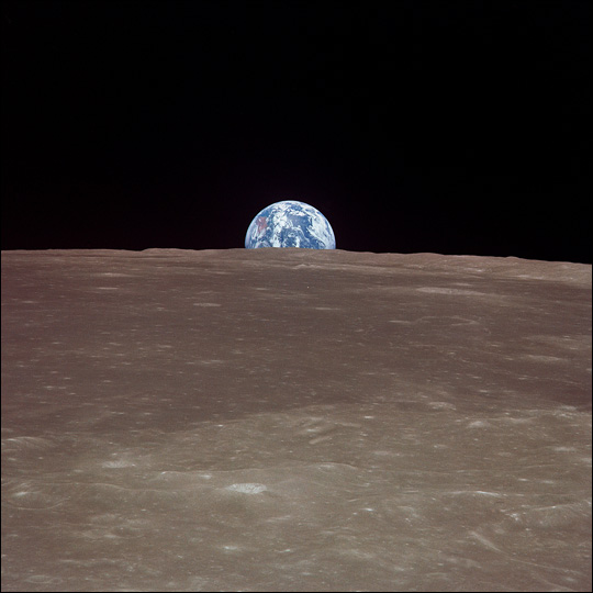
This image from Apollo 11 shows the Earth rising over the limb of the Moon much as the Harvest Moon does from our planetary perspective. Over the stark, scarred surface of the Moon, the Earth floats in the void of space, a watery jewel swathed in ribbons of clouds.
While the Harvest Moon has allowed humans throughout history to coax “just a little more” from the Earth’s bounty before the onset of winter, images of our home from the Moon helped raise awareness of the Earth as a rare (and perhaps unique) planetary ecosystem. The Apollo 11 images provided a global backdrop for the building U.S. environmental movement, including a surge of citizen-led environmental cleanups in the 1960s and 70s, and implementation of key national environmental policies. Read more.
The Multi-angle Imaging SpectroRadiometer (MISR) team at NASA is pleased to offer its 31st “Where on Earth?” quiz.
To participate, visit https://climate.nasa.gov/quizzes/misr_quiz_31/
When you visit that page and press “start,” you will be presented with nine multiple-choice questions (one for each of MISR’s nine cameras) about the image above. You may research the answers using any website or reference material you like. You cannot go back to previous questions, so make sure of your answer before proceeding!
The natural color image above was acquired by MISR’s vertical-viewing camera in July 2017 and represents an area about 300 kilometers by 240 kilometers (190 miles by 150 miles). Note that north is not necessarily at the top of the image.
If you answer all of the questions correctly, you will be eligible for a prize. The deadline for entries is July 18, 2019, at 4:00 p.m. Pacific Time. Note – if you try to answer on this blog, you will not be eligible for the prize, so click here to take the quiz.
If you are a fan of soccer (football), June has been an exciting month. Millions of people have been watching the 2019 Women’s World Cup in France, setting a record number for viewers. At least three of those spectators are watching from space.
Onboard the International Space Station, the astronauts have been able to watch from Node 2 as the 24 teams compete for the coveted international championship. Actually, ISS astronauts have 50 computers around the Space Station that can stream the tournament while they continue to work.
Or they can just look out the window.
It’s not the best seat in the house, as they are orbiting 250 miles (400 kilometers) above Earth’s surface. They are also moving at 17,500 miles per hour, so they only get about 5 minutes within sight of France.
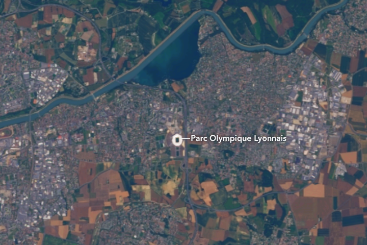
The Landsat 8 satellite caught a closer look at the action on June 29. The image below shows the Parc Olympique Lyonnais in Décines-Charpieu, France. The stadium fits almost 60,000 people and will host the semifinals and final game.
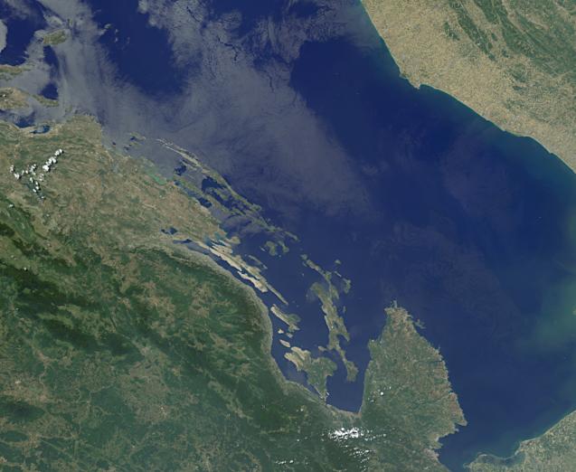
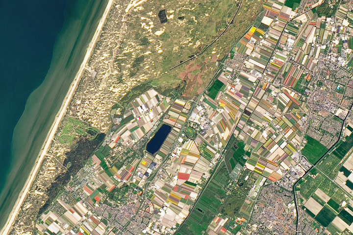
At the start of July 2, there were four teams still competing for the Cup: Sweden, the Netherlands, England, and the United States. We looked back into our archives to find images of each of these countries. Can you guess which satellite image below belongs to which country?

Update: the answer to the June puzzler has been posted.
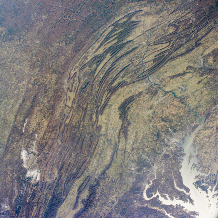
Every month on Earth Matters, we offer a puzzling satellite image. The June 2019 puzzler is above. Your challenge is to use the comments section to tell us what we are looking at and why it is interesting.
How to answer. You can use a few words or several paragraphs. You might simply tell us the location. Or you can dig deeper and explain what satellite and instrument produced the image, what spectral bands were used to create it, or what is compelling about some obscure feature in the image. If you think something is interesting or noteworthy, tell us about it.
The prize. We can’t offer prize money or a trip to Mars, but we can promise you credit and glory. Well, maybe just credit. Roughly one week after a puzzler image appears on this blog, we will post an annotated and captioned version as our Image of the Day. After we post the answer, we will acknowledge the first person to correctly identify the image at the bottom of this blog post. We also may recognize readers who offer the most interesting tidbits of information about the geological, meteorological, or human processes that have shaped the landscape. Please include your preferred name or alias with your comment. If you work for or attend an institution that you would like to recognize, please mention that as well.
Recent winners. If you’ve won the puzzler in the past few months or if you work in geospatial imaging, please hold your answer for at least a day to give less experienced readers a chance to play.
Releasing Comments. Savvy readers have solved some puzzlers after a few minutes. To give more people a chance to play, we may wait between 24 to 48 hours before posting comments.
Good luck!
The UK’s Antarctic Place-names Committee has agreed that seven ice features in western Antarctica should be named for Earth-observation satellites. One of them is Landsat Ice Steam.
The new designations were announced on June 7, 2019. The ice features are all located in Western Palmer Land on the southern Antarctic Peninsula.
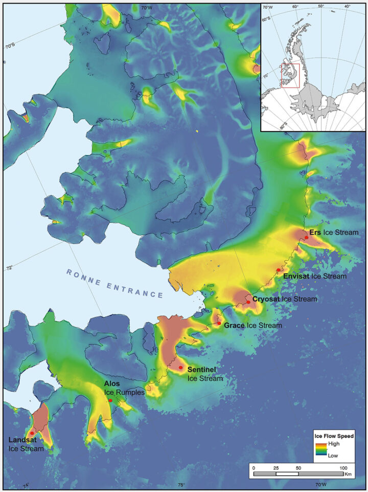
The seven features ring George VI Sound like pearls on a necklace. The new names, as officially entered into the British Antarctic Territory Gazetteer, are (from west to east): Landsat Ice Steam, ALOS Ice Rumples, Sentinel Ice Stream, GRACE Ice Stream, Envisat Ice Stream, Cryosat Ice Stream, and ERS Ice Stream.
The UK has submitted the new names for the fast-moving ice features to Scientific Committee on Antarctic Research (SCAR), which maintains a gazetteer or registry, of names officially adopted by individual nations. Under the Antarctic Treaty, signatory nations confer on geographic feature names, but each nation’s naming authority formally adopts new names. The U.S. Board on Geographic Names will meet in July and may discuss at that meeting whether the names adopted by the UK also will be adopted by the US. The question of using the term “glacier” for the ice features instead of “ice stream” is also part of each nation’s naming decision.
The new names were proposed by Anna Hogg, a glaciologist with the Center for Polar Observation and Modelling at the University of Leeds. In research published in 2017, Hogg found that glaciers draining from the Antarctic Peninsula were accelerating, thinning, and retreating, with implications for global sea level rise. The fast-moving glaciers that Hogg and colleagues tracked with radar and optical satellite imagery were unnamed. In her paper, the glaciers had to be designated by latitude and longitude.
Satellites had enabled Hogg and her team to clock the speed of these nameless ice features—some with rates faster than 1.5 meters/day. In tribute to the spaceborne instruments, Hogg came up with a way to describe the fast-moving ice features more succinctly—name them after the satellites that had helped her understand their behavior.
Hogg proposed to the U.K.’s Antarctic Place-names Committee that the features should be named for Landsat, Sentinel, ALOS PALSAR, ERS, GRACE, CryoSat, and Envisat. She was notified in early June that the committee had agreed to adopt the names, which provide a way to recognize international collaboration, as fifteen space agencies currently collaborate on Antarctic data collection.
“Satellites are the heroes in my science of glaciology,” Hogg told the BBC. “They’ve totally revolutionized our understanding, and I thought it would be brilliant to commemorate them in this way.”
Naming the glaciers after satellites is also a celebration of data fusion. “Our understanding of ice velocities and ice sheet mass balance has come from putting many different remote sensing data sets together—optical, radar, gravity, and laser altimetry,” said Jeff Masek, the NASA Landsat 9 Project Scientist. “Landsat has been a key piece in assembling that larger puzzle. Naming an ice stream after Landsat is a fitting way to recognize the value of long-term Earth Observation data for measuring changes in Earth’ polar regions.”
Read more from NASA’s Landsat science and outreach team, including the history of Antarctic observation with Landsat. Read more about all of the glaciers and their namesake satellites, as told by the European Space Agency. And read about the island discovered by and named for Landsat, and the woman who discovered it.
Correction, June 27, 2019: SCAR’s role in the Antarctic naming process was incorrectly described in the earlier version of this article. Updates were provided by Dr. Scott Borg, Deputy Assistant Director of the National Science Foundation’s Directorate for Geosciences, and Peter West, the Outreach Program managers for NSF’s Office of Polar Programs, to correctly describe the naming process.
If you follow science news, this will probably sound familiar.
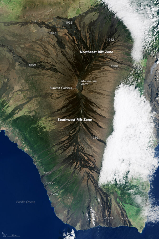
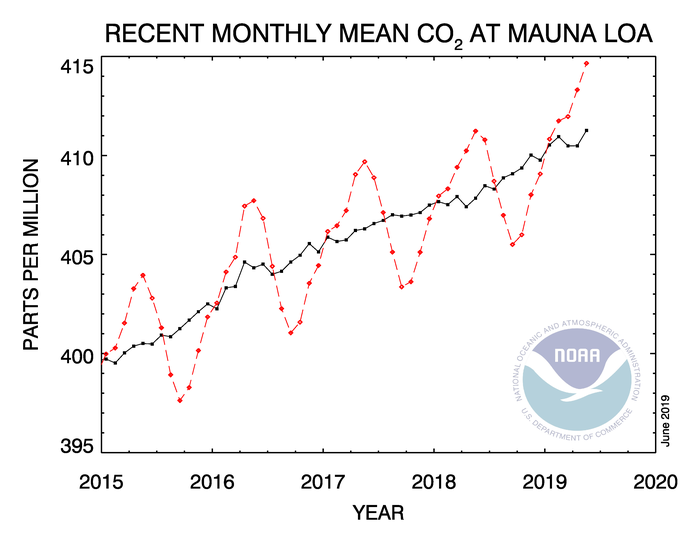
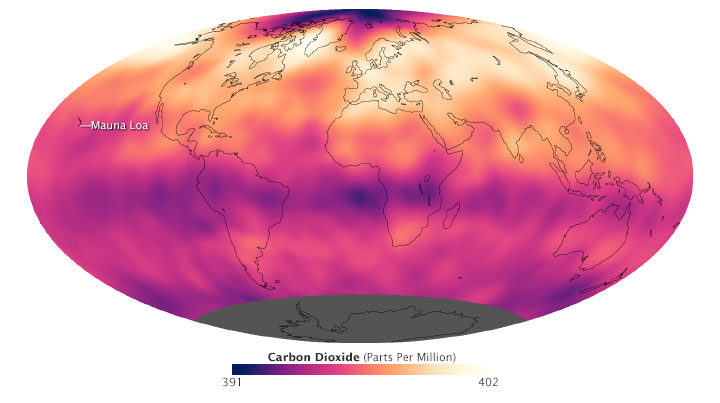
In May 2019, when atmospheric carbon dioxide reached its yearly peak, it set a record. The May average concentration of the greenhouse gas was 414.7 parts per million (ppm), as observed at NOAA’s Mauna Loa Atmospheric Baseline Observatory in Hawaii. That was the highest seasonal peak in 61 years, and the seventh consecutive year with a steep increase, according to NOAA and the Scripps Institution of Oceanography.
The Mauna Loa Observatory has been measuring carbon dioxide since 1958. The remote location (high on a volcano) and scarce vegetation make it a good place to monitor carbon dioxide because it does not have much interference from local sources of the gas. (There are occasional volcanic emissions, but scientists can easily monitor and filter them out.) Mauna Loa is part of a globally distributed network of air sampling sites that measure how much carbon dioxide is in the atmosphere.
The broad consensus among climate scientists is that increasing concentrations of carbon dioxide in the atmosphere are causing temperatures to warm, sea levels to rise, oceans to grow more acidic, and rainstorms, droughts, floods and fires to become more severe. Here are six less widely known but interesting things to know about carbon dioxide.
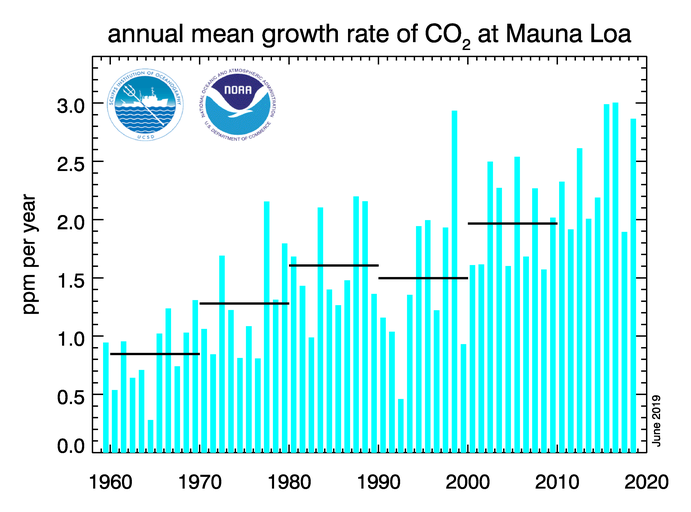
For decades, carbon dioxide concentrations have been increasing every year. In the 1960s, Mauna Loa saw annual increases around 0.8 ppm per year. By the 1980s and 1990s, the growth rate was up to 1.5 ppm year. Now it is above 2 ppm per year. There is “abundant and conclusive evidence” that the acceleration is caused by increased emissions, according to Pieter Tans, senior scientist with NOAA’s Global Monitoring Division.
To understand carbon dioxide variations prior to 1958, scientists rely on ice cores. Researchers have drilled deep into icepack in Antarctica and Greenland and taken samples of ice that are thousands of years old. That old ice contains trapped air bubbles that make it possible for scientists to reconstruct past carbon dioxide levels. The video below, produced by NOAA, illustrates this data set in beautiful detail. Notice how the variations and seasonal “noise” in the observations at short time scales fade away as you look at longer time scales.
Satellite observations show carbon dioxide in the air can be somewhat patchy, with high concentrations in some places and lower concentrations in others. For instance, the map below shows carbon dioxide levels for May 2013 in the mid-troposphere, the part of the atmosphere where most weather occurs. At the time there was more carbon dioxide in the northern hemisphere because crops, grasses, and trees hadn’t greened up yet and absorbed some of the gas. The transport and distribution of CO2 throughout the atmosphere is controlled by the jet stream, large weather systems, and other large-scale atmospheric circulations. This patchiness has raised interesting questions about how carbon dioxide is transported from one part of the atmosphere to another—both horizontally and vertically.
In this animation from NASA’s Scientific Visualization Studio, big plumes of carbon dioxide stream from cities in North America, Asia, and Europe. They also rise from areas with active crop fires or wildfires. Yet these plumes quickly get mixed as they rise and encounter high-altitude winds. In the visualization, reds and yellows show regions of higher than average CO2, while blues show regions lower than average. The pulsing of the data is caused by the day/night cycle of plant photosynthesis at the ground. This view highlights carbon dioxide emissions from crop fires in South America and Africa. The carbon dioxide can be transported over long distances, but notice how mountains can block the flow of the gas.
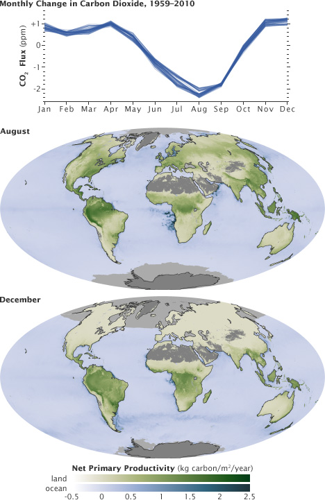
You’ll notice that there is a distinct sawtooth pattern in charts that show how carbon dioxide is changing over time. There are peaks and dips in carbon dioxide caused by seasonal changes in vegetation. Plants, trees, and crops absorb carbon dioxide, so seasons with more vegetation have lower levels of the gas. Carbon dioxide concentrations typically peak in April and May because decomposing leaves in forests in the Northern Hemisphere (particularly Canada and Russia) have been adding carbon dioxide to the air all winter, while new leaves have not yet sprouted and absorbed much of the gas. In the chart and maps below, the ebb and flow of the carbon cycle is visible by comparing the monthly changes in carbon dioxide with the globe’s net primary productivity, a measure of how much carbon dioxide vegetation consume during photosynthesis minus the amount they release during respiration. Notice that carbon dioxide dips in Northern Hemisphere summer.
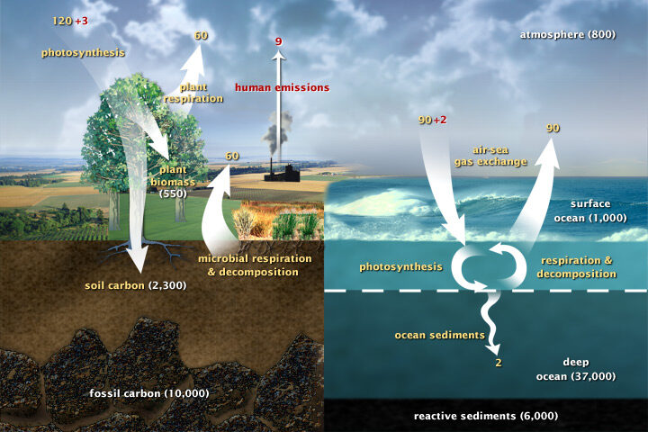
Most of Earth’s carbon—about 65,500 billion metric tons—is stored in rocks. The rest resides in the ocean, atmosphere, plants, soil, and fossil fuels. Carbon flows between each reservoir in the carbon cycle, which has slow and fast components. Any change in the cycle that shifts carbon out of one reservoir puts more carbon into other reservoirs. Any changes that put more carbon gases into the atmosphere result in warmer air temperatures. That’s why burning fossil fuels or wildfires are not the only factors determining what happens with atmospheric carbon dioxide. Things like the activity of phytoplankton, the health of the world’s forests, and the ways we change the landscapes through farming or building can play critical roles as well. Read more about the carbon cycle here.
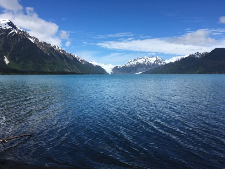
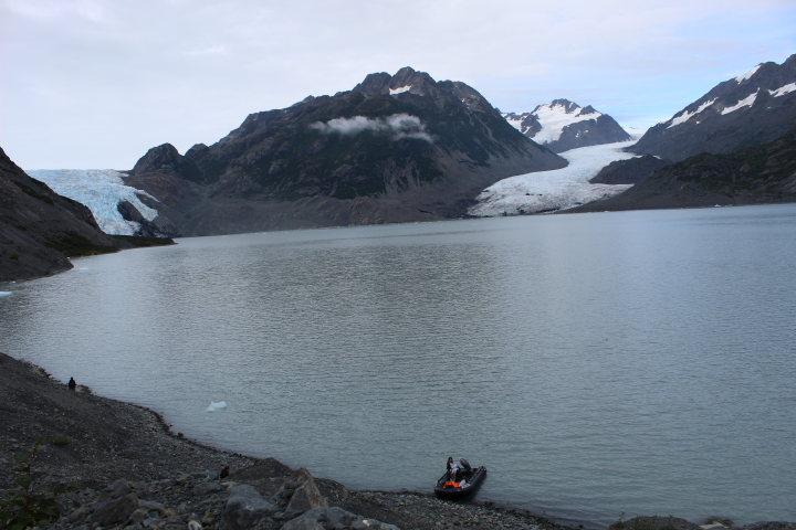
In a recent article, we showed satellite imagery of the dramatic retreat of Alaska’s Excelsior Glacier over the past two decades. The glacier has shortened by 30 percent since 1994, primarily due to rising temperatures and calving. What was once ice is now a pool of meltwater called Big Johnstone Lake. Images collected closer to the ground also show dramatic change.
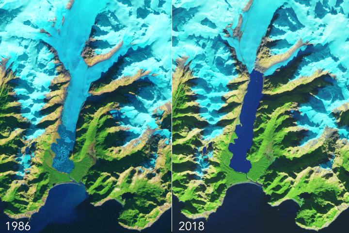
In photos taken in 1909 by the U.S. Geological Survey, Excelsior glacier nearly touched the Pacific Ocean, resting on a sliver of forested land. Today, the glacier is separated from the ocean by Big Johnstone Lake, which measures nearly five times the area of New York City’s Central Park.
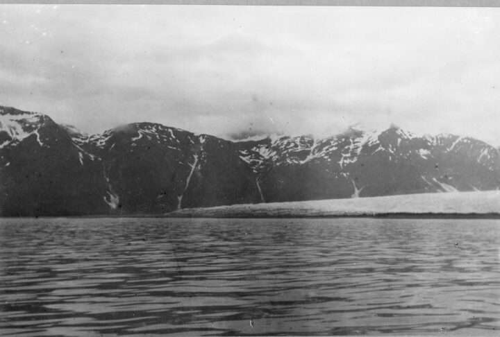
The following images were taken by staff from the Johnstone Adventure Lodge, which was built near the mouth of the glacier.
The image below shows Excelsior Glacier in 2016 (first) compared to 2018 (second). While the second picture was taken from a farther distance, the absence of icebergs in Big Johnstone Lake stands out.
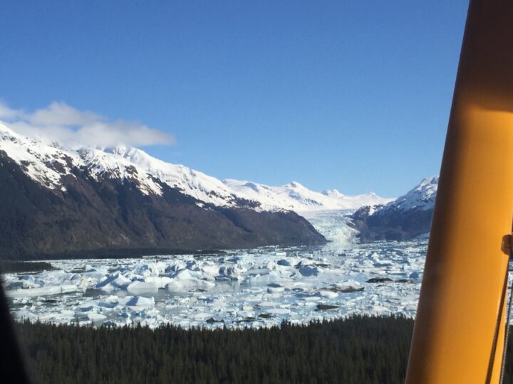
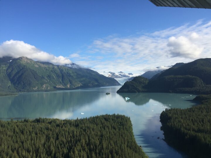
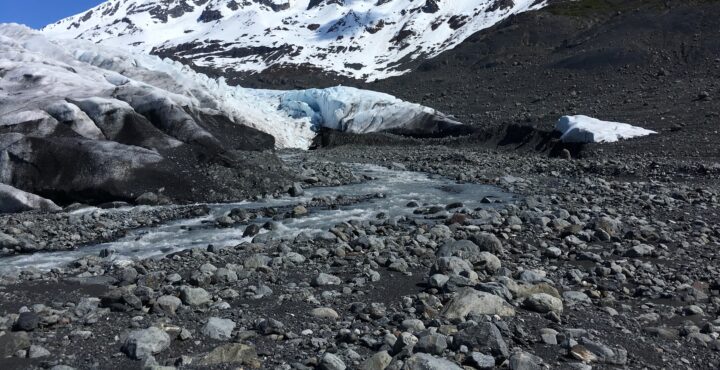
The following image also shows the complete separation of the glacier into its eastern and western tributaries (as seen in the top 2018 satellite photo). The owners of the lodge have named the right tributary “Roan Glacier.”
The following images show changes on Roan Glacier from 2018 to 2019. In 2019, you can see a rogue chunk of ice on right (first image below). According to the owners of the Johnstone Adventure Lodge, the chunk “was certainly not separated in September 2018,” as shown in the second picture.
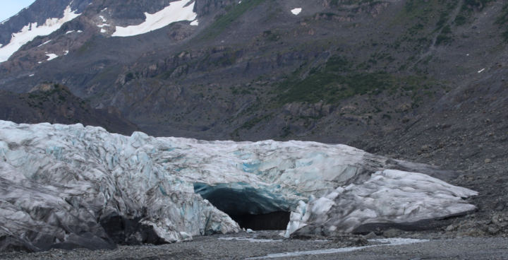
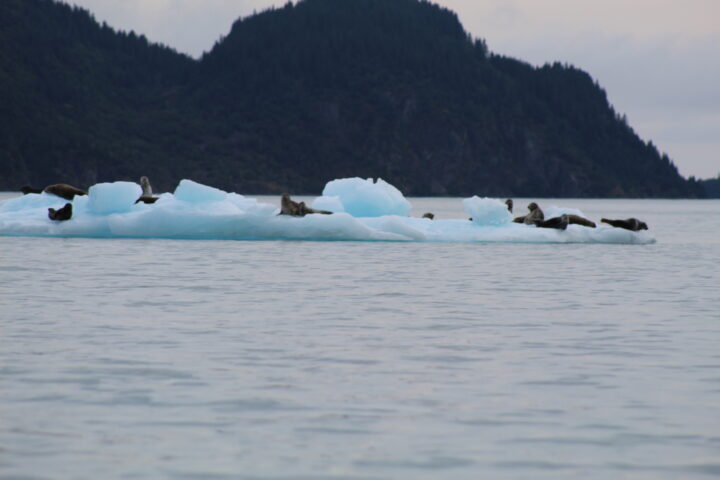
This last image shows 15-20 harbor seals that hang around the glacier. Harbor seals often haul-out on icebergs, so fewer icebergs will likely mean fewer seals as time goes on.