Every month on Earth Matters, we offer a puzzling satellite image. The June 2020 puzzler is above. Your challenge is to use the comments section to tell us what we are looking at, where it is, and why it is interesting.
How to answer. You can use a few words or several paragraphs. You might simply tell us the location, or you can dig deeper and explain what satellite and instrument produced the image, what spectral bands were used to create it, or what is compelling about some obscure feature. If you think something is interesting or noteworthy, tell us about it.
The prize. We cannot offer prize money or a trip to Mars, but we can promise you credit and glory. Well, maybe just credit. Roughly one week after a puzzler image appears on this blog, we will post an annotated and captioned version as our Image of the Day. After we post the answer, we will acknowledge the first person to correctly identify the image at the bottom of this blog post. We also may recognize readers who offer the most interesting tidbits of information about the geological, meteorological, or human processes that have shaped the landscape. Please include your preferred name or alias with your comment. If you work for or attend an institution that you would like to recognize, please mention that as well.
Recent winners. If you’ve won the puzzler in the past few months, or if you work in geospatial imaging, please hold your answer for at least a day to give less experienced readers a chance.
Releasing Comments. Savvy readers have solved some puzzlers after a few minutes. To give more people a chance, we may wait 24 to 48 hours before posting comments. Good luck!
Cada mes en la sección Earth Matters, ofrecemos una imagen de satélite intrigante. La imagen superior es el acertijo de junio 2020. Tu desafío es usar la sección de comentarios para decirnos qué miramos, dónde está, y por qué es interesante.
Cómo participar. Responde usando unas pocas palabras o varios párrafos. Puedes solo darnos la ubicación, o puedes profundizar y explicar qué satélite e instrumento produjeron la imagen, qué bandas espectrales se emplearon para crearla, o qué resulta atractivo en algún elemento poco definido. Si piensas que algo es interesante o digno de mención, dínoslo.
El premio. No podemos ofrecerte recompensa monetaria o un viaje a Marte, pero podemos prometerte reconocimiento y fama. En verdad, solo reconocimiento. Aproximadamente una semana después de publicar la imagen acertijo en este blog, publicaremos una versión comentada y subtitulada como nuestra imagen del día. Tras publicar la respuesta, daremos crédito a la primera persona que identificó correctamente la imagen en la parte inferior de la publicación. También podemos dar crédito a los participantes que ofrecieron las piezas de información más interesantes sobre los procesos geológicos, meteorológicos, o humanos que dieron forma al paisaje. Por favor incluye tu nombre o alias con tu comentario. Si trabajas o asistes a una institución que quieras reconocer, por favor menciónala también.
Ganadores recientes. Si has ganado uno de los acertijos de los últimos meses, o si trabajas con imágenes geoespaciales, por favor contén tu respuesta por al menos un día para dar oportunidad a aquellos lectores menos experimentados.
Publicación de comentarios.Los lectores expertos han resuelto algunos de los acertijos en solo minutos. Para dar oportunidad de resolverlo a la mayor cantidad de lectores, la publicación de comentarios puede retardarse de 24 a 48 horas. ¡Buena suerte!
Esta entrada fue originalmente publicada el martes, 30 de junio de 2020 a las 3:00 pm y está archivada bajo la sección EO Satellite Puzzler. Puedes hacer seguimiento a las respuestas de este acertijo a través de la fuente RSS 2.0. Puedes saltar hasta el final y dejar una respuesta. Actualmente no está permitido hacer ping.
Deja tu respuesta
Mantén tu respuesta relevante. Los comentarios inapropiados u ofensivos pueden ser editados y/o borrados. Evita añadir direcciones URL de sitios web.
Nombre (obligatorio)
Correo (no se publicará) (obligatorio)
NASA, the European Space Agency (ESA), and the Japan Aerospace Exploration Agency (JAXA) have joined forces to create the COVID-19 Earth Observation Dashboard. The web platform combines the collective scientific power of the agencies’ Earth-observing satellites to document changes in the environment and society in response to the pandemic.
The dashboard is a user-friendly tool to track changes in air and water quality, climate change, economic activity, and agriculture.
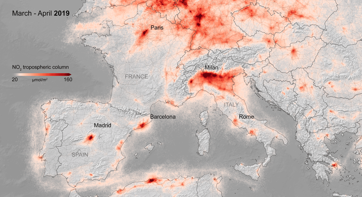
Air quality changes were among the first noticeable impacts of pandemic-related stay-at-home orders, and the resulting reductions in industrial activity, that could be tracked through satellite observations. Reductions in nitrogen dioxide (NO2) levels — primarily related to temporary reductions in the burning of fossil fuels — show up clearly in satellite data.
A preliminary analysis also indicates that planting (farming) activity dropped during the quarantines and lockdowns. For example, the cultivated area of white asparagus in Brandenburg, Germany, has been 20 to 30 percent lower this year, compared to 2019. More information on agricultural productivity changes will be added to the dashboard in the months to come.
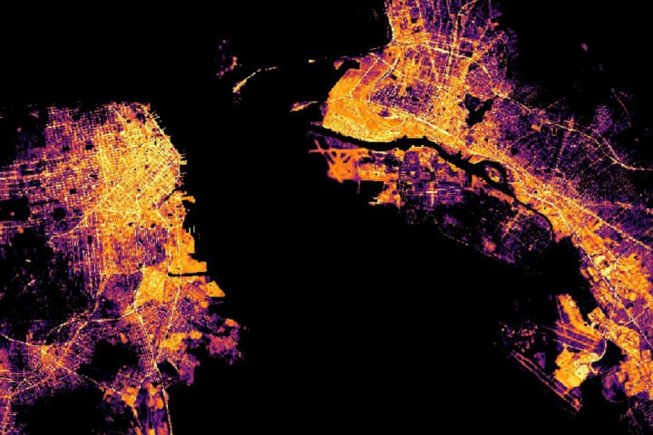
Recent water quality changes have been reported in a few locations that typically have intense industry and tourism — activities that have decreased during the pandemic. Data on ship identification, construction activity, and nighttime lights (above) are featured on the dashboard to keep track of some of the economic ramifications of the virus.
Together, ESA, JAXA, and NASA will continue to add new observations to the dashboard in the coming months to see how these indicators change. Learn more in the NASA press release, the video below, or by exploring the dashboard.
A series of research papers in recent months shows that we know more than ever before about the ice on our land and covering the seas. In case you missed them, here’s a look at some of the notable findings. Many are based on data from NASA’s ICESat-2 satellite, which just over a year ago released to the public more than a trillion new measurements of Earth’s height. With these and other satellite data scientists have …
Earlier this month we wrote about how the data were used to make the first maps of snow depth on sea ice. The research, published in JGR Oceans, shows how elevation measurements from ICESat-2 can be combined with data from ESA’s Cryosat-2 to get maps like these:
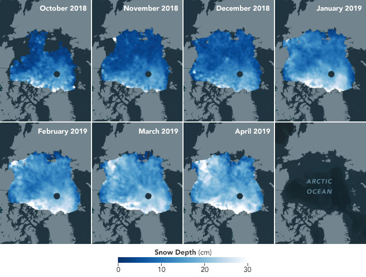
The snow layer is an important component of the sea ice system, affecting how the ice cover grows and melts. With additional years of observations, such maps could help scientists assess how climate change affects precipitation and the accumulation of snow.
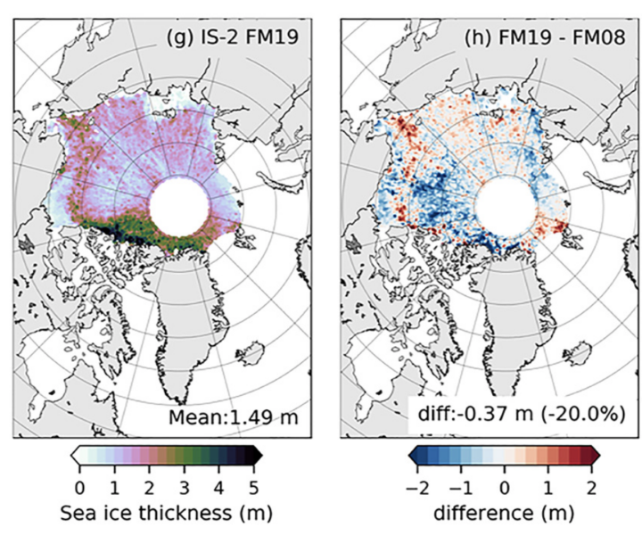
In another paper, scientists described how they used ICESat-2 data and a new model to estimate the thickness of Arctic sea ice. Comparing the new estimates to those made with the first ICESat mission (2003-2009), they found that sea ice in winter has thinned by as much as 20 percent in the past 11 years. The bottom-left map shows the February-March 2019 thickness estimate; the bottom-right map shows how much thickness has changed between 2008 and 2019. Read more about that study here.
Other research outlined the changes happening to ice on land. In a paper published April 2020 in Science, scientists chronicled 16-years of change to the Greenland and Antarctic ice sheets.
ICESat-2 data from 2019 showed that Greenland’s ice sheet had lost an average of 200 million metric tons of ice per year since the original ICESat started collecting data in 2003. Antarctica’s ice sheet lost an average of 118 million metric tons of ice per year during the same period.
But the beauty of the new measurements from ICESat-2 is that scientists can show details of where the changes are happening. Not only can they discern where the ice sheets have been thinning or thickening, but they can see changes on the scales of individual glaciers and, for the first time, across floating ice shelves. Read this story for more details, or check out the video below.
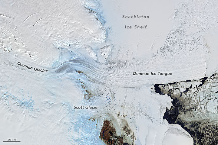
The ice in East Antarctica is generally thought to be less vulnerable than the ice in West Antarctica and the Antarctic Peninsula. Research in 2018, however, pointed to a number of glaciers along East Antarctica’s coastline that appear to be destabilizing. A new paper published March 2020 detailed the changes happening to Denman Glacier. The stability of Denman is a concern because this one glacier in East Antarctica holds as much ice as half of West Antarctica.
Scientists used satellite radar data from the Italian COSMO‐SkyMed constellation to detect the retreat of the glacier’s grounding line—the point at which a glacier last touches the seafloor and begins to float. If the grounding line continues to retreat, warm seawater could eventually penetrate upstream and beneath the glacier, continuing to melt it from below and destabilizing it. Read the full story here.
Sometimes multiple satellites can tell you more than a single satellite. In research published in Nature, scientists used observations from 11 satellite missions to calculate losses from the Antarctic and Greenland ice sheets since the 1990s. They show that the ice sheets together lost 81 billion metric tons per year in the 1990s, compared with 475 billion metric tons of ice per year in the 2010s—a sixfold increase.
The meltwater associated with the ice loss boosted global sea levels by 17.8 millimeters (0.7 inches), according to a story about the research.
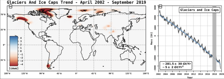
Some losses are directly affecting the freshwater resources available to people. In the 20thcentury, the largest contributors to sea level rise came from melting ice caps and glaciers in Alaska, the Canadian Arctic Archipelago, the Southern Andes, High Mountain Asia, the Russian Arctic, Iceland, and Svalbard.
Researchers used the GRACE and GRACE-FO satellites to determine that these seven regions lost (on average) more than 280 billion metric tons of ice per year between 2002 and 2019. The losses contributed 13 millimeters (0.5 inches) to global sea level rise. The losses also deplete a freshwater resource for communities that depend on the ice to provide meltwater for agriculture and drinking water. You can read more about the research, published April 2020 in GRL, in this story.
To counter the rapid spread of COVID-19 in the winter and spring of 2020, quarantines and social distancing measures were implemented around the world. Air traffic nearly ceased; non-essential businesses were closed; and the number of vehicles on the road fell well below normal.
Remote sensing scientists have started looking at potential changes in the environment due to these changes in human behavior. They are looking for signs of how environmental factors such as humidity, temperature, and ultraviolet radiation might play a role in the behavior of the virus. Some may also look for data related to access to water resources, which can be critical to the spread or prevention of certain diseases.
NASA’s Earth Science Data Systems program has developed a new web-based tool, the COVID-19 Data Pathfinder, which provides links to datasets that can be used to research changing environmental impacts from modified human behavior patterns, the possibility of seasonal trends in virus transmission, and water availability. The COVID-19 Data Pathfinder is also a resource for participants in NASA’s Space Apps COVID-19 Challenge, providing an intuitive means for new users to find and use NASA data.
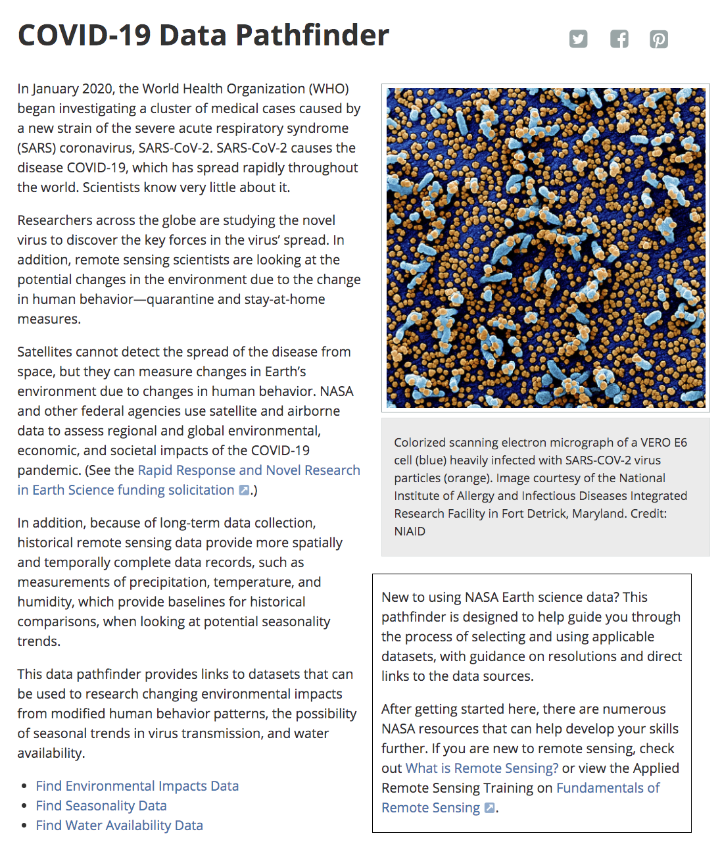
Web view of the COVID-19 Data Pathfinder page
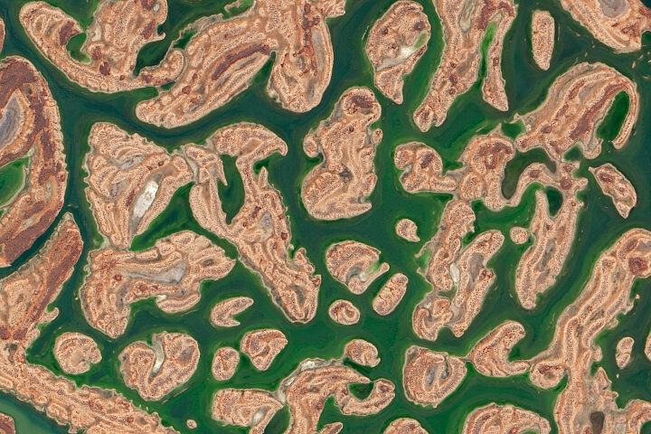
Every month on Earth Matters, we offer a puzzling satellite image. The May 2020 puzzler is above. Your challenge is to use the comments section to tell us what we are looking at, where it is, and why it is interesting.
How to answer. You can use a few words or several paragraphs. You might simply tell us the location, or you can dig deeper and explain what satellite and instrument produced the image, what spectral bands were used to create it, or what is compelling about some obscure feature. If you think something is interesting or noteworthy, tell us about it.
The prize. We cannot offer prize money or a trip to Mars, but we can promise you credit and glory. Well, maybe just credit. Roughly one week after a puzzler image appears on this blog, we will post an annotated and captioned version as our Image of the Day. After we post the answer, we will acknowledge the first person to correctly identify the image at the bottom of this blog post. We also may recognize readers who offer the most interesting tidbits of information about the geological, meteorological, or human processes that have shaped the landscape. Please include your preferred name or alias with your comment. If you work for or attend an institution that you would like to recognize, please mention that as well.
Recent winners. If you’ve won the puzzler in the past few months, or if you work in geospatial imaging, please hold your answer for at least a day to give less experienced readers a chance.
Releasing Comments. Savvy readers have solved some puzzlers after a few minutes. To give more people a chance, we may wait 24 to 48 hours before posting comments. Good luck!
See “In a Desert Not So Far Away for the Answer” Image of the Day for the answer. Congratulations to Dan O’Brien for being the first reader to post the answer on the Earth Matters blog.
As noted in a recent Image of the Day (“A Fiery Month in Zulia”) satellites have detected lots of fire activity in western Venezuela in recent weeks. Just as we were finishing that story, a surprisingly large, dark smoke plume appeared in VIIRS and MODIS imagery. It bore little resemblance to the smaller, gray plumes that we had been watching. Forest and crops fires had caused the earlier plumes; the new black smoke was caused by a brush fire that had spread into a crude oil storage area, according to news reports.
The animation above shows the progression of the plume on the morning of April 25, 2020. The images were collected at 10 minute intervals by the Advanced Baseline Imager (ABI) on NOAA’s GOES-16 satellite. Sensors on other satellites caught glimpses of the short-lived plume as well, including the Multispectral Instrument (MSI) on the European Space Agency’s Sentinel-2 satellite and the Ozone Monitoring Instrument (OMI) on NASA’s Aura satellite.
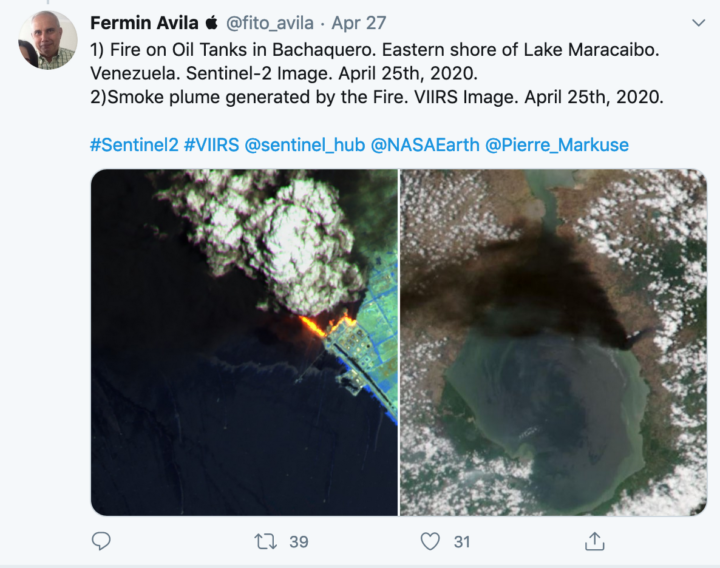
With dozens of firefighters battling the blaze, it was extinguished by the next day. On April 26, 2020, there were no signs of smoke or active fires visible in MODIS and VIIRS images of that area.

“As you take this constant drumbeat of new information and research in, remember that this virus is new to science and people have only just started studying it. Doing high-quality, definitive science takes time, sometimes a long time. The appetite for answers is understandably intense, but we also have to try to balance that hunger with patience.”
– Benjamin Zaitchik, a Johns Hopkins University researcher working to understand whether environmental factors are affecting the spread of coronavirus.
Ever since a new and deadly strain of coronavirus (SARS-CoV-2) emerged in China and then spread around the world, the virus has upended life in many countries. Scientists at NASA and other institutions have hustled to track and make sense of our new reality with every tool and technique at their disposal, including satellite data.
As several comprehensive NASA-funded research projects get started, here is a quick roundup of some of the more interesting satellite-related findings about the science of coronavirus and its effects on the environment.
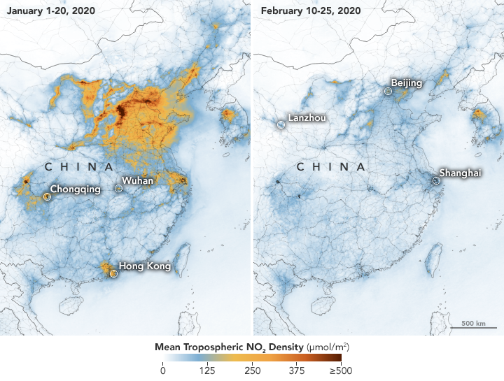
Much of the news about the new coronavirus is grim, but observations of air quality offer a breath of fresh air. Several satellite sensors have detected drops in air pollutants — including nitrogen dioxide, carbon monoxide, and fine particles — following restrictions on travel and economic activity. Teams of scientists have spotted changes in China, Europe, the U.S. Northeast and Southeast, and India.
Look here for some tips on how to find and visualize changes in nitrogen dioxide, one of the gases that most clearly shows the effects of quarantines and economic shutdowns. Also, look here for nitrogen dioxide data for cities all around the world. But beware: As University of Georgia meteorologist Marshall Shepherd has pointed out, clouds and rain can create confusing changes in nitrogen dioxide that have nothing to do coronavirus restrictions.
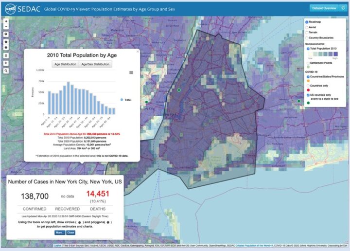
Given how much the virus has changed daily life, many of us find ourselves turning into armchair epidemiologists, trying to make sense of how the virus is spreading and what it means for our local area. If you are interested in taking a close look at new data as it comes in, this simple-to-use mapping tool from NASA’s Socioeconomic Data and Applications Center (SEDAC) might be of interest. It features demographic data, along with regularly updated information on reported global cases of the novel coronavirus (COVID-19). There is a short user guide here.
One of the key unknowns about the new coronavirus is whether environmental conditions — such as temperature, humidity, and exposure to ultraviolet light — have any effect on how the virus spreads or on the severity of the symptoms. NASA-funded researchers are starting to investigate this in several ways, while others are using NASA data in their models and analyses.
Some controlled laboratory research has suggested that exposure to warm air may make it more difficult for the virus to survive and spread. That has led many researchers around the world to start analyzing epidemiological and meteorological data to see if certain environmental factors have a significant impact on the virus in the real world. At this point it is too early to say, declared the National Academy of Sciences in a report on April 7, 2020, but the research continues.
Billions of people are facing something that NASA astronauts have plenty of experience with—living in social isolation for long periods with just a few other people. Here are some tips from astronaut Anne McClain and psychologist Tom Williams.
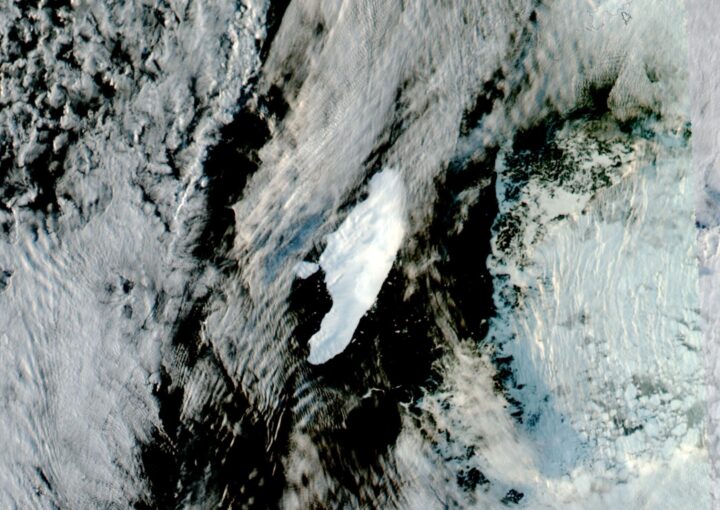
Antarctic iceberg A-68A, which broke from the Larsen C Ice Shelf in 2017, has been floating solo in recent years. Not anymore. The colossal iceberg finally fractured in late April 2020, spawning a new companion named A-68C.
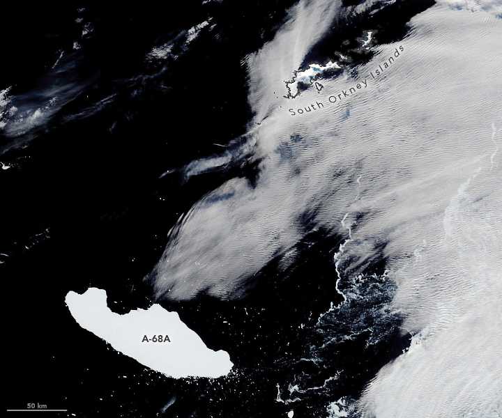
The break was not exactly surprising. A few weeks ago, we published this image (above) showing Iceberg A-68A on April 9, 2020. The iceberg on that day was still intact, but it had drifted north into dangerously warm waters. Christopher Readinger of the U.S. National Ice Center (USNIC) noted at the time:
“I’m surprised at how well it’s sticking together. It’s been in warmer water for a few months now and it’s not exactly a very thick berg, so I expect it will break up sometime soon, but it’s showing no signs of that yet.”
Less than two weeks later, that’s exactly what happened. Satellite images on April 22 showed that a new iceberg had broken off from A-68A. The pair is now drifting at the edge of the Weddell Sea and South Atlantic Ocean, near the South Orkney Islands. The image below, acquired by the Visible Infrared Imaging Radiometer Suite (VIIRS) on the NASA-NOAA Suomi-NPP satellite, shows the bergs on May 3, 2020.
Iceberg A-68C measures about 11 nautical miles long and 7 nautical miles wide (20 by 13 kilometers). That’s small compared to its parent berg A-68A, which now measures 82 by 26 nautical miles (152 by 48 kilometers), but it is large enough to be named and tracked by the U.S. National Ice Center.
Even after shedding the sizable piece of ice, A-68A is still the largest iceberg currently floating anywhere on Earth. It has calved only one other named berg, forming A-68B in July 2017 just after the initial calving event from the ice shelf.
To see where the iceberg duo goes from here, you can follow them in satellite imagery available on Worldview.
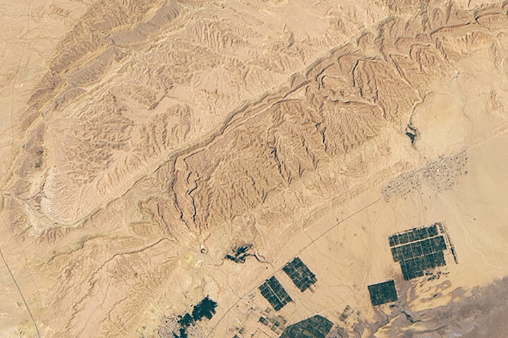
Every month on Earth Matters, we offer a puzzling satellite image. The April 2020 puzzler is above. Your challenge is to use the comments section to tell us what we are looking at, where it is, and why it is interesting.
How to answer. You can use a few words or several paragraphs. You might simply tell us the location, or you can dig deeper and explain what satellite and instrument produced the image, what spectral bands were used to create it, or what is compelling about some obscure feature. If you think something is interesting or noteworthy, tell us about it.
The prize. We cannot offer prize money or a trip to Mars, but we can promise you credit and glory. Well, maybe just credit. Roughly one week after a puzzler image appears on this blog, we will post an annotated and captioned version as our Image of the Day. After we post the answer, we will acknowledge the first person to correctly identify the image at the bottom of this blog post. We also may recognize readers who offer the most interesting tidbits of information about the geological, meteorological, or human processes that have shaped the landscape. Please include your preferred name or alias with your comment. If you work for or attend an institution that you would like to recognize, please mention that as well.
Recent winners. If you’ve won the puzzler in the past few months, or if you work in geospatial imaging, please hold your answer for at least a day to give less experienced readers a chance.
Releasing Comments. Savvy readers have solved some puzzlers after a few minutes. To give more people a chance, we may wait 24 to 48 hours before posting comments. Good luck!
See our “Filling up Lake Carnegie” Image of the Day for the answer.
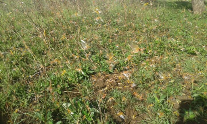
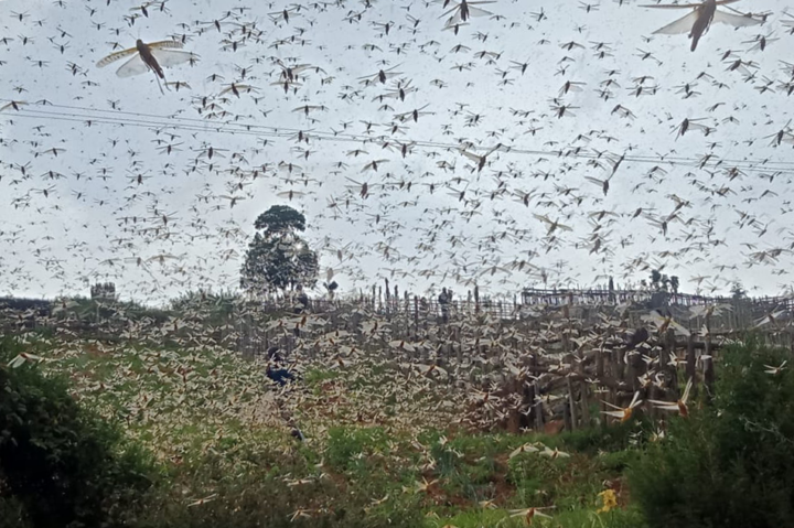
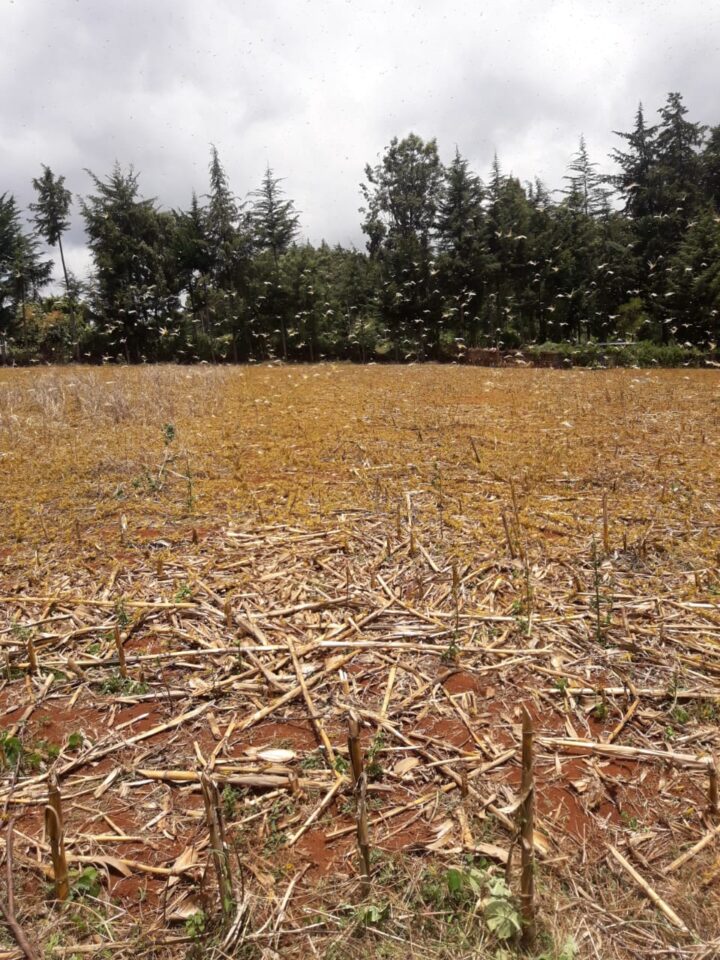
East Africa is experiencing one of its worst locust outbreaks in decades. The voracious insects are devouring thousands of hectares of farmland and forests, and threatening food security for millions across the region, which is already vulnerable to food shortages.
To help manage outbreaks, NASA scientists are developing tools to track locust breeding grounds and to assess crop damage. We previously reported on the satellite data used in these assessments, but researchers are also using ground-based observations from several local organizations and government offices. Such information is used to validate estimates of crop conditions made from satellite imagery and included in international crop forecasts.
“Our ground partners give monthly updates on crop conditions and major events like flooding and disease outbreaks,” said Catherine Nakalembe, a food security researcher with NASA SERVIR and NASA Harvest. “They help provide critical ground information when the remote sensing data are not sufficient.”
The following photos, taken by people in Uganda and Kenya, show some of the effects of the locust outbreak on farms.
Kenya is experiencing its worst locust outbreak in 70 years. The image at the top of this page and the one below shows locusts (yellow) swarming a field in March 2020.
The images were taken by Gentrix Machenje. Machenje is a county officer who works with NASA SERVIR and provides information for Kenya’s National Crop Monitor.
The photos below were taken in early April 2020 in the Karamoja region of northeast Uganda. Officials believe the locusts hatched from eggs laid a few weeks ago.
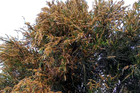
The images were taken by Evans Noble Opiolo, an agricultural officer in the Nakapiripirit District who also contributes to a Disaster Risk Financing Project for Uganda’s Office of the Prime Minister. Such officers are reporting on locust locations and are often present when ground-control operations, such as pesticide spraying, are in progress.