
This is a cross-post of a story by Ellen Gray. It provides deeper insight into our May 23 Image of the Day.
Ominous beginning: Garbage data from a new satellite
Six months after GRACE launched in March 2002, we got our first look at the data fields. They had these big vertical, pole-to-pole stripes that obscured everything. We’re like, holy cow this is garbage. All this work and it’s going to be useless.
But it didn’t take the science team long to realize that they could use some pretty common data filters to remove the noise, and after that they were able to clean up the fields and we could see quite a bit more of the signal. We definitely breathed a sigh of relief. Steadily over the course of the mission, the science team became better and better at processing the data, removing errors, and some of the features came into focus. Then it became clear that we could do useful things with it.
And then trends emerged
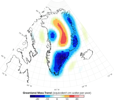
It only took a couple of years. By 2004, 2005, the science team working on mass changes in the Arctic and Antarctic could see the ice sheet depletion of Greenland and Antarctica. We’d never been able before to get the total mass change of ice being lost. It was always the elevation changes – there’s this much ice, we guess – but this was like wow, this is the real number.
Not long after that we started to see, maybe, that there were some trends on the land, although it’s a little harder on the land because with terrestrial water storage — the groundwater, soil moisture, snow, and everything. There’s inter-annual variability, so if you go from a drought one year to wet a couple years later, it will look like you’re gaining all this water, but really, it’s just natural variability.
By around 2006, there was a pretty clear trend over Northern India. At the GRACE science team meeting, it turned out another group had noticed that as well. We were friendly with them, so we decided to work on it separately. Our research ended up being published in 2009, a couple years after the trends had started to become apparent. By the time we looked at India, we knew that there were other trends around the world. Slowly not just our team but all sorts of teams, all different scientists around the world, were looking at different apparent trends and diagnosing them and trying to decide if they were real and what was causing them.
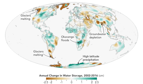
A world of big blobs of red and blue
I think the map, the global trends map, is the key. By 2010 we were getting the broad-brush outline, and I wanted to tell a story about what is happening in that map. For me the easiest way was to just look at the data around the continents and talk about the major blobs of red or blue that you see and explain each one of them and not worry about what country it’s in or placing it in a climate region or whatever. We can just draw an outline around these big blobs. Water is being gained or lost. The possible explanations are not that difficult to understand. It’s just trying to figure out which one is right.
Not everywhere you see as red or blue on the map is a real trend. It could be natural variability in part of the cycle where freshwater is increasing or decreasing. But some of the blobs were real trends. If it’s lined up in a place where we know that there’s a lot of agriculture, that they’re using a lot of water for irrigation, there’s a good chance it’s a decreasing trend that’s caused by human-induced groundwater depletion.
And then, there’s the question: are any of the changes related to climate change? There have been predictions of precipitation changes, that they’re going to get more precipitation in the high latitudes and more precipitation as rain as opposed to snow. Sometimes people say that the wet get wetter and the dry get dryer. That’s not always the case, but we’ve been looking for that sort of thing. These are large-scale features that are observed by a relatively new satellite system and we’re lucky enough to be some of the first to try and explain them.
What kept me up at night
The past couple years when I’d been working the most intensely on the map, the best parts of my time in the office were when I was working on it. Because I’m a lab chief, I spend about half my time on managerial and administrative things. But I love being able to do the science, and in particular this, looking at the GRACE data, trying to diagnose what’s happening, has been very enjoyable and fulfilling. We’ve been scrutinizing this map going on eight, nine years now, and I really do have a strong connection to it.
What kept me up at night was finding the right explanations and the evidence to support our hypotheses – or evidence to say that this hypothesis is wrong and we need to consider something else. In some cases, you have a strong feeling you know what’s happening but there’s no published paper or data that supports it. Or maybe there is anecdotal evidence or a map that corroborates what you think but is not enough to quantify it. So being able to come up with defendable explanations is what kept me up at night. I knew the reviewers, rightly, couldn’t let us just go and be completely speculative. We have to back up everything we say.
A tangled mix of answers
The world is a complicated place. I think it helped, in the end, that we categorized these changes as natural variability or as a direct human impact or a climate change related impact. But then there can be a mix of those – any of those three can be combined, and when they’re combined, that’s when it’s more difficult to disentangle them and say this one is dominant or whatever. It’s often not obvious. Because these are moving parts and particularly with the natural variability, you know it’s going to take another 15 years, probably the length of the GRACE Follow-On mission, before we become completely confident about some of these. So it’ll be interesting to return to this in 15 years and see which ones we got right and which ones we got wrong.
You can read about Matt’s research here: https://go.nasa.gov/2L7LXoP.
Tags: climate, drought, freshwater, GRACE, groundwater, ice, NASA