Every year, a group of scientists affiliated with the Global Carbon Project give Earth something like an annual checkup. Among the key questions they address: how much carbon is stored in the atmosphere, the ocean, and the land? And how much of that carbon has moved from one reservoir to another through fossil fuel burning, deforestation, reforestation, and uptake by the ocean each year?
All of the latest findings—including the data for 2020, a year like few others—are available here, including links to dozens of interesting charts and a peer-reviewed science paper. Ben Poulter, a NASA scientist and member of the Global Carbon Project team, summarized the findings this way: “The economic effects of COVID-19 caused fossil fuel emissions to decrease by 7 percent in 2020, but we continued to see atmospheric CO2 concentrations increase, by 2.5 ppm, or about 5.3 PgC. This means that the remaining carbon budget to avoid 1.5 or 2 degrees warming continues to shrink, and that we need to continue to monitor the land, ocean, and atmosphere to understand where fossil fuel CO2 ends up.”
Below are 10 key findings from the most recent report. (Note: the Global Carbon Project team synthesizes a broad range of data, some of which requires time-consuming processing, quality-control, and analysis. While they do report some 2020 numbers, the most recent full year of data available for others is 2019.)


The Global Carbon Budget is produced by more than 80 researchers working from universities and research institutions in 15 countries. Observations from several NASA satellites, sensors, aircraft, and models were among the sources of information used to formulate the 2020 budget. Sources of information supported by NASA included: the MODIS sensors on Aqua and Terra satellites, the Global Fire Emissions Database (GFED), the LPJ land surface carbon exchange model, Landsat, the LUHv2 land-cover change model, the CASA land surface carbon exchange model, ODIAC fossil fuel emissions data, the MERRA-2 reanalysis, the Cooperative Global Atmospheric Data Integration Project, and OCO-2.
This is a cross-post of a story by Ellen Gray. It provides deeper insight into our May 23 Image of the Day.
Six months after GRACE launched in March 2002, we got our first look at the data fields. They had these big vertical, pole-to-pole stripes that obscured everything. We’re like, holy cow this is garbage. All this work and it’s going to be useless.
But it didn’t take the science team long to realize that they could use some pretty common data filters to remove the noise, and after that they were able to clean up the fields and we could see quite a bit more of the signal. We definitely breathed a sigh of relief. Steadily over the course of the mission, the science team became better and better at processing the data, removing errors, and some of the features came into focus. Then it became clear that we could do useful things with it.
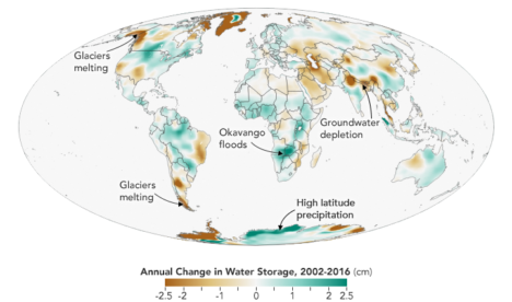
It only took a couple of years. By 2004, 2005, the science team working on mass changes in the Arctic and Antarctic could see the ice sheet depletion of Greenland and Antarctica. We’d never been able before to get the total mass change of ice being lost. It was always the elevation changes – there’s this much ice, we guess – but this was like wow, this is the real number.
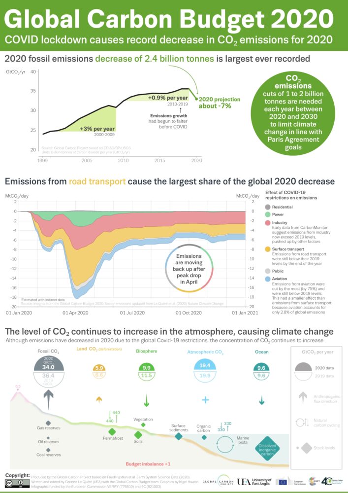
Not long after that we started to see, maybe, that there were some trends on the land, although it’s a little harder on the land because with terrestrial water storage — the groundwater, soil moisture, snow, and everything. There’s inter-annual variability, so if you go from a drought one year to wet a couple years later, it will look like you’re gaining all this water, but really, it’s just natural variability.
By around 2006, there was a pretty clear trend over Northern India. At the GRACE science team meeting, it turned out another group had noticed that as well. We were friendly with them, so we decided to work on it separately. Our research ended up being published in 2009, a couple years after the trends had started to become apparent. By the time we looked at India, we knew that there were other trends around the world. Slowly not just our team but all sorts of teams, all different scientists around the world, were looking at different apparent trends and diagnosing them and trying to decide if they were real and what was causing them.
I think the map, the global trends map, is the key. By 2010 we were getting the broad-brush outline, and I wanted to tell a story about what is happening in that map. For me the easiest way was to just look at the data around the continents and talk about the major blobs of red or blue that you see and explain each one of them and not worry about what country it’s in or placing it in a climate region or whatever. We can just draw an outline around these big blobs. Water is being gained or lost. The possible explanations are not that difficult to understand. It’s just trying to figure out which one is right.
Not everywhere you see as red or blue on the map is a real trend. It could be natural variability in part of the cycle where freshwater is increasing or decreasing. But some of the blobs were real trends. If it’s lined up in a place where we know that there’s a lot of agriculture, that they’re using a lot of water for irrigation, there’s a good chance it’s a decreasing trend that’s caused by human-induced groundwater depletion.
And then, there’s the question: are any of the changes related to climate change? There have been predictions of precipitation changes, that they’re going to get more precipitation in the high latitudes and more precipitation as rain as opposed to snow. Sometimes people say that the wet get wetter and the dry get dryer. That’s not always the case, but we’ve been looking for that sort of thing. These are large-scale features that are observed by a relatively new satellite system and we’re lucky enough to be some of the first to try and explain them.
The past couple years when I’d been working the most intensely on the map, the best parts of my time in the office were when I was working on it. Because I’m a lab chief, I spend about half my time on managerial and administrative things. But I love being able to do the science, and in particular this, looking at the GRACE data, trying to diagnose what’s happening, has been very enjoyable and fulfilling. We’ve been scrutinizing this map going on eight, nine years now, and I really do have a strong connection to it.
What kept me up at night was finding the right explanations and the evidence to support our hypotheses – or evidence to say that this hypothesis is wrong and we need to consider something else. In some cases, you have a strong feeling you know what’s happening but there’s no published paper or data that supports it. Or maybe there is anecdotal evidence or a map that corroborates what you think but is not enough to quantify it. So being able to come up with defendable explanations is what kept me up at night. I knew the reviewers, rightly, couldn’t let us just go and be completely speculative. We have to back up everything we say.
The world is a complicated place. I think it helped, in the end, that we categorized these changes as natural variability or as a direct human impact or a climate change related impact. But then there can be a mix of those – any of those three can be combined, and when they’re combined, that’s when it’s more difficult to disentangle them and say this one is dominant or whatever. It’s often not obvious. Because these are moving parts and particularly with the natural variability, you know it’s going to take another 15 years, probably the length of the GRACE Follow-On mission, before we become completely confident about some of these. So it’ll be interesting to return to this in 15 years and see which ones we got right and which ones we got wrong.
You can read about Matt’s research here: https://go.nasa.gov/2L7LXoP.
Remember the year 2000? Bill Clinton was president of the United States, Faith Hill and Santana topped Billboard music charts, and the world’s computers had just “survived” the Y2K bug. It also was the year that NASA’s Terra satellite began collecting images of Earth.
Eighteen years later, the versatile satellite — with five scientific sensors — is still operating. For all of that time, the satellite’s Moderate Resolution Imaging Spectroradiometer (MODIS) has been collecting daily data and imagery of the Arctic — and the rest of the planet, too.
If you knew where to look and were willing to wait patiently for file downloads, the images have always been available on specialized websites used by scientists. But there was no quick-and-easy way for the public to browse the imagery. With the recent addition of the full record of MODIS data into NASA’s Worldview browser, checking on what was happening anywhere in the world on any day since 2000 has gotten much easier.
Say you want to check on the weather in your hometown on the day you or your child was born. Just navigate to the date on Worldview, and make sure that the MODIS data layer is turned on. (In the image below, you can tell the Terra MODIS data layer is on because it is light gray.)
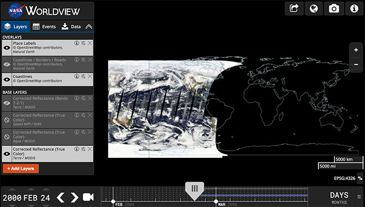
This Worldview screenshot shows the first day that Terra MODIS collected data — February 24, 2000. The very first Terra scene showed northern Argentina and Chile. Credit: EOSDIS.
One of the things I love about having all this MODIS data at my fingertips is that it makes it possible to see the passage of relatively long periods of time in just a few minutes. Look, for instance, at the animation at the top of this page, generated by Delft University of Technology ice scientist Stef Lhermitte using Worldview.
Lhermitte summoned every natural-color MODIS image of the Arctic that Terra and Aqua (which also has a MODIS instrument) have collected since April 2003. The result — a product of 71,000 satellite overpasses — is a remarkable six-minute time capsule of swirling clouds, bursts of wildfire smoke, the comings and goings of snow, and the ebb and flow of sea ice.
Though beautiful, Lhermitte’s animation also has a troubling side to it. If you look carefully, you can see the downward trend in sea ice extent. Look, for instance, at mid-August and September 2012 — the period when Arctic sea ice extent hit a record-low minimum of 3.4 million square miles. Between the heavy cloud cover, you will see lots of dark open water. Compare that to the same period in 2003, when the minimum extent was 6.2 million square miles. Scientists attribute the loss of sea ice to global warming.
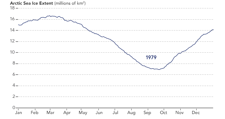
NASA Earth Observatory chart by Joshua Stevens, using data from the National Snow and Ice Data Center.
Earth Matters had a conversation with Lhermitte to find why he made the clip and what stands out about it. MODIS images of notable events that Lhermitte mentioned are interspersed throughout the interview. All of the images come from the archives of NASA Earth Observatory, a website that was founded in 1999 in conjunction with the launch of Terra.
What prompted you to create this animation?
The extension of the MODIS record back to the beginning of the mission in the Worldview website triggered me to make the animation. As a remote sensing scientist, I often use Worldview to put things into context (e.g. for studying changes over ice sheets and glaciers). Previously, Worldview only had data until 2010.
What do you think are the most interesting events or patterns visible in the clip?
I think the strength of the video is that it contains so many of them, and it allows you to see them all in one video. The ones that are most striking to me are:
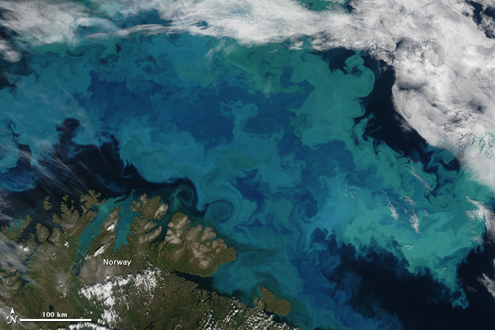
An Aqua MODIS image of a bloom in the Barents Sea on August 14, 2011. Image by Jeff Schmaltz, MODIS Rapid Response Team at NASA GSFC.
+ algal blooms in the Barents Sea
+ declining sea ice extent. You can see this both annually and over the longer term.
+ changing snow extent. You can see this each summer, especially over Canada and Siberia.
+ summer wildfire smoke in Canada (2004, 2005, 2009, 2014, 2017) and Russia (2006, 2011, 2012, 2013, 2014, 2016)
+ albedo reductions (reduction in brightness) over the Greenland Ice Sheet in 2010 and 2012 related to strong melt years.
+ overall eastward atmospheric circulation
+ the Grímsvötn ash plume (21 May 2011)
How did you make it? Was it difficult from a technical standpoint?
It was simple. I just downloaded the MODIS quicklook data from the Worldview archive using an automated script. Afterwards, I slightly modified the images for visualization purposes (e.g. overlaying country borders, clipping to a circular area). and stitched everything together in a video.
When you sit back and watch the whole video, how does it make you feel?
On the one hand, I am fascinated by the beauty and complexity of our planet. On the other hand, as a scientist, it makes me want to understand its processes even better. The video shows so many different processes at different scales, from natural processes (annual changes in snow cover and the Vatnajökull ash plume) to climate change related changes (e.g. the long term decrease in sea ice).
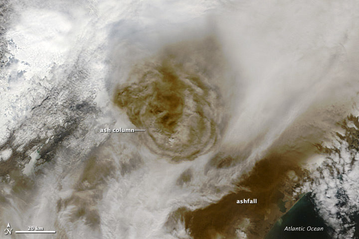
Terra MODIS image of the eruption of Grímsvötn Volcano in Iceland on May 22, 2011. NASA image by Jeff Schmaltz, MODIS Rapid Response Team.
There are some gaps during the winter where the extent of the sea ice abruptly changes. Can you explain why?
I used the standard reflectance products, which show the reflected sunlight. I decided to leave all dates out where part of the Arctic is without sunlight during satellite overpasses (approximately 10:30 a.m. and 1:30 p.m. local time). The missing data due to the polar night are very prominent if you compile the complete record including winter months, and I did not want it to distract the viewer from the more subtle changes in the video.
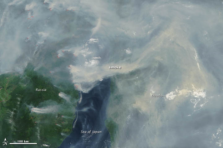
A Terra MODIS image of smoke and fires in Siberia on June 29, 2012. NASA image by Jeff Schmaltz, LANCE MODIS Rapid Response.
In the course of your day job as a scientist, do you use MODIS imagery? For what purpose?
Yes, as a polar remote sensing scientist, I tend to work with a range of satellite data sets. MODIS is a unique data product, given its global daily coverage and its long record. Besides the fact that I use MODIS frequently to monitor ice shelves and outlet glaciers, my colleagues and I use it to study snow and ice-albedo processes, snow cover in mountainous areas, vegetation recovery after wildfires, and ecosystem processes. One MODIS animation of ice calving from a glacier in Antarctica actually made it into the Washington Post recently.
Aerosol: A collection of microscopic particles, solid or liquid, suspended in a gas. They drift in Earth’s atmosphere from the stratosphere to the surface and range in size from a few nanometers—less than the width of the smallest viruses—to several several tens of micrometers—about the diameter of human hair. Despite their small size, they have major impacts on climate and health.
Different specialists describe the particles based on shape, size, and chemical composition. Toxicologists refer to aerosols as ultrafine, fine, or coarse matter. Regulatory agencies, as well as meteorologists, typically call them particulate matter—PM2.5 or PM10, depending on their size. In some fields of engineering, they’re called nanoparticles. Everyday terms that hint at aerosol sources, such as smoke, ash, haze, dust, pollution, and soot are widely used as well.
Climatologists typically use another set of labels that speak to the chemical composition. Key aerosol groups include sulfates, organic carbon, black carbon, nitrates, mineral dust, and sea salt. In practice, many of these terms are imperfect, as aerosols often clump together to form complex mixtures. It’s common, for example, for particles of black carbon from soot or smoke to mix with nitrates and sulfates, or to coat the surfaces of dust, creating hybrid particles.
Satellite Imagery of Aerosols:
NASA Earth Observatory image by Joshua Stevens, using Landsat data from the U.S. Geological Survey.
NASA images by Jeff Schmaltz and Joshua Stevens, using MODIS data from LANCE/EOSDIS Rapid Response.
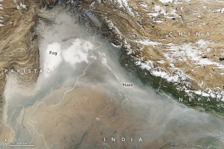
Smoke and haze in the Indo-Gangetic Plain. (NASA Earth Observatory image by Joshua Stevens, using data from the Land Atmosphere Near real-time Capability for EOS.)
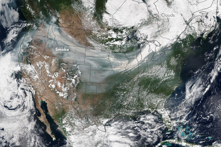
A smoke plume spans the United States. (NASA Earth Observatory image by Jesse Allen, using VIIRS data from the Suomi National Polar-orbiting Partnership.)
Aerosols in the News:
Air Quality Suffering in China, NASA Earth Observatory
Tracking Dust Across the Atlantic, NASA Earth Observatory
Where to Learn More?
Tiny Particles, Big Impact
Aerosols as explained by the IPCC
Aerosols and Climate Change
Read the Alphabet from Space
A is for aerosols altering an astronaut’s view of an ancient assemblage of rock in a state adjacent to Arizona!
About this Glossary
There are other glossaries out there, but there aren’t many visual earth science glossaries, particularly those with a focus on satellite imagery. To fill that gap, Earth Matters is working on building its own. Have suggestions for what we should include? Comment on a post or send us an email.
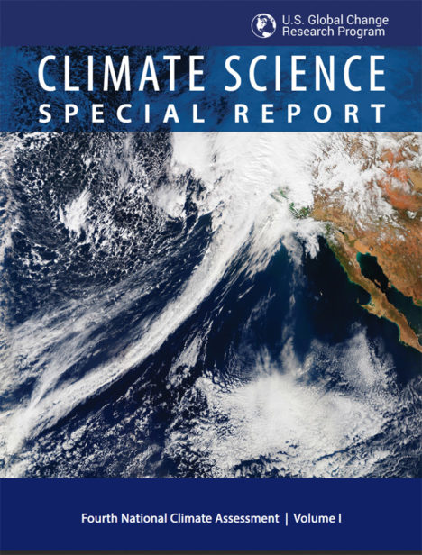 NASA Earth Observatory readers may recognize this image of a long trail of clouds — an atmospheric river — reaching across the Pacific Ocean toward California. It appeared first as an Image of the Day about how these moisture superhighways fueled a series of drought-busting rain and snow storms.
More recently, we were pleased to see that image on the cover of the Fourth National Climate Assessment — a major report issued by the U.S. Global Research Program. That image was one of many from Earth Observatory that appeared in the report. Since the authors did not give much background about the images, here is a quick rundown of how they were created and how they fit with some of the key points on our changing climate.
Hurricanes in the Atlantic
Found in Chapter 1: Our Globally Changing Climate
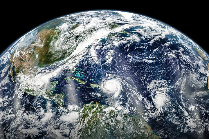
What the image shows:
Three hurricanes — Katia, Irma, and Jose — marching across the Atlantic Ocean on September 6, 2017.
What the report says about tropical cyclones and climate change:
The frequency of the most intense hurricanes is projected to increase in the Atlantic and the eastern North Pacific. Sea level rise will increase the frequency and extent of extreme flooding associated with coastal storms, such as hurricanes.
How the image was made:
The Visible Infrared Imaging Radiometer Suite (VIIRS) on the Suomi NPP satellite collected the data. Earth Observatory staff combined several scenes, taken at different times, to create this composite. Original source of the image: Three Hurricanes in the Atlantic
The North Pole
Found in Chapter 2: Physical Drivers of Climate Change
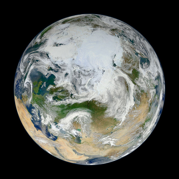
What the image shows:
Clouds swirl over sea ice, glaciers, and green vegetation in the Northern Hemisphere, as seen on a spring day from an angle of 70 degrees North, 60 degrees East.
What the report says about climate change and the Arctic:
Over the past 50 years, near-surface air temperatures across Alaska and the Arctic have increased at a rate more than twice as fast as the global average. It is very likely that human activities have contributed to observed Arctic warming, sea ice loss, glacier mass loss, and a decline in snow extent in the Northern Hemisphere.
How it was made:
Ocean scientist Norman Kuring of NASA’s Goddard Space Flight Center pieced together this composite based on 15 satellite passes made by VIIRS/Suomi NPP on May 26, 2012. The spacecraft circles the Earth from pole to pole, so it took multiple passes to gather enough data to show an entire hemisphere without gaps. Original source of the image: The View from the Top
Columbia Glacier
Found in Chapter 3: Detection and Attribution of Climate Change
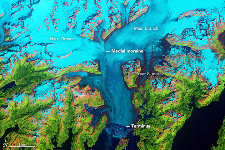
What the image shows:
Columbia Glacier in Alaska, one of the most rapidly changing glaciers in the world.
What the report says about Alaskan glaciers and climate change:
The collective ice mass of all Arctic glaciers has decreased every year since 1984, with significant losses in Alaska.
How the image was made:
NASA Earth Observatory visualizers made this false-color image based on data collected in 1986 by the Thematic Mapper on Landsat 5. The image combines shortwave-infrared, near-infrared, and green portions of the electromagnetic spectrum. With this combination, snow and ice appears bright cyan, vegetation is green, clouds are white or light orange, and open water is dark blue. Exposed bedrock is brown, while rocky debris on the glacier’s surface is gray. Original source of the image: World of Change: Columbia Glacier
Cloud Streets
Found in: Intro to Chapter 4: Climate Models, Scenarios, and Projections
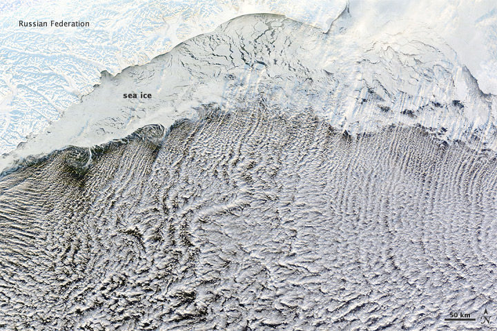
What the image shows:
Sea ice hugging the Russian coastline and cloud streets streaming over the Bering Sea.
What the report says about clouds and climate change:
Climate feedbacks are the largest source of uncertainty in quantifying climate sensitivity — that is, how much global temperatures will change in response to the addition of more greenhouse gases to the atmosphere.
How it was made:
The Moderate Resolution Imaging Spectroradiometer (MODIS) on NASA’s Terra satellite captured this natural-color image on January 4, 2012. The LANCE/EOSDIS MODIS Rapid Response Team generated the image, and NASA Earth Observatory staff cropped and labeled it. Original source of the image: Cloud streets over the Bering Sea
Extratropical Cyclones
Found in Intro to Chapter 5: Large-scale circulation and climate variability
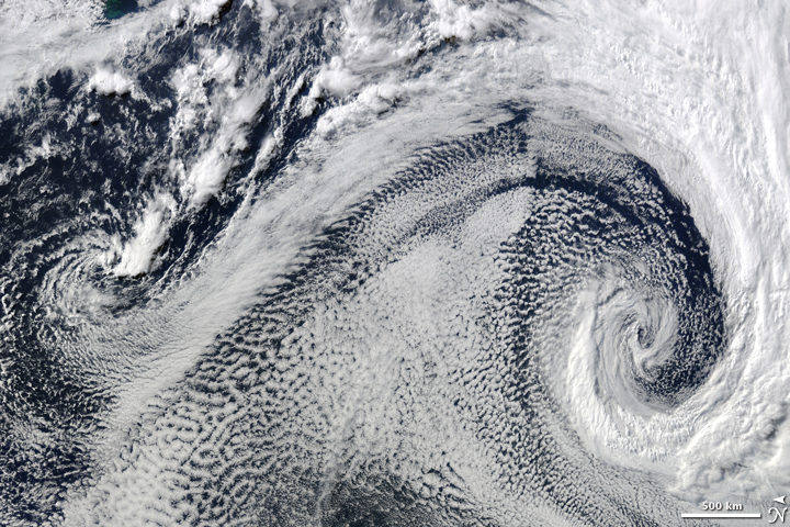
What it shows:
Two extratropical cyclones, the cause of most winter storms, churned near each other off the coast of South Africa in 2009.
What the report says about extratropical storms and climate change:
There is uncertainty about future changes in winter extratropical cyclones. Activity is projected to change in complex ways, with increases in some regions and seasons and decreases in others. There has been a trend toward earlier snowmelt and a decrease in snowstorm frequency on the southern margins of snowy areas. Winter storm tracks have shifted northward since 1950 over the Northern Hemisphere.
How the image was made:
The Moderate Resolution Imaging Spectroradiometer (MODIS) on NASA’s Terra satellite captured this natural-color image. The LANCE/EOSDIS MODIS Rapid Response Team generated the image and NASA Earth Observatory staff cropped and labeled it. Original source of the image: Cyclonic Clouds over the South Atlantic Ocean
Sea of Sand
Found in: Chapter 6: Temperature Changes in the United States
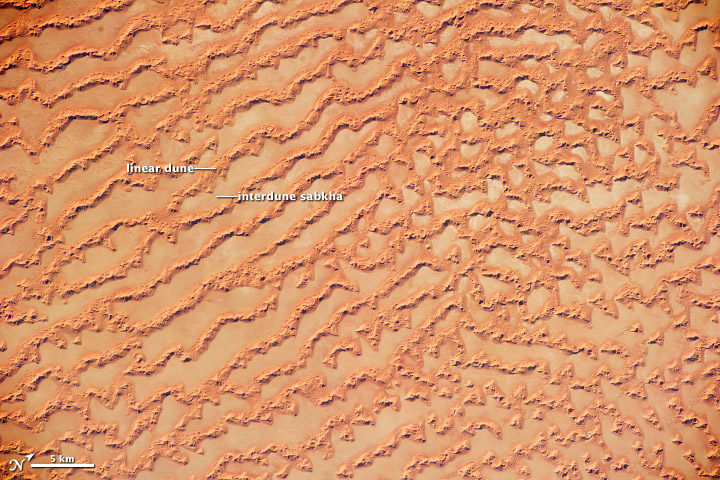
What the image shows: Large, linear sand dunes alternating with interdune salt flats in the Rub’ al Khali in the Sultanate of Oman.
What the report says about drought, dust storms, and climate change:
The human effect on droughts is complicated. There is little evidence for a human influence on precipitation deficits, but a lot of evidence for a human fingerprint on surface soil moisture deficits — starting with increased evapotranspiration caused by higher temperatures. Decreases in surface soil moisture over most of the United States are likely as the climate warms. Assuming no change to current water resources management, chronic hydrological drought is increasingly possible by the end of the 21st century. Changes in drought frequency or intensity will also play an important role in the strength and frequency of dust storms.
How it was made: An astronaut on the International Space Station took the photograph with a Nikon D3S digital camera using a 200 millimeter lens on May 16, 2011. Original source of the image: Ar Rub’ al Khali Sand Sea, Arabian Peninsula
Flooding on the Missouri River
Found in Chapter 7: Precipitation Change in the United States
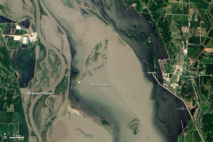
What the image shows:
Sediment-rich flood water lingering on the Missouri River in July 2011.
What the report says about precipitation, floods, and climate change:
Detectable changes in flood frequency have occurred in parts of the United States, with a mix of increases and decreases in different regions. Extreme precipitation, one of the controlling factors in flood statistics, is observed to have generally increased and is projected to continue to do. However, scientists have not yet established a significant connection between increased river flooding and human-induced climate change.
How the image was made:
The Advanced Land Imager (ALI) on NASA’s Earth Observing-1 (EO-1) satellite captured the data for this natural-color image. NASA Earth Observatory staff processed, cropped, and labeled the image. Original source of the image: Flooding near Hamburg, Iowa
Smoke and Fire
Found in Chapter 8: Droughts, Floods, and Wildfires
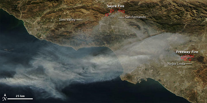
What the image shows:
Smoke streaming from the Freeway fire in the Los Angeles metro area on November 16, 2008.
What the report says about wildfires and climate change:
The incidence of large forest fires in the western United States and Alaska has increased since the early 1980s and is projected to further increase as the climate warms, with profound changes to certain ecosystems. However, other factors related to climate change — such as water scarcity or insect infestations — may act to stifle future forest fire activity by reducing growth or otherwise killing trees.
How it was made: The MODIS Rapid Response Team made this image based on data collected by NASA’s Aqua satellite. Original source of the image: Fires in California
The Colorado River and Grand Canyon
Found in Chapter 10: Changes in Land Cover and Terrestrial Biogeochemistry
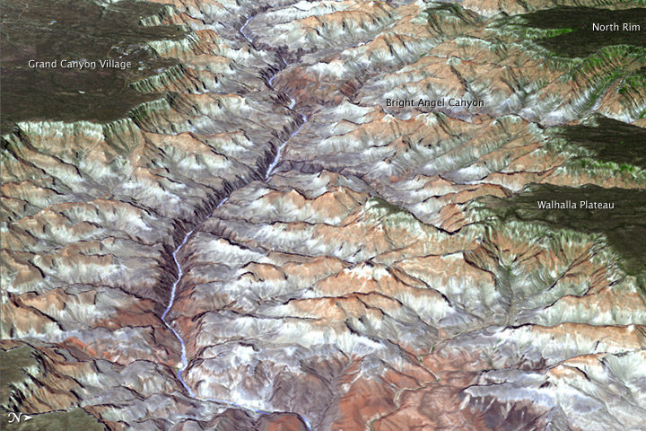
What the image shows:
The Grand Canyon in northern Arizona.
What the report says about climate change and the Colorado River:
The southwestern United States is projected to experience significant decreases in surface water availability, leading to runoff decreases in California, Nevada, Texas, and the Colorado River headwaters, even in the near term. Several studies focused on the Colorado River basin showed that annual runoff reductions in a warmer western U.S. climate occur through a combination of evapotranspiration increases and precipitation decreases, with the overall reduction in river flow exacerbated by human demands on the water supply.
How the image was made:
On July 14, 2011, the ASTER sensor on NASA’s Terra spacecraft collected the data used in this 3D image. NASA Earth Observatory staff made the image by draping an ASTER image over a digital elevation model produced from ASTER stereo data. Original source of the image: Grand New View of the Grand Canyon
Arctic Sea Ice
Found in Chapter 11: Arctic Changes and their Effects on Alaska and the Rest of the United States
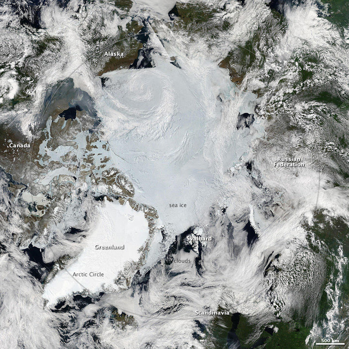
What the image shows: A clear view of the Arctic in June 2010. Clouds swirl over sea ice, snow, and forests in the far north.
What the report says about sea ice and climate change: Since the early 1980s, annual average Arctic sea ice has decreased in extent between 3.5 percent and 4.1 percent per decade, become 4.3 to 7.5 feet (1.3 and 2.3 meters) thinner. The ice melts for at least 15 more days each year. Arctic-wide ice loss is expected to continue through the 21st century, very likely resulting in nearly sea ice-free late summers by the 2040s.
How it was made: Earth Observatory staff used data from several MODIS passes from NASA’s Aqua satellite to make this mosaic. All of the data were collected on June 28, 2010. Original source of the image: Sunny Skies Over the Arctic
Crack in the Larsen C Ice Shelf
Found in Chapter 12: Sea Level Rise
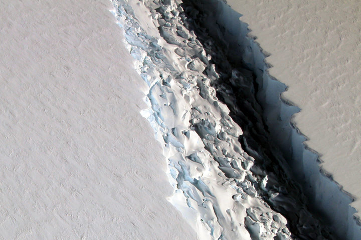
What the image shows:
This photograph shows a rift in the Larsen C Ice Shelf as observed from NASA’s DC-8 research aircraft. An iceberg the size of Delaware broke off from the ice shelf in 2017.
What the report says about ice shelves in Antarctica and climate change?
Floating ice shelves around Antarctica are losing mass at an accelerating rate. Mass loss from floating ice shelves does not directly affect global mean sea level — because that ice is already in the water — but it does lead to the faster flow of land ice into the ocean.
How it was made:
NASA scientist John Sonntag took the photo on November 10, 2016, during an Operation IceBridge flight. Original source of the image: Crack on Larsen C
The Gulf of Mexico
Found in Chapter 13: Ocean Acidification and Other Changes
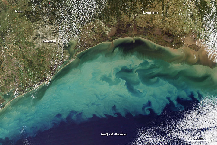
What the image shows:
Suspended sediment in shallow coastal waters in the Gulf of Mexico near Louisiana.
What the report says about the Gulf of Mexico:
The western Gulf of Mexico and parts of the U.S. Atlantic Coast (south of New York) are currently experiencing significant sea level rise caused by the withdrawal of groundwater and fossil fuels. Continuation of these practices will further amplify sea level rise.
How the image was made:
The MODIS instrument on NASA’s Aqua satellite captured this natural-color image on November 10, 2009. Original source of the image: Sediment in the Gulf of Mexico
Farmland in Virginia
Found in Appendix D
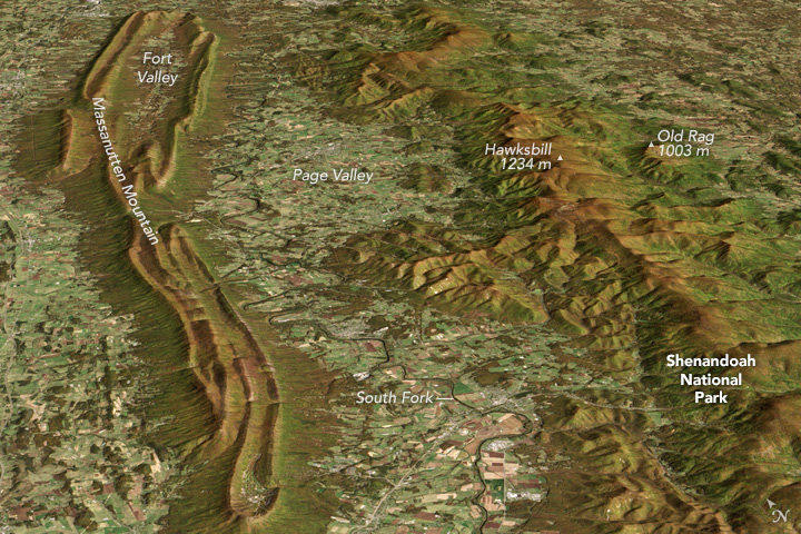
What the image shows:
A fall scene showing farmland in the Page Valley of Virginia, between Shenandoah National Park and Massanutten Mountain.
What the report says about farming and climate change:
Since 1901, the consecutive number of frost-free days and the length of the growing season have increased for the seven contiguous U.S. regions used in this assessment. However, there is important variability at smaller scales, with some locations actually showing decreases of a few days to as much as one to two weeks. However, plant productivity has not increased, and future consequences of the longer growing season are uncertain.
How the image was made: On October 21, 2013, the Operational Land Imager (OLI) on Landsat 8 captured a natural-color image of these neighboring ridges. The Landsat image has been draped over a digital elevation model based on data from the ASTER sensor on the Terra satellite. Original source of the image: Contrasting Ridges in Virginia
Atmospheric River
Found on the Cover and Executive Summary
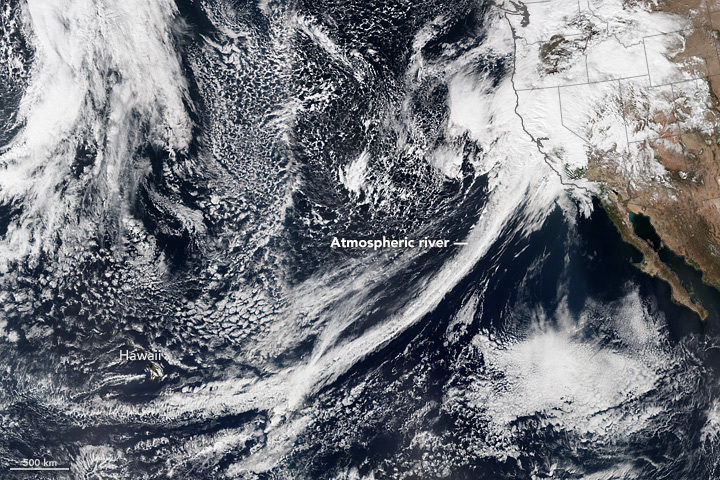
What the image shows: A tight arc of clouds stretching from Hawaii to California, which is a visible manifestation of an atmospheric river of moisture flowing into western states.
What the report says about atmospheric rivers and climate change:
The frequency and severity of land-falling atmospheric rivers on the U.S. West Coast will increase as a result of increasing evaporation and the higher atmospheric water vapor content that occurs with increasing temperature. Atmospheric rivers are narrow streams of moisture that account for 30 to 40 percent of the typical snow pack and annual precipitation along the Pacific Coast and are associated with severe flooding events.
How it was made: On February 20, 2017, the VIIRS on Suomi NPP captured this natural-color image of conditions over the northeastern Pacific. NASA Earth Observatory data visualizers stitched together two scenes to make the image. Original source of the image: River in the Sky Keeps Flowing Over the West
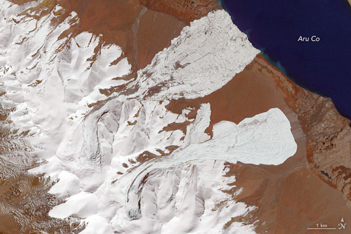
In July 2016, the lower portion of a valley glacier in the Aru Range of Tibet detached and barreled into a nearby valley, killing nine people and hundreds of animals. The huge avalanche, one of the largest scientists had ever seen, sent a tongue of debris spreading across 9 square kilometers (3 square miles). With debris reaching speeds of 140 kilometers (90 miles) per hour, the avalanche was remarkably fast for its size.
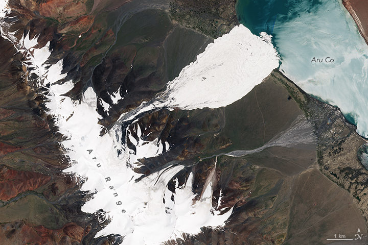
(NASA Earth Observatory image by Joshua Stevens, using modified Copernicus Sentinel 2 data processed by the European Space Agency. Image collected on July 21, 2016.)
Researchers were initially baffled about how it had happened. The glacier was on a nearly flat slope that was too shallow to cause avalanches, especially fast-moving ones. What’s more, the collapse happened at an elevation where permafrost was widespread; it should have securely anchored the glacier to the surface.
Two months later, it happened again — this time to a glacier just a few kilometers away. One gigantic avalanche was unusual; two in a row was unprecedented. The second collapse raised even more questions. Had an earthquake played a role in triggering them? Did climate change play a role? Should we expect more of these mega-avalanches?
(NASA Earth Observatory image by Joshua Stevens and Jesse Allen, using ASTER data from NASA/GSFC/METI/ERSDAC/JAROS, and U.S./Japan ASTER Science Team. Image collected on October 4, 2016.)
Now scientists have answers about how these unusual avalanches happened. There were four factors that came together and triggered the collapses, an international team of researchers reported in Nature Geoscience. The scientists analyzed many types of satellite, meteorological, and seismic data to reach their conclusions. They also sent teams of researchers to investigate the avalanches in the field.
First, increasing snowfall since the mid-1990s caused snow to pile up and start working its way toward the front edge of the glaciers (a process known as surging). Second, a great deal of rain fell in the summer of 2016. As a result, water worked its way through crevasses on the surface and lubricated the undersides of the glaciers. Third, water pooled up underneath the glaciers, even as the edges remained frozen to the ground. Fourth, the glaciers sat on a fine-grained layer of siltstone and clay that became extremely slippery.
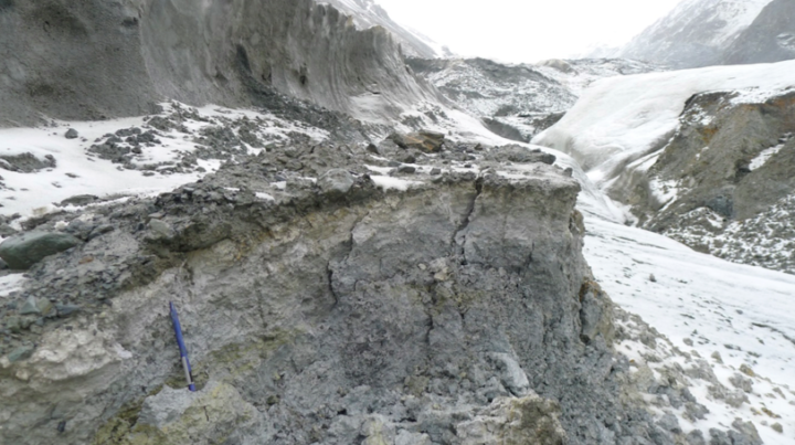
Notice the large amounts of silt and clay in the path of the first avalanche. (Photo taken on July 15, 2017, by Adrien Gilbert/University of Oslo)
Earth Observatory checked in with Andreas Kääb (University of Oslo), lead author of the study, to find out more about how the avalanche happened and what it means.
These glaciers were not on a steep slope, but the avalanche moved quite quickly. How did that happen?
Strong resistance by the frozen margins and tongues of the glaciers allowed the pressure to build instead of enabling them to adjust. The glaciers were loading up more and more pressure until the frozen margins suddenly failed. Local people reported a load bang. Once the margins failed, there was nothing at the glacier bed to hold it back, just water-soaked clay.
Your study notes that there was “undestroyed grassy vegetation on the lee side of the hills, suggesting that the fast-moving mass had partially jumped over it.” Are you saying the avalanche was airborne? If so, is that unusual?
Yes, for a small part of the avalanche path. We see this for other large-volume, high-speed avalanches, and it really illustrates the massive amount of energy released. You need quite high speeds in order for debris to jump. For us, the phenomenon is important as validation for the speeds obtained from the seismic signals the avalanches triggered and the avalanche modeling that we did.
Would you say these collapses were a product of climate change?
Climate change was necessary, but other factors that had nothing to do with climate were also critical. The increasing mass of the glaciers since the 1990s and the heavy rains and meltwater in 2016 are connected to climate change. The type of bedrock and the way the edges were frozen to the ground had nothing to do with climate change.
Can we expect to see more big glacial collapses as the world gets warmer?
It’s not clear. Climate change could increase or, maybe even more likely, decrease the probability of such massive collapses. Most glaciers on Earth are actually losing mass (not gaining, like the two glaciers in Tibet were). Also, if permafrost becomes less widespread over time and glacier margins melt, it is less likely that pressure will build up in that way that it did in this case.
I know you used several types of satellite data as part of this analysis. Can you mention a few that yielded particularly useful information?
We used a lot of different sources of data: Sentinel 1 and 2, TerraSAR-X/TanDEM-X, Planet Labs, and DigitalGlobe WorldView. Landsat 8 was absolutely critical because it gave the first and critical indication of the soft-bed characteristics. The entire Landsat series was instrumental for checking the glacier history since the 1980s. We also used declassified Corona data back to the 1960s.
Are these sorts of avalanches likely to happen in other parts of the world?
Honestly, I have no clue at the moment, but we would be much less surprised next time. We know now that this type of collapse can happen under special circumstances. (It happened once before in the Caucasus at Kolka Glacier.) One thing that should be investigated is whether there are other glaciers—especially polythermal ones—with these very fine-grained materials underneath them.
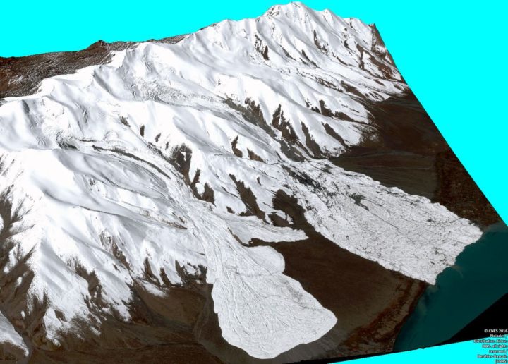
Three dimensional CNES Pléiades image of the avalanches. Processed by Etienne Berthier. Via Twitter.
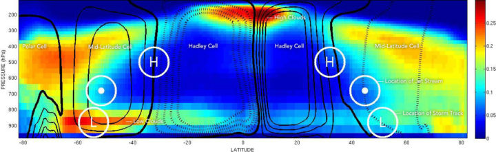
The location of mid-latitude storm tracks are marked with an L. The location of the jet stream is marked with a dot. And the place where air sinks between Hadley Cells and Mid-latitude Cells is marked with an H. The left side of the chart depicts the Southern Hemisphere; the right side depicts the Northern Hemisphere. Chart by George Tselioudis/NASA. The cloud data was collected by CloudSat.
The concentrations of greenhouse gases in Earth’s atmosphere have risen rapidly during the past century, mainly because of fossil fuel burning. Some of the effects of this are pretty straightforward: more carbon dioxide in the atmosphere means air temperatures will rise; ice in the high latitudes will begin to melt; and sea level will rise.
That seems pretty straightforward, right? But there are some areas where the changes will be more complicated. For instance, what will all of that extra carbon dioxide means for how air circulates, for the position of the jet stream, and for how clouds are distributed in the atmosphere?
George Tselioudis, a climate scientist at NASA’s Goddard Institute for Space Studies, did a nice job of explaining this as part of a post he wrote recently. In case you are not familiar with some of the scientific terms, I have added links to web sites that explain them in more detail. I also added some additional explanations to make his description a little clearer.
Take it away, George:
Atmospheric circulation, when examined using a simplified, two-dimensional view (such as the figure above), is dominated by two major features. The first is a large feature called the Hadley cell, which lifts air in the Inter-Tropical Convergence Zone (ITCZ), moves it at high altitudes towards the poles, and sinks it again to the surface in the subtropical regions. The second feature is a very strong river of air, known as the jet stream, that flows from west to east in the middle latitudes of each hemisphere. The meanders of the jet stream produce the storm tracks that are the major weather makers in the mid-latitude regions.
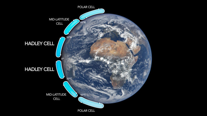
Image Credit: NASA.
George did not include it in his post, but here is a useful chart that lays out the locations of Hadley cells and the other higher-latitude cells. Now look back at the figure at the top of this page, and let’s go back to George.
The subsiding zones at latitudes between 20° and 30° North and South are noted by the letter ‘H’; the jet stream is in each hemisphere is marked with a dot; and the storm tracks are noted with an ‘L’. The circulation is superimposed on the distribution of the world’s clouds, derived from NASA CloudSat satellite observations. Areas with the most clouds are red and yellow.
Note: The CloudSat data are key. There are plenty of diagrams that show how global circulation patterns work (in fact, I have included one more below). But there are few that show you where clouds actually form and, crucially, at what altitude those clouds form.
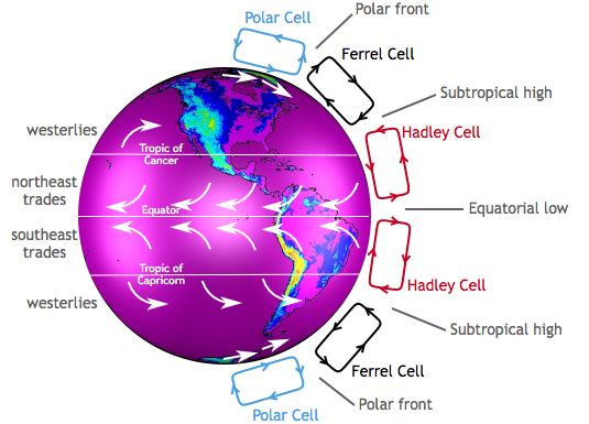
Image by the Center for Multiscale modeling of Atmospheric Processes.
George continues:
It is apparent how the clouds relate to the circulation features. The narrow zone of uplift in the tropics produces high, thick clouds in the ITCZ (which is near the equator). The areas of subsidence in the subtropics produce extensive fields of low clouds, more extensive and deep in the southern than in the northern hemisphere, while the storms embedded in the jet stream produce deep, high clouds that extend throughout the Earth’s troposphere.
It is worth looking carefully at the figure at the top of the page and tracing out the features that Tselioudis describes. Whether clouds are low or high leads to different effects on climate. Low clouds primarily reflect solar radiation and cool the surface of the Earth. In contrast, high clouds tend to have a warming effect on the surface and atmosphere.
Now let us look at the key claim that Tselioudis and other climate scientists make about how global warming will affect circulation patterns. In short, scientists expect Hadley cells to expand so that the edges (where air descends) move toward the poles. In other words, the tropics will expand.
And that is exactly what has happened over the past few decades:
Observations of the past 35 years indicate that, as the Earth has warmed, these circulation features are moving towards the poles. The Hadley cell shows a clear signal of poleward expansion, while poleward movement is present but less clear in the jet stream and mid-latitude storm tracks. We found that the two quantities that correlate significantly and consistently in all ocean basins and seasons are the Hadley cell extent and the high cloud field: when the Hadley cell edge moves poleward, the high cloud field also shifts towards the poles, and vice versa.
Still following? Good, because this is where things get more complicated. Though Hadley cells are expanding in both the Northern and Southern Hemispheres, the effects on clouds and climate are different in each hemisphere. Here is how Tselioudis puts it:
However, this coordinated movement does not have the same effect in the two hemispheres. In the northern hemisphere, the poleward movement of the high clouds opens up a “cloud curtain” that lets more sunlight into the ocean surface, thus producing warming at the surface. But in the southern hemisphere, the poleward contraction of the high clouds is balanced by an expansion of the already extensive low cloud decks, which ends up blocking more sunlight and producing a small surface cooling.
A map of Earth showing the global cloud cover on July 11, 2005, based largely on observations by the MODIS sensor on the NASA Terra satellite. Most clouds form in bands near the equator and along lines of latitude roughly 60 degrees North and South of the equator.
Why does this matter? According to Tselioudis, representing this detail correctly in climate models is critical to determining how much warming will result from a given increase of greenhouse gases. Climatologists call this climate sensitivity. Many climate models do not represent Hadley Cell expansion correctly yet; specifically, the models do not account for the fact that the Hadley cells have grown wider. Tselioudis’s research shows that the models that do match real-world observations of clouds have a lower sensitivity to greenhouse gases (a climate sensitivity near 3° Celsius compared to between 4°C and 5°C).
If Tselioudis is right, that is a piece of mildly good news for the planet from the complicated world of cloud climate science.
For more details, read the post Tselioudis wrote for GISS. Also, take a look at this June 2017 article and this May 2016 study and news release.

Urban Heat Islands Come with a Cost
The urban heat island effect has been shown to raise the temperature of cities compared to their neighboring rural and semi-rural areas. Research published in May 2017 in Nature Climate Change spells out the cost associated the effect. Economists analyzed 1,692 cities and found that the economic cost of climate change this century could be 2.6 times larger when the heat island effect is accounted for. The costs stem from factors like air pollution, water quality, and energy for cooling.
CO2 Reached Record Highs
In April 2017, the concentration of carbon dioxide in the atmosphere reached (and surpassed) 410 parts per million (ppm) for the first time in recorded history. The milestone measurement was made at the Mauna Loa Observatory in Hawaii, a ground-based station that has collected CO2 data since 1958. (Global, space-based data now supplement those measurements and provide the big-picture view.)
Levels continued to rise, and by the end of May, the monthly average was the highest on record at 409.65 ppm. CO2 concentrations reach an annual peak every May, but the average in May 2017 was well above that of previous years. Check out this graph to see how 2017 has measured up.
Rainfall Reorg
Climate change is likely to affect Earth’s rainfall patterns. Authors of a recent study published in Science Advances used paleoclimate data to examine how rainfall patterns have responded to past climate shifts. These past trends lend evidence to scenarios that could unfold in the future. During the northern hemisphere’s summer, dry areas are likely to become drier and wet areas would be wetter; in the winter, regions of relatively heavy rainfall would expand northward.
Plants Pack a Punch on Precipitation
During photosynthesis, plants release water vapor into the air. This water vapor can ultimately cause clouds to form, which in turn can affect Earth’s energy balance and produce precipitation. A May 2017 study published in Nature Geoscience used global satellite data and a statistical technique to show that as much as 30 percent of the variability in climate and weather patterns can be attributed to plants.
“Hottest” Events on the Rise
Scientists have developed a framework to help determine if an extreme weather events can be attributed to climate change. Using the framework, they show that for 80 percent of areas where observations are available, global warming has increased the chances for (and severity of) “hottest” events—months and days that measure in as the hottest of the year. The research was published May 2017 in Proceedings of the National Academy of Sciences.
