This is a cross-post of a story by Ellen Gray. It provides deeper insight into our May 23 Image of the Day.
Six months after GRACE launched in March 2002, we got our first look at the data fields. They had these big vertical, pole-to-pole stripes that obscured everything. We’re like, holy cow this is garbage. All this work and it’s going to be useless.
But it didn’t take the science team long to realize that they could use some pretty common data filters to remove the noise, and after that they were able to clean up the fields and we could see quite a bit more of the signal. We definitely breathed a sigh of relief. Steadily over the course of the mission, the science team became better and better at processing the data, removing errors, and some of the features came into focus. Then it became clear that we could do useful things with it.
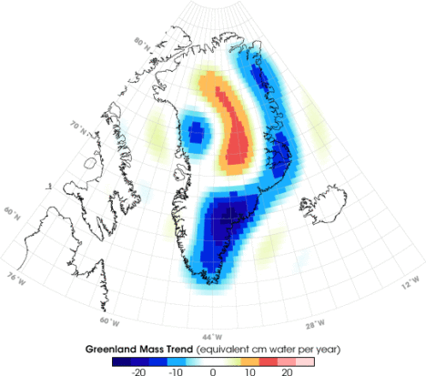
It only took a couple of years. By 2004, 2005, the science team working on mass changes in the Arctic and Antarctic could see the ice sheet depletion of Greenland and Antarctica. We’d never been able before to get the total mass change of ice being lost. It was always the elevation changes – there’s this much ice, we guess – but this was like wow, this is the real number.
Not long after that we started to see, maybe, that there were some trends on the land, although it’s a little harder on the land because with terrestrial water storage — the groundwater, soil moisture, snow, and everything. There’s inter-annual variability, so if you go from a drought one year to wet a couple years later, it will look like you’re gaining all this water, but really, it’s just natural variability.
By around 2006, there was a pretty clear trend over Northern India. At the GRACE science team meeting, it turned out another group had noticed that as well. We were friendly with them, so we decided to work on it separately. Our research ended up being published in 2009, a couple years after the trends had started to become apparent. By the time we looked at India, we knew that there were other trends around the world. Slowly not just our team but all sorts of teams, all different scientists around the world, were looking at different apparent trends and diagnosing them and trying to decide if they were real and what was causing them.
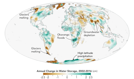
I think the map, the global trends map, is the key. By 2010 we were getting the broad-brush outline, and I wanted to tell a story about what is happening in that map. For me the easiest way was to just look at the data around the continents and talk about the major blobs of red or blue that you see and explain each one of them and not worry about what country it’s in or placing it in a climate region or whatever. We can just draw an outline around these big blobs. Water is being gained or lost. The possible explanations are not that difficult to understand. It’s just trying to figure out which one is right.
Not everywhere you see as red or blue on the map is a real trend. It could be natural variability in part of the cycle where freshwater is increasing or decreasing. But some of the blobs were real trends. If it’s lined up in a place where we know that there’s a lot of agriculture, that they’re using a lot of water for irrigation, there’s a good chance it’s a decreasing trend that’s caused by human-induced groundwater depletion.
And then, there’s the question: are any of the changes related to climate change? There have been predictions of precipitation changes, that they’re going to get more precipitation in the high latitudes and more precipitation as rain as opposed to snow. Sometimes people say that the wet get wetter and the dry get dryer. That’s not always the case, but we’ve been looking for that sort of thing. These are large-scale features that are observed by a relatively new satellite system and we’re lucky enough to be some of the first to try and explain them.
The past couple years when I’d been working the most intensely on the map, the best parts of my time in the office were when I was working on it. Because I’m a lab chief, I spend about half my time on managerial and administrative things. But I love being able to do the science, and in particular this, looking at the GRACE data, trying to diagnose what’s happening, has been very enjoyable and fulfilling. We’ve been scrutinizing this map going on eight, nine years now, and I really do have a strong connection to it.
What kept me up at night was finding the right explanations and the evidence to support our hypotheses – or evidence to say that this hypothesis is wrong and we need to consider something else. In some cases, you have a strong feeling you know what’s happening but there’s no published paper or data that supports it. Or maybe there is anecdotal evidence or a map that corroborates what you think but is not enough to quantify it. So being able to come up with defendable explanations is what kept me up at night. I knew the reviewers, rightly, couldn’t let us just go and be completely speculative. We have to back up everything we say.
The world is a complicated place. I think it helped, in the end, that we categorized these changes as natural variability or as a direct human impact or a climate change related impact. But then there can be a mix of those – any of those three can be combined, and when they’re combined, that’s when it’s more difficult to disentangle them and say this one is dominant or whatever. It’s often not obvious. Because these are moving parts and particularly with the natural variability, you know it’s going to take another 15 years, probably the length of the GRACE Follow-On mission, before we become completely confident about some of these. So it’ll be interesting to return to this in 15 years and see which ones we got right and which ones we got wrong.
You can read about Matt’s research here: https://go.nasa.gov/2L7LXoP.
Today’s post is a reprint of recent story by Carol Rasmussen of NASA’s Earth Science News Team.
NASA has produced the first three-dimensional numerical model of melting snowflakes in the atmosphere. Developed by scientist Jussi Leinonen of NASA’s Jet Propulsion Laboratory, the model provides a better understanding of how snow melts. This can help scientists recognize the signature (in radar signals) of heavier, wetter snow — the kind that snaps power lines and tree limbs — and could be a step toward improving predictions of this hazard.
Leinonen’s model reproduces key features of melting snowflakes that have been observed in nature. First, meltwater gathers in any concave regions of the snowflake’s surface. These liquid-water regions then merge to form a shell of liquid around an ice core, and finally develop into a water drop. The modeled snowflake shown in the video is less than half an inch (one centimeter) long and composed of many individual ice crystals whose arms became entangled when they collided in midair.
Leinonen said he got interested in modeling melting snow because of the way it affects observations with remote sensing instruments. A radar “profile” of the atmosphere from top to bottom shows a very bright, prominent layer at the altitude where falling snow and hail melt — much brighter than atmospheric layers above and below it. “The reasons for this layer are still not particularly clear, and there has been a bit of debate in the community,” Leinonen said. Simpler models can reproduce the bright melt layer, but a more detailed model like this one can help scientists to understand it better, particularly how the layer is related to both the type of melting snow and the radar wavelengths used to observe it.
A paper on the numerical model, titled “Snowflake melting simulation using smoothed particle hydrodynamics,” recently appeared in the Journal of Geophysical Research – Atmospheres.
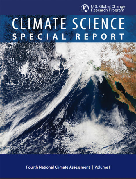 NASA Earth Observatory readers may recognize this image of a long trail of clouds — an atmospheric river — reaching across the Pacific Ocean toward California. It appeared first as an Image of the Day about how these moisture superhighways fueled a series of drought-busting rain and snow storms.
More recently, we were pleased to see that image on the cover of the Fourth National Climate Assessment — a major report issued by the U.S. Global Research Program. That image was one of many from Earth Observatory that appeared in the report. Since the authors did not give much background about the images, here is a quick rundown of how they were created and how they fit with some of the key points on our changing climate.
Hurricanes in the Atlantic
Found in Chapter 1: Our Globally Changing Climate
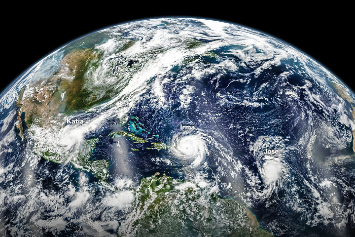
What the image shows:
Three hurricanes — Katia, Irma, and Jose — marching across the Atlantic Ocean on September 6, 2017.
What the report says about tropical cyclones and climate change:
The frequency of the most intense hurricanes is projected to increase in the Atlantic and the eastern North Pacific. Sea level rise will increase the frequency and extent of extreme flooding associated with coastal storms, such as hurricanes.
How the image was made:
The Visible Infrared Imaging Radiometer Suite (VIIRS) on the Suomi NPP satellite collected the data. Earth Observatory staff combined several scenes, taken at different times, to create this composite. Original source of the image: Three Hurricanes in the Atlantic
The North Pole
Found in Chapter 2: Physical Drivers of Climate Change
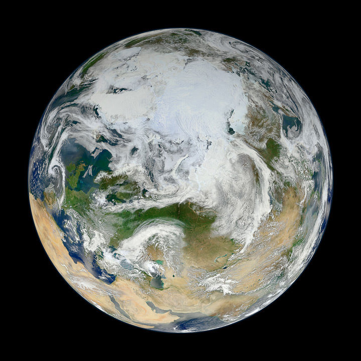
What the image shows:
Clouds swirl over sea ice, glaciers, and green vegetation in the Northern Hemisphere, as seen on a spring day from an angle of 70 degrees North, 60 degrees East.
What the report says about climate change and the Arctic:
Over the past 50 years, near-surface air temperatures across Alaska and the Arctic have increased at a rate more than twice as fast as the global average. It is very likely that human activities have contributed to observed Arctic warming, sea ice loss, glacier mass loss, and a decline in snow extent in the Northern Hemisphere.
How it was made:
Ocean scientist Norman Kuring of NASA’s Goddard Space Flight Center pieced together this composite based on 15 satellite passes made by VIIRS/Suomi NPP on May 26, 2012. The spacecraft circles the Earth from pole to pole, so it took multiple passes to gather enough data to show an entire hemisphere without gaps. Original source of the image: The View from the Top
Columbia Glacier
Found in Chapter 3: Detection and Attribution of Climate Change
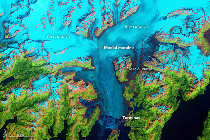
What the image shows:
Columbia Glacier in Alaska, one of the most rapidly changing glaciers in the world.
What the report says about Alaskan glaciers and climate change:
The collective ice mass of all Arctic glaciers has decreased every year since 1984, with significant losses in Alaska.
How the image was made:
NASA Earth Observatory visualizers made this false-color image based on data collected in 1986 by the Thematic Mapper on Landsat 5. The image combines shortwave-infrared, near-infrared, and green portions of the electromagnetic spectrum. With this combination, snow and ice appears bright cyan, vegetation is green, clouds are white or light orange, and open water is dark blue. Exposed bedrock is brown, while rocky debris on the glacier’s surface is gray. Original source of the image: World of Change: Columbia Glacier
Cloud Streets
Found in: Intro to Chapter 4: Climate Models, Scenarios, and Projections
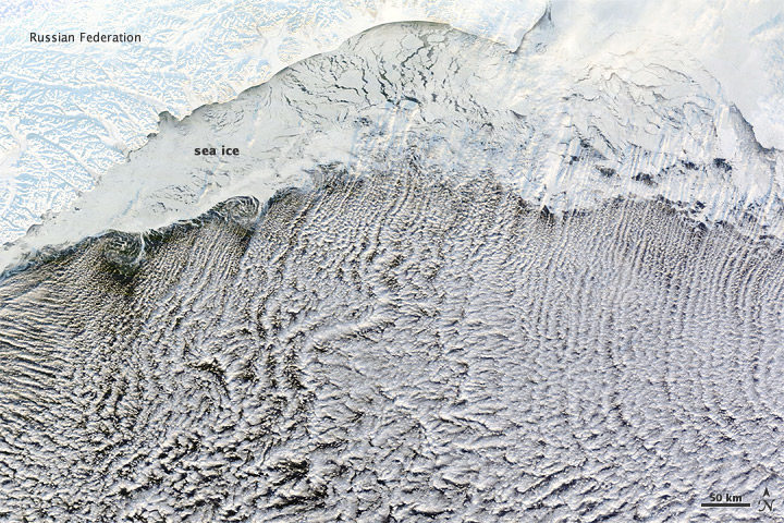
What the image shows:
Sea ice hugging the Russian coastline and cloud streets streaming over the Bering Sea.
What the report says about clouds and climate change:
Climate feedbacks are the largest source of uncertainty in quantifying climate sensitivity — that is, how much global temperatures will change in response to the addition of more greenhouse gases to the atmosphere.
How it was made:
The Moderate Resolution Imaging Spectroradiometer (MODIS) on NASA’s Terra satellite captured this natural-color image on January 4, 2012. The LANCE/EOSDIS MODIS Rapid Response Team generated the image, and NASA Earth Observatory staff cropped and labeled it. Original source of the image: Cloud streets over the Bering Sea
Extratropical Cyclones
Found in Intro to Chapter 5: Large-scale circulation and climate variability
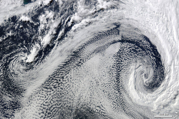
What it shows:
Two extratropical cyclones, the cause of most winter storms, churned near each other off the coast of South Africa in 2009.
What the report says about extratropical storms and climate change:
There is uncertainty about future changes in winter extratropical cyclones. Activity is projected to change in complex ways, with increases in some regions and seasons and decreases in others. There has been a trend toward earlier snowmelt and a decrease in snowstorm frequency on the southern margins of snowy areas. Winter storm tracks have shifted northward since 1950 over the Northern Hemisphere.
How the image was made:
The Moderate Resolution Imaging Spectroradiometer (MODIS) on NASA’s Terra satellite captured this natural-color image. The LANCE/EOSDIS MODIS Rapid Response Team generated the image and NASA Earth Observatory staff cropped and labeled it. Original source of the image: Cyclonic Clouds over the South Atlantic Ocean
Sea of Sand
Found in: Chapter 6: Temperature Changes in the United States
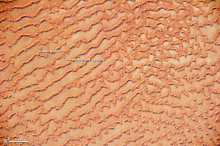
What the image shows: Large, linear sand dunes alternating with interdune salt flats in the Rub’ al Khali in the Sultanate of Oman.
What the report says about drought, dust storms, and climate change:
The human effect on droughts is complicated. There is little evidence for a human influence on precipitation deficits, but a lot of evidence for a human fingerprint on surface soil moisture deficits — starting with increased evapotranspiration caused by higher temperatures. Decreases in surface soil moisture over most of the United States are likely as the climate warms. Assuming no change to current water resources management, chronic hydrological drought is increasingly possible by the end of the 21st century. Changes in drought frequency or intensity will also play an important role in the strength and frequency of dust storms.
How it was made: An astronaut on the International Space Station took the photograph with a Nikon D3S digital camera using a 200 millimeter lens on May 16, 2011. Original source of the image: Ar Rub’ al Khali Sand Sea, Arabian Peninsula
Flooding on the Missouri River
Found in Chapter 7: Precipitation Change in the United States
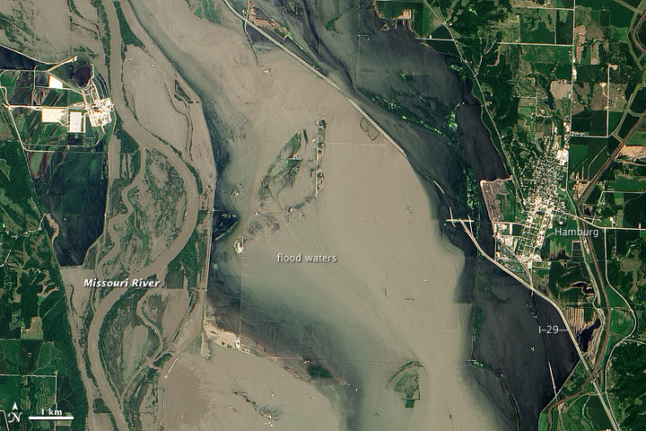
What the image shows:
Sediment-rich flood water lingering on the Missouri River in July 2011.
What the report says about precipitation, floods, and climate change:
Detectable changes in flood frequency have occurred in parts of the United States, with a mix of increases and decreases in different regions. Extreme precipitation, one of the controlling factors in flood statistics, is observed to have generally increased and is projected to continue to do. However, scientists have not yet established a significant connection between increased river flooding and human-induced climate change.
How the image was made:
The Advanced Land Imager (ALI) on NASA’s Earth Observing-1 (EO-1) satellite captured the data for this natural-color image. NASA Earth Observatory staff processed, cropped, and labeled the image. Original source of the image: Flooding near Hamburg, Iowa
Smoke and Fire
Found in Chapter 8: Droughts, Floods, and Wildfires
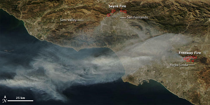
What the image shows:
Smoke streaming from the Freeway fire in the Los Angeles metro area on November 16, 2008.
What the report says about wildfires and climate change:
The incidence of large forest fires in the western United States and Alaska has increased since the early 1980s and is projected to further increase as the climate warms, with profound changes to certain ecosystems. However, other factors related to climate change — such as water scarcity or insect infestations — may act to stifle future forest fire activity by reducing growth or otherwise killing trees.
How it was made: The MODIS Rapid Response Team made this image based on data collected by NASA’s Aqua satellite. Original source of the image: Fires in California
The Colorado River and Grand Canyon
Found in Chapter 10: Changes in Land Cover and Terrestrial Biogeochemistry
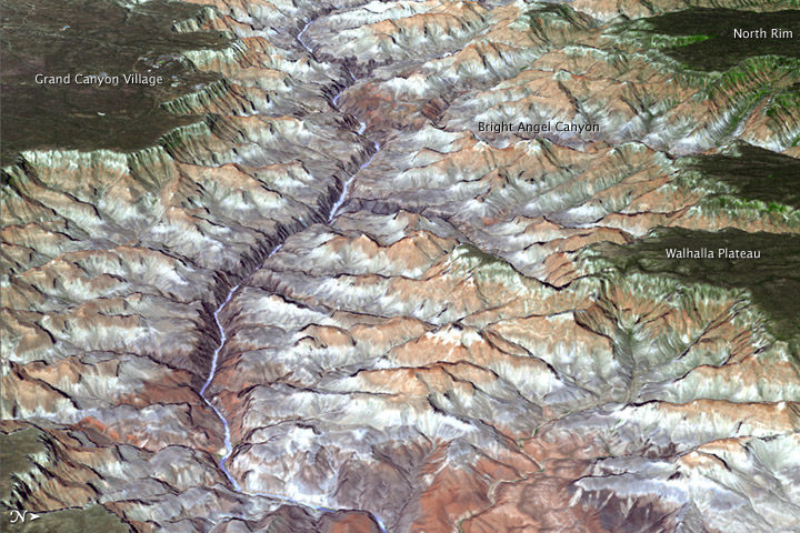
What the image shows:
The Grand Canyon in northern Arizona.
What the report says about climate change and the Colorado River:
The southwestern United States is projected to experience significant decreases in surface water availability, leading to runoff decreases in California, Nevada, Texas, and the Colorado River headwaters, even in the near term. Several studies focused on the Colorado River basin showed that annual runoff reductions in a warmer western U.S. climate occur through a combination of evapotranspiration increases and precipitation decreases, with the overall reduction in river flow exacerbated by human demands on the water supply.
How the image was made:
On July 14, 2011, the ASTER sensor on NASA’s Terra spacecraft collected the data used in this 3D image. NASA Earth Observatory staff made the image by draping an ASTER image over a digital elevation model produced from ASTER stereo data. Original source of the image: Grand New View of the Grand Canyon
Arctic Sea Ice
Found in Chapter 11: Arctic Changes and their Effects on Alaska and the Rest of the United States
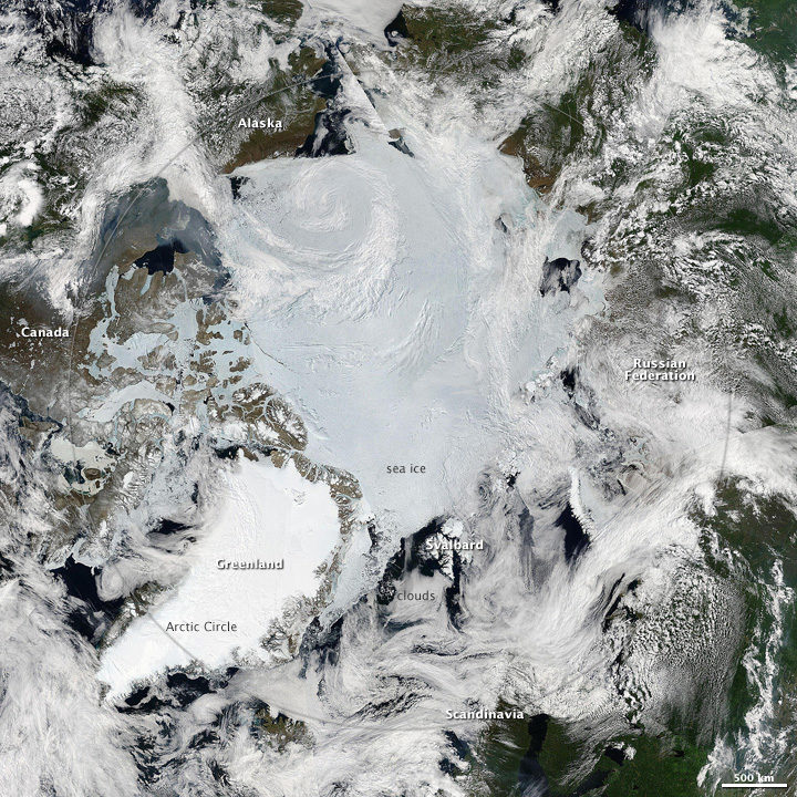
What the image shows: A clear view of the Arctic in June 2010. Clouds swirl over sea ice, snow, and forests in the far north.
What the report says about sea ice and climate change: Since the early 1980s, annual average Arctic sea ice has decreased in extent between 3.5 percent and 4.1 percent per decade, become 4.3 to 7.5 feet (1.3 and 2.3 meters) thinner. The ice melts for at least 15 more days each year. Arctic-wide ice loss is expected to continue through the 21st century, very likely resulting in nearly sea ice-free late summers by the 2040s.
How it was made: Earth Observatory staff used data from several MODIS passes from NASA’s Aqua satellite to make this mosaic. All of the data were collected on June 28, 2010. Original source of the image: Sunny Skies Over the Arctic
Crack in the Larsen C Ice Shelf
Found in Chapter 12: Sea Level Rise
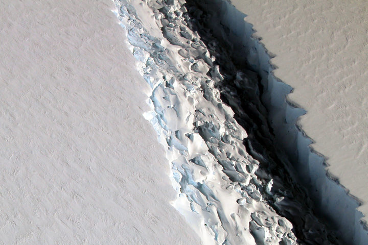
What the image shows:
This photograph shows a rift in the Larsen C Ice Shelf as observed from NASA’s DC-8 research aircraft. An iceberg the size of Delaware broke off from the ice shelf in 2017.
What the report says about ice shelves in Antarctica and climate change?
Floating ice shelves around Antarctica are losing mass at an accelerating rate. Mass loss from floating ice shelves does not directly affect global mean sea level — because that ice is already in the water — but it does lead to the faster flow of land ice into the ocean.
How it was made:
NASA scientist John Sonntag took the photo on November 10, 2016, during an Operation IceBridge flight. Original source of the image: Crack on Larsen C
The Gulf of Mexico
Found in Chapter 13: Ocean Acidification and Other Changes
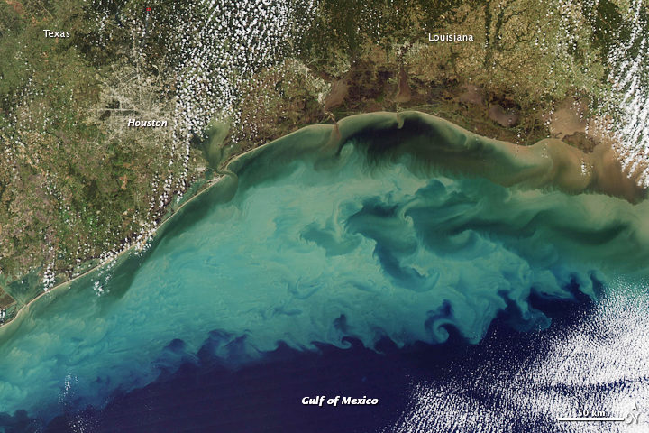
What the image shows:
Suspended sediment in shallow coastal waters in the Gulf of Mexico near Louisiana.
What the report says about the Gulf of Mexico:
The western Gulf of Mexico and parts of the U.S. Atlantic Coast (south of New York) are currently experiencing significant sea level rise caused by the withdrawal of groundwater and fossil fuels. Continuation of these practices will further amplify sea level rise.
How the image was made:
The MODIS instrument on NASA’s Aqua satellite captured this natural-color image on November 10, 2009. Original source of the image: Sediment in the Gulf of Mexico
Farmland in Virginia
Found in Appendix D
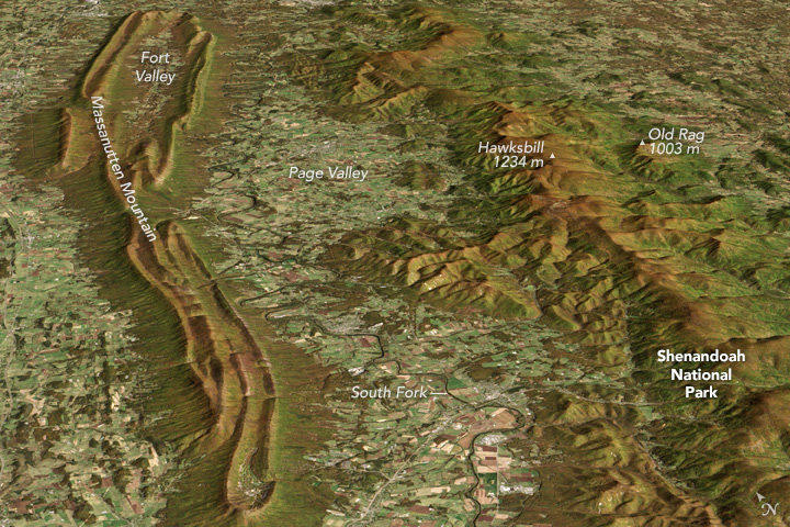
What the image shows:
A fall scene showing farmland in the Page Valley of Virginia, between Shenandoah National Park and Massanutten Mountain.
What the report says about farming and climate change:
Since 1901, the consecutive number of frost-free days and the length of the growing season have increased for the seven contiguous U.S. regions used in this assessment. However, there is important variability at smaller scales, with some locations actually showing decreases of a few days to as much as one to two weeks. However, plant productivity has not increased, and future consequences of the longer growing season are uncertain.
How the image was made: On October 21, 2013, the Operational Land Imager (OLI) on Landsat 8 captured a natural-color image of these neighboring ridges. The Landsat image has been draped over a digital elevation model based on data from the ASTER sensor on the Terra satellite. Original source of the image: Contrasting Ridges in Virginia
Atmospheric River
Found on the Cover and Executive Summary
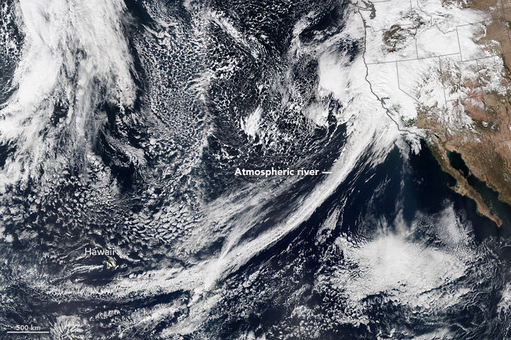
What the image shows: A tight arc of clouds stretching from Hawaii to California, which is a visible manifestation of an atmospheric river of moisture flowing into western states.
What the report says about atmospheric rivers and climate change:
The frequency and severity of land-falling atmospheric rivers on the U.S. West Coast will increase as a result of increasing evaporation and the higher atmospheric water vapor content that occurs with increasing temperature. Atmospheric rivers are narrow streams of moisture that account for 30 to 40 percent of the typical snow pack and annual precipitation along the Pacific Coast and are associated with severe flooding events.
How it was made: On February 20, 2017, the VIIRS on Suomi NPP captured this natural-color image of conditions over the northeastern Pacific. NASA Earth Observatory data visualizers stitched together two scenes to make the image. Original source of the image: River in the Sky Keeps Flowing Over the West
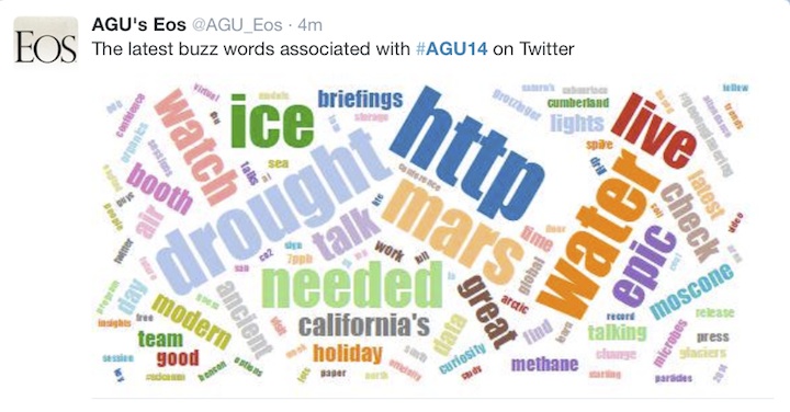
A record 25,000 researchers and exhibitors descended on San Francisco this week for the 2014 meeting of the American Geophysical Union (AGU). That number of attendees translates to a tremendous amount of Earth science being discussed via presentations and posters, and we can’t possibly cover it all in this blog. Fortunately, this buzz word graphic posted by @AGU_Eos helped us sort what attendees are talking about, at least on twitter at #AGU14.
Drought was certainly a hot topic, particularly California’s multi-year episode. NASA scientists announced at a press briefing that it would take about 11 trillion gallons of water (42 cubic kilometers)—or 1.5 times the maximum volume of the largest U.S. reservoir—to recover from the current drought. The calculation, based on data from the Gravity Recovery and Climate Experiment (GRACE) satellites, is the first of its kind. Read the full story here.
The buzz word “ice” probably stems from the abundance of research on Greenland that was presented on December 15. Scientists using ground-based and airborne radar instruments found that liquid water can now persist throughout the year on the perimeter of the ice sheet; it might help kick off melting in the spring and summer. Read more about those studies here. Look, too, at this new study that used satellite data to get a better picture of how the ice sheet is losing mass.
And finally, take a minute to browse some of the cool photos presented by Anders Bjørk of the Natural History Museum of Denmark, which included the portrait of Arctic explorers (below) and this image pair demonstrating glacial retreat in Greenland.

