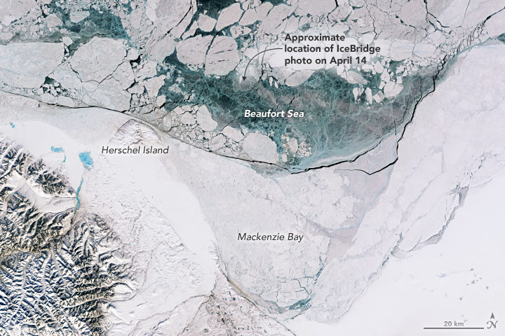
With springtime comes sunlight and warmth that advance the melting and breakup of Arctic sea ice. Varied patterns and textures appear across the icescape, and many are visible in this image, which was our Image of the Day on April 30. This satellite image includes the area photographed a day earlier by Operation IceBridge—the same photograph that sparked discussion on our blog and on news and social media about what might have caused the holes in the ice.
The holes were not a research focus of the mission; scientists were flying that day to measure the thickness of sea ice. Rather, as some scientists explain below, the holes were simply a sign of spring, and just one of the many interesting and photogenic sights seen from the aircraft in 10 years of research flights over the Arctic.
Nathan Kurtz, IceBridge project scientist
“The main purpose of these IceBridge flights is to measure the thickness of the sea ice. Ice thickness is an important factor which allows us to assess the health of the pack and its ability to survive the summer melt. It is also an important regulator in the exchange of energy and moisture between the ocean and the atmosphere.”
“While on the flights, I’ll stare out the windows for hours looking at the surface. The movement of the ice leads to huge variability over small scales, with many interesting scenes and patterns visible and a variety of color shades. But there’s only so much that can be discerned with human eyes. That is why we have the sensitive instrument suite on the plane: to map the intricacies of the ice cover which may otherwise be invisible to us and to quantify parameters for scientific interpretation.”
Chris Shuman, UMBC glaciologist based at NASA’s Goddard Space Flight Center
“Well back into March, satellites show a whole series of relatively clear images over Mackenzie Bay, indicating lots of sunshine coming in. The ‘holes’ in the sea ice are just a sign of spring, augmented by some particular process—‘submarine groundwater discharge,’ large mammals, algae growth, brine pockets draining, or something else entirely. Attributing any particular area of open water to a particular process is speculation. There is always a lot going on in the spring sea ice pack of the Beaufort Sea.”
John Sonntag, IceBridge mission scientist
“As scientists, we have the privilege of witnessing the beauty and mystery of the cryosphere firsthand, even as we work to collect that data. The Beaufort “ice circles” were among those. We have heard a number of plausible explanations for those fascinating features. In a more personal sense, I have been genuinely gratified to see the high level of interest from the public in the ice circles. The public’s clear enthusiasm for the puzzles of nature matches my own. It’s why I like my job!”
Remember the year 2000? Bill Clinton was president of the United States, Faith Hill and Santana topped Billboard music charts, and the world’s computers had just “survived” the Y2K bug. It also was the year that NASA’s Terra satellite began collecting images of Earth.
Eighteen years later, the versatile satellite — with five scientific sensors — is still operating. For all of that time, the satellite’s Moderate Resolution Imaging Spectroradiometer (MODIS) has been collecting daily data and imagery of the Arctic — and the rest of the planet, too.
If you knew where to look and were willing to wait patiently for file downloads, the images have always been available on specialized websites used by scientists. But there was no quick-and-easy way for the public to browse the imagery. With the recent addition of the full record of MODIS data into NASA’s Worldview browser, checking on what was happening anywhere in the world on any day since 2000 has gotten much easier.
Say you want to check on the weather in your hometown on the day you or your child was born. Just navigate to the date on Worldview, and make sure that the MODIS data layer is turned on. (In the image below, you can tell the Terra MODIS data layer is on because it is light gray.)
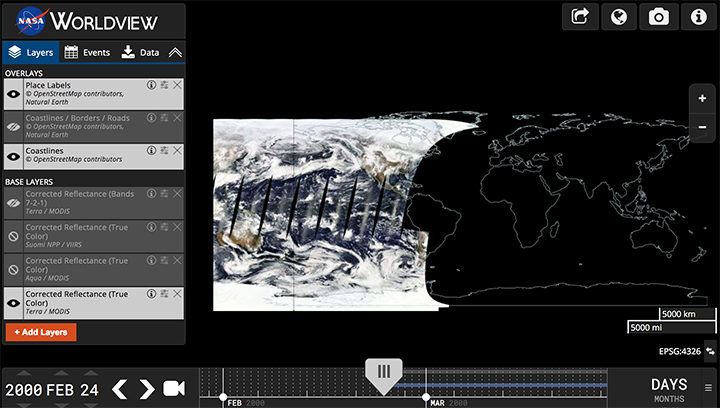
This Worldview screenshot shows the first day that Terra MODIS collected data — February 24, 2000. The very first Terra scene showed northern Argentina and Chile. Credit: EOSDIS.
One of the things I love about having all this MODIS data at my fingertips is that it makes it possible to see the passage of relatively long periods of time in just a few minutes. Look, for instance, at the animation at the top of this page, generated by Delft University of Technology ice scientist Stef Lhermitte using Worldview.
Lhermitte summoned every natural-color MODIS image of the Arctic that Terra and Aqua (which also has a MODIS instrument) have collected since April 2003. The result — a product of 71,000 satellite overpasses — is a remarkable six-minute time capsule of swirling clouds, bursts of wildfire smoke, the comings and goings of snow, and the ebb and flow of sea ice.
Though beautiful, Lhermitte’s animation also has a troubling side to it. If you look carefully, you can see the downward trend in sea ice extent. Look, for instance, at mid-August and September 2012 — the period when Arctic sea ice extent hit a record-low minimum of 3.4 million square miles. Between the heavy cloud cover, you will see lots of dark open water. Compare that to the same period in 2003, when the minimum extent was 6.2 million square miles. Scientists attribute the loss of sea ice to global warming.
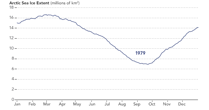
NASA Earth Observatory chart by Joshua Stevens, using data from the National Snow and Ice Data Center.
Earth Matters had a conversation with Lhermitte to find why he made the clip and what stands out about it. MODIS images of notable events that Lhermitte mentioned are interspersed throughout the interview. All of the images come from the archives of NASA Earth Observatory, a website that was founded in 1999 in conjunction with the launch of Terra.
What prompted you to create this animation?
The extension of the MODIS record back to the beginning of the mission in the Worldview website triggered me to make the animation. As a remote sensing scientist, I often use Worldview to put things into context (e.g. for studying changes over ice sheets and glaciers). Previously, Worldview only had data until 2010.
What do you think are the most interesting events or patterns visible in the clip?
I think the strength of the video is that it contains so many of them, and it allows you to see them all in one video. The ones that are most striking to me are:
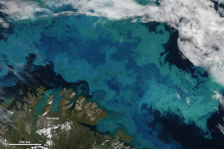
An Aqua MODIS image of a bloom in the Barents Sea on August 14, 2011. Image by Jeff Schmaltz, MODIS Rapid Response Team at NASA GSFC.
+ algal blooms in the Barents Sea
+ declining sea ice extent. You can see this both annually and over the longer term.
+ changing snow extent. You can see this each summer, especially over Canada and Siberia.
+ summer wildfire smoke in Canada (2004, 2005, 2009, 2014, 2017) and Russia (2006, 2011, 2012, 2013, 2014, 2016)
+ albedo reductions (reduction in brightness) over the Greenland Ice Sheet in 2010 and 2012 related to strong melt years.
+ overall eastward atmospheric circulation
+ the Grímsvötn ash plume (21 May 2011)
How did you make it? Was it difficult from a technical standpoint?
It was simple. I just downloaded the MODIS quicklook data from the Worldview archive using an automated script. Afterwards, I slightly modified the images for visualization purposes (e.g. overlaying country borders, clipping to a circular area). and stitched everything together in a video.
When you sit back and watch the whole video, how does it make you feel?
On the one hand, I am fascinated by the beauty and complexity of our planet. On the other hand, as a scientist, it makes me want to understand its processes even better. The video shows so many different processes at different scales, from natural processes (annual changes in snow cover and the Vatnajökull ash plume) to climate change related changes (e.g. the long term decrease in sea ice).
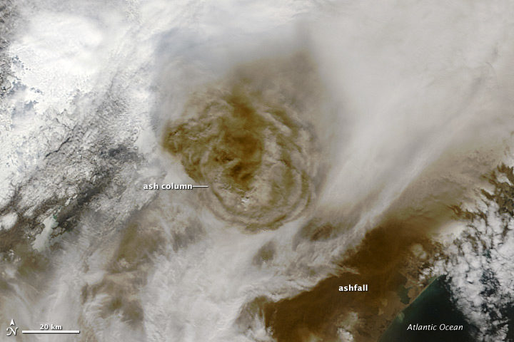
Terra MODIS image of the eruption of Grímsvötn Volcano in Iceland on May 22, 2011. NASA image by Jeff Schmaltz, MODIS Rapid Response Team.
There are some gaps during the winter where the extent of the sea ice abruptly changes. Can you explain why?
I used the standard reflectance products, which show the reflected sunlight. I decided to leave all dates out where part of the Arctic is without sunlight during satellite overpasses (approximately 10:30 a.m. and 1:30 p.m. local time). The missing data due to the polar night are very prominent if you compile the complete record including winter months, and I did not want it to distract the viewer from the more subtle changes in the video.
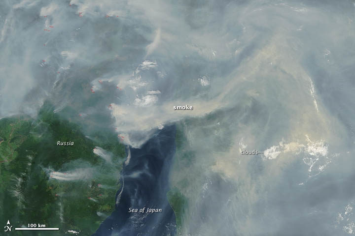
A Terra MODIS image of smoke and fires in Siberia on June 29, 2012. NASA image by Jeff Schmaltz, LANCE MODIS Rapid Response.
In the course of your day job as a scientist, do you use MODIS imagery? For what purpose?
Yes, as a polar remote sensing scientist, I tend to work with a range of satellite data sets. MODIS is a unique data product, given its global daily coverage and its long record. Besides the fact that I use MODIS frequently to monitor ice shelves and outlet glaciers, my colleagues and I use it to study snow and ice-albedo processes, snow cover in mountainous areas, vegetation recovery after wildfires, and ecosystem processes. One MODIS animation of ice calving from a glacier in Antarctica actually made it into the Washington Post recently.
Today’s blog is re-posted from NASA.gov in recognition of the agency’s Earth Day activities.
NASA’s Worldview app lets you explore Earth as it looks right now or as it looked almost 20 years ago. See a view you like? Take a snapshot and share your map with a friend or colleague. Want to track the spread of a wildfire? You can even create an animated GIF to see change over time.
Through an easy-to-use map interface, you can watch tropical storms developing over the Pacific Ocean; track the movement of icebergs after they calve from glaciers and ice shelves; and see wildfires spread and grow as they burn vegetation in their path. Pan and zoom to your region of the world to see not only what it looks like today, but to investigate changes over time. Worldview’s nighttime lights layers provide a truly unique perspective of our planet.
What else can you do with Worldview? Add imagery by discipline, natural hazard, or key word to learn more about what’s happening on this dynamic planet. View Earth’s frozen regions with the Arctic and Antarctic views. Take a look at current natural events like tropical storms, volcanic eruptions, wildfires, and icebergs at the touch of a button using the “events” tab.
https://worldview.earthdata.nasa.gov
Worldview is an open-source project at NASA. All data, software, and services are freely available to anyone for any purpose. You can participate in the software development by visiting:
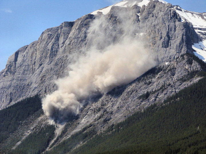
This landslide occurred on June, 1, 2007 on a mountain near Canmore in Alberta, Canada. The Flickr photo was taken by Sheri Teris (Creative Commons)
Landslides cause thousands of deaths and billions of dollars in property damage each year. Surprisingly, very few centralized global landslide databases exist, especially those that are publicly available.
Now NASA scientists are working to fill the gap—and they want your help collecting information. In March 2018, NASA scientist Dalia Kirschbaum and several colleagues launched a citizen science project that will make it possible to report landslides you have witnessed, heard about in the news, or found on an online database. All you need to do is log into the Landslide Reporter portal and report the time, location, and date of the landslide—as well as your source of information. You are also encouraged to submit additional details, such as the size of the landslide and what triggered it. And if you have photos, you can upload them.
Kirschbaum’s team will review each entry and submit credible reports to the Cooperative Open Online Landslide Repository (COOLR) — which they hope will eventually be the largest global online landslide catalog available.
Landslide Reporter is designed to improve the quantity and quality of data in COOLR. Currently, COOLR contains NASA’s Global Landslide Catalog, which includes more than 11,000 reports on landslides, debris flows, and rock avalanches. Since the current catalog is based mainly on information from English language news reports and journalists tend to cover only large and deadly landslides in densely populated areas, many landslides never make it into the database. Landslide Reporter should help change this because it makes it possible for people to submit reports, including first-hand accounts, from anywhere in the world.
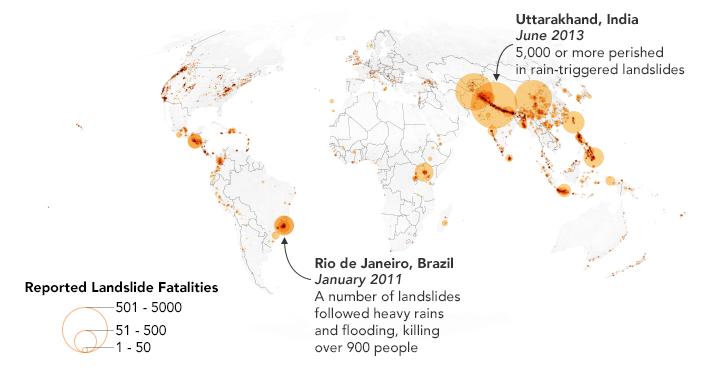
This map shows 2,085 landslides with fatalities as reported in the Global Landslide Catalog, which is currently included in the Cooperative Open Online Landslide Repository (COOLR). NASA Earth Observatory images by Joshua Stevens, using landslide susceptibility data provided by Thomas Stanley and Dalia Kirschbaum (NASA/GSFC).
Kirschbaum plans to use this database to improve the algorithm for her team’s landslide prediction model. The model, known as the Landslide Hazard Assessment for Situational Awareness (LHASA) model, analyzes rainfall and land characteristics in an area that might make a landslide more susceptible. The model produces forecasts of potential landslide activity every 30 minutes. In some cases, however, the model predicts more or less potential activity.
“With more ground data to validate the model, we can create a better tool for improving situational awareness and research for this pervasive hazard. We could better anticipate and forecast where landslides may impact populations,” said Kirschbaum.
Check out posts by Caroline Juang on Discover magazine’s citizen science blog and by David Petley on American Geophysical Union’s Landslide Blog to find out more. You can also follow the project on Twitter (@LandslideReport) and Facebook.
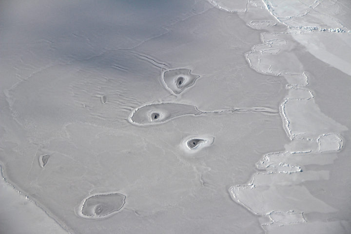
Answer: The image above shows curious holes in Arctic sea ice, located about 50 miles northwest of Canada’s Mackenzie River Delta. Guesses from readers included everything from ice broken by marine animals to breathe, to ice that had been thawed by methane hydrates. It’s a challenge to know the source of the features based on a photograph or satellite image alone, but several scientists offered their hypotheses in our April 21 Image of the Day.
Every month on Earth Matters, we offer a puzzling satellite or aerial image of Earth. The April 2018 puzzler is above. Your challenge is to use the comments section to tell us what we are looking at and why this place is interesting.
How to answer. You can use a few words or several paragraphs. You might simply tell us the location. Or you can dig deeper and explain what mission produced the image, what instrument was used to create it, or what is compelling about some obscure feature in the image. If you think something is interesting or noteworthy, tell us about it.
The prize. We can’t offer prize money or a trip to Mars, but we can promise you credit and glory. Well, maybe just credit. Roughly one week after a puzzler image appears on this blog, we will post an annotated and captioned version as our Image of the Day. After we post the answer, we will acknowledge the first person to correctly identify the image at the bottom of this blog post. We also may recognize readers who offer the most interesting tidbits of information about the geological, meteorological, or human processes that have shaped the landscape. Please include your preferred name or alias with your comment. If you work for or attend an institution that you would like to recognize, please mention that as well.
Recent winners. If you’ve won the puzzler in the past few months or if you work in geospatial imaging, please hold your answer for at least a day to give less experienced readers a chance to play.
Releasing Comments. Savvy readers have solved some puzzlers after a few minutes. To give more people a chance to play, we may wait between 24 to 48 hours before posting comments.
Good luck!
Today’s post is a reprint of recent story by Carol Rasmussen of NASA’s Earth Science News Team.
NASA has produced the first three-dimensional numerical model of melting snowflakes in the atmosphere. Developed by scientist Jussi Leinonen of NASA’s Jet Propulsion Laboratory, the model provides a better understanding of how snow melts. This can help scientists recognize the signature (in radar signals) of heavier, wetter snow — the kind that snaps power lines and tree limbs — and could be a step toward improving predictions of this hazard.
Leinonen’s model reproduces key features of melting snowflakes that have been observed in nature. First, meltwater gathers in any concave regions of the snowflake’s surface. These liquid-water regions then merge to form a shell of liquid around an ice core, and finally develop into a water drop. The modeled snowflake shown in the video is less than half an inch (one centimeter) long and composed of many individual ice crystals whose arms became entangled when they collided in midair.
Leinonen said he got interested in modeling melting snow because of the way it affects observations with remote sensing instruments. A radar “profile” of the atmosphere from top to bottom shows a very bright, prominent layer at the altitude where falling snow and hail melt — much brighter than atmospheric layers above and below it. “The reasons for this layer are still not particularly clear, and there has been a bit of debate in the community,” Leinonen said. Simpler models can reproduce the bright melt layer, but a more detailed model like this one can help scientists to understand it better, particularly how the layer is related to both the type of melting snow and the radar wavelengths used to observe it.
A paper on the numerical model, titled “Snowflake melting simulation using smoothed particle hydrodynamics,” recently appeared in the Journal of Geophysical Research – Atmospheres.
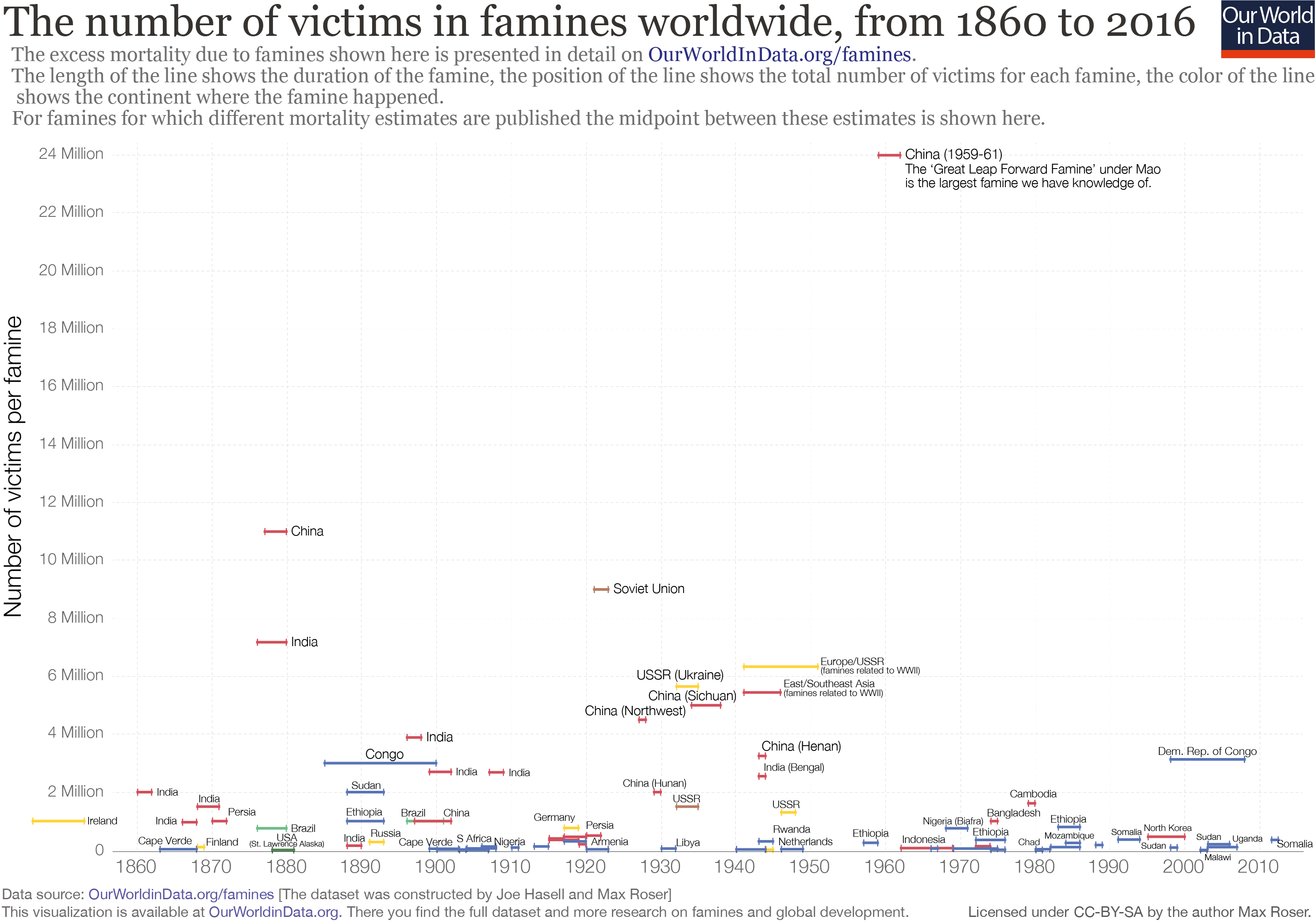
If you take the long view, our world is much better fed than it used to be. In the 1970s, about one-third of people in developing countries were undernourished; today the number is 13 percent. Even as global population has increased, it has been a long time since the horrific famines that claimed 5 million lives or more in the Soviet Union, China, Europe, and India during the 20th Century.
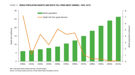
Chart courtesy of IFPRI.
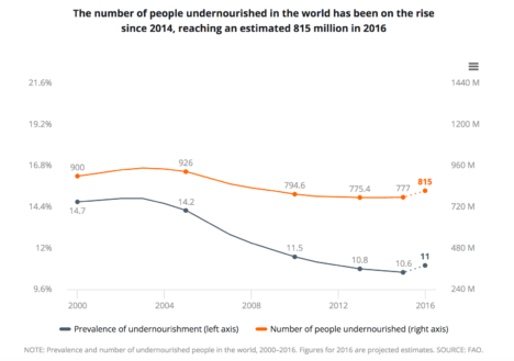
However, serious food shortages remain a fact of life. Roughly 815 million people were undernourished in 2016, according to the UN Food and Agricultural Organization. That is an increase of 38 million people from 2015, making 2016 the first year in more than a decade that the world grew hungrier. The grim trend was driven largely by armed conflicts in South Sudan, Yemen, Nigeria, and Syria.
Meanwhile, other problems loom. Climate change is already starting to exacerbate famines, as temperature and precipitation patterns shift. Many experts worry that food production systems may struggle to adapt in coming decades. Even if problems caused by climate change turn out to be modest, global populations are expected to increase to 10 billion people by 2050, and the demand for food will likely go up by 50 percent or more as people in the developing world increase their income and consume foods that require more resources to produce.
Solving global problems sometimes requires a global view, so NASA’s Applied Sciences Program is working to make sure the world’s food systems are ready for the future. Researchers and program managers have created an agency-wide initiative to put remote sensing data and knowledge into the hands of people who can advance agriculture and reduce world hunger.
Earth Matters sat down with Sean McCartney, coordinator of NASA’s new Food Security Office, to learn more.
Earth Matters: How did NASA get involved with food security?
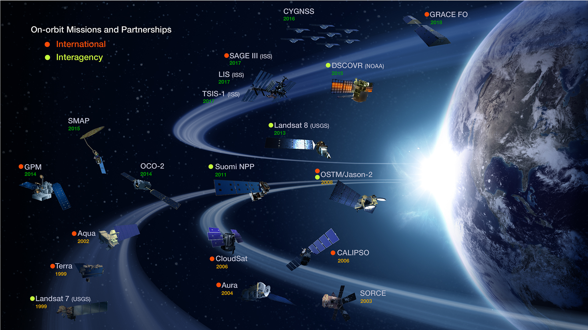
McCartney: People sometimes forget that NASA’s charter states that one of the agency’s key objectives is “the expansion of human knowledge of the Earth and of phenomena in the atmosphere and space.” There are currently around 20 Earth-observing satellites that collect data on the hydrosphere, biosphere, and atmosphere. NASA has been able to leverage this data through scientific analysis and modeling to better understand food systems on a global scale.
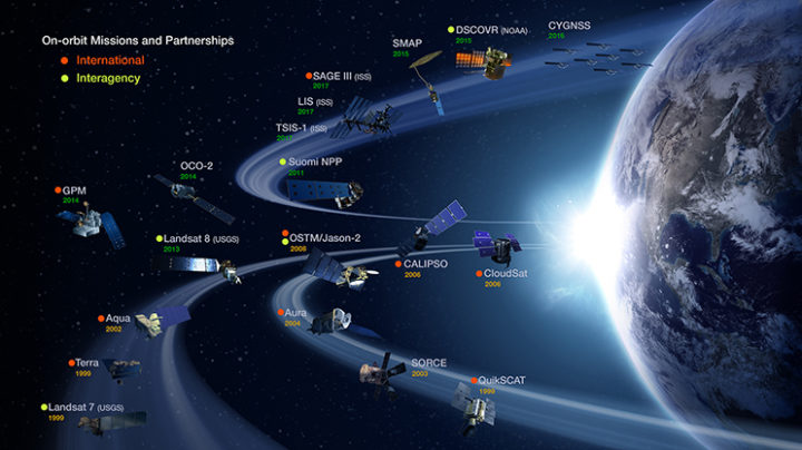
Chart courtesy of NASA’s Earth Observing System Project Science Office.
The food security initiative is part of our Applied Sciences Program, which does outreach with end users and showcases Earth observations. Through this program, NASA began to work with the United Nations on Sustainable Development Goals (SGDs), a global effort to end poverty, protect the planet, and ensure prosperity for all. Some of the goals relate to water and food security, and NASA leadership believed that that was an area where Earth observations could really contribute. Getting involved with the SGDs dovetailed with the establishment of the Food Security Office.
How do satellites and Earth-observing data relate to the food situation on the ground?
We already do a lot with satellites to monitor major commodity crops like rice, maize, wheat, and soy. We can use satellites to help track key crop characteristics, such as the “greenness” of vegetation (NDVI), crop type, the acreage and distribution of crops, precipitation, soil moisture, evapotranspiration, and more. This sort of environmental data is incorporated into important crop assessment reports, such as the GEOGLAM Crop Monitor, a monthly bulletin on conditions for major crops around the world.
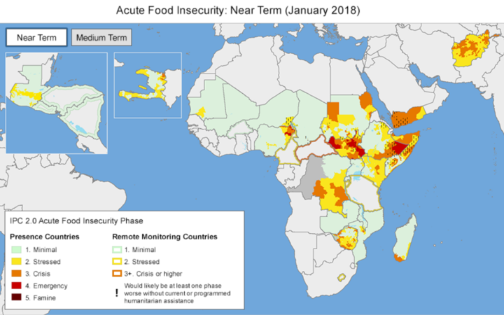
Likewise, the U.S. Agency for International Development (USAID) uses satellite data as part of its Famine Early Warning Systems Network (FEWS NET), which produces frequent reports on food conditions in 34 of the most famine-prone countries in the world.
What we’re trying to do is optimize programs and tools like these — and develop others — and get them into the right hands at the right time. NASA assets help inform governments, NGOs, the private sector, and other stakeholders to anticipate and react to food shortages.
Map courtesy of FEWS NET.
What are the main priorities of the new office?
A lot of the efforts so far have been through a partnership with the Earth Observations for Food Security and Agriculture Consortium (EOFSAC), a program led by the University of Maryland. The consortium is a really multidisciplinary group, which is what makes it so exciting. It has roughly 40 partner organizations from government, NGOs, international organizations, universities, and the private sector all working together. You can see a full list of the partners here.
What is on the consortium’s agenda?
Partnering with both the private and public sector—for instance, USDA and USAID—is one focus. They are going to be looking at innovative ways where Earth observations can provide value to end users. That might involve working with the reinsurance industry to provide them with a broad view of crops or working with USDA’s National Agricultural Statistics Service to develop ways of incorporating more satellite data into their workflow.
In February 2018, the consortium sponsored a workshop at the National Agricultural Library focusing on emerging technologies in Earth observations. Presenters highlighted several new sensors and data sets that are now being applied to agriculture — such as soil moisture, solar induced fluorescence, and satellite-derived precipitation. For a full account of the meeting, you can read the minutes here.

Photo courtesy of EOFSAC.
How would you say the world is doing in regards to food security?
It really depends on the country. If you look at overall food production, even in countries that are in need, they might be producing adequate food, but they don’t have access to markets, so they can’t get that food to people before it spoils.
Is it possible to follow some of these organizations and projects on social media?
Yes, check out @EOFSAC, @GEOCropMonitor, @FEWSNET, @G20_GEOGLAM, and @AgMIPnews.
Aerosol: A collection of microscopic particles, solid or liquid, suspended in a gas. They drift in Earth’s atmosphere from the stratosphere to the surface and range in size from a few nanometers—less than the width of the smallest viruses—to several several tens of micrometers—about the diameter of human hair. Despite their small size, they have major impacts on climate and health.
Different specialists describe the particles based on shape, size, and chemical composition. Toxicologists refer to aerosols as ultrafine, fine, or coarse matter. Regulatory agencies, as well as meteorologists, typically call them particulate matter—PM2.5 or PM10, depending on their size. In some fields of engineering, they’re called nanoparticles. Everyday terms that hint at aerosol sources, such as smoke, ash, haze, dust, pollution, and soot are widely used as well.
Climatologists typically use another set of labels that speak to the chemical composition. Key aerosol groups include sulfates, organic carbon, black carbon, nitrates, mineral dust, and sea salt. In practice, many of these terms are imperfect, as aerosols often clump together to form complex mixtures. It’s common, for example, for particles of black carbon from soot or smoke to mix with nitrates and sulfates, or to coat the surfaces of dust, creating hybrid particles.
Satellite Imagery of Aerosols:
NASA Earth Observatory image by Joshua Stevens, using Landsat data from the U.S. Geological Survey.
NASA images by Jeff Schmaltz and Joshua Stevens, using MODIS data from LANCE/EOSDIS Rapid Response.
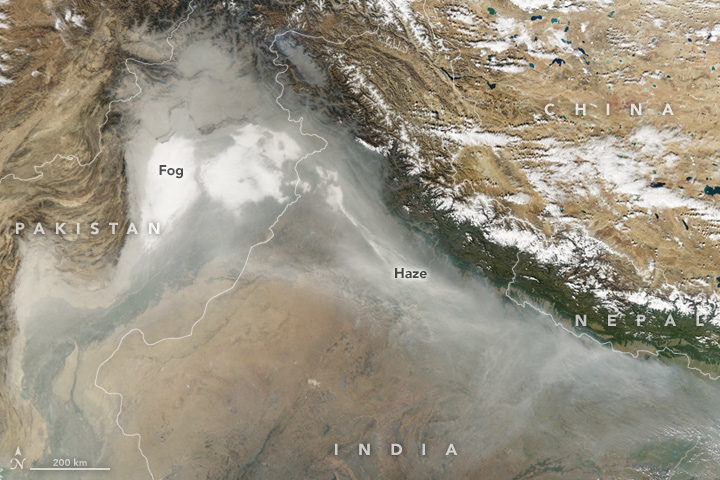
Smoke and haze in the Indo-Gangetic Plain. (NASA Earth Observatory image by Joshua Stevens, using data from the Land Atmosphere Near real-time Capability for EOS.)
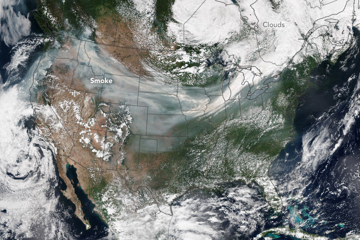
A smoke plume spans the United States. (NASA Earth Observatory image by Jesse Allen, using VIIRS data from the Suomi National Polar-orbiting Partnership.)
Aerosols in the News:
Air Quality Suffering in China, NASA Earth Observatory
Tracking Dust Across the Atlantic, NASA Earth Observatory
Where to Learn More?
Tiny Particles, Big Impact
Aerosols as explained by the IPCC
Aerosols and Climate Change
Read the Alphabet from Space
A is for aerosols altering an astronaut’s view of an ancient assemblage of rock in a state adjacent to Arizona!
About this Glossary
There are other glossaries out there, but there aren’t many visual earth science glossaries, particularly those with a focus on satellite imagery. To fill that gap, Earth Matters is working on building its own. Have suggestions for what we should include? Comment on a post or send us an email.
Fire on Bellandur Lake on January 19, 2018. Photo by pee vee.
In Bengaluru, India, one of the city’s lakes is so polluted with sewage, trash, and industrial chemicals that it has an alarming habit of catching on fire. As recently as January 19, 2018, fire broke out on Bellandur Lake and burned for seven hours.
The same lake is notorious for churning up large amounts of white foam that has, at times, spilled from the lake and enveloped nearby streets, cars, and bridges. The water is so polluted that it can’t be used for drinking or bathing or even irrigation.
Bellandur Lake is not the only lake in Bengaluru with water quality problems. During a recent check, not one of the hundreds of lakes that the city tested was clean enough to be used for drinking or bathing.
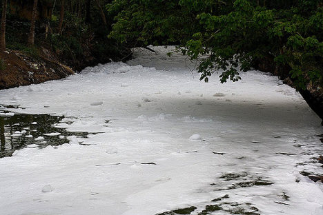
Foamy water flowing into Bellandur Lake. Photo by Kannon B.
I point this out on World Water Day to underscore that Bengaluru’s water woes, though extreme, are not particularly uncommon. According to the United Nations, a quarter of all people on the planet lack access to safely managed drinking water, and 40 percent of people live in areas where water scarcity is a problem. Roughly 80 percent of wastewater flows back into ecosystems untreated. Even in the United States, tens of millions of people may be exposed to unsafe drinking water, according to one recently published study.
Even in the course of reporting for this website from a satellite perspective, we see signs of trouble. Capetown was on the verge of running out of water in February 2018. Drought pushed São Paulo’s reservoirs to near empty in recent years. The GRACE satellites have observed rapid depletion of groundwater in several critical aquifers. On more than one occasion, we have reported on rainbow-colored escaped mine tailings contaminating waterways.
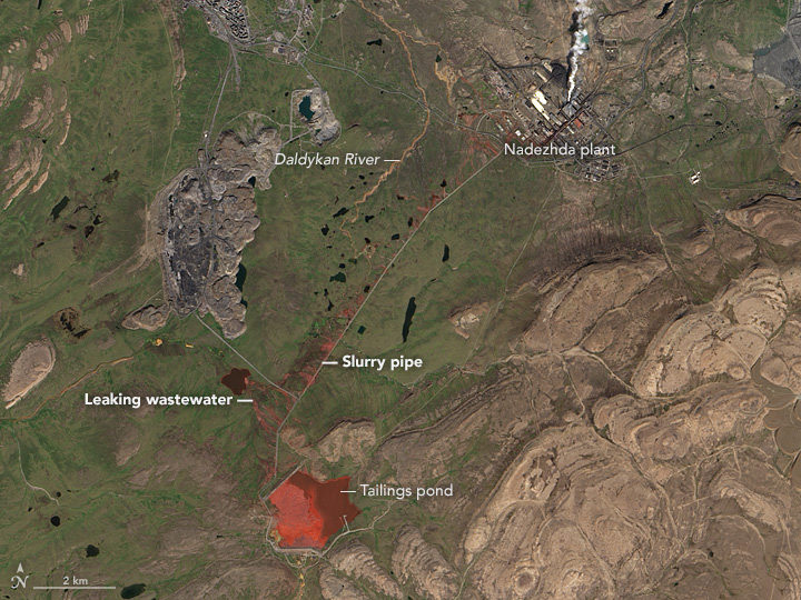
NASA Earth Observatory image by Jesse Allen, using Landsat data from the U.S. Geological Survey. Learn more about the image here.
To push back against such problems, NASA’s Earth Science Division, and particularly its applied sciences program, is doing what it can to marshal the agency’s resources to make countries aware of what NASA resources are available to monitor and reduce the impact of water-related problems.
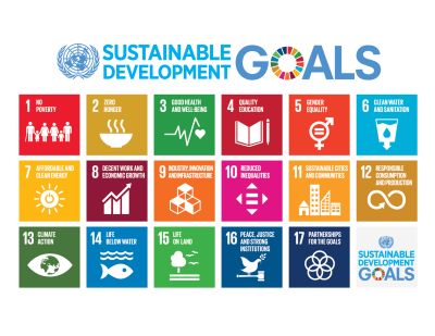
Learn more about the Sustainable Development Goals. Image by the United Nations.
As one piece of its water program, NASA scientists and staff are working with the United Nations to highlight key NASA datasets, tools, and satellite-based monitoring capabilities that may help countries meet the 17 sustainable development goals established by the international body. Goal number 6—that countries ensure the availability and sustainable management of water and sanitation for all—has been a particular focus of the NASA teams.
NASA and NOAA satellites collect several types of data that may be useful for water management. Sensors such as the Moderate Resolution Imaging Spectroradiometer (MODIS) and the Visible Infrared Imaging Radiometer Suite (VIIRS) collect daily data and images of water bodies around the planet that can be used to track the number and extent of lakes and reservoirs.
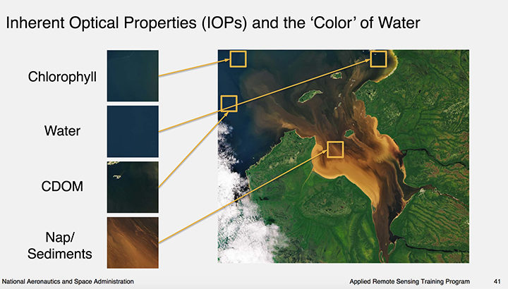
Image courtesy of this NASA ARSET presentation. Learn more about the image here.
The same sensors collect information about water color, which scientists use to detect sediment, chlorophyll-a (a product of phytoplankton and algae blooms), colored dissolved organic matter (CDOM), and other indicators of water quality.
The strength of MODIS and VIIRS is that these sensors collect daily imagery; the downside is that the data is relatively coarse. However, another family of satellites, Landsat, carries sensors that provide more than 10 times as much detail.
The combination of information from multiple satellites collected over time can be powerful. For instance, as we reported previously, a team of scientists based in China used decades of Landsat data to track a 30 percent decrease in the total surface area of lakes in Inner Mongolia between the 1980s and 2010. The scientists attributed the losses to warming temperatures, decreased precipitation, and increased mining and agricultural activity.
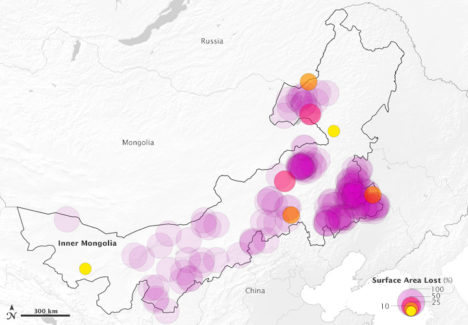
This map above depicts 375 lakes within Inner Mongolia that experienced a loss in water surface area between 1987-2010. The large, purple circles indicate a complete loss of water. Learn more about the map here.
Meanwhile, one of NASA’s scientists, Nima Pahlevan, is in the process of building an early warning system based on Landsat and Sentinel-2 data that will be used to alert water managers in near-real time when satellites detect high levels of chlorophyll-a, an indicator that harmful algal blooms could be present. While some blooms are harmless, outbreaks of certain types of organisms lead to fish kills and dangerous contamination of seafood. His team is working on a prototype system for Lake Mead in Nevada (see below), Indian River Lagoon in Florida, and certain reservoirs in Oregon. Eventually, he hopes to have a tool available that can be used globally.
“The idea is that we can get the information to water managers quickly about where satellites are seeing suspicious blooms, and then folks on the ground will know where to test water to determine if there’s a harmful algae bloom,” said Pahvalen. “We’re not suggesting that satellites can replace on-the-ground sampling, but they can be a great complement and make that work much work more efficient and less costly.”
To learn more about how satellites can be used to aid in the monitoring of water quality, see this workshop report and harmful algal bloom training module from NASA’s ARSET program.
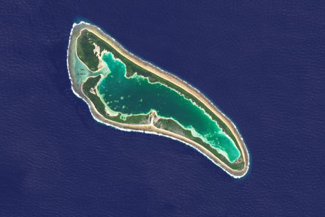
Every month on Earth Matters, we offer a puzzling satellite image. The March 2018 puzzler is above. Your challenge is to use the comments section to tell us what we are looking at and why this place is interesting.
How to answer. You can use a few words or several paragraphs. You might simply tell us the location. Or you can dig deeper and explain what satellite and instrument produced the image, what spectral bands were used to create it, or what is compelling about some obscure feature in the image. If you think something is interesting or noteworthy, tell us about it.
The prize. We can’t offer prize money or a trip to Mars, but we can promise you credit and glory. Well, maybe just credit. Roughly one week after a puzzler image appears on this blog, we will post an annotated and captioned version as our Image of the Day. After we post the answer, we will acknowledge the first person to correctly identify the image at the bottom of this blog post. We also may recognize readers who offer the most interesting tidbits of information about the geological, meteorological, or human processes that have shaped the landscape. Please include your preferred name or alias with your comment. If you work for or attend an institution that you would like to recognize, please mention that as well.
Recent winners. If you’ve won the puzzler in the past few months or if you work in geospatial imaging, please hold your answer for at least a day to give less experienced readers a chance to play.
Releasing Comments. Savvy readers have solved some puzzlers after a few minutes. To give more people a chance to play, we may wait between 24 to 48 hours before posting comments.
Good luck!
