
No, that is not a photograph of the death star orbiting Earth. It is the winner of NASA Earth Observatory’s 2016 Tournament Earth—the Dark Side and the Bright Side. The image shows the fully illuminated far side of the Moon that is not visible from Earth.
The images were acquired by the Earth Polychromatic Imaging Camera (EPIC) on the DSCOVR satellite, which orbits about 1.6 million kilometers (1 million miles) from Earth. EPIC maintains a constant view of the fully illuminated Earth as it rotates. About twice a year the camera captures images of the Moon and Earth together as the orbit of DSCOVR crosses the orbital plane of the Moon.

The Moon faced some stiff competition on its journey to the championship. In the course of the tournament, it faced a trio of hurricanes over the Pacific, the electric eye of Cyclone Bansi, an underwater volcano, and the wrath of Mount St. Helens. The final round came down to a slugfest between the Moon and an impressionistic bloom in the Baltic Sea caused by a profusion of cyanobacteria. When the voting was over, the Dark Side/Bright Side finished with 59 percent of the vote.
While we aren’t aware of any homecoming parades to honor the 2016 champion, watching the video above (or listening to all of Pink Floyd’s Dark Side of the Moon) seems like a fitting way to celebrate. The images in the movie below were taken over the course of five hours on July 16, 2015. The North Pole is toward the upper left, reflecting the orbital tilt of Earth from the vantage point of the spacecraft. The far side of the Moon was first observed in 1959, when the Soviet Luna 3 spacecraft returned the first images. Since then, several missions by NASA and other space agencies have imaged the lunar far side.


NASA’s Earth Observatory brings you a new view of Earth from above every single day. Many of these images are more than just pretty pictures; scientists use satellite-based information to figure out how the planet works and to better understand how and why it is changing on a global scale. But to get a full picture, the view from space isn’t enough. You also need granular observations that can only be gathered from the ground. And that’s the job of many NASA researchers who embark on expeditions each year, traversing land, air, ice, and sea.
NASA has a long history of field campaigns large and small. But 2016 is a particularly busy year as eight major new campaigns get under way. If you like acronyms, you’ll love this list:
Watch the video below for an armchair tour and brief explanation of each campaign.
So what on Earth is OMG? Scientists are now in the field to help get to the bottom of sea level rise. Namely, how much is ocean warming contributing to ice loss from below, where glaciers meet the water? Data collected during flights around the island’s perimeter will help find out. Read more about the OMG campaign here, and follow writers in the field with each campaign here.
Also currently under way is the Arctic Boreal Vulnerability Experiment (ABoVE). This campaign covers 2.5 million square miles of tundra, mountains, permafrost, lakes, and forests in Alaska and Northwestern Canada. Scientists use satellites and aircraft study this formidable terrain as it changes in a warming climate. But remote sensing by itself is not enough to understand the whole picture, so teams of researchers are on location to gather more data. Follow their journey here, as told directly by scientists in the field.
Stay tuned as the rest of the campaigns ramp up. It’s been an icy adventure so far. But later this year, scientists with CORAL will assess the condition of threatened coral-based ecosystems in Hawaii, and scientists with KORUS-AQ will study air quality in South Korea. If you want to learn more about those campaigns now, take a look at the story we published about CORAL or the story we did about KORUS-AQ in March.

The maps above, featured in our January 9, 2016 Image of the Day, show soil composition across the United States (bottom) and the space available for water to reside within those soil types (top). Douglas Miller—a soil, informatics, and remote sensing expert at Penn State—compiled the dataset on which the map is based (soil characteristics for the conterminous United States, or CONUS-Soil.) By combining information about soil type with current, satellite-derived estimates of soil moisture, scientists can better predict events such as flooding, drought, and severe storms. Miller answered some of questions about soil composition, water storage, and why such things matter via email.
We have all heard about soil since we were kids, but what is it actually made of?
Soil contains many different things, but the most basic elements that soil scientists would talk about include various particle sizes (sand, silt, and clay), rock fragments, open pores, roots and live organisms, water, and air. Depending upon the exact combination of all of these things, there can be more (or less) space available for water to reside. The image below shows a soil texture triangle that’s very colorful and is a handy way of thinking about soil particle composition.
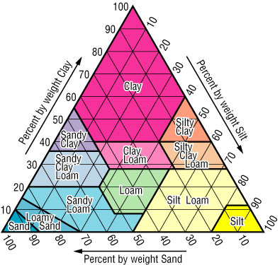
Image courtesy Douglas Miller, from the CONUS-Soil web site.
Soils that have more sand in them will not tend to hold water for a very long time. Think of what happened when you were a kid at the beach with your bucket and you tried to keep water in the castle’s moat! Soils that are heavy with clay will tend to hold water longer and not drain as quickly. Soils that have more silt in them will tend to be intermediate in drainage properties. All told, the ideal soil would have nearly equal amounts of the three major textures (somewhere in the middle of the soil triangle).
Why does soil composition matter?
Farmers, gardeners–essentially anyone interested in growing plants in soil–would be interested in knowing soil composition. Thinking back to the soil triangle mentioned above, one would ideally love to have a medium textured soil from near the middle of the soil triangle. By being aware of the soil texture that you have and the capacity of that soil to hold water (along with the water requirements of the plants that you wish to grow), you can manage your landscape. If I have too much clay in my soil, I would want to work in materials (like leaves, peat moss, etc.) to moderate the texture and open more space in the soil profile for water. Years ago, my back yard garden was mostly clay soil. For three years I chopped up all of my leaves and put them in the garden. This helped to add organic matter and nutrients, but also made the soil texture closer to middle of the triangle.
Can knowledge about soil composition and soil moisture tell you something that wouldn’t be known by looking at just one or the other?
Yes! The interesting thing about soils is that they’re closely connected to weather through soil moisture. Satellites like SMAP and SMOS, flying overhead, give us near-real time estimates of soil moisture. When combined with soil properties, we can improve our ability to predict things like flooding, drought relief, and even severe storm generation. There’s a strong connection between soil moisture at the land surface and severe storms (thunderstorms, tornados, derechos, etc.). Soil moisture near the surface is available to be easily evaporated in to the atmosphere. With the proper atmospheric conditions, rapid evaporation can lead to strong storm development. Using a combination of weather data, SMOS/SMAP data, and land surface properties (soils, vegetation, and topography), we can develop improved models that more accurately predict when and where storms and consequent flooding, damage, etc. will occur.
What have been the developments in this area of research since the dataset was compiled?
Since we compiled CONUS-Soil from the USDA National Resources Conservation Service database in the mid-1990s, USDA has now completed SSURGO–detailed soil surveys that are conducted on a county-level basis for the entire continental U.S. As compared to CONUS-Soil (1 kilometer resolution grid cells), SSURGO can be gridded at 10 meters in most places. This provides a tremendous amount of detail. I believe the entire U.S. dataset for SSURGO gridded at 10 meters is about 16GB. It’s a huge dataset.
However, a real challenge still exists in creating a standardized dataset (like CONUS-Soil) that has the same number of layers for each grid cell, anywhere in the U.S. What makes our product still unique, after all these years, are the standardized layers that a climate or hydrology model can count on being the same, from cell-to-cell. The monthly downloads that we still get for CONUS-Soil indicate that its 1-kilometer resolution is still valuable for regional climate and hydrology models. We are investigating what it will take to create a new CONUS-Soil from SSURGO (with standard layers). We believe that will require the use of a significantly sized supercomputer!
Read more in our Image of the Day, Soil Composition Across the U.S., and in our feature story, A Little Bit of Water, A Lot of Impact.
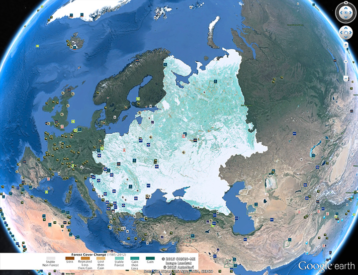
Our July 16 Image of the Day—Changing Forest Cover Since the Soviet Era—features a Landsat-derived map showing how forests have changed in Eastern Europe since 1985. After exploring the three areas we highlighted, I highly recommend browsing the map at full resolution using either Google Earth or GigaPan. The amount of detail you will find is extraordinary. There are dozens of other interesting forest loss and gain hot spots that we could have highlighted. In fact, we may publish additional stories using these data, so please let us know if you are aware of local stories of forest change in eastern Europe that deserve more attention.
While the satellite maps offer invaluable “big picture” perspective, ground photographs really bring the changes to life. Peter Potapov, the University of Maryland scientist who led the mapping effort, passed along a few photographs taken during his field research in Russia. It is one thing to know that a brown pixel in the maps indicate forest loss and the a green pixel indicates gain. It becomes real when you can actually see charred trunks after a forest fire or stands of saplings springing up in abandoned Soviet farm fields.
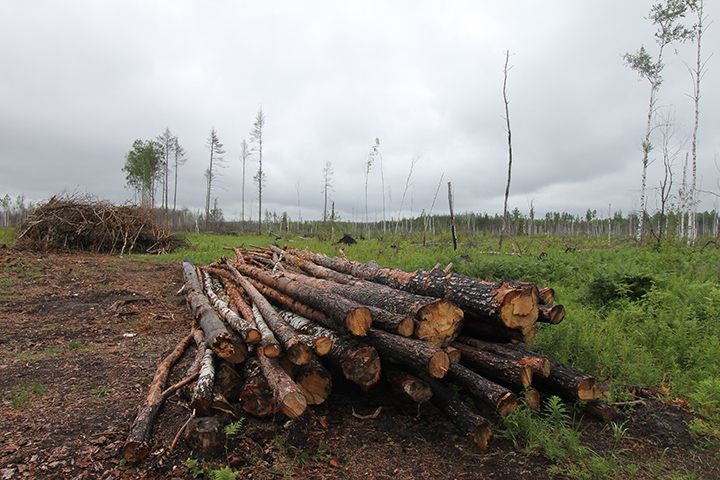
Logging site in the Vladimir region of Russia. Photo Credit: Peter Potapov.
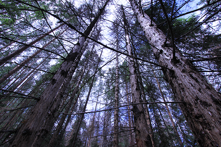
Spruce trees killed by bark beetle in the Vladimir region of Russia. Photo Credit: Peter Potapov.

Charred trunks caused by a forest fire in the Vladimer region of Russia. Photo credit: Peter Potapov
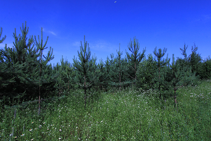
Pine forests in an abandoned pasture in the Vladimir region of Russia. The pine trees are about ten years old. Photo Credit: Peter Potapov.

Birch forest growing on abandoned farmland in the Nizhny Novgorod region of Russia. Photo Credit: Peter Potopov
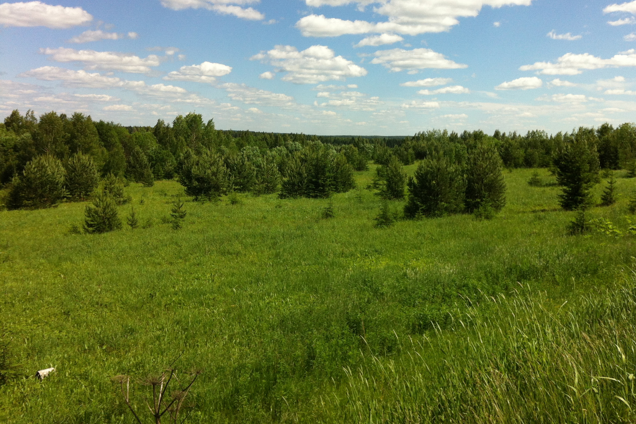
Early stages of forest recovery in abandoned farmland in the Kirov region of Russia. Photo Credit: Peter Potapov
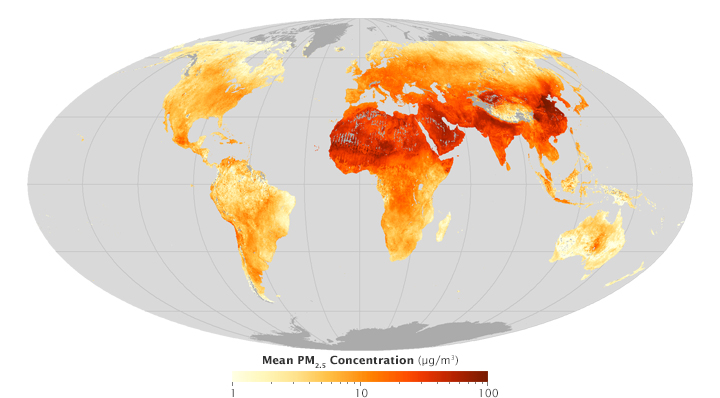
Fine particulate matter (PM2.5) for 2010-2012 with dust and sea salt included. Visualization by Josh Stevens. Data from van Donkelaar et al.

Fine particulate matter (2.5) concentration for 2010-2012 without dust and sea salt included. Data from van Donkelaar et al.
If you saw our June 22 Image of the Day with global maps of fine particulate matter (PM2.5), you may have noticed large concentrations over the Sahara Desert and the Arabian Peninsula. With vast deserts in these areas, it’s not a surprise that the satellites detected so many particulates. Winds regularly send plumes of dust blowing over the region and even to Europe and the Americas.
However, it isn’t clear how damaging dust particles are to human health in comparison to other types of fine aerosol particles (such as those produced by burning fossil fuels or biomass burning). Several teams of epidemiologists have looked for associations between outbreaks of Saharan dust and health problems, but the results have been mixed. A literature review published in 2012 summarized the state of the science this way: “The association of fine particles PM2.5, with total or cause-specific mortality is not significant during Saharan dust intrusions. However, regarding coarser fractions PM10 and PM2.5-10, an explicit answer cannot be given. Some of the published studies state that they increase mortality during Sahara dust days while other studies find no association between mortality and PM10 or PM2.5-10. The main conclusion of this review is that health impacts of Saharan dust outbreaks needs to be further explored.”
Since dust is natural and may not have significant effects on human health, the team of Dalhousie University scientists who developed the global PM2.5 exposure maps prepared two versions of their data. One shows total PM2.5 concentration (top map above) globally; the other shows PM2.5 excluding contributions from dust and sea salt (bottom map). Notice how much less PM2.5 appears in northern Africa when dust is excluded.
To get a sense of how PM2.5 concentration (excluding dust and sea salt) has changed between 2000 and 2010, see the map below. Notice that while PM2.5 has decreased over North America and Europe, it has increased over Asia. To read more about what is driving these trends, read this story. To learn more about the data used to create these maps, visit this website.

Areas where PM2.5 concentration has increased between 1998 and 2012 are shown with shades of red. Decreases are shown with shades of blue. Data from van Donkelaar et al.
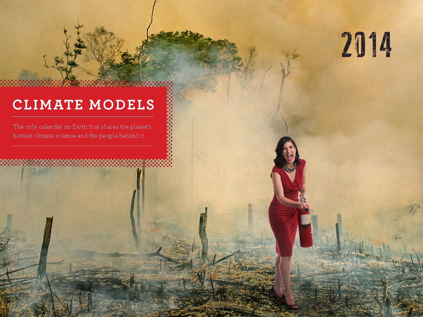
Columbia University climate scientist Kátia Fernandes appeared on the cover of the 2014 Climate Models wall calendar. The calendar, dreamed up by two science writers at Columbia University, offered a fresh look on the meaning of the term ‘climate model.” Read more about the calendar from AGU’s Plainspoken Scientist blog. Image credit: Charlie Naebeck.
Based on email and social media comments we receive, climate models are one of the least understood and most maligned tools used by Earth scientists.
What is a climate model? Putting aside the scientists from the Lamont-Doherty Earth Observatory who posed for a climate model calendar in 2014 (cover above), climate models are simply mathematical representations of Earth’s climate that are based on fundamental physical, biological, and chemical laws and theories. As NOAA explained in a story about the first general circulation model to include both the ocean and atmosphere, scientists divide the planet into a three-dimensional grid, use computers to solve the equations, and then evaluate the results when they “run” a climate model. As the story noted: “Models calculate winds, heat transfer, radiation, relative humidity, and surface hydrology within each grid and evaluate interactions with neighboring points.” The illustration below should help you visualize how the grids are laid out and some of the physical processes models include.
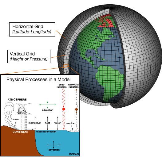
Image credit: NOAA
One of the first general circulation models was developed at Lawrence Livermore National Laboratory by Cecil “Chuck” Leith in the early 1960s. Unlike the NOAA model mentioned above, Leith’s model only simulated the atmosphere. What make Leith’s work so remarkable was that he was the first to produce a computer animation based on the model output. Watch the video below to see how these wobbling yet compelling animations looked.
From the very beginning, Leith’s animations attracted attention. “The one that I have is essentially a polar projection of the Northern Hemisphere, and you can see the patterns moving in mid-latitudes,” Leith explained during an oral history interview conducted by the American Institute of Physics. “I did it just because I knew we could do it, it would be interesting to look at, but it was almost too interesting. Whenever I’d go anywhere and give a talk about what I was doing, I would show the film and everybody was fascinated by the film, and they didn’t care what I said about the technical aspects of the model, as far as I could tell. And, in fact, Smagorinsky (another pioneer of climate modeling and the first director of NOAA) used to chide me about it a little bit. He says: ‘That’s just big plan showmanship. There’s no science there.’ But they started making movies too.” You can read more about Leith’s animation from Climate Central.
If the animation makes you curious about the history of climate modeling, try this chapter of Spencer Weart’s excellent book “The Discovery of Global Warming,” as well as this excerpt from Warren Washington’s autobiography “Odyssey in Climate Modeling, Global Warming, and Advising Five Presidents.” And if you’re looking for a more current take on climate models, how they work, and how they can be useful, see Motherboard’s new story and video profile (below) of NASA’s Goddard Institute for Space Studies (GISS). Finally, the TED talk by GISS Director Gavin Schmidt about models and the emergent patterns of climate change is well worth the twelve minutes.
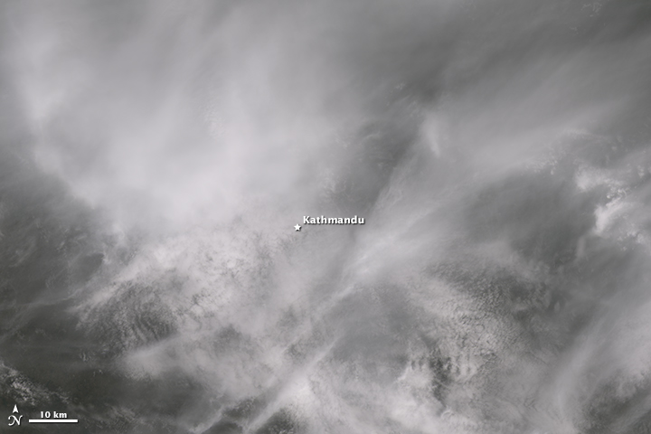
Clouds obscuring the Operational Land Imager’s view of Kathmandu, Nepal.
Several readers have asked us to post satellite imagery related to the earthquake that struck Nepal on April 25, 2015. While we regularly post imagery of natural hazards, the weather and the satellites haven’t cooperated in this case.
Some people assume NASA’s satellite fleet can collect images of virtually any part of the world in near-real time, but the reality is more complicated. The orbital track of the satellites and the specific capabilities of the sensors on board determine whether we have imagery to share. In the case of Nepal, things haven’t lined up in our favor.
NASA did acquire imagery of Nepal soon after the earthquake. The Aqua and Terra satellites capture images of Nepal every day with their identical Moderate Resolution Imaging Spectroradiometer (MODIS) sensors. Note, however, the words “moderate resolution” in the name. Each MODIS pixel corresponds to 250 meters of the Earth — not 1 meter or less like you will find if you zoom all the way in on Google maps. MODIS does a fantastic job of showing a broad area, but if you compare an April 22 MODIS view of Nepal with an April 27 view, you’ll see the sensor doesn’t have enough spatial resolution to see changes caused by the earthquake. What’s more, it has been rather cloudy since the earthquake anyway.
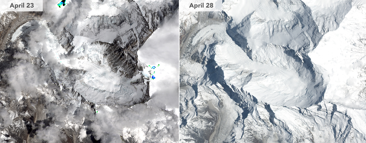
Mount Everest before and after the earthquake. Not much change is visible because of a fresh coat of snow and cloud cover. The April 23 image was acquired by the Operational Land Imager on Landsat 8. The April 28 image was acquired by the Advanced Land Imager on Earth Observing-1.
Other sensors like the Advanced Land Imager (ALI) on Earth Observing-1, the Operational Land Imager (OLI) on Landsat 8, and the Advanced Spaceborne Thermal Emission and Reflection Radiometer (ASTER) on Terra have much higher spatial resolution (10, 15, and 15 meters per pixel respectively…good enough to see individual buildings). But each satellite passes over Nepal much less frequently. OLI, for instance, captured imagery of Nepal on April 23, but it isn’t due for another pass until May 9. ALI did get an image of Mount Everest on April 28, but as shown in the images above, there’s no noticeable sign of the earthquake and avalanche due to a fresh coating of snow and some cloud cover. ASTER also was clouded out.
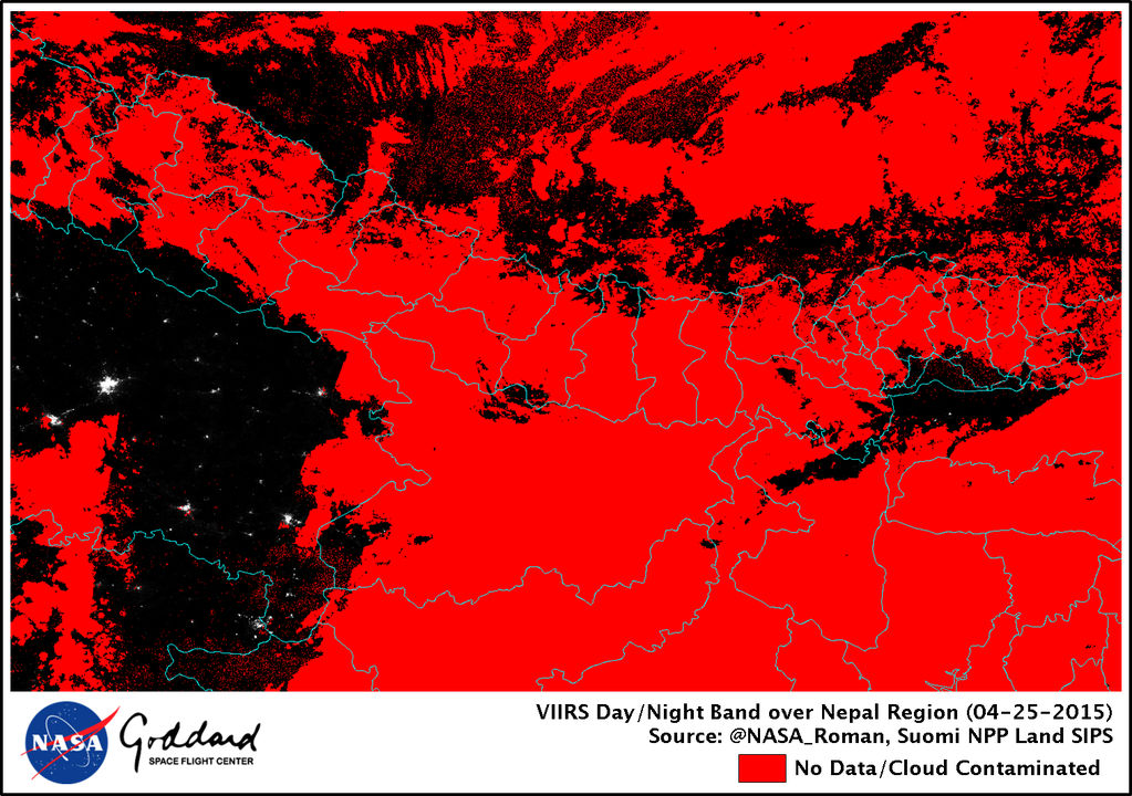
It’s also possible for the Visible Infrared Imaging Radiometer Suite (VIIRS) on the Suomi NPP satellite to detect the widespread blackouts that have occurred since the earthquake but, again, the weather has not cooperated. As you can see in the images (below) tweeted by NASA researcher Miquel Roman, clouds blocked the satellite’s view on April 25 (below), 26, and 27.
Why doesn’t NASA have sensors with extremely high spatial resolution (less than one meter per pixel) that like some commercial satellite companies do? (Some of those satellites have glimpsed damage to individual structures and shown groups of people congregating in streets.) That’s a complicated subject that would need a much longer blog post to explore properly, but the short answer is that NASA’s emphasis is on the broad view—using medium- and low-resolution imagers to understand macro scale processes on Earth.
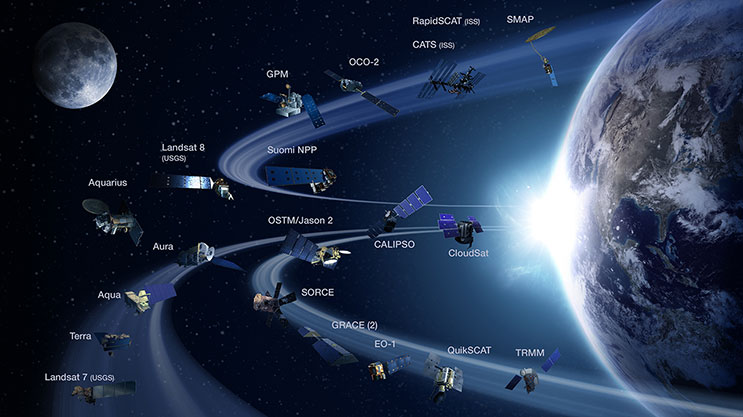
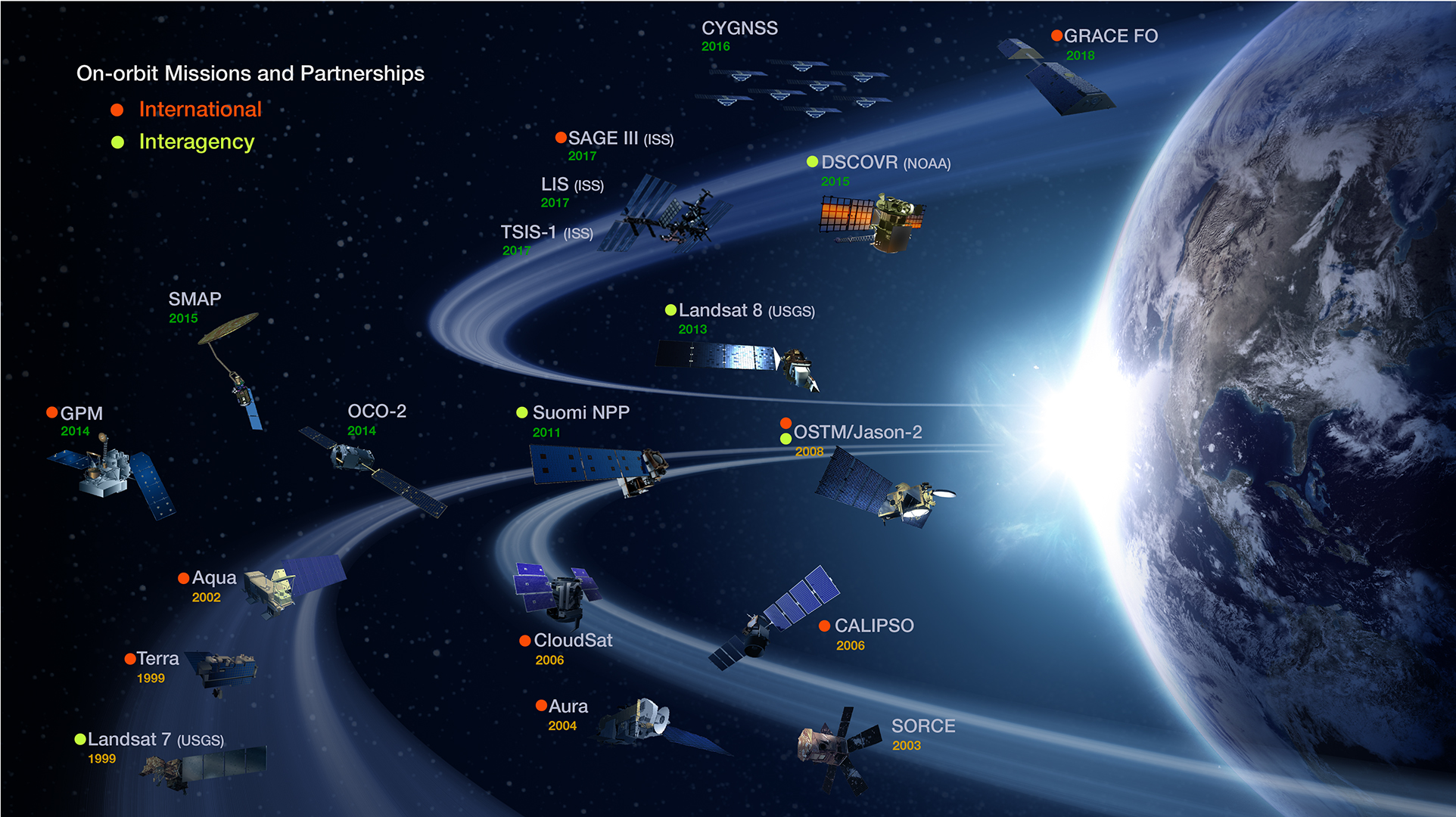
NASA sensors are sometimes useful for disaster response and often provide a unique and memorable view of an event like a landslide or wildfire. Yet the strength of satellites like Terra, Aqua, Aura, Landsat, CALIPSO, Cloudsat, GPM, OCO-2, Aquarius, and GRACE is that they drive cutting-edge science by providing global perspective. Want a global map of the world’s fires? Or global view of sea surface temperatures? A map of ground water? A record of how Arctic ice has changed over decades? A view through a smoke plume as it drifts from Asia to North America? A three-dimensional perspective on the world’s forests? That’s where the NASA satellite fleet shines. For high-resolution imagery of specific events…well, there are plenty of other organizations that specialize in that.
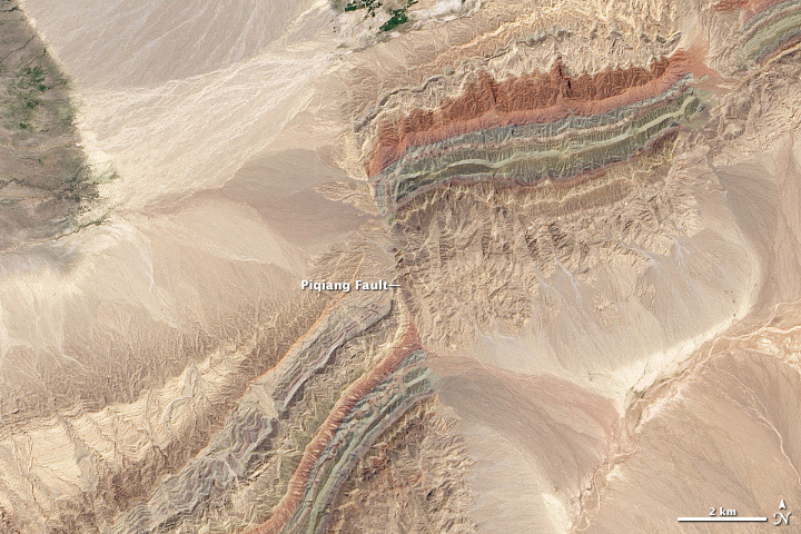
Tournament Earth 2015 has come to a dramatic end. Despite some tough match ups, the colorful faults of Xinjiang fought off a bolt of lightning (as seen from the International Space Station), taking the #2 seed from the art division all the way to the championship.
This year’s victory was a first for an image from a Landsat satellite. In 2014, the Moderate Resolution Imaging Spectroradiometer (MODIS) on Terra captured the winning shot. In 2013, it was the Advanced Land Imager (ALI) on the Earth Observing-1 (EO-1) satellite. This was also the first year that an image not associated with the Canary Islands won the tournament.
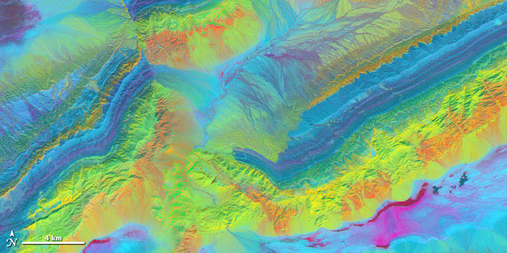
As noted in our original Image of the Day, Piqiang Fault is a northwest trending strike-slip fault that runs roughly perpendicular to a series of thrust faults. The thrust faults are marked by the colorful southeast-to-northeast running ridges. The ridges are offset by about 3 kilometers (2 miles) due to the strike-slip fault. For another perspective on the faults, see how they look in the near infrared and shortwave infrared (below). In the near infrared, variations in mineral content, vegetation, and water cause the patterns of light and dark. Below that, comparing the differences between 3 shortwave infrared bands highlights the mineral geology surrounding the fault.

Though obvious from above, the Piqiang Fault can be a challenge to see from the ground. “You can’t actually see the fault unless you hike into the mountains,” explained Sebastian Turner, a geologist who has conducted studies in the area. If you would like to learn more about the geology of this area, I would recommend looking through Turner’s study or this one by Mark Allen.
Thank you for voting!

Every month on Earth Matters, we offer a puzzling satellite image. The February 2015 puzzler is above. Your challenge is to use the comments section to tell us what part of the world we are looking at, when the image was acquired, what the image shows, and why the scene is interesting.
How to answer. Your answer can be a few words or several paragraphs. (Try to keep it shorter than 200 words). You might simply tell us what part of the world an image shows. Or you can dig deeper and explain what satellite and instrument produced the image, what spectral bands were used to create it, or what is compelling about some obscure speck in the far corner of an image. If you think something is interesting or noteworthy, tell us about it.
The prize. We can’t offer prize money, but, we can promise you credit and glory (well, maybe just credit). Roughly one week after a puzzler image appears on this blog, we will post an annotated and captioned version as our Image of the Day. In the credits, we’ll acknowledge the person who was first to correctly ID the image. We’ll also recognize people who offer the most interesting tidbits of information about the geological, meteorological, or human processes that have played a role in molding the landscape. Please include your preferred name or alias with your comment. If you work for or attend an institution that you want us to recognize, please mention that as well.
Recent winners. If you’ve won the puzzler in the last few months or work in geospatial imaging, please sit on your hands for at least a day to give others a chance to play.
Releasing Comments. Savvy readers have solved some of our puzzlers after only a few minutes or hours. To give more people a chance to play, we may wait between 24-48 hours before posting the answers we receive in the comment thread.
Good luck!

Every month on Earth Matters, we offer a puzzling satellite image. The January 2015 puzzler is above. Your challenge is to use the comments section to tell us what part of the world we are looking at, when the image was acquired, what the image shows, and why the scene is interesting.
How to answer. Your answer can be a few words or several paragraphs. (Try to keep it shorter than 200 words). You might simply tell us what part of the world an image shows. Or you can dig deeper and explain what satellite and instrument produced the image, what spectral bands were used to create it, or what is compelling about some obscure speck in the far corner of an image. If you think something is interesting or noteworthy, tell us about it.
The prize. We can’t offer prize money, but, we can promise you credit and glory (well, maybe just credit). Roughly one week after a puzzler image appears on this blog, we will post an annotated and captioned version as our Image of the Day. In the credits, we’ll acknowledge the person who was first to correctly ID the image. We’ll also recognize people who offer the most interesting tidbits of information about the geological, meteorological, or human processes that have played a role in molding the landscape. Please include your preferred name or alias with your comment. If you work for or attend an institution that you want us to recognize, please mention that as well.
Recent winners. If you’ve won the puzzler in the last few months or work in geospatial imaging, please sit on your hands for at least a day to give others a chance to play.
Releasing Comments. Savvy readers have solved some of our puzzlers after only a few minutes or hours. To give more people a chance to play, we may wait between 24-48 hours before posting the answers we receive in the comment thread.
Good luck!
