If you follow Earth and climate science closely, you may have noticed that the media is abuzz every December and January with stories about how the past year ranked in terms of global temperatures. Was this the hottest year on record? In fact, it was. The Japanese Meteorological Agency released data on January 5, 2015, that showed 2014 was the warmest year on its record. NASA and NOAA made a similar announcement on January 16. The UK Met Office, which maintains the fourth major global temperature record, ranked 2014 as tied with 2010 for being the hottest year on record on January 26.
Astute readers then ask a deeper question: why do different institutions come up with slightly different numbers for the same planet? Although all four science institutions have strong similarities in how they track and analyze temperatures, there are subtle differences. As shown in the chart above, the NASA record tends to run slightly higher than the Japanese record, while the Met Office and NOAA records are usually in the middle.
There are good reasons for these differences, small as they are. Getting an accurate measurement of air temperature across the entire planet is not simple. Ideally, scientists would like to have thousands of standardized weather stations spaced evenly all around Earth’s surface. The trouble is that while there are plenty of weather stations on land, there are some pretty big gaps over the oceans, the polar regions, and even parts of Africa and South America.
The four research groups mentioned above deal with those gaps in slightly different ways. The Japanese group leaves areas without plenty of temperature stations out of their analysis, so its analysis covers about 85 percent of the globe. The Met Office makes similar choices, meaning its record covers about 86 percent of Earth’s surface. NOAA takes a different approach to the gaps, using nearby stations to interpolate temperatures in some areas that lack stations, giving the NOAA analysis 93 percent coverage of the globe. The group at NASA interpolates even more aggressively—areas with gaps are interpolated from the nearest station up to 1,200 kilometers away—and offers 99 percent coverage.
See the chart below to get a sense of where the gaps are in the various records. Areas not included in the analysis are shown in gray. JMA is Japan Meteorological Agency data, GISTEMP is the NASA Goddard Institute for Space Studies data, HadCrut4 is the Met Office data, UAH is a satellite-based record maintained by the University of Alabama Huntsville (more on that below), NCDC is the NOAA data, and NCEP/NCAR is a reanalysis of weather model data from the National Center for Atmospheric Research.
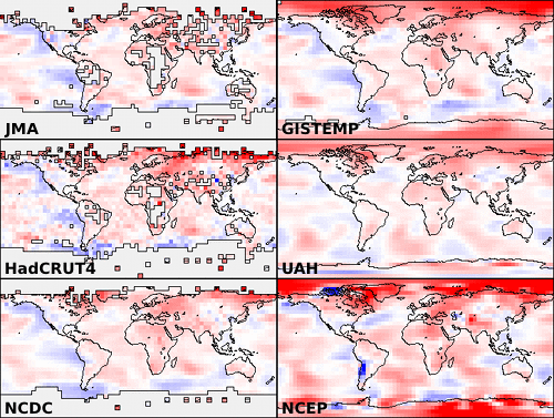
Chart from Skeptical Science.
If you’re a real data hound, you may have heard about other institutions that maintain global temperature records. In the last few years, a group at UC Berkeley — a group that was initially skeptical of the findings of the other groups — developed yet another approach that involved using data from even more temperature stations (37,000 stations as opposed to the 5,000-7,000 used by the other groups). For 2014, the Berkeley group came to the same conclusion: the past year was the warmest year on record, though their analysis has 2014 in a virtual tie with 2005 and 2010.
Rather than coming up with a way to fill the gaps, a few other groups have tried using a completely different approach. A group from the University of Alabama-Huntsville maintains a record of temperatures based on microwave sounders on satellites. The satellite-based record dates back 36 years, and the University of Alabama group has ranked 2014 as the third warmest on that record, though only by a very small margin. Another research group from Remote Sensing Systems maintains a similar record based on microwave sounders on satellites, although there are a few differences in the way the Remote Sensing Systems and University of Alabama teams handle gaps in the record and correct for differences between sensors. Remote Sensing Systems has 2014 as the 6th warmest on its record.
But let’s get back to the original question: why are there so many temperature records? One of the hallmarks of good science is that observations should be independently confirmed by separate research groups using separate methods when possible. And in the case of global temperatures, that’s exactly what is happening. Despite some differences in the year-to-year rankings, the trends observed by all the groups are roughly the same. They all show warming. They all find the most recent decade to be warmer than previous decades.
You may observe some hand-wringing and contrarian arguments about how one group’s ranking is slightly different than another and about how scientists cannot agree on the “hottest year” or the temperature trend. Before you get caught up in that, know this: the difference between the hottest and the second hottest or the 10th hottest and 11th hottest year on any of these records is vanishingly small. The more carefully you look at graph at the top of this page, the more you’ll start to appreciate that the individual ranking of a given year hardly even matters. It’s the longer term trends that matter. And, as you can see in that chart, all of the records are in remarkably good agreement.
That said, if you are still interested in the minutia of how these these data sets are compiled and analyzed, as well as how they compare to one other, wade through the links below. Some of the sites will even explain how you can access the data and calculate the trends yourself.
+ UCAR’s Global Temperature Data Sets Overview and Comparison page.
+ NASA GISS’s GISTEMP and FAQ page.
+ NOAA’s Global Temperature Analysis page.
+ Met Office’s Hadley Center Temperature page.
+ Japan Meteorological Agency’s Global Average Surface Temperature Anomalies page.
+ University of Alabama Huntsville Temperature page.
+Remote Sensing Systems Climate Analysis, Upper Air Temperature, and The Recent Slowing in the Rise of Global Temperatures pages.
+ Berkley Earth’s Data Overview page.
+ Moyhu’s list of climate data portals.
+ Skeptical Science’s Comparing All the Temperature Records, The Japan Meteorological Agency Temperature Records, Satellite Measurements of the Warming in the Troposphere, GISTEMP: Cool or Uncool, and Temperature Trend Calculator posts.
+ Tamino’s comparing Temperature Data Sets post.
+NOAA/NASA 2014 Warmest Year on Record powerpoint.
+James Hansen’s Global Temperature in 2014 and 2015 update posted on his Columbia University page.
+The Carbon Brief’s How Do Scientists Measure Global Temperature?
+Yale’s A Deeper Look: 2014’s Warming Record and the Continued Trend Upwards post.

NASA and NOAA announced today that 2014 brought the warmest global temperatures in the modern instrumental record. But what did the year look like on a more regional scale?
According to the Met Office, the United Kingdom experienced it warmest year since 1659. Despite the record-breaking temperatures, however, no month was extremely warm. Instead, each month (with the exception of August) was consistently warm. The UK was not alone. Eighteen other countries in Europe experienced their hottest year on record, according to Vox.
The contiguous United States, meanwhile, only experienced the 34th warmest year since 1895, according to a NOAA analysis. The Midwest and the Mississippi Valley were particularly cool, while unusually warm conditions gripped the West. California, for instance, went through its hottest year on record. Meanwhile, temperatures in Alaska were unusually warm; in Anchorage, temperatures never dropped below 0 degrees Fahrenheit.
James Hansen, a retired NASA scientist, underscored this point in an update on his Columbia University website: “Residents of the eastern two-thirds of the United States and Canada might be surprised that 2014 was the warmest year, as they happened to reside in an area with the largest negative temperature anomaly on the planet, except for a region in Antarctica.”
According to Australia’s Bureau of Meteorology, 2014 was the third warmest year on record in that country. “Much of Australia experienced temperatures very much above average in 2014, with mean temperatures 0.91°C above the long-term average,” said the bureau’s assistant director of climate information services.
The map at the top of this page depicts global temperature anomalies in 2014. It does not show absolute temperatures, but instead shows how much warmer or cooler the Earth was compared to a baseline average from 1951 to 1980. Areas that experienced unusually warm temperatures are shown in red; unusually cool temperatures are shown in blue.
It’s human nature to get excited by novelty in science…to gravitate to the sexy headlines and the tales of new discoveries and the flashy imagery. But so much of science is a slow slog, an anonymous labor in ordinary looking labs and cinderblock office buildings. Most scientists know that the fundamental advances do not often come in “Eureka!” moments or get announced at press conferences. They get made in the background by the unsung worker bees, both human and technological.
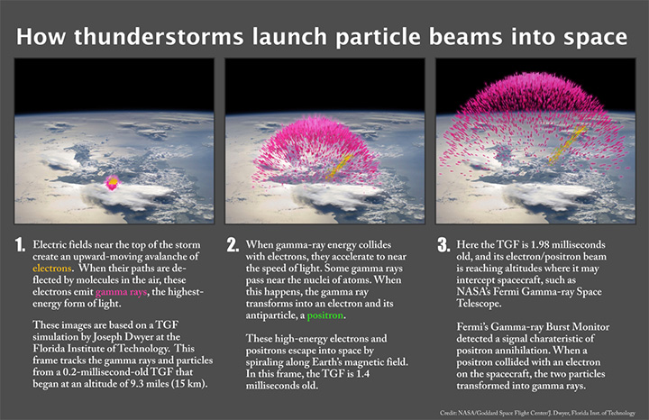
And so it is for NASA’s Wind spacecraft. You probably have never heard of it. Most of my colleagues around NASA have never heard of it. And yet it has quietly made fundamental contributions to our understanding of the electric space around Earth.

Wind studies a dark and mostly desolate netherworld between Earth and the Sun, a region that doesn’t quite fit into solar science (heliophysics) nor does it have a home in Earth science. The Wind spacecraft has no cameras and its data are rarely turned into images for public consumption. With particle counters and antennas and magnetometers, it studies how Earth’s sphere of space — geospace — interacts with the energy and particles Sun flying off of the Sun. The field is often referred to as space weather, but the analogies sort of fall apart when you learn that the most potent solar wind couldn’t ruffle the hair on your head. (It could wipe out your satellite, though.)
This solar wind, the namesake of the spacecraft, stretches and pulls the Earth’s magnetic aura (the magnetosphere) like a windsock. The magnetic field occasionally snaps back to energize the Van Allen radiation belts and to create the cascade of atmospheric particles that we know as aurora borealis and aurora australis (the northern and southern lights). Click on this link to a 1997 vintage computer model showing how the solar wind stirs up the magnetosphere. (Seventeen year-old GIFs below, with credit to Ramon Lopez, Chuck Goodrich, and their former science team at the University of Maryland).
In November 2014, Wind celebrated its 20th birthday in space. After observing our magnetic and plasma environment from several angles, it has moved back to where it started its work at the L1 Lagrange point, where the gravitational pull of the Earth and Sun cancel each other out and provide a stable orbit. Engineers say there is enough fuel to keep the spacecraft there until 2074, so Wind will keep working until the batteries or money run out.
I have a special affection for Wind, as it is one of the missions that first brought me to work at NASA. In 1997, the scientists leading the International Solar Terrestrial Physics program and the Global Geospace Science hired a young science writer to help them tell their story, and I am grateful to have had the chance. If you want to spy a bit of ancient history on the web, take a look at this old web site.
My colleague in NASA’s heliophysics division, Karen Fox, has written a great roundup of where Wind has been and all that has been accomplished with this mostly anonymous spacecraft. Go here to read her article. If you want to dig through nearly 3,000 scholarly references to Wind data, click here.
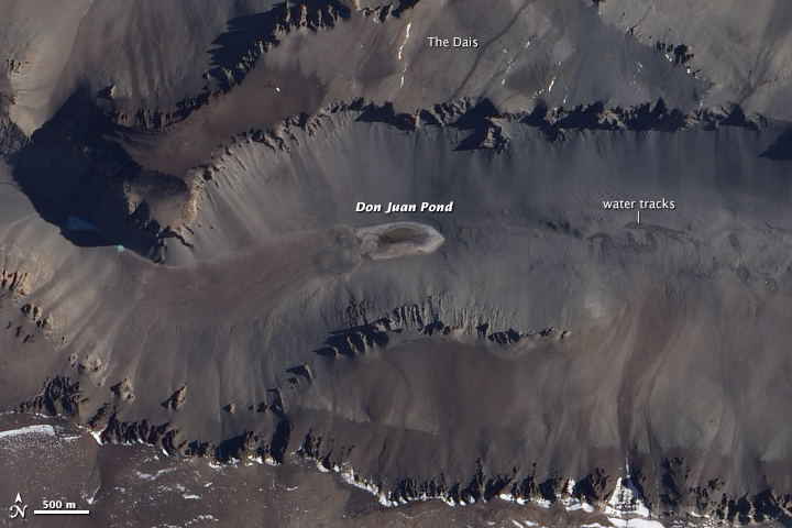
Shortly after we posted our December puzzler, Dan Mahr had responded with the correct answer. “This is definitely a scene of the McMurdo Dry Valleys in Antarctica. Specifically, I think this is Wright Valley, and the body of water at center is Don Juan Pond, one of the most saline lakes in the world. The high salinity prevents the water from freezing despite the temperature being well below the freezing point of normal, non-saline water,” wrote Mahr. About an hour later, Lee Saper chimed in with a link to the Dickson et al study that helped inspire the post. Meanwhile, Edwin Clatworthy was the first of many to weigh in with the correct location on Facebook.
If you read our Image of the Day caption, you know that Don Juan’s water is the saltiest in the world. But where exactly does the water come from in such an arid environment? While scientists suspected deep groundwater bubbling up was the source for decades, the Dickson et al study comes to a different conclusion. By setting up a monitoring station that took thousands of photographs, the scientists showed that salts in the soil suck available moisture from the air through a process called deliquescence.
These water-rich salts then trickle down slopes toward the pond, often mixing with small amounts of melt water from snow and ice. Fresh melt water flows in from the west, while a briny trickle arrives from the east. For a more visual explanation of how this works, check out the two videos from Jay Dickson below. By stringing together all the photographs, you can literally see how Don Juan pond gets its water. The captions accompanying the videos are straight from Dickson’s Antarctic time-lapse research page.
Time-lapse data show water tracks hydrating at the exact moment that a front of moist air passes through Upper Wright Valley. This is confirmation that salts (specifically CaCl2) absorb water out of the atmosphere, generating brines that match the composition of Don Juan Pond, the saltiest body of water in the world.
Two months of 5-minute interval imaging allowed for detailed mapping of inputs into Don Juan Pond. Freshwater is input from the west (right), while previously undocumented seeps of brine provide input from the east (left). These pulses are controlled by diurnal spikes in surface temperature, consistent with a near-surface source. Input from deep groundwater sources was not observed.
The 2014 fall meeting of the American Geological Union (AGU) is more than halfway over. Throughout the week we’ve been enjoying a series of cartoons drawn live at the meeting by Miles Traer, a multimedia producer at Stanford’s School of Earth Sciences, inspired by various sessions. Below is a cartoon from December 16 titled: “Atlas of Global Urban Change, a compendium of Earth’s rapid urbanization.” See the full collection here.
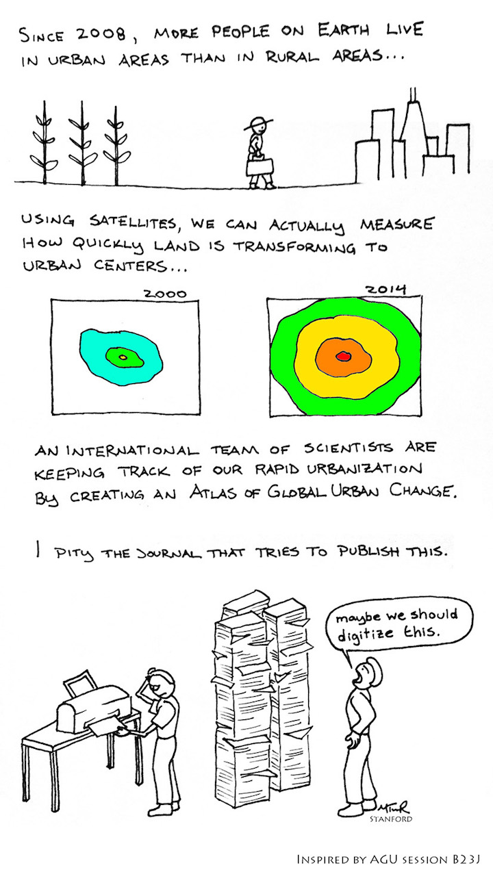
Also on December 16 at AGU, scientists presented images demonstrating an aspect of urbanization that appeared less like a cartoon and a bit more festive. The images showed that city lights shine brighter during the holidays in the U.S. when compared with the rest of the year. In central urban areas, brightness was shown to increase by 20 to 30 percent, while suburbs and outskirts of major cities saw light intensity increase by 30 to 50 percent. Read more about the holiday lights images here and here.


A record 25,000 researchers and exhibitors descended on San Francisco this week for the 2014 meeting of the American Geophysical Union (AGU). That number of attendees translates to a tremendous amount of Earth science being discussed via presentations and posters, and we can’t possibly cover it all in this blog. Fortunately, this buzz word graphic posted by @AGU_Eos helped us sort what attendees are talking about, at least on twitter at #AGU14.
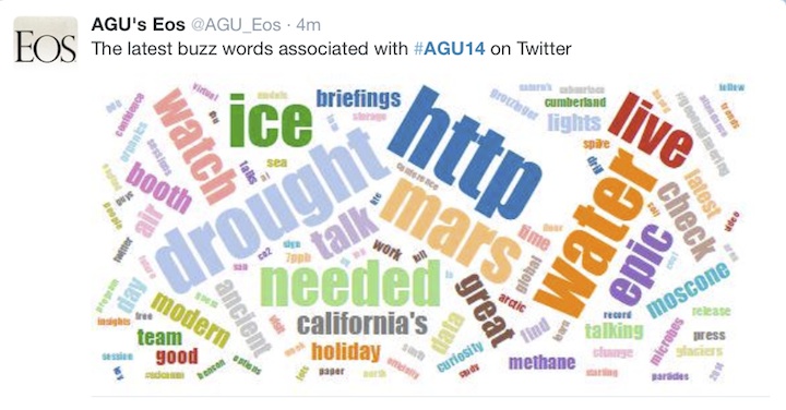
Drought was certainly a hot topic, particularly California’s multi-year episode. NASA scientists announced at a press briefing that it would take about 11 trillion gallons of water (42 cubic kilometers)—or 1.5 times the maximum volume of the largest U.S. reservoir—to recover from the current drought. The calculation, based on data from the Gravity Recovery and Climate Experiment (GRACE) satellites, is the first of its kind. Read the full story here.
The buzz word “ice” probably stems from the abundance of research on Greenland that was presented on December 15. Scientists using ground-based and airborne radar instruments found that liquid water can now persist throughout the year on the perimeter of the ice sheet; it might help kick off melting in the spring and summer. Read more about those studies here. Look, too, at this new study that used satellite data to get a better picture of how the ice sheet is losing mass.
And finally, take a minute to browse some of the cool photos presented by Anders Bjørk of the Natural History Museum of Denmark, which included the portrait of Arctic explorers (below) and this image pair demonstrating glacial retreat in Greenland.

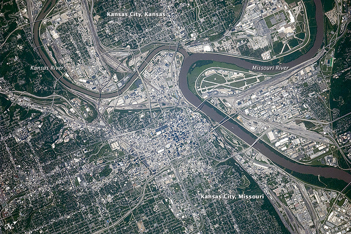
Congratulations to Deanne Howard, who was the first to solve our October 2014 puzzler. The answer is Kansas City, which as many readers pointed out is located in both Kansas and Missouri. We decided to award the win to the first person to correctly guess the city name, regardless of whether the answer specified a state.
North is to the upper right in this image, which was taken on September 6, 2014, by astronauts on the International Space Station. Charles B. Wheeler Downtown Airport is a distinct landmark, located inside the bend of the Missouri River. Southeast of the river confluence (off the bottom of this photograph), the Kansas City Royals faced the San Francisco Giants in baseball’s 2014 World Series at Kauffman Stadium. Read more about this Image of the Day published on October 24, 2014.
We extend a special thank you to Lynne Beatty, Daniel Hogan, Mary Mathews, DJ Bailey, Ryan Wilson, David M., hai On, Gaye Hattem, and others who shared extra insight about the scene in the comments section of the puzzler’s original blog post, and to Ken Hammond for the nod to the area’s history on Facebook.

Drought-induced depletion of groundwater is no longer an issue that’s out of sight, out of mind.
Research by scientists from Scripps Institution of Oceanography, published this week in Science, describes a GPS technique used to measure drought-induced uplift of land in the western United States. The uplift measurements were used, in turn, to calculate the deficit in surface and near-surface water for the area, which they estimated for March 2014 to be 240 billion tons. That’s equivalent to a 4-inch-thick layer (10 centimeters) of water over the region, or the current annual mass loss from the Greenland Ice Sheet.
GPS is not the only way to measure land displacement caused by the loss of ground and surface water. Scientists have long used the Gravity Recovery and Climate Experiment (GRACE) satellites to estimate groundwater depletion around the planet, as noted by Marcia McNutt in a related editorial.
GRACE’s achievements even graced the cover of the same issue of Science (pictured above). The image shows California’s loss of fresh water (red) from 2002 through 2014. Drought has drained the region of more than 3.6 cubic miles (15 cubic kilometers) of fresh water in each of the past three years.
The image was updated from a version that initially appeared alongside research in 2013 by James Famiglietti of NASA’s Jet Propulsion Laboratory and University of California, Irvine, and Matthew Rodell of NASA’s Goddard Space Flight Center.
Read more to learn about how GRACE is used to view Earth’s water supplies, or how U.S. groundwater on July 7, 2014, compared to the average from 1948 to 2009.
Tidewater glaciers—glaciers that flow from inland mountains all the way into the sea—are perhaps best known for birthing new icebergs in spectacular fashion. As members of James Balog’s Extreme Ice Survey team captured in this clip (above) of Ilulissat Glacier in western Greenland, calving events can feature huge chunks of ice tumbling into roiling waters and be accompanied by loud booming and splashing sounds.
However, tidewater glaciers aren’t the only type of glacier that calve. The ends of lacustrine, or lake, glaciers also break off periodically. Such glaciers gouge depressions in the ground, and those holes fill with melt water to become proglacial lakes. While many of these lakes are small and ephemeral, some are large enough to serve as the backdrop for sizable calving events.
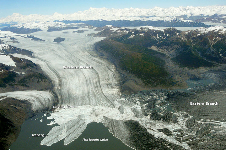
University of Alaska glaciologist Martin Truffer captured this sequence of images (below), which show a calving event at Yakutat Glacier in southeastern Alaska on July 16, 2009. “What we see in the video is a huge iceberg breaking off and rotating. I don’t have a good estimate of the size, but the part of the front that broke of is at least one kilometer long. I think it is quite unusual to see such large ice bergs overturning in lake-calving glaciers. Mostly, they just break off and quietly drift away,” Truffer noted in an email.
There are some key differences between calving events at tidewater and lacustrine glaciers. Tidewater glaciers tend to have much steeper calving fronts than their freshwater cousins. Also, lake water is generally much cooler than seawater, and there is less water circulation in lakes due to the absence of tides. As a result, tidewater glaciers calve much more frequently and are much less likely to have floating tongues of ice, which are common on lake-calving glaciers.
To learn more about Yakutat Glacier, read the Image of the Day we published on August 20, 2014. To learn more about the differences between lake-calving and tidewater glaciers, read this study published in the Journal of Glaciology. And to see more photographs of Yakutat Glacier, check out Martin Truffer’s field dispatches on his Glacier Adventures blog. I’ve included one of my favorites—an aerial shot taken on September 26, 2011, after Yakut retreated enough that its single calving face had divided into two separate branches. The photograph was taken by William Dryer, one of Truffer’s colleagues.