Every year, a group of scientists affiliated with the Global Carbon Project give Earth something like an annual checkup. Among the key questions they address: how much carbon is stored in the atmosphere, the ocean, and the land? And how much of that carbon has moved from one reservoir to another through fossil fuel burning, deforestation, reforestation, and uptake by the ocean each year?
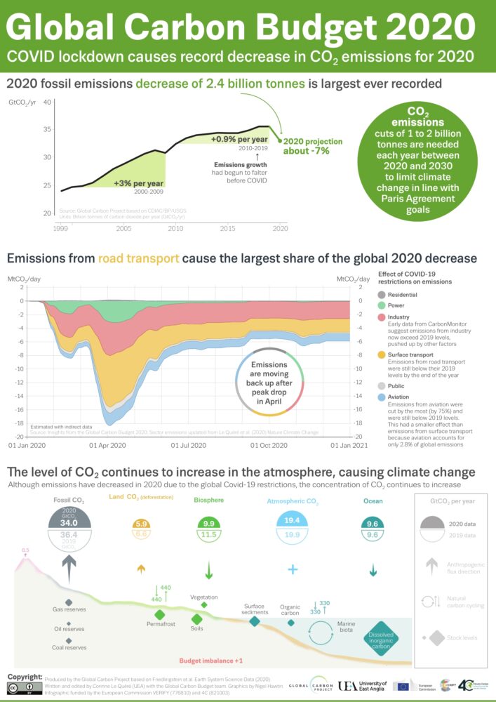
All of the latest findings—including the data for 2020, a year like few others—are available here, including links to dozens of interesting charts and a peer-reviewed science paper. Ben Poulter, a NASA scientist and member of the Global Carbon Project team, summarized the findings this way: “The economic effects of COVID-19 caused fossil fuel emissions to decrease by 7 percent in 2020, but we continued to see atmospheric CO2 concentrations increase, by 2.5 ppm, or about 5.3 PgC. This means that the remaining carbon budget to avoid 1.5 or 2 degrees warming continues to shrink, and that we need to continue to monitor the land, ocean, and atmosphere to understand where fossil fuel CO2 ends up.”
Below are 10 key findings from the most recent report. (Note: the Global Carbon Project team synthesizes a broad range of data, some of which requires time-consuming processing, quality-control, and analysis. While they do report some 2020 numbers, the most recent full year of data available for others is 2019.)


The Global Carbon Budget is produced by more than 80 researchers working from universities and research institutions in 15 countries. Observations from several NASA satellites, sensors, aircraft, and models were among the sources of information used to formulate the 2020 budget. Sources of information supported by NASA included: the MODIS sensors on Aqua and Terra satellites, the Global Fire Emissions Database (GFED), the LPJ land surface carbon exchange model, Landsat, the LUHv2 land-cover change model, the CASA land surface carbon exchange model, ODIAC fossil fuel emissions data, the MERRA-2 reanalysis, the Cooperative Global Atmospheric Data Integration Project, and OCO-2.
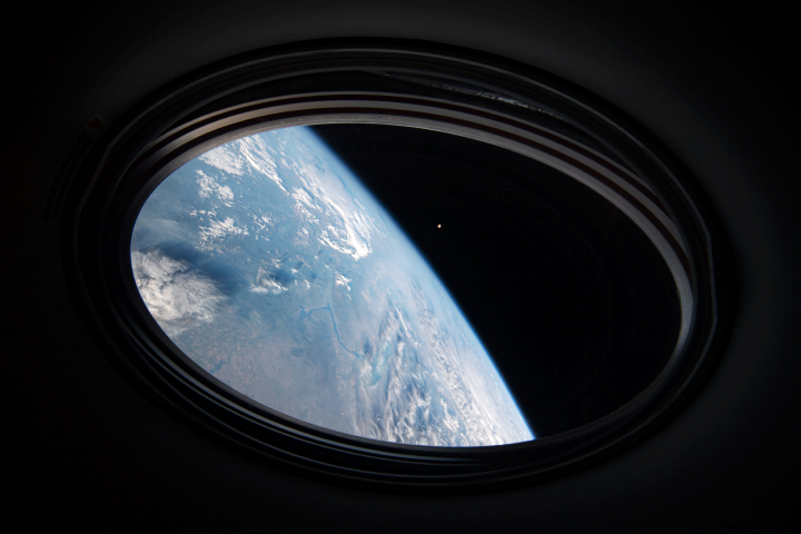
For more than 20 years, astronauts have been shooting photographs of Earth from the International Space Station. Before that, they looked down from Mercury, Gemini, Apollo, Skylab, the Space Shuttles, and MIR. They have brought us unique views of our home planet in all of its wonder, beauty, and ferocity. They have also made some interesting and timely science observations along the way.
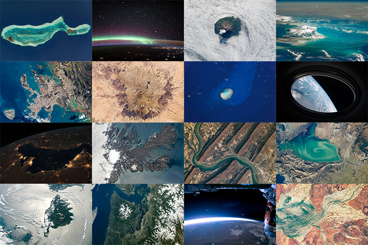
More than 1,000 of those photos have been published here on NASA Earth Observatory. We would like you to help us choose the best in our archives. In early March, we will launch Tournament Earth: Astronaut Photography, and we want you to be part of the selection committee.
From now through February 19, 2021, search our archives and point out the best photos shot by the astronauts. Post the URLs of your favorite photos in the comments section below.
Please choose images from these collections:
EO Astronaut Photography Collection
Visible Earth: Astronaut Photography
Please note that there are 30+ pages of images to scroll through — an internet rabbit hole of incredible beauty.
In March 2021, we will include some of your selections in Tournament Earth, a head-to-head contest to vote for the best of the best from our archives. Each week, readers will pick from pairs of images as we narrow down the field from 32 nominees to one champion. The Tournament Earth champion will be announced in early April.
So get browsing and get choosing. Then post your favorite URLs in the comments section by February 19.
If you want to learn more about how and why astronauts shoot photos of our planet — and the special training involved — check out our video series “Picturing Earth.”
Astronaut Photography in Focus
Trees connect us scientifically, environmentally, and culturally. We all know that trees are vital to our planet’s health. As trees grow, they absorb carbon from the atmosphere, playing a vital role in Earth’s global carbon cycle and helping to regulate Earth’s carbon budget.
But before you read any further, look around…especially if you are outside. Most of you can look in any direction and see a tree. You might wonder about a few things like: “What type of tree is that?” or “Why is that tree so tall or short?” or “How old is that tree?” or even “Was that tree planted by someone, or did the wind blow a seed to where the tree is now standing?”
Or what if you don’t see any trees? What does that signify about the environment? Did nature make it that way, or did humans? All of these are great questions that can help us understand and connect with the environment.
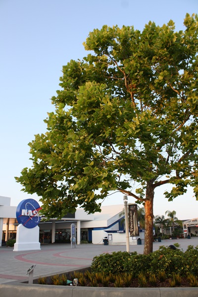
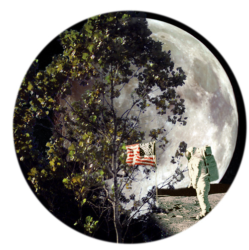
A few trees on Earth also connect us to the Moon. Have you ever heard of “Moon Trees?”
“Moon Trees” never actually grew on the Moon, but their seeds were taken into lunar orbit 50 years ago this week. The NASA Moon Trees history website explains:
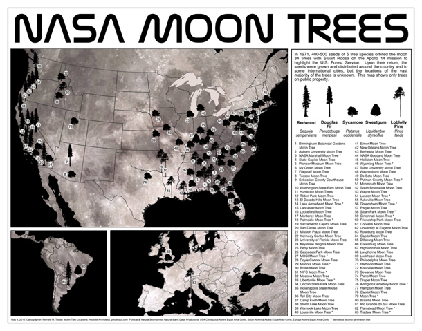
Apollo 14 launched in the late afternoon of January 31, 1971, on what was to be our third trip to the lunar surface. Five days later, Alan Shepard and Edgar Mitchell walked on the Moon while Stuart Roosa, a former U.S. Forest Service smoke jumper, orbited above in the command module. Packed in small containers in Roosa’s personal kit were hundreds of tree seeds, part of a joint NASA/USFS project. Upon return to Earth, the seeds were germinated by the Forest Service. Known as the “Moon Trees,” the resulting seedlings were planted throughout the United States (often as part of the nation’s bicentennial in 1976) and the world. They stand as a tribute to astronaut Roosa and the Apollo program.
Among the Moon Trees that were eventually planted around the United States and the world were sycamores, Loblolly pines, redwoods, sweetgums, and Douglas firs. Though it is unlikely the Moon Tree seeds were changed much by their brief lunar orbit, it is still a wonder that they made it into space and back, and that many of the trees are growing and thriving today.
So, where can you find them? The NASA Moon Trees site has a list, and there is also an article and photographs from our friends at National Geographic. UC Davis data scientist Michele M. Tobias created the map below. You can also learn more about the trees from our colleagues at Marshall Space Flight Center.
Perhaps you might see some Moon Trees in person in the next year or two. If you do, consider making tree height observations using the tree tools on the NASA GLOBE Observer app. When completing your observation, let us know in the app.
Have you ever visited and seen a Moon Tree? Tell us about it below.
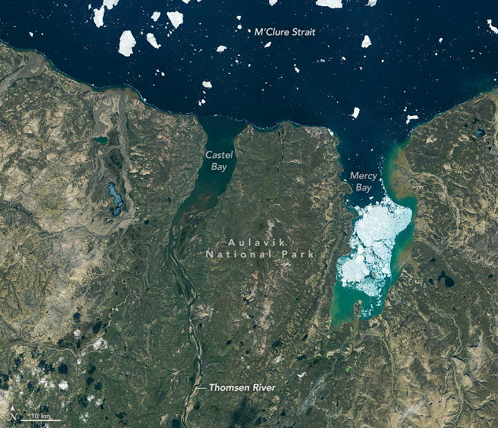
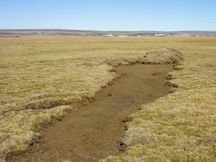
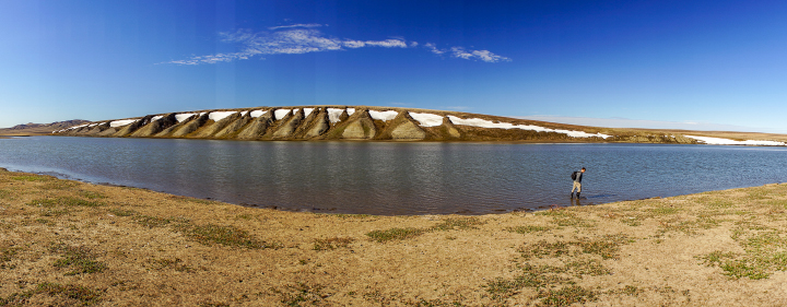
In a typical year, perhaps a dozen people visit Auluvik National Park in Canada’s Northwest Territories. Luckily, one of those visitors brought back some outstanding photos.
In November 2020, we highlighted a few compelling features around the Thomsen River estuary on Banks Island, including lines of sea ice tracing the shoreline and the braided pattern of the river. But there’s so much more to explore across this remote lowland tundra and river valley.
Robie Macdonald, a scientist at the University of Manitoba, shared some photos that he shot while doing fieldwork in the region between 2014 and 2016. The purpose of that project, led by Matt Alkire of the University of Washington, was to collect geochemical measurements from small rivers across the Canadian Arctic Archipelago.
“I really do love working in these places,” Macdonald said. “Once the aircraft has landed, one is bathed in a tremendous silence broken only by waves breaking on shingle. Then you have this incredible tundra spreading out toward the hills that define the river floodplain.”
Here are ten of Macdonald’s favorite photographs.
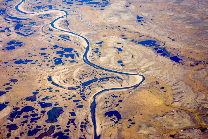
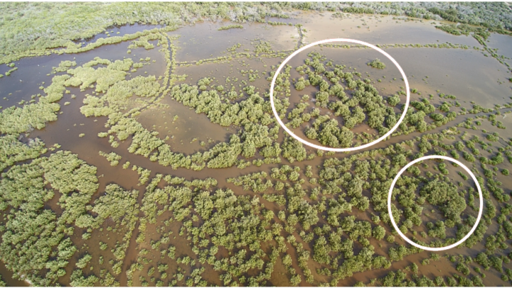
“Numerous ponds of all sizes populate the drainage basins of Banks Island, and you can see several clusters of them in the satellite image (top), especially along the small river to the west of the Thomsen. This photograph provides a closer look at one such pond cluster. In the image, you can also see textbook oxbows, which have become the setting for more ponds.”
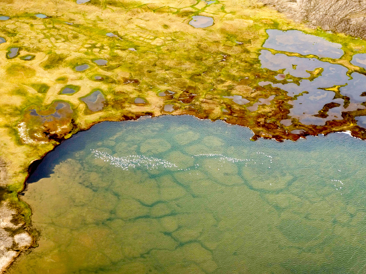
“During breeding season, it seems like almost every pond on Banks Island has its own population of snow geese (visible in this photo). You can also see old permafrost polygons that are now submerged within the pond. Polygons are widespread features of the permafrost in soil-rich locations and are produced over time by freeze-thaw cycles of the surface active layer. Permafrost thaw is widely impacting these regions, leading to feedbacks in the carbon system (CO2, CH4).”
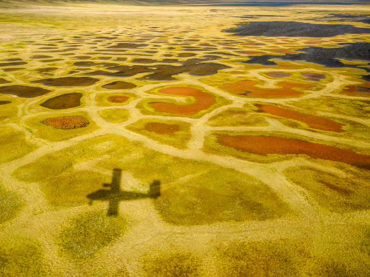
“Perhaps the most surprising characteristic of the valley bottoms in this ‘Arctic desert’ is the vibrant color of the vegetation: yellows, greens, and reds mark a dense ground cover that can be seen on the satellite image as areas with a yellowish-brownish cast.”
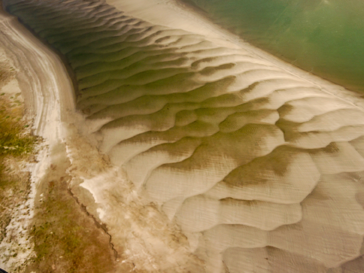
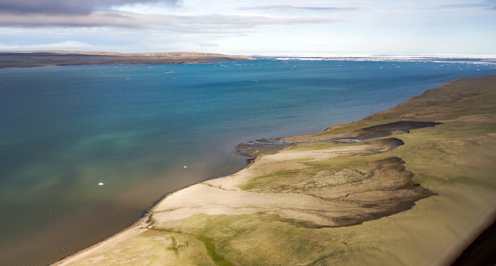
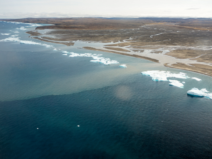
“As a result of the strong sediment supply, the large embayment at the Thomsen River mouth has been practically filled with sediment. The shallow water reveals itself in the satellite image by the lighter-greenish tone compared to water out in the channel north of Banks Island. More evidence of the ample sediment supply can be seen in beautiful displays of sand/silt ripples in the lower river between the islands. In the satellite image (top), the ripples are almost visible as grey zones between the islands before the river enters the open bay.”
“When walking on these islands near the river mouth, you can see evidence of bank erosion and ‘ice shoves.’ These are produced when wind forces newly formed ice to ride up over the river bank and gouge out the top layer of the silty material that makes up these islands. Unfortunately, ice shoves are too small to show on the satellite image.”
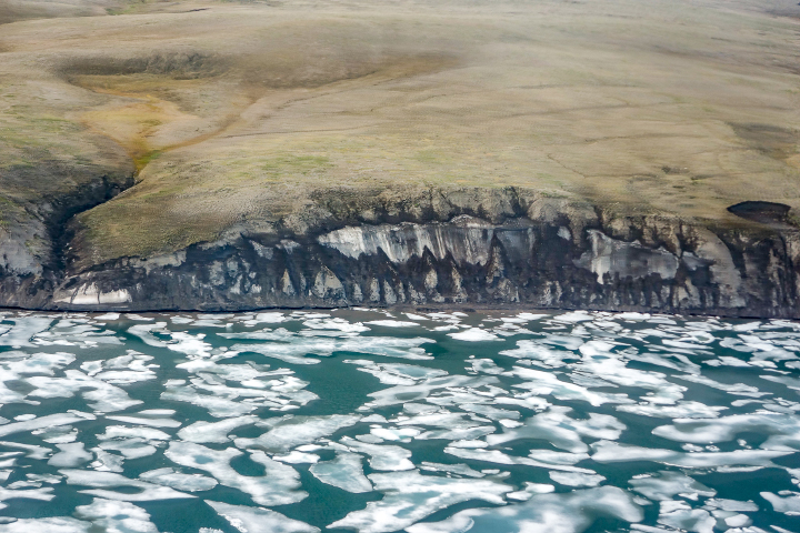
“Global warming and the extensive loss of sea-ice cover in late summer have helped accelerate coastal erosion and permafrost slumping. This image shows a section of coastline just to the east of the Thomsen River mouth that consists of a lot of frozen ice. This sort of permafrost is especially vulnerable to the changing temperature regime.”
“Thaw slumps are also a sign of the permafrost warming. These can be seen just barely in the satellite image as small dark regions along cliff faces–both facing the ocean and within the river drainage basins. Erosion and slumping expose ancient organic carbon to the air and the hydrosphere, thus providing an extensive positive feedback to climate warming.”
“Lines of bergy bits has collected along a thin shore margin at the point where the sea bottom rapidly deepens below ice keel depths, likely at approximately 2-4 meters. Although the grounded ice bits are continually melting, they are resupplied by more ice chunks shed from the permanent pack out in the channel. Two turbid plumes supplied by a river to the west of the Thomsen easily pass through the necklace of ice.”

“When we were sampling the water in this region, we found this ice barrier to be a bit more of a problem to navigate in our small inflatable boats, but ice along the shore did make it simple to sample sea ice. This image shows Greg Lehn preparing to launch our boat.”
Sampling in the Thomson River itself was somewhat simpler, once we had found a suitable place to land the plane. This image shows Greg Lehn scoping out the shore of the Thomsen River near its mouth.”
In October 2020, Mexico’s Yucatan Peninsula was doused by three storms: Gamma, Delta, and Eta. The storms came just months after tropical storm Cristobal delivered more than 50 centimeters (20 inches) of rainfall to the region in June. The accumulated rainfall and powerful winds significantly damaged mangrove forests in the region.
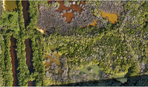
Scientists from NASA, Wageningen University, and Federal University of Viçosa have been assessing the damage in Central America using satellite data. A team based in the state of Yucatan also caught the action closer to the ground, using drones to capture mangrove changes before and after the 2020 hurricane season.
All photos are provided by Jorge Herrera from the Center for Research and Advanced Studies of the National Polytechnic Institute (CINVESTAV) and his team.
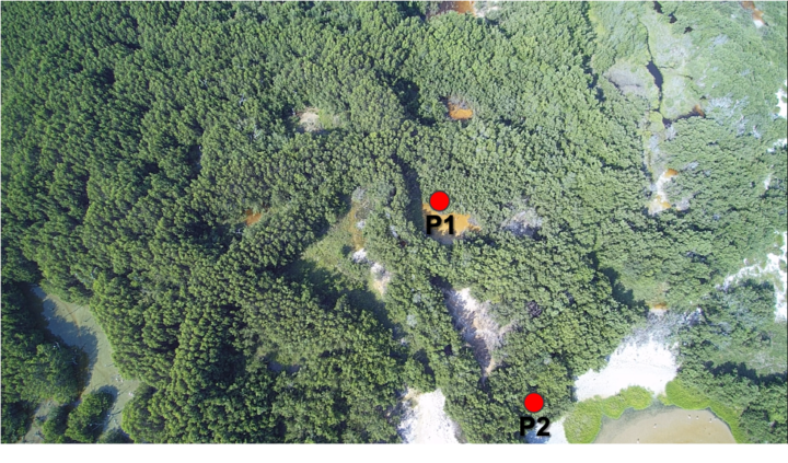
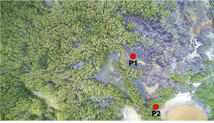
The October storms brought powerful winds that uprooted and defoliated mangrove forests near the coastal city of Dzilam el Bravo, located on the northern tip of the Yucatan Peninsula. The images below show changes from 2019 (top) to October 2020 (bottom), after Delta recently passed through the region.
The storms also brought major flooding to other Yucatan regions. Extreme precipitation can affect oxygen concentrations in soils and hinder photosynthesis for mangroves. Large storm surges can also cause physical damage and uproot trees. The images below show a mangrove near the city of Progreso in September 2020 (top image) and in November 2020 (bottom), after suffering from severe flooding.
The images below show an area near the Yucalpetén port, a few kilometers west of Progreso. Note the difference in defoliated trees from 2019 (top image) and in 2020 (bottom). In addition to defoliation, mangrove damage can also include the loss of seedlings, roots, and woody material.

The team will continue monitoring these and other sites for at least the next two years as they study mangrove regrowth and recovery through the COastal biodiversity RESilience to increasing extreme events in Central America (CORESCAM) project.
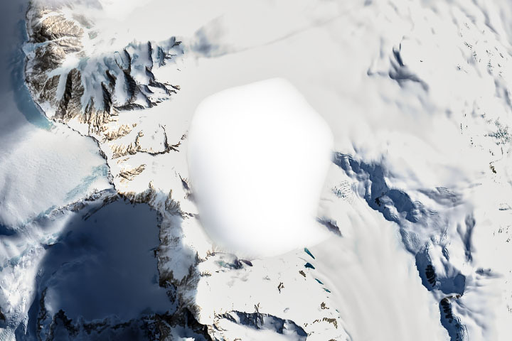
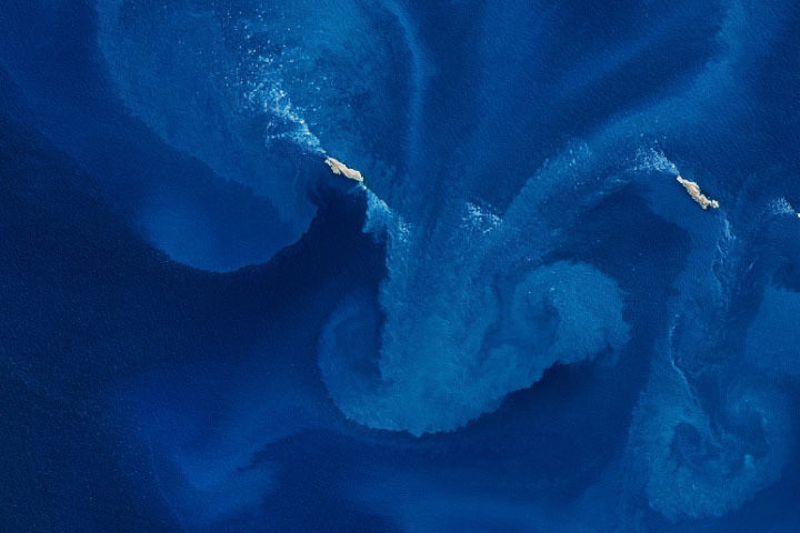
Every month on Earth Matters, we offer a puzzling satellite image. The January 2021 puzzler is above. Your challenge is to use the comments section to tell us what we are looking at, where it is, and why it is interesting.
How to answer. You can use a few words or several paragraphs. You might simply tell us the location, or you can dig deeper and explain what satellite and instrument produced the image, what spectral bands were used to create it, or what is compelling about some obscure feature. If you think something is interesting or noteworthy, tell us about it.
The prize. We cannot offer prize money or a trip to Mars, but we can promise you credit and glory. Well, maybe just credit. Roughly one week after a puzzler image appears on this blog, we will post an annotated and captioned version as our Image of the Day. After we post the answer, we will acknowledge the first person to correctly identify the image at the bottom of this blog post. We also may recognize readers who offer the most interesting tidbits of information about the geological, meteorological, or human processes that have shaped the landscape. Please include your preferred name or alias with your comment. If you work for or attend an institution that you would like to recognize, please mention that as well.
Recent winners. If you’ve won the puzzler in the past few months, or if you work in geospatial imaging, please hold your answer for at least a day to give less experienced readers a chance.
Releasing Comments. Savvy readers have solved some puzzlers after a few minutes. To give more people a chance, we may wait 24 to 48 hours before posting comments. Good luck!
UPDATE on January 19 — This puzzler shows a soft-edged cloud hovering over a mountain range in Antarctica. Margaret Obrien was the first to specify the correct continent. The Image of the Day reveals that this is the Eisenhower Range of Antarctica’s Transantarctic Mountains near Terra Nova Bay. Holger Wille was the first to specify that the clouds are likely lenticular clouds—a cloud type that can form when fast moving wind is disturbed by a topographic barrier.
Every month on Earth Matters, we offer a puzzling satellite image. The December 2020 puzzler is above. Your challenge is to use the comments section to tell us what we are looking at, where it is, and why it is interesting.
How to answer. You can use a few words or several paragraphs. You might simply tell us the location, or you can dig deeper and explain what satellite and instrument produced the image, what spectral bands were used to create it, or what is compelling about some obscure feature. If you think something is interesting or noteworthy, tell us about it.
The prize. We cannot offer prize money or a trip to Mars, but we can promise you credit and glory. Well, maybe just credit. Roughly one week after a puzzler image appears on this blog, we will post an annotated and captioned version as our Image of the Day. After we post the answer, we will acknowledge the first person to correctly identify the image at the bottom of this blog post. We also may recognize readers who offer the most interesting tidbits of information about the geological, meteorological, or human processes that have shaped the landscape. Please include your preferred name or alias with your comment. If you work for or attend an institution that you would like to recognize, please mention that as well.
Recent winners. If you’ve won the puzzler in the past few months, or if you work in geospatial imaging, please hold your answer for at least a day to give less experienced readers a chance.
Releasing Comments. Savvy readers have solved some puzzlers after a few minutes. To give more people a chance, we may wait 24 to 48 hours before posting comments. Good luck!
UPDATE on January 13 — This puzzler shows the southeastern part of the Aral Sea. Julia Daly quickly identified the location as the Aral Sea. Steve Goodman later pointed out that the desiccated part of the sea is now sometimes called the Aralkum Desert. Winter snow cover is visible in the wide view.
Every month on Earth Matters, we offer a puzzling satellite image. The November 2020 puzzler is above. Your challenge is to use the comments section to tell us what we are looking at, where it is, and why it is interesting.
How to answer. You can use a few words or several paragraphs. You might simply tell us the location, or you can dig deeper and explain what satellite and instrument produced the image, what spectral bands were used to create it, or what is compelling about some obscure feature. If you think something is interesting or noteworthy, tell us about it.
The prize. We cannot offer prize money or a trip to Mars, but we can promise you credit and glory. Well, maybe just credit. A few days after a puzzler image appears on this blog, we will post an annotated and captioned version as our Image of the Day. After we post the answer, we will acknowledge the first person to correctly identify the image at the bottom of this blog post. We also may recognize readers who offer the most interesting tidbits of information about the geological, meteorological, or human processes that have shaped the landscape. Please include your preferred name or alias with your comment. If you work for or attend an institution that you would like to recognize, please mention that as well.
Recent winners. If you’ve won the puzzler in the past few months, or if you work in geospatial imaging, please hold your answer for at least a day to give less experienced readers a chance.
Releasing Comments. Savvy readers have solved some puzzlers after a few minutes. To give more people a chance, we may wait 24 to 48 hours before posting comments. Good luck!
UPDATE on November 9 — The answer is a phytoplankton bloom near the Jason Islands, an archipelago off of the Falkland (Malvinas) Islands. Read more about it here. Evzen Schulc quickly identified that it was an ocean bloom, though no one managed to identify the location.
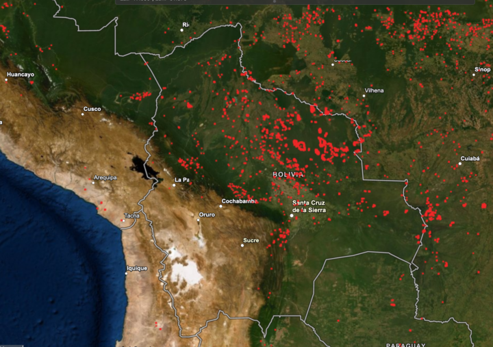
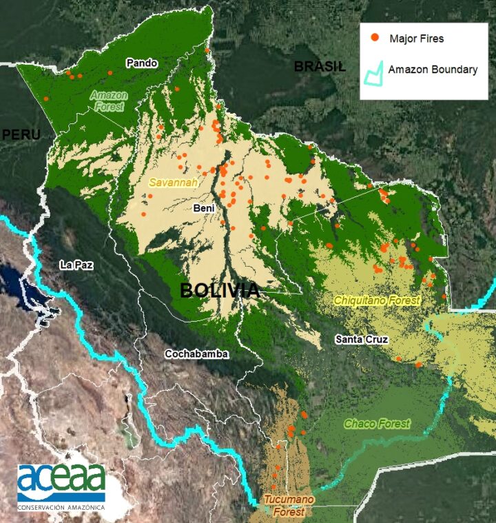
For the second year in a row, fierce fires have burned throughout Bolivia. They are the product of a prolonged drought, which has supercharged the fires that are lit seasonally by farmers and ranchers to maintain grazing land and to clear forest and woodlands for agricultural production.
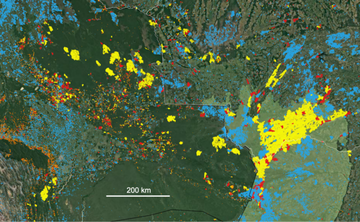
Sensors on NASA and NOAA satellites – including the Moderate Resolution Imaging Spectroradiometer (MODIS) and Visible Infrared Imaging Radiometer Suite (VIIRS) – map where fires are actively burning on Earth each day. For instance, the map from NASA’s Fire Information for Resource Management System (FIRMS) below shows all of the fire detections in Bolivia that VIIRS observed on October 16, 2020.
But not all the red dots on the map are of equal ecological significance. As these screenshots (below) from NASA’s Amazon fire dashboard make clear, there is a lot of variety in the types of fires that have burned in Bolivia in recent months, and they vary by region and ecosystem.
Many fires in the region are short-lived grassland and savanna fires; these burn vegetation that regrows quickly, and there is usually little ecological damage and minimal carbon emissions. Likewise, many others are small-scale land clearing and agricultural fires that do not cause substantial new damage to intact tropical forests.
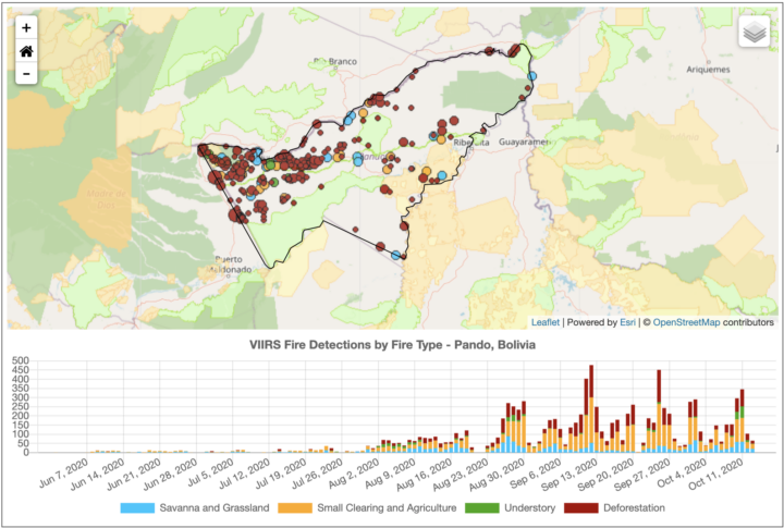
On the other hand, some of those red dots are long-lasting, intense deforestation fires that were lit specifically to burn trees as part of land-clearing processes. These fires turn patches of tropical forests into pasture or cropland, fragmenting the remaining forests and altering ecosystems for decades.
Others are low-intensity understory fires that typically begin in cleared areas as agricultural fires, but then escape into neighboring forests. Even a low-intensity fire may kill half of the trees, unleashing a cascade of ecological changes that can transform tropical forests into open-canopy woodlands over time.
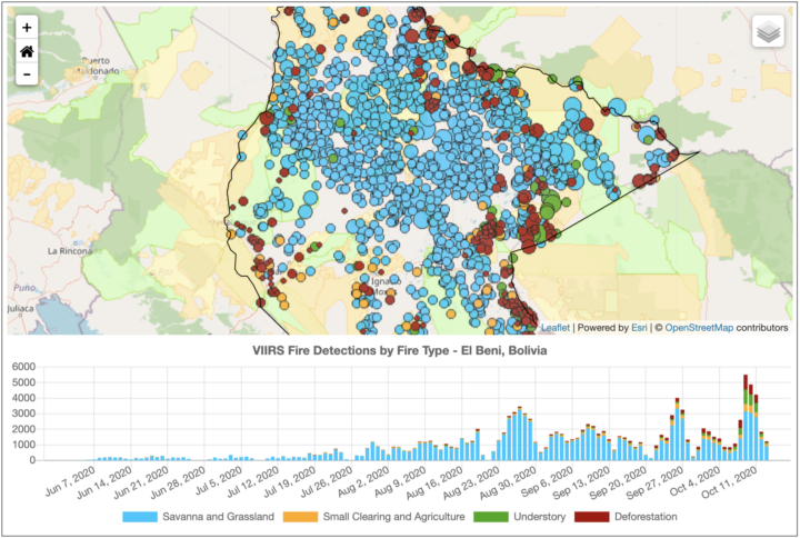
The charts above highlight the types and trends of fire type for three states (departments) in Bolivia. The northerly Pando department is still dominated by intact tropical rainforest. Satellites have detected large numbers of deforestation and agricultural fires burning there since August 2020, particularly along Highway 13. With more grasslands and fewer forests, El Beni has a higher proportion of the less-damaging fire types. The large Santa Cruz department, home to the Chiquitano dry forest and Pantanal grasslands, has comparatively large numbers of understory and grass fires.
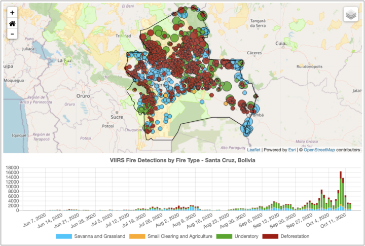
“The goal of our new classification system is to provide real-time information on what types of fires are burning across the Amazon region every day. With thousands of individual fires burning at this point in the dry season, the question is how to prioritize regional efforts for fire suppression to best protect communities and ecosystems. Understory fires are particularly devastating in Amazon forests that are not adapted to fire,” said Douglas Morton, chief of the Biospheric Sciences Laboratory at NASA’s Goddard Space Flight Center. “However, it is worth pointing out that our real-time classification system for Amazon fires is not the only way of categorizing fires. We are working closely with state and national agencies across the Amazon to improve the classification, based on feedback from field crews.”
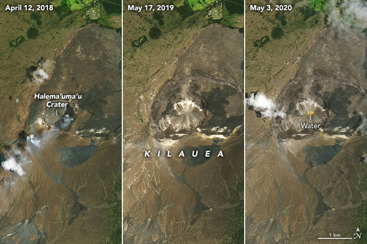
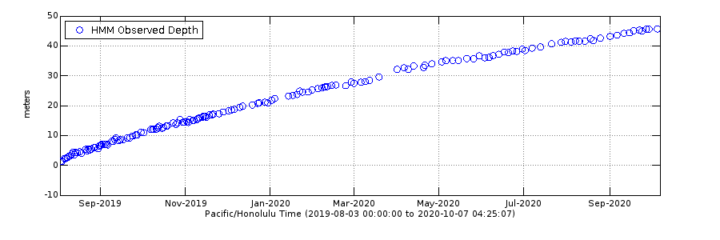
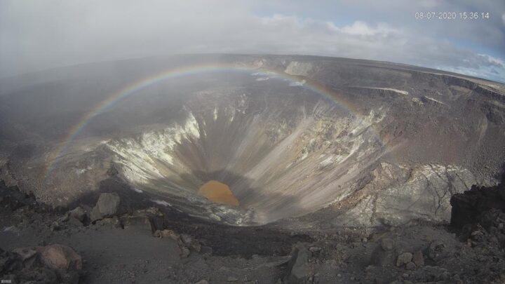
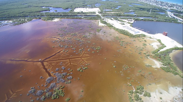
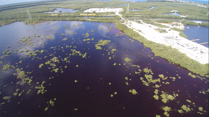
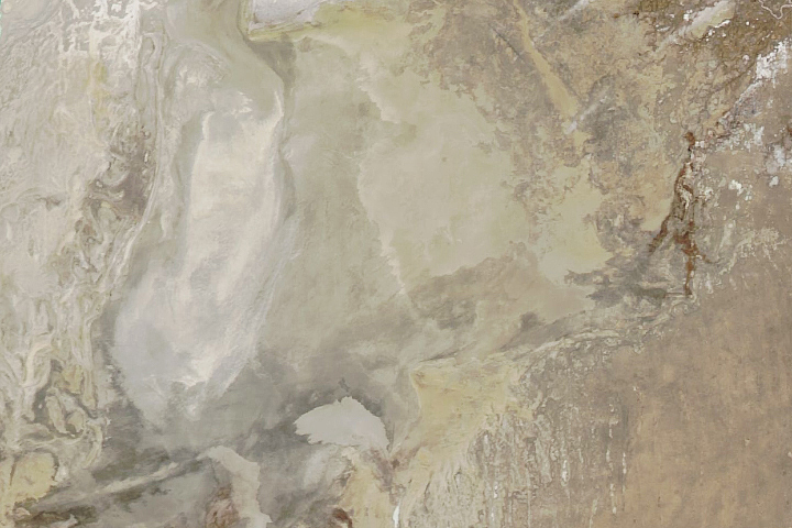
In May 2020, we published a story about a new lake growing in the summit caldera of Hawaii’s Kīlauea volcano. Six months later, the heated lake continues to rise. The water level now tops 40 meters (130 feet), according to U.S Geological Survey (USGS) measurements made with a laser rangefinder.
Though gentle “effusive” eruptions have been the norm at Kīlauea across the past two centuries, the geologic record shows plenty of evidence that the volcano has had periods when violent, explosive eruptions were common. The presence of water in magma is a key factor contributing to explosive eruptions, so USGS scientists have been carefully monitoring the volcano for signs that it may be entering a more explosive and dangerous phase.
As detailed in a September 2020 EOS article, that monitoring has included sending unoccupied aircraft systems (UAS)—drones—deep into the crater to get a closer look at the lake. Scientists have also been conducting regular helicopter flights over the lake and monitoring a suite of ground-based sensors (seismometers, GPS sites, thermal cameras, and others) that measure the motion of the ground, gaseous emissions, and the appearance and temperature of the lake.
Meanwhile, satellites provide the big-picture view. Landsat satellites periodically collect multi-spectral imagery of the lake; the images at the top of this page provide a natural-color perspective. Other satellites with Interferometric Aperture Radar (InSAR) complement the ground-based GPS sites by offering a crucial, large-scale view of land deformation.
“The chance to monitor an incipient volcanic lake is not unprecedented, but it is rare,” a group of USGS geologists wrote in EOS. “Kīlauea’s crater lake provides an opportunity to improve the scientific community’s understanding of how such lakes evolve and interact with magmatic systems below.”
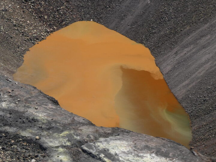
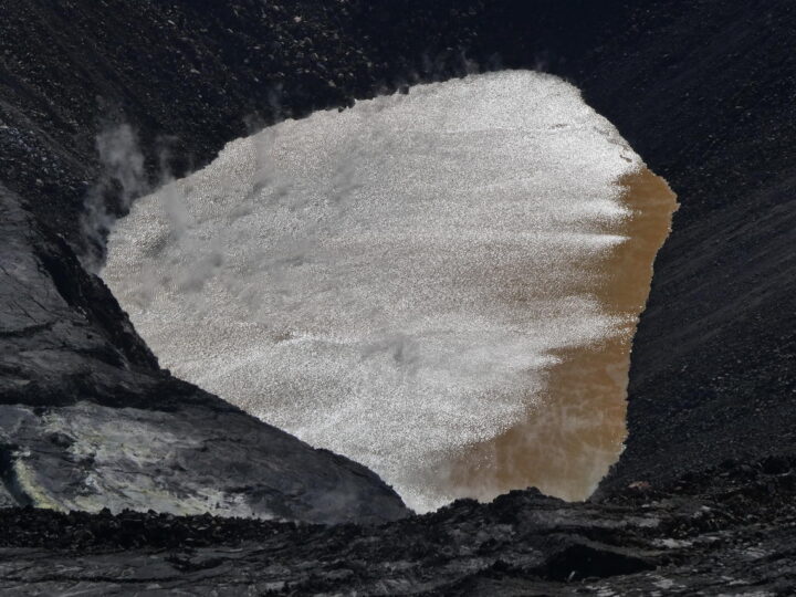
One byproduct of all the scientific monitoring is a steady stream of lake imagery that is visually striking as well as scientifically interesting. In July, for instance, morning sunglint transformed the muddy brown water to something that glittered and shimmered (see photo above). Influxes of new water often set up gradients of color that range from green to rusty orange (also above). And on a day when a light mist moved across the caldera, a webcam at the summit acquired a striking image of a rainbow framing the lake (below). You can find more images in Hawaii Volcano Observatory’s photo and video chronology.