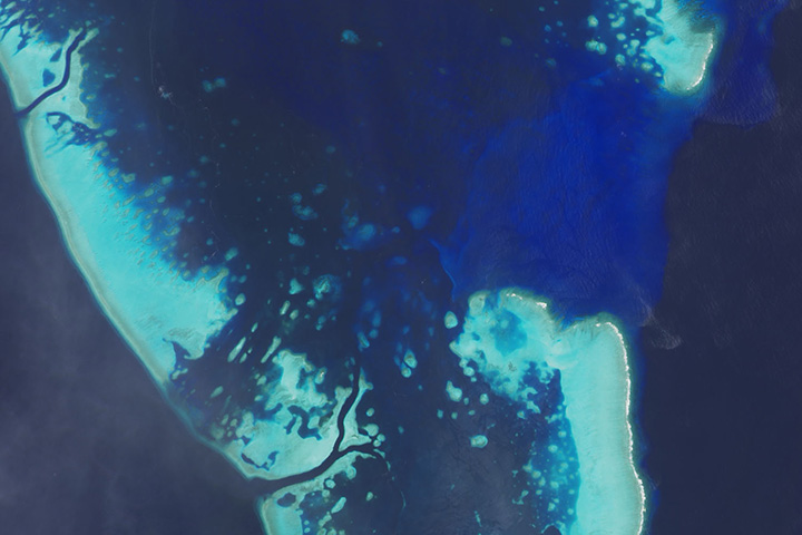
Every month on Earth Matters, we offer a puzzling satellite image. The January 2016 puzzler is above. Your challenge is to use the comments section to tell us what part of the world we are looking at, when the image was acquired, what the image shows, and why the scene is interesting.
How to answer. Your answer can be a few words or several paragraphs. (Try to keep it shorter than 200 words). You might simply tell us what part of the world an image shows. Or you can dig deeper and explain what satellite and instrument produced the image, what spectral bands were used to create it, or what is compelling about some obscure speck in the far corner of an image. If you think something is interesting or noteworthy, tell us about it.
The prize. We can’t offer prize money, but, we can promise you credit and glory (well, maybe just credit). Roughly one week after a puzzler image appears on this blog, we will post an annotated and captioned version as our Image of the Day. In the credits, we’ll acknowledge the person who was first to correctly ID the image. We’ll also recognize people who offer the most interesting tidbits of information about the geological, meteorological, or human processes that have played a role in molding the landscape. Please include your preferred name or alias with your comment. If you work for or attend an institution that you want us to recognize, please mention that as well.
Recent winners. If you’ve won the puzzler in the last few months or work in geospatial imaging, please sit on your hands for at least a day to give others a chance to play.
Releasing Comments. Savvy readers have solved some of our puzzlers after only a few minutes or hours. To give more people a chance to play, we may wait between 24-48 hours before posting the answers we receive in the comment thread.
Good luck!
Update: The answer is posted here. The winners and more details are highlighted here.

(Image by NASA Earth Observatory)
Though blizzards and cold snaps may have made you forget the news from last week, 2015 was the warmest year in NASA’s global temperature record, which dates back to 1880. During a January 2016 press conference (see the slides here), Gavin Schmidt, director of NASA’s Goddard Institute for Space Studies, explained that 2015 was 0.87 degrees C (1.57°F) above the 1951-80 average in the GISS surface temperature analysis (GISTEMP), one of four widely-cited global temperature analyses.
The statistical record is notable, but keep in mind that this year is just part of a much longer story about the climate. If you want to learn more about climate science as a whole rather than just the latest headlines, here are a few resources that you may find informative. The list is not comprehensive (and we are open to more suggestions), but it is a useful starting point for understanding climate science.

(Image by Eric Roston and Blacki Migliozzi for Bloomberg Business)
The plot above comes from an interactive graphic called “What’s Really Warming the World?” Put together by Eric Roston and Blacki Migliozzi of Bloomberg News (with assistance from NASA climatologists Gavin Schmidt and Kate Marvel), the chart does an excellent job of breaking down the various factors (greenhouse gases, aerosols, solar activity, orbital variations, etc.) that affect climate. It parses out visually how much each factor contributes. The bottom line: greenhouse gases are absolutely central to explaining global temperature trends since 1880. The screenshot above hints at what the interactive looks like, but I highly recommend heading over to Bloomberg to see the full graphic.
Another invaluable graphic for understanding climate change is the “radiative forcing bar chart” below. (You can read an interesting post by Schmidt that explains how these charts have evolved over the decades). At first glance, the chart from the fifth assessment report by the United Nations’ Intergovernmental Panel on Climate Change may seem technical and difficult to understand. It is. But it is well worth looking up the technical terms.

(Image by the IPCC for the WG1AR5 Summary for Policy Makers)
In short, you are looking at a balance sheet of the major types of emissions that have either a warming or cooling effect on climate. Bars that extend to the left of the 0 signify a cooling effect; bars that extend to the right signify warming. The longer the bar, the more warming or cooling a given type of emissions contributes. What becomes immediately obvious is that carbon dioxide (CO2) and methane (CH4) have the biggest warming influence by far. The other well-mixed greenhouse gases — halocarbons, nitrous oxide (N20), chlorofluorocarbons (CFCs), and hydrochlorofluorocarbons (HCFCs) play a much smaller role.
The situation gets messy when you look at the role that short-lived gases and aerosols play. Some gases like carbon monoxide (CO) and the non-methane volatile organic compounds (NMVOC) — such as benzene, ethanol, formaldehyde — contribute to warming, but not much. Others like NOx actually slightly cool the climate overall if you consider how these gases interact with other substances in the atmosphere. Things get even messier if you look at aerosols. Mineral dust, sulfate, nitrate, and organic carbon have a cooling effect. On the other hand, black carbon causes warming. Albedo changes due to land use and changes in solar irradiance are minor in comparison to the other factors.
That’s a lot of variables, but one reason I like this chart is the error bars and the “level of confidence” column. The error bars give you a sense of how much uncertainty there is when it comes to the effects of various emissions. Look at the aerosol section, for instance, and you will see that the error bars are quite large and there is still some uncertainty about how aerosols affect clouds. The level of confidence column offers further clues to what scientists understand well and which areas they are less confident about. VH stands for very high confidence; H stands for high confidence; M stands for medium confidence; and L stands for low confidence.
What is striking is that even when you account for the error bars, there is little doubt that carbon dioxide and methane are warming the climate.
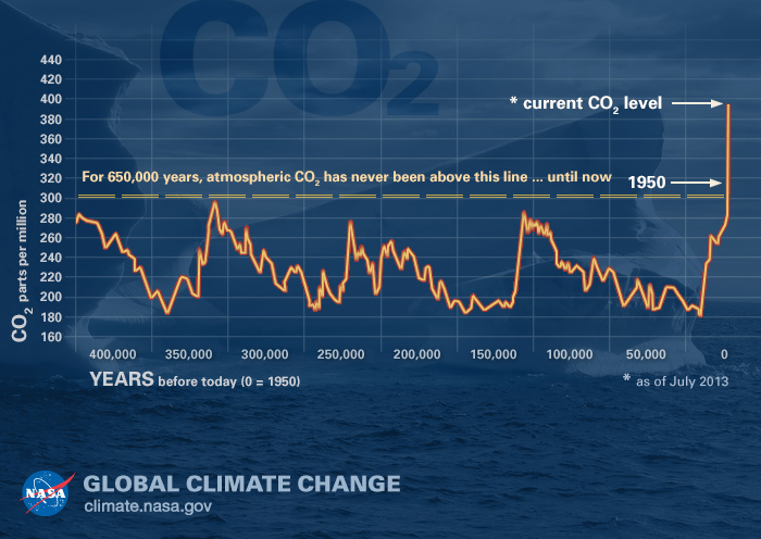
(Image by the NASA Global Climate Change website)
A third graphic, produced by NASA but based on data described here, is particularly compelling. Based on atmospheric information preserved in air bubbles in ancient ice cores, the plot offers a view of carbon dioxide levels in Earth’s atmosphere for the past 400,000 years. As this graph makes obvious, it has been a long time since carbon dioxide levels have been anywhere near where they are now.
https://www.youtube.com/watch?v=P61dkKwjybc
For a much more recent view of carbon dioxide levels, the animation above is useful. Produced by NASA’s Scientific Visualization Studio, the video shows a time-series of the distribution and concentration of carbon dioxide in the mid-troposphere, as observed by the Atmospheric Infrared Sounder (AIRS) on the Aqua spacecraft. For comparison, the fluctuations in AIRS data is overlain by a graph of the seasonal variation and interannual increase of carbon dioxide observed at the Mauna Loa observatory in Hawaii. You can clearly see seasonal variations in carbon dioxide levels, but notice also that the mid-tropospheric carbon dioxide shows a steady increase in atmospheric carbon dioxide concentrations over time. That increase is because of human activity.
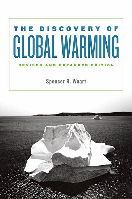
(Image by Harvard University Press)
My last recommendation will take longer for you to get through, but it is an invaluable resource. Physicist Spencer Weart offers a detailed but understandable account of the history of climate science research in his book The Discovery of Global Warming. You can read an extended version of book online on the American Institute of Physics’ website. If you make it all the way through, you will know far more than most people about the climate.

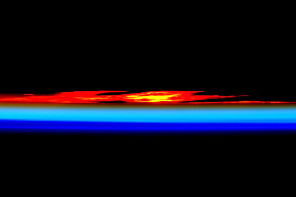
Photographs by Scott Kelly/NASA. Sunrise (upper); sunset (lower).
My colleagues and I spend most of our time looking for stories, images, and data related to the latest and greatest remote sensing science at NASA and beyond. This often leads us to rather technical scientific journals and obscure websites that are hardly known for their artistry.
But every now and then during the course of a workday, we stumble across an image that is simply so gorgeous that we can not resist sharing it. The first image above, tweeted from the International Space Station by astronaut Scott Kelly on January 13, captures the intense, raw beauty of a sunrise with an unforgettable gradient of yellow to red. About eight hours later, he tweeted the second image. “Day 292. Colors of #sunset. #GoodNight from @space_station! #YearInSpace,” Kelly said of the orange, teal, and blue horizontal lines that fade to black.
This was probably not Kelly’s only chance to capture a spectacular sunset and sunrise on January 13.
“The sun truly ‘comes up like thunder,’ and it sets just as fast,” said Joseph Allen, an astronaut who logged more than 300 hours in space on the Space Shuttle in the 1980s. “Each sunrise and sunset lasts only a few seconds. But in that time you see at least eight different bands of color come and go, from a brilliant red to the brightest and deepest blue.”
Curious to see more sunsets and sunrises from space? In the image below, see how a sunset reveals different layers of the atmosphere. Learn more about the image here. See several more of Kelly’s sunrise and sunset photographs featured by The Atlantic here. And if you still want more space sunrises and sunsets, check out our archives.


The maps above, featured in our January 9, 2016 Image of the Day, show soil composition across the United States (bottom) and the space available for water to reside within those soil types (top). Douglas Miller—a soil, informatics, and remote sensing expert at Penn State—compiled the dataset on which the map is based (soil characteristics for the conterminous United States, or CONUS-Soil.) By combining information about soil type with current, satellite-derived estimates of soil moisture, scientists can better predict events such as flooding, drought, and severe storms. Miller answered some of questions about soil composition, water storage, and why such things matter via email.
We have all heard about soil since we were kids, but what is it actually made of?
Soil contains many different things, but the most basic elements that soil scientists would talk about include various particle sizes (sand, silt, and clay), rock fragments, open pores, roots and live organisms, water, and air. Depending upon the exact combination of all of these things, there can be more (or less) space available for water to reside. The image below shows a soil texture triangle that’s very colorful and is a handy way of thinking about soil particle composition.
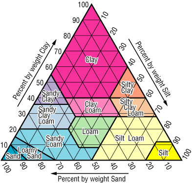
Image courtesy Douglas Miller, from the CONUS-Soil web site.
Soils that have more sand in them will not tend to hold water for a very long time. Think of what happened when you were a kid at the beach with your bucket and you tried to keep water in the castle’s moat! Soils that are heavy with clay will tend to hold water longer and not drain as quickly. Soils that have more silt in them will tend to be intermediate in drainage properties. All told, the ideal soil would have nearly equal amounts of the three major textures (somewhere in the middle of the soil triangle).
Why does soil composition matter?
Farmers, gardeners–essentially anyone interested in growing plants in soil–would be interested in knowing soil composition. Thinking back to the soil triangle mentioned above, one would ideally love to have a medium textured soil from near the middle of the soil triangle. By being aware of the soil texture that you have and the capacity of that soil to hold water (along with the water requirements of the plants that you wish to grow), you can manage your landscape. If I have too much clay in my soil, I would want to work in materials (like leaves, peat moss, etc.) to moderate the texture and open more space in the soil profile for water. Years ago, my back yard garden was mostly clay soil. For three years I chopped up all of my leaves and put them in the garden. This helped to add organic matter and nutrients, but also made the soil texture closer to middle of the triangle.
Can knowledge about soil composition and soil moisture tell you something that wouldn’t be known by looking at just one or the other?
Yes! The interesting thing about soils is that they’re closely connected to weather through soil moisture. Satellites like SMAP and SMOS, flying overhead, give us near-real time estimates of soil moisture. When combined with soil properties, we can improve our ability to predict things like flooding, drought relief, and even severe storm generation. There’s a strong connection between soil moisture at the land surface and severe storms (thunderstorms, tornados, derechos, etc.). Soil moisture near the surface is available to be easily evaporated in to the atmosphere. With the proper atmospheric conditions, rapid evaporation can lead to strong storm development. Using a combination of weather data, SMOS/SMAP data, and land surface properties (soils, vegetation, and topography), we can develop improved models that more accurately predict when and where storms and consequent flooding, damage, etc. will occur.
What have been the developments in this area of research since the dataset was compiled?
Since we compiled CONUS-Soil from the USDA National Resources Conservation Service database in the mid-1990s, USDA has now completed SSURGO–detailed soil surveys that are conducted on a county-level basis for the entire continental U.S. As compared to CONUS-Soil (1 kilometer resolution grid cells), SSURGO can be gridded at 10 meters in most places. This provides a tremendous amount of detail. I believe the entire U.S. dataset for SSURGO gridded at 10 meters is about 16GB. It’s a huge dataset.
However, a real challenge still exists in creating a standardized dataset (like CONUS-Soil) that has the same number of layers for each grid cell, anywhere in the U.S. What makes our product still unique, after all these years, are the standardized layers that a climate or hydrology model can count on being the same, from cell-to-cell. The monthly downloads that we still get for CONUS-Soil indicate that its 1-kilometer resolution is still valuable for regional climate and hydrology models. We are investigating what it will take to create a new CONUS-Soil from SSURGO (with standard layers). We believe that will require the use of a significantly sized supercomputer!
Read more in our Image of the Day, Soil Composition Across the U.S., and in our feature story, A Little Bit of Water, A Lot of Impact.

Images by NASA Earth Observatory. Mosaic by the Daily Mail.
Each month at the Earth Observatory, we publish a new satellite puzzler to challenge your remote sensing and image interpretation skills. But this December, a bit of mirth and mischief got into us. (“I could say ‘Elves,’ but it’s not elves really…”)
See, we have this great new image gallery — Reading the ABCs from Space — and between all of the letters and the festive holiday season, it got us to thinking about games. Then word games. Then ways to challenge and torment entertain our readers.
Your challenge this month is inspired by Scrabble or Words with Friends, depending on your age and your affinity for old-school versus electronic games. Over the next two weeks, we will publish seven satellite-observed letters as Images of the Day (IOTD). Your task is to keep track of those seven letters and to assemble them into words.
Recognition will be given to the reader who:
We all know you can find word-building tools on the Internet, but what fun would that be? Do it the old-fashioned way…with your brain and a writing tool.
Reminder: Our satellite gallery is here, but we are not using the full alphabet. Wait for the letters to be released as IOTDs between December 23 and January 3. To see which letters have been published as IOTDs check here. Submit your answers as comments on this blog post.

The November 2015 puzzler turned out to perplex many of our readers. That’s no surprise; the scene shows less than 20 kilometers of Canada’s longest river—the Mackenzie.
The Mackenzie River flows for more than 4,000 kilometers, and drains a basin that spans one-fifth of Canada’s total land area. Each year, the Mackenzie delivers about 325 cubic kilometers of fresh water to the Arctic Ocean.
Clues to the image’s location show up as flecks of white, which are floating bits of ice. The ice came from the Great Slave Lake, east of this image, where the river gets its start. This image was acquired with the Operational Land Imager (OLI) on Landsat 8 on May 13, 2015, around the beginning of the annual spring melt. A wider view of the area, including the lake, was featured as our Image of the Day on November 28, 2015.
Congratulations to Irene Marzolff, the first to post a correct answer to the blog. Not only did she deduce the correct location, she specified that it was acquired with the Landsat 8 satellite sometime during the melt season. On Facebook, Georg Pointner was the first to correctly name the river and note its location near Great Slave Lake.
Click here to see the river’s other extremity, at the Mackenzie River Delta. This is where the river empties into the Arctic Ocean via the Beaufort Sea.
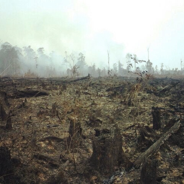
Aftermath of a fire in peatlands on the southwest border of Gunung Palung National Park, West Kalimantan. (Photo courtesy of the Gunung Palung Orangutan Conservation Program).
Cassie Freund is the program director of the Gunung Palung Orangutan Conservation Program, an orangutan protection project in Indonesia. While working on our latest feature story, we asked her what life was like in West Kalimantan during the 2015 fire season, when smoke blanketed parts of Borneo and Sumatra. Peat deposits, El Niño weather, and agricultural activity converged to produce prodigious fires and planet-warming emissions. Read Seeing Through the Smoky Pall: Observations from a Grim Indonesian Fire Season to learn more.
How has the smoke affected you?
I live in the Ketapang district of West Kalimantan. We had some serious fires here, but it wasn’t as bad as in Central Kalimantan, which was basically the epicenter of the disaster. Breathing the smoke wasn’t pleasant, and I didn’t dare open a window or a door in my house because it would just permeate everything.
The smoke also seriously disrupted some of my travel plans. There were no flights into or out of my town for at least a month, so we had to rely on boats or long-distance travel by car.
The smoke also disrupted my work. I do lot in the community and in schools, but September and October were quiet months for us because the schools were not in session. It was too dangerous for students. Adults were not available to participate in our conservation activities and meetings because they either had to stay in the field and guard their crops from fire, or didn’t want to be outside more then necessary.
Have you had health problems as a result of the haze? Do you know people who have?
I had a cough for several weeks. I do know people whose children were sick, and one woman I spoke to has a three-month old baby that she has not taken outside at all because of the smoke. One problem was that there just weren’t enough good masks to go around. During the worst of the pollution, normal surgical masks aren’t enough. But many people don’t own the N95 masks that block out the smoke particles.
Can you describe how the air smelled and tasted during the worst of the burning?
Acrid is the best word to describe it. Peat fires have a pretty distinctive smell. The smoke just goes right to the back of your throat, and makes your eyes sting. People here describe it has having mata pedas, which translates to “spicy eyes.” The smoke looks like morning fog, but it doesn’t dissipate.
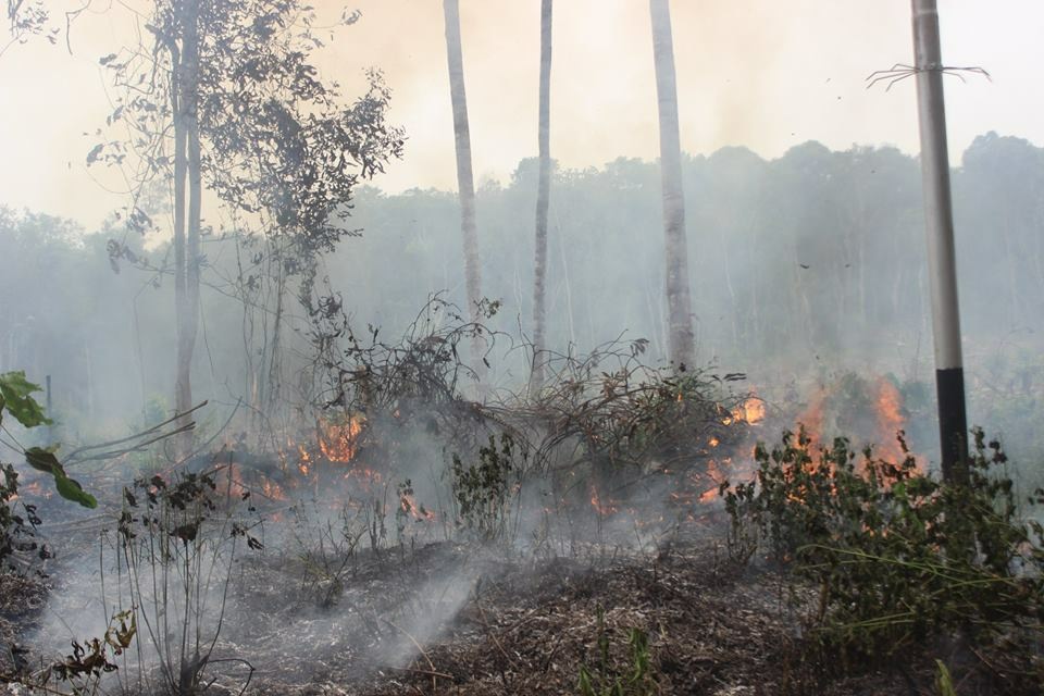
A peat fire burns vegetation in the Sungai Laur area of Ketapang district, West Kalimantan. (Photo courtesy of the Gunung Palung Orangutan Conservation Program).
Is there anything else you would like to add?
I am afraid that the next huge hot spots—not this year, but maybe in the future—will be in Papua. And there, as someone has pointed out to me, there are no charismatic species to get people riled up and to motivate them to donate to conservation. There’s just peat. Most of the peatlands there are still intact, too, and they absolutely need to be protected.
You can read blog posts by Cassie Freund about the fires here and here.

Photo by William Hrybyk for NASA’s Goddard Space Flight Center.
Earth Observatory has a pretty small staff — seven people — for a daily publication. There are a lot of other folks inside and outside of NASA who help us find and tell stories, but one man stands out from the rest. We might not be able to bring you a new Image of the Day, every day, if it were not for the unsung, unofficial eighth member of our team: Jeff Schmaltz. Our colleagues at NASA Goddard Space Flight Center (GSFC) have just published a Q&A with Jeff, and we thought you should know more about him.
“Curious Jeff” Schmaltz is on his third career.
What do you do and what is most interesting about your role here at Goddard? How do you help support Goddard’s mission?
Our group provides real-time Earth imagery from NASA Earth-observing satellites. The data is transmitted from the satellites to the ground stations, then to NASA’s Goddard Space Flight Center in Greenbelt, Maryland, and then to the near-real-time data processing system. The data is basically numbers that we convert to images which we place on NASA websites such as https://worldview.earthdata.nasa.gov.
Our images come from the Moderate Resolution Imaging Spectroradiometer (MODIS) instrument flying on the Aqua and Terra satellites. Each satellite covers the entire Earth every day, so we receive two complete images of the Earth daily. From the time the satellite acquires data to the time we put the image on our website is roughly three to four hours.

What is your education?
I have three master’s degrees, one each in wildlife management, computer science and remote sensing.
Please tell us about your three different careers.
Since I was a kid in Connecticut, I wanted to work in the outdoors with animals. I got a master’s in wildlife management and then worked as a wildlife biologist for the U.S. Forest Service in the Daniel Boone National Forrest in Somerset, Kentucky. We counted endangered woodpeckers and maintained the forest. I spent all day outside walking through the forest and then came in later to do the paperwork.
I returned to school to get a master’s in computer science. Although I intended to apply my new skills to natural resource management, I was seduced by computer graphics, which was in its infancy. My next job was with the Department of Energy’s Pacific Northwest Laboratory in Richland, Washington. I wrote software for scientists, which was then called scientific programming. We also used the computer to prospect for gold, but we never found any.
I went back to school again, this time, for a master’s in remote sensing. Then I came to work for Goddard.
Is there a connection between your different careers?
My careers are connected through the common theme of computers. I’m excited that some of the imagery I’m currently creating is being used by the wildlife management and forestry community where I initially started.
What inspires you?
For many years, I have had a quote on my wall from Alfred Lord Tennyson’s poem “Ulysses”:
Yet all experience is an arch wherethro’
Gleams that untravell’d world whose margin fades
For ever and forever when I move.
I always want to move forward, to see what is beyond the horizon, to try something new. It’s the way I was born. I’m curious.
What are you searching for at Goddard?
I want to make a practical difference in people’s lives.
How do you make a practical difference?
The thing that is so exciting about my work is that the satellites were originally designed for scientific research, to collect data, but people at Goddard and around the world have found so many other practical uses. In 2000, the western U.S. had a very bad fire season. At that time, the data from our Earth-observing satellites showing the location of the forest fires took weeks to months to be publicly available. At the request of the Forest Service, a team from Goddard and the University of Maryland figured out how to make this data available the same day.
Many other uses have been found for this information including tracking drought and agricultural production, volcanic ash and dust storms.
What is the role of teamwork?
Everything that I do involves teamwork. Thousands of people, in hundreds of disciplines, living all over the world are involved.
What life lesson would you pass along?
You can take anyone’s life story and make a good, entertaining hour-and-a-half movie out of it. Everyone is more interesting than they think.
What would you say to somebody just starting at Goddard?
You never want to be the smartest person in a place because you want to learn from other people. At Goddard, you are surrounded by geniuses. Take advantage of that.
What is first on your bucket list?
I’ve always wanted to go to New Zealand to see the spectacular landscape and wildlife.
Every month on Earth Matters, we offer a puzzling satellite image. The November 2015 puzzler is above. Your challenge is to use the comments section to tell us what part of the world we are looking at, when the image was acquired, what the image shows, and why the scene is interesting.
How to answer. Your answer can be a few words or several paragraphs. (Try to keep it shorter than 200 words). You might simply tell us what part of the world an image shows. Or you can dig deeper and explain what satellite and instrument produced the image, what spectral bands were used to create it, or what is compelling about some obscure speck in the far corner of an image. If you think something is interesting or noteworthy, tell us about it.
The prize. We can’t offer prize money, but, we can promise you credit and glory (well, maybe just credit). Roughly one week after a puzzler image appears on this blog, we will post an annotated and captioned version as our Image of the Day. In the credits, we’ll acknowledge the person who was first to correctly ID the image. We’ll also recognize people who offer the most interesting tidbits of information about the geological, meteorological, or human processes that have played a role in molding the landscape. Please include your preferred name or alias with your comment. If you work for or attend an institution that you want us to recognize, please mention that as well.
Recent winners. If you’ve won the puzzler in the last few months or work in geospatial imaging, please sit on your hands for at least a day to give others a chance to play.
Releasing Comments. Savvy readers have solved some of our puzzlers after only a few minutes or hours. To give more people a chance to play, we may wait between 24-48 hours before posting the answers we receive in the comment thread.
Good luck!

Congratulations to Shadab Raza, a geologist with Oil and Natural Gas Corporation Limited, for being the first reader to decipher the location of our October Puzzler, Xinjiang in western China. Jonathan Aul followed up later in the day with the exact coordinates. “Roughly 41.6 N, 80.7 E, approximately 10-15 km south of Bozidunxiang, Wensu, Aksu, Xinjiang Province, China.”
In researching the area, I become most interested in the distinctive salt glaciers, though Raza pointed out something that I completely missed: there appears to be a coal mine just to the west of one of the salt glaciers. I am not sure if it is the same mine shown in our image, but Raza also noted that an Aksu coal mine has been in the news recently.
If you are interested in learning more about salt glaciers, read our October 25 Image of the Day and click through the references for more information. University of Leeds geologist Alex Webb was kind enough to share several photographs of the salt glaciers that he took during a research trip. I have posted a few of them below with his commentary.
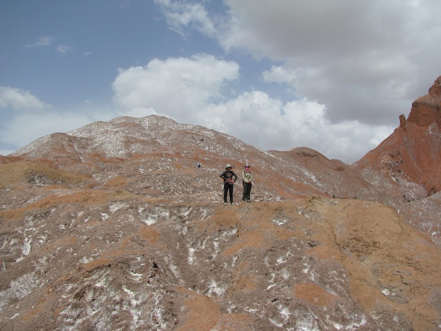
Walking around on a the Awate salt glacier. Yellow bits in the foreground are gypsum concentrations. Courtesy of Alex Webb (University of Leeds).
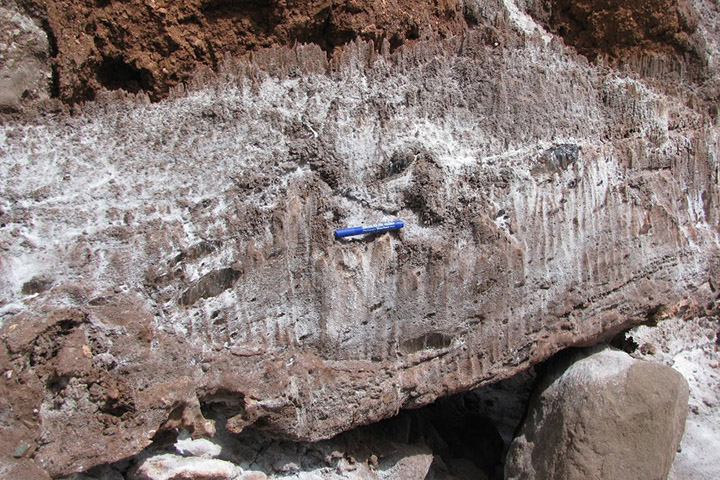
Salt flow at the surface is largely controlled by dissolution creep, aided by rain water. Here, some patches of crystalline salt from the spout (still dislocation creep) remain within a largely reworked salt layer. Photo courtesy of Alex Webb (University of Leeds).
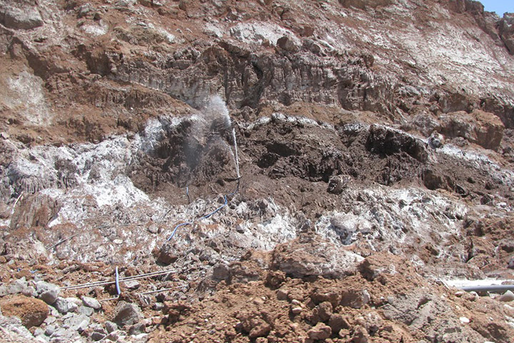
Salt extraction via water. They blast the salt glacier with water from hoses, and let that water (now enriched in salt) flow down into flat pools. In the pools, the water evaporates and relatively pristine salt is left behind for collection. Photograph courtesy of Alex Webb (University of Leeds).
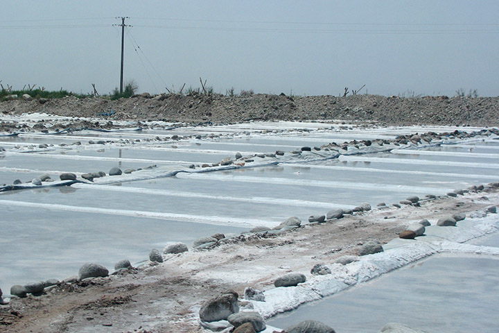
Salt evaporation ponds. Photo courtesy of Alex Webb (University of Leeds).
