
Many of the Olympic festivities are taking place in Barra da Tijuca, one of the youngest and most affluent neighborhoods in Rio. Credit: Landsat 8/NASA Earth Observatory.
While gymnasts leap, cyclists pedal, and divers twirl for Olympic gold in Rio de Janeiro, sensors on several NASA Earth Observing satellites are catching glimpses of the city and its surroundings from space. The mix of satellites and sensors in orbit are nearly as varied and diverse as the athletes competing below.
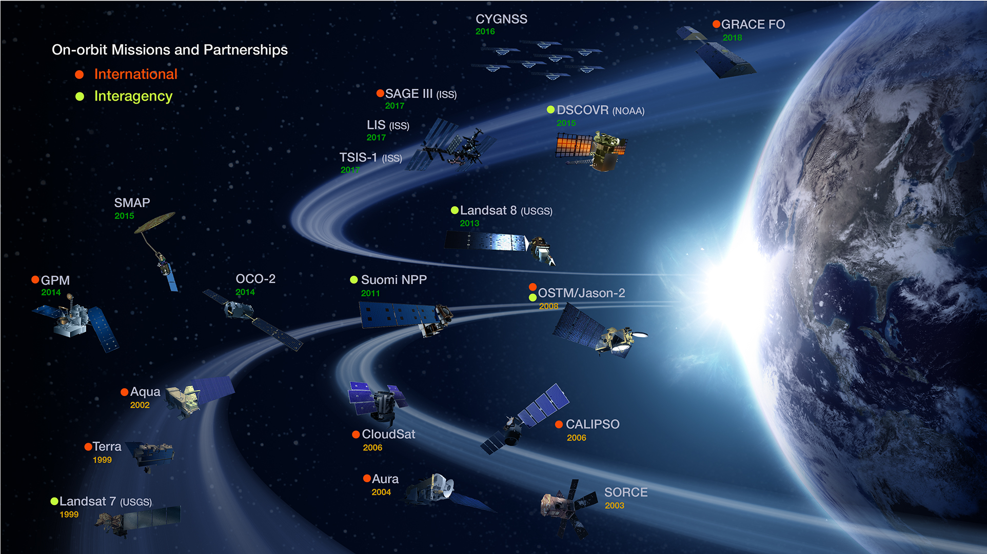
The marathoner among NASA’s fleet would have to be Terra. Despite having a design life of six years, this reliable spacecraft has been in orbit since 2000. The multi-purpose satellite carries five scientific payloads and monitors everything from phytoplankton to forest cover to airborne particles called aerosols.

NASA’s Earth Observing Fleet. Credit: NASA Earth Observing System Project Science Office
The swimmers would have to be Aquarius, Aqua, and the Global Precipitation Measurement (GPM). All three satellites, as their names suggest, specialize in studying water. Aquarius focuses on measuring the ocean’s salinity. Aqua, like Terra, is versatile: It studies water vapor, sea ice, snow ice, clouds, and more. GPM is the newest of the trio. Launched in 2014, it makes global maps of precipitation and sets standards for precipitation measurements worldwide.
The synchronized divers of space would have to be the Gravity Recovery and Climate Experiment (GRACE). While divers seem to temporarily defy gravity with their flips and turns, the pair of GRACE satellites actually measures Earth’s gravity from space.

The twin GRACE satellites. Credit: NASA
The archers would be CALIPSO and CloudSat. These two satellites shoot laser pulses (CALIPSO) and radar waves (CloudSat) down toward features in the atmosphere such as clouds and smoke plumes. They measures precisely how long it takes for the light or radio waves to bounce back, making it possible to map the vertical structure of the atmosphere.

Rio at night. Credit: VIIRS/NASA Earth Observatory.
The images above and below offer a glimpse of some of the types of imagery and data that NASA-Earth observing satellites collect. The image at the top of the page shows how Olympic Park in Rio appeared to the Operational Land Imager (OLI), a sensor on Landsat 8. The image immediately above shows Rio at night as seen by the Visible Infrared Imaging Radiometer Suite (VIIRS) on the Suomi NPP satellite. The instrument can sense light 100,000 times fainter than conventional visible-light sensors, making it extremely sensitive to moonlight and city lights.

Rio on August 6, 2016. Credit: Worldview/NASA.
The image directly above shows a view of Rio and Guanabara Bay on August 6, 2016, the day after the opening ceremony. The fourth image (below) shows a view of aerosols observed over Rio by the Multi-Angle Imaging Spectrometer (MISR) on August 2, 2016.

Observations of aerosols over Rio on August 2, 2016. Credit: NASA/Terra/MISR.
Scientists at NASA and officials in the Rio de Janeiro government recently signed an agreement about natural hazards preparedness. The hope is that satellite imagery and data—in conjunction with in situ data from the ground—will help scientists better understand, anticipate, and monitor drought, flooding, and landslides that occur in and around Rio. The collaboration will focus on integrating, visualizing, and sharing relevant data from NASA satellites.

Severe mudslides and landslides affected Rio in 2011. Read more about this image here. Credit: EO-1/NASA Earth Observatory
In a NASA press release, Rio de Janeiro Mayor Eduardo Paes said that his city has historically suffered from massive rainstorms and subsequent floods and landslides, all of which can cause casualties and disrupt the economy. Discussions are underway to address those hazards and to plan future cooperative activities.

Image from MODIS/NASA Earth Observatory.
The 2015 fire season was the most severe ever observed by NASA Earth Observing System satellites, a new study shows. As we reported in December, 2015 was an intense fire season in Indonesia because the drying effects of El Niño exacerbated seasonal fires lit by growers. Many farmers lost control of fires, which then spread through dried-out peat deposits. Peat fires produce thick, acrid smoke rich with greenhouse gases.
Since our story was published, scientists tracking fire activity with several satellite sensors have further analyzed the 2015 data and compared the 2015 fire season with 2006, another severe burning season. The group of scientists looked at measurements of carbon monoxide from the Measurement of Pollution in the Troposphere (MOPITT), the Microwave Limb Sounder (MLS), and the Atmospheric Infrared Sounder (AIRS). They tracked aerosol pollution with Moderate Resolution Imaging Spectroradiometer (MODIS) and the Ozone Monitoring Instrument (OMI). They also used MODIS to track the number of actively burning fires. Finally, they used the Tropical Rainfal Measuring Mission (TRMM) to track rainfall.
Some of the results from their analysis are shown in the chart below. Note that red lines indicate trends in 2006 (also a severe fire year); blacks lines indicate 2015. The tick marks on the X-axis indicate the month of the year. Comparing the two years, it is clear that 2015 was the more severe fire season. The sensors generally detected higher levels (or longer duration of emissions) of each pollutant in 2015. The peak number of fires observed by MODIS was slightly higher in 2006, but the sensor detected more fires overall in 2015. In both 2006 and 2015, fire activity increased rapidly as rainfall decreased.

Figure from Field et al. PNAS, 2016.
To see how the 2015 fires compared to severe fire seasons before the Earth Observing System satellites were in space, Goddard Institute for Space Studies scientist Robert Field looked back at longer-term records of visibility collected at Indonesian airports. The chart below compares visibility in 2015 with 1997 and 1991—two other years that were dry because of El Niño. (Note: Bext stands for extinction coefficient; a higher extinction coefficient means more smoke was in the air. The upper part of the chart shows how much rain fell. .) By that measure, 1997 was a far more severe fire season. In Sumatra, visibility was also lower in 1991, though in Kalimantan. visibility was about the same in 2015 and 1991.

Figure from Field et al. PNAS, 2016.
Still, greenhouse gas emissions from the 2015 Indonesian fires were considerable. Using the Global Fire Emissions Database, the scientists estimate that 2015 released 380 teragrams of carbon—which is roughly more than the annual fossil fuel emissions of Japan.
“Without significant reforms in land use and the adoption of early warning triggers tied to precipitation forecasts, these intense fire episodes will reoccur during future droughts, usually associated with El Niño events,” the authors emphasized.
+Read a NASA press release about the study here.
+Read a more detailed story about the 2015 fires here.

In Indonesia, dry weather can mean fire. September 2015 data from the TRMM satellite shows lack of rainfall in the areas where fire broke out. Image by NASA Earth Observatory.
Fourteen years ago, a rocket launched a pair of satellites known as the Gravity Recovery and Climate Experiment (GRACE) from the Plesetsk Cosmodrome in Russia. Though just 487 kilograms (1,074 pounds) each, the satellites have produced out-sized scientific advances. As we noted in 2012, few hydrologists believed the satellites would be able to detect—no less measure—changes in groundwater when they launched. As the map below shows, scientists working with GRACE data have shown otherwise.

This map shows how water supplies have changed between 2003 and 2012. GRACE measures subtle shifts in gravity from month to month. Variations in land topography or ocean tides change the distribution of Earth’s mass; the addition or subtraction of water also changes the gravity field. During that period, groundwater supplies decreased in California’s Central Valley and in the Southern High Plains (Texas and Oklahoma)—places that rely on ground water to irrigate crops. Eastern Texas, Alabama, and the Mid-Atlantic states also saw a decrease in ground water supplies because of long-term drought. The flood-prone Upper Missouri basin, on the other hand, stored more water over the decade.
GRACE has observed a number of significant changes in the water cycle. For instance, the mission revealed losses in ice mass on Greenland (where the loss is dramatic), Alaska, and Antarctica. The gravity measurements revealed how much the melting glaciers are contributing to sea level rise by recording both ice lost from land and the mass gained in the ocean. The image below shows changes in the Antarctic ice sheet between 2003 and 2010 as measured by GRACE.

GRACE measured changes in the Antarctic ice sheet from December 2003 through 2010. Red areas lost mass, while blue regions gained mass. (NASA map adapted from Luthke et al., 2012.)
As seen in the set of maps below, GRACE-based measurements can also be combined with ground-based measurements to map water at the surface, in the root zone, and as groundwater.
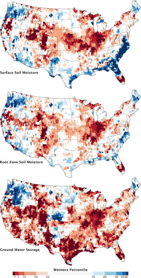
These maps compare conditions during the week of August 20, 2012, to the long-term average from 1948 to the present. For example, dark red regions represent dry conditions that should occur only 2 percent of the time (once every 50 years).
Thank you, GRACE! Here’s to many more years of observations. You can learn more about the mission here. Launch and clean room photos available here.
Here in the U.S., it’s election season. Don’t forget to vote.


(Image by NASA Earth Observatory)
Though blizzards and cold snaps may have made you forget the news from last week, 2015 was the warmest year in NASA’s global temperature record, which dates back to 1880. During a January 2016 press conference (see the slides here), Gavin Schmidt, director of NASA’s Goddard Institute for Space Studies, explained that 2015 was 0.87 degrees C (1.57°F) above the 1951-80 average in the GISS surface temperature analysis (GISTEMP), one of four widely-cited global temperature analyses.
The statistical record is notable, but keep in mind that this year is just part of a much longer story about the climate. If you want to learn more about climate science as a whole rather than just the latest headlines, here are a few resources that you may find informative. The list is not comprehensive (and we are open to more suggestions), but it is a useful starting point for understanding climate science.

(Image by Eric Roston and Blacki Migliozzi for Bloomberg Business)
The plot above comes from an interactive graphic called “What’s Really Warming the World?” Put together by Eric Roston and Blacki Migliozzi of Bloomberg News (with assistance from NASA climatologists Gavin Schmidt and Kate Marvel), the chart does an excellent job of breaking down the various factors (greenhouse gases, aerosols, solar activity, orbital variations, etc.) that affect climate. It parses out visually how much each factor contributes. The bottom line: greenhouse gases are absolutely central to explaining global temperature trends since 1880. The screenshot above hints at what the interactive looks like, but I highly recommend heading over to Bloomberg to see the full graphic.
Another invaluable graphic for understanding climate change is the “radiative forcing bar chart” below. (You can read an interesting post by Schmidt that explains how these charts have evolved over the decades). At first glance, the chart from the fifth assessment report by the United Nations’ Intergovernmental Panel on Climate Change may seem technical and difficult to understand. It is. But it is well worth looking up the technical terms.

(Image by the IPCC for the WG1AR5 Summary for Policy Makers)
In short, you are looking at a balance sheet of the major types of emissions that have either a warming or cooling effect on climate. Bars that extend to the left of the 0 signify a cooling effect; bars that extend to the right signify warming. The longer the bar, the more warming or cooling a given type of emissions contributes. What becomes immediately obvious is that carbon dioxide (CO2) and methane (CH4) have the biggest warming influence by far. The other well-mixed greenhouse gases — halocarbons, nitrous oxide (N20), chlorofluorocarbons (CFCs), and hydrochlorofluorocarbons (HCFCs) play a much smaller role.
The situation gets messy when you look at the role that short-lived gases and aerosols play. Some gases like carbon monoxide (CO) and the non-methane volatile organic compounds (NMVOC) — such as benzene, ethanol, formaldehyde — contribute to warming, but not much. Others like NOx actually slightly cool the climate overall if you consider how these gases interact with other substances in the atmosphere. Things get even messier if you look at aerosols. Mineral dust, sulfate, nitrate, and organic carbon have a cooling effect. On the other hand, black carbon causes warming. Albedo changes due to land use and changes in solar irradiance are minor in comparison to the other factors.
That’s a lot of variables, but one reason I like this chart is the error bars and the “level of confidence” column. The error bars give you a sense of how much uncertainty there is when it comes to the effects of various emissions. Look at the aerosol section, for instance, and you will see that the error bars are quite large and there is still some uncertainty about how aerosols affect clouds. The level of confidence column offers further clues to what scientists understand well and which areas they are less confident about. VH stands for very high confidence; H stands for high confidence; M stands for medium confidence; and L stands for low confidence.
What is striking is that even when you account for the error bars, there is little doubt that carbon dioxide and methane are warming the climate.
(Image by the NASA Global Climate Change website)
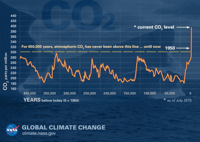
A third graphic, produced by NASA but based on data described here, is particularly compelling. Based on atmospheric information preserved in air bubbles in ancient ice cores, the plot offers a view of carbon dioxide levels in Earth’s atmosphere for the past 400,000 years. As this graph makes obvious, it has been a long time since carbon dioxide levels have been anywhere near where they are now.
For a much more recent view of carbon dioxide levels, the animation above is useful. Produced by NASA’s Scientific Visualization Studio, the video shows a time-series of the distribution and concentration of carbon dioxide in the mid-troposphere, as observed by the Atmospheric Infrared Sounder (AIRS) on the Aqua spacecraft. For comparison, the fluctuations in AIRS data is overlain by a graph of the seasonal variation and interannual increase of carbon dioxide observed at the Mauna Loa observatory in Hawaii. You can clearly see seasonal variations in carbon dioxide levels, but notice also that the mid-tropospheric carbon dioxide shows a steady increase in atmospheric carbon dioxide concentrations over time. That increase is because of human activity.
(Image by Harvard University Press)
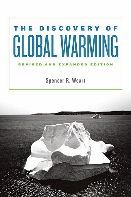
My last recommendation will take longer for you to get through, but it is an invaluable resource. Physicist Spencer Weart offers a detailed but understandable account of the history of climate science research in his book The Discovery of Global Warming. You can read an extended version of book online on the American Institute of Physics’ website. If you make it all the way through, you will know far more than most people about the climate.
Photo by William Hrybyk for NASA’s Goddard Space Flight Center.
Earth Observatory has a pretty small staff — seven people — for a daily publication. There are a lot of other folks inside and outside of NASA who help us find and tell stories, but one man stands out from the rest. We might not be able to bring you a new Image of the Day, every day, if it were not for the unsung, unofficial eighth member of our team: Jeff Schmaltz. Our colleagues at NASA Goddard Space Flight Center (GSFC) have just published a Q&A with Jeff, and we thought you should know more about him.
“Curious Jeff” Schmaltz is on his third career.
What do you do and what is most interesting about your role here at Goddard? How do you help support Goddard’s mission?
Our group provides real-time Earth imagery from NASA Earth-observing satellites. The data is transmitted from the satellites to the ground stations, then to NASA’s Goddard Space Flight Center in Greenbelt, Maryland, and then to the near-real-time data processing system. The data is basically numbers that we convert to images which we place on NASA websites such as https://worldview.earthdata.nasa.gov.
Our images come from the Moderate Resolution Imaging Spectroradiometer (MODIS) instrument flying on the Aqua and Terra satellites. Each satellite covers the entire Earth every day, so we receive two complete images of the Earth daily. From the time the satellite acquires data to the time we put the image on our website is roughly three to four hours.

What is your education?
I have three master’s degrees, one each in wildlife management, computer science and remote sensing.
Please tell us about your three different careers.
Since I was a kid in Connecticut, I wanted to work in the outdoors with animals. I got a master’s in wildlife management and then worked as a wildlife biologist for the U.S. Forest Service in the Daniel Boone National Forrest in Somerset, Kentucky. We counted endangered woodpeckers and maintained the forest. I spent all day outside walking through the forest and then came in later to do the paperwork.
I returned to school to get a master’s in computer science. Although I intended to apply my new skills to natural resource management, I was seduced by computer graphics, which was in its infancy. My next job was with the Department of Energy’s Pacific Northwest Laboratory in Richland, Washington. I wrote software for scientists, which was then called scientific programming. We also used the computer to prospect for gold, but we never found any.
I went back to school again, this time, for a master’s in remote sensing. Then I came to work for Goddard.
Is there a connection between your different careers?
My careers are connected through the common theme of computers. I’m excited that some of the imagery I’m currently creating is being used by the wildlife management and forestry community where I initially started.
What inspires you?
For many years, I have had a quote on my wall from Alfred Lord Tennyson’s poem “Ulysses”:
Yet all experience is an arch wherethro’
Gleams that untravell’d world whose margin fades
For ever and forever when I move.
I always want to move forward, to see what is beyond the horizon, to try something new. It’s the way I was born. I’m curious.
What are you searching for at Goddard?
I want to make a practical difference in people’s lives.
How do you make a practical difference?
The thing that is so exciting about my work is that the satellites were originally designed for scientific research, to collect data, but people at Goddard and around the world have found so many other practical uses. In 2000, the western U.S. had a very bad fire season. At that time, the data from our Earth-observing satellites showing the location of the forest fires took weeks to months to be publicly available. At the request of the Forest Service, a team from Goddard and the University of Maryland figured out how to make this data available the same day.
Many other uses have been found for this information including tracking drought and agricultural production, volcanic ash and dust storms.
What is the role of teamwork?
Everything that I do involves teamwork. Thousands of people, in hundreds of disciplines, living all over the world are involved.
What life lesson would you pass along?
You can take anyone’s life story and make a good, entertaining hour-and-a-half movie out of it. Everyone is more interesting than they think.
What would you say to somebody just starting at Goddard?
You never want to be the smartest person in a place because you want to learn from other people. At Goddard, you are surrounded by geniuses. Take advantage of that.
What is first on your bucket list?
I’ve always wanted to go to New Zealand to see the spectacular landscape and wildlife.
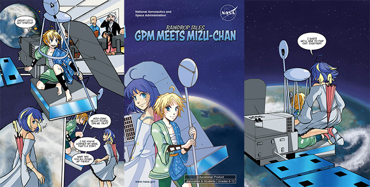
Usually, comic book heroes wear tight pants and have superhuman strength. In the new educational manga Raindrop Tales from NASA, one of the heroes (Mizu-chan) evaporates water with her hair. The other (GPM) rides on a 3,900-kilogram satellite that observes rain and snow.
Look carefully at the art in the screenshots above, and you will find some telling details. Mizu-chan wears a flowing blue dress that symbolizes the many forms of water (snow, ice, rain, hail, water vapor, fresh water, salt water, etc.) found on Earth. Notice how her hemline is surrounded by clouds. Depending on her mood, the clouds form different types of precipitation.
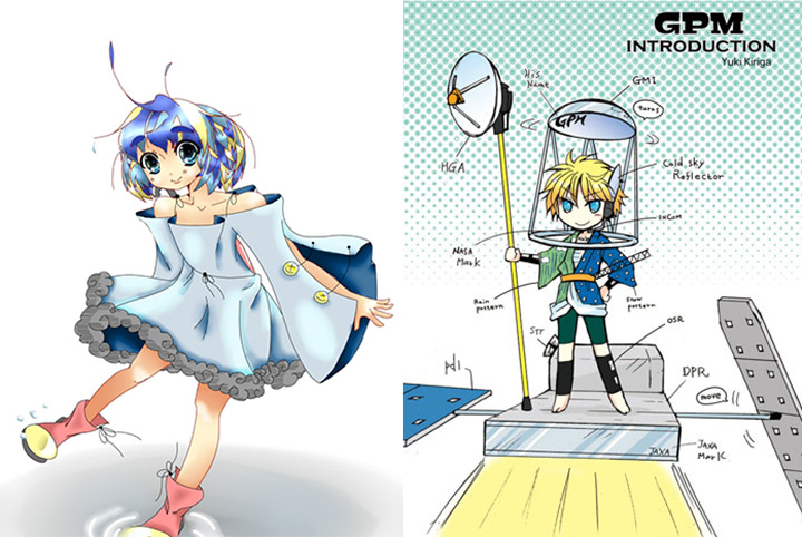
GPM—named after the Global Precipitation Measurement mission—has blond hair and wears a kimono with a rain pattern on one half and a snow pattern on the other. Though he rides atop the GPM Core Observatory, that does not mean he has free reign over the satellite. Read the full comic to find out how GPM deals with meddlesome managers on the ground and what happens when he meets a diverse cast of characters in space.
The new manga is the culmination of an anime challenge sponsored by GPM’s education and outreach team. They made a call to artists from around the world to develop anime-themed comic book characters that could be used to teach students about the mission. Yuki Kiriga of Tokyo developed the GPM character; Sabrynne Buchholz of Colorado developed Mizu-chan. See some of their winning artwork below.
After finishing the manga, you may want to learn more about water. If so, try this story about the water cycle. “Viewed from space, one of the most striking features of our home planet is the water, in both liquid and frozen forms, that covers approximately 75 percent of the Earth’s surface,” the story begins.

The vast majority (about 96.5 percent) of that water, of course, fills the oceans. As for the rest of it, approximately 1.7 percent of Earth’s water is stored in the polar icecaps, glaciers, and permanent snow; another 1.7 percent is stored in groundwater, lakes, rivers, streams, and soil.
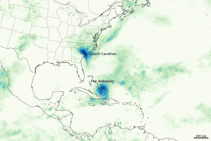
Only .001 percent of the water on Earth exists as water vapor in the atmosphere. But that tiny fraction is what GPM sees the best. To get a sense of the data GPM is collecting on a routine basis, see this story about the devastating rains that struck South Carolina in October 2015.
For nearly 20 years, Jim Acker, a contract support scientist at the NASA Goddard Earth Science Data and Information Services Center (GES DISC), has helped oceanographers compile and study data collected by satellites. A chemical oceanographer by training, he has been involved in the study of ocean color as viewed from space. He recently wrote a book for NASA about the history of the subject. He is also scheduled to deliver the NASA Goddard Science Colloquium on September 30 at 3:30 p.m. His talk is entitled: “Rise of the Machines: Computational Power and the History of NASA’s Ocean Color Missions.” He gave us a preview of the book and the talk this week.
NASA Earth Observatory: Most of us think of the ocean as blue; in some places, it looks green. So what do scientists mean when they refer to “ocean color?”

Jim Acker: Well, it’s blue and green and brown, and occasionally a few other related hues. Ocean color refers to the science of using satellite sensors to measure the light emanating from the ocean and determining what is in the water based on those light measurements. The main things that change the color of the ocean are phytoplankton—the floating plants at the base of the ocean food chain—dissolved colored substances, and different kinds of sediments.
EO: What are some of the things we have learned by looking at the ocean from satellites?
Acker: One of the main things done with global observations has been estimating how much carbon is produced by the growth of phytoplankton. Ocean color observations have shown how much this can vary, particularly with events like El Niño or La Niña in the Pacific Ocean.
The satellite view also can show how much variation there is over relatively short distances. A ship could be sitting in nice clear water, and just a few tens of kilometers away there could be a strong phytoplankton bloom that they would never know about without observations from space.

The observations also have helped understand phytoplankton patterns in hard-to-reach places like the polar seas and the Red Sea or Arabian Sea. The interaction of the land and ocean, with weather patterns and river inflows, has also been better observed.
EO: Have there been any big surprises?
Acker: Definitely. One of the biggest surprises from the Coastal Zone Color Scanner, the first NASA ocean color mission, was truly how much the ocean varied over small distances. Where oceanographers used to draw simple lines, they realized there were swirls and spirals and curlicues and loops and jets and rings. It was much more complicated.
Another surprise when SeaWiFS and MODIS started making global observations was how cloudy it is over the oceans. It takes really impressive data processing to get accurate values because of that.

And because the satellites make continuous observations, they have observed many different features that weren’t where we expected them to be or they happened more often than we thought.
EO: What provoked you to write a book?
Acker: NASA wanted to have some histories of NASA science, and I wanted to tell the history of ocean color because it’s been so successful. It’s like a well-trained, elite athlete: they make what they do look easy, though a lot of hard effort and training makes that possible.

Ocean color measurements are very difficult to make, but because the missions have been so successful, the public and even most scientists have just seen the beautiful results and have not realized the dedicated, behind-the-scenes work that made them possible. It isn’t just about seeing images from space on a computer monitor. To be sure the data is accurate, there have been some true high-seas adventures. I was able to get a lot of real-life experiences from the scientists and engineers into the book.
EO: What is your favorite book about science? And your favorite writer?
Acker: My favorite book that was sort of about science was The Map that Changed the World by Simon Winchester; I also enjoyed his book about the eruption of Krakatoa. My favorite writers are Pat Conroy and J.R.R. Tolkien. The late Stephen Jay Gould wrote a lot of things about science I liked. And I have to mention that I just read Andy Weir’s The Martian and was quite impressed. I’m looking forward to seeing the movie.

This is a cross-post from Laura Rocchio and our colleagues at NASA’s Landsat Science Team.
The European Space Agency’s Sentinel-2A successfully launched into orbit on June 22, 2015, from Europe’s Spaceport in Kourou, French Guiana, aboard a Vega rocket (10:52 p.m. local time; 01:52 GMT).
The Sentinel-2A satellite has spectral bands similar to Landsat 8’s (excluding the thermal bands of Landsat 8’s Thermal Infrared Sensor). The placement of the Sentinel-2A bands, as compared to Landsat 8 and Landsat 7 bands, can be seen in the graphic below.
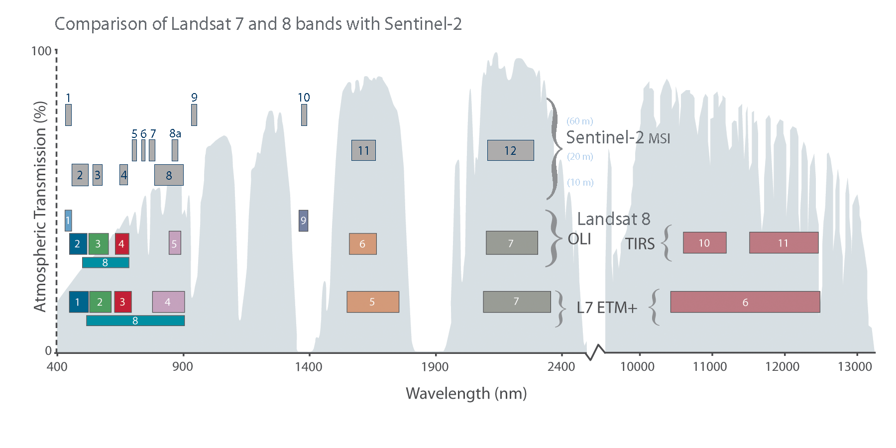
The main visible and near-infrared Sentinel-2A bands have a spatial resolution of 10 meters, while its “red-edge” (red and near-infrared bands)—specifically designed to monitor vegetation—along with its two shortwave infrared bands have a 20-meter spatial resolution, and its coastal/aerosol, water vapor, and cirrus bands have a 60-meter spatial resolution.
During the development of Landsat 8 and Sentinel-2A, calibration scientists from both projects worked together to cross-calibrate the sensors. Many scientists and researchers are looking forward to collectively using data from Landsat 8 and Sentinel-2A.
Sentinel-2A alone provides 10-day repeat coverage of Earth’s land areas. In combination with the 8-day coverage from Landsat 7 and 8 combined, users can look forward to better-than-weekly coverage at moderate resolution. Repeat coverage capabilities will further increase with the planned launch of a second Sentinel-2 satellite (Sentinel-2B) in 2016.
According to ESA, “As well as monitoring plant growth, Sentinel-2 will be used to map changes in land cover and to monitor the world’s forests. It will also provide information on pollution in lakes and coastal waters. Images of floods, volcanic eruptions and landslides will contribute to disaster mapping and helping humanitarian relief efforts.”
After the successful Sentinel-2A launch, Dr. Garik Gutman, the NASA Land Use / Land Cover Change program manager, said, “We are looking forward to new exciting data to complement Landsat observations and to collaborative research—especially because ESA followed USGS in its open data policy.” This sentiment is echoed by many in the Landsat community.
Read more about Sentinel 2A by clicking here.
The following is a statement from NASA Administrator Charles Bolden on the House of Representatives’ NASA authorization bill:
“The NASA authorization bill making its way through the House of Representatives guts our Earth science program and threatens to set back generations worth of progress in better understanding our changing climate, and our ability to prepare for and respond to earthquakes, droughts, and storm events.
NASA leads the world in the exploration of and study of planets, and none is more important than the one on which we live.
In addition, the bill underfunds the critical space technologies that the nation will need to lead in space, including on our journey to Mars.”
