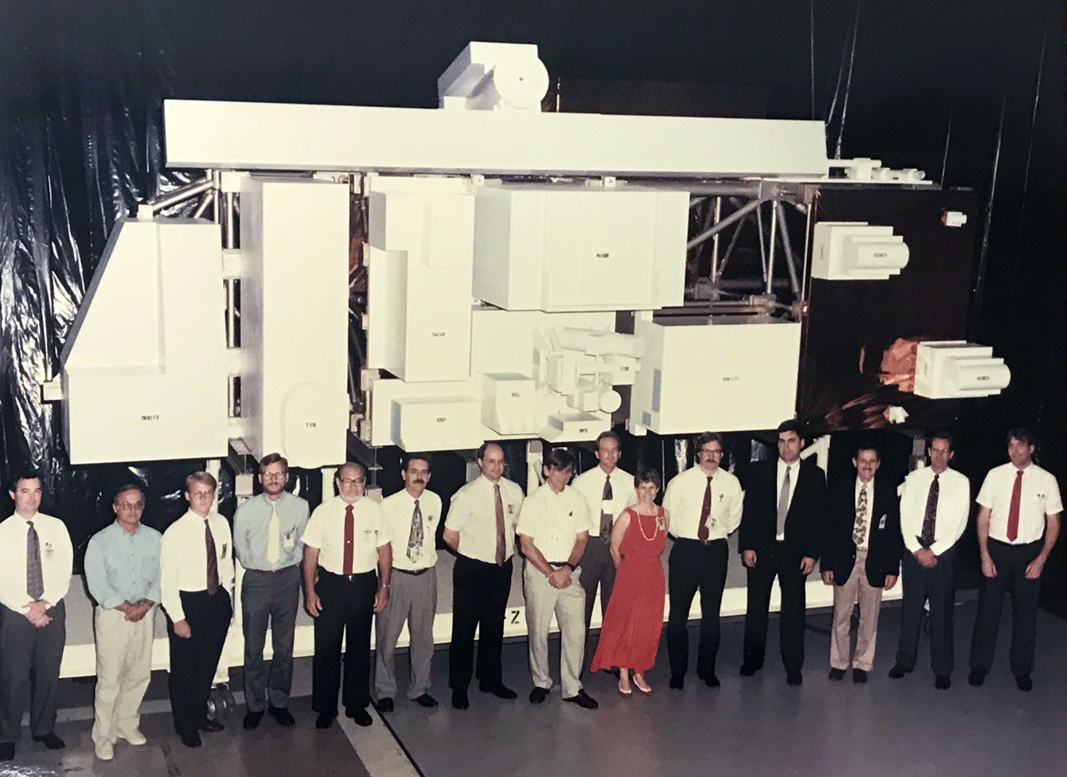
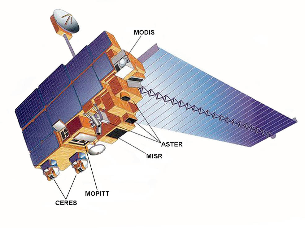
If there was ever a satellite that deserves an award for longevity, it’s Terra. Designed for a mission of 6 years (or 30,000 orbits), the bus-sized spacecraft continues to cruise 705 kilometers (438 miles) above Earth’s surface nearly 19 years after launch. The spacecraft officially surpassed 100,000 orbits on October 6, 2018. To celebrate, here are ten things to know about the intrepid Earth-observing satellite. Click on each image to find out more.
NASA has funded five new projects to develop tools and technology to make the agency’s massive Earth science datasets more accessible and user-friendly.
Wake up. Turn on laptop. Start processing airborne data of the Adirondack forests in New York. Make Coffee. Eat Breakfast. Fasten the open laptop’s seatbelt in the passenger seat as it continues to crunch numbers. Drive to work.
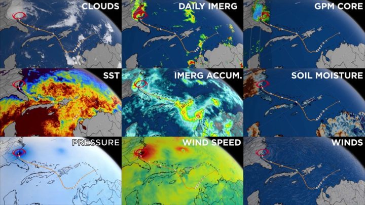
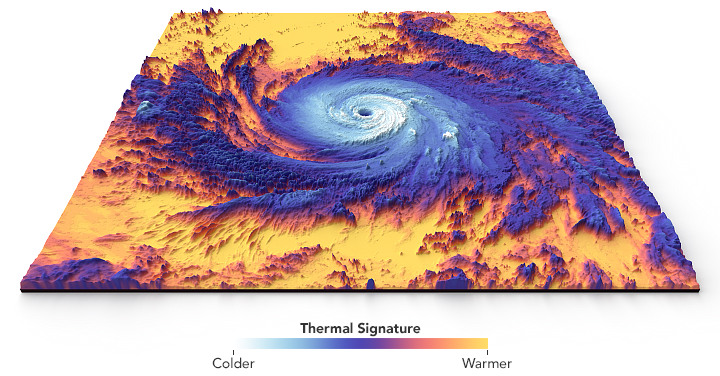
NASA Earth science datasets provide different perspectives and information on our planet, as seen here in this data visualization of observations of Hurricane Matthew in October 2016. Credits: NASA’s Scientific Visualization Studio
That used to be Sara Lubkin’s morning routine as an early career scientist at NASA’s Goddard Space Flight Center in Greenbelt, Maryland. Once at work, she would use her desktop computer, while her laptop diligently spent the next 12 hours processing airborne instrument data for the relevant information she needed to study invasive pests of hemlock trees.
“I’m not a computer scientist, I’m an Earth scientist,” said Lubkin, who now works as a program officer for NASA Earth Science Data Systems’ Advancing Collaborative Connections for Earth Systems Science, or ACCESS program. But her experience as a researcher is not unique.
Spending large chunks of time simply getting Earth science data into a usable form for analysis is a common situation for researchers working with the big datasets that come from NASA field, airborne and satellite missions. Downloading huge files, converting data formats, locating the same study areas in multiple datasets, writing code to distinguish different land types in a satellite image – these types of tasks eat into time scientists would rather be using to analyze the actual information in the data.
That’s where the ACCESS program comes in. Part of the Earth Science Data Systems division since 2005, ACCESS finds innovative ways to streamline that cumbersome processing time. The program funds two-year research projects to improve behind-the-scenes data management and provide ready-to-use datasets and services to scientists, Lubkin said.
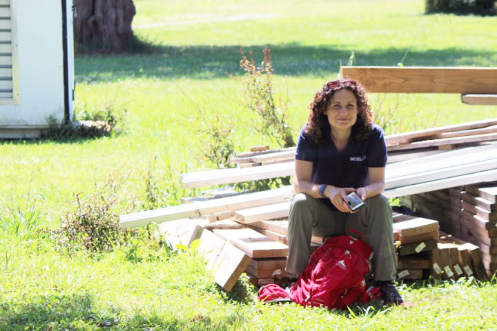
Sara Lubkin worked with NASA’s big data sets studying invasive pests in Adirondack hemlock trees as part of NASA’s Applied Sciences DEVELOP program, which addresses environmental and public policy issues through interdisciplinary research projects that apply the lens of NASA Earth observations to community concerns around the globe. Credit: Sara Lubkin
In June, NASA selected five teams of NASA, university and commercial computer science researchers from the 2017 round of submissions in a range of projects that will use machine learning, cloud computing and advanced search capabilities to develop tools to improve the behind-the-scenes management for selected NASA datasets.
“We continually invest in development and evaluation of the newest technologies to improve science data systems,” said Kevin Murphy, program executive for NASA’s Earth Science Data Systems at NASA Headquarters in Washington. But more than that, they want to make sure that the tools and technology help real scientists address real problems.
Each ACCESS project has Earth scientists and computer scientists involved from beginning to end, Murphy said. “With the ACCESS program, we’re really trying to understand, for example, how ocean currents work, but we’re trying to do that now with data that’s so large that we need a team of experts who can work together to solve the big science and big data questions.”
The projects will complement data management, distribution and other services provided by the Earth Observing System Data and Information System (EOSDIS), which manages and stores NASA data collected from Earth-observing satellites, aircraft and field campaigns. EOSDIS has 12 interconnected data and archive centers located across the United States, which are organized by discipline. Currently, these centers host 26 petabytes of Earth datasets – that’s 26 million gigabytes, or enough data to need 52,000 computers each with 500 gigabytes of storage space. That number is expected to grow to 150 petabytes within five years with the launch of new satellites.
“Satellite data is big data,” said Jeff Walter, one of the ACCESS 2017 principal investigators and lead engineer for Science Data Services at the Atmospheric Science Data Center at NASA’s Langley Research Center in Hampton, Virginia. “It’s very complex and sometimes difficult to use, even for expert users. In addition to the volume, which makes it difficult for users to acquire, store and manage, there’s also the complexity of both the format and content. Users often have to spend a lot of time understanding how the data is organized and what the various parameters represent.”
Walter’s project is one of three that will use cloud computing to alleviate download and storage issues for users. Starting with two atmospheric datasets, his team will also be developing a way to convert satellite data formats into those that can be read by commercial geospatial information system (GIS) software.
“Our project aims to lower the barrier to entry for a potential new user community who might find novel ways to use this data, and who are more familiar with GIS types of tools,” Walter said.
The two other cloud computing projects will be developing open source processing and analysis tools, including one designed for ocean datasets. A fourth project will use machine learning to detect changes over time in land observations, starting with the detection of landslides, floods and uplift caused by volcanic activity. The fifth project will develop an automated method for lining up datasets that observe the same location so researchers can combine more than one type of information about a place.
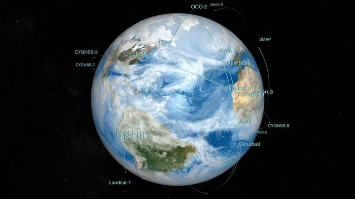
NASA has 26 Earth-observing satellites monitoring the vital signs of our home planet. Along with airborne and ground Earth science missions, their data is stored and managed by the Earth Observing System Data and Information System. Credit: NASA
Upon completion, the ACCESS researchers will work closely with EOSDIS teams to incorporate their advancements into the data centers’ day-to-day operations. Once those new tools are in place, that’s when the real power of open and freely available Earth science datasets can flourish, according to Murphy. Easy-to-use data means it gets into the hands of decision-makers, non-governmental organizations, scientists studying related applications and researchers in different fields that may have new uses for it.
“When you make these products open and accessible, you have a lot of unintended, good scientific consequences,” Murphy said, citing examples that include detecting groundwater movement from space, rapid wildfire detection and using night lights to study human energy use. “NASA has a lot of very valuable information, and the ACCESS program really tries to help scientists to not only address primary science questions but also help us understand our environment and plan for our future.”
To learn more about ACCESS, visit https://earthdata.nasa.gov/community/community-data-system-programs/access-projects
To learn more about NASA’s Earth Science Data Systems, visit https://earthdata.nasa.gov/

Orbit Pavilion. Image courtesy of NASA/Jet Propulsion Laboratory-Caltech/The Studio/Dan Goods
Sure, space may be silent, or at least absent the sound waves that human ears can hear. But put that aside for a moment, and try to imagine the sound of a satellite orbiting hundreds of miles above Earth’s surface.
Now imagine 19 sounds for 19 Earth-observing satellites — the murmur of ocean waves for a spacecraft that studies the oceans, or the howl of winds for one that studies hurricanes. Then swirl all of those sounds into a shell-shaped silver sculpture that looks like something from a sci-fi film.
Put the shell at the Huntington Library in southern California, walk inside, and you have Orbit Pavilion — an immersive piece of art and science communication designed to envelop people in sounds that represents the orbital movements of NASA’s fleet of Earth-observing satellites.
Dan Goods and David Delgado, artists working at The Studio at NASA Jet Propulsion Laboratory, initially developed the sound concept. They commissioned sound artist Shane Myrbeck to compose the soundscape, and Jason Klimoski and Lesley Chang of StudioKCA to envision and design a form.
Myrbeck describes the pavilion’s soundscape this way:
“The piece is in two parts, each with one sound following the path of a satellite. One section demonstrates the movement of the satellites by compressing a day’s worth of trajectory data into one minute, so listeners are enveloped by a symphony of 19 sounds swirling around them. The other section represents the real-time position of the spacecraft: each satellite currently in our hemisphere will “speak” in sequence, and when a sound is playing, if a listener points to the direction of the sound, they are pointing to the satellite orbiting hundreds of miles above us….These satellites are all part of Earth science missions, studying our atmosphere, oceans, and geology — they are helping us better understand how our planet is changing, and potentially how we can be better stewards of it. In that way I see them as kind of sentinels or protectors.”
The result, as Myrebeck had hoped, is both enveloping and comforting.

Information about the orbits of 17 satellites and two sensors on the International Space Station feed into the Orbit Pavilion. Image Credit: StudioKCA

The current fleet of Earth-observing satellites. Image Credit: NASA/EOSPSO
For a deeper dive into the diversity of the data these satellites collect, try searching a satellite’s name on Visible Earth. Or browse NASA Earth Observatory’s global maps sections and Image of the Day archive.
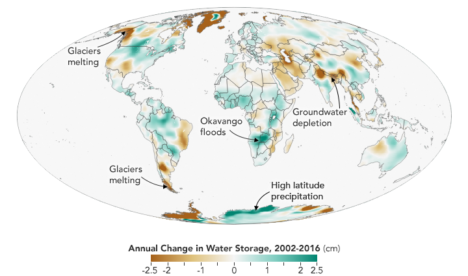
For instance, the map below helped me understand our planet a little bit better. It depicts more than a decade of cloudiness data as observed by the MODIS sensor. Blue shows areas where clouds were infrequent; white indicates areas where they were common.

Image Credit: NASA Earth Observatory, based on data from MODIS.
This is a cross-post of a story by Ellen Gray. It provides deeper insight into our May 23 Image of the Day.
Six months after GRACE launched in March 2002, we got our first look at the data fields. They had these big vertical, pole-to-pole stripes that obscured everything. We’re like, holy cow this is garbage. All this work and it’s going to be useless.
But it didn’t take the science team long to realize that they could use some pretty common data filters to remove the noise, and after that they were able to clean up the fields and we could see quite a bit more of the signal. We definitely breathed a sigh of relief. Steadily over the course of the mission, the science team became better and better at processing the data, removing errors, and some of the features came into focus. Then it became clear that we could do useful things with it.
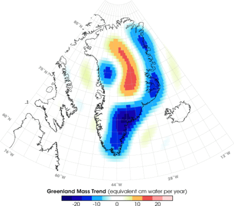
It only took a couple of years. By 2004, 2005, the science team working on mass changes in the Arctic and Antarctic could see the ice sheet depletion of Greenland and Antarctica. We’d never been able before to get the total mass change of ice being lost. It was always the elevation changes – there’s this much ice, we guess – but this was like wow, this is the real number.
Not long after that we started to see, maybe, that there were some trends on the land, although it’s a little harder on the land because with terrestrial water storage — the groundwater, soil moisture, snow, and everything. There’s inter-annual variability, so if you go from a drought one year to wet a couple years later, it will look like you’re gaining all this water, but really, it’s just natural variability.
By around 2006, there was a pretty clear trend over Northern India. At the GRACE science team meeting, it turned out another group had noticed that as well. We were friendly with them, so we decided to work on it separately. Our research ended up being published in 2009, a couple years after the trends had started to become apparent. By the time we looked at India, we knew that there were other trends around the world. Slowly not just our team but all sorts of teams, all different scientists around the world, were looking at different apparent trends and diagnosing them and trying to decide if they were real and what was causing them.
I think the map, the global trends map, is the key. By 2010 we were getting the broad-brush outline, and I wanted to tell a story about what is happening in that map. For me the easiest way was to just look at the data around the continents and talk about the major blobs of red or blue that you see and explain each one of them and not worry about what country it’s in or placing it in a climate region or whatever. We can just draw an outline around these big blobs. Water is being gained or lost. The possible explanations are not that difficult to understand. It’s just trying to figure out which one is right.
Not everywhere you see as red or blue on the map is a real trend. It could be natural variability in part of the cycle where freshwater is increasing or decreasing. But some of the blobs were real trends. If it’s lined up in a place where we know that there’s a lot of agriculture, that they’re using a lot of water for irrigation, there’s a good chance it’s a decreasing trend that’s caused by human-induced groundwater depletion.
And then, there’s the question: are any of the changes related to climate change? There have been predictions of precipitation changes, that they’re going to get more precipitation in the high latitudes and more precipitation as rain as opposed to snow. Sometimes people say that the wet get wetter and the dry get dryer. That’s not always the case, but we’ve been looking for that sort of thing. These are large-scale features that are observed by a relatively new satellite system and we’re lucky enough to be some of the first to try and explain them.
The past couple years when I’d been working the most intensely on the map, the best parts of my time in the office were when I was working on it. Because I’m a lab chief, I spend about half my time on managerial and administrative things. But I love being able to do the science, and in particular this, looking at the GRACE data, trying to diagnose what’s happening, has been very enjoyable and fulfilling. We’ve been scrutinizing this map going on eight, nine years now, and I really do have a strong connection to it.
What kept me up at night was finding the right explanations and the evidence to support our hypotheses – or evidence to say that this hypothesis is wrong and we need to consider something else. In some cases, you have a strong feeling you know what’s happening but there’s no published paper or data that supports it. Or maybe there is anecdotal evidence or a map that corroborates what you think but is not enough to quantify it. So being able to come up with defendable explanations is what kept me up at night. I knew the reviewers, rightly, couldn’t let us just go and be completely speculative. We have to back up everything we say.
The world is a complicated place. I think it helped, in the end, that we categorized these changes as natural variability or as a direct human impact or a climate change related impact. But then there can be a mix of those – any of those three can be combined, and when they’re combined, that’s when it’s more difficult to disentangle them and say this one is dominant or whatever. It’s often not obvious. Because these are moving parts and particularly with the natural variability, you know it’s going to take another 15 years, probably the length of the GRACE Follow-On mission, before we become completely confident about some of these. So it’ll be interesting to return to this in 15 years and see which ones we got right and which ones we got wrong.
You can read about Matt’s research here: https://go.nasa.gov/2L7LXoP.
Today’s blog is re-posted from NASA.gov in recognition of the agency’s Earth Day activities.
NASA’s Worldview app lets you explore Earth as it looks right now or as it looked almost 20 years ago. See a view you like? Take a snapshot and share your map with a friend or colleague. Want to track the spread of a wildfire? You can even create an animated GIF to see change over time.
Through an easy-to-use map interface, you can watch tropical storms developing over the Pacific Ocean; track the movement of icebergs after they calve from glaciers and ice shelves; and see wildfires spread and grow as they burn vegetation in their path. Pan and zoom to your region of the world to see not only what it looks like today, but to investigate changes over time. Worldview’s nighttime lights layers provide a truly unique perspective of our planet.
What else can you do with Worldview? Add imagery by discipline, natural hazard, or key word to learn more about what’s happening on this dynamic planet. View Earth’s frozen regions with the Arctic and Antarctic views. Take a look at current natural events like tropical storms, volcanic eruptions, wildfires, and icebergs at the touch of a button using the “events” tab.
https://worldview.earthdata.nasa.gov
Worldview is an open-source project at NASA. All data, software, and services are freely available to anyone for any purpose. You can participate in the software development by visiting:
Today’s post is a reprint of recent story by Carol Rasmussen of NASA’s Earth Science News Team.
NASA has produced the first three-dimensional numerical model of melting snowflakes in the atmosphere. Developed by scientist Jussi Leinonen of NASA’s Jet Propulsion Laboratory, the model provides a better understanding of how snow melts. This can help scientists recognize the signature (in radar signals) of heavier, wetter snow — the kind that snaps power lines and tree limbs — and could be a step toward improving predictions of this hazard.
Leinonen’s model reproduces key features of melting snowflakes that have been observed in nature. First, meltwater gathers in any concave regions of the snowflake’s surface. These liquid-water regions then merge to form a shell of liquid around an ice core, and finally develop into a water drop. The modeled snowflake shown in the video is less than half an inch (one centimeter) long and composed of many individual ice crystals whose arms became entangled when they collided in midair.
Leinonen said he got interested in modeling melting snow because of the way it affects observations with remote sensing instruments. A radar “profile” of the atmosphere from top to bottom shows a very bright, prominent layer at the altitude where falling snow and hail melt — much brighter than atmospheric layers above and below it. “The reasons for this layer are still not particularly clear, and there has been a bit of debate in the community,” Leinonen said. Simpler models can reproduce the bright melt layer, but a more detailed model like this one can help scientists to understand it better, particularly how the layer is related to both the type of melting snow and the radar wavelengths used to observe it.
A paper on the numerical model, titled “Snowflake melting simulation using smoothed particle hydrodynamics,” recently appeared in the Journal of Geophysical Research – Atmospheres.
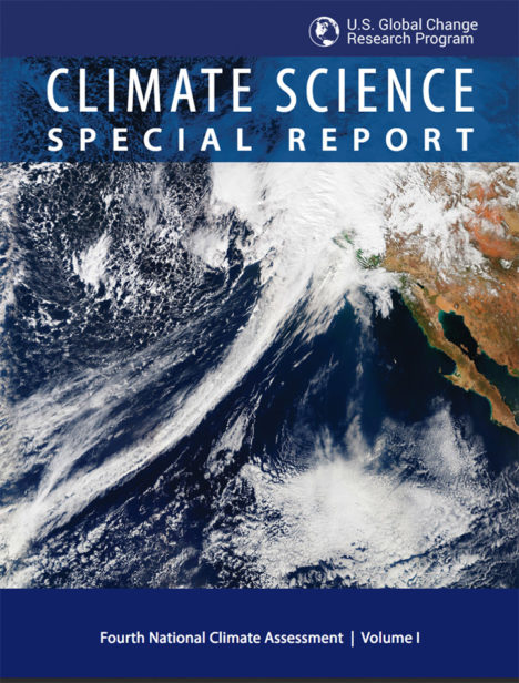 NASA Earth Observatory readers may recognize this image of a long trail of clouds — an atmospheric river — reaching across the Pacific Ocean toward California. It appeared first as an Image of the Day about how these moisture superhighways fueled a series of drought-busting rain and snow storms.
More recently, we were pleased to see that image on the cover of the Fourth National Climate Assessment — a major report issued by the U.S. Global Research Program. That image was one of many from Earth Observatory that appeared in the report. Since the authors did not give much background about the images, here is a quick rundown of how they were created and how they fit with some of the key points on our changing climate.
Hurricanes in the Atlantic
Found in Chapter 1: Our Globally Changing Climate
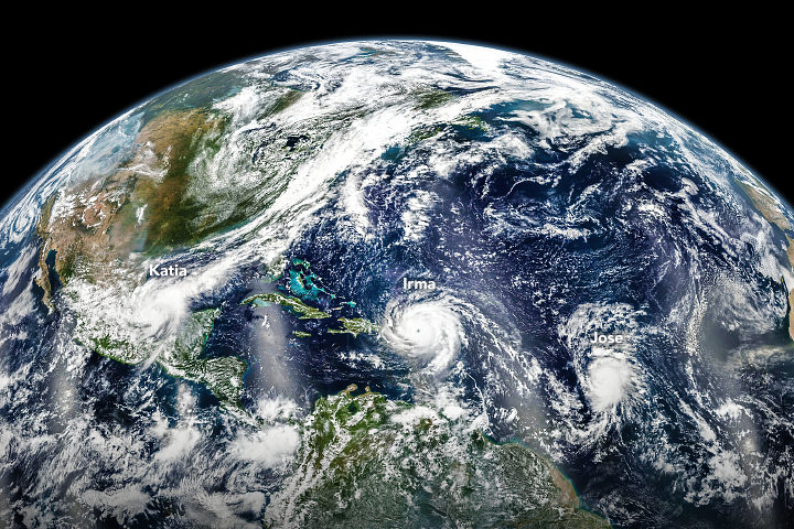
What the image shows:
Three hurricanes — Katia, Irma, and Jose — marching across the Atlantic Ocean on September 6, 2017.
What the report says about tropical cyclones and climate change:
The frequency of the most intense hurricanes is projected to increase in the Atlantic and the eastern North Pacific. Sea level rise will increase the frequency and extent of extreme flooding associated with coastal storms, such as hurricanes.
How the image was made:
The Visible Infrared Imaging Radiometer Suite (VIIRS) on the Suomi NPP satellite collected the data. Earth Observatory staff combined several scenes, taken at different times, to create this composite. Original source of the image: Three Hurricanes in the Atlantic
The North Pole
Found in Chapter 2: Physical Drivers of Climate Change
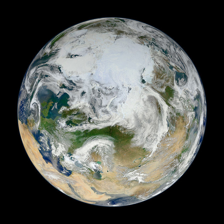
What the image shows:
Clouds swirl over sea ice, glaciers, and green vegetation in the Northern Hemisphere, as seen on a spring day from an angle of 70 degrees North, 60 degrees East.
What the report says about climate change and the Arctic:
Over the past 50 years, near-surface air temperatures across Alaska and the Arctic have increased at a rate more than twice as fast as the global average. It is very likely that human activities have contributed to observed Arctic warming, sea ice loss, glacier mass loss, and a decline in snow extent in the Northern Hemisphere.
How it was made:
Ocean scientist Norman Kuring of NASA’s Goddard Space Flight Center pieced together this composite based on 15 satellite passes made by VIIRS/Suomi NPP on May 26, 2012. The spacecraft circles the Earth from pole to pole, so it took multiple passes to gather enough data to show an entire hemisphere without gaps. Original source of the image: The View from the Top
Columbia Glacier
Found in Chapter 3: Detection and Attribution of Climate Change
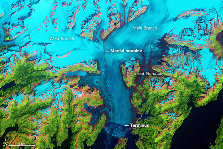
What the image shows:
Columbia Glacier in Alaska, one of the most rapidly changing glaciers in the world.
What the report says about Alaskan glaciers and climate change:
The collective ice mass of all Arctic glaciers has decreased every year since 1984, with significant losses in Alaska.
How the image was made:
NASA Earth Observatory visualizers made this false-color image based on data collected in 1986 by the Thematic Mapper on Landsat 5. The image combines shortwave-infrared, near-infrared, and green portions of the electromagnetic spectrum. With this combination, snow and ice appears bright cyan, vegetation is green, clouds are white or light orange, and open water is dark blue. Exposed bedrock is brown, while rocky debris on the glacier’s surface is gray. Original source of the image: World of Change: Columbia Glacier
Cloud Streets
Found in: Intro to Chapter 4: Climate Models, Scenarios, and Projections
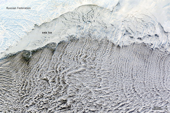
What the image shows:
Sea ice hugging the Russian coastline and cloud streets streaming over the Bering Sea.
What the report says about clouds and climate change:
Climate feedbacks are the largest source of uncertainty in quantifying climate sensitivity — that is, how much global temperatures will change in response to the addition of more greenhouse gases to the atmosphere.
How it was made:
The Moderate Resolution Imaging Spectroradiometer (MODIS) on NASA’s Terra satellite captured this natural-color image on January 4, 2012. The LANCE/EOSDIS MODIS Rapid Response Team generated the image, and NASA Earth Observatory staff cropped and labeled it. Original source of the image: Cloud streets over the Bering Sea
Extratropical Cyclones
Found in Intro to Chapter 5: Large-scale circulation and climate variability
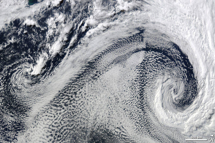
What it shows:
Two extratropical cyclones, the cause of most winter storms, churned near each other off the coast of South Africa in 2009.
What the report says about extratropical storms and climate change:
There is uncertainty about future changes in winter extratropical cyclones. Activity is projected to change in complex ways, with increases in some regions and seasons and decreases in others. There has been a trend toward earlier snowmelt and a decrease in snowstorm frequency on the southern margins of snowy areas. Winter storm tracks have shifted northward since 1950 over the Northern Hemisphere.
How the image was made:
The Moderate Resolution Imaging Spectroradiometer (MODIS) on NASA’s Terra satellite captured this natural-color image. The LANCE/EOSDIS MODIS Rapid Response Team generated the image and NASA Earth Observatory staff cropped and labeled it. Original source of the image: Cyclonic Clouds over the South Atlantic Ocean
Sea of Sand
Found in: Chapter 6: Temperature Changes in the United States
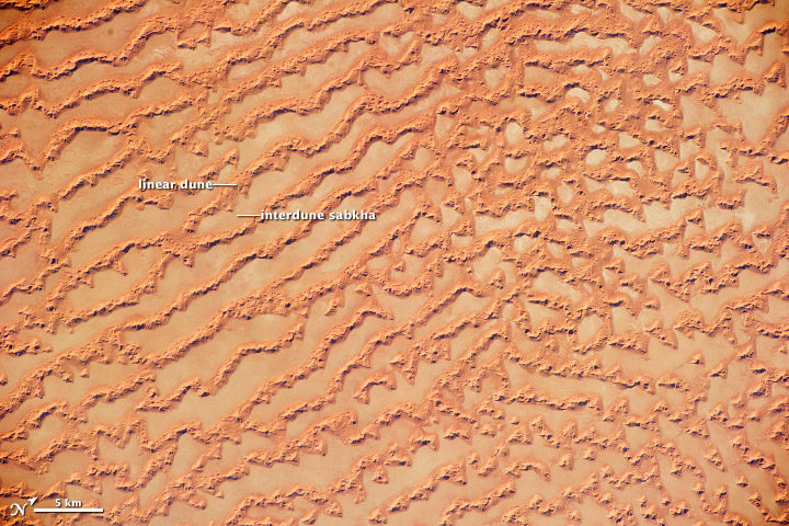
What the image shows: Large, linear sand dunes alternating with interdune salt flats in the Rub’ al Khali in the Sultanate of Oman.
What the report says about drought, dust storms, and climate change:
The human effect on droughts is complicated. There is little evidence for a human influence on precipitation deficits, but a lot of evidence for a human fingerprint on surface soil moisture deficits — starting with increased evapotranspiration caused by higher temperatures. Decreases in surface soil moisture over most of the United States are likely as the climate warms. Assuming no change to current water resources management, chronic hydrological drought is increasingly possible by the end of the 21st century. Changes in drought frequency or intensity will also play an important role in the strength and frequency of dust storms.
How it was made: An astronaut on the International Space Station took the photograph with a Nikon D3S digital camera using a 200 millimeter lens on May 16, 2011. Original source of the image: Ar Rub’ al Khali Sand Sea, Arabian Peninsula
Flooding on the Missouri River
Found in Chapter 7: Precipitation Change in the United States
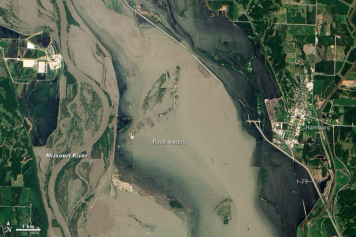
What the image shows:
Sediment-rich flood water lingering on the Missouri River in July 2011.
What the report says about precipitation, floods, and climate change:
Detectable changes in flood frequency have occurred in parts of the United States, with a mix of increases and decreases in different regions. Extreme precipitation, one of the controlling factors in flood statistics, is observed to have generally increased and is projected to continue to do. However, scientists have not yet established a significant connection between increased river flooding and human-induced climate change.
How the image was made:
The Advanced Land Imager (ALI) on NASA’s Earth Observing-1 (EO-1) satellite captured the data for this natural-color image. NASA Earth Observatory staff processed, cropped, and labeled the image. Original source of the image: Flooding near Hamburg, Iowa
Smoke and Fire
Found in Chapter 8: Droughts, Floods, and Wildfires
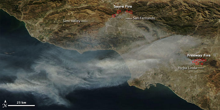
What the image shows:
Smoke streaming from the Freeway fire in the Los Angeles metro area on November 16, 2008.
What the report says about wildfires and climate change:
The incidence of large forest fires in the western United States and Alaska has increased since the early 1980s and is projected to further increase as the climate warms, with profound changes to certain ecosystems. However, other factors related to climate change — such as water scarcity or insect infestations — may act to stifle future forest fire activity by reducing growth or otherwise killing trees.
How it was made: The MODIS Rapid Response Team made this image based on data collected by NASA’s Aqua satellite. Original source of the image: Fires in California
The Colorado River and Grand Canyon
Found in Chapter 10: Changes in Land Cover and Terrestrial Biogeochemistry
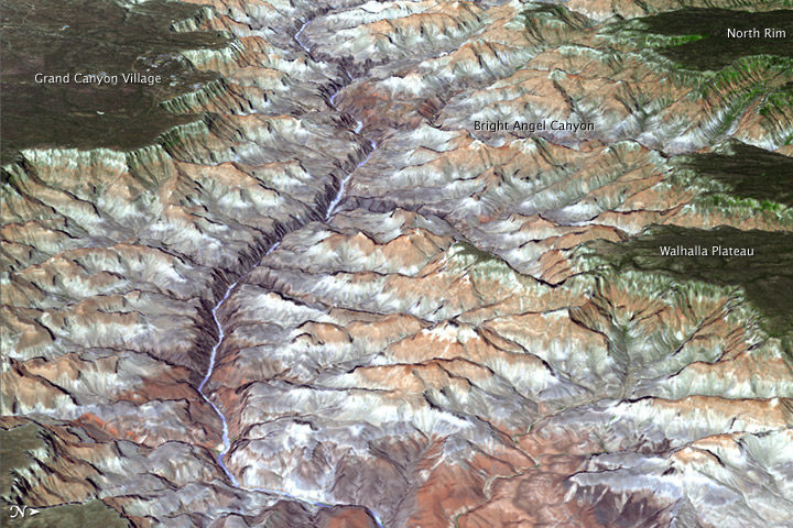
What the image shows:
The Grand Canyon in northern Arizona.
What the report says about climate change and the Colorado River:
The southwestern United States is projected to experience significant decreases in surface water availability, leading to runoff decreases in California, Nevada, Texas, and the Colorado River headwaters, even in the near term. Several studies focused on the Colorado River basin showed that annual runoff reductions in a warmer western U.S. climate occur through a combination of evapotranspiration increases and precipitation decreases, with the overall reduction in river flow exacerbated by human demands on the water supply.
How the image was made:
On July 14, 2011, the ASTER sensor on NASA’s Terra spacecraft collected the data used in this 3D image. NASA Earth Observatory staff made the image by draping an ASTER image over a digital elevation model produced from ASTER stereo data. Original source of the image: Grand New View of the Grand Canyon
Arctic Sea Ice
Found in Chapter 11: Arctic Changes and their Effects on Alaska and the Rest of the United States
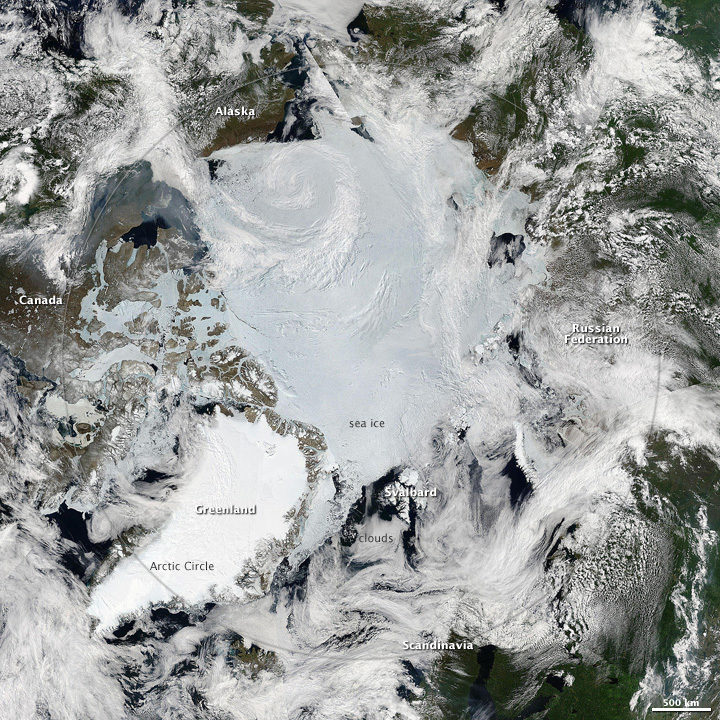
What the image shows: A clear view of the Arctic in June 2010. Clouds swirl over sea ice, snow, and forests in the far north.
What the report says about sea ice and climate change: Since the early 1980s, annual average Arctic sea ice has decreased in extent between 3.5 percent and 4.1 percent per decade, become 4.3 to 7.5 feet (1.3 and 2.3 meters) thinner. The ice melts for at least 15 more days each year. Arctic-wide ice loss is expected to continue through the 21st century, very likely resulting in nearly sea ice-free late summers by the 2040s.
How it was made: Earth Observatory staff used data from several MODIS passes from NASA’s Aqua satellite to make this mosaic. All of the data were collected on June 28, 2010. Original source of the image: Sunny Skies Over the Arctic
Crack in the Larsen C Ice Shelf
Found in Chapter 12: Sea Level Rise
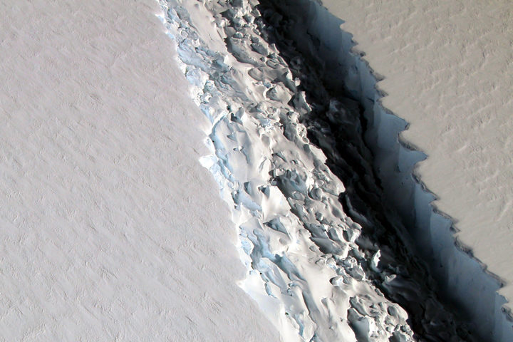
What the image shows:
This photograph shows a rift in the Larsen C Ice Shelf as observed from NASA’s DC-8 research aircraft. An iceberg the size of Delaware broke off from the ice shelf in 2017.
What the report says about ice shelves in Antarctica and climate change?
Floating ice shelves around Antarctica are losing mass at an accelerating rate. Mass loss from floating ice shelves does not directly affect global mean sea level — because that ice is already in the water — but it does lead to the faster flow of land ice into the ocean.
How it was made:
NASA scientist John Sonntag took the photo on November 10, 2016, during an Operation IceBridge flight. Original source of the image: Crack on Larsen C
The Gulf of Mexico
Found in Chapter 13: Ocean Acidification and Other Changes
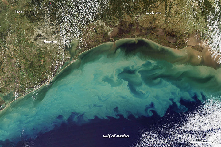
What the image shows:
Suspended sediment in shallow coastal waters in the Gulf of Mexico near Louisiana.
What the report says about the Gulf of Mexico:
The western Gulf of Mexico and parts of the U.S. Atlantic Coast (south of New York) are currently experiencing significant sea level rise caused by the withdrawal of groundwater and fossil fuels. Continuation of these practices will further amplify sea level rise.
How the image was made:
The MODIS instrument on NASA’s Aqua satellite captured this natural-color image on November 10, 2009. Original source of the image: Sediment in the Gulf of Mexico
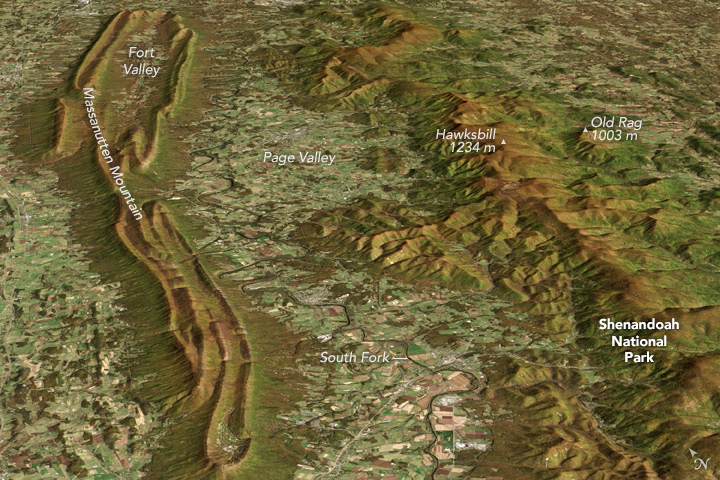
Farmland in Virginia
Found in Appendix D

What the image shows:
A fall scene showing farmland in the Page Valley of Virginia, between Shenandoah National Park and Massanutten Mountain.
What the report says about farming and climate change:
Since 1901, the consecutive number of frost-free days and the length of the growing season have increased for the seven contiguous U.S. regions used in this assessment. However, there is important variability at smaller scales, with some locations actually showing decreases of a few days to as much as one to two weeks. However, plant productivity has not increased, and future consequences of the longer growing season are uncertain.
How the image was made: On October 21, 2013, the Operational Land Imager (OLI) on Landsat 8 captured a natural-color image of these neighboring ridges. The Landsat image has been draped over a digital elevation model based on data from the ASTER sensor on the Terra satellite. Original source of the image: Contrasting Ridges in Virginia
Atmospheric River
Found on the Cover and Executive Summary
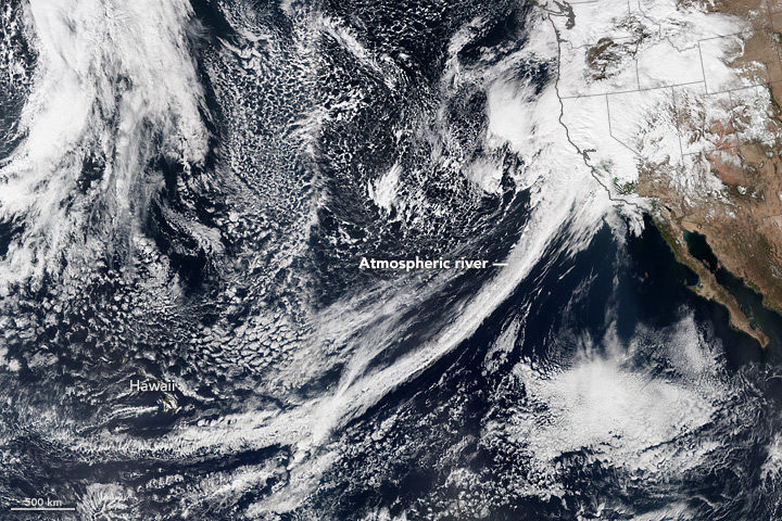
What the image shows: A tight arc of clouds stretching from Hawaii to California, which is a visible manifestation of an atmospheric river of moisture flowing into western states.
What the report says about atmospheric rivers and climate change:
The frequency and severity of land-falling atmospheric rivers on the U.S. West Coast will increase as a result of increasing evaporation and the higher atmospheric water vapor content that occurs with increasing temperature. Atmospheric rivers are narrow streams of moisture that account for 30 to 40 percent of the typical snow pack and annual precipitation along the Pacific Coast and are associated with severe flooding events.
How it was made: On February 20, 2017, the VIIRS on Suomi NPP captured this natural-color image of conditions over the northeastern Pacific. NASA Earth Observatory data visualizers stitched together two scenes to make the image. Original source of the image: River in the Sky Keeps Flowing Over the West
This article was published by NASA’s Jet Propulsion Laboratory on January 23, 2018. NASA is beginning several months of commemoration of the beginning of the Space Age and the evolution of Earth science from space.
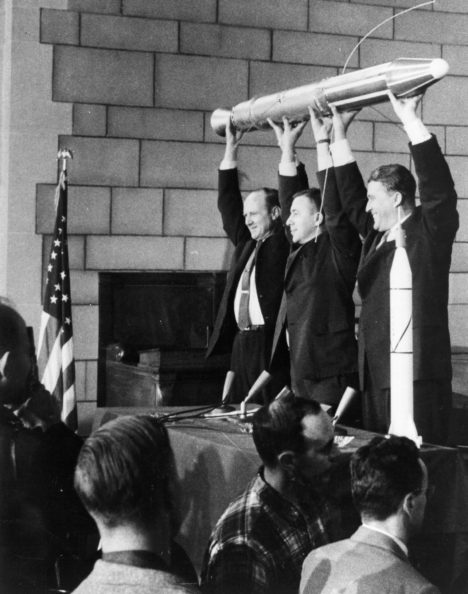
Sixty years ago next week, the hopes of Cold War America soared into the night sky as a rocket lofted skyward above Cape Canaveral, a soon-to-be-famous barrier island off the Florida coast.
The date was Jan. 31, 1958. NASA had yet to be formed, and the honor of this first flight belonged to the U.S. Army. The rocket’s sole payload was a javelin-shaped satellite built by the Jet Propulsion Laboratory in Pasadena, California. Explorer 1, as it would soon come to be called, was America’s first satellite.
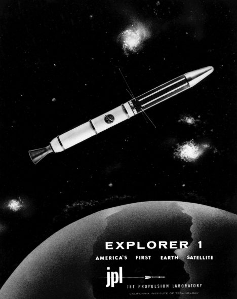
“The launch of Explorer 1 marked the beginning of U.S. spaceflight, as well as the scientific exploration of space, which led to a series of bold missions that have opened humanity’s eyes to new wonders of the solar system,” said Michael Watkins, current director of JPL. “It was a watershed moment for the nation that also defined who we are at JPL.”
In the mid-1950s, both the United States and the Soviet Union were proceeding toward the capability to put a spacecraft in orbit. Yet great uncertainty hung over the pursuit. As the Cold War between the two countries deepened, it had not yet been determined whether the sovereignty of a nation’s borders extended upward into space. Accordingly, then-President Eisenhower sought to ensure that the first American satellites were not perceived to be military or national security assets.
In 1954, an international council of scientists called for artificial satellites to be orbited as part of a worldwide science program called the International Geophysical Year (IGY), set to take place from July 1957 to December 1958. Both the American and Soviet governments seized on the idea, announcing they would launch spacecraft as part of the effort. Soon, a competition began between the Army, Air Force and Navy to develop a U.S. satellite and launch vehicle capable of reaching orbit.
At that time, JPL, which was part of the California Institute of Technology in Pasadena, primarily performed defense work for the Army. (The “jet” in JPL’s name traces back to rocket motors used to provide “jet assisted” takeoff for Army planes during World War II.) In 1954, the laboratory’s engineers began working with the Army Ballistic Missile Agency in Alabama on a project called “Orbiter.” The Army team included Wernher von Braun (who would later design NASA’s Saturn V rocket) and his team of engineers. Their work centered around the Redstone Jupiter-C rocket, which was derived from the V-2 missile Germany had used against Britain during the war.
JPL’s role was to prepare the three upper stages for the launch vehicle, which included the satellite itself. These used solid rocket motors the laboratory had developed for the Army’s Sergeant guided missile. JPL would also be responsible for receiving and transmitting the orbiting spacecraft’s communications. In addition to JPL’s involvement in the Orbiter program, the laboratory’s then-director, William Pickering, chaired the science committee on satellite tracking for the U.S. launch effort overall.
The Navy’s entry, called Vanguard, had a competitive edge in that it was not derived from a ballistic missile program — its rocket was designed, from the ground up, for civilian scientific purposes. The Army’s Jupiter-C rocket had made its first successful suborbital flight in 1956, so Army commanders were confident they could be ready to launch a satellite fairly quickly. Nevertheless, the Navy’s program was chosen to launch a satellite for the IGY.
University of Iowa physicist James Van Allen, whose instrument proposal had been chosen for the Vanguard satellite, was concerned about development issues on the project. Thus, he made sure his scientific instrument payload — a cosmic ray detector — would fit either launch vehicle. Meanwhile, although their project was officially mothballed, JPL engineers used a pre-existing rocket casing to quietly build a flight-worthy satellite, just in case it might be needed.
The world changed on Oct. 4, 1957, when the Soviet Union launched a 23-inch (58-centimeter) metal sphere called Sputnik. With that singular event, the space age had begun. The launch resolved a key diplomatic uncertainty about the future of spaceflight, establishing the right to orbit above any territory on the globe. The Russians quickly followed up their first launch with a second Sputnik just a month later. Under pressure to mount a U.S. response, the Eisenhower administration decided a scheduled test flight of the Vanguard rocket, already being planned in support of the IGY, would fit the bill. But when the Vanguard rocket was, embarrassingly, destroyed during the launch attempt on Dec. 6, the administration turned to the Army’s program to save the country’s reputation as a technological leader.
Unbeknownst to JPL, von Braun and his team had also been developing their own satellite, but after some consideration, the Army decided that JPL would still provide the spacecraft. The result of that fateful decision was that JPL’s focus shifted permanently — from rockets to what sits on top of them.
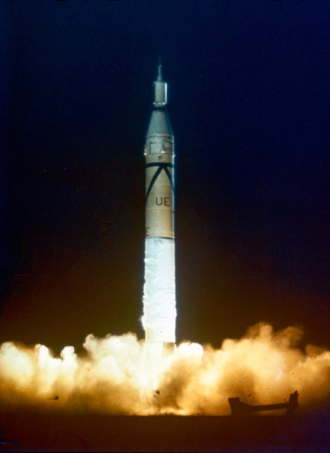
The Army team had its orders to be ready for launch within 90 days. Thanks to its advance preparation, 84 days later, its satellite stood on the launch pad at Cape Canaveral Air Force Station in Florida.
The spacecraft was launched at 10:48 p.m. EST on Friday, Jan. 31, 1958. An hour and a half later, a JPL tracking station in California picked up its signal transmitted from orbit. In keeping with the desire to portray the launch as the fulfillment of the U.S. commitment under the International Geophysical Year, the announcement of its success was made early the next morning at the National Academy of Sciences in Washington, with Pickering, Van Allen and von Braun on hand to answer questions from the media.
Following the launch, the spacecraft was given its official name, Explorer 1. (In the following decades, nearly a hundred spacecraft would be given the designation “Explorer.”) The satellite continued to transmit data for about four months, until its batteries were exhausted, and it ceased operating on May 23, 1958.
Later that year, when the National Aeronautics and Space Administration (NASA) was established by Congress, Pickering and Caltech worked to shift JPL away from its defense work to become part of the new agency. JPL remains a division of Caltech, which manages the laboratory for NASA.
The beginnings of U.S. space exploration were not without setbacks — of the first five Explorer satellites, two failed to reach orbit. But the three that made it gave the world the first scientific discovery in space — the Van Allen radiation belts. These doughnut-shaped regions of high-energy particles, held in place by Earth’s magnetic field, may have been important in making Earth habitable for life. Explorer 1, with Van Allen’s cosmic ray detector on board, was the first to detect this phenomenon, which is still being studied today.
In advocating for a civilian space agency before Congress after the launch of Explorer 1, Pickering drew on Van Allen’s discovery, stating, “Dr. Van Allen has given us some completely new information about the radiation present in outer space….This is a rather dramatic example of a quite simple scientific experiment which was our first step out into space.”
Explorer 1 re-entered Earth’s atmosphere and burned up on March 31, 1970, after more than 58,000 orbits.
For more information about Explorer 1 and the 60 years of U.S. space exploration that have followed it, visit:
This post is republished from the Landsat science team page.
In the giddy, early days following the flawless launch of Landsat 8, as the satellite commissioning was taking place, the calibration team noticed something strange. Light and dark stripes were showing up in images acquired by the satellite’s Thermal Infrared Sensor (TIRS).
Comparing coincident data collected by Landsat 8 and Landsat 7 — acquired as Landsat 8 flew under Landsat 7, on its way to its final orbit — showed that thermal data collected by Landsat 8 was off by several degrees.

This was a big deal. The TIRS sensor had been added to the Landsat 8 payload specifically because it had been deemed essential to a number of applications, especially water management in the U.S’s arid western states.
The TIRS error source was a mystery. The prelaunch TIRS testing in the lab had shown highly accurate data (to within 1 degree K); and on-orbit internal calibration measurements (measurements taken of an onboard light source with a known temperature) were just as good as they had been in the lab. But when TIRS radiance measurements were compared to ground-based measurements, errors were undeniably present. Everywhere TIRS was reporting temperatures that were warmer than they should have been, with the error at its worst in regions with extreme temperatures like Antarctica.
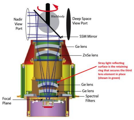
After a year-long investigation, the TIRS team found the problem. Stray light from outside the TIRS field-of-view was contaminating the image. The stray light was adding signal to the TIRS images that should not have been there—a “ghost signal” had been found.
Scans of the Moon, together with ray tracing models created with a spare telescope by the TIRS instrument team, identified the stray light culprit. A metal alloy retaining ring mounted just above the third lens of the four-lens refractive TIRS telescope was bouncing out-of-field reflections onto the TIRS focal plane. The ghost-maker had been found.
With the source of the TIRS ghosts discovered, Matthew Montanaro and Aaron Gerace, two thermal imaging experts from the Rochester Institute of Technology, were tasked with getting rid of them.
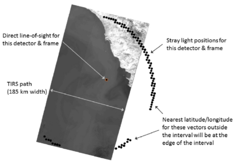
Montanaro and Gerace had to first figure out how much energy or “noise” the ghost signals were adding to the TIRS measurements. To do this, a stray light optical model was created using reverse ray traces for each TIRS detector. This essentially gave Montanaro and Gerace a “map” of ghost signals. Because TIRS has 1,920 detectors, each in a slightly different position, it wasn’t just one ghost signal they had to deal with— it was a gaggle of ghost signals.
To calculate the ghost signal contamination for each detector, they compared TIRS radiance data to a known “correct” top-of-atmosphere radiance value (specifically, MODIS radiance measurements made during the Landsat 8 / Terra underflight period in March 2013).
Comparing the MODIS and TIRS measurements showed how much energy the ghost signal was adding to the TIRS radiance measurements. These actual ghost signal values were then compared to the model-based ghost signal values that Montanaro and Gerace had calculated using their stray light maps and out-of-field radiance values from TIRS interval data (data collected just above and below a given scene along the Landsat 8 orbital track).
Using the relationships established by these comparisons, Montanaro and Gerace came up with generic equations that could be used to calculate the ghost signal for each TIRS detector.
Once the ghost signal value is calculated for each pixel, that value can be subtracted from the measured radiance to get a stray-light corrected radiance, i.e. an accurate radiance. This algorithm has become known as the “TIRS-on-TIRS” correction. After performing this correction, the absolute error can be reduced from roughly 9 K to 1 K and the image banding, that visible vestige of the ghost signal, largely disappears.
“The stray light issue is very complex and it took years of investigation to determine a suitable solution,” Montanaro said.
This work paid off. Their correction—hailed as “innovative” by the Landsat 8 Project Scientist, Jim Irons—has withstood the scrutiny of the Landsat Science Team. And Montanaro and Gerace’s “exorcism” has now placed the Landsat 8 thermal bands in-line with the accuracy of the previous (ghost-free) Landsat thermal instruments.
USGS EROS has now implemented the software fix developed by these “Landsat Ghostbusters” as part of the Landsat Collection 1 data product. Savvy programmers at USGS, led by Tim Beckmann, made it possible to turn the complex de-ghosting calculations into a computationally reasonable fix that can be done for the 700+ scenes collected by Landsat 8 each day.
“EROS was able to streamline the process so that although there are many calculations, the overall additional processing time is negligible for each Landsat scene,” Montanaro explained.

Gerace is now determining if an atmospheric correction based on measurements made by the two TIRS bands, a technique known as a split window atmospheric correction, can be developed with the corrected TIRS data.
Meanwhile, Montanaro has been asked to support the instrument team building the Thermal Infrared Sensor 2 that will fly on Landsat 9. A hardware fix for TIRS-2 is planned. Baffles will be placed within the telescope to block the stray light that haunted the Landsat 8 TIRS.
The Landsat future is looking ghost-free.
Related Reading:
+ RIT University News
+ TIRS Stray Light Correction Implemented in Collection 1 Processing, USGS Landsat Headline
+ Landsat Level-1 Collection 1 Processing, USGS Landsat Update Vol. 11 Issue 1 2017
+ Landsat Data Users Handbook, Appendix A – Known Issues
References:
Montanaro, M., Gerace, A., Lunsford, A., & Reuter, D. (2014). Stray light artifacts in imagery from the Landsat 8 Thermal Infrared Sensor. Remote Sensing, 6(11), 10435-10456. doi:10.3390/rs61110435
Montanaro, M., Gerace, A., & Rohrbach, S. (2015). Toward an operational stray light correction for the Landsat 8 Thermal Infrared Sensor. Applied Optics, 54(13), 3963-3978. doi: 10.1364/AO.54.003963 (https://www.osapublishing.org/ao/abstract.cfm?uri=ao-54-13-3963)
Barsi JA, Schott JR, Hook SJ, Raqueno NG, Markham BL, Radocinski RG. (2014) Landsat-8 Thermal Infrared Sensor (TIRS) Vicarious Radiometric Calibration. Remote Sensing, 6(11), 11607-11626.
Montanaro, M., Levy, R., & Markham, B. (2014). On-orbit radiometric performance of the Landsat 8 Thermal Infrared Sensor. Remote Sensing, 6(12), 11753-11769. doi: 10.3390/rs61211753
Gerace, A., & Montanaro, M. (2017). Derivation and validation of the stray light correction algorithm for the Thermal Infrared Sensor onboard Landsat 8. Remote Sensing of Environment, 191, 246-257. doi: 10.1016/j.rse.2017.01.029
Gerace, A. D., Montanaro, M., Connal, R. (2017). Leveraging intercalibration techniques to support stray-light removal from Landsat 8 Thermal Infrared Sensor data. Journal of Applied Remote Sensing, Accepted for Publication.
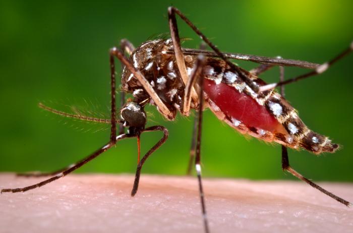
An Aedes aegypti mosquito in the process of acquiring a blood meal. Image Credit: CDC/James Gathany.
Though mosquitoes are small, they are also deadly. Mosquito bites result in the deaths of more than 725,000 people each year—more than any other animal. That compares to about 50,000 deaths from snakes, 25,000 from dogs, 20,000 from tsetse flies, 1,000 from crocodiles, and 500 from hippos.
More than 50 percent of the world’s population lives in areas where mosquito-borne diseases are common, according to the World Health Organization. Malaria is the deadliest disease spread by mosquito, but the bugs also serve as vectors for Chikungunya, Zika, Dengue, West Nile Virus, and Yellow Fever.
NASA and the Global Learning and Observation to Benefit the Environment (GLOBE) Program have a new way of fighting back. The GLOBE Observer Mosquito Habitat Mapper is an app that makes it possible for citizen scientists to collect data on mosquito range and habitat and then feed that information to public health and science institutions trying to combat mosquito-borne illnesses. The app also provides tips on fighting the spread of disease by disrupting mosquito habitats. Specifically, it will help you find potential breeding sites, identify and count larvae, take photos, and clean away pools of standing water where mosquitoes reproduce.
The Crowd & the Cloud, a show hosted by former NASA Chief Scientist Waleed Abdalati, has an excellent segment (video above) that explains how the app works.
Don’t delay. Download the Habitat Mapper for iOS from the iTunes app store or from Google Play for Android now, and start hunting down these blood-sucking killers.
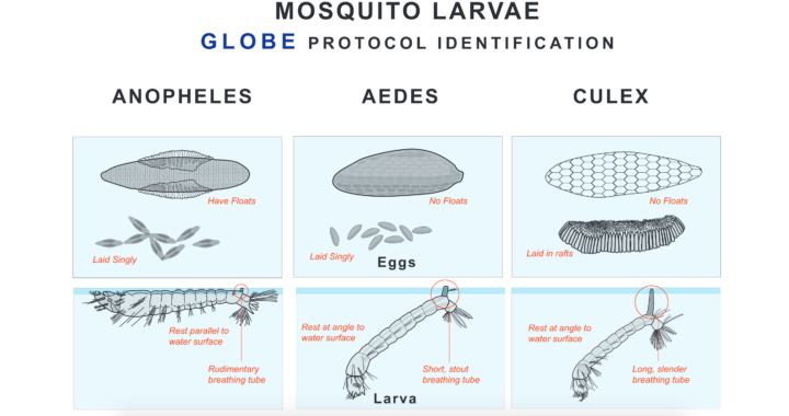
Eggs and larvae of three species of mosquitoes. Image Credit: The Globe Program. Download a larger version.
