If you are like me, you have probably fantasized about looking down and photographing Earth while floating in the zero gravity of space.
I suppose I should never say never, but my chances of becoming an astronaut do look pretty slim at this point in my life. But even if I can’t experience space firsthand, I may have have found the next best thing: merged panorama photographs that make me feel like I am up there. NASA astronaut Jeff Williams has been posting short video clips on his social media feeds and the results are stunning.
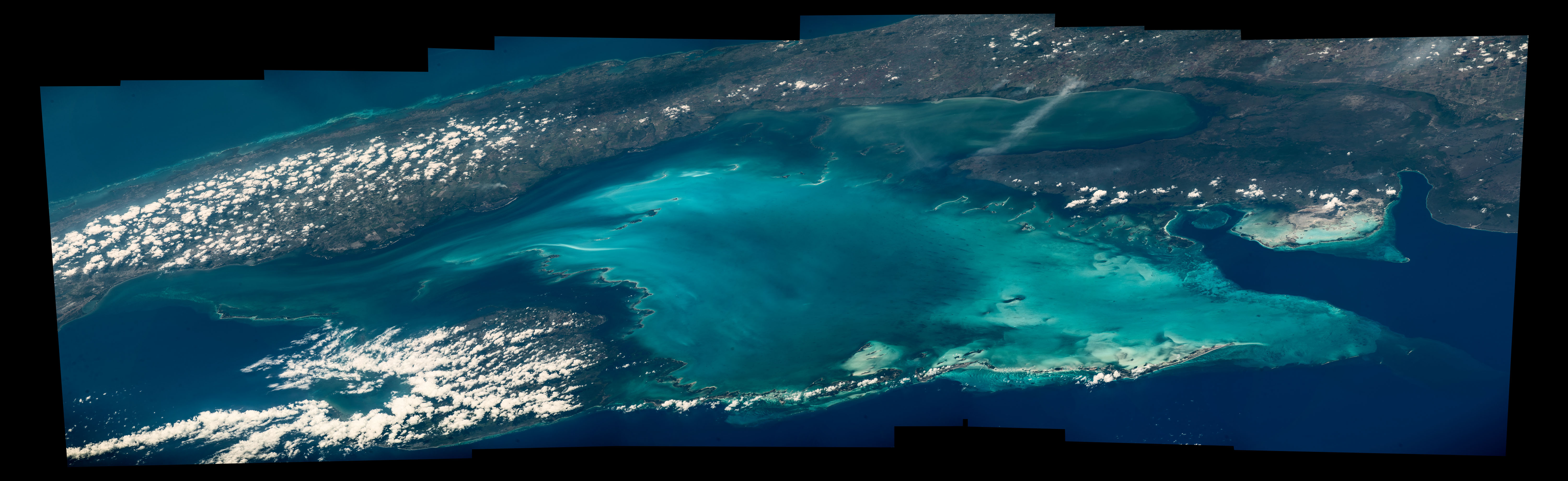
All of these panoramas were taken while he was orbiting about 250 miles (400 kilometers) above the surface of Earth on the International Space Station. At the time, he was moving about 17,150 miles (27,600 kilometers) per hour. The photos were taken from the Cupola, a dome-shaped module on the Space Station with bay windows that offer panoramic views of Earth. To make the videos, Williams (with help from NASA colleagues on the ground) stitched together several images into mosaics and then used computer software to pan across the mosaic.
I have posted a few of my favorites here: a sunset, the coastline of western Australia, the Andes Mountains, and Cuba’s Gulf of Batabano. Scroll down past the video for a view of one of the raw mosaics and some video of Williams explaining what it is like to take photographs from space. Browse more astronaut photography here and find more of Williams’ photography on Facebook, Twitter, and Instagram. In related stories from the Earth Observatory, learn more about sunsets seen from space, the Andes, and coastal Australia.
Here is how the raw mosaic of the Gulf of Batabano looked.

And here is Williams explaining the cameras he uses and how he makes the merged panoramas.
Global atmospheric concentrations of methane are rising—along with scientific scrutiny of this potent greenhouse gas. In March 2016, we published a feature story that took a broad look at why methane matters. Since that story came out, several new studies have been published. But first, some broader context from that feature story…
The long-term, global trend for atmospheric methane is clear. The concentration of the gas was relatively stable for hundreds of thousands of years, but then started to increase rapidly around 1750. The reason is simple: increasing human populations since the Industrial Revolution have meant more agriculture, more waste, and more fossil fuel production. Over the same period, emissions from natural sources have stayed about the same.
The Zeppelin Observatory in Svalbard monitors methane concentrations. It is one of several stations that helps scientists assemble a global picture of atmospheric aerosols and pollutants. Photo courtesy of AGAGE.
If you focus on just the past five decades—when modern scientific tools have been available to detect atmospheric methane—there have been fluctuations in methane levels that are harder to explain. Since 2005, methane has been on the rise, and no one is quite sure why. Some scientists think tropical wetlands have gotten a bit wetter and are releasing more gas. Others point to the natural gas fracking boom in North America and its sometimes leaky infrastructure. Others wonder if changes in agriculture may be playing a role.

A combination of historical ice core data and air monitoring instruments reveals a consistent trend: global atmospheric methane concentrations have risen sharply in the past 2000 years. (NASA Earth Observatory image by Joshua Stevens, using data from the EPA.)
The stakes are high when it comes to sorting out what is going on with methane. Global temperatures in 2014 and 2015 were warmer than at any other time in the modern temperature record, which dates back to 1880. The most recent decade was the warmest on the record. The current year, 2016, is already on track to be the warmest. And carbon emissions — including methane — are central to that rise.

Atmospheric methane has continued to increase, though the rate of the increase has varied considerably over time and puzzled experts. (NASA Earth Observatory image by Joshua Stevens, using data from NOAA.)
Isotope Data Suggests Fossil Fuels Not to Blame for Increase
Methane bubbles up from swamps and rivers, belches from volcanoes, rises from wildfires, and seeps from the guts of cows and termites (where is it made by microbes). Human settlements are awash with the gas. Methane leaks silently from natural gas and oil wells and pipelines, as well as coal mines. It stews in landfills, sewage treatment plants, and rice paddies. With so many different sources, many scientists who study methane are hesitant to pin the rising concentration of the gas on a particular source until more data is collected and analyzed.
However, an April 2016 study led by a researcher from New Zealand’s National Institute of Water and Atmospheric Research came down squarely on one side. After measuring the isotopic composition, or chemical structure, of carbon trapped in ice cores and archived air samples from a global network of monitoring stations, the scientists concluded that blaming the rise in atmospheric methane on fossil fuel production makes little sense.

Chart from Schaefer et al.
When methane has extra neutrons in its chemical structure, it is said to be a “heavier” isotope; fewer neutrons make for “lighter” methane. Different processes produce different proportions of heavy and light methane. Lighter isotopes of a carbon (meaning they have a lower ratio of Carbon 13 to Carbon 12 than the atmosphere), for instance, are usually associated with methane recovered from fossil fuels.
As shown in the chart above, the authors observed a decrease in the isotopes associated with fossil fuels at all latitudes beginning in 2006. But at the same time, global concentrations of methane (blue line in the top chart) have risen. “The finding is unexpected, given the recent boom in unconventional gas production and reported resurgence in coal mining and the Asian economy. Either food production or climate-sensitive natural emissions are the most probable causes of the current methane increase,” the authors noted.
If fossil fuel production is not responsible for increasing concentrations of atmospheric methane, than what is? The authors say that more research is needed to be certain, but that there are indications that the agricultural sector in southeast Asia (especially rice cultivation and livestock production) is likely responsible.
Large Increase in U.S. Emissions over Past Decade
A March 2016 study led by Harvard researchers based on surface measurements and satellite observations detected a 30 percent increase in methane emissions from the United States between 2002 and 2014 — an amount the authors argue could account for between 30 to 60 percent of the global growth in atmospheric methane during the past decade.

Chart from Turner et al.
The most significant increase (in red, as observed with Japan’s Greenhouse Gases Observing Satellite) occurred in the central United States. However, the authors avoid making claims about why. “The U.S. has seen a 20 percent increase in oil and gas production and a nine-fold increase in shale gas production from 2002 to 2014, but the spatial pattern of the methane increase seen by GOSAT does not clearly point to these sources. More work is needed to attribute the observed increase to specific sources.”
First Time Satellite View of Methane Leaking from a Single Facility
For the first time, an instrument on a spacecraft has measured the methane emissions leaking from a single facility on Earth’s surface. The observation, detailed in a June 2016 study, was made by the hyperspectral spectrometer Hyperion on NASA’s Earth Observing-1 (EO-1) satellite. On three separate overpasses, Hyperion detected methane leaking from the Aliso Canyon gas leak, the largest methane leak in U.S. history.

Image from NASA Earth Observatory.
“The percentage of atmospheric methane produced through human activities remains poorly understood. Future satellite instruments with much greater sensitivity can help resolve this question by surveying the biggest sources around the world and helping us to better understand and address this unknown factor in greenhouse gas emissions,” David Thompson, an atmospheric chemist at NASA’s Jet Propulsion Laboratory and an author of the study. For instance, the upcoming Environmental Mapping and Analysis Program (EnMAP) is a satellite mission (managed by the German Aerospace Center) that will provide new hyperspectral data for scientists for monitoring methane.
As detailed in a July 2016 study, scientists and engineering are also working on a project called GEO-CAPE that will result in the deployment of a new generation of methane-monitoring instruments on geostationary satellites that can monitor methane sources in North and South America on a more continuous basis. Current methane sensors operate in low-Earth orbit, and thus take several days or even weeks before they can observe the same methane hot spot. For instance, EO-1 detected the Aliso Canyon plume just three times between December 29, 2015 and February 14, 2016, due to challenges posed by cloud cover and the lighting angle. A geostationary satellite would have detected it on a much more regular basis.

Every month on Earth Matters, we offer a puzzling satellite image. The July 2016 puzzler is above. Your challenge is to use the comments section to tell us what part of the world we are looking at, when the image was acquired, what the image shows, and why the scene is interesting.
How to answer. Your answer can be a few words or several paragraphs. (Try to keep it shorter than 200 words). You might simply tell us what part of the world an image shows. Or you can dig deeper and explain what satellite and instrument produced the image, what spectral bands were used to create it, or what is compelling about some obscure speck in the far corner of an image. If you think something is interesting or noteworthy, tell us about it.
The prize. We can’t offer prize money, but, we can promise you credit and glory (well, maybe just credit). Roughly one week after a puzzler image appears on this blog, we will post an annotated and captioned version as our Image of the Day. In a blog post, we’ll acknowledge the person who was first to correctly ID the image. We’ll also recognize people who offer the most interesting tidbits of information about the geological, meteorological, or human processes that have played a role in molding the landscape. Please include your preferred name or alias with your comment. If you work for or attend an institution that you want us to recognize, please mention that as well.
Recent winners. If you’ve won the puzzler in the last few months or work in geospatial imaging, please sit on your hands for at least a day to give others a chance to play.
Releasing Comments. Savvy readers have solved some of our puzzlers after only a few minutes or hours. To give more people a chance to play, we may wait between 24-48 hours before posting the answers we receive in the comment thread.
Good luck!
Update: The answer is posted here.

Congratulations to Dan Mahr for being the first to solve our May puzzler. As Dan pointed out: “These are wind turbines, probably viewed from Landsat 8 OLI. The shadows of some turbines are visible from the diagonal roads connecting them.” Indeed, the Operational Land Imager on Landsat 8 captured this image of the Camp Springs Wind Farm in Scurry County, Texas, on April 29, 2015. You can learn more about these wind farms and surrounding landscape in our May 28, 2016, Image of the Day.
If you are interested in learning more about America’s wind infrastructure, check out WindFarm, an online database and interactive mapping tool from the U. S. Geological Survey. The database includes the location and other details about more than 47,000 wind turbines. Just choose one of the turbines and WindFarm will serve up key details (capacity, blade length, height, etc.) about it. The image below is a screenshot from WindFarm showing turbines that are part of the Camp Springs project in blue.

To get a quick sense of where wind turbines in the United States are located, see the screenshot below. Turbines are shown with colored circles. The highest capacity turbines are red and yellow; lower capacity turbines are green and blue. Note the lack of turbines in the Southeast—a region known for having relatively weak winds. While development has lagged there as a result, the advent of a new generation of wind turbine with taller towers and more efficient blades is poised to change this.

The U.S. Geological Survey developed the map by tapping publicly available data from the Federal Aviation Administration Digital Obstacle File and the using high-resolution aerial imagery to verify the locations of wind turbines. For more detailed description of the data used, see this report. For a more detailed overview of WindFarm, see this story and view this video.
Programming Note: The puzzler was on summer vacation in June, but it will return in July.

1) In most of the world, water hyacinth (Eichhonria crassipes) — a fast-growing, aquatic plant — is loathed for its ability to reproduce so quickly that it can blanket large portions of lakes and ponds with a thick mat of vegetation.
2) In a lake with strongly entrenched water hyacinth, plants interlock into such dense masses that they are sturdy enough to hold people walking on them. On Inle Lake in Burma, people turn mats of water hyacinth into floating islands and grow vegetables and flowers on them.
3) Lakes that are overrun by water hyacinths undergo dramatic transformations. Submerged native plants became shaded and often die. The resulting decay processes depletes dissolved oxygen in the water and leads to fish kills. Boat travel can become impossible with severe infestations.
4) Water hyacinth is native to South America, the only continent where natural predators such as weevils and moths keep it at bay.
5) Cutting a water hyacinth plant into pieces will not kill it. The plants can reproduce using a process called fragmentation. Each plant also produces thousands of seeds each year.
6) The invasive plant is currently considered an invasive weed in more than 50 countries (including Central and North America, Asia, Europe, and Africa). Climate change may allow them to spread even farther.
7) Scientists use satellites to monitor lakes infested with water hyacinth. A NASA DEVELOP group recently devised an automated technique for monitoring water hyacinth in Lake Victoria’s Winam Gulf, an area that has struggled with water hyacinth infestation for decades. The researchers used satellite data collected by the OLI, MODIS, and MSI sensors. Winam Gulf communities have struggled with water hyacinth infestation for more than a decade. Learn more about the project in the video below.
Editor’s Note: DEVELOP, part of NASA’s Applied Sciences Program, addresses environmental and public policy issues through interdisciplinary research projects. To highlight the program’s work, the Earth Matters blog occasionally highlights some of the most interesting topics that DEVELOP teams are pursuing.

Every month on Earth Matters, we offer a puzzling satellite image. The May 2016 puzzler is above. Your challenge is to use the comments section to tell us what part of the world we are looking at, when the image was acquired, what the image shows, and why the scene is interesting.
How to answer. Your answer can be a few words or several paragraphs. (Try to keep it shorter than 200 words). You might simply tell us what part of the world an image shows. Or you can dig deeper and explain what satellite and instrument produced the image, what spectral bands were used to create it, or what is compelling about some obscure speck in the far corner of an image. If you think something is interesting or noteworthy, tell us about it.
The prize. We can’t offer prize money, but, we can promise you credit and glory (well, maybe just credit). Roughly one week after a puzzler image appears on this blog, we will post an annotated and captioned version as our Image of the Day. In a blog post, we’ll acknowledge the person who was first to correctly ID the image. We’ll also recognize people who offer the most interesting tidbits of information about the geological, meteorological, or human processes that have played a role in molding the landscape. Please include your preferred name or alias with your comment. If you work for or attend an institution that you want us to recognize, please mention that as well.
Recent winners. If you’ve won the puzzler in the last few months or work in geospatial imaging, please sit on your hands for at least a day to give others a chance to play.
Releasing Comments. Savvy readers have solved some of our puzzlers after only a few minutes or hours. To give more people a chance to play, we may wait between 24-48 hours before posting the answers we receive in the comment thread.
Good luck!
Update: The answer is posted here.


Readers were quick to name the Caspian Sea as the location featured in our April 2016 puzzler. It took just a bit longer to puzzle out what caused the curious lines that crisscross the image. Are they gouges on the seafloor produced by trawling? Or are they are related to the movement of marine animals? Those are good guesses, but it turns out that the real culprit is ice.
Ice’s impact on the area becomes evident when you look back in time. The puzzler image (top) was acquired in springtime, on April 16, 2016; it shows open water in the vicinity of the Caspian Sea’s Tyuleniy Archipelago. On January 17, 2016, (second image) the same area is covered with fragmented ice.
Ice cover in some areas is easily deformed, rising upward and downward into hummocks. The keels of these hummocks can extend down through the shallow water to the seafloor. As wind and currents push the ice around, the keels drag along the seafloor like a rake to produce the gouges. Read more about the phenomenon in our April 23, 2016, image of the day.

Go even farther back in time and you see that the phenomenon is not new. “These scratches were found on the aerial photographs as early as the fifties of the last century,” said Stanislav Ogorodov, a scientist at Lomonosov Moscow State University. “They were published in the Russian-language scientific literature and unambiguously interpreted as ice gouges.” The image above shows ice gouges photographed from aircraft in 1954 and is described in this 2015 paper.
A number of readers suspected early on that the gouge marks had icy origins. James Varghese and Rachel were the first to comment on the blog and correctly describe the location and phenomenon. On Facebook, Jaouhar Mosbahi was the first to post a correct description. And Rodney Forster contributed insight in a twitter conversation with @NASAOceans, where the image was first released.

Santiago Gasso. (Credit: NASA/W.Hrybrk)
Earth Matters occasionally publishes interviews with earth scientists from around NASA. Here we feature Santiago Gassó, research associate at Goddard Space Flight Center in Maryland.
What is most interesting about your role at Goddard?
I am a physicist and work in atmospheric science, with a specialty in remote sensing. I use data from satellites to look at Earth’s atmosphere, and I focus on natural and manmade aerosols, which are very small particulate matter.
I am part of the science team for the Ozone Monitoring Instrument (OMI) on the Aura satellite. Launched in 2004, OMI is an instrument designed to survey pollutants such as sulfur dioxide or aerosols in the atmosphere. I am part of the team that develops algorithms based on this data.


These scanning electron microscope images (not at the same scale) show the wide variety of aerosol shapes. From left to right: volcanic ash, pollen, sea salt, and soot. (Micrographs courtesy USGS, UMBC (Chere Petty), and Arizona State University (Peter Buseck).) The top strip of photos shows desert dust, volatile organic compounds from vegetation, smoke from forest fires, and volcanic ash. All are natural sources of aerosols. (Photographs copyright (left to right) Western Sahara Project, Jonathan Jessup, Vox, and Ludie Cochrane.)
Where are you from?
I was born in Buenos Aires, a city as dense as New York. I got a master’s degree in physics from the University of Buenos Aires. Because I wanted to live abroad, I came to the U.S. to get a doctorate in geophysics, specializing in atmospheric sciences at the University of Washington. I came to NASA Goddard because I wanted to learn radiative transfer theory from the people who designed and created the satellites that I used for my Ph.D. thesis. Radiative transfer is the study of propagation of electromagnetic energy. It provides the framework and, most importantly, the equations that most satellite retrieval algorithms use.
What is your main scientific work?
My main objective is to use algorithms to determine how much radiation has been absorbed by atmospheric aerosols. The study of absorption by aerosols is important because it can change the temperature profile of the atmosphere. For example, a thick cloud of smoke can increase the ambient temperature by absorbing solar energy and returning that energy to the environment as heat.
What are some of your other scientific interests?
I also like to spend time looking at satellite images for phenomena that are overlooked. For example, I am very interested in dust from glaciers and other high-latitude deserts. Dust plumes coming off Greenland’s and Alaska’s coasts can be clearly seen in satellite images.

The Moderate Resolution Imaging Spectroradiometer (MODIS) on NASA’s Aqua satellite captured this image of dust from the Copper River Delta being blown over the Gulf of Alaska on October 28, 2014. Read more here.
I am curious about measuring particulate mass concentration based on these images. The implication is that, unlike the more tropical sources of dust like the Sahara Desert, the high-latitude sources are near and upwind of ocean ecosystems with known deficiencies in certain nutrients. It is widely believed that the dust plumes are supplying nutrients, such as iron and phosphorous, that would otherwise not be available in these marine ecosystems. However, we have not yet proven this idea.
I am also beginning to work with astrobiologists to implement or adapt astrobiology remote sensing techniques to study aerosols in the Earth’s atmosphere. This is a new, exciting area for me.
What is your biggest discovery?
About 10 years ago, while looking at dust plumes coming off the Patagonia desert of South America, I ran into a very cloudy area with highly distinctive tracks in the clouds. It turns out that I discovered the equivalent of tracks of smoke from ship engines—except these tracks were generated by volcanoes. The tracks were formed in clouds moving over very weak volcanic eruptions. Rather than a full eruption, these traces are made from volcanic belches. When these aerosols reach the cloud deck above the volcano, they change the properties of the clouds slightly. Just like pollution entering a cloud, the volcanic aerosols induce a change in droplet size that results in a change in amount of radiation reflected by the cloud. This is change is what is detected by the satellite.
I found all this just by chasing dust from Patagonia. I just wanted to know how far this dust would go.
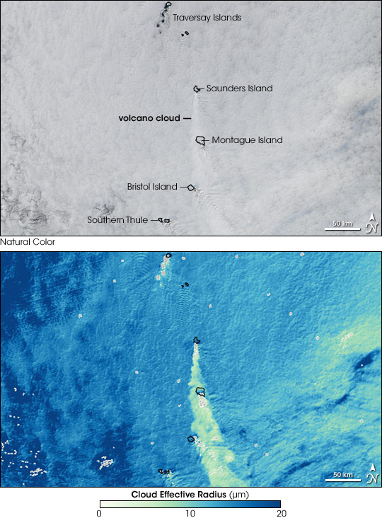
Clouds that form around volcanic emissions are made up of many small droplets instead of fewer larger droplets. Since these clouds present more surfaces for light to bounce off of, they are brighter than other marine clouds. Bright volcano clouds are similar to ship tracks, which from around sulfate aerosols in ship exhaust. The top image illustrates the impact of small-scale volcanic eruptions on clouds. The image was captured by the Moderate Resolution Imaging Spectroradiometer (MODIS) on NASA’s Aqua satellite on April 27, 2006. The lower image, calculated from the MODIS data, shows the average size of particles at the top of the clouds. Read more about the images here.
Please tell us about your field work in Patagonia.
I have been to Patagonia twice. Both times, I was working with a partner to install equipment that measures dust at the ground—the same dust that we see from space.
Patagonia is a desert in the southern end of Argentina. It is cold, dry, and sparsely populated. Patagonia lies next to a fantastic mountain range, the Andes, that is twice as tall as the Rockies.
How have your Patagonian studies evolved?
I was the first person to report observations from space of dust storms in Patagonia. I was the first one to study the entire transport of these dust storms using satellites and modeling tools.

The Moderate Resolution Imaging Spectroradiometer (MODIS) on NASA’s Aqua satellite captured this natural-color image of dust blowing out of the Patagonian Desert.
This work put me in touch with a diverse group of scientists–including geochemists, paleoclimatologists, and geomorphologists–who are all interested in the presence and impact of dust at high latitudes. We formed a network called the High Latitude Dust and Climate Network, and we are hosting a symposiumin Iceland two years from now.
It is interesting to see how different scientists view time. The satellite data I use is based on many photos per minute. My time reference is very fast. In contrast, some of the paleoclimatologists, who drill cores into the ice, view tens of thousands of years in a single inch. They think in terms of thousands of years.
How did your training make you able to find things no one else sees?
This skill comes from my Ph.D. thesis on measuring how atmospheric particles capture water and grow to become cloud drops. I was one of my adviser’s first Ph.D. students, and he did not have much money to buy new equipment. So we had to use observations or data already analyzed by other groups. As a result, I was always getting leftover data that had already been mined. The easy things that one could say about them had already been discovered and reported. So I had to sharpen my skills to discover phenomena and effects that had been overlooked by others.
What motivates your scientific research?
I am always curious about understanding physical concepts and how different phenomena integrate. For example, I want to understand how dust interacts with ocean biology. Another example is how the ocean interacts with the atmosphere by supplying aerosols.
What else do you do to satisfy your curiosity?
I make it a point to attend seminars outside my field. Presently, I am very interested in planetary exploration, so I go to many lectures. It is super fun, and I learn things that I can apply to my own research. I also read papers from outside my field so that I can learn about other areas.
Why did you choose your profession?
I wanted to be a biologist. I became a physicist because it was easier for me to understand equations than to memorize facts. Mathematics makes sense to me.
Who is the most inspiring person you have worked with at Goddard?
One of my thesis advisers was the Yoram Kauffman. He was a very intelligent and generous scientist–brilliant actually. He was very good at inspiring and encouraging others to explore their instincts, to ask why and then find out the answer. Yoram is the one who inspired me to follow up on the volcano discovery. When I first showed him the faint traces, he was so excited that he said that he could see the image on the front page of Science magazine. Coming from him, that meant everything to me. Unfortunately, he died about two months later.
What do you do in your spare time?
On weekends, I spend most of my time with my wife and two kids. Every spare minute during the week, I get onto my laptop and look at new satellite images, much to my wife’s chagrin.
This piece was adapted from an article originally published by Goddard Space Flight Center.

Every month on Earth Matters, we offer a puzzling satellite image. The April 2016 puzzler is above. Your challenge is to use the comments section to tell us what part of the world we are looking at, when the image was acquired, what the image shows, and why the scene is interesting.
How to answer. Your answer can be a few words or several paragraphs. (Try to keep it shorter than 200 words). You might simply tell us what part of the world an image shows. Or you can dig deeper and explain what satellite and instrument produced the image, what spectral bands were used to create it, or what is compelling about some obscure speck in the far corner of an image. If you think something is interesting or noteworthy, tell us about it.
The prize. We can’t offer prize money, but, we can promise you credit and glory (well, maybe just credit). Roughly one week after a puzzler image appears on this blog, we will post an annotated and captioned version as our Image of the Day. In the credits, we’ll acknowledge the person who was first to correctly ID the image. We’ll also recognize people who offer the most interesting tidbits of information about the geological, meteorological, or human processes that have played a role in molding the landscape. Please include your preferred name or alias with your comment. If you work for or attend an institution that you want us to recognize, please mention that as well.
Recent winners. If you’ve won the puzzler in the last few months or work in geospatial imaging, please sit on your hands for at least a day to give others a chance to play.
Releasing Comments. Savvy readers have solved some of our puzzlers after only a few minutes or hours. To give more people a chance to play, we may wait between 24-48 hours before posting the answers we receive in the comment thread.
Good luck!
Update: The answer is posted here.

No, that is not a photograph of the death star orbiting Earth. It is the winner of NASA Earth Observatory’s 2016 Tournament Earth—the Dark Side and the Bright Side. The image shows the fully illuminated far side of the Moon that is not visible from Earth.
The images were acquired by the Earth Polychromatic Imaging Camera (EPIC) on the DSCOVR satellite, which orbits about 1.6 million kilometers (1 million miles) from Earth. EPIC maintains a constant view of the fully illuminated Earth as it rotates. About twice a year the camera captures images of the Moon and Earth together as the orbit of DSCOVR crosses the orbital plane of the Moon.

The Moon faced some stiff competition on its journey to the championship. In the course of the tournament, it faced a trio of hurricanes over the Pacific, the electric eye of Cyclone Bansi, an underwater volcano, and the wrath of Mount St. Helens. The final round came down to a slugfest between the Moon and an impressionistic bloom in the Baltic Sea caused by a profusion of cyanobacteria. When the voting was over, the Dark Side/Bright Side finished with 59 percent of the vote.
While we aren’t aware of any homecoming parades to honor the 2016 champion, watching the video above (or listening to all of Pink Floyd’s Dark Side of the Moon) seems like a fitting way to celebrate. The images in the movie below were taken over the course of five hours on July 16, 2015. The North Pole is toward the upper left, reflecting the orbital tilt of Earth from the vantage point of the spacecraft. The far side of the Moon was first observed in 1959, when the Soviet Luna 3 spacecraft returned the first images. Since then, several missions by NASA and other space agencies have imaged the lunar far side.

