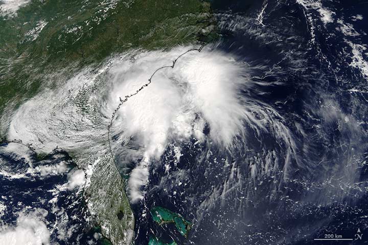
Tropical Storm Julia made headlines in September 2016, but not in the usual way. It wasn’t a particularly strong or destructive storm, although it brought heavy rainfall to coastal areas of the eastern United States from Florida to Virginia. The unusual aspect was where it formed: Julia became a tropical storm while over land, not over the ocean.
The image above, acquired at 11:55 a.m. Eastern Daylight Time (15:55 Universal Time) on September 14, 2016, with the Moderate Resolution Imaging Spectroradiometer (MODIS) on NASA’s Terra satellite, shows Julia over the southeastern United States. At the time, the storm was moving toward the east and had maximum sustained winds of about 55 kilometers (35 miles) per hour.
A NASA-funded study in 2013 by meteorologists Theresa Andersen and Marshall Shepherd described a new category of storm—one that draws energy from water on land. The research showed that some storms can derive energy from the evaporation of abundant soil moisture. Since publishing the research, Shepherd and colleagues have received frequent inquiries as to whether a particular storm was influenced by this “brown ocean” effect. In the case of Julia, the answer is not clear.
“I personally find it overly speculative to make that linkage right now,” Shepherd said. “Frankly, the Baton Rouge floods may have more of a link to the brown ocean than this event, which experienced quite a bit of moisture advection from the ocean.”
The uncertainty in Julia’s case comes from its position. Although the storm developed its center while over land, it was still too close to the ocean for scientists to distinguish an influence from land-based water. Read Shepherd’s full explanation here.

Every month on Earth Matters, we offer a puzzling satellite image. The September 2016 puzzler is above. Your challenge is to use the comments section to tell us what part of the world we are looking at, when the image was acquired, what the image shows, and why the scene is interesting.
How to answer. Your answer can be a few words or several paragraphs. (Try to keep it shorter than 200 words). You might simply tell us what part of the world an image shows. Or you can dig deeper and explain what satellite and instrument produced the image, what spectral bands were used to create it, or what is compelling about some obscure speck in the far corner of an image. If you think something is interesting or noteworthy, tell us about it.
The prize. We can’t offer prize money or a trip to Mars, but, we can promise you credit and glory. Well, maybe just credit. Roughly one week after a puzzler image appears on this blog, we will post an annotated and captioned version as our Image of the Day. In the credits (and also on this blog), we will acknowledge the person who was first to correctly ID the image. We may also recognize certain readers who offer the most interesting tidbits of information about the geological, meteorological, or human processes that have played a role in molding the landscape. Please include your preferred name or alias with your comment. If you work for or attend an institution that you want us to recognize, please mention that as well.
Recent winners. If you’ve won the puzzler in the last few months or work in geospatial imaging, please sit on your hands for at least a day to give others a chance to play.
Releasing Comments. Savvy readers have solved some of our puzzlers after only a few minutes or hours. To give more people a chance to play, we may wait between 24-48 hours before posting the answers we receive in the comment thread.
Good luck!
Editor’s Note: Congratulations to Cait Stuart, Tyler Keaton, and Rosemary Butt for being some of the first readers to solve the puzzler on Facebook. Congratulations to Adam Liefloff for being the first to weigh in with the answer on Earth Matters. See a labeled version of the September puzzler here.
While I was interviewing University of North Carolina climate scientist Wei Mei about his new research that shows a significant increase in the intensity of land-falling typhoons in the western Pacific, the strongest storm of the 2016 season (Super Typhoon Meranti) was on the verge of slamming into China after grazing Taiwan.
“Meranti fits the trend,” said Wei. “In 2016 so far, there have been six typhoons in the northwestern Pacific. Three have already made it to category 4 or 5. In the late 1970s, only about one-quarter of typhoons reached that strength. Now about half do.”

NASA Earth Observatory MODIS image of Super Typhoon Meranti.
Some meteorologists have mused that with sustained winds of 165 knots (190 miles per hour), Meranti would have been the equivalent of a Category 6 storm—if the Saffir-Simpson scale actually went that high. (It maxes out at 5). Even though Meranti only grazed southern Taiwan, it still knocked out power to 500,000 households and produced giant waves along the coast.
The focus of Mei’s research, however, is not Meranti or the 2016 typhoon season. Working with colleague Shang-Ping Xie of Scripps Institution of Oceanography, Mei has been digging through records that detail every typhoon in the northwestern Pacific since 1977 and looking for changes in the intensity of storms. What they found was a strong increase in typhoon intensity. Overall, landfalling storms strengthened by about 15 percent over the past four decades, with the proportion of typhoons reaching categories 4 and 5 more than doubling. Mei and Xie showed that storms that passed over waters relatively near to land and moved toward land (red and green dots in the chart below) have strengthened the most. Those that stayed out over the open ocean (black and blue dots) did not strengthen by a significant amount.
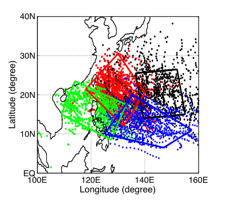
Figure from Mei and Xie, 2016.
“Elevated rates of warming in coastal seas (in comparison to the open ocean) are the reason for the intensification of land-falling typhoons,” said Mei. Between 1977 and 2013, many coastal areas in Asia have warmed by upwards of 0.20 degrees Celsius (0.36 degrees Fahrenheit) per decade along the coasts—more than twice as much as open ocean areas. In the chart below, notice all the deep reds (more warming) near the coasts; farther out to sea tends to be yellow and orange (less warming).
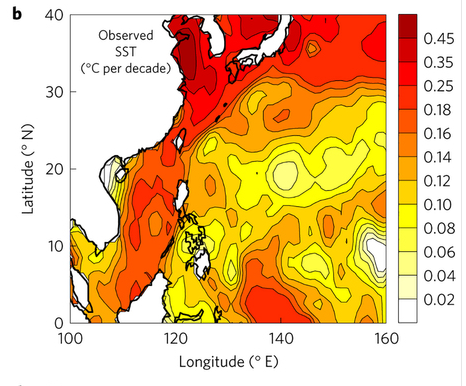
Figure from Mei and Xie, 2016.
“We are not arguing that the warming of the coastal seas is due to greenhouse gas-driven climate change; that would require attribution studies that we have not conducted yet,” he said. “But we feel confident that land-falling storms are getting stronger because of rising sea surface temperatures, particularly in a band off the coast of East and Southeast Asia.” A related 2015 study led by Mei argued that sea surface temperatures are a more important factor in controlling long-term variations in typhoon intensity than other factors, such as vertical wind shear.
In this study, Mei and Xie did not look at the frequency of storm development. Some storm researchers have argued that a warming world may make hurricanes and typhoons stronger but less frequent.
For more details about Mei and Xie’s latest study, read more from Scripps Institution of Oceanography, The Verge, and Nature Geoscience.

Himawari-8 image of Super Typhoon Meranti and night lights (in orange) of Asia via Colorado State University and Mashable.
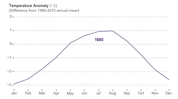
August 2016 was the warmest August in 136 years of modern record-keeping, according to a monthly analysis of global temperatures by scientists at NASA’s Goddard Institute for Space Studies (GISS).
Although the seasonal temperature cycle typically peaks in July, August 2016 wound up tied with July 2016 for the warmest month ever recorded. August 2016’s temperature was 0.16 degrees Celsius warmer than the previous warmest August (2014). The month also was 0.98 degrees Celsius warmer than the mean August temperature from 1951-1980.
NASA Earth Observatory chart by Joshua Stevens, based on data from the NASA Goddard Institute for Space Studies.
“Monthly rankings, which vary by only a few hundredths of a degree, are inherently fragile,” said GISS Director Gavin Schmidt. “We stress that the long-term trends are the most important for understanding the ongoing changes that are affecting our planet.” Those long-term trends are apparent in the plot of temperature anomalies above.
The record warm August continued a streak of 11 consecutive months (dating to October 2015) that have set new monthly temperature records. The analysis by the GISS team is assembled from publicly available data acquired by about 6,300 meteorological stations around the world, ship- and buoy-based instruments measuring sea surface temperature, and Antarctic research stations. The modern global temperature record begins around 1880 because previous observations didn’t cover enough of the planet.
Related Links
+ For more information on NASA GISS’s monthly temperature analysis, visit: data.giss.nasa.gov/gistemp.
+ For more information about how the GISS analysis compares to other global analysis of global temperatures, visit:
http://earthobservatory.nasa.gov/blogs/earthmatters/2015/01/21/why-so-many-global-temperature-records/
+ To learn more about climate change and global warming, visit:
http://earthobservatory.nasa.gov/Features/GlobalWarming/
Related Reading in the News
+ Mashable: Earth sets record for hottest August, extending warm streak another month
http://mashable.com/2016/09/12/earth-warmest-august-hottest-summer/#ivXnyy8yusqu
+ XKCD: A Timeline of Earth’s Average Temperature
http://xkcd.com/1732/
+ Climate Central: August Ties July as Hottest Month Ever on Record
http://www.climatecentral.org/news/august-ties-july-as-hottest-month-on-record-20691

Every month on Earth Matters, we offer a puzzling satellite image. The August 2016 puzzler is above. Your challenge is to use the comments section to tell us what part of the world we are looking at, when the image was acquired, what the image shows, and why the scene is interesting.
How to answer. Your answer can be a few words or several paragraphs. (Try to keep it shorter than 200 words). You might simply tell us what part of the world an image shows. Or you can dig deeper and explain what satellite and instrument produced the image, what spectral bands were used to create it, or what is compelling about some obscure speck in the far corner of an image. If you think something is interesting or noteworthy, tell us about it.
The prize. We can’t offer prize money, but, we can promise you credit and glory (well, maybe just credit). Roughly one week after a puzzler image appears on this blog, we will post an annotated and captioned version as our Image of the Day. In a blog post, we’ll acknowledge the person who was first to correctly ID the image. We’ll also recognize people who offer the most interesting tidbits of information about the geological, meteorological, or human processes that have played a role in molding the landscape. Please include your preferred name or alias with your comment. If you work for or attend an institution that you want us to recognize, please mention that as well.
Recent winners. If you’ve won the puzzler in the last few months or work in geospatial imaging, please sit on your hands for at least a day to give others a chance to play.
Releasing Comments. Savvy readers have solved some of our puzzlers after only a few minutes or hours. To give more people a chance to play, we may wait between 24-48 hours before posting the answers we receive in the comment thread.
Good luck!
Editor’s Note: The answer to this puzzler was Clew Bay in Ireland, the Bay of the Partly Drowned Hills. Though we had many readers submit the correct location, a special congratulations to Brendan Conway for being the first to do so on Earth Matters. And congratulations also to Thomas Es Thomas for sharing some interesting details about the image on Facebook.
This summer, recent college graduates and early career professionals launched 30 small research projects as part of NASA’s DEVELOP program. The aim is to use NASA satellite observations of Earth to address an environmental or public policy issue. The young researchers have just 10 weeks to do it!
On Aug. 10, 2016, the “DEVELOPers” gathered at NASA Headquarters in Washington, D.C., to showcase their results. So, how can Earth observations solve real-world problems? Let’s take a look:
1. They help land managers identify the locations of invasive species.
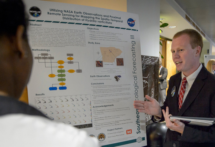
Image credit: NASA/Bill Ingalls
Austin Haney, DEVELOP project co-lead at University of Georgia, has seen first-hand how an invasive species can affect the ecosystem of Lake Thurmond, a large reservoir that straddles Georgia and South Carolina. Birds in the area “behave visibly different,” he said, after they consume a toxic cyanobacteria that lives on Hydrilla verticillata, an invasive aquatic plant. Ingesting the toxin causes a neurodegenerative disease and ultimately death. Scores of birds have been found dead in areas where large amounts of the toxin-supporting Hydrilla grow. To help lake managers better address the situation, Haney and project members developed a tool that uses data from the Landsat 8 satellite to map the distribution of Hydrilla across the lake.
2. They help identify wildlife habitat threatened by wildfires.
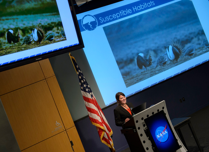
Image credit: NASA/Bill Ingalls
Maps that depict habitat and fire risk in eastern Idaho previously stopped short of Craters of the Moon National Monument, where shrubs and grasses transition to a sea of ankle-twisting basalt. But the environment is not as inhospitable as it first appears. Throughout the monument there are more than 500 kipukas — pockets of older lava capable of supporting some vegetation. That means they are also prone to burning. Project lead Courtney Ohr explained how her team used data from the Landsat 8 and Sentinel-2 satellites to simulate the area’s susceptibility to wildfires. Decisionmakers can use this model to monitor the remote wildlife habitat from afar.
3. In conjunction with Instagram, they help find seaweed blooms
Image credit: Caribbean Oceans Team
Who knew that Instagram could be a tool for science? One DEVELOP team searched for photographs of massive seaweed (sargassum) blooms in the Caribbean, mapped the locations, and then checked what satellites could see. In the process, they tested two techniques for finding algae and floating vegetation in the ocean.
4. They help conserve water by reducing urban stormwater runoff.
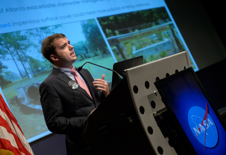
Image credit: NASA/Bill Ingalls
Atlanta’s sewer system is among the nation’s most expensive, yet the city still struggles with stormwater. It’s an uphill climb as new construction paves over more of the city, removing landscapes that could absorb rain. The University of Georgia DEVELOP team partnered with The Nature Conservancy to address the problem.
Using satellite imagery, the team pinpointed 17 communities ripe for more green infrastructure and reforestation that could capture more of the city’s runoff. The team used two models — Land-Use Conflict Identification Strategy and the Soil and Water Assessment Tool — as well as the Landsat and Terra satellite data. Their analysis provides local groups with a working picture of the city’s water resources.
5. They show the spread of the mite eating away Puerto Rico’s palm trees.
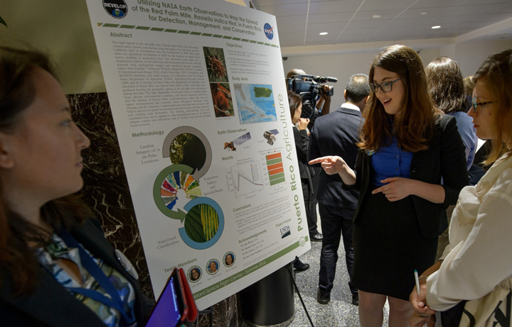
Image credit: NASA/Bill Ingalls
The red palm mite has devastated Puerto Rico’s trees in recent years, chewing through coconut palms, bananas, and plantains on the island. The pests have spread and hurt crops across the Caribbean.
A DEVELOP team led by Sara Lubkin analyzed satellite imagery to track the mites’ rapid spread from 2002. The team mapped changes to vegetation (such as yellowing) and differences in canopy structure. They made use of imagery from Landsat, Hyperion, and IKONOS, as well as aerial views. Their work can be used to mitigate current mite infestations and monitor and prevent future ones.
6. They evaluate landslide-prone areas in the developing world
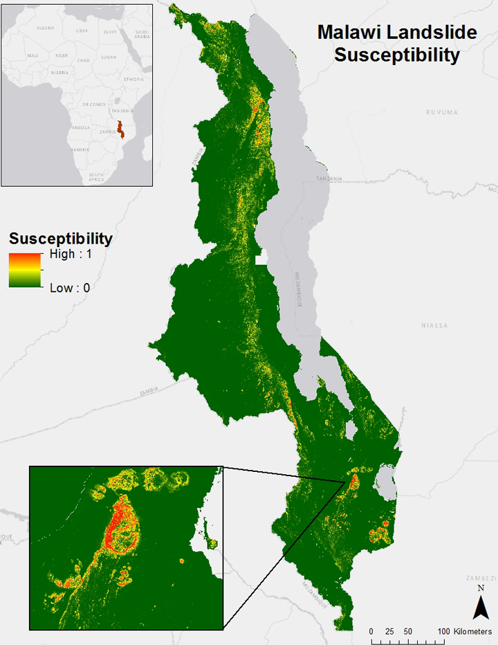
Image credit: East Africa Disasters II Team
One team of DEVELOPers took on a project to aid people in developing nations. They examined satellite imagery to find past landslides in the African nation of Malawi. Factors such as flooding after long periods of drought have made the country increasingly prone to landslides. Blending maps of the landscape, rainfall data, and population centers, the young researchers assessed the areas most at risk—and most in need of education and support—from landslides.
Want to read more about DEVELOP projects? Want to get involved? Summaries, images, and maps of current and past projects can be viewed HERE. You can also learn how to apply for the DEVELOP program HERE.

NASA Earth Observatory image by Joshua Stevens. Learn more about individual images here.
“Thousands of tired, nerve-shaken, over-civilized people are beginning to find out that going to the mountains is going home; that wildness is a necessity”
― John Muir, Our National Parks
Happy Birthday to the U.S. National Park Service! A century after President Woodrow Wilson signed the bill that established the National Park Service, there are now 420 national parks, monuments, battlefields, military parks, historical sites, lake shores, seashores, recreation areas, and scenic rivers and trails. Interestingly, the first National Park—Yellowstone—was established in 1872, well before the park service.
For more on the long and fascinating history of the parks, see these stories from PBS, USA Today, and the National Park Service. You can also tour some of the parks from space by viewing this image gallery compiled by NASA Earth Observatory. Many of the images were captured by sensors on Landsat satellites.
Also, stay tuned to that image gallery page. We will continue to add images throughout the week and for the rest of the year. Follow the links to read more quotes about the park system and wilderness. And if you want to see even more imagery of national parks from space, check out this gallery of astronauts photographs of some of the more famous parks.
“Laws change; people die; the land remains.”
― Abraham Lincoln, 16th President of the United States

NASA Earth Observatory map by Joshua Stevens, using data from the National Park Service and the U.S. Fish and Wildlife Service.
On August 13, 2016, we published an image and video showing meteors streaking across the night sky. The perspective is a new one. Instead of looking up from the ground, the camera recorded the action from the vantage point of the International Space Station (ISS). In case you missed it, you can see the image and read the full story here. The video is reposted below.
[youtube 5j8i17-lDCI 666 375]
At 6 and 16 seconds into the video, bright meteors dash across the sky over Pakistan. The video was acquired a few days before the annual Perseid meteor shower reached its peak. But as one reader pointed out to us via email, only one of these meteors can be associated with the shower. The reason? The view from orbit shows them travelling in different directions.
Meteors within a shower all travel in roughly the same direction and speed. The map below illustrates that point, showing the ground tracks and speed of all Perseids observed in the United States in July and August 2016 by the ground-based all sky camera network. The map shows all Perseids within range of a camera; blank areas are outside the range of a camera.
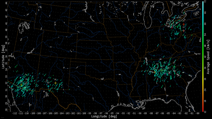
“Note how their paths all move from top right to bottom left,” said Bill Cooke with NASA’s Meteoroid Environments Office. “This is what would be seen from the ISS or another space platform.”
Showers look vastly different to a person standing on the ground looking up at a wide view of the night sky. From this perspective, meteors associated with a shower can appear to radiate outward from a central point called the “radiant.” The central point in the night sky is linked to the shower’s name; the Perseids, for example, appear to stem from the area of sky near the constellation Perseus.
The phenomenon, however, is an illusion of perspective. The illusion has been compared to flakes that appear to radiate outward as you drive through a snowstorm, or parallel train tracks that appear to converge in the distance.
“The perspective from orbit is somewhat different, because you are not looking at the entire sky, just a small fraction of the total area,” Cooke said. “In this case, meteors from a particular shower will be all moving the same direction.”
So which meteors viewed from orbit are belong to a particular shower, and which are “sporadic meteors?” That’s the type of information that will ultimately be gleaned from the diffraction grating on the space station’s Meteor camera. It will collect spectroscopy data that can tell scientists about a meteor’s composition, which can ultimately be related back to the parent body—comet Swift-Tuttle, in the case of the Perseids.

Many of the Olympic festivities are taking place in Barra da Tijuca, one of the youngest and most affluent neighborhoods in Rio. Credit: Landsat 8/NASA Earth Observatory.
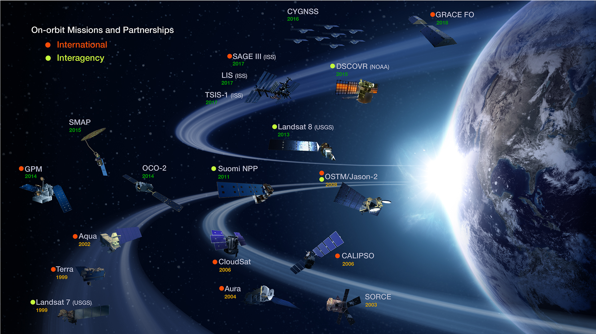
While gymnasts leap, cyclists pedal, and divers twirl for Olympic gold in Rio de Janeiro, sensors on several NASA Earth Observing satellites are catching glimpses of the city and its surroundings from space. The mix of satellites and sensors in orbit are nearly as varied and diverse as the athletes competing below.
The marathoner among NASA’s fleet would have to be Terra. Despite having a design life of six years, this reliable spacecraft has been in orbit since 2000. The multi-purpose satellite carries five scientific payloads and monitors everything from phytoplankton to forest cover to airborne particles called aerosols.

NASA’s Earth Observing Fleet. Credit: NASA Earth Observing System Project Science Office
The swimmers would have to be Aquarius, Aqua, and the Global Precipitation Measurement (GPM). All three satellites, as their names suggest, specialize in studying water. Aquarius focuses on measuring the ocean’s salinity. Aqua, like Terra, is versatile: It studies water vapor, sea ice, snow ice, clouds, and more. GPM is the newest of the trio. Launched in 2014, it makes global maps of precipitation and sets standards for precipitation measurements worldwide.
The synchronized divers of space would have to be the Gravity Recovery and Climate Experiment (GRACE). While divers seem to temporarily defy gravity with their flips and turns, the pair of GRACE satellites actually measures Earth’s gravity from space.

The twin GRACE satellites. Credit: NASA
The archers would be CALIPSO and CloudSat. These two satellites shoot laser pulses (CALIPSO) and radar waves (CloudSat) down toward features in the atmosphere such as clouds and smoke plumes. They measures precisely how long it takes for the light or radio waves to bounce back, making it possible to map the vertical structure of the atmosphere.

Rio at night. Credit: VIIRS/NASA Earth Observatory.
The images above and below offer a glimpse of some of the types of imagery and data that NASA-Earth observing satellites collect. The image at the top of the page shows how Olympic Park in Rio appeared to the Operational Land Imager (OLI), a sensor on Landsat 8. The image immediately above shows Rio at night as seen by the Visible Infrared Imaging Radiometer Suite (VIIRS) on the Suomi NPP satellite. The instrument can sense light 100,000 times fainter than conventional visible-light sensors, making it extremely sensitive to moonlight and city lights.

Rio on August 6, 2016. Credit: Worldview/NASA.
The image directly above shows a view of Rio and Guanabara Bay on August 6, 2016, the day after the opening ceremony. The fourth image (below) shows a view of aerosols observed over Rio by the Multi-Angle Imaging Spectrometer (MISR) on August 2, 2016.

Observations of aerosols over Rio on August 2, 2016. Credit: NASA/Terra/MISR.
Scientists at NASA and officials in the Rio de Janeiro government recently signed an agreement about natural hazards preparedness. The hope is that satellite imagery and data—in conjunction with in situ data from the ground—will help scientists better understand, anticipate, and monitor drought, flooding, and landslides that occur in and around Rio. The collaboration will focus on integrating, visualizing, and sharing relevant data from NASA satellites.

Severe mudslides and landslides affected Rio in 2011. Read more about this image here. Credit: EO-1/NASA Earth Observatory
In a NASA press release, Rio de Janeiro Mayor Eduardo Paes said that his city has historically suffered from massive rainstorms and subsequent floods and landslides, all of which can cause casualties and disrupt the economy. Discussions are underway to address those hazards and to plan future cooperative activities.

Image from MODIS/NASA Earth Observatory.
The 2015 fire season was the most severe ever observed by NASA Earth Observing System satellites, a new study shows. As we reported in December, 2015 was an intense fire season in Indonesia because the drying effects of El Niño exacerbated seasonal fires lit by growers. Many farmers lost control of fires, which then spread through dried-out peat deposits. Peat fires produce thick, acrid smoke rich with greenhouse gases.
Since our story was published, scientists tracking fire activity with several satellite sensors have further analyzed the 2015 data and compared the 2015 fire season with 2006, another severe burning season. The group of scientists looked at measurements of carbon monoxide from the Measurement of Pollution in the Troposphere (MOPITT), the Microwave Limb Sounder (MLS), and the Atmospheric Infrared Sounder (AIRS). They tracked aerosol pollution with Moderate Resolution Imaging Spectroradiometer (MODIS) and the Ozone Monitoring Instrument (OMI). They also used MODIS to track the number of actively burning fires. Finally, they used the Tropical Rainfal Measuring Mission (TRMM) to track rainfall.
Some of the results from their analysis are shown in the chart below. Note that red lines indicate trends in 2006 (also a severe fire year); blacks lines indicate 2015. The tick marks on the X-axis indicate the month of the year. Comparing the two years, it is clear that 2015 was the more severe fire season. The sensors generally detected higher levels (or longer duration of emissions) of each pollutant in 2015. The peak number of fires observed by MODIS was slightly higher in 2006, but the sensor detected more fires overall in 2015. In both 2006 and 2015, fire activity increased rapidly as rainfall decreased.

Figure from Field et al. PNAS, 2016.
To see how the 2015 fires compared to severe fire seasons before the Earth Observing System satellites were in space, Goddard Institute for Space Studies scientist Robert Field looked back at longer-term records of visibility collected at Indonesian airports. The chart below compares visibility in 2015 with 1997 and 1991—two other years that were dry because of El Niño. (Note: Bext stands for extinction coefficient; a higher extinction coefficient means more smoke was in the air. The upper part of the chart shows how much rain fell. .) By that measure, 1997 was a far more severe fire season. In Sumatra, visibility was also lower in 1991, though in Kalimantan. visibility was about the same in 2015 and 1991.

Figure from Field et al. PNAS, 2016.
Still, greenhouse gas emissions from the 2015 Indonesian fires were considerable. Using the Global Fire Emissions Database, the scientists estimate that 2015 released 380 teragrams of carbon—which is roughly more than the annual fossil fuel emissions of Japan.
“Without significant reforms in land use and the adoption of early warning triggers tied to precipitation forecasts, these intense fire episodes will reoccur during future droughts, usually associated with El Niño events,” the authors emphasized.
+Read a NASA press release about the study here.
+Read a more detailed story about the 2015 fires here.

In Indonesia, dry weather can mean fire. September 2015 data from the TRMM satellite shows lack of rainfall in the areas where fire broke out. Image by NASA Earth Observatory.
