In recognition of World Oceans Day (June 8) and this week’s UN Oceans Conference, here are some recent highlights from ocean science…
1.4 Million Pixels of Salt
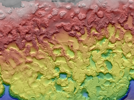
The Gulf of Mexico, like any sea, is rich in dissolved salts. Unlike most seas, the Gulf also sits atop a big mound of salt. Left behind by an ancient ocean, salt deposits lie beneath the Gulf seafloor and get pressed and squeezed and bulged by the heavy sediments laying on top of them. The result is pock-marked, almost lunar-looking seafloor. The many mounds and depressions came into clearer relief this spring with the release of a new seafloor bathymetry map compiled from oil and gas industry surveys and assembled by the U.S. Bureau of Ocean Energy Management.
3D Water Babies
NASA’s Scientific Visualization Studio took a look back at conditions in the Pacific Ocean in 2015-16, which included the arrival and departure of both El Nino and La Nina. The 3D visualizations were derived from NASA’s Modern-Era Retrospective Analysis for Research and Applications (MERRA) dataset, a global climate modeling effort that is built from remote sensing data.
In other Nino news, a research team led by NASA Langley scientists found that the strong 2015-2016 El Niño lofted abnormal amounts of cloud ice and water vapor unusually high into the atmosphere, creating conditions similar to what could happen on a larger scale in a warming world.
Not the Kind of Brightening You Want to See
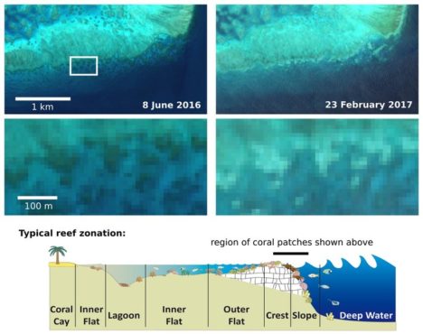
For past few years, warm ocean temperatures in the western Pacific Ocean have wrecked havoc on the Great Barrier Reef. Extreme water temperatures can disrupt the symbiotic partnership between corals and the algae that live inside their tissues. This leads the colorful algae to wash out of the coral, leaving them bright white in what scientists refer to as “bleaching” events. The health of coral reefs is usually monitored by airborne and diver-based surveys, but the European Space Agency recently reported that scientists have been able to use Sentinel 2 data to identify a bleaching event on the Great Barrier Reef. Such satellite monitoring could prove especially useful for monitoring reefs that are more remote and not as well studied as those around Australia.
Eyeing the Fuel for Hurricane Season
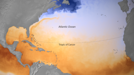
On June 1, the beginning of Atlantic Hurricane Season, the National Oceanic and Atmospheric Administration released a map of sea surface temperatures in the Caribbean, the Gulf of Mexico, and the tropical North Atlantic Ocean. The darkest orange areas indicate water temperatures of 26.5°C (80°F) and higher — the temperatures required for the formation and growth of hurricanes. Forecasters are expecting a hurricane season that is a bit more active than average.
(Finger)Prints of Tides
In a new comprehensive analysis published in Geophysical Research Letters, a French-led research team found that global mean sea level is rising 25 percent faster now than it did during the late 20th century. The increase is mostly due to increased melting of the Greenland Ice Sheet. A big part of the study was a reanalysis and recalibration of data acquired by satellites over the past 25 years, which are now better correlated to surface-based measurements. The study found that mean sea level has been increasing by 3 millimeters (0.1 inches) per year. The American Geophysical Union published a popular summary of the study.
It takes a certain amount of devotion to reach Miyar Glacier. The glacier sits high in the Indian Himalayas, well away from towns and roads, but it rewards explorers with stunning scenery and mountain peaks that rise above 6,000 meters (20,000 feet). Many of the peaks have little or no record of previous ascents. Satellites, however, can explore with considerably greater ease.
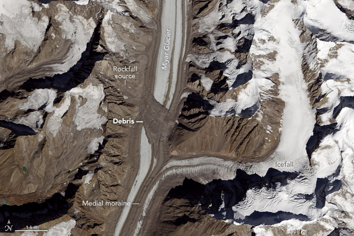
The Operational Land Imager (OLI) on Landsat 8 acquired this image on October 19, 2016. Summer warmth had melted off snow from the previous winter, leaving only the permanent snow and ice cover. Notice the debris field spread across the width of the glacier. The landslide that left it predates this image by some time; we know this because the debris has been carried downstream by the flow of the ice.
A little exploring with the Google Earth Engine timelapse tool shows Landsat 8’s high dynamic range — that is, its ability to discern both dim and bright features. In images prior to 2013, much of the glacier is featureless and white because it was too bright for the older Thematic Mapper (Landsat 5) and Enhanced Thematic Mapper Plus (Landsat 7) instruments to make out details. Images from 2013 onwards, which use the newer OLI data, show more detail. Still, it is fairly clear that there was no landslide feature as recently as 2007, and the slide definitely had taken place by 2010. Indian researchers used other satellite resources to pin the landslide date down to some time in 2009.
The Miyar Glacier has a relatively smooth surface in this image, with long linear streaks through the center of the glacier. These are medial moraines, features that form when two or more glaciers merge. The confluence of the tributary and the glacier shows how new material gets carried in to create medial moraines.
The tributary merging from the east (in the image above) shows choppy features from the confluence all the way upstream. This very rough surface is an icefall, a feature somewhat akin to rapids or a waterfall in a river. The glacier at the bend is roughly 700 meters (2,100 feet) higher than at the Miyar confluence (approximately 5,200 meters and 4,500 meters above sea level respectively). The ice is flowing over a rough and steep rock surface, causing matching rippling in the ice surface.
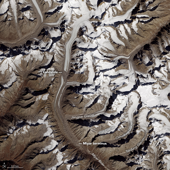
The wider image shows the terminus of the Miyar Glacier as well as a number of other tributary glaciers. The names shown here are based on the American Alpine Journal (2009), which notes that many of these glaciers have different names in trekking journals and maps.
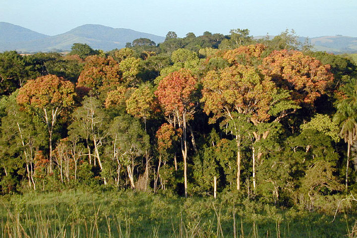
Tropical forests, such as those in Gabon, Africa, are an important reservoir of carbon. (Photography courtesy of Sassan Saatchi, NASA/JPL-Caltech.)
Old-growth forests are vital because they capture large amounts of carbon and provide homes to hundreds of species. In the Eastern United States, trees in these minimally disturbed ecosystems tend to be more than 120 years old.
Can satellites help pinpoint this “old-growth” and quantify its value? That was the question Joan Maloof posed to a group of researchers during a talk at NASA Goddard Space Flight Center in May 2017. As head of the Old-Growth Forest Network and a professor at Salisbury University, Maloof aims to identify stands of old-growth forests for conservation. A large part of her job involves explaining why these areas are important—something satellite data can help show.
As it turns out, satellites have already told us much about trees. A 2012 story from NASA Earth Observatory described some of the remote sensing methods researchers use:
Scientists have used a variety of methods to survey the world’s forests and their biomass. […] With satellites, they have collected regional and global measurements of the “greenness” of the land surface and assessed the presence or absence of vegetation, while looking for signals to distinguish trees from shrubs from ground cover.
In January 2017, a paper in Science Advances tracked intact forest landscapes between 2000 and 2013. (Intact forest landscapes were defined as areas larger than 500 square kilometers with no signs of human activity in Landsat imagery). This new research underscores the importance of such landscapes. The study’s authors identified several key findings:
For more information on trees and satellites, check out the NASA Earth Observatory feature, “Seeing Forests for the Trees and the Carbon: Mapping the World’s Forests in Three Dimensions.”
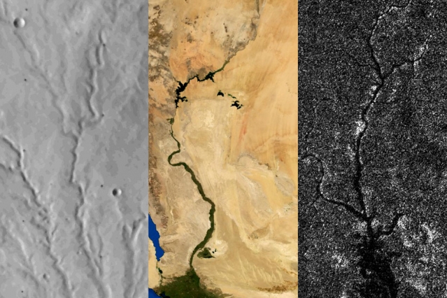
Rivers on three planetary bodies: the dry Parana Valles on Mars (left), the Nile River on Earth (middle), and Vid Flumina on Titan (right). Image by Benjamin Black using NASA data.
One of the more distinctive things about Earth among the planets is that we have plate tectonics. In other words, the hard, outer shell of the planet (called the lithosphere) is divided into several cool, rigid plates that float atop a hotter, more fluid layer of rock (the asthenosphere). These rigid surface plates do not float placidly: their grinding, colliding, shifting, and diving causes earthquakes, fuels volcanoes, builds mountains, tears open oceans, and constantly remodels and resurfaces the planet.
That is a far cry from what is happening on Mars and Titan, according to a recent study published in Science. Researchers came to that conclusion by carefully analyzing the way rivers cut through each of these planetary bodies. On Earth, countless rivers and streams snake their way across the surface. On Mars, rivers dried up long ago, but evidence of their presence remains etched into the arid surface. On Titan, Saturn’s largest moon, rivers of liquid ethane and methane still flow into lakes.
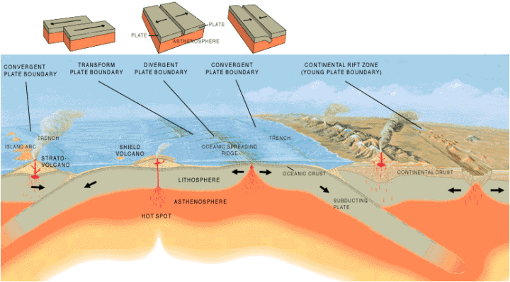
Artist’s cross section illustrating the main types of plate boundaries on Earth. (Cross section by José F. Vigil from This Dynamic Planet—a wall map produced jointly by the U.S. Geological Survey, the Smithsonian Institution, and the U.S. Naval Research Laboratory.)
By comparing imagery and data from all three planetary bodies, researchers noticed distinctive bends in the courses of rivers on Earth; these were formed as rivers were forced to wind around mountain ranges. These bends were absent in river networks on Mars and Titan. In an MIT press release, Benjamin Black, a geologist at the City College of New York, explained:
“Titan might have broad-scale highs and lows, which might have formed some time ago, and the rivers have been eroding into that topography ever since, as opposed to having new mountain ranges popping up all the time, with rivers constantly fighting against them.”
Read more about the study from New Scientist, Space.com, and the American Association for the Advancement of Science. Read the full study in Science. Read this NASA Earth Observatory story to learn more about how scientists are using satellites to study river width on Earth.
In the triptych at the top of the page, the image of Parana Valles on Mars was acquired by the Viking 1 orbiter on September 13, 1976. The image of the Nile was captured by NASA’s Terra satellite on August 10, 2000. NASA’s Cassini spacecraft captured the image of Vid Flumina on Titan on September 26, 2012.
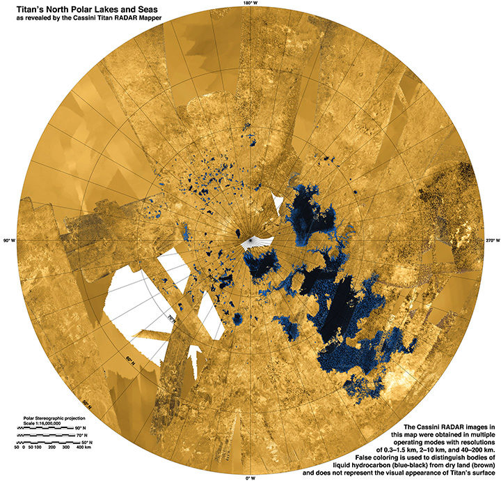
While water does not flow on Titan, rivers of methane and ethane flow into lakes near the moon’s northern pole. Learn more about this image from the NASA Jet Propulsion Laboratory Photojournal.
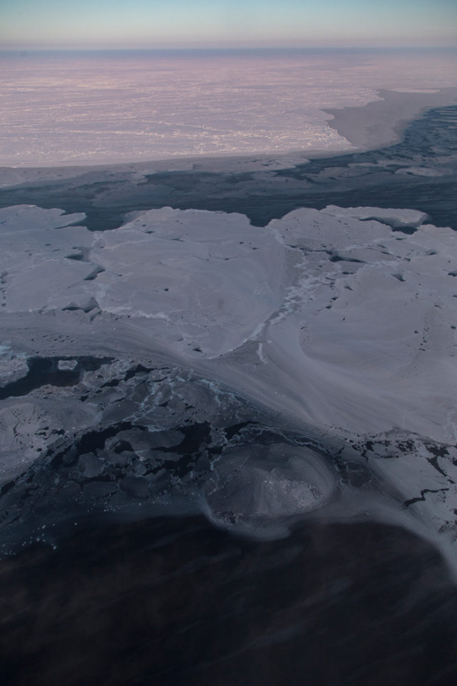
In May 2017, NASA’s Operation IceBridge concluded its annual survey of Arctic ice. After 10 weeks, 39 research flights, and hundreds of terabytes of data collected, scientists have more information than ever to help them understand changes to the region’s sea- and land ice.
Notable this year were measurements of a crack growing across the ice shelf of Petermann Glacier. Also, the mission flew for the first time over the Eurasian half of the Arctic Basin.
The research flight on April 3 explored glaciers in Greenland, before transiting to Longyearbyen, Norway, which would become the base of operations for the week. These images, snapped by NASA’s Jeremy Harbeck, show some of the highlights from that flight, featuring plenty of interesting glaciers, landforms, and even some wildlife.
An iceberg near the calving front of Zachariah Glacier. Photo by Jeremy Harbeck.
A sinuous meltwater channel on 79 North Glacier. Photo by Jeremy Harbeck.

A snowy, frozen landscape just north of 79 N Glacier. Photo by Jeremy Harbeck.
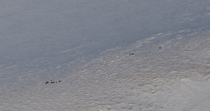
Musk ox from the P-3, between Zachariae and 79 N glaciers. Photo by Jeremy Harbeck.
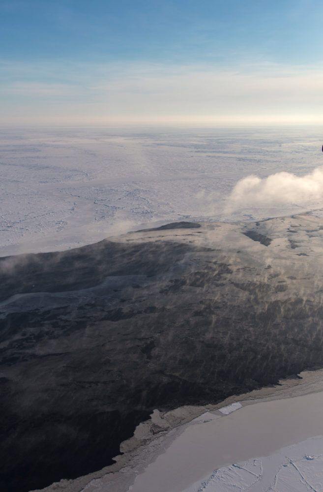
On April 6, researchers flew from Svalbard and surveyed sea ice atop the eastern Arctic Ocean. Below are a few of Harbeck’s favorite photographs from that flight, highlighting the variability of sea ice.
Some very interesting nilas and grease ice patterns. Photo by Jeremy Harbeck.
The low sun angle highlights the moisture going into the atmosphere from this lead. Photo by Jeremy Harbeck.
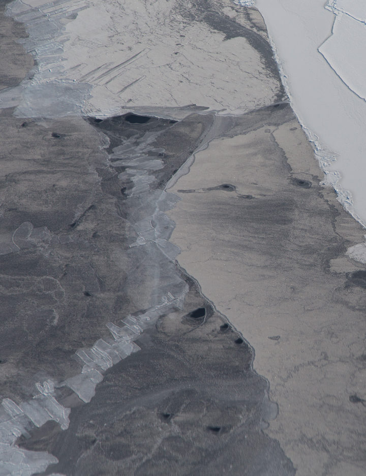
Some finger-rafted nilas along with some thicker snow-covered ice. Photo by Jeremy Harbeck.
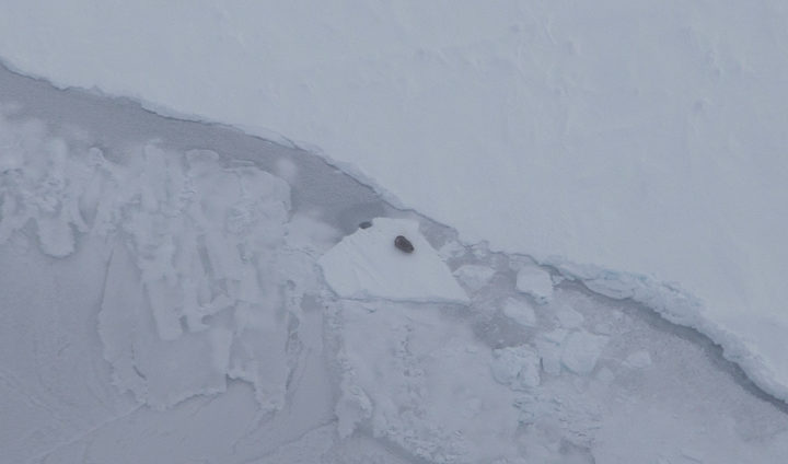
A seal on the sea ice, just northeast of Svalbard. Photo by Jeremy Harbeck.
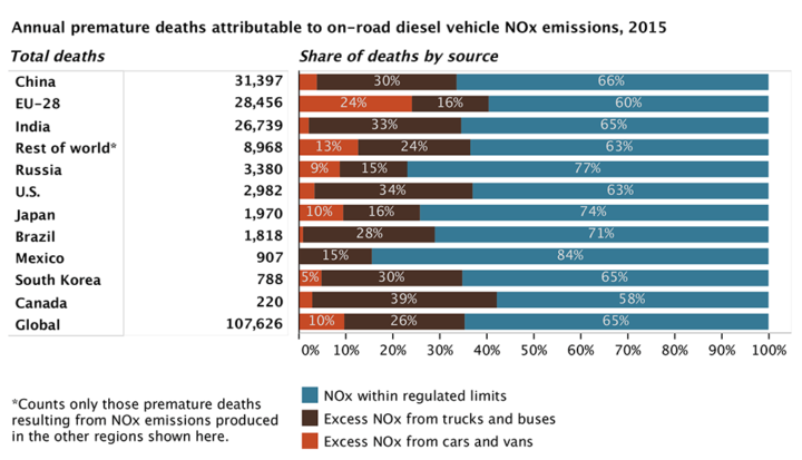
Figure by the ICCT based on data from Anenberg et al. 2017.
It is no secret that many diesel cars and trucks emit more pollution under real-world driving conditions than during laboratory certification testing. Many lab tests, for instance, are run with perfectly maintained vehicles on flat surfaces in ideal conditions. In the real world, drivers chug up hills or sit in traffic in bad weather in vehicles well past their prime.
Until this month, nobody had tallied the health effects of all the excess diesel air pollution entering the atmosphere through real-world driving conditions. According to a new study published in Nature, vehicles in eleven major markets (Australia, Brazil, Canada, China, Europe, India, Japan, Mexico, Russia, South Korea, and the United States) emitted about 4.6 million more tons of nitrogen oxides (NOx) in 2015 than official laboratory tests suggested they would. NOx contributes to the accumulation of both ground-level ozone (O3) and fine particulate matter (PM2.5) in the atmosphere.
According to the research team, nearly one-third of heavy-duty diesel vehicle emissions and over half of light-duty diesel vehicle emissions are above the certification limits. On average, light-duty diesel vehicles produce 2.3 times more NOx than the limit; heavy-duty diesel vehicles emit more than 1.45 times the limit.
The authors of the study calculated the health effects for current and future levels of this excess diesel NOx by running a global atmospheric chemistry model that simulates the distribution of PM2.5 and O3. The bottom line: excess NOx caused 38,000 premature deaths in 2015. It could cause as many as 183,600 premature deaths by 2040 as the use of diesel increases.
“We estimate that excess diesel NOx emissions from on-road trucks, buses, and cars leads to upwards of 1,100 premature deaths per year in the U.S.,” said Daven Henze, a professor of mechanical engineering at the University of Colorado and member of NASA’s Health and Air Quality Applied Sciences Team.
Other key findings from the study:
For more information, read a press release and fact sheet from the International Council on Clean Transportation, a press release from the University of Colorado, and a press release from the University of York. To find out more about global air pollution trends, read A Clearer View of Hazy Skies from NASA Earth Observatory.
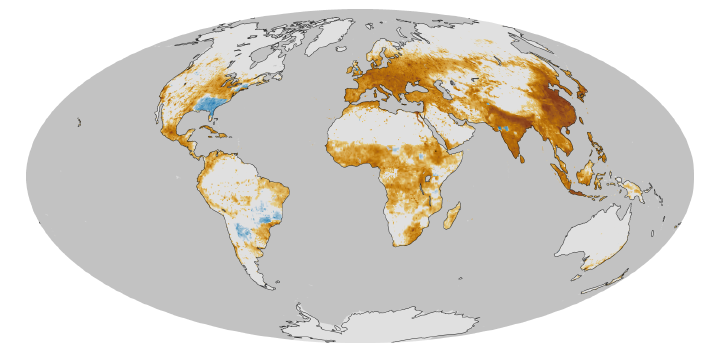
This map, based on previous research, shows a model estimate of the average number of deaths per 1,000 square kilometers (386 square miles) per year due to fine particulate matter (PM2.5), a type of outdoor air pollution. Pollution from diesel exhaust is one contributer to PM2.5. Earth Observatory image by Robert Simmon based on data provided by Jason West. Learn more about this map here.
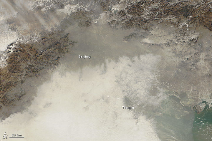
Haze over northeastern China on January 14, 2013. Image by NASA Earth Observatory, using data Terra MODIS data from LANCE MODIS Rapid Response.
In the winter of 2013, thick haze enveloped northern China for several weeks. On January 12, 2013, the peak of that bad-air episode, the air quality index (AQI) rose to a staggering 775—off the U.S. Environmental Protection Agency scale—according to a U.S. air quality sensor in Beijing.
Extra pollution from cars, homes, and factories in the winter often sets the stage for outbreaks of air pollution in China. But a March 2017 study in Science Advances suggests that a loss of Arctic sea ice in 2012 and increased Eurasian snowfall the winter before may have helped fuel the extreme event.
Snow and ice cover can affect weather patterns because both affect albedo, a measure of how much solar radiation the surface reflects in comparison to how much incoming solar radiation it receives. In September 2012, sea ice covered less area than at any other time since 1979. Meanwhile, Eurasia had unusually high snow cover in December 2012, the second most on a record that dates back to 1967.
Normally, winds blow air pollution away from eastern China, which is home to Beijing and several other large cities. But in January 2013, winds died down to a whisper and air pollution piled up. By analyzing decades of data collected by ground-based weather stations, 15 years of satellite data on aerosols, and computer simulations of the atmosphere, the researchers concluded that unusual sea ice and snow conditions triggered a shift in China’s winter monsoon, stilling the winds that normally ventilate Beijing.
A press release from Georgia Tech explained the connection in more detail:
“The reductions in sea ice and increases in snowfall have the effect of damping the climatological pressure ridge structure over China,” explained Yuhang Wang. “That flattens the temperature and pressure gradients and moves the East Asian Winter Monsoon to the east, decreasing wind speeds and creating an atmospheric circulation that makes the air in China more stagnant.”
If correct, this might explain why efforts to reduce air pollution in recent years have not stopped extreme haze events from happening. “Emissions in China have been decreasing over the last four years, but the severe winter haze is not getting better,” said Wang. “Mostly, that’s because of a very rapid change in the high polar regions.”
This is not the first study that connects changes in the Arctic to severe haze in China. Research published in August 2015 in Atmospheric Oceanic Science Letters argued that a decline in Arctic sea ice intensifies haze in eastern China. And a study published in Nature Climate Change in April 2017 came to a similar conclusion. The latter study projected a 50 percent increase in the frequency of extreme haze events and an 80 percent increase in their persistence in the near future.
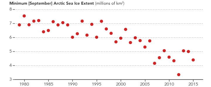
In 2012, Arctic sea ice extent was unusually low in September. New research suggests that may have contributed to a bad haze outbreak in eastern China the next winter. (NASA Earth Observatory graph by Joshua Stevens, based on data from the National Snow and Ice Data Center.)
Watch out, master gardeners: There’s competition up above.
Scientists have made marked developments in growing vegetables in space this spring. Researchers based at Kennedy Space Center have been working with a team from the University of Arizona to create a prototype lunar/Mars greenhouse. The cylindrical, inflatable chamber measures 18 feet long and 8 feet in diameter. It recycles waste and water from astronauts, and uses carbon dioxide they exhale.
Growing edible plants in space will allow humans to venture farther beyond our home planet, said Ray Wheeler, lead scientist for Kennedy Advanced Life Support Research. “The greenhouses provide a more autonomous approach to long-term exploration on the Moon, Mars and beyond,” he said.

Image by University of Arizona.
In other space veggie tales…
Last month, perhaps the most-watched cabbage in the world—technically speaking, in Earth orbit—sprouted. Two tiny shoots of the Tokyo Bekana Chinese cabbage poked out of their specially-designed plant pillow. The pillow acts like a miniature plant bed, providing nutrients without the mess of dirt careening through space.
The cabbage is but the most recent crop on the ISS. The crew’s first harvest of space veggies from the Veg-01 experiment took place in 2015. However, flower-raising efforts have encountered a few more obstacles, including the formation of mold.

Scott Kelly with romaine lettuce. Image by NASA.
To learn more, check out this video, aptly titled “Lettuce Look at Veggie”:
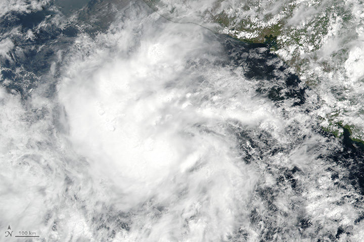
On May 9, 2017, the Visible Infrared Imaging Radiometer Suite (VIIRS) on the Suomi NPP satellite captured this image of a tropical depression off Central America. Later that day, the storm became Tropical Storm Adrian. The storm was not very well organized, as evidenced by its amorphous appearance. Despite warmer-than-average ocean surface temperatures, wind shear would keep the storm from strengthening into a hurricane.
But it wasn’t the storm’s strength that was worth noting; it was its timing. Adrian earned the title of “earliest tropical storm to form in the East Pacific” since reliable records began in 1970. It takes the top spot from Tropical Storm Alma, which formed on May 12, 1990. Read more about Adrian on the Weather Underground Category 6 blog here and here.
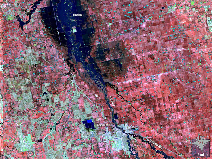
Image by the NASA GSFC Landsat/LDCM EPO Team using Landsat 5 data from the U.S. Geological Survey.
Twenty years ago this month, a hundred-year flood inundated cities along the Red River. The waters rose through April and May 1997, inundating 2,200 square miles (5,700 square kilometers) of North Dakota and Minnesota—a footprint twice as big as Rhode Island. The river spilled over its banks in Winnipeg, Canada, as well.
The false-color Landsat 5 image above shows Grand Forks, North Dakota, as it appeared on May 4, 1997. At that point, flood waters had mostly retreated, but the river still appeared swollen, with water lingering in floodplains just north of the city. Water appears dark blue, while structures are off-white.
There have been a several other notable floods since 1997. The river also overflowed its banks in 2006, 2009, and 2011.
In early May 2017, the river’s levels are average, and its water output holds steady, according to ground-based measurements taken at Grand Forks. Yet, the country as a whole just experienced its second-wettest April on record, with severe floods along the Mississippi River.
The U.S. Geological Survey has additional satellite imagery and a gallery of ground photographs of the flood. The Star Tribune has a good story that looks at how Grand Forks has fared since 1997.
