Compared to Earth, the planet Jupiter is about 11 times larger in circumference, 5 times farther from the Sun, 4 times colder, and it rotates 2.5 times faster. Based on the numbers, this gas giant wouldn’t seem to have much in common with our planet. But spend a moment looking at these detailed images of vortices in Earth’s oceans and in the atmosphere on Jupiter. You might struggle to tell the difference.
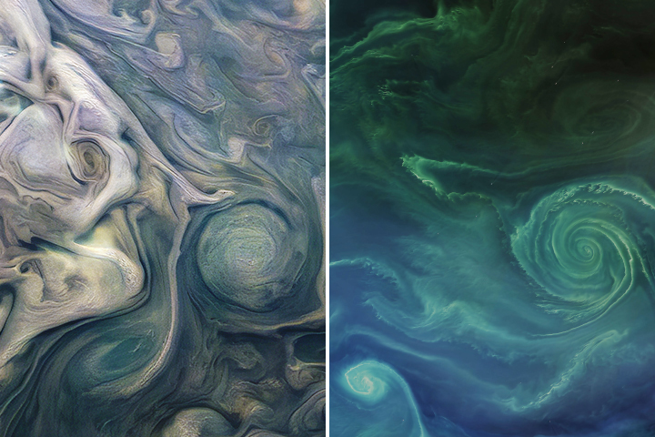
In 2019 we published this side-by-side comparison of Jupiter and Earth. The image of Jupiter (left) shows ammonia-rich clouds swirling in the outermost layers of the planet’s atmosphere. The eddies trace disturbances caused by the planet’s fast rotation and by high temperatures deeper in the atmosphere. The image of Earth (right) shows a green phytoplankton bloom tracing the edges of a vortex in the Baltic Sea. Turbulent processes in the oceans are important for moving heat, carbon, and nutrients around the planet.
Scientists are paying attention to the similarities. Lia Siegelman, a physical oceanographer at Scripps Institution of Oceanography, became interested in NASA’s Juno mission when images of Jupiter reminded her of the turbulent oceans she was studying on Earth. She presented the following examples at the December 2021 meeting of the American Geophysical Union.
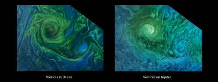
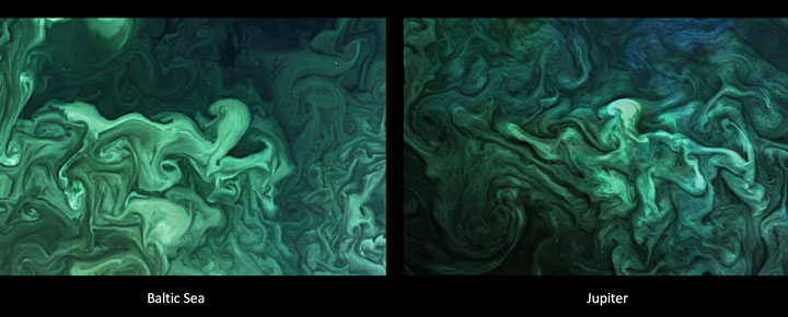
Notice how the swirls and vortices in the Norwegian Sea (top-left) and Baltic Sea (bottom-left) resemble vortices in Jupiter’s atmosphere (top- and bottom-right). Siegelman noted that although the scales are different–the vortex on Jupiter is about ten times larger than the one in the Baltic–they are generated by the same sort of fluid dynamics.
By studying these naturally emerging patterns, scientists are learning more about atmospheric processes on Jupiter. Someday, such comparisons might even tell us something new about our home planet.
The Juno spacecraft, which has been gathering data on the gas giant since July 2016, completed its 38th close pass by Jupiter in November 2021. You can find more information about the Juno mission here and here.
harmony: 1. A pleasing arrangement of parts. 2. An interweaving of different accounts into a single narrative. (Merriam-Webster Online Dictionary)
The Operational Land Imager (OLI) aboard the Landsat 8 satellite and the Multi-Spectral Instrument (MSI) aboard the Sentinel-2A and Sentinel-2B satellites tell two slightly different stories of Earth. OLI fully images the planet’s land surfaces every sixteen days at 30-meter resolution. MSI images Earth with repeat coverage every five days at 10- to 20-meter resolution.
But what if you could combine, or harmonize, these two data stories into a single narrative? With the provisional release of the Harmonized Landsat Sentinel-2 (HLS) dataset, NASA, the U.S. Geological Survey, and the European Space Agency have done just that. By combining OLI and MSI data—processing it to be used together as if it all came from a single instrument on one satellite—scientists have created global land surface products at 30-meter spatial resolution that are refreshed every two to three days.
“Our definition of ‘harmonized’ is that observations should be interchangeable for common [spectral] bands,” says Jeff Masek, the HLS principal investigator and Landsat 9 project scientist. “By harmonizing the datasets and making the corrections so that it appears to the user that the data are coming from a single platform, it makes it easier for a user to put these two datasets together and get that high temporal frequency they need for land monitoring.”
Two provisional surface reflectance HLS products are available through NASA’s Earthdata Search and NASA’s Land Processes Distributed Active Archive Center (LP DAAC): the Landsat 30-meter (L30) product (doi:10.5067/HLS/HLSL30.015) and the Sentinel 30-meter (S30) product (doi:10.5067/HLS/HLSS30.015). HLS imagery also is available through NASA’s Global Imagery Browse Services (GIBS) for interactive exploration using the NASA Worldview data visualization application.
The HLS image-processing algorithm was initially developed by a team at NASA’s Goddard Space Flight Center starting in 2013, with test versions released in 2015, 2016, and 2017. Even though HLS was still in the prototype stage and covered just 28 percent of Earth’s land surface, the team saw immediate and clear value for the scientific community. The project was scaled up from 28 percent to nearly 100 percent of Earth’s land surface (minus Antarctica) in 2019 by NASA’s Interagency Implementation and Advanced Concepts Team (IMPACT) at NASA’s Marshall Space Flight Center.
The HLS dataset is optimized for use in the Amazon Web Services commercial cloud environment; hosting it in the cloud has significant benefits for data users. “We’re really trying to take data analysis to the next level where we’re able to provide this large-scale processing without large-scale computing requirements,” says Brian Freitag, the HLS project manager at IMPACT. “For example, if you want to look at all the HLS data for a particular plot of land at the 30-meter resolution provided by HLS, you can do this using your laptop. Everything is in cloud-optimized GeoTIFF format.”
The harmonious combination of the OLI and MSI stories is opening new avenues of terrestrial research. A principal HLS application area will be agriculture, including studies of vegetation health; crop development, management, and identification; and drought impacts. HLS data also are being used in a new vegetation seasonal cycle dataset available through LP DAAC.
Global, 30-meter coverage every two to three days? The ability to access and work with years of Landsat and Sentinel imagery in the commercial cloud? That’s a harmonious arrangement the scientific community is eager to explore.
Five decades ago, NASA and the U.S. Geological Society launched a satellite to monitor Earth’s landmasses. The Apollo era had given us our first look at Earth from space and inspired scientists to regularly collect images of our planet. The first Landsat — originally known as the Earth Resources Technology Satellite (ERTS) — rocketed into space in 1972. Today we are preparing to launch the ninth satellite in the series.
Each Landsat has improved our view of Earth, while providing a continuous record of how our home has evolved. We decided to examine the legacy of the Landsat program in a four-part series of videos narrated by actor Marc Evan Jackson (who played a Landsat scientist in the movie Kong: Skull Island). The series moves from the birth of the program to preparations for launching Landsat 9 and even into the future of these satellites.
Episode 1: Getting Off the Ground
The soon-to-be-launched Landsat 9 is the intellectual and technical successor to eight generations of Landsat missions. Episode 1 answers the “why?” questions. Why did space exploration between 1962 and 1972 lead to such a mission? Why did the leadership of several U.S. government agencies commit to it? Why did scientists come to see satellites as important to advancing earth science? In this episode, we are introduced to William Pecora and Stewart Udall, two men who propelled the project forward, as well as Virginia Norwood, who breathed life into new technology.
Episode 2: Designing for the Future
The early Landsat satellites carried a sensor that could “see” visible light, plus a little bit of near-infrared light. Newer Landsats, including the coming Landsat 9 mission, have two sensors: the Operational Land Imager (OLI) and the Thermal Infrared Sensor (TIRS). Together they observe in visible, near-infrared, shortwave-infrared, and thermal infrared wavelengths. By comparing observations of different wavelengths, scientists can identify algal blooms, storm damage, fire burn scars, the health of plants, and more.
Episode 2 takes us inside the spacecraft, showing how Landsat instruments collect carefully calibrated data. We are introduced to Matt Bromley, who studies water usage in the western United States, as well as Phil Dabney and Melody Djam, who have worked on designing and building Landsat 9. Together, they are making sure that Landsat continues to deliver data to help manage Earth’s precious resources.
Episode 3: More Than Just a Pretty Picture
The Landsat legacy includes five decades of observations, one of the longest continuous Earth data records in existence. The length of that record is crucial for studying change over time, from the growth of cities to the extension of irrigation in the desert, from insect damage to forests to plant regrowth after a volcanic eruption. Since 2008, that data has been free to the public. Anyone can download and use Landsat imagery for everything from scientific papers to crop maps to beautiful art.
Episode 3 explores the efforts of USGS to downlink and archive five decades of Landsat data. We introduce Mike O’Brien, who is on the receiving end of daily satellite downloads, as well as Kristi Kline, who works to make Landsat data available to users. Jeff Masek, the Landsat 9 project scientist at NASA, describes how free access to data has revolutionized what we are learning about our home planet.
Episode 4: Plays Well With Others
For the past 50 years, Landsat satellites have shown us Earth in unprecedented ways, but they haven’t operated in isolation. Landsat works in conjunction with other satellites from NASA, NOAA, and the European Space Agency, as well as private companies. It takes a combination of datasets to get a full picture of what’s happening on the surface of Earth.
In Episode 4, we are introduced to Danielle Rappaport, who combines audio recordings with Landsat data to measure biodiversity in rainforests. Jeff Masek also describes using Landsat and other data to understand depleted groundwater.
Learn more about the Landsat science team at NASA.
Learn more about the Landsat program at USGS.
View images in our Landsat gallery.
The UK’s Antarctic Place-names Committee has agreed that seven ice features in western Antarctica should be named for Earth-observation satellites. One of them is Landsat Ice Steam.
The new designations were announced on June 7, 2019. The ice features are all located in Western Palmer Land on the southern Antarctic Peninsula.
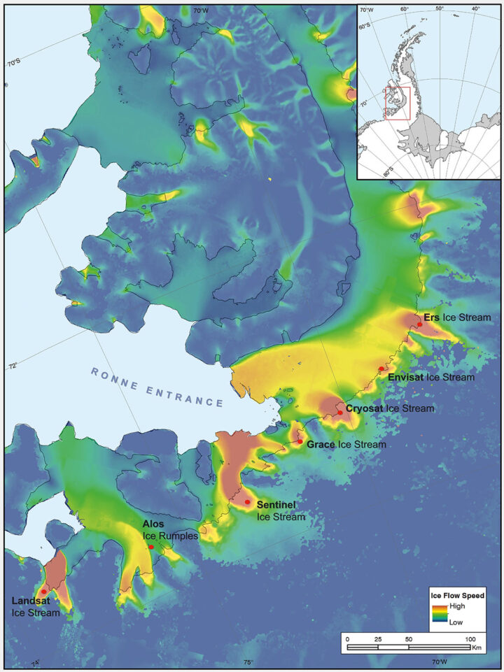
The seven features ring George VI Sound like pearls on a necklace. The new names, as officially entered into the British Antarctic Territory Gazetteer, are (from west to east): Landsat Ice Steam, ALOS Ice Rumples, Sentinel Ice Stream, GRACE Ice Stream, Envisat Ice Stream, Cryosat Ice Stream, and ERS Ice Stream.
The UK has submitted the new names for the fast-moving ice features to Scientific Committee on Antarctic Research (SCAR), which maintains a gazetteer or registry, of names officially adopted by individual nations. Under the Antarctic Treaty, signatory nations confer on geographic feature names, but each nation’s naming authority formally adopts new names. The U.S. Board on Geographic Names will meet in July and may discuss at that meeting whether the names adopted by the UK also will be adopted by the US. The question of using the term “glacier” for the ice features instead of “ice stream” is also part of each nation’s naming decision.
The new names were proposed by Anna Hogg, a glaciologist with the Center for Polar Observation and Modelling at the University of Leeds. In research published in 2017, Hogg found that glaciers draining from the Antarctic Peninsula were accelerating, thinning, and retreating, with implications for global sea level rise. The fast-moving glaciers that Hogg and colleagues tracked with radar and optical satellite imagery were unnamed. In her paper, the glaciers had to be designated by latitude and longitude.
Satellites had enabled Hogg and her team to clock the speed of these nameless ice features—some with rates faster than 1.5 meters/day. In tribute to the spaceborne instruments, Hogg came up with a way to describe the fast-moving ice features more succinctly—name them after the satellites that had helped her understand their behavior.
Hogg proposed to the U.K.’s Antarctic Place-names Committee that the features should be named for Landsat, Sentinel, ALOS PALSAR, ERS, GRACE, CryoSat, and Envisat. She was notified in early June that the committee had agreed to adopt the names, which provide a way to recognize international collaboration, as fifteen space agencies currently collaborate on Antarctic data collection.
“Satellites are the heroes in my science of glaciology,” Hogg told the BBC. “They’ve totally revolutionized our understanding, and I thought it would be brilliant to commemorate them in this way.”
Naming the glaciers after satellites is also a celebration of data fusion. “Our understanding of ice velocities and ice sheet mass balance has come from putting many different remote sensing data sets together—optical, radar, gravity, and laser altimetry,” said Jeff Masek, the NASA Landsat 9 Project Scientist. “Landsat has been a key piece in assembling that larger puzzle. Naming an ice stream after Landsat is a fitting way to recognize the value of long-term Earth Observation data for measuring changes in Earth’ polar regions.”
Read more from NASA’s Landsat science and outreach team, including the history of Antarctic observation with Landsat. Read more about all of the glaciers and their namesake satellites, as told by the European Space Agency. And read about the island discovered by and named for Landsat, and the woman who discovered it.
Correction, June 27, 2019: SCAR’s role in the Antarctic naming process was incorrectly described in the earlier version of this article. Updates were provided by Dr. Scott Borg, Deputy Assistant Director of the National Science Foundation’s Directorate for Geosciences, and Peter West, the Outreach Program managers for NSF’s Office of Polar Programs, to correctly describe the naming process.
This post is republished from the Landsat science team page.
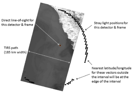
In the giddy, early days following the flawless launch of Landsat 8, as the satellite commissioning was taking place, the calibration team noticed something strange. Light and dark stripes were showing up in images acquired by the satellite’s Thermal Infrared Sensor (TIRS).
Comparing coincident data collected by Landsat 8 and Landsat 7 — acquired as Landsat 8 flew under Landsat 7, on its way to its final orbit — showed that thermal data collected by Landsat 8 was off by several degrees.

This was a big deal. The TIRS sensor had been added to the Landsat 8 payload specifically because it had been deemed essential to a number of applications, especially water management in the U.S’s arid western states.
The TIRS error source was a mystery. The prelaunch TIRS testing in the lab had shown highly accurate data (to within 1 degree K); and on-orbit internal calibration measurements (measurements taken of an onboard light source with a known temperature) were just as good as they had been in the lab. But when TIRS radiance measurements were compared to ground-based measurements, errors were undeniably present. Everywhere TIRS was reporting temperatures that were warmer than they should have been, with the error at its worst in regions with extreme temperatures like Antarctica.
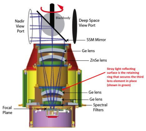
After a year-long investigation, the TIRS team found the problem. Stray light from outside the TIRS field-of-view was contaminating the image. The stray light was adding signal to the TIRS images that should not have been there—a “ghost signal” had been found.
Scans of the Moon, together with ray tracing models created with a spare telescope by the TIRS instrument team, identified the stray light culprit. A metal alloy retaining ring mounted just above the third lens of the four-lens refractive TIRS telescope was bouncing out-of-field reflections onto the TIRS focal plane. The ghost-maker had been found.
With the source of the TIRS ghosts discovered, Matthew Montanaro and Aaron Gerace, two thermal imaging experts from the Rochester Institute of Technology, were tasked with getting rid of them.
Montanaro and Gerace had to first figure out how much energy or “noise” the ghost signals were adding to the TIRS measurements. To do this, a stray light optical model was created using reverse ray traces for each TIRS detector. This essentially gave Montanaro and Gerace a “map” of ghost signals. Because TIRS has 1,920 detectors, each in a slightly different position, it wasn’t just one ghost signal they had to deal with— it was a gaggle of ghost signals.
To calculate the ghost signal contamination for each detector, they compared TIRS radiance data to a known “correct” top-of-atmosphere radiance value (specifically, MODIS radiance measurements made during the Landsat 8 / Terra underflight period in March 2013).
Comparing the MODIS and TIRS measurements showed how much energy the ghost signal was adding to the TIRS radiance measurements. These actual ghost signal values were then compared to the model-based ghost signal values that Montanaro and Gerace had calculated using their stray light maps and out-of-field radiance values from TIRS interval data (data collected just above and below a given scene along the Landsat 8 orbital track).
Using the relationships established by these comparisons, Montanaro and Gerace came up with generic equations that could be used to calculate the ghost signal for each TIRS detector.
Once the ghost signal value is calculated for each pixel, that value can be subtracted from the measured radiance to get a stray-light corrected radiance, i.e. an accurate radiance. This algorithm has become known as the “TIRS-on-TIRS” correction. After performing this correction, the absolute error can be reduced from roughly 9 K to 1 K and the image banding, that visible vestige of the ghost signal, largely disappears.
“The stray light issue is very complex and it took years of investigation to determine a suitable solution,” Montanaro said.
This work paid off. Their correction—hailed as “innovative” by the Landsat 8 Project Scientist, Jim Irons—has withstood the scrutiny of the Landsat Science Team. And Montanaro and Gerace’s “exorcism” has now placed the Landsat 8 thermal bands in-line with the accuracy of the previous (ghost-free) Landsat thermal instruments.
USGS EROS has now implemented the software fix developed by these “Landsat Ghostbusters” as part of the Landsat Collection 1 data product. Savvy programmers at USGS, led by Tim Beckmann, made it possible to turn the complex de-ghosting calculations into a computationally reasonable fix that can be done for the 700+ scenes collected by Landsat 8 each day.
“EROS was able to streamline the process so that although there are many calculations, the overall additional processing time is negligible for each Landsat scene,” Montanaro explained.

Gerace is now determining if an atmospheric correction based on measurements made by the two TIRS bands, a technique known as a split window atmospheric correction, can be developed with the corrected TIRS data.
Meanwhile, Montanaro has been asked to support the instrument team building the Thermal Infrared Sensor 2 that will fly on Landsat 9. A hardware fix for TIRS-2 is planned. Baffles will be placed within the telescope to block the stray light that haunted the Landsat 8 TIRS.
The Landsat future is looking ghost-free.
Related Reading:
+ RIT University News
+ TIRS Stray Light Correction Implemented in Collection 1 Processing, USGS Landsat Headline
+ Landsat Level-1 Collection 1 Processing, USGS Landsat Update Vol. 11 Issue 1 2017
+ Landsat Data Users Handbook, Appendix A – Known Issues
References:
Montanaro, M., Gerace, A., Lunsford, A., & Reuter, D. (2014). Stray light artifacts in imagery from the Landsat 8 Thermal Infrared Sensor. Remote Sensing, 6(11), 10435-10456. doi:10.3390/rs61110435
Montanaro, M., Gerace, A., & Rohrbach, S. (2015). Toward an operational stray light correction for the Landsat 8 Thermal Infrared Sensor. Applied Optics, 54(13), 3963-3978. doi: 10.1364/AO.54.003963 (https://www.osapublishing.org/ao/abstract.cfm?uri=ao-54-13-3963)
Barsi JA, Schott JR, Hook SJ, Raqueno NG, Markham BL, Radocinski RG. (2014) Landsat-8 Thermal Infrared Sensor (TIRS) Vicarious Radiometric Calibration. Remote Sensing, 6(11), 11607-11626.
Montanaro, M., Levy, R., & Markham, B. (2014). On-orbit radiometric performance of the Landsat 8 Thermal Infrared Sensor. Remote Sensing, 6(12), 11753-11769. doi: 10.3390/rs61211753
Gerace, A., & Montanaro, M. (2017). Derivation and validation of the stray light correction algorithm for the Thermal Infrared Sensor onboard Landsat 8. Remote Sensing of Environment, 191, 246-257. doi: 10.1016/j.rse.2017.01.029
Gerace, A. D., Montanaro, M., Connal, R. (2017). Leveraging intercalibration techniques to support stray-light removal from Landsat 8 Thermal Infrared Sensor data. Journal of Applied Remote Sensing, Accepted for Publication.
Landsat imagery has become a staple of the Earth observation community. By acquiring as many as 1,400 new images a day, Landsat 7 and 8 have given us an unprecedented look at our planet. But it’s not just the quantity of the imagery that is so exciting. Within each scene, a trove of data awaits those eager to explore the planet, pixel-by-pixel, from the vantage point of space.
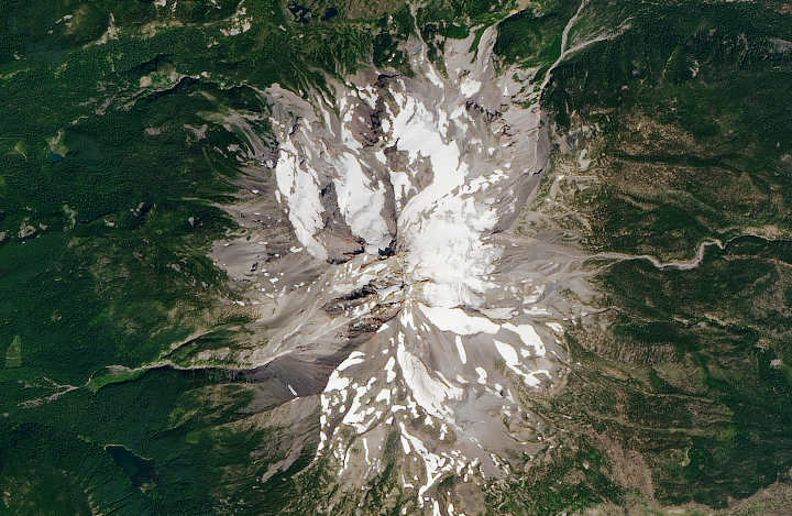
A true-color Landsat 8 image of Mount Jefferson, Oregon, at a resolution of 15 meters per pixel.
It’s almost like having your own camera in orbit, 700 kilometers (430 miles) above the Earth. But Landsat is quite different from the camera in your mobile phone or dSLR. The sensors onboard Landsat capture imagery in several different “bands.” Each band represents a unique chunk of the electromagnetic spectrum, defined by wavelength. This allows for multispectral imagery that goes beyond the visible light our eyes can see. It also enables us to combine these bands in order to see the unseen, make important calculations, or assemble just the data from visible light to produce a natural-color image.
But there’s another great feature of the different bands in Landsat 7 and 8 data: one of them can be used to effectively double the resolution of your image. Yes, you read that correctly!
Panchromatic sharpening (pan-sharpening) is a technique that combines the high-resolution detail from a panchromatic band with the lower-resolution color information of other bands (usually only the visible bands).
The spectral bands of Landsat 7 and 8 have a resolution of 30 meters per pixel, while the panchromatic band has a resolution of 15 meters per pixel. By itself, the panchromatic band would look somewhat uninteresting; like other individual bands, it appears black and white. But unlike other bands, it captures a much wider range of light, allowing it to be significantly sharper. As a result, panchromatic imagery is twice as detailed as the individual spectral bands.
An image that is twice as detailed is a lot more valuable and can reveal features or phenomena that would otherwise be difficult to see:
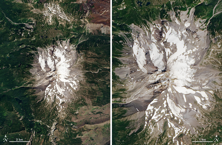
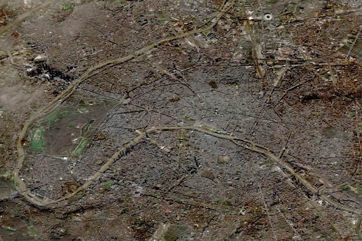
Left: a natural-color Landsat 8 image of Mt. Jefferson, by Robert Simmon. Right: A pan-sharpened version of the same data, by Joshua Stevens.
The first step in creating a pan-sharpened image is to acquire the data. If you need help, we have an Earth Explorer tutorial that will guide you through the process. You may also use this sample data of Mt. Jefferson (960 MB zip archive).
The following steps assume you have acquired and unzipped the necessary data. You will also need an image editor capable of working with 16-bit data, the ability to combine and edit color channels, and support for the Lab color space. Adobe Photoshop and GIMP, a free and open source editor, are both great tools that meet this criteria.
I use Photoshop, and the examples below will reflect the Photoshop tools and interface.
Follow the first part of Rob Simmon’s tutorial, How To Make a True-Color Landsat 8 Image, but stop after the initial RGB image is created. Do not color correct the image!
1. At this point, you should have a single, uncorrected RGB composite. Mine looks like this:

This unsharpened image will have a height and width in the ballpark of 7000 to 8000 pixels.
2. To prepare the image to be twice as sharp, we first need to double its size. In the Photoshop menu, go to Image and then Image Size. In the dialog, set the height and width to 200% and ensure that resampling is set to bilinear (this will prevent any unwanted, extra sharpening from occurring).
Your image will now be twice as large (15000-16000 pixels wide and tall). But you will notice it is not very sharp; in fact, it will look quite fuzzy. Let’s change that.
3. Recall that the panchromatic band has a resolution of 15 m in black and white. What if we could use the color from this fuzzy image, but add detail from the lightness and darkness of the panchromatic data? That is exactly what we are going to do.
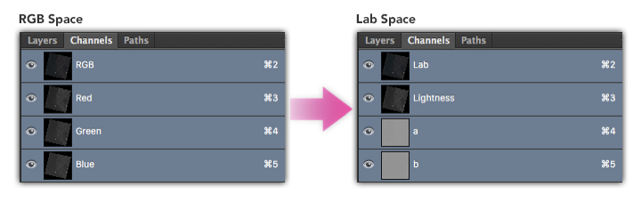
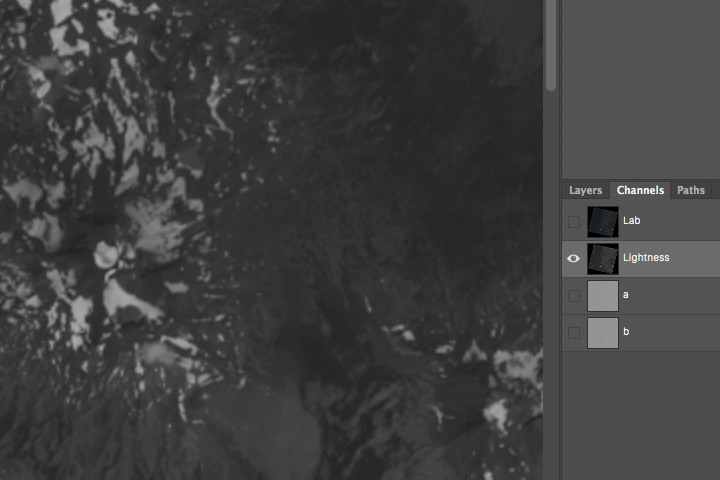
Currently, our image is composed of three channels: red, green, and blue. We want to change that so one of the channels reflects lightness.
That is where the Lab color space comes in. Lab color space depicts color in terms of lightness and two other channels known as a and b (which control the red-green and yellow-blue of an image, respectively).
In the Photoshop menu, go to Image –> Mode -> Lab Color. You won’t see the image change, but if you look at your image channels, you will see that you now have Lightness, a, and b.
4. We need to replace the image in the Lightness channel with the panchromatic data. Open your panchromatic band (the filename should end with _B8.tif in your data).
5. With the panchromatic image open, select everything (Photoshop menu Select -> All). Then copy the image (cmd-c on Mac, ctrl-c on Windows).
Go back to your RGB composite image. In the Channels window click on Lightness to isolate that channel. Your image should change to black and white to indicate that only the selected channel is active:
Paste the panchromatic data (cmd-v on Mac, ctrl-v on Windows). You should see the black and white image become significantly sharper as the higher resolution imagery replaces the previous data:

6. Convert the image back to RGB space. In Photoshop go to Image -> Mode -> RGB Color.
Color has returned and you now have a pan-sharpened, RGB composite!
You can now color correct the image and apply any additional sharpening desired.
Return to How To Make a True-Color Landsat 8 Image to learn how to color correct your pan-sharpened imagery.
Pan-sharpening is a common technique, and there’s more than one way to do it. The method shown here is called HSV Sharpening. It is the simplest of the techniques and relies only on swapping the value (the ‘v’ of HSV) data with a higher resolution counterpart. The hue and saturation (the ‘h’ and ‘s’) provide the color from the lower resolution imagery.
Another more sophisticated method known as Gram-Schmidt pan-sharpening is frequently used in GIS software. Gram-Schmidt generates a closer representation of the panchromatic data by simulating it from the other spectral bands.
On Landsat 8, the panchromatic band doesn’t go as far into the blue wavelengths as the blue band, and it goes slightly beyond red. If you followed this tutorial and noticed a slight change in tone when you pasted in the panchromatic data, this is why. Panchromatic data from Landsat 7 is even more extreme and includes more near infrared light, so it will change the tone of the image even more.
A third technique, known as a Brovey transform, or color normalization, attempts to balance the color information with the panchromatic data. It can be useful for pan-sharpening false color imagery, the success of which depends on the wavelengths captured by the panchromatic data.
Although this tutorial covered the process on a single image manually, much of this can be automated from the command line with relative ease. A few tools I recommend:
There you have it. Happy sharpening!
