Compared to Earth, the planet Jupiter is about 11 times larger in circumference, 5 times farther from the Sun, 4 times colder, and it rotates 2.5 times faster. Based on the numbers, this gas giant wouldn’t seem to have much in common with our planet. But spend a moment looking at these detailed images of vortices in Earth’s oceans and in the atmosphere on Jupiter. You might struggle to tell the difference.
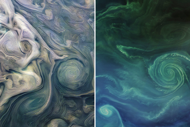
In 2019 we published this side-by-side comparison of Jupiter and Earth. The image of Jupiter (left) shows ammonia-rich clouds swirling in the outermost layers of the planet’s atmosphere. The eddies trace disturbances caused by the planet’s fast rotation and by high temperatures deeper in the atmosphere. The image of Earth (right) shows a green phytoplankton bloom tracing the edges of a vortex in the Baltic Sea. Turbulent processes in the oceans are important for moving heat, carbon, and nutrients around the planet.
Scientists are paying attention to the similarities. Lia Siegelman, a physical oceanographer at Scripps Institution of Oceanography, became interested in NASA’s Juno mission when images of Jupiter reminded her of the turbulent oceans she was studying on Earth. She presented the following examples at the December 2021 meeting of the American Geophysical Union.
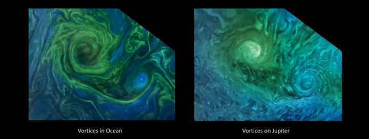
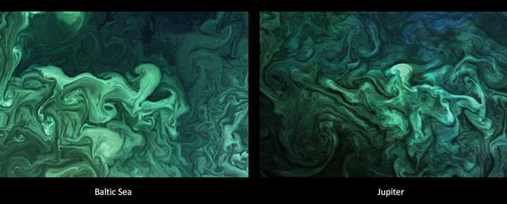
Notice how the swirls and vortices in the Norwegian Sea (top-left) and Baltic Sea (bottom-left) resemble vortices in Jupiter’s atmosphere (top- and bottom-right). Siegelman noted that although the scales are different–the vortex on Jupiter is about ten times larger than the one in the Baltic–they are generated by the same sort of fluid dynamics.
By studying these naturally emerging patterns, scientists are learning more about atmospheric processes on Jupiter. Someday, such comparisons might even tell us something new about our home planet.
The Juno spacecraft, which has been gathering data on the gas giant since July 2016, completed its 38th close pass by Jupiter in November 2021. You can find more information about the Juno mission here and here.
harmony: 1. A pleasing arrangement of parts. 2. An interweaving of different accounts into a single narrative. (Merriam-Webster Online Dictionary)
The Operational Land Imager (OLI) aboard the Landsat 8 satellite and the Multi-Spectral Instrument (MSI) aboard the Sentinel-2A and Sentinel-2B satellites tell two slightly different stories of Earth. OLI fully images the planet’s land surfaces every sixteen days at 30-meter resolution. MSI images Earth with repeat coverage every five days at 10- to 20-meter resolution.
But what if you could combine, or harmonize, these two data stories into a single narrative? With the provisional release of the Harmonized Landsat Sentinel-2 (HLS) dataset, NASA, the U.S. Geological Survey, and the European Space Agency have done just that. By combining OLI and MSI data—processing it to be used together as if it all came from a single instrument on one satellite—scientists have created global land surface products at 30-meter spatial resolution that are refreshed every two to three days.
“Our definition of ‘harmonized’ is that observations should be interchangeable for common [spectral] bands,” says Jeff Masek, the HLS principal investigator and Landsat 9 project scientist. “By harmonizing the datasets and making the corrections so that it appears to the user that the data are coming from a single platform, it makes it easier for a user to put these two datasets together and get that high temporal frequency they need for land monitoring.”
Two provisional surface reflectance HLS products are available through NASA’s Earthdata Search and NASA’s Land Processes Distributed Active Archive Center (LP DAAC): the Landsat 30-meter (L30) product (doi:10.5067/HLS/HLSL30.015) and the Sentinel 30-meter (S30) product (doi:10.5067/HLS/HLSS30.015). HLS imagery also is available through NASA’s Global Imagery Browse Services (GIBS) for interactive exploration using the NASA Worldview data visualization application.
The HLS image-processing algorithm was initially developed by a team at NASA’s Goddard Space Flight Center starting in 2013, with test versions released in 2015, 2016, and 2017. Even though HLS was still in the prototype stage and covered just 28 percent of Earth’s land surface, the team saw immediate and clear value for the scientific community. The project was scaled up from 28 percent to nearly 100 percent of Earth’s land surface (minus Antarctica) in 2019 by NASA’s Interagency Implementation and Advanced Concepts Team (IMPACT) at NASA’s Marshall Space Flight Center.
The HLS dataset is optimized for use in the Amazon Web Services commercial cloud environment; hosting it in the cloud has significant benefits for data users. “We’re really trying to take data analysis to the next level where we’re able to provide this large-scale processing without large-scale computing requirements,” says Brian Freitag, the HLS project manager at IMPACT. “For example, if you want to look at all the HLS data for a particular plot of land at the 30-meter resolution provided by HLS, you can do this using your laptop. Everything is in cloud-optimized GeoTIFF format.”
The harmonious combination of the OLI and MSI stories is opening new avenues of terrestrial research. A principal HLS application area will be agriculture, including studies of vegetation health; crop development, management, and identification; and drought impacts. HLS data also are being used in a new vegetation seasonal cycle dataset available through LP DAAC.
Global, 30-meter coverage every two to three days? The ability to access and work with years of Landsat and Sentinel imagery in the commercial cloud? That’s a harmonious arrangement the scientific community is eager to explore.
This post is republished from the Landsat science team page.
In the giddy, early days following the flawless launch of Landsat 8, as the satellite commissioning was taking place, the calibration team noticed something strange. Light and dark stripes were showing up in images acquired by the satellite’s Thermal Infrared Sensor (TIRS).
Comparing coincident data collected by Landsat 8 and Landsat 7 — acquired as Landsat 8 flew under Landsat 7, on its way to its final orbit — showed that thermal data collected by Landsat 8 was off by several degrees.

This was a big deal. The TIRS sensor had been added to the Landsat 8 payload specifically because it had been deemed essential to a number of applications, especially water management in the U.S’s arid western states.
The TIRS error source was a mystery. The prelaunch TIRS testing in the lab had shown highly accurate data (to within 1 degree K); and on-orbit internal calibration measurements (measurements taken of an onboard light source with a known temperature) were just as good as they had been in the lab. But when TIRS radiance measurements were compared to ground-based measurements, errors were undeniably present. Everywhere TIRS was reporting temperatures that were warmer than they should have been, with the error at its worst in regions with extreme temperatures like Antarctica.
After a year-long investigation, the TIRS team found the problem. Stray light from outside the TIRS field-of-view was contaminating the image. The stray light was adding signal to the TIRS images that should not have been there—a “ghost signal” had been found.
Scans of the Moon, together with ray tracing models created with a spare telescope by the TIRS instrument team, identified the stray light culprit. A metal alloy retaining ring mounted just above the third lens of the four-lens refractive TIRS telescope was bouncing out-of-field reflections onto the TIRS focal plane. The ghost-maker had been found.
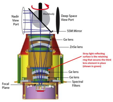
With the source of the TIRS ghosts discovered, Matthew Montanaro and Aaron Gerace, two thermal imaging experts from the Rochester Institute of Technology, were tasked with getting rid of them.
Montanaro and Gerace had to first figure out how much energy or “noise” the ghost signals were adding to the TIRS measurements. To do this, a stray light optical model was created using reverse ray traces for each TIRS detector. This essentially gave Montanaro and Gerace a “map” of ghost signals. Because TIRS has 1,920 detectors, each in a slightly different position, it wasn’t just one ghost signal they had to deal with— it was a gaggle of ghost signals.
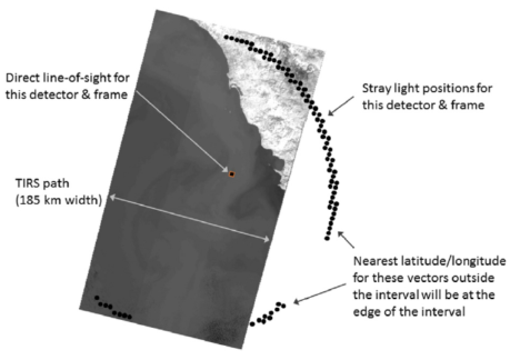
To calculate the ghost signal contamination for each detector, they compared TIRS radiance data to a known “correct” top-of-atmosphere radiance value (specifically, MODIS radiance measurements made during the Landsat 8 / Terra underflight period in March 2013).
Comparing the MODIS and TIRS measurements showed how much energy the ghost signal was adding to the TIRS radiance measurements. These actual ghost signal values were then compared to the model-based ghost signal values that Montanaro and Gerace had calculated using their stray light maps and out-of-field radiance values from TIRS interval data (data collected just above and below a given scene along the Landsat 8 orbital track).
Using the relationships established by these comparisons, Montanaro and Gerace came up with generic equations that could be used to calculate the ghost signal for each TIRS detector.
Once the ghost signal value is calculated for each pixel, that value can be subtracted from the measured radiance to get a stray-light corrected radiance, i.e. an accurate radiance. This algorithm has become known as the “TIRS-on-TIRS” correction. After performing this correction, the absolute error can be reduced from roughly 9 K to 1 K and the image banding, that visible vestige of the ghost signal, largely disappears.
“The stray light issue is very complex and it took years of investigation to determine a suitable solution,” Montanaro said.
This work paid off. Their correction—hailed as “innovative” by the Landsat 8 Project Scientist, Jim Irons—has withstood the scrutiny of the Landsat Science Team. And Montanaro and Gerace’s “exorcism” has now placed the Landsat 8 thermal bands in-line with the accuracy of the previous (ghost-free) Landsat thermal instruments.
USGS EROS has now implemented the software fix developed by these “Landsat Ghostbusters” as part of the Landsat Collection 1 data product. Savvy programmers at USGS, led by Tim Beckmann, made it possible to turn the complex de-ghosting calculations into a computationally reasonable fix that can be done for the 700+ scenes collected by Landsat 8 each day.
“EROS was able to streamline the process so that although there are many calculations, the overall additional processing time is negligible for each Landsat scene,” Montanaro explained.

Gerace is now determining if an atmospheric correction based on measurements made by the two TIRS bands, a technique known as a split window atmospheric correction, can be developed with the corrected TIRS data.
Meanwhile, Montanaro has been asked to support the instrument team building the Thermal Infrared Sensor 2 that will fly on Landsat 9. A hardware fix for TIRS-2 is planned. Baffles will be placed within the telescope to block the stray light that haunted the Landsat 8 TIRS.
The Landsat future is looking ghost-free.
Related Reading:
+ RIT University News
+ TIRS Stray Light Correction Implemented in Collection 1 Processing, USGS Landsat Headline
+ Landsat Level-1 Collection 1 Processing, USGS Landsat Update Vol. 11 Issue 1 2017
+ Landsat Data Users Handbook, Appendix A – Known Issues
References:
Montanaro, M., Gerace, A., Lunsford, A., & Reuter, D. (2014). Stray light artifacts in imagery from the Landsat 8 Thermal Infrared Sensor. Remote Sensing, 6(11), 10435-10456. doi:10.3390/rs61110435
Montanaro, M., Gerace, A., & Rohrbach, S. (2015). Toward an operational stray light correction for the Landsat 8 Thermal Infrared Sensor. Applied Optics, 54(13), 3963-3978. doi: 10.1364/AO.54.003963 (https://www.osapublishing.org/ao/abstract.cfm?uri=ao-54-13-3963)
Barsi JA, Schott JR, Hook SJ, Raqueno NG, Markham BL, Radocinski RG. (2014) Landsat-8 Thermal Infrared Sensor (TIRS) Vicarious Radiometric Calibration. Remote Sensing, 6(11), 11607-11626.
Montanaro, M., Levy, R., & Markham, B. (2014). On-orbit radiometric performance of the Landsat 8 Thermal Infrared Sensor. Remote Sensing, 6(12), 11753-11769. doi: 10.3390/rs61211753
Gerace, A., & Montanaro, M. (2017). Derivation and validation of the stray light correction algorithm for the Thermal Infrared Sensor onboard Landsat 8. Remote Sensing of Environment, 191, 246-257. doi: 10.1016/j.rse.2017.01.029
Gerace, A. D., Montanaro, M., Connal, R. (2017). Leveraging intercalibration techniques to support stray-light removal from Landsat 8 Thermal Infrared Sensor data. Journal of Applied Remote Sensing, Accepted for Publication.
It takes a certain amount of devotion to reach Miyar Glacier. The glacier sits high in the Indian Himalayas, well away from towns and roads, but it rewards explorers with stunning scenery and mountain peaks that rise above 6,000 meters (20,000 feet). Many of the peaks have little or no record of previous ascents. Satellites, however, can explore with considerably greater ease.
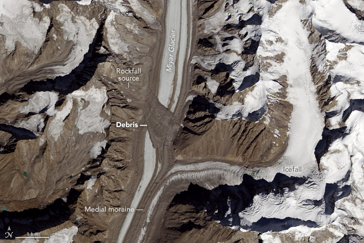
The Operational Land Imager (OLI) on Landsat 8 acquired this image on October 19, 2016. Summer warmth had melted off snow from the previous winter, leaving only the permanent snow and ice cover. Notice the debris field spread across the width of the glacier. The landslide that left it predates this image by some time; we know this because the debris has been carried downstream by the flow of the ice.
A little exploring with the Google Earth Engine timelapse tool shows Landsat 8’s high dynamic range — that is, its ability to discern both dim and bright features. In images prior to 2013, much of the glacier is featureless and white because it was too bright for the older Thematic Mapper (Landsat 5) and Enhanced Thematic Mapper Plus (Landsat 7) instruments to make out details. Images from 2013 onwards, which use the newer OLI data, show more detail. Still, it is fairly clear that there was no landslide feature as recently as 2007, and the slide definitely had taken place by 2010. Indian researchers used other satellite resources to pin the landslide date down to some time in 2009.
The Miyar Glacier has a relatively smooth surface in this image, with long linear streaks through the center of the glacier. These are medial moraines, features that form when two or more glaciers merge. The confluence of the tributary and the glacier shows how new material gets carried in to create medial moraines.
The tributary merging from the east (in the image above) shows choppy features from the confluence all the way upstream. This very rough surface is an icefall, a feature somewhat akin to rapids or a waterfall in a river. The glacier at the bend is roughly 700 meters (2,100 feet) higher than at the Miyar confluence (approximately 5,200 meters and 4,500 meters above sea level respectively). The ice is flowing over a rough and steep rock surface, causing matching rippling in the ice surface.
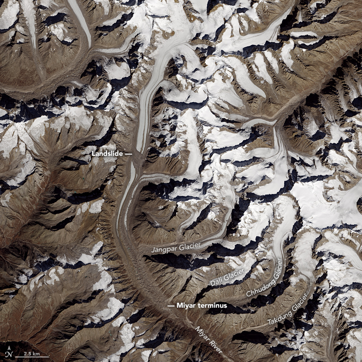
The wider image shows the terminus of the Miyar Glacier as well as a number of other tributary glaciers. The names shown here are based on the American Alpine Journal (2009), which notes that many of these glaciers have different names in trekking journals and maps.
One of the wonderful things about working for the Earth Observatory is that we often get first crack at examining imagery from satellites new and old. It’s been especially exciting to look at data from Landsat 8, a joint U.S. Geological Survey and NASA mission launched in February 2013.
But with new things comes new challenges. We’ve had some odd problems with the very intense memory demands of Landsat 8 imagery, for example. And when I saw the image below, I thought for sure I had stumbled on a processing error.
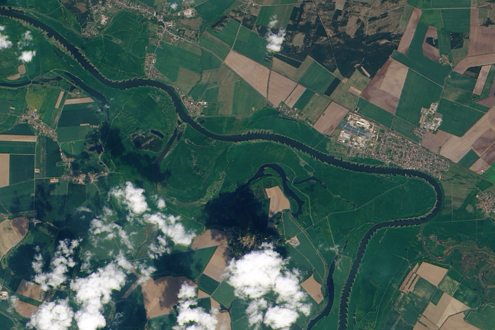
This is a natural-color, pan-sharpened image of the Elbe River near Wittenberg, Germany, obtained by Landsat 8 on May 6, 2013. I had obtained this to compare to a new acquisition from June 7, 2013, which showed major flooding in the Elbe.
Oh dear. Look at that ripple pattern along the river banks. Superficially, it looks a lot like a software processing error. New code I wrote: my error, right? In fact, at first glance, it looked a lot like Landsat data of a decade or so ago when the source files were being distributed with nearest-neighbor resampling–a technique used in remapping and resizing data which limits interactions between adjacent measures, something often useful in science measurements, but which causes jagged-looking edges. Since this was not the first time my code had done something unexpected, it was the obvious first place to look for the cause. The software failed me! Again!
However, a quick glance through the data files showed that, whatever was going on, it was coming from the source data: the same rippling showed up in all the bands. Ha! Someone else’s software had failed!
Because Landsat 8 is so new, it is easy to assume maybe I was not the only one having occasional processing problems with old software on new data. There was one more check I should have done before contacting customer service at USGS, but…
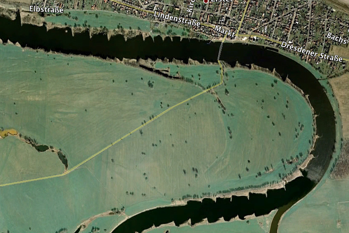
…I didn’t think of it. If you see something odd in imagery, it is always good to check reality. In this case, a quick zoomed-in view in Google Earth (as shown here) would have informed me that the jagged edges along the banks of the river in the imagery are real jagged edges along the banks of the river.
In hindsight, there were other clues. Notice that the jagged features are present in some places and not others. And notice that the rippled pattern along the banks bends and curves with the flow of the river. A processing artifact might only show up on very strongly contrasting features (the boundary between land and water here, for example), but would most likely be aligned consistently through the image. It wouldn’t appear and disappear like it does here, and it would probably be more regular. It would probably distort in the same direction every time it happened.
In the end, it turns out that all the new systems were working just fine and there really is a very oddly shaped series of features along the banks of the Elbe River near Wittenberg, presumably to stablize the banks of the river and control sediment flow.
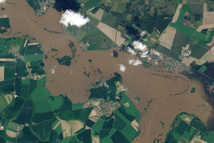
But there’s not much they can do in the face of severe flooding.
