harmony: 1. A pleasing arrangement of parts. 2. An interweaving of different accounts into a single narrative. (Merriam-Webster Online Dictionary)
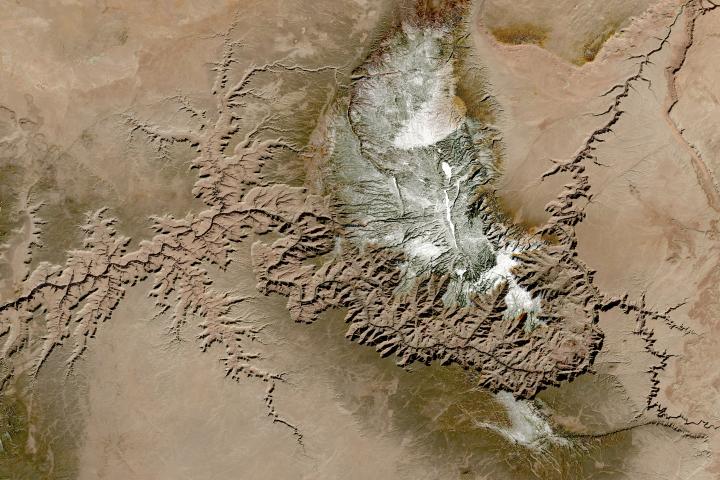
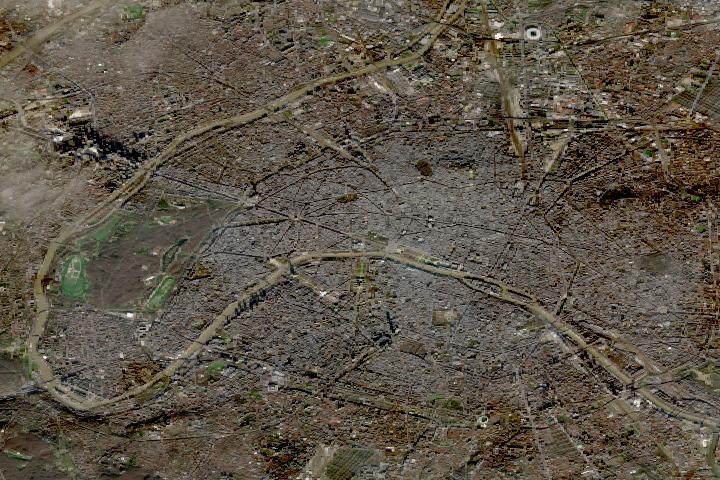
The Operational Land Imager (OLI) aboard the Landsat 8 satellite and the Multi-Spectral Instrument (MSI) aboard the Sentinel-2A and Sentinel-2B satellites tell two slightly different stories of Earth. OLI fully images the planet’s land surfaces every sixteen days at 30-meter resolution. MSI images Earth with repeat coverage every five days at 10- to 20-meter resolution.
But what if you could combine, or harmonize, these two data stories into a single narrative? With the provisional release of the Harmonized Landsat Sentinel-2 (HLS) dataset, NASA, the U.S. Geological Survey, and the European Space Agency have done just that. By combining OLI and MSI data—processing it to be used together as if it all came from a single instrument on one satellite—scientists have created global land surface products at 30-meter spatial resolution that are refreshed every two to three days.
“Our definition of ‘harmonized’ is that observations should be interchangeable for common [spectral] bands,” says Jeff Masek, the HLS principal investigator and Landsat 9 project scientist. “By harmonizing the datasets and making the corrections so that it appears to the user that the data are coming from a single platform, it makes it easier for a user to put these two datasets together and get that high temporal frequency they need for land monitoring.”
Two provisional surface reflectance HLS products are available through NASA’s Earthdata Search and NASA’s Land Processes Distributed Active Archive Center (LP DAAC): the Landsat 30-meter (L30) product (doi:10.5067/HLS/HLSL30.015) and the Sentinel 30-meter (S30) product (doi:10.5067/HLS/HLSS30.015). HLS imagery also is available through NASA’s Global Imagery Browse Services (GIBS) for interactive exploration using the NASA Worldview data visualization application.
The HLS image-processing algorithm was initially developed by a team at NASA’s Goddard Space Flight Center starting in 2013, with test versions released in 2015, 2016, and 2017. Even though HLS was still in the prototype stage and covered just 28 percent of Earth’s land surface, the team saw immediate and clear value for the scientific community. The project was scaled up from 28 percent to nearly 100 percent of Earth’s land surface (minus Antarctica) in 2019 by NASA’s Interagency Implementation and Advanced Concepts Team (IMPACT) at NASA’s Marshall Space Flight Center.
The HLS dataset is optimized for use in the Amazon Web Services commercial cloud environment; hosting it in the cloud has significant benefits for data users. “We’re really trying to take data analysis to the next level where we’re able to provide this large-scale processing without large-scale computing requirements,” says Brian Freitag, the HLS project manager at IMPACT. “For example, if you want to look at all the HLS data for a particular plot of land at the 30-meter resolution provided by HLS, you can do this using your laptop. Everything is in cloud-optimized GeoTIFF format.”
The harmonious combination of the OLI and MSI stories is opening new avenues of terrestrial research. A principal HLS application area will be agriculture, including studies of vegetation health; crop development, management, and identification; and drought impacts. HLS data also are being used in a new vegetation seasonal cycle dataset available through LP DAAC.
Global, 30-meter coverage every two to three days? The ability to access and work with years of Landsat and Sentinel imagery in the commercial cloud? That’s a harmonious arrangement the scientific community is eager to explore.
NASA, the European Space Agency (ESA), and the Japan Aerospace Exploration Agency (JAXA) have joined forces to create the COVID-19 Earth Observation Dashboard. The web platform combines the collective scientific power of the agencies’ Earth-observing satellites to document changes in the environment and society in response to the pandemic.
The dashboard is a user-friendly tool to track changes in air and water quality, climate change, economic activity, and agriculture.
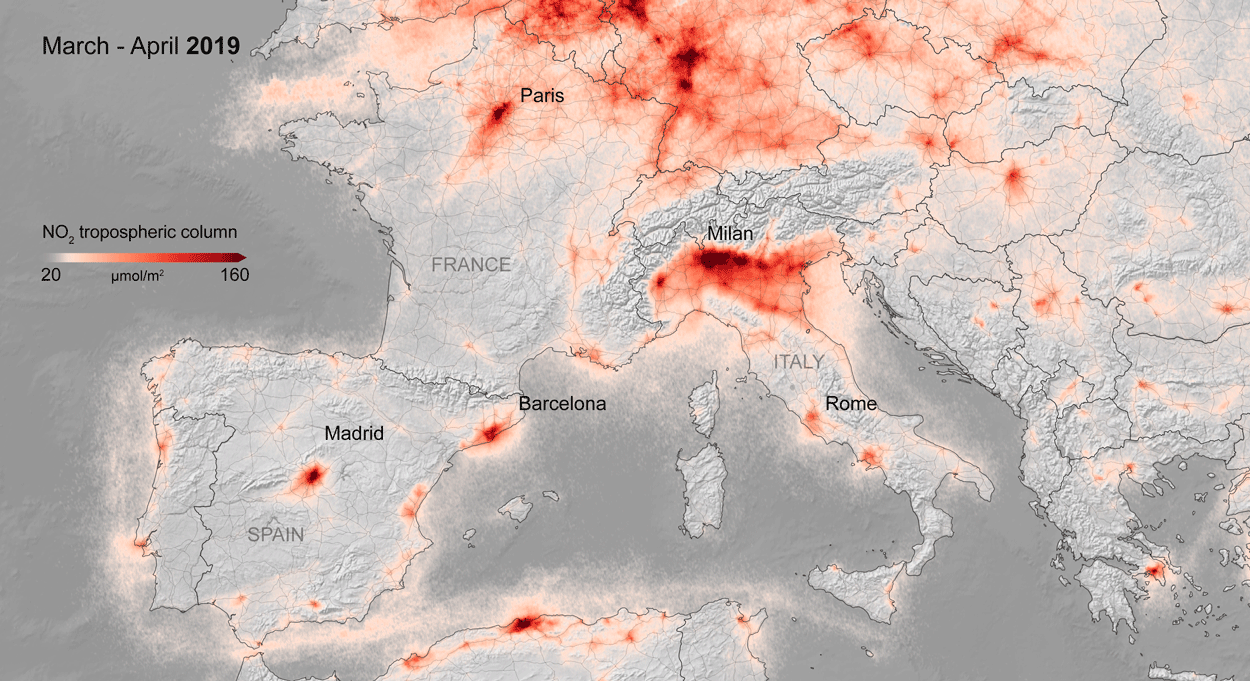
Air quality changes were among the first noticeable impacts of pandemic-related stay-at-home orders, and the resulting reductions in industrial activity, that could be tracked through satellite observations. Reductions in nitrogen dioxide (NO2) levels — primarily related to temporary reductions in the burning of fossil fuels — show up clearly in satellite data.
A preliminary analysis also indicates that planting (farming) activity dropped during the quarantines and lockdowns. For example, the cultivated area of white asparagus in Brandenburg, Germany, has been 20 to 30 percent lower this year, compared to 2019. More information on agricultural productivity changes will be added to the dashboard in the months to come.
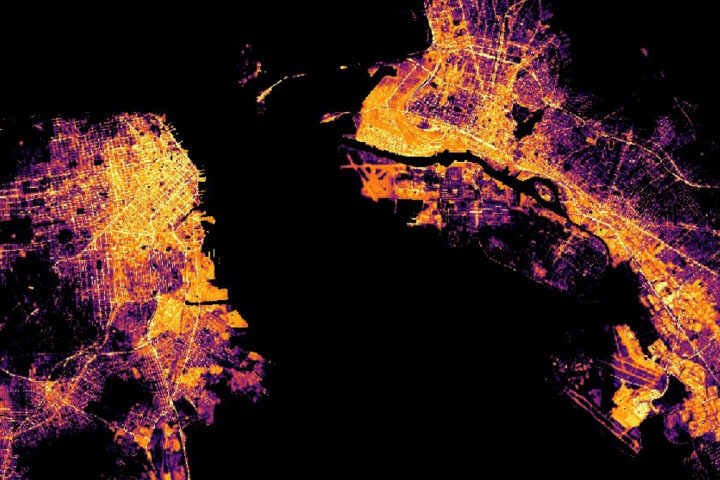
Recent water quality changes have been reported in a few locations that typically have intense industry and tourism — activities that have decreased during the pandemic. Data on ship identification, construction activity, and nighttime lights (above) are featured on the dashboard to keep track of some of the economic ramifications of the virus.
Together, ESA, JAXA, and NASA will continue to add new observations to the dashboard in the coming months to see how these indicators change. Learn more in the NASA press release, the video below, or by exploring the dashboard.
