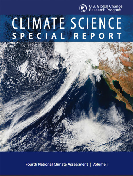
 NASA Earth Observatory readers may recognize this image of a long trail of clouds — an atmospheric river — reaching across the Pacific Ocean toward California. It appeared first as an Image of the Day about how these moisture superhighways fueled a series of drought-busting rain and snow storms.
More recently, we were pleased to see that image on the cover of the Fourth National Climate Assessment — a major report issued by the U.S. Global Research Program. That image was one of many from Earth Observatory that appeared in the report. Since the authors did not give much background about the images, here is a quick rundown of how they were created and how they fit with some of the key points on our changing climate.
Hurricanes in the Atlantic
Found in Chapter 1: Our Globally Changing Climate
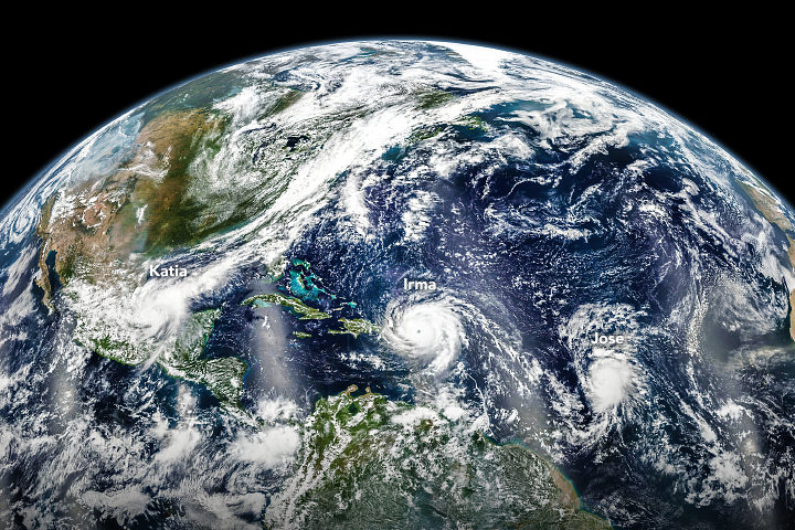
What the image shows:
Three hurricanes — Katia, Irma, and Jose — marching across the Atlantic Ocean on September 6, 2017.
What the report says about tropical cyclones and climate change:
The frequency of the most intense hurricanes is projected to increase in the Atlantic and the eastern North Pacific. Sea level rise will increase the frequency and extent of extreme flooding associated with coastal storms, such as hurricanes.
How the image was made:
The Visible Infrared Imaging Radiometer Suite (VIIRS) on the Suomi NPP satellite collected the data. Earth Observatory staff combined several scenes, taken at different times, to create this composite. Original source of the image: Three Hurricanes in the Atlantic
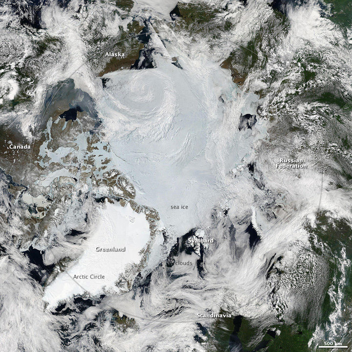
The North Pole
Found in Chapter 2: Physical Drivers of Climate Change
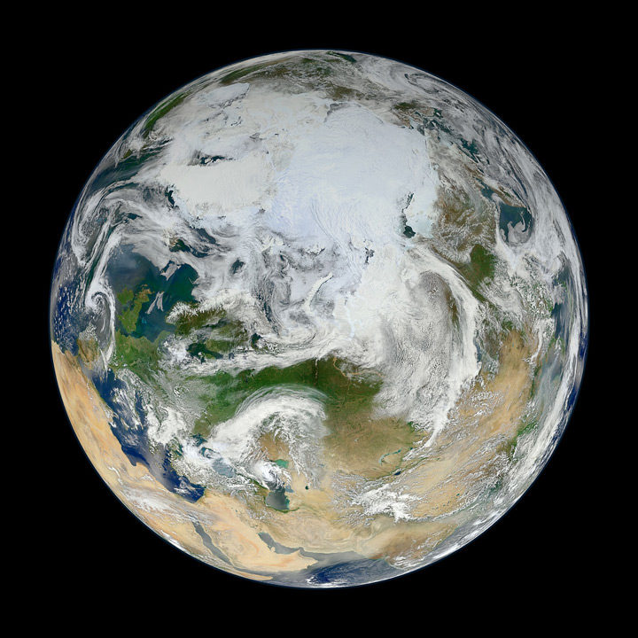
What the image shows:
Clouds swirl over sea ice, glaciers, and green vegetation in the Northern Hemisphere, as seen on a spring day from an angle of 70 degrees North, 60 degrees East.
What the report says about climate change and the Arctic:
Over the past 50 years, near-surface air temperatures across Alaska and the Arctic have increased at a rate more than twice as fast as the global average. It is very likely that human activities have contributed to observed Arctic warming, sea ice loss, glacier mass loss, and a decline in snow extent in the Northern Hemisphere.
How it was made:
Ocean scientist Norman Kuring of NASA’s Goddard Space Flight Center pieced together this composite based on 15 satellite passes made by VIIRS/Suomi NPP on May 26, 2012. The spacecraft circles the Earth from pole to pole, so it took multiple passes to gather enough data to show an entire hemisphere without gaps. Original source of the image: The View from the Top
Columbia Glacier
Found in Chapter 3: Detection and Attribution of Climate Change
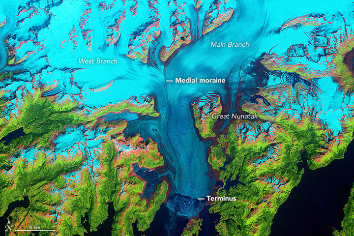
What the image shows:
Columbia Glacier in Alaska, one of the most rapidly changing glaciers in the world.
What the report says about Alaskan glaciers and climate change:
The collective ice mass of all Arctic glaciers has decreased every year since 1984, with significant losses in Alaska.
How the image was made:
NASA Earth Observatory visualizers made this false-color image based on data collected in 1986 by the Thematic Mapper on Landsat 5. The image combines shortwave-infrared, near-infrared, and green portions of the electromagnetic spectrum. With this combination, snow and ice appears bright cyan, vegetation is green, clouds are white or light orange, and open water is dark blue. Exposed bedrock is brown, while rocky debris on the glacier’s surface is gray. Original source of the image: World of Change: Columbia Glacier
Cloud Streets
Found in: Intro to Chapter 4: Climate Models, Scenarios, and Projections
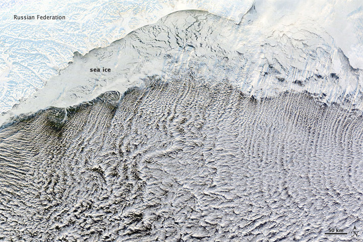
What the image shows:
Sea ice hugging the Russian coastline and cloud streets streaming over the Bering Sea.
What the report says about clouds and climate change:
Climate feedbacks are the largest source of uncertainty in quantifying climate sensitivity — that is, how much global temperatures will change in response to the addition of more greenhouse gases to the atmosphere.
How it was made:
The Moderate Resolution Imaging Spectroradiometer (MODIS) on NASA’s Terra satellite captured this natural-color image on January 4, 2012. The LANCE/EOSDIS MODIS Rapid Response Team generated the image, and NASA Earth Observatory staff cropped and labeled it. Original source of the image: Cloud streets over the Bering Sea
Extratropical Cyclones
Found in Intro to Chapter 5: Large-scale circulation and climate variability
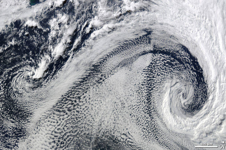
What it shows:
Two extratropical cyclones, the cause of most winter storms, churned near each other off the coast of South Africa in 2009.
What the report says about extratropical storms and climate change:
There is uncertainty about future changes in winter extratropical cyclones. Activity is projected to change in complex ways, with increases in some regions and seasons and decreases in others. There has been a trend toward earlier snowmelt and a decrease in snowstorm frequency on the southern margins of snowy areas. Winter storm tracks have shifted northward since 1950 over the Northern Hemisphere.
How the image was made:
The Moderate Resolution Imaging Spectroradiometer (MODIS) on NASA’s Terra satellite captured this natural-color image. The LANCE/EOSDIS MODIS Rapid Response Team generated the image and NASA Earth Observatory staff cropped and labeled it. Original source of the image: Cyclonic Clouds over the South Atlantic Ocean
Sea of Sand
Found in: Chapter 6: Temperature Changes in the United States
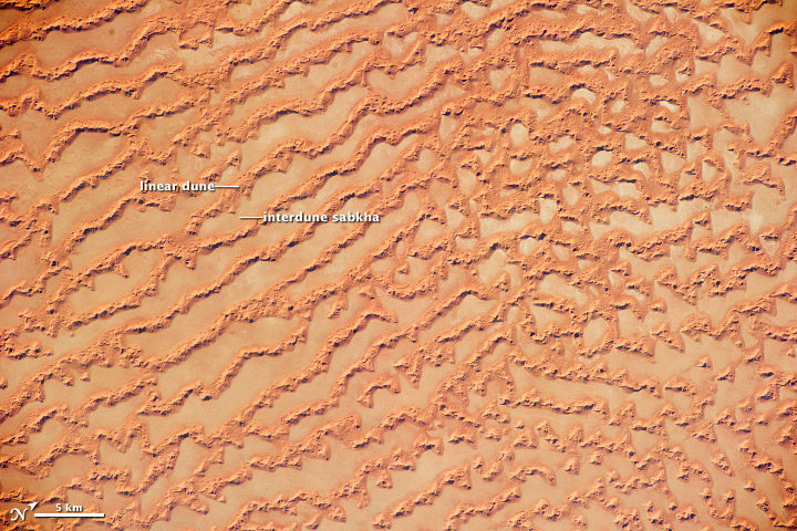
What the image shows: Large, linear sand dunes alternating with interdune salt flats in the Rub’ al Khali in the Sultanate of Oman.
What the report says about drought, dust storms, and climate change:
The human effect on droughts is complicated. There is little evidence for a human influence on precipitation deficits, but a lot of evidence for a human fingerprint on surface soil moisture deficits — starting with increased evapotranspiration caused by higher temperatures. Decreases in surface soil moisture over most of the United States are likely as the climate warms. Assuming no change to current water resources management, chronic hydrological drought is increasingly possible by the end of the 21st century. Changes in drought frequency or intensity will also play an important role in the strength and frequency of dust storms.
How it was made: An astronaut on the International Space Station took the photograph with a Nikon D3S digital camera using a 200 millimeter lens on May 16, 2011. Original source of the image: Ar Rub’ al Khali Sand Sea, Arabian Peninsula
Flooding on the Missouri River
Found in Chapter 7: Precipitation Change in the United States
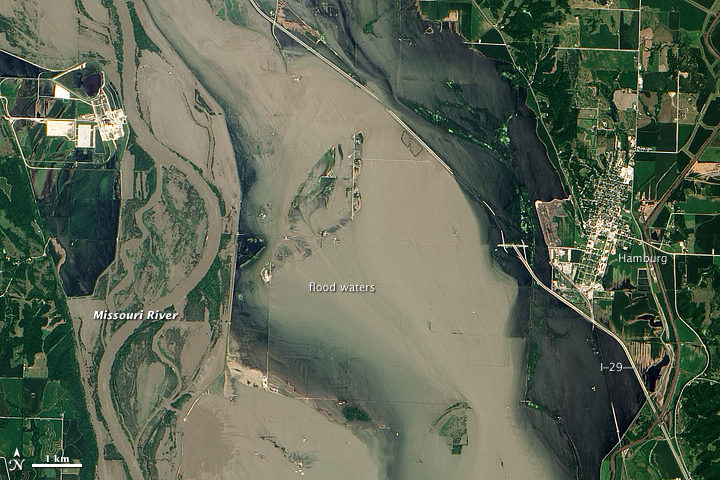
What the image shows:
Sediment-rich flood water lingering on the Missouri River in July 2011.
What the report says about precipitation, floods, and climate change:
Detectable changes in flood frequency have occurred in parts of the United States, with a mix of increases and decreases in different regions. Extreme precipitation, one of the controlling factors in flood statistics, is observed to have generally increased and is projected to continue to do. However, scientists have not yet established a significant connection between increased river flooding and human-induced climate change.
How the image was made:
The Advanced Land Imager (ALI) on NASA’s Earth Observing-1 (EO-1) satellite captured the data for this natural-color image. NASA Earth Observatory staff processed, cropped, and labeled the image. Original source of the image: Flooding near Hamburg, Iowa
Smoke and Fire
Found in Chapter 8: Droughts, Floods, and Wildfires
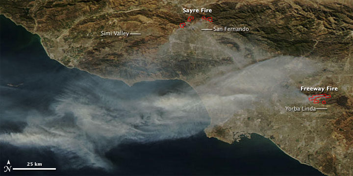
What the image shows:
Smoke streaming from the Freeway fire in the Los Angeles metro area on November 16, 2008.
What the report says about wildfires and climate change:
The incidence of large forest fires in the western United States and Alaska has increased since the early 1980s and is projected to further increase as the climate warms, with profound changes to certain ecosystems. However, other factors related to climate change — such as water scarcity or insect infestations — may act to stifle future forest fire activity by reducing growth or otherwise killing trees.
How it was made: The MODIS Rapid Response Team made this image based on data collected by NASA’s Aqua satellite. Original source of the image: Fires in California
The Colorado River and Grand Canyon
Found in Chapter 10: Changes in Land Cover and Terrestrial Biogeochemistry
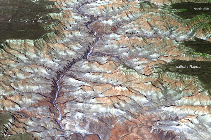
What the image shows:
The Grand Canyon in northern Arizona.
What the report says about climate change and the Colorado River:
The southwestern United States is projected to experience significant decreases in surface water availability, leading to runoff decreases in California, Nevada, Texas, and the Colorado River headwaters, even in the near term. Several studies focused on the Colorado River basin showed that annual runoff reductions in a warmer western U.S. climate occur through a combination of evapotranspiration increases and precipitation decreases, with the overall reduction in river flow exacerbated by human demands on the water supply.
How the image was made:
On July 14, 2011, the ASTER sensor on NASA’s Terra spacecraft collected the data used in this 3D image. NASA Earth Observatory staff made the image by draping an ASTER image over a digital elevation model produced from ASTER stereo data. Original source of the image: Grand New View of the Grand Canyon
Arctic Sea Ice
Found in Chapter 11: Arctic Changes and their Effects on Alaska and the Rest of the United States
What the image shows: A clear view of the Arctic in June 2010. Clouds swirl over sea ice, snow, and forests in the far north.
What the report says about sea ice and climate change: Since the early 1980s, annual average Arctic sea ice has decreased in extent between 3.5 percent and 4.1 percent per decade, become 4.3 to 7.5 feet (1.3 and 2.3 meters) thinner. The ice melts for at least 15 more days each year. Arctic-wide ice loss is expected to continue through the 21st century, very likely resulting in nearly sea ice-free late summers by the 2040s.
How it was made: Earth Observatory staff used data from several MODIS passes from NASA’s Aqua satellite to make this mosaic. All of the data were collected on June 28, 2010. Original source of the image: Sunny Skies Over the Arctic
Crack in the Larsen C Ice Shelf
Found in Chapter 12: Sea Level Rise
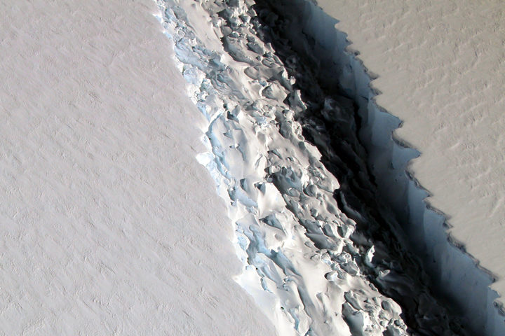
What the image shows:
This photograph shows a rift in the Larsen C Ice Shelf as observed from NASA’s DC-8 research aircraft. An iceberg the size of Delaware broke off from the ice shelf in 2017.
What the report says about ice shelves in Antarctica and climate change?
Floating ice shelves around Antarctica are losing mass at an accelerating rate. Mass loss from floating ice shelves does not directly affect global mean sea level — because that ice is already in the water — but it does lead to the faster flow of land ice into the ocean.
How it was made:
NASA scientist John Sonntag took the photo on November 10, 2016, during an Operation IceBridge flight. Original source of the image: Crack on Larsen C
The Gulf of Mexico
Found in Chapter 13: Ocean Acidification and Other Changes
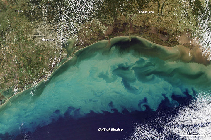
What the image shows:
Suspended sediment in shallow coastal waters in the Gulf of Mexico near Louisiana.
What the report says about the Gulf of Mexico:
The western Gulf of Mexico and parts of the U.S. Atlantic Coast (south of New York) are currently experiencing significant sea level rise caused by the withdrawal of groundwater and fossil fuels. Continuation of these practices will further amplify sea level rise.
How the image was made:
The MODIS instrument on NASA’s Aqua satellite captured this natural-color image on November 10, 2009. Original source of the image: Sediment in the Gulf of Mexico
Farmland in Virginia
Found in Appendix D
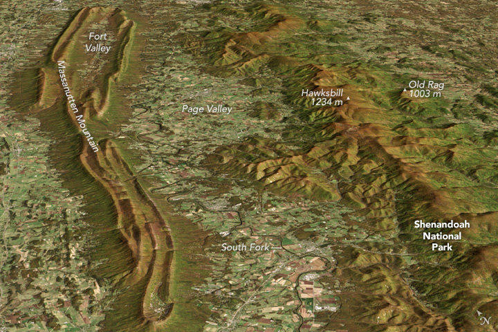
What the image shows:
A fall scene showing farmland in the Page Valley of Virginia, between Shenandoah National Park and Massanutten Mountain.
What the report says about farming and climate change:
Since 1901, the consecutive number of frost-free days and the length of the growing season have increased for the seven contiguous U.S. regions used in this assessment. However, there is important variability at smaller scales, with some locations actually showing decreases of a few days to as much as one to two weeks. However, plant productivity has not increased, and future consequences of the longer growing season are uncertain.
How the image was made: On October 21, 2013, the Operational Land Imager (OLI) on Landsat 8 captured a natural-color image of these neighboring ridges. The Landsat image has been draped over a digital elevation model based on data from the ASTER sensor on the Terra satellite. Original source of the image: Contrasting Ridges in Virginia
Atmospheric River
Found on the Cover and Executive Summary
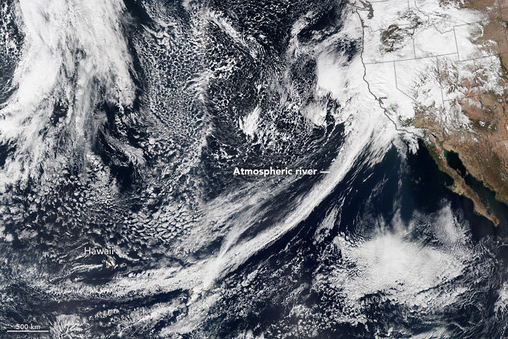
What the image shows: A tight arc of clouds stretching from Hawaii to California, which is a visible manifestation of an atmospheric river of moisture flowing into western states.
What the report says about atmospheric rivers and climate change:
The frequency and severity of land-falling atmospheric rivers on the U.S. West Coast will increase as a result of increasing evaporation and the higher atmospheric water vapor content that occurs with increasing temperature. Atmospheric rivers are narrow streams of moisture that account for 30 to 40 percent of the typical snow pack and annual precipitation along the Pacific Coast and are associated with severe flooding events.
How it was made: On February 20, 2017, the VIIRS on Suomi NPP captured this natural-color image of conditions over the northeastern Pacific. NASA Earth Observatory data visualizers stitched together two scenes to make the image. Original source of the image: River in the Sky Keeps Flowing Over the West

NASA Earth Observatory images by Joshua Stevens, using VIIRS data from the Suomi National Polar-orbiting Partnership and the Fire Information for Resource Management System (FIRMS). The map shows fires detected on November 2, 2016.
When I was writing about the crop fires in northern India last fall, it was obvious that 2016 was a pretty severe burning season. For several weeks, large plumes of smoke from Punjab and Haryana blotted out towns and cities along the Indo-Gangetic plain in satellite images.
But I didn’t realize just how severe the fires were until Hiren Jethva, an atmospheric scientist at NASA Goddard Space Flight Center, crunched the numbers. By analyzing satellite records of fire activity, he found that the 2016 fires were the most severe the region has seen since 2002 in regards to the number of fire hot spots satellites detected. In regards to the amount of smoke detected, the 2016 burning was the most severe observed since 2004. He used data from the Moderate Resolution Imaging Spectroradiometer (MODIS) sensor on Aqua and the Ozone Monitoring Instrument (OMI) on Aura to reach his conclusions.
Smoke and fire in northern India have become common in October and November during the last three decades because farmers increasingly use combines to harvest rice and wheat. Since these machines leave stems and other plant residue behind, farmers have started to use fire to clear the leftover debris away in preparation for the next planting.
For more details about how 2016 compared to past years, see the charts below, which Jethva prepared. His explanation for each chart is in italics.
Aqua Detected More Fires in 2016 Than During Any Year Since 2002

Chart by Hiren Jethva based on MODIS data.
The satellite-based sensor MODIS can detect the signal of fire hot spots, also called thermal anomalies, because the signal measured by the sensor in space in the thermal infrared bands appears to be an anomaly compared to the signal emanated from the background land. Since its launch in 2002, the MODIS on NASA’s Aqua satellite has detected thermal anomalies such as wildfires, agricultural fires, and gas flares on a daily basis.
The yearly evolution of total number of fires and Fire Radiative Power (FRP) — the heat energy produced from these fires — detected over Punjab and Haryana showed 2016 to be an anomalous year, with the highest number of crop residue fires (18,707) and the highest FRP in relation to the fires in all other years over the region. In comparison to 2015, the total number of fire hot spots detected over the region in 2016 was 43 percent higher; the difference is 25 percent if the hot spot counts are averaged over the last five years, i.e., 2011-2015. A careful look at the time-evolution of fire counts also reveals an increasing trend in the total number of fires over the region.
Punjab Skies Were Unusually Smoky

Chart by Hiren Jethva based on OMI data.
These fires produced huge amounts of fine aerosol particles and trace gases, which can potentially impact the climate and degrade air quality drastically at ground level. NASA’s A-train sensors such as the Ozone Monitoring Instrument (OMI) on the Aura satellite and the MODIS on Aqua offer capabilities to measure the total amounts of airborne particles. The UV Aerosol Index (UV-AI), which is an excellent indicator of the column amounts of light-absorbing particles in clear as well as cloudy atmospheres, showed 2016 was the smokiest season on record since 2004.
Greener Fields and Larger Harvests Lead to More Fires

Many studies have shown that satellite measurements of the “greenness” of crop fields prior to harvest and crop yield after the harvest are strongly correlated. The normalized difference vegetation index (NDVI), which is derived from satellite measurements of radiation at the red and near-infrared light, is one useful measure of greenness. As seen in the charts above, there seems to be a one-to-one relationship in NDVI measured by the MODIS sensor on Aqua prior to harvest (September) and the total number of fire hot spots observed during harvest season (Oct-Nov). This suggest that the increase in the number of fires is likely related to increasing crop yields.
