In recognition of World Oceans Day (June 8) and this week’s UN Oceans Conference, here are some recent highlights from ocean science…
1.4 Million Pixels of Salt
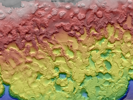
The Gulf of Mexico, like any sea, is rich in dissolved salts. Unlike most seas, the Gulf also sits atop a big mound of salt. Left behind by an ancient ocean, salt deposits lie beneath the Gulf seafloor and get pressed and squeezed and bulged by the heavy sediments laying on top of them. The result is pock-marked, almost lunar-looking seafloor. The many mounds and depressions came into clearer relief this spring with the release of a new seafloor bathymetry map compiled from oil and gas industry surveys and assembled by the U.S. Bureau of Ocean Energy Management.
3D Water Babies
NASA’s Scientific Visualization Studio took a look back at conditions in the Pacific Ocean in 2015-16, which included the arrival and departure of both El Nino and La Nina. The 3D visualizations were derived from NASA’s Modern-Era Retrospective Analysis for Research and Applications (MERRA) dataset, a global climate modeling effort that is built from remote sensing data.
In other Nino news, a research team led by NASA Langley scientists found that the strong 2015-2016 El Niño lofted abnormal amounts of cloud ice and water vapor unusually high into the atmosphere, creating conditions similar to what could happen on a larger scale in a warming world.
Not the Kind of Brightening You Want to See
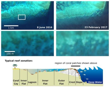
For past few years, warm ocean temperatures in the western Pacific Ocean have wrecked havoc on the Great Barrier Reef. Extreme water temperatures can disrupt the symbiotic partnership between corals and the algae that live inside their tissues. This leads the colorful algae to wash out of the coral, leaving them bright white in what scientists refer to as “bleaching” events. The health of coral reefs is usually monitored by airborne and diver-based surveys, but the European Space Agency recently reported that scientists have been able to use Sentinel 2 data to identify a bleaching event on the Great Barrier Reef. Such satellite monitoring could prove especially useful for monitoring reefs that are more remote and not as well studied as those around Australia.
Eyeing the Fuel for Hurricane Season
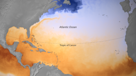
On June 1, the beginning of Atlantic Hurricane Season, the National Oceanic and Atmospheric Administration released a map of sea surface temperatures in the Caribbean, the Gulf of Mexico, and the tropical North Atlantic Ocean. The darkest orange areas indicate water temperatures of 26.5°C (80°F) and higher — the temperatures required for the formation and growth of hurricanes. Forecasters are expecting a hurricane season that is a bit more active than average.
(Finger)Prints of Tides
In a new comprehensive analysis published in Geophysical Research Letters, a French-led research team found that global mean sea level is rising 25 percent faster now than it did during the late 20th century. The increase is mostly due to increased melting of the Greenland Ice Sheet. A big part of the study was a reanalysis and recalibration of data acquired by satellites over the past 25 years, which are now better correlated to surface-based measurements. The study found that mean sea level has been increasing by 3 millimeters (0.1 inches) per year. The American Geophysical Union published a popular summary of the study.
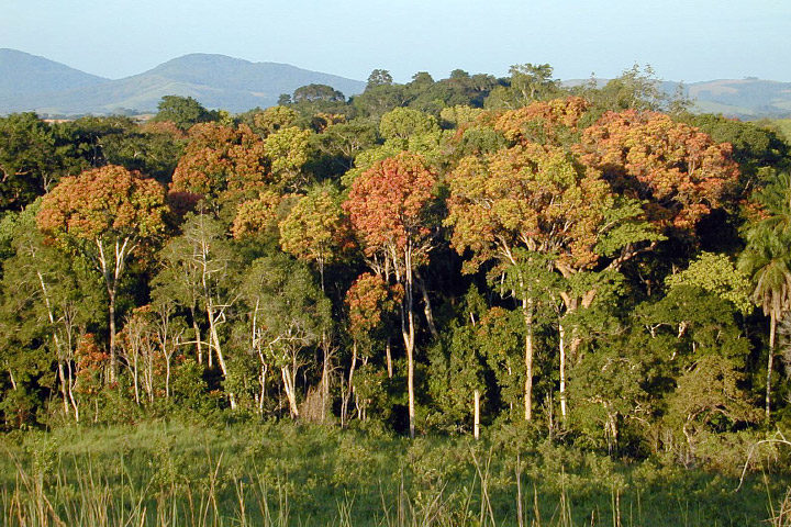
Tropical forests, such as those in Gabon, Africa, are an important reservoir of carbon. (Photography courtesy of Sassan Saatchi, NASA/JPL-Caltech.)
Old-growth forests are vital because they capture large amounts of carbon and provide homes to hundreds of species. In the Eastern United States, trees in these minimally disturbed ecosystems tend to be more than 120 years old.
Can satellites help pinpoint this “old-growth” and quantify its value? That was the question Joan Maloof posed to a group of researchers during a talk at NASA Goddard Space Flight Center in May 2017. As head of the Old-Growth Forest Network and a professor at Salisbury University, Maloof aims to identify stands of old-growth forests for conservation. A large part of her job involves explaining why these areas are important—something satellite data can help show.
As it turns out, satellites have already told us much about trees. A 2012 story from NASA Earth Observatory described some of the remote sensing methods researchers use:
Scientists have used a variety of methods to survey the world’s forests and their biomass. […] With satellites, they have collected regional and global measurements of the “greenness” of the land surface and assessed the presence or absence of vegetation, while looking for signals to distinguish trees from shrubs from ground cover.
In January 2017, a paper in Science Advances tracked intact forest landscapes between 2000 and 2013. (Intact forest landscapes were defined as areas larger than 500 square kilometers with no signs of human activity in Landsat imagery). This new research underscores the importance of such landscapes. The study’s authors identified several key findings:
For more information on trees and satellites, check out the NASA Earth Observatory feature, “Seeing Forests for the Trees and the Carbon: Mapping the World’s Forests in Three Dimensions.”
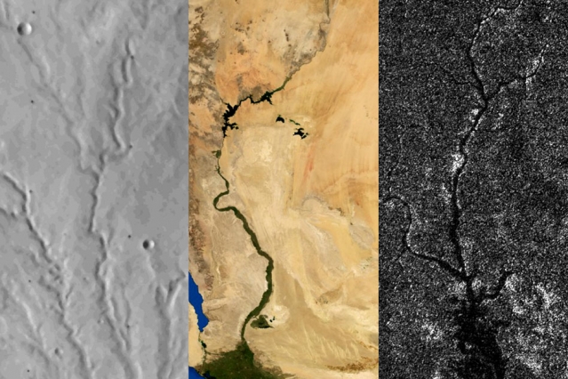
Rivers on three planetary bodies: the dry Parana Valles on Mars (left), the Nile River on Earth (middle), and Vid Flumina on Titan (right). Image by Benjamin Black using NASA data.
One of the more distinctive things about Earth among the planets is that we have plate tectonics. In other words, the hard, outer shell of the planet (called the lithosphere) is divided into several cool, rigid plates that float atop a hotter, more fluid layer of rock (the asthenosphere). These rigid surface plates do not float placidly: their grinding, colliding, shifting, and diving causes earthquakes, fuels volcanoes, builds mountains, tears open oceans, and constantly remodels and resurfaces the planet.
That is a far cry from what is happening on Mars and Titan, according to a recent study published in Science. Researchers came to that conclusion by carefully analyzing the way rivers cut through each of these planetary bodies. On Earth, countless rivers and streams snake their way across the surface. On Mars, rivers dried up long ago, but evidence of their presence remains etched into the arid surface. On Titan, Saturn’s largest moon, rivers of liquid ethane and methane still flow into lakes.
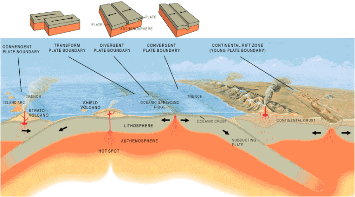
Artist’s cross section illustrating the main types of plate boundaries on Earth. (Cross section by José F. Vigil from This Dynamic Planet—a wall map produced jointly by the U.S. Geological Survey, the Smithsonian Institution, and the U.S. Naval Research Laboratory.)
By comparing imagery and data from all three planetary bodies, researchers noticed distinctive bends in the courses of rivers on Earth; these were formed as rivers were forced to wind around mountain ranges. These bends were absent in river networks on Mars and Titan. In an MIT press release, Benjamin Black, a geologist at the City College of New York, explained:
“Titan might have broad-scale highs and lows, which might have formed some time ago, and the rivers have been eroding into that topography ever since, as opposed to having new mountain ranges popping up all the time, with rivers constantly fighting against them.”
Read more about the study from New Scientist, Space.com, and the American Association for the Advancement of Science. Read the full study in Science. Read this NASA Earth Observatory story to learn more about how scientists are using satellites to study river width on Earth.
In the triptych at the top of the page, the image of Parana Valles on Mars was acquired by the Viking 1 orbiter on September 13, 1976. The image of the Nile was captured by NASA’s Terra satellite on August 10, 2000. NASA’s Cassini spacecraft captured the image of Vid Flumina on Titan on September 26, 2012.
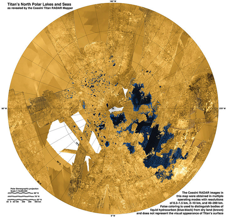
While water does not flow on Titan, rivers of methane and ethane flow into lakes near the moon’s northern pole. Learn more about this image from the NASA Jet Propulsion Laboratory Photojournal.
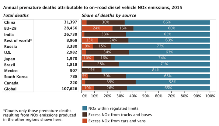
Figure by the ICCT based on data from Anenberg et al. 2017.
It is no secret that many diesel cars and trucks emit more pollution under real-world driving conditions than during laboratory certification testing. Many lab tests, for instance, are run with perfectly maintained vehicles on flat surfaces in ideal conditions. In the real world, drivers chug up hills or sit in traffic in bad weather in vehicles well past their prime.
Until this month, nobody had tallied the health effects of all the excess diesel air pollution entering the atmosphere through real-world driving conditions. According to a new study published in Nature, vehicles in eleven major markets (Australia, Brazil, Canada, China, Europe, India, Japan, Mexico, Russia, South Korea, and the United States) emitted about 4.6 million more tons of nitrogen oxides (NOx) in 2015 than official laboratory tests suggested they would. NOx contributes to the accumulation of both ground-level ozone (O3) and fine particulate matter (PM2.5) in the atmosphere.
According to the research team, nearly one-third of heavy-duty diesel vehicle emissions and over half of light-duty diesel vehicle emissions are above the certification limits. On average, light-duty diesel vehicles produce 2.3 times more NOx than the limit; heavy-duty diesel vehicles emit more than 1.45 times the limit.
The authors of the study calculated the health effects for current and future levels of this excess diesel NOx by running a global atmospheric chemistry model that simulates the distribution of PM2.5 and O3. The bottom line: excess NOx caused 38,000 premature deaths in 2015. It could cause as many as 183,600 premature deaths by 2040 as the use of diesel increases.
“We estimate that excess diesel NOx emissions from on-road trucks, buses, and cars leads to upwards of 1,100 premature deaths per year in the U.S.,” said Daven Henze, a professor of mechanical engineering at the University of Colorado and member of NASA’s Health and Air Quality Applied Sciences Team.
Other key findings from the study:
For more information, read a press release and fact sheet from the International Council on Clean Transportation, a press release from the University of Colorado, and a press release from the University of York. To find out more about global air pollution trends, read A Clearer View of Hazy Skies from NASA Earth Observatory.
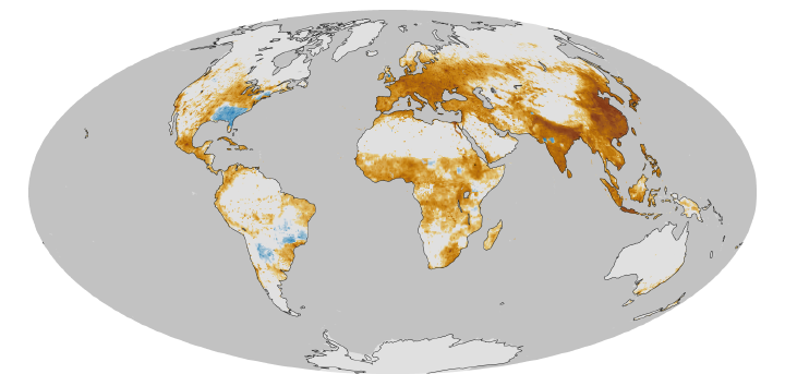
This map, based on previous research, shows a model estimate of the average number of deaths per 1,000 square kilometers (386 square miles) per year due to fine particulate matter (PM2.5), a type of outdoor air pollution. Pollution from diesel exhaust is one contributer to PM2.5. Earth Observatory image by Robert Simmon based on data provided by Jason West. Learn more about this map here.
Model simulation of the hydroxyl radical concentration in the atmosphere. Image by Angharad Stell, University of Bristol.
A mystery about global methane trends just got more muddled. Two studies published in April 2017 suggest that recent increases in atmospheric concentrations of methane may not be caused by increasing emissions. Instead, the culprit may be the reduced availability of highly reactive “detergent” molecules called hydroxyl radicals (OH) that break methane down.
Understanding how globally-averaged methane concentrations have fluctuated in the past few decades—and particularly why they have increased significantly since 2007—has proven puzzling to researchers. As we reported last year:
“If you focus on just the past five decades—when modern scientific tools have been available to detect atmospheric methane—there have been fluctuations in methane levels that are harder to explain. Since 2007, methane has been on the rise, and no one is quite sure why. Some scientists think tropical wetlands have gotten a bit wetter and are releasing more gas. Others point to the natural gas fracking boom in North America and its sometimes leaky infrastructure. Others wonder if changes in agriculture may be playing a role.”
The new studies suggest that such theories may be off the mark. Both of them find that OH levels may have decreased by 7 to 8 percent since the early 2000s. That is enough to make methane concentrations increase by simply leaving the gas to linger in the atmosphere longer than before.
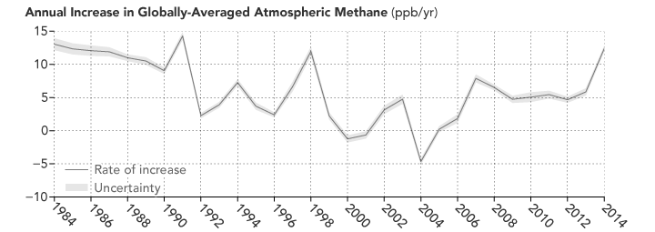
Atmospheric methane has continued to increase, though the rate of the increase has varied considerably over time and puzzled experts. (NASA Earth Observatory image by Joshua Stevens, using data from NOAA. Learn more about the image.)
As a press release from the Jet Propulsion Laboratory (JPL) noted: “Think of the atmosphere like a kitchen sink with the faucet running,” said Christian Frankenberg, an associate professor of environmental science and engineering at Caltech and a JPL researcher. “When the water level inside the sink rises, that can mean that you’ve opened up the faucet more. Or it can mean that the drain is blocking up. You have to look at both.”
Unfortunately, neither of the new studies is definitive. The authors of both papers caution that high degrees of uncertainty remain, and future work is required to reduce those uncertainties. “Basically these studies are opening a new can of worms, and there was no shortage of worms,” Stefan Schwietzke, a NOAA atmospheric scientist, told Science News.
You can find the full studies here and here. The University of Bristol has also published a press release.
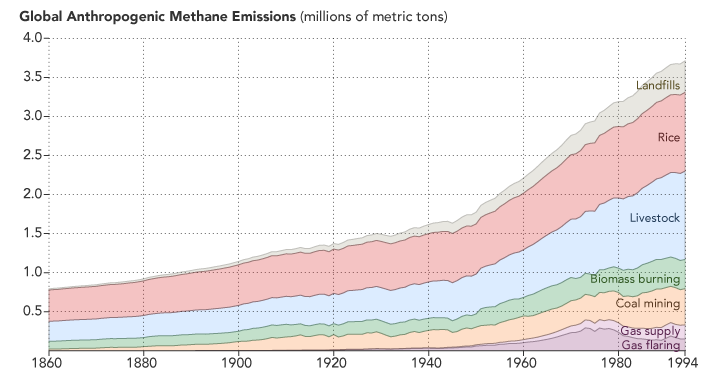
Methane emissions related to human activity are on the rise. (NASA Earth Observatory image by Joshua Stevens, using data from CDIAC. Learn more.)
NASA/EO-1/ALI/Jesse Allen and Robert Simmon. More info about this image here.
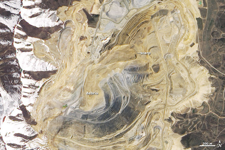
Four years ago today, one of the largest non-volcanic landslides in U.S. history began high on the northern wall of Utah’s Bingham Canyon mine. During two main bursts of activity that day, several million cubic meters of rock and soil careened deep into the mine’s pit.
This was a case where science and the right preparation saved lives. The company that runs the mine had installed an interferometric radar system months before the slide, and it prevented miners from being blindsided. With the radar system in place, mine operators detected changes in the stability of the pit’s walls well before the landslide occurred. When the slope finally gave way, all the workers in the pit had already been evacuated. Not one person was injured.
The image above was acquired by the Advanced Land Imager (ALI) on the Earth Observing-1 satellite on May 2, 2013. For more detailed and recent images of the mine pit, see the montage below. Photos A, B, and C — from Rio Tinto Kennecott — show an overview of the pit, the source area, and slide debris in the immediate aftermath of the event. D is an aerial image from the state government of Utah that shows the mine nine months before the landslide. E is part of the ALI satellite image above. F is a second aerial image taken in February 2014. By then, much of the debris had been removed and a new access road had been built.
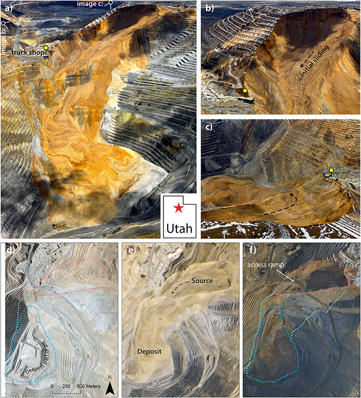
The montage was originally published in March 2017 by the Journal of Geophysical Research as part of a study authored by Jeffrey Moore of Lawrence Livermore National Laboratory. The University of Utah wrote about the research in a recent blog post:
On April 10, at 9:30 p.m. and again at 11:05 p.m., the slope gave way and thundered down into the pit, filling in part of what had been the largest man-made excavation in the world. Later analysis estimated that the landslide was at the time the largest non-volcanic slide in recorded North American history. Now, University of Utah geoscientists have revisited the slide with a combined analysis of aerial photos, computer modeling, and seismic data to pick apart the details. The total volume of rock that fell during the slide was 52 million cubic meters, they report, enough to cover Central Park with 50 feet of rock and dirt. The slide occurred in two main phases, but researchers used infrasound recordings and seismic data to discover 11 additional landslides that occurred between the two main events. Modeling and further seismic analysis revealed the average speeds at which the hillsides fell: 81 miles per hour for the first main slide and 92 mph for the second, with peak speeds well over 150 mph.
The interferometric radar system is not the only safety technology in place at Bingham Canyon. Drones, GPS, and trained experts keep a vigilant eye out for signs of landslides at this mine. Technology and tactics like this mean landslides cause very few injuries and deaths in the United States even though significant landslide potential exists in many parts of the country. As we recently reported, many other parts of the world (notably Africa and South America) are not nearly so fortunate.
Decades or even centuries from now, when enough time has passed for historians to write definitive accounts of global warming and climate change, two names are likely to make it into history books: Syukuro Manabe and Richard Wetherald.
In the late-1960s, these two scientists from the Geophysical Fluid Dynamics Laboratory developed one of the very first climate models. In 1967, they published results showing that global temperatures would increase by 2.0 degrees Celsius (3.6 degrees Fahrenheit) if the carbon dioxide content of the atmosphere doubled.
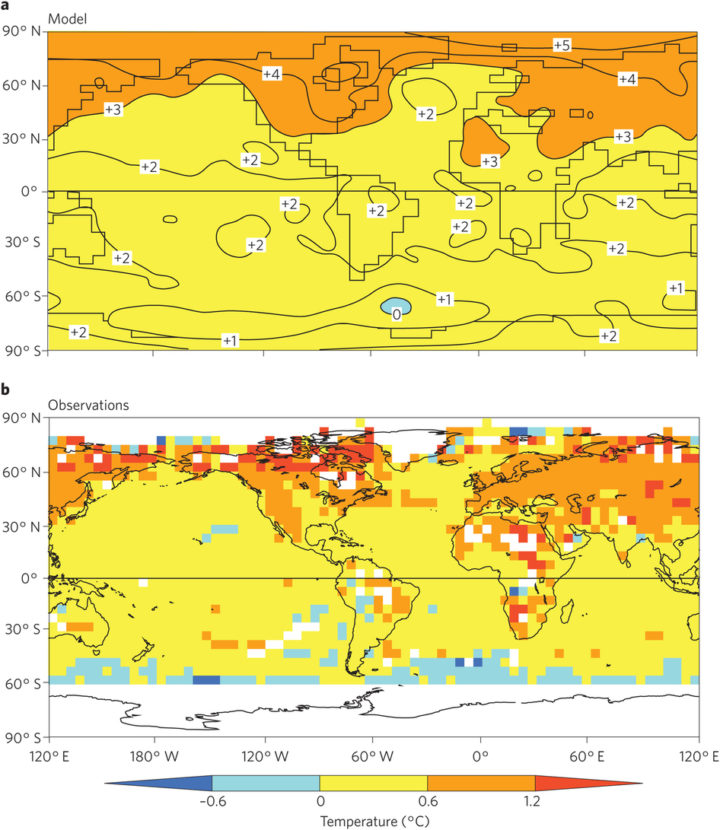
The top map shows temperature changes in one of Manabe’s coupled atmosphere–ocean models. It depicts what would happen by the 70th year of a global warming experiment when atmospheric concentrations of carbon dioxide are doubled. The model’s predictions match closely with levels of warming observed in the real world. The lower image shows observed change from a 30-year base period around 1961–1990 and 1991–2015. The map was obtained using the historical surface temperature dataset HadCRUT4. Figure published in Stouffer & Manabe, 2017.
As Ethan Siegel pointed out in Forbes, carbon dioxide content has risen by roughly 50 percent since the pre-industrial era. Observed temperatures, meanwhile, have increased by 1°C (1.8°F). For a pair of scientists working in a time when computer instructions were compiled on printed punch cards and processing was thousands of times slower than today, they created a remarkably accurate model. That is not to say that Manabe claims his 1967 model is perfect. In fact, he is quick to point out that there are some aspects that his and other climate models still get wrong. In an interview with CarbonBrief, he put it this way:
Models have been very effective in predicting climate change, but have not been as effective in predicting its impact on ecosystem[s] and human society. The distinction between the two has not been stated clearly. For this reason, major effort should be made to monitor globally not only climate change, but also its impact on ecosystem[s] through remote sensing from satellites as well as in-situ observation.
There is a great deal of fascinating detail about Manabe and Wetherald’s model and the early history of climate modeling that do not fit into a short blog post. If you want to learn more, this section of Spencer Wirt’s the History of Global Warming is well worth the time. The American Institute of Physics has also posted a Q & A with Manabe that covers his 1967 paper, which is considered one of the most influential in climate science. And in March 2017, Manabe and colleague Ronald Stouffer authored a commentary that was published in Nature Climate Change. The Independent also has a good article about this.
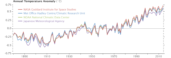
This line plot shows yearly temperature anomalies from 1880 to 2014 as recorded by NASA, NOAA, the Japan Meteorological Agency, and the Met Office Hadley Centre (United Kingdom). Though there are minor variations from year to year, all four records show peaks and valleys in sync with each other. All show rapid warming in the past few decades, and all show the last decade as the warmest. Read more about this chart.
Most NASA stories about sea ice records tend to start with the year 1979, when consistent observations started to be collected regularly by satellites. But we do know a bit about what happened before then based on aerial, ocean, and ground-based data. And now some recently recovered observations and new modeling suggest that Arctic sea ice grew for a period between 1950 and 1975.
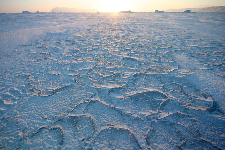
The Sun hangs low on the horizon above solidified pancake ice in the Arctic Ocean. (Photograph courtesy Andy Mahoney, NSIDC.)
A new analysis led by Marie-Ève Gagné of Environment and Climate Change Canada offers an explanation for the rise: air pollution. Gagné and colleagues showed that sulfate aerosol particles, which are released by the burning of fossil fuels, may have disguised the impact of greenhouse gases on Arctic sea ice.
In a press release, the American Geophysical Union explained more details:
These particles, called sulfate aerosols, reflect sunlight back into space and cool the surface. This cooling effect may have disguised the influence of global warming on Arctic sea ice and may have resulted in sea ice growth recorded by Russian aerial surveys in the region from 1950 through 1975, according to the new research.
“The cooling impact from increasing aerosols more than masked the warming impact from increasing greenhouse gases,” said John Fyfe, a senior scientist at Environment and Climate Change Canada and a co-author of the new study accepted for publication in Geophysical Research Letters.
To test the aerosol idea, researchers used computer modeling to simulate sulfate aerosols in the Arctic from 1950 through 1975. Concentrations of sulfate aerosols were especially high during these years before regulations like the Clean Air Act limited sulfur dioxide emissions that produce sulfate aerosols.
The study’s authors then matched the sulfate aerosol simulations to Russian observational data that suggested a substantial amount of sea ice growth during those years in the eastern Arctic. The resulting simulations show the cooling contribution of aerosols offset the ongoing warming effect of increasing greenhouse gases over the mid-twentieth century in that part of the Arctic. This would explain the expansion of the Arctic sea ice cover in those years, according to the new study.
Aerosols spend only days or weeks in the atmosphere so their effects are short-lived. The weak aerosol cooling effect diminished after 1980, following the enactment of clean air regulations. In the absence of this cooling effect, the warming effect of long-lived greenhouse gases like carbon dioxide has prevailed, leading to Arctic sea ice loss, according to the study’s authors.
Read more about aerosols and sea ice.
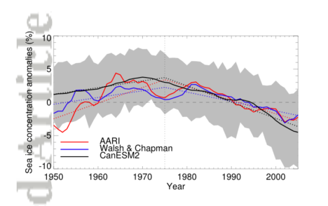
This chart, from Gagné et al, shows the area-averaged annual mean sea ice concentration anomaly between 1950 and 2005. The red line reflects Arctic and Antarctic Research Institute (AARI) data, which is based on historical sea ice charts from several sources (aircraft, ship, and satellite observations). The blue Walsh & Chapman data includes additional historical sources and uses slightly different techniques for merging various data streams. The black line is a simulated mean sea ice concentration from the CanESM2 large ensemble, a group of models developed at the Canadian Center for Climate Modelling and Analysis. Anomalies are relative to climatological averages between 1975 and 2005. The time series have been lightly smoothed with 5-year running mean. The gray shading shows the 5-95 percent range over the individual simulations of the model ensemble. The dotted lines are the piecewise linear approximated trends.

Image Credit: NASA Earth Observatory/Aqua/MODIS/Jeff Schmaltz
In August and September 2015, a massive dust storm swirled across the Middle East. After reporting on the storm, I read a fair amount of speculation — but no clear answers — as to what kicked up such an unusually large amount of dust. Several reports made the case that the ongoing war in Syria was a contributing factor. The war, some scientists speculated, had increased the military traffic over unpaved roads and had led farmers to abandon their land.
Now a new study led by a researcher from Duke University argues that the war was not an important cause. By analyzing satellite data of vegetation cover before the war, the researchers concluded that the conflict did not have much effect on vegetation. (Vegetation helps hold sand and soil in place.) In fact, the satellites observed that agricultural activity was healthy in 2015 in comparison to earlier years.
Rather, the research team found that the key drivers of the dust storm were meteorological. The summer of 2015 was unusually hot and dry compared to the past 20 years, meaning more dust was available and in a condition that winds could easily lift. So when an unusual cyclonic wind pattern developed in late August and persisted for more than a week, a mega dust storm was born.
Read a press release about the study from Princeton University, and read the full study in Environmental Research Letters. To reach their conclusion, the researchers used Aerosol Optical Depth and Normalized Difference Vegetation Index (NDVI) observations from NASA’s Moderate Resolution Imaging Spectroadiomters (MODIS), and meteorological simulations from the Weather Research and Forecasting (WRF) model. You can view several types of satellite imagery of the storm, which began on August 31 and peaked on September 8, on NASA’s Worldview browser.
Global atmospheric concentrations of methane are rising—along with scientific scrutiny of this potent greenhouse gas. In March 2016, we published a feature story that took a broad look at why methane matters. Since that story came out, several new studies have been published. But first, some broader context from that feature story…
The long-term, global trend for atmospheric methane is clear. The concentration of the gas was relatively stable for hundreds of thousands of years, but then started to increase rapidly around 1750. The reason is simple: increasing human populations since the Industrial Revolution have meant more agriculture, more waste, and more fossil fuel production. Over the same period, emissions from natural sources have stayed about the same.
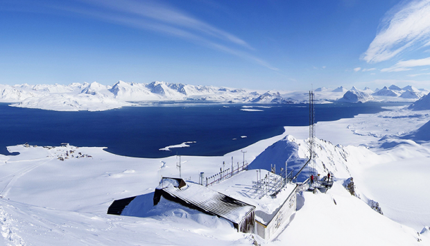
The Zeppelin Observatory in Svalbard monitors methane concentrations. It is one of several stations that helps scientists assemble a global picture of atmospheric aerosols and pollutants. Photo courtesy of AGAGE.
If you focus on just the past five decades—when modern scientific tools have been available to detect atmospheric methane—there have been fluctuations in methane levels that are harder to explain. Since 2005, methane has been on the rise, and no one is quite sure why. Some scientists think tropical wetlands have gotten a bit wetter and are releasing more gas. Others point to the natural gas fracking boom in North America and its sometimes leaky infrastructure. Others wonder if changes in agriculture may be playing a role.

A combination of historical ice core data and air monitoring instruments reveals a consistent trend: global atmospheric methane concentrations have risen sharply in the past 2000 years. (NASA Earth Observatory image by Joshua Stevens, using data from the EPA.)
The stakes are high when it comes to sorting out what is going on with methane. Global temperatures in 2014 and 2015 were warmer than at any other time in the modern temperature record, which dates back to 1880. The most recent decade was the warmest on the record. The current year, 2016, is already on track to be the warmest. And carbon emissions — including methane — are central to that rise.

Atmospheric methane has continued to increase, though the rate of the increase has varied considerably over time and puzzled experts. (NASA Earth Observatory image by Joshua Stevens, using data from NOAA.)
Isotope Data Suggests Fossil Fuels Not to Blame for Increase
Methane bubbles up from swamps and rivers, belches from volcanoes, rises from wildfires, and seeps from the guts of cows and termites (where is it made by microbes). Human settlements are awash with the gas. Methane leaks silently from natural gas and oil wells and pipelines, as well as coal mines. It stews in landfills, sewage treatment plants, and rice paddies. With so many different sources, many scientists who study methane are hesitant to pin the rising concentration of the gas on a particular source until more data is collected and analyzed.
However, an April 2016 study led by a researcher from New Zealand’s National Institute of Water and Atmospheric Research came down squarely on one side. After measuring the isotopic composition, or chemical structure, of carbon trapped in ice cores and archived air samples from a global network of monitoring stations, the scientists concluded that blaming the rise in atmospheric methane on fossil fuel production makes little sense.

Chart from Schaefer et al.
When methane has extra neutrons in its chemical structure, it is said to be a “heavier” isotope; fewer neutrons make for “lighter” methane. Different processes produce different proportions of heavy and light methane. Lighter isotopes of a carbon (meaning they have a lower ratio of Carbon 13 to Carbon 12 than the atmosphere), for instance, are usually associated with methane recovered from fossil fuels.
As shown in the chart above, the authors observed a decrease in the isotopes associated with fossil fuels at all latitudes beginning in 2006. But at the same time, global concentrations of methane (blue line in the top chart) have risen. “The finding is unexpected, given the recent boom in unconventional gas production and reported resurgence in coal mining and the Asian economy. Either food production or climate-sensitive natural emissions are the most probable causes of the current methane increase,” the authors noted.
If fossil fuel production is not responsible for increasing concentrations of atmospheric methane, than what is? The authors say that more research is needed to be certain, but that there are indications that the agricultural sector in southeast Asia (especially rice cultivation and livestock production) is likely responsible.
Large Increase in U.S. Emissions over Past Decade
A March 2016 study led by Harvard researchers based on surface measurements and satellite observations detected a 30 percent increase in methane emissions from the United States between 2002 and 2014 — an amount the authors argue could account for between 30 to 60 percent of the global growth in atmospheric methane during the past decade.

Chart from Turner et al.
The most significant increase (in red, as observed with Japan’s Greenhouse Gases Observing Satellite) occurred in the central United States. However, the authors avoid making claims about why. “The U.S. has seen a 20 percent increase in oil and gas production and a nine-fold increase in shale gas production from 2002 to 2014, but the spatial pattern of the methane increase seen by GOSAT does not clearly point to these sources. More work is needed to attribute the observed increase to specific sources.”
First Time Satellite View of Methane Leaking from a Single Facility
For the first time, an instrument on a spacecraft has measured the methane emissions leaking from a single facility on Earth’s surface. The observation, detailed in a June 2016 study, was made by the hyperspectral spectrometer Hyperion on NASA’s Earth Observing-1 (EO-1) satellite. On three separate overpasses, Hyperion detected methane leaking from the Aliso Canyon gas leak, the largest methane leak in U.S. history.

Image from NASA Earth Observatory.
“The percentage of atmospheric methane produced through human activities remains poorly understood. Future satellite instruments with much greater sensitivity can help resolve this question by surveying the biggest sources around the world and helping us to better understand and address this unknown factor in greenhouse gas emissions,” David Thompson, an atmospheric chemist at NASA’s Jet Propulsion Laboratory and an author of the study. For instance, the upcoming Environmental Mapping and Analysis Program (EnMAP) is a satellite mission (managed by the German Aerospace Center) that will provide new hyperspectral data for scientists for monitoring methane.
As detailed in a July 2016 study, scientists and engineering are also working on a project called GEO-CAPE that will result in the deployment of a new generation of methane-monitoring instruments on geostationary satellites that can monitor methane sources in North and South America on a more continuous basis. Current methane sensors operate in low-Earth orbit, and thus take several days or even weeks before they can observe the same methane hot spot. For instance, EO-1 detected the Aliso Canyon plume just three times between December 29, 2015 and February 14, 2016, due to challenges posed by cloud cover and the lighting angle. A geostationary satellite would have detected it on a much more regular basis.
