Today’s post is a reprint of recent story by Carol Rasmussen of NASA’s Earth Science News Team.
NASA has produced the first three-dimensional numerical model of melting snowflakes in the atmosphere. Developed by scientist Jussi Leinonen of NASA’s Jet Propulsion Laboratory, the model provides a better understanding of how snow melts. This can help scientists recognize the signature (in radar signals) of heavier, wetter snow — the kind that snaps power lines and tree limbs — and could be a step toward improving predictions of this hazard.
Leinonen’s model reproduces key features of melting snowflakes that have been observed in nature. First, meltwater gathers in any concave regions of the snowflake’s surface. These liquid-water regions then merge to form a shell of liquid around an ice core, and finally develop into a water drop. The modeled snowflake shown in the video is less than half an inch (one centimeter) long and composed of many individual ice crystals whose arms became entangled when they collided in midair.
Leinonen said he got interested in modeling melting snow because of the way it affects observations with remote sensing instruments. A radar “profile” of the atmosphere from top to bottom shows a very bright, prominent layer at the altitude where falling snow and hail melt — much brighter than atmospheric layers above and below it. “The reasons for this layer are still not particularly clear, and there has been a bit of debate in the community,” Leinonen said. Simpler models can reproduce the bright melt layer, but a more detailed model like this one can help scientists to understand it better, particularly how the layer is related to both the type of melting snow and the radar wavelengths used to observe it.
A paper on the numerical model, titled “Snowflake melting simulation using smoothed particle hydrodynamics,” recently appeared in the Journal of Geophysical Research – Atmospheres.
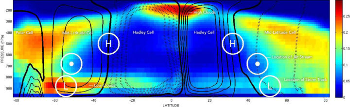
The location of mid-latitude storm tracks are marked with an L. The location of the jet stream is marked with a dot. And the place where air sinks between Hadley Cells and Mid-latitude Cells is marked with an H. The left side of the chart depicts the Southern Hemisphere; the right side depicts the Northern Hemisphere. Chart by George Tselioudis/NASA. The cloud data was collected by CloudSat.
The concentrations of greenhouse gases in Earth’s atmosphere have risen rapidly during the past century, mainly because of fossil fuel burning. Some of the effects of this are pretty straightforward: more carbon dioxide in the atmosphere means air temperatures will rise; ice in the high latitudes will begin to melt; and sea level will rise.
That seems pretty straightforward, right? But there are some areas where the changes will be more complicated. For instance, what will all of that extra carbon dioxide means for how air circulates, for the position of the jet stream, and for how clouds are distributed in the atmosphere?
George Tselioudis, a climate scientist at NASA’s Goddard Institute for Space Studies, did a nice job of explaining this as part of a post he wrote recently. In case you are not familiar with some of the scientific terms, I have added links to web sites that explain them in more detail. I also added some additional explanations to make his description a little clearer.
Take it away, George:
Atmospheric circulation, when examined using a simplified, two-dimensional view (such as the figure above), is dominated by two major features. The first is a large feature called the Hadley cell, which lifts air in the Inter-Tropical Convergence Zone (ITCZ), moves it at high altitudes towards the poles, and sinks it again to the surface in the subtropical regions. The second feature is a very strong river of air, known as the jet stream, that flows from west to east in the middle latitudes of each hemisphere. The meanders of the jet stream produce the storm tracks that are the major weather makers in the mid-latitude regions.
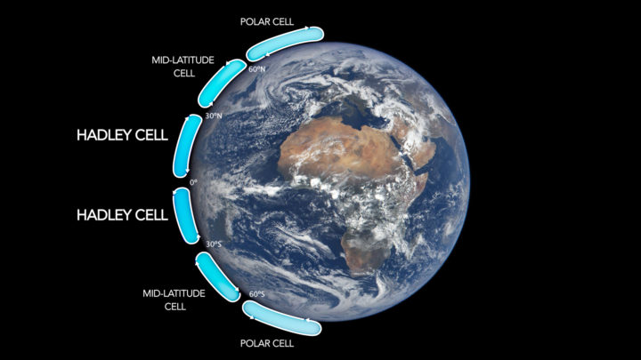
Image Credit: NASA.
George did not include it in his post, but here is a useful chart that lays out the locations of Hadley cells and the other higher-latitude cells. Now look back at the figure at the top of this page, and let’s go back to George.
The subsiding zones at latitudes between 20° and 30° North and South are noted by the letter ‘H’; the jet stream is in each hemisphere is marked with a dot; and the storm tracks are noted with an ‘L’. The circulation is superimposed on the distribution of the world’s clouds, derived from NASA CloudSat satellite observations. Areas with the most clouds are red and yellow.
Note: The CloudSat data are key. There are plenty of diagrams that show how global circulation patterns work (in fact, I have included one more below). But there are few that show you where clouds actually form and, crucially, at what altitude those clouds form.
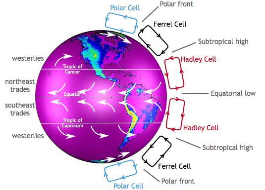
Image by the Center for Multiscale modeling of Atmospheric Processes.
George continues:
It is apparent how the clouds relate to the circulation features. The narrow zone of uplift in the tropics produces high, thick clouds in the ITCZ (which is near the equator). The areas of subsidence in the subtropics produce extensive fields of low clouds, more extensive and deep in the southern than in the northern hemisphere, while the storms embedded in the jet stream produce deep, high clouds that extend throughout the Earth’s troposphere.
It is worth looking carefully at the figure at the top of the page and tracing out the features that Tselioudis describes. Whether clouds are low or high leads to different effects on climate. Low clouds primarily reflect solar radiation and cool the surface of the Earth. In contrast, high clouds tend to have a warming effect on the surface and atmosphere.
Now let us look at the key claim that Tselioudis and other climate scientists make about how global warming will affect circulation patterns. In short, scientists expect Hadley cells to expand so that the edges (where air descends) move toward the poles. In other words, the tropics will expand.
And that is exactly what has happened over the past few decades:
Observations of the past 35 years indicate that, as the Earth has warmed, these circulation features are moving towards the poles. The Hadley cell shows a clear signal of poleward expansion, while poleward movement is present but less clear in the jet stream and mid-latitude storm tracks. We found that the two quantities that correlate significantly and consistently in all ocean basins and seasons are the Hadley cell extent and the high cloud field: when the Hadley cell edge moves poleward, the high cloud field also shifts towards the poles, and vice versa.
Still following? Good, because this is where things get more complicated. Though Hadley cells are expanding in both the Northern and Southern Hemispheres, the effects on clouds and climate are different in each hemisphere. Here is how Tselioudis puts it:
However, this coordinated movement does not have the same effect in the two hemispheres. In the northern hemisphere, the poleward movement of the high clouds opens up a “cloud curtain” that lets more sunlight into the ocean surface, thus producing warming at the surface. But in the southern hemisphere, the poleward contraction of the high clouds is balanced by an expansion of the already extensive low cloud decks, which ends up blocking more sunlight and producing a small surface cooling.
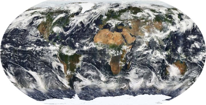
A map of Earth showing the global cloud cover on July 11, 2005, based largely on observations by the MODIS sensor on the NASA Terra satellite. Most clouds form in bands near the equator and along lines of latitude roughly 60 degrees North and South of the equator.
Why does this matter? According to Tselioudis, representing this detail correctly in climate models is critical to determining how much warming will result from a given increase of greenhouse gases. Climatologists call this climate sensitivity. Many climate models do not represent Hadley Cell expansion correctly yet; specifically, the models do not account for the fact that the Hadley cells have grown wider. Tselioudis’s research shows that the models that do match real-world observations of clouds have a lower sensitivity to greenhouse gases (a climate sensitivity near 3° Celsius compared to between 4°C and 5°C).
If Tselioudis is right, that is a piece of mildly good news for the planet from the complicated world of cloud climate science.
For more details, read the post Tselioudis wrote for GISS. Also, take a look at this June 2017 article and this May 2016 study and news release.
