In mid-September 2012, the National Snow and Ice Data Center (NSIDC) announced that Arctic sea ice had reached a new record minimum — 3.41 million square kilometers (1.32 million square miles). The previous record low came in September 2007 at 4.17 million square kilometers (1.61 million square miles). The 1979–2000 average minimum ice extent was 6.70 million square kilometers (2.59 million square miles).
If you are not used to tracking the ice pack at the top of the globe, this may seem like just a string of big numbers. So NSIDC’s Walt Meier offers another way to understand the shrinking ice cap.
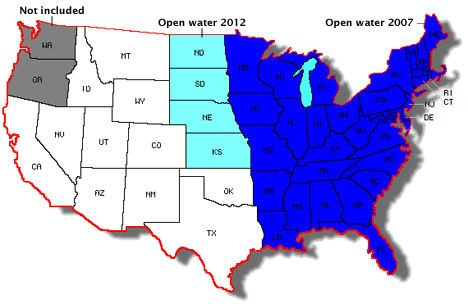
May courtesy Walt Meier, National Snow and Ice Data Center.
In the 1980s, the average extent of sea ice extent in the Arctic was roughly equal to the area of the contiguous United States, minus Washington and Oregon. In September 2007, the sea ice minimum dropped so far below the 1980s average that the area shaded in blue became open water, and the white and turquoise areas would have remained ice-covered. The September 2012 minimum was lower still, such that the Dakotas, Nebraska, and Kansas were also ice free, along with all of the states to the east.
On September 16, 2012, the extent of sea ice in the Arctic Ocean dropped to 3.41 million square kilometers (1.32 million square miles). The National Snow and Ice Data Center (NSIDC) issued a preliminary announcement on September 19 noting that it was likely the minimum extent for the year and the lowest extent observed in the 33-year satellite record.
This year’s Arctic sea ice minimum was 760,000 square kilometers (290,000 square miles) below the previous record set on September 18, 2007. (For a sense of scale, that’s an ice-area loss larger than the state of Texas.)
The previous record minimum, set in 2007, was 4.17 million square kilometers, or 1.61 million square miles. The September 2012 minimum was 18 percent below the 2007 minimum, and 49 percent below the 1979–2000 average minimum.
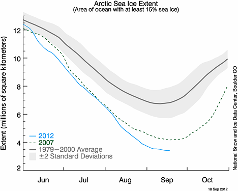
Graph courtesy National Snow and Ice Data Center.
Arctic sea ice typically reaches is minimum extent in mid-September, then begins increasing through the Northern Hemisphere fall and winter. The maximum extent usually occurs in March. Since the last maximum on March 20, 2012, the Arctic has lost a total of 11.83 million square kilometers (4.57 million square miles) of sea ice.
NSIDC uses a five-day running average for sea ice extent, and calculations of sea ice extent have been refined from those of previous years. For more information on Arctic sea ice in 2012, visit NSIDC’s Arctic Sea Ice News and Analysis blog and the NASA news release on the observation. To learn more about sea ice basics, see the sea ice fact sheet.
In the summer of 2012, Arctic sea ice has broken the previous record for minimum extent (set in 2007), fallen below 4 million square kilometers, and, as of September 17, dropped below 3.5 million square kilometers in extent. Multiple studies indicate that the Arctic will eventually lose its sea ice during the summers of the future.
As summer sea ice shrinks, the ice edge—the perimeter of the ice pack that remains—will retreat farther north. Meanwhile, the satellites that observe the ice can see almost as far north as the North Pole—but not quite. As a result, scientists and data managers at institutions such as the National Snow and Ice Data Center (NSIDC) are looking for ways to cope with a situation that was once unexpected.
Since 1979, scientists have relied on a variety of satellite sensors, including the Scanning Multichannel Microwave Radiometer (SMMR), the Special Sensor Microwave/Imager (SSM/I), the Advanced Microwave Scanning Radiometer – Earth Observing System (AMSR-E), and (most recently) the Special Sensor Microwave Imager/Sounder (SSMIS). The satellites carrying these sensors fly in near-polar orbits (see the Catalog of Earth Satellite Orbits for more information). This means that they pass close to the pole, but not quite over it. As a result, many sea ice images have a gap in the data extending from 87 degrees northward to the North Pole. The gap appears as a black circle over the pole in the image from August 2012.
Over the years, sensor capabilities have improved, shrinking the data gap over the North Pole. “For instance, SSM/I only saw as far north as 87 degrees, but AMSR-E and SSMIS can see up to 89 degrees north,” explains NSIDC’s Walt Meier. But to be consistent with satellite data from earlier years, NSIDC often stuck with the larger data gaps, treating the whole area the same way from year to year. This worked well for years because the entire region could be safely assumed to be ice-covered. “There might have been some small areas of open water, but nothing significant.”
The reliable presence of sea ice above 87 degrees north has long simplified how NSIDC measures sea ice. The smallest “unit” that a satellite sensor sees is known as a pixel, and the sensors measuring sea ice can have pixels as big as 25 by 25 kilometers. Sea ice concentration is the percentage of any pixel covered by ice. NSIDC uses a threshold of 15 percent and considers any pixel that is more than 15 percent ice covered completely ice filled. The resulting measurement is known as sea ice extent.
Historically, NSIDC scientists have handled the data gap over the North Pole by assuming it was ice-filled, and adding that area to the extent observed outside the data gap. But the continued retreat of sea ice presents a potential problem, especially if scientists stick with the historic data gap from 87 degrees northward to the pole. First-year, melt-prone ice is spreading northward. “In the past, we didn’t see first-year ice that far north,” Meier says. In addition, the 2012 melt season produced a surprising area of open water. “The open water is getting close to the 87-degree data gap.”
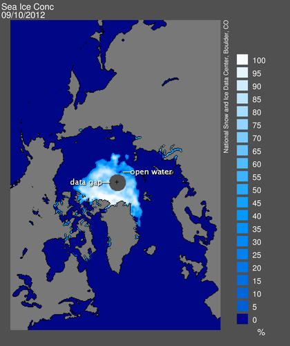
Sea ice concentration on September 10, 2012. Image courtesy NSIDC.
The data gap doesn’t pose an immediate problem for NSIDC’s sea ice estimates, but Meier acknowledges that changes may be advisable in the long run. “If the ice retreats past the current data gap, going to a smaller one may be beneficial. We won’t be able to just assume it’s filled with ice.”
This northward migration of the ice edge is another reminder—in an already historic summer—of how fast the Arctic is changing.

A satellite-radar view of Hurricane Isaac’s hot towers acquired on August 28, 2012. Data from the TRMM satellite provided by the Precipitation Measurement Missions science team at NASA and by JAXA.
Two hours before Hurricane Isaac made landfall, a satellite orbiting hundreds of miles above the storm used a radar instrument to map the storm’s inner structure. The instrument on the Tropical Rainfall Measuring Mission (TRMM) observed two extremely tall complexes of rain clouds called hot towers in the eyewall, a sign that Isaac was trying to strengthen. The towering clouds were so high that they punched through the troposphere (the lowest layer of the atmosphere where most weather occurs) and sent air loaded with ice crystals rushing into the stratosphere, a higher layer that normally contains very little moisture.
Interestingly, the “hot” in the name comes not from the temperature of the air that hot towers loft high into the atmosphere, but because of the latent heat the rain clouds release. “The latent heat is an important ingredient in fueling the updrafts that allow the towers to rise to such icy heights, so ‘in honor’ of the role that latent heat plays, the towers are called hot towers,” explained Owen Kelley, a research scientist based at NASA’s Goddard Space Flight Center.
Early radar instruments first confirmed the existence of hot towers in the 1950s, but such instruments (and those that followed in subsequent decades) did not measure their vertical structure precisely and could not track and catalog the features in a uniform way. That’s no longer a problem. Since TRMM launched in 1997, the satellite has been monitoring hot towers over land and open ocean throughout the tropics in a consistent fashion. And when the follow-on mission to TRMM (the Global Precipitation Mission) launches in 2014, it will continue to expand TRMM’s catalog of radar-observed hot towers further north and south to the edge of Arctic and Antarctic circles. “Before TRMM, we didn’t have enough of a sample size to study where, when, and why hot towers form and how hot towers relate to larger systems like tropical cyclones,” noted Kelley.
Read this Earth Observatory feature to learn more about how the late Joanne Simpson pioneered the study of hot towers. The video below, produced by NASA Goddard’s Scientific Visualization Studio, offers a dramatic view of how hot towers work. There’s also a great deal more information about TRMM on NASA’s Precipitation Measurement Missions website that’s well worth checking out.

Every month, NASA Earth Observatory will offer up a puzzling satellite image here on Earth Matters. The fourth puzzler is above. Your challenge is to use the comments section below to tell us what part of the world we’re looking at, when the image was acquired, and what’s happening in the scene.
How to answer. Your answer can be a few words or several paragraphs. (Just try to keep it shorter than 300-400 words). You might simply tell us what part of the world an image shows. Or you can dig deeper and explain what satellite and instrument produced the image, what bands were used to create it, and what’s interesting about the geologic history of some obscure speck of color in the far corner of an image. If you think something is interesting or noteworthy about a scene, tell us about it.
The prize. We can’t offer prize money for being the first to respond or for digging up the most interesting kernels of information. But, we can promise you credit and glory (well, maybe just credit). Roughly one week after a “mystery image” appears on the blog, we will post an annotated and captioned version as our Image of the Day. In the credits, we’ll acknowledge the person who was first to correctly ID an image. We’ll also recognize people who offer the most interesting tidbits of information. Please include your preferred name or alias with your comment. If you work for an institution that you want us to recognize, please mention that as well.
Recent winners. If you’ve won the puzzler in the last few months, please sit on your hands for at least a few days to give others a chance to play.
You can read more about the origins of the satellite puzzler here. Good luck!
Every day we bring you a different view of Earth, as only NASA can see it…from high above, and usually from space.
One of our colleagues has also been working since 2000 to bring you breathtaking views of Earth…albeit, from a perspective that’s a bit closer to the ground. Together with a few professional helpers and hundreds of amateur photographers, atmospheric scientist Jim Foster of NASA’s Goddard Space Flight Center offers up the Earth Science Picture of the Day. Here is a recent offering that caught my eye:

Foster and photographer Jimmy Hamilton wrote: “Airplanes are great places to observe sunsets as long as you have a window seat…The photo above was taken mid-flight somewhere over the Atlantic Ocean, on a flight from the Dominican Republic to London, England. I was presented with this startling view when I popped open the window blind. The Sun was illuminating the base of the clouds producing a seemingly upside down sunset.”
Check out more Earth photos, and learn how to submit your own, by visiting EPOD.
