
At Earth Observatory, we try to bring you views of as many natural events as we can fit into a day. Some days, the satellites don’t have a good view. And other days, we have to leave the office because of an earthquake…
While most of the U.S. East Coast is talking about the quake that set the ground rippling from South Carolina to Montreal, we can’t offer you the maps of ground shaking intensity or tremor magnitude that we usually assemble. That’s because NASA’s Goddard Space Flight Center was shut down this afternoon for building and infrastructure checks, as were many other federal facilities in the Washington, DC, area. We’ll post something once we are back online tomorrow.
Compared to the disastrous earthquakes that have rattled the world in the past year, the quake in Mineral, Virginia, is a baby. But in an area that does not get many noticeable quakes, it rattled millions of people…
Virginia wasn’t the only unusual part of the U.S. shaking today. Colorado saw it’s biggest quake in 40 years.
We were thinking about showing Hurricane Irene, which is beating a menacing path toward the Bahamas, Turks and Caicos, and the eastern U.S. coast. Puerto Rico and the Dominican Republic have already been pounded. But the storm was positioned today in a slot just between the orbital path of the Terra and Aqua satellites (views here and here and here) . The view is likely to be better tomorrow.
For now, we will point you to this view from our friends on the International Space Station (video here). Keep your eyes on our natural hazards section, as I suspect we will see a lot more of that storm this week.
Ever since we posted an image last week of a coccolithophore plankton bloom, I have been trading notes with Peter Eick, an Earth Observatory reader and seismic surveyor working in the Barents Sea. “I look at your site every morning,” he wrote. “I found today kind of neat since I am in your picture and saw the event firsthand.”
Peter spends half to two-thirds of each year traveling the world for work, and he has seen some compelling phenomena along the way. “The scary things are the red blooms (PDF) in the Persian Gulf or the jellyfish packs in the Gulf of Paria. Both just make you want to pray that the ship does not sink.”
Last week, Peter and fellow shipmates noticed an unusual color to the seas around their ship, and the stillness of the water. He shared a few photos from the aft (back) deck of the ship:
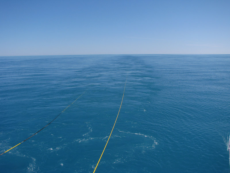
“It was quite a unique color for the water, almost a cyan,” he wrote. “We thought it might have been some sort of algae or sediment event initially, but then the whales came in and really were common in it. They must have been eating the animals that live off the bloom.”
“Normally the arctic is a brilliant deep blue, and very scenic (except when it is rough). It is still rough right now, but the weather is going to lay down in the middle of next week. I will try and get you some more pictures that really show how deep the cyan is. It’s pretty amazing if you are used to the normal, blue-water deep ocean.”
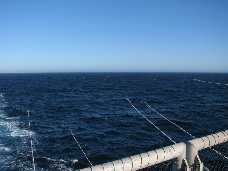
We can see many intriguing things from space, and the science of remote sensing has been developing for at least a half a century. Still, it is always nice to have some “ground truth”…to see images from up close, at the Earth’s surface that confirm what we see from space. Thanks to Peter for sharing.
If you have a timely photo of a phenomenon or landscape that we present on Earth Observatory, drop us a line. We can’t promise to use them, but you never know what you may inspire us to do.
PS – If you want to see more images of the bloom, look here and here…
Post composed by Jesse Allen, Earth Observatory data visualizer
One thing we occasionally hear from readers is “Why don’t you have images of…?” We actually get some really fantastic ideas just that way. For instance, just a few weeks ago, we got a request for satellite imagery of the slide at Medvezhiy Glacier in Tajikistan courtesy of a reader’s letter.
However, sometimes we don’t cover an event because we cannot see it. Take, for instance, the recent tornado in Blagoveshchensk, a city on the Amur River in eastern Russia, near the border with China. The rare tornado was initially reported as a super-powerful EF4 or EF5 strength storm. NASA sensors, such as the Advanced Land Imager (ALI), have been used to observe storm damage from comparable storms: see the April 2011 ALI imagery of Tuscaloosa, Alabama, for example.
It turned out that the initial reports of tornado strength in Blagoveshchensk were probably a bit off, though that wasn’t much consolation to the people in harm’s way. (Tornadoes are extraordinarily rare in all of Russia, and none had that struck Blagoveshchensk in recorded history. ) The tornado was certainly not a minor storm: at least one person was dead and 30 were injured, according to news sources. Damage from the storm was estimated to be worth as much as US$2.9 million. But it was probably not the same kind of super-strong storm as the Tuscaloosa event.
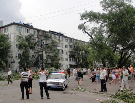
How do we know? In this ground-based photo, you can see damaged trees, roof sections torn off, and the covered balconies ripped off the sides of the apartment building. But this was not the kind of total demolition seen in super-powerful tornadoes like those that struck the U.S. in April 2011. As shown in the image below, the tornado did not leave a wide swath of damage across Blagoveshchensk.
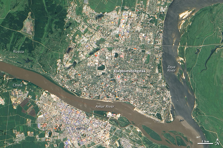
The ALI instrument cannot see anything smaller than 10 meters, so the storm track just doesn’t show up. Sometimes we don’t see things in satellite images because they are just too small to be viewed that way. Some commercial satellites, which have resolutions as tight as 50 centimeters, might show storm damage. But research satellites are not designed to look for features that small.
We had fun with last month’s “Where on Earth” mystery, so we thought we’d throw a new image out for your guessing pleasure.
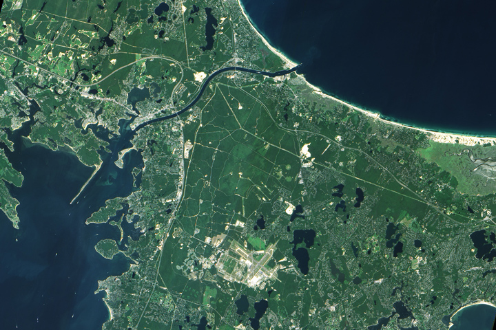
A few hints…
+ German U-boats sank a tug nearby in 1918…
+ The ponds in the image were formed by retreating glaciers…
+ The main waterway in the image is partly man-made…
+ Down the road, a famous stretch of parkland just celebrated its 50th anniversary…
We are a bit short on prizes — and federal laws keep us from offering much beyond our admiration. But after all, success is its own reward.
PS (added at 1:30 p.m.) — Well, clearly that was too easy. So let me make it harder – can you find my house in there? Aha!
ANSWER (added August 23, 2011) = the Cape Cod Canal

On July 29, the Earth Observatory posted an image (above) from the MISR Mystery Image contest. How did you do? Did you guess South Africa? The image is rotated so that north is in the lower right. Visible as a cement-colored grid at this distance, Cape Town sits at the head of the U-shaped bay, called False Bay.
The MISR team revealed the image location and answers to the associated trivia quiz on their web page. More than 470 people from all over the world entered the contest. Congratulations to the winners!
PS – Here is the image flipped around so that north is at the top…

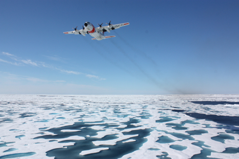
Arctic Ice Update
It’s good fun to follow the progress of our ship full of scientists cruising the Arctic Ocean and scrutinizing the health of marine ecosystems, but what do satellites show is happening to the central part of that ecosystem – the sea ice? The National Snow and Ice Data Center released an update noting that Arctic sea ice extent for June 2011 was the second lowest in the satellite record since 1979. Stay tuned: weather over the next few weeks will determine whether Arctic sea ice cover reaches record lows.
Coasts-a-Crumbling?
Pacific storms with waves 20 percent stronger than normal hammered the West Coast of North America in 2009-2010, causing coastal erosion rates to spike, the U.S. Geological Survey announced this week. Ocean Beach in California saw some of the most vigorous erosion, with its shoreline retreating 184 feet – 75 percent more than a typical winter. The cause: an El Niño-like phenomenon called El Niño Modoki. Warm water pooled in the central Pacific instead of the eastern equatorial Pacific, bringing stronger waves and higher sea levels to the West Coast.
A Bit of Good News
Writing about climate science can get grim: melting ice, warming temperatures, rising sea levels. But the weather is nothing if not variable, so there’s often good news to share as well. One hydrology example: The water level at Lake Mead, the nation’s largest freshwater reservoir, has been rising since February. Water levels are still modest, but after nearing a record low last November, it’s a welcome relief for the 35 million people who rely on the lake’s water in the short-term. The long-term, as Climate Central reports, is a whole other matter…
Thirteen Years of Aerosols
NASA’s What on Earth blog reports that measurements from a now defunct satellite called SeaWiFS have allowed researchers from NASA’s Goddard Space Flight Center to develop the longest single-satellite global record of aerosols. (Not sure what an aerosol is or what it has to do with climate? Read this.) Why does a long aerosol record matter? Two other important records from satellite instruments — one from MODIS and the other from MISR — don’t agree well over land, so scientists hope that data from other other sensors like SeaWiFS might help resolve some of the discrepancies and reduce the overall uncertainty about aerosols in climate models.

Lost Something?
Nope, this isn’t from a sci-fi movie. This is a real picture of a Russian Orlan spacesuit – stuffed with old clothes and set free to orbit Earth. Why exactly the Russians decided to toss the suit – also known as SuitSat 1 – into space is rather mystifying, but this Wikipedia article suggests it was a commemorative gesture for the 175th anniversary of Moscow State Technical University, and this Science@NASA piece from 2006 hints it was an engineering test of some sort. Regardless of intent, one thing is certain: the pictures make fabulous computer wallpaper.
Guest blogger Katie Bethea chimes in from NASA’s Langley Research Center…
[youtube rzzGuxAAmRA]
To call it a “bird’s eye view” is, in this case, not an exaggeration. The bumpy video above was captured by a camera mounted to the belly of a plane that was rising, falling, and pirouetting about 1,000 feet above the roadways and suburbs between Washington, D.C. and Baltimore, Maryland.
The July 5 flight was part of a summer-long air quality study known as DISCOVER-AQ, or Deriving Information on Surface conditions from Column and Vertically Resolved Observations Relevant to Air Quality. The goal is to sharpen the eyesight of Earth-observing satellites so they can better distinguish between pollution high in the atmosphere versus pollution in the surface layer where we live and breathe.
DISCOVER-AQ planes have been flying over roadways, neighborhoods, and woods between the heavily populated areas of Baltimore and Washington to make observations of air quality during “rush hour” and throughout the day. For the campaign, researchers have loaded two NASA research airplanes—the P-3B and the UC-12—with instruments to measure aerosol particles and trace gases relevant to air quality.
The video above was collected to help researchers visually identify the conditions below in sync with what the scientific instruments are seeing. A continuous video stream is recorded throughout the flights of the P-3B aircraft.
“Our video helps the researchers correlate their instruments’ observations with the ground cover, whether it’s traffic, a city, or a forest,” said John Barrick, one of the DISCOVER-AQ investigators. “Surface temperature is often a clue to ground cover, but our video confirms exactly what we’re flying over.”
Roads and city terrain exhibit different temperature signatures than trees, open fields, and water surfaces. Those varying surface temperatures are one of the reasons for the jumpy recording.
Barrick explains that the pilot flew the P-3B at low altitude (about 1,000 feet) and “by hand” rather than auto-pilot. “Different types of ground cover heat the air at different rates,” said Barrick. “Turbulence occurs when the air above these different surfaces—the boundary layer—mixes. We spend much of the mission flying through the boundary layer, so we get bounced around quite a bit.”
The team also records the video at a lower frequency data rate to reduce the size of the video files for archiving purposes, making the video a bit choppier than typical TV-quality recordings. A typical flight can last eight hours, and the mission is expecting to make at least 14 flights this summer, creating quite a bit of video to store.
Satellite sensors provide an unprecedented perspective on our planet. Some zoom in for spectacular detail, while others take the wide view. But while our eyes in the sky give us encyclopedias full of information, they can give us something else: optical illusions.
Many of us have an unconscious expectation to see objects illuminated from above. When looking at paintings or photographs, this means we often expect the light source to occur somewhere off the top edge of the picture. In satellite images, however, this is not always the case.
Earth Observatory generally follows the convention of orienting satellite images so that north is up. For images of the Southern Hemisphere, this rarely presents a problem. But for images of the Northern Hemisphere, sunlight usually comes from the south. Where sunlight illuminates south-facing slopes and leaves northern slopes in shadow, many viewers experience an optical illusion known as relief inversion.
One example of relief inversion comes from the southwestern United States, in the Grand Staircase-Escalante National Monument. When north is up, an elaborate network of canyons in the national monument appear, to some viewers at least, to rise above the surrounding land.
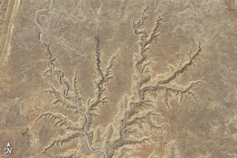
When the image is rotated, the canyons look like canyons.
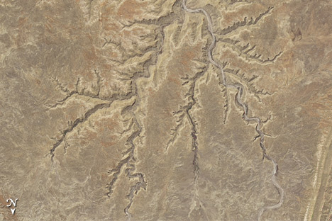
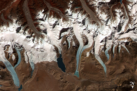
Relief inversion is also pronounced in images of mountainous areas, such as the Bhutan Himalaya.
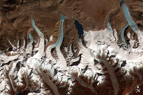
As before, rotating the image 180 degrees alleviates the optical illusion and makes it easier to identify glaciers flowing downhill and terminating in the glacial lakes.
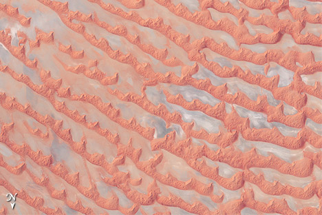
Perhaps the biggest hazard of relief inversion is that it’s possible to be misled without even realizing it. This is especially true when looking at images of unfamiliar landscapes that few of us encounter in person. The Arabian Peninsula’s Empty Quarter, known as Rub’al Khali, is a huge expanse of shifting sand dunes. When north is up, the salt flats between the dunes appear elevated.
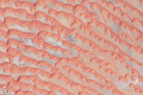
When the image is rotated, this alien landscape is easier to interpret.
A simple solution to relief inversion is to view satellite images from multiple angles — such as printing a copy and turning the page upside down, or using a photo editing software program to rotate the image. If a landscape looks puzzling, try looking from a different angle.
For more information, read “Perceptual biases in the interpretation of 3D shape from shading,” or “Getting real: Reflecting on the new look of National Park Service maps” (PDF).
No Ordinary Sight
If you’re driving along Interstate 95 between Washington and Baltimore this July, don’t be alarmed if you see a large aircraft hurtling toward you from above. It’s not a a terrorist attack or a pilot dozing at the stick; it’s just NASA’s P-3B doing air quality research. The 117-foot plane is the workhorse for a field experiment that kicked off this week. The plane will fly along heavily-traveled roadways and make conspicuous spirals over ground stations in northeastern Maryland. “We’re trying fill the knowledge gap that severely limits our ability to monitor air pollution with satellites,” said James Crawford, the experiment’s lead scientist.

Still Warming Folks
The more things change, the more they stay the same. NOAA released its annual State of the Climate Report (PDF) this week, and the findings won’t surprise anybody who has cracked a newspaper open in the last decade. Last year was the second warmest on record since official record-keeping began. The world’s glaciers lost mass for the 20th year in a row. Arctic sea ice shrank to its third smallest area on record. I could go and on – NOAA offers details on a total of 41 global climate indicators in the report — but The Washington Post already has it covered.
Near Misses
Asteroid 2011 MD offered a reminder last week that catastrophe could strike unexpectedly. The asteroid arrived out of the blue – er, black – and buzzed within 7,500 miles of Earth. The good news, as the Christian Science Monitor reported, is that the asteroid was small enough that it would have burned up in the atmosphere even if it had been headed for Manhattan. Meanwhile, in other space flotsam news, the crew of the International Space Station had a close call with a hunk of debris this week.
Sea Ice Today, Gone Tomorrow
After reading this post from the “Open Mind” climate blog, I have a feeling that after regaling my future grandkids with stories of life before cell phones and Facebook, I’ll be telling them about the days when we actually had summer sea ice in the Arctic. Tamino’s post walks through what scientists know about the rapid decline in sea ice extent and volume due to satellite, aircraft, and submarine research. In sum, the trends are pretty grim. “The phrase ‘death spiral’ comes to mind,” the blogger noted.
Never a Dull Day for Science
Every field expedition has its hiccups, and this time they’ve come early and often for the Healy, the Coast Guard icebreaker conducting NASA-sponsored research in the Arctic. While still in port in Alaska, a magnitude-7.2 earthquake and subsequent tsunami warning sent the crew and scientists scrambling for high ground. A few days later, a distress signal from a sinking tugboat sent the Healy off its planned route to conduct a search-and-rescue mission. A Coast Guard helicopter rescued the tugboat’s stranded crew, and now the icebreaker is back on course. Science writer Kathryn Hansen is on board blogging about the drama.
A Mesmerizing View
The simplicity, beauty, and calming voice of the narrator in this video of Earth from the vantage point of the International Space Station makes me want to watch it again and again. And it appears I’m not alone – the clip had already registered more than a million views when this post went live in late June. Meanwhile, Popular Science reported that a Canadian company has plans to stream a high-definition video feed from the space station later this year. “The system will work as a sort of mashup between Google Earth and YouTube,” the founder of the company said. Sign me up…
[youtube rj18UQjPpGA]
In the process of researching a feature for the Earth Observatory, I always come across fascinating tidbits that just don’t quite fit into my article. For instance, there’s this great carbon calculator tool from the University of Wisconsin-Madison.
Early during the development of the recent carbon cycle feature, I heard NASA scientist Peter Griffith speak to a group of National Park rangers. Most scientists speak from slides full of data, and I fully expected Peter to do so as well. But he didn’t. He stood at the front of the group with just a banana and a piece of coal. In a matter of minutes, he demonstrated both the carbon cycle and why burning fossil fuels has such a big impact on the carbon cycle. It was a simple and powerful demonstration. At the end, he concluded that by burning fossil fuels, we move carbon from the slow, old carbon cycle to the fast, young carbon cycle.
The talk shaped the way I think about the carbon cycle. And while the analogy never made it into the article, the way he organized the ideas and his conclusion did. As I was finishing the article, a colleague shared this two-minute video Peter made based on that talk. Enjoy!
[youtube uStoBFtjy8U]
