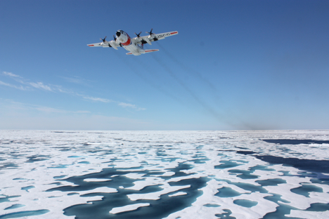
Arctic Ice Update
It’s good fun to follow the progress of our ship full of scientists cruising the Arctic Ocean and scrutinizing the health of marine ecosystems, but what do satellites show is happening to the central part of that ecosystem – the sea ice? The National Snow and Ice Data Center released an update noting that Arctic sea ice extent for June 2011 was the second lowest in the satellite record since 1979. Stay tuned: weather over the next few weeks will determine whether Arctic sea ice cover reaches record lows.
Coasts-a-Crumbling?
Pacific storms with waves 20 percent stronger than normal hammered the West Coast of North America in 2009-2010, causing coastal erosion rates to spike, the U.S. Geological Survey announced this week. Ocean Beach in California saw some of the most vigorous erosion, with its shoreline retreating 184 feet – 75 percent more than a typical winter. The cause: an El Niño-like phenomenon called El Niño Modoki. Warm water pooled in the central Pacific instead of the eastern equatorial Pacific, bringing stronger waves and higher sea levels to the West Coast.
A Bit of Good News
Writing about climate science can get grim: melting ice, warming temperatures, rising sea levels. But the weather is nothing if not variable, so there’s often good news to share as well. One hydrology example: The water level at Lake Mead, the nation’s largest freshwater reservoir, has been rising since February. Water levels are still modest, but after nearing a record low last November, it’s a welcome relief for the 35 million people who rely on the lake’s water in the short-term. The long-term, as Climate Central reports, is a whole other matter…
Thirteen Years of Aerosols
NASA’s What on Earth blog reports that measurements from a now defunct satellite called SeaWiFS have allowed researchers from NASA’s Goddard Space Flight Center to develop the longest single-satellite global record of aerosols. (Not sure what an aerosol is or what it has to do with climate? Read this.) Why does a long aerosol record matter? Two other important records from satellite instruments — one from MODIS and the other from MISR — don’t agree well over land, so scientists hope that data from other other sensors like SeaWiFS might help resolve some of the discrepancies and reduce the overall uncertainty about aerosols in climate models.

Lost Something?
Nope, this isn’t from a sci-fi movie. This is a real picture of a Russian Orlan spacesuit – stuffed with old clothes and set free to orbit Earth. Why exactly the Russians decided to toss the suit – also known as SuitSat 1 – into space is rather mystifying, but this Wikipedia article suggests it was a commemorative gesture for the 175th anniversary of Moscow State Technical University, and this Science@NASA piece from 2006 hints it was an engineering test of some sort. Regardless of intent, one thing is certain: the pictures make fabulous computer wallpaper.
Guest blogger Katie Bethea chimes in from NASA’s Langley Research Center…
[youtube rzzGuxAAmRA]
To call it a “bird’s eye view” is, in this case, not an exaggeration. The bumpy video above was captured by a camera mounted to the belly of a plane that was rising, falling, and pirouetting about 1,000 feet above the roadways and suburbs between Washington, D.C. and Baltimore, Maryland.
The July 5 flight was part of a summer-long air quality study known as DISCOVER-AQ, or Deriving Information on Surface conditions from Column and Vertically Resolved Observations Relevant to Air Quality. The goal is to sharpen the eyesight of Earth-observing satellites so they can better distinguish between pollution high in the atmosphere versus pollution in the surface layer where we live and breathe.
DISCOVER-AQ planes have been flying over roadways, neighborhoods, and woods between the heavily populated areas of Baltimore and Washington to make observations of air quality during “rush hour” and throughout the day. For the campaign, researchers have loaded two NASA research airplanes—the P-3B and the UC-12—with instruments to measure aerosol particles and trace gases relevant to air quality.
The video above was collected to help researchers visually identify the conditions below in sync with what the scientific instruments are seeing. A continuous video stream is recorded throughout the flights of the P-3B aircraft.
“Our video helps the researchers correlate their instruments’ observations with the ground cover, whether it’s traffic, a city, or a forest,” said John Barrick, one of the DISCOVER-AQ investigators. “Surface temperature is often a clue to ground cover, but our video confirms exactly what we’re flying over.”
Roads and city terrain exhibit different temperature signatures than trees, open fields, and water surfaces. Those varying surface temperatures are one of the reasons for the jumpy recording.
Barrick explains that the pilot flew the P-3B at low altitude (about 1,000 feet) and “by hand” rather than auto-pilot. “Different types of ground cover heat the air at different rates,” said Barrick. “Turbulence occurs when the air above these different surfaces—the boundary layer—mixes. We spend much of the mission flying through the boundary layer, so we get bounced around quite a bit.”
The team also records the video at a lower frequency data rate to reduce the size of the video files for archiving purposes, making the video a bit choppier than typical TV-quality recordings. A typical flight can last eight hours, and the mission is expecting to make at least 14 flights this summer, creating quite a bit of video to store.
Satellite sensors provide an unprecedented perspective on our planet. Some zoom in for spectacular detail, while others take the wide view. But while our eyes in the sky give us encyclopedias full of information, they can give us something else: optical illusions.
Many of us have an unconscious expectation to see objects illuminated from above. When looking at paintings or photographs, this means we often expect the light source to occur somewhere off the top edge of the picture. In satellite images, however, this is not always the case.
Earth Observatory generally follows the convention of orienting satellite images so that north is up. For images of the Southern Hemisphere, this rarely presents a problem. But for images of the Northern Hemisphere, sunlight usually comes from the south. Where sunlight illuminates south-facing slopes and leaves northern slopes in shadow, many viewers experience an optical illusion known as relief inversion.
One example of relief inversion comes from the southwestern United States, in the Grand Staircase-Escalante National Monument. When north is up, an elaborate network of canyons in the national monument appear, to some viewers at least, to rise above the surrounding land.
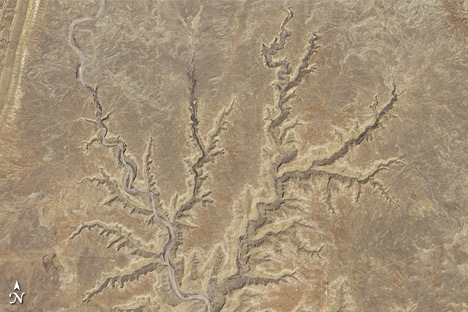
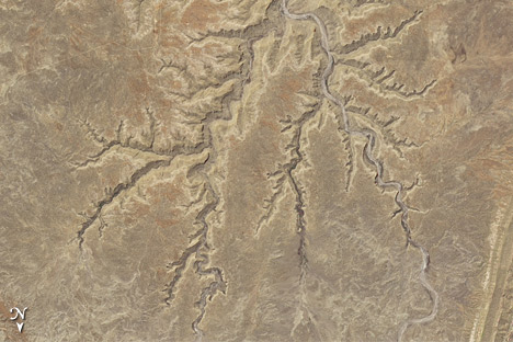
When the image is rotated, the canyons look like canyons.
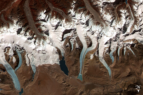
Relief inversion is also pronounced in images of mountainous areas, such as the Bhutan Himalaya.
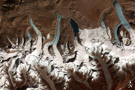
As before, rotating the image 180 degrees alleviates the optical illusion and makes it easier to identify glaciers flowing downhill and terminating in the glacial lakes.
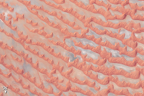
Perhaps the biggest hazard of relief inversion is that it’s possible to be misled without even realizing it. This is especially true when looking at images of unfamiliar landscapes that few of us encounter in person. The Arabian Peninsula’s Empty Quarter, known as Rub’al Khali, is a huge expanse of shifting sand dunes. When north is up, the salt flats between the dunes appear elevated.
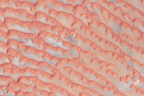
When the image is rotated, this alien landscape is easier to interpret.
A simple solution to relief inversion is to view satellite images from multiple angles — such as printing a copy and turning the page upside down, or using a photo editing software program to rotate the image. If a landscape looks puzzling, try looking from a different angle.
For more information, read “Perceptual biases in the interpretation of 3D shape from shading,” or “Getting real: Reflecting on the new look of National Park Service maps” (PDF).
