
After nearly 20 years, it’s time for me to leave NASA and do something radically different—help Planet Labs develop world-class satellite imagery. OK, not that radically different. In any case, now is as good a time as ever to point to some of my favorite visualizations. If you’d like like to get in touch with me, drop me a note on Twitter (@rsimmon) or contact the Earth Observatory team—they’ll know where I am.
Thanks to everyone on the Earth Observatory team that I’ve worked with over the years. Among them: David Herring, Kevin Ward, Mike Carlowicz, Paul Przyborski, Rebecca Lindsey, Holli Riebeek, Adam Voiland, Jesse Allen, Reto Stöckli, Goran Halusa, and John Weier.
Ten: The Blue Marble
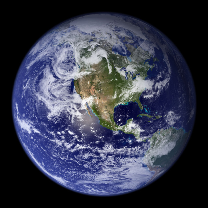
Let me get this out of the way: this was the first NASA image of an entire hemisphere of the Earth made with full-color data since the Apollo 17 crew returned from the Moon. It’s certainly striking, but once you look carefully a number of flaws start to appear. Flaws that I may or may not have pointed out when I described my design process. (I’ll also reiterate Reto Stöckli’s invaluable work building the land and cloud textures, which were the hard parts.)
Nine: Global Net Primary Productivity
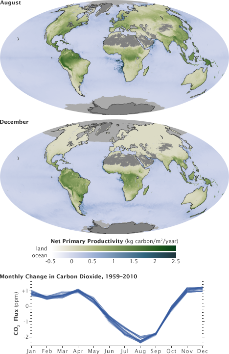
Although these two datasets show the exact same property (net primary productivity, a measure of the amount of carbon the biosphere draws out of the atmosphere) they’re measured in different ways, and deserve to be differentiated. By using palettes with different hues but an identical range of lightness and saturation, they are directly comparable but remain distinct from one another.
Eight: The Landsat Long Swath
[youtube 8nboMGGdXUc]
Shortly after launch, Landsat 8 collected what was probably the single largest satellite image ever made. Roughly 12,000 pixels wide by 600,000 pixels tall the image combined 56 individual Landsat scenes into a single strip from Siberia to South Africa.
Seven: LIDAR
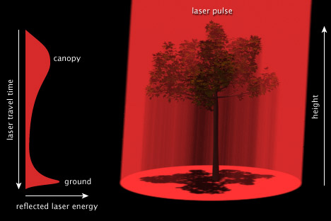
Back when I used to be competent at 3D, I made this illustration showing how a pulse of laser light can measure the structure of a forest canopy.
Six: Air Quality over 16 Megacities
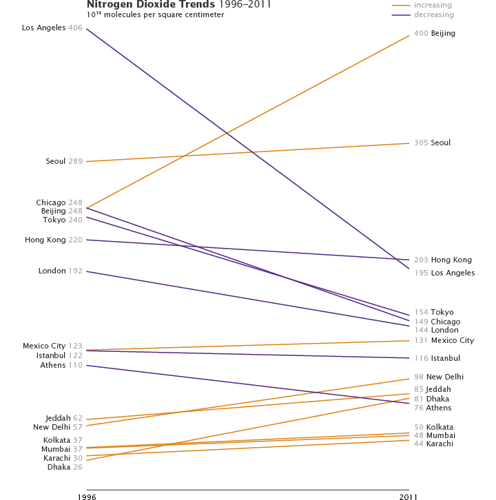
It may just be that I’m enamored with Alberto Cairo, but I’m growing increasingly fond of slope graphs. They occasionally tell stories more clearly than more conventional graph types.
Five: an Erupting Volcano from the International Space Station
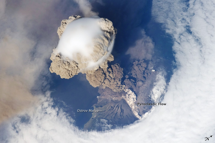
When Sarychev Volcano blasted a column of ash high above the Kuril Islands an astronaut captured not one, but a whole sequence of photographs of the plume. Make sure you look for the pyroclastic flows coursing down the side of the volcano. (The eruption did not blast a hole in the clouds by the way, that’s a result of interactions between wind, clouds, and island topography.)
Four: Faults in Xinjiang
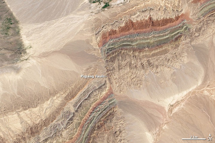
I’ve probably worked on more than 1,000 Landsat images over the course of my career. This scene of offset folds in Xinjian China is the best.
Three: Amazonia
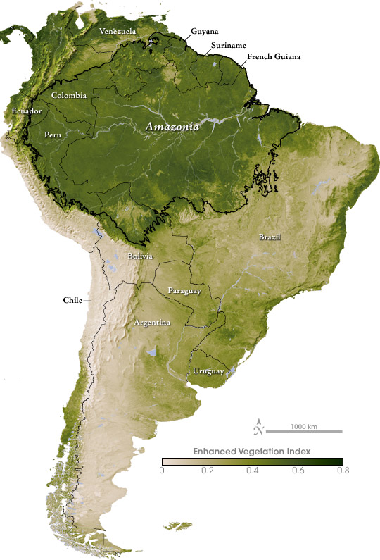
I think this map of vegetation in South America was the first original color palette I really got right.
Two: The Original Earth at Night
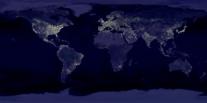
For some reason the color and contrast work better in this version (originally published in 2000 to accompany the story Bright Lights, Big City) than any of my attempted remakes. This includes the 2012 Black Marble, which was made with much better data.
One: Seeing Equinoxes and Solstices from Space
[youtube FmCJqykN2J0]
I’m generally skeptical of animation in data visualization, but for some things motion is the story. I think this applies to the apparent motion of the sun over the course of a year, alternately lighting the North and South Poles. (Apologies for the poor quality of the YouTube compression. Make sure you check out the HD version.)
Finally: Thanks to the NASA family, and to all of you who’ve expressed appreciation for my pictures over the years.
Thank You for all you’ve given us — both the work itself and the inspiration to “look up” — and best wishes for all good things going forward
These visualisations are stunning! Especially the Equinoxes and Solstices video clip. Our home planet is so beautiful…