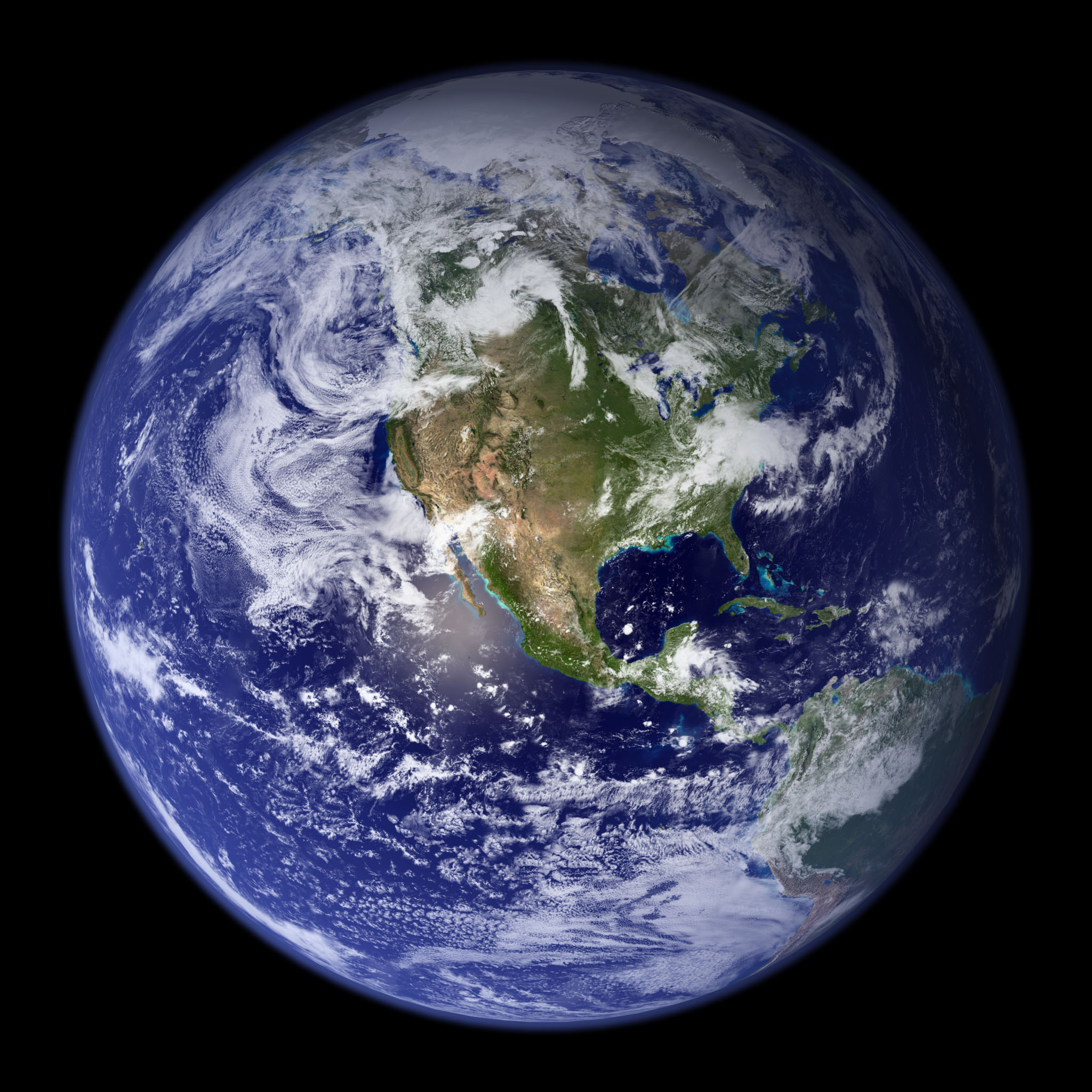
One of the best surprises of my life was turning on my brand-new iPhone—before it had even been activated—glancing down at the screen, and seeing an image I had made. Apple chose the NASA Blue Marble for the default welcome screen and wallpaper, and I had no idea beforehand.
Here’s how I did it.
In 2002 my colleague Reto Stöckli (now back in Switzerland) was working on a global map of the Earth that was going to blow away all previous examples. A new NASA satellite (Terra) was gathering the first color pictures of the entire Earth, and we wanted to showcase the imagery. Reto put together about 10,000 satellite scenes (each file over 300 MB) collected over 100 days, stripped out the clouds, and created a 43,200-pixel by 21,600-pixel map of the Earth in (this was the hard part, everything I did afterwards was just adding chrome).
Now that we had a source image, we needed to create something evocative, something that would show the potential of the imagery. To us, at least, the obvious choice was to render a few 3D views of the world as it would look from space: echoes of the famous Apollo 17 photograph.
To make the Earth look realistic, or at least how I imagined the Earth would look, I needed to do some work. First of all, the satellite images weren’t usable over deep water (it collects data, but there’s no automated process to detect clouds and correct for the atmosphere), so I needed to add some color into the water. NASA measures chlorophyll in the ocean (a way of monitoring phytoplankton), so I grabbed a month’s worth of that data, colored it blue and green (I looked at individual satellite images to get a sense of what hues to use), and used that map for the ocean. I also had to add a stand-in for sea ice, since it’s impossible to measure chlorophyll beneath a few meters of snow and ice. At least that was simple–I just replaced missing data near the poles with white. In addition to the sea ice, I brightened and reduced the saturation of Antarctica, which was pasted into the original from a different dataset. The combined ocean color and ice look like this:
Throw in a map of clouds stitched together from 200 satellite scenes, and a global topographic map to add some texture in the landscape, and I was ready to bring everything into my 3D software (Electric Image at the time). Wrapping a rectangular image onto a sphere and rendering out images was probably the simplest and fastest part of the entire process. It’s much easier to fine-tune an image with each component of the image rendered separately, so I made individual renders of the land and ocean, specular highlight, clouds, a couple day/night masks, and atmospheric haze (which I never did get quite right). [Click on the image below to download a zip file with each layer as a separate JPEG].
Compositing separate images into a convincing whole is (of course) easier said than done. Even with control of each layer in my image processing software (Photoshop) it took hours of tweaking and re-tweaking transparency, layer masks, hue, saturation, gaussian blur, and curves to get an image that looked like the picture I had in my head. Since it was before adjustment layers were introduced (with which I could have saved all the settings), I have no idea exactly what I did. Making the clouds appear opaque, while remaining white, rather than gray, was by far the hardest part. It was also tricky trying to get the atmosphere to appear most transparent in the center, and thicker and bluer near the edges. Looking at the Photoshop file, I’ve got two atmospheric layers and two cloud layers, each set to different levels of transparency, over a combined land and ocean layer, with sunglint (a specular highlight) off Baja California.
At the time, I had no idea the Blue Marble would be seen by so many people: it was just a way to show off some cool data. It’s based on the hard work of the literally thousands of scientists, engineers, programmers, admin staff, and others here at NASA; especially the MODIS team. I’m glad Steve Jobs seemed to like it, and I’m sad he died so young.
Made on a Mac, of course. Thanks, Steve.
A Few Notes
All the source files are archived on the original Blue Marble page. They’re free to use and modify, but you can’t use them to imply you’re associated with NASA.
We’ve subsequently made a new and improved version of the base maps, the Blue Marble Next Generation. It’s not only twice the resolution (86,400 pixels by 43,200 pixels), but there’s a separate image for each month, so you can see the changing seasons. Reto didn’t make new clouds because it’s a really long and painful process of stitching images together by hand that’s never going to be perfect.
In the existing cloud map some people have noticed a few repeating features that appear photoshopped. They are. There are gaps between orbits near the equator, and there’s no way to fill them with real data. The specular highlight off Baja and the thickness and fuzziness of the atmosphere I based off full-disk GOES images. There’s a weird streak in the clouds near Greenland that’s entirely due to an error on my part, and I have no idea why the shading on the east coast of Greenland is incorrect.
Yes, it’s centered on North America: I’ve spent the vast majority of my life here, and I’m biased. I did, however, make a version centered on South Asia at the same time, as well as a rotating Earth centered on the Equator. I’ve subsequently done a few more versions, including the Pacific Ocean. I’m still not happy with the shading of the atmosphere—anyone know how to simulate Rayleigh scattering in Maya?
“… complex datasets require complex visualizations. In general though, simpler is usually the best way to go in the sense that you should make it as easy as possible for a reader to understand what’s going on. You’re the storyteller, so it’s your job to tell them what’s interesting.”
—Nathan Yau, author of Visualize This: The Flowing Data Guide to Design, Visualization, and Statistics and the Flowing Data blog (that I should read more frequently). Found on SmartPlanet.
One of the simplest ways to improve the look of graphics on a computer screen is to anti-alias them: i.e. smooth any curved or angled edges. At the relatively low resolution of a computer screen (nominally 72 dots per inch, although modern screens are often around 100 dots per inch) it’s easy to spot blocky pixels along any sharp edge that’s not perfectly vertical or horizontal. Here’s an example:
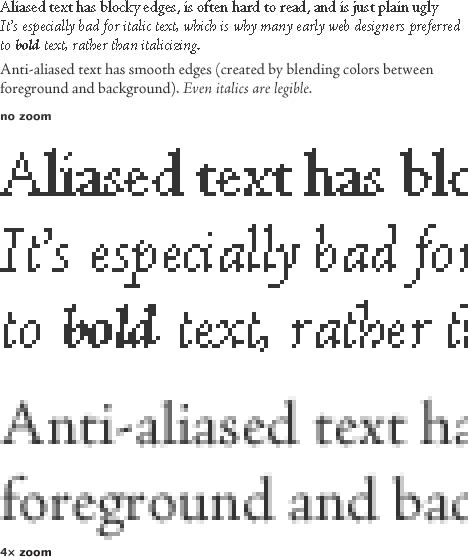
Most modern graphics software anti-aliases by default (and modern operating systems anti-alias text on the desktop, in browsers, and other applications), so text & graphics usually look pretty good. Unfortunately, a lot of scientific visualization software doesn’t (at least not by default)—so many of the graphics NASA produces (especially those that are generated automatically as data is processed) look chunky. Like this:
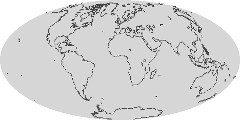
One quick fix is just to render out any graphic larger than it needs to be (4 times is fine) and shrink it using a resampling algorithm like bilinear or bicubic that blends pixels [nearest neighbor (also the default in many visualization packages) will not]. If your data has a vector overlay it’s often feasible to export a Postscript file, and then render the image in something like Illustrator, which will produce nice smooth lines:

As always in design there are exceptions and caveats. Horizontal and vertical lines, like the axes on a graph, look much better when they’re sharp, and anti-aliasing can blur them. I usually export any elements of a graphic that need to be as sharp as possible as a separate step, with anti-aliasing turned off. Likewise, printed material should not be anti-aliased. Most printers are high-enough resolution that curved edges look perfectly clean.
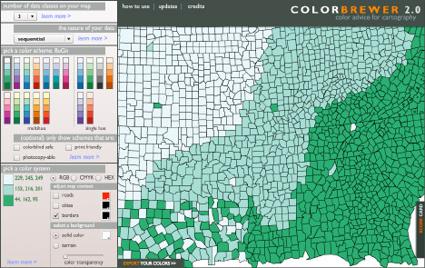
Whenever I invite someone to talk at our monthly “education and outreach” colloquia I seem to be out of town when the talk is scheduled. Sure enough, last Wednesday when Cynthia Brewer was here (at Goddard Space Flight Center, near Washington, DC) I was in Los Angeles.
Dr. Brewer is a geography professor at Penn State (as well as an author of several books on design and cartography: Designed Maps: A Sourcebook for GIS Users and Designing Better Maps: A Guide for GIS Users) specializing in research on effective map design, especially the use of color in maps. Since we make a lot of maps, ColorBrewer, her on-line tool for selecting color schemes, has been an invaluable tool. By all accounts she gave an excellent talk, I’m sorry I missed it.
In addition to data visualization, satellite imagery, and case studies, I intend to occasionally discuss general topics in design and typography. In this case, the typeface* Comic Sans.
Seen at the entrance to the Gibson Ampitheatre, Los Angeles, California:
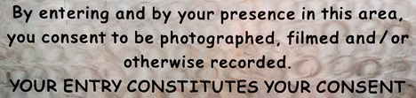
A legal warning (giving up all rights to your likeness once you pass the sign) written in Comic Sans bold. The problem? Comic Sans is an extremely informal typeface, and legal text is extremely formal. Not a good combination. It’s also not a particularly readable typeface, since it was designed for short snippets of text in word balloons, not prose. (I’ve even had the thought that the sign was in a difficult to read font on purpose, but that’s not likely.) Comic Sans is famously infamous, it’s even been featured by the Wall Street Journal: Typeface Inspired by Comic Books Has Become a Font of Ill Will.


I’m not out to ban comic sans, but there are plenty of better typefaces available for public signage; from the London Underground’s Johnston, to the ubiquitous Helvetica, to the Standard Alphabets for Traffic Control Devices. (Actually, those might not be the best choice in this case, since they’re designed for legibility, not readability, but that’s a different discussion.)
Comic Sans would be good for something like lettering in a storyboard, or even its original intended use in comics. Unfortunately it would be a pretty generic comic, since Comic Sans ships with Microsoft Windows and Microsoft Office, so almost everyone with a computer has a copy. There’s plenty of good (and free) alternatives out there. At this point the most appropriate use of comic sans is probably ironic.
In case you’re wondering, we use 13-point Georgia for body text, 11-point Lucida Sans for captions & annotations, and 21 point Helvetica Neue Medium Condensed in the masthead. And how was the show? Awesome.
* Typefaces are colloquially referred to as fonts, but technically a font is a specific size of a specific font weight & style of a typeface. A typeface is all sizes a specific weight & style (bold, italic, etc.). A typeface family is the next step up in the hierarchy, including variant versions of a typeface, sometimes even as extreme as sans-serif and serif versions. I’m pedantic, so I usually use the precise terms.
