Of all the Earth sciences, geology has the strongest tradition of visual communication. It’s probably because mapping is fundamental to the field, and geologists have 200 years of practice at it. As a result, they tend to create well designed imagery.
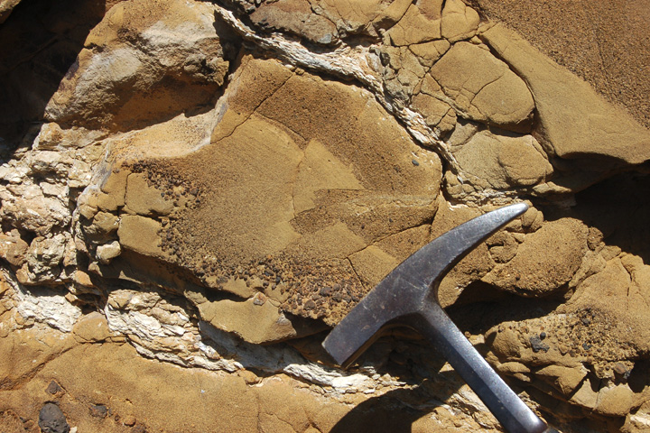
Two exemplary techniques geologists use: they almost always include a scale, and they often annotate images directly, rather than relying on separate keys or text descriptions. Here’s an example from Lockwood DeWitt, of Outside the Interzone:
Callan Bentley, author of Mountain Beltway, added annotations that show small faults, and the distribution of grain size in the rock:
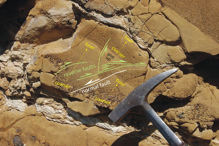
Callan even used different colors to differentiate types of information, and varied the size labels to emphasize the location and type of faulting. Excellent work.
Here’s what Lockwood had to say about Table Rock:
Table Rock is quite similar to the more widely known Fort Rock, but larger and better preserved. It erupted enough material that toward the end, it had raised a cone above the original water-influenced explosive (hydrophreatic) vent. The final phase was a more gentle effusive basalt eruption, which filled in the hollow interior. Without that basalt filling, Table Rock would look very similar indeed to Fort Rock. Here’s the location in FlashEarth, maybe a hundred yards north of the dirt road. The two features both lie in the Fort Rock-Christmas Valley, which were filled by a pluvial lake during the Pleistocene. Even a quick glance over this area reveals quite a few similar water-mediated eruptions. In this view, Hole-in-the-Ground is in the left of the top middle, Fort Rock is in the upper middle, just to left of the four center-pivot irrigation fields, turning the rotated “L” into a backwards “C,” and Table Rock is in the bottom right middle, just above and a bit to the right of the Highway 31 label and tight cluster of irrigated fields.
By the way, I don’t include a scale in every image. Sometimes I just want to let the beauty of a spot be what it is. so I take two pictures. One with, and one without, scale. Here’s an example from a couple days earlier, sans scale. But I have a number of other photos of the same spot (not posted yet) that do provide a sense of scale.
I rest my case.
“… complex datasets require complex visualizations. In general though, simpler is usually the best way to go in the sense that you should make it as easy as possible for a reader to understand what’s going on. You’re the storyteller, so it’s your job to tell them what’s interesting.”
—Nathan Yau, author of Visualize This: The Flowing Data Guide to Design, Visualization, and Statistics and the Flowing Data blog (that I should read more frequently). Found on SmartPlanet.
Every visualization blog on the planet has already posted one or two of these, but they’re awesome, so here is what Washington, DC looks like via Tweets (blue) and photos posted to Flickr (orange). White areas have both tweets and photos.
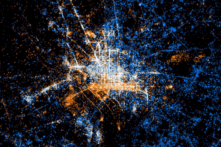
Unsurprisingly, tourist areas are dominated by photos, residential areas by tweets. More here: See something or say something. Visualization by Eric Fischer. H/T to Visual Complexity.
