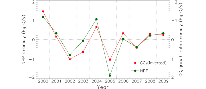
James Hrynyshyn over at Class M has an interesting post about a graph of net primary productivity (also, and perhaps more commonly, referred to as NPP—it’s a measure of the amount of carbon a plant takes from the atmosphere and uses to grow) anomaly (difference from normal) compared to the anomaly in the growth rate of carbon dioxide in the atmosphere. The graph is from the same paper as our recent image: Drought Slows Plant Growth, 2000–2009. The two variables are plotted together, but “carbon dioxide growth rate anomaly” (a somewhat complex concept in itself) is inverted. This gives the impression (unless you read the caption) that the growth rate of carbon dioxide in the atmosphere falls if net primary productivity falls, and rises if net primary productivity rises, when, in fact, the opposite is true.
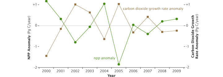
I agree with Class M: if the first impression a graph gives is the opposite of what the data shows, and a close reading of the caption and annotations is required for understanding, the graph is destined to cause misunderstandings. Just for the record, this is what I would have done:
Reference: Zhao, M., Running, S.W. (2010). Drought-induced reduction in global terrestrial net primary production from 2000 through 2009. Science, 329(5994), 940–943.
