Tools & Techniques: the Nuts and Bolts of Designing a Color Palette
Knowing what makes a good palette for visualization, how to find and apply good examples, or create one from scratch? In my mind the best place to start is Color Brewer. Cynthia Brewer’s tool is popular for a reason: it explains the theory behind palette design, provides excellent examples to get started with, and even displays the palettes on a sample map. The Color Brewer Palettes are also implemented in visualization applications and languages like D3, Processing, R, ArcMap, etc.
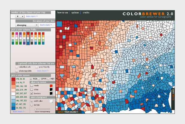
The widely-used Red-Blue divergent palette on Color Brewer.
If you don’t use software that comes with the Color Brewer palettes (Adobe Photoshop, for example), using the tables can be a bit tricky. Each color has to be specified manually, and then the individual steps need to be blended (at least if you want a smooth ramp).
In Photoshop, there’s two ways to do this: create a custom indexed color palette (good for 8-bit data, with a range of 256 values), or create a gradient map (useful for applying color to 16-bit datasets). Similar techniques should work with the GIMP and other applications.
To build an indexed palette (also called a color look-up table), start with one of the 9-color Color Brewer palettes. We need 9 colors because there are 8 divisions between each specified color, which divides evenly into the 256 available indices.
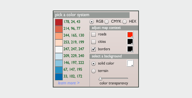
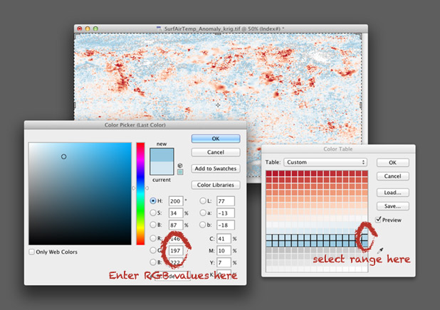
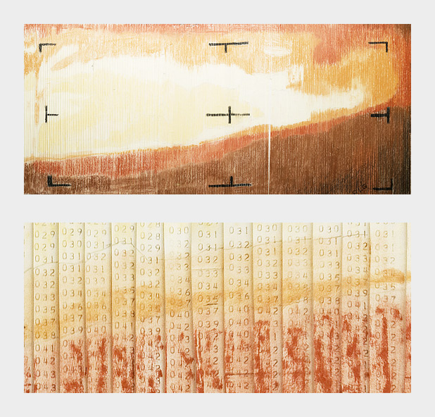
To convert the discrete colors from Color Brewer into a smooth 256-color ramp, import an 8-bit grayscale image into Photoshop. Then select Image > Mode > Indexed Color. This will bring up the Color Table window. Starting in the upper left, click and drag to select two rows, representing the first 32 colors in the palette. Then enter the Red, Green, Blue values of the first color (178, 24, 43 in our example), hit return, then enter the second color (214, 96, 77). Do this 7 more times (I know, it’s tedious) and you’ll have a full 8-bit palette. To make your life easier, Save the color table for next time (in .act format, the specification is buried on this page) before you hit OK.
You can also make a discrete palette. Just set the start and end points of the ramp to the same color.
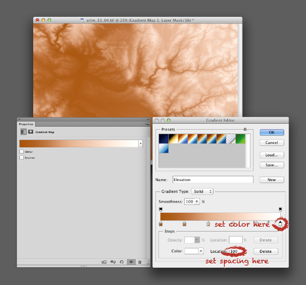
For 16-bit data (a digital elevation model, for example), use a gradient map. Again, start by opening a grayscale file, but this time with a bit depth of 16. Then convert the grayscale image to a color one by selecting Image > Mode > RGB Color. Then add a gradient map: Layer > New Adjustment Layer > Gradient Map… Name the layer if you want, then hit OK. You’ll end up with an editable gradient map as a separate layer above your data.
A gradient map allows you to set an arbitrary number of color points to blend between, and change both the relative spacing (in increments of one percent) and relative weighting of each point. It’s a bit more flexible than an indexed color palette, but specific to Photoshop (indexed color palettes are useful in almost all visualization and graphics software). For example, to create a palette blended between 6 colors, set 6 points, each separated by a distance of 20% (see the image below). Like an indexed color palette, you can also save the gradient for future use.
While Color Brewer is great (I use the palettes frequently) it’s not comprehensive. The available palettes are a bit limited in contrast, the selection of single- or two-color palettes is small, the lightness and saturation of the end points don’t match between palettes (making it impossible to make direct comparisons between similar datasets), and the Munsell color space doesn’t have perceptually linear saturation.
The next logical step is the NASA Ames Color Tool. (Note: When OS X 10.6 was released, the standard gamma for Macs changed from 1.8 to 2.2. Use the “Color Tool, Gamma = 2.2 (PC)” option on both Macs and PCs.) Developed to support the creation of legible aviation charts, the Ames Tool converts between the CIE L*C*h color space and RGB values. Lightness varies between 0 and 100 in increments of 10, chroma (saturation) from 0 to 156, also in increments of 10, and hue from 0 to 360 in 1˚ steps.
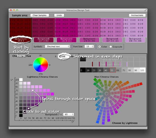
I find it easiest to create palettes by typing in the hue manually, then picking a color with the appropriate lightness and chroma. Move diagonally across the array of colors, and change the hue in even increments with each step. This creates a spiral through three-dimensional color space, with hue, chroma, and lightness varying simultaneously. It’s possible to create a strictly perceptual palette by always changing saturation in the same direction (usually from dark and saturated (intense) to light and desaturated (pale)), but the available range of contrast is less than a palette that includes very dark colors. Feel free to experiment, as long as lightness varies evenly.
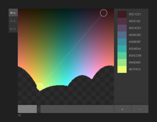
The Ames tool provides more flexibility than Color Brewer, but is also limited in the available range of colors. The maximum lightness with any hue is 90, the darkest 10 (inevitably with very low saturation). A suite of tools utilizing Gregor Aisch’s chroma.js Javascript library expand the number of colors, but are (in my opinion) a bit trickier to use than the Ames tool.
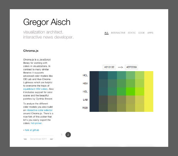
Chroma.js home page.
HCL picker, by Tristen Brown.
LAB, LCH, RGB, and HSV color picker, with initial colors specified in LCH (also by Gregor Aisch). LAB allows two-color ramps, which provides additional options to create palettes appropriate for particular datasets. Gregor was kind enough to whip this up based on a few suggestion posted on Twitter. Thanks!
Another option, but sadly lacking in visual feedback, is the colormine.org Online Color Converter. I haven’t used it much, but the results seem a little bit different than the equivalent conversion with chroma.js. Not too surprising, since L*C*h to RGB conversions are hardly simple.
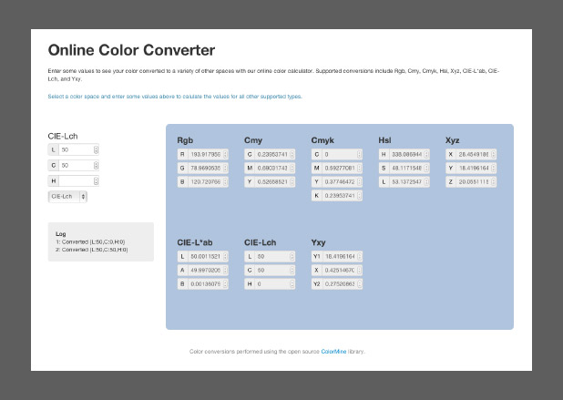
The ColorMine color conversion interface.
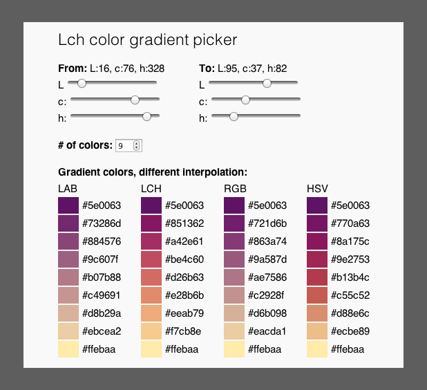
The NASA Ames color tool, Lch color gradient picker, and Online Color Converter are more-or-less useful for building sequential or divergent scales. I want hue, from the médialab at Sciences Po is designed to randomly generate “maximally distinct” colors—i.e. colors for qualitative palettes. (ColorBrewer, of course, works for all three types of data.)
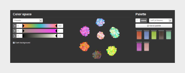
The interface for I want hue, a tool to generate qualitative color palettes derived from a perceptual color space.
The unique part about I want hue is that it can generate clusters of analogous colors—colors near each other on the color wheel. Perfect for building complex maps with large numbers of categories. It’s also useful for choosing colors for different categories of data that’s not spatial: line graphs, dot plots, or grouped bar charts, for example.
As far as I know, these tools are the state of the art. Yet each of them is limited in one way or another. Color Brewer has a fixed number of palettes. The NASA tool has a limited number of available lightness values. The chroma.js interfaces are a bit difficult to control precisely. Colormine lacks feedback. All of these tools generate a small number of colors, that then need to be blended to create smooth palettes.
What would the ideal palette building tool look like? (My ideal tool, at least.)
Spoiler alert: I’m working on this. Drop me a line if you’re interested in collaborating.
Subtleties of Color
Part 1: Introduction
Part 2: The “Perfect” Palette
Part 3: Different Data, Different Colors
Part 4: Connecting Color to Meaning
Part 6: References & Resources for Visualization Professionals
(This series on the use of color in data visualization is being cross-posted on visual.ly. Thanks to Drew Skau at visual.ly for the invitation.)
Connecting Color to Meaning
Pretty much any dataset can be categorized as one of three types—sequential, divergent, and qualitative—each suited to a different color scheme. Sequential data is best displayed with a palette that varies uniformly in lightness and saturation, preferably with a simultaneous shift in hue. Divergent data is suited to bifurcated palettes with a neutral central color. Qualitative data benefits from a set of easily distinguishable colors. Palettes defined in a perceptual color space—particularly CIE L*C*h—will be more accurate than those composed using RGB or HSV color spaces, which are more suited to computers than people.
I consider those the fundamentals of color for data visualization. You’d better be certain you know what you’re doing before you violate those rules (i.e. don’t use a rainbow palette unless there’s a reason more compelling than “that’s how we’ve always done it”). What are the more subtle aspects of color for data visualization? The touches that (hopefully) put an image on the 10% side of Sturgeon’s Law (not the 90%).
Intuitive Colors
This may sound obvious, but it’s an underused principle. Whenever possible, make intuitive palettes. Some conventional color schemes, especially those used in scientific visualization, are difficult for non-experts to understand. In fact, one study found “satellite visualizations used by many scientists are not intelligible to novice users” (emphasis mine). Visualizations should be as easy as possible to interpret, so try to find a color scheme that matches the audience’s preconceptions and cultural associations.
It’s not always possible, of course (what color is electrical charge, or income?) but a fair number of datasets lend themselves to particular colors. Vegetation is green, barren ground is gray or beige. Water is blue. Clouds are white. Red, orange, and yellow are hot (or at least warm); blue is chilly.
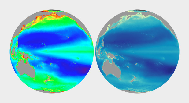
The unnatural colors of the rainbow palette (left) are often difficult for novice viewers to interpret. A more naturalistic palette for phytoplankton (more or less a type of ocean vegetation) trends from dark blue for barren ocean, through turquoise, green, and yellow for increasing concentrations of the tiny plants and algae.
In addition to colors affiliated with our physical environment (can you tell I primarily work on Earth science datasets?), cultural values are linked to certain colors. Check out the quilted thumbnails of Google image search results for words like “clean” (mint green) “malevolent” (ochre) and “abstract” (blue). Use these relationships to add cues into a visualization. Be aware that these are not universal, but vary by culture.
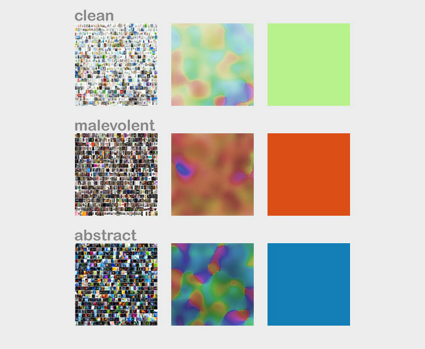
The cultural associations of color (at least in English), derived via Google image search. Image by John Nelson, IDV solutions.
Layering
The combination of two or more datasets often tell a story better than a single dataset, and the best visualizations tell stories. The color schemes for multiple datasets displayed together need to be designed together, and complement one another.
One approach is to layer datasets together, which is pretty much impossible if you’ve already used all the colors of the rainbow to display a single dataset. (I know I harp on the rainbow palette, and I’m sure you’re tired of it, but despite the well known flaws it’s still used in a disproportionate amount of visualization.) Instead, use muted colors to limit the range of hues and contrast in one dataset, and then overlay additional data, such as the contour lines and shaded relief of a topographic map combined with land cover, roads, and buildings.
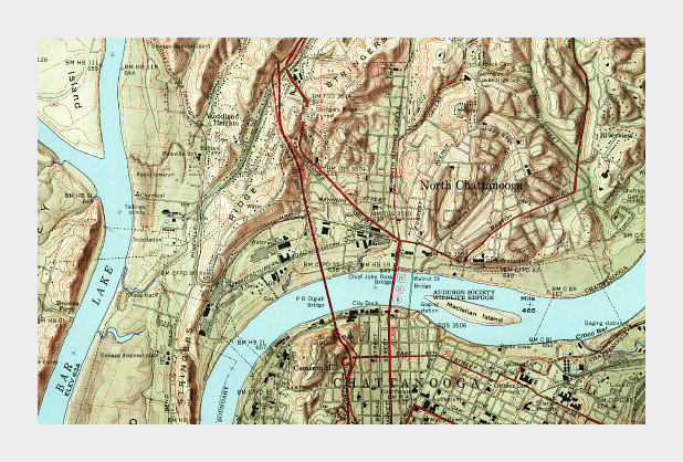
Muted colors, subtle shading and thin contour lines allow multiple types of data to be layered together in this 1958 topographic map of Chattanooga, Tennessee. (Did I mention cartographers have been doing this for ages, and are really good at it?)
Complementary Datasets
Other types of complementary data aren’t co-located: maps that include ocean and land, for example. In those cases careful control of lightness, saturation, and hue can enable quick differentiation as well as (mostly) accurate comparisons between datasets. Use two different hues, and vary the lightness and saturation simultaneously.
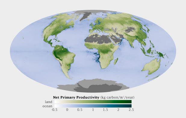
This map shows net primary productivity [a measure of the how much plants breathe (technically the amount of carbon plants take from the atmosphere and use to grow each year)] on land and in the ocean. The two datasets are qualitatively different (phytoplankton growing in the ocean, terrestrial plants on land), but quantitatively the same. The green land NPP is easily distinguishable from the blue oceans, but the relative lightness matches for a given rate of carbon uptake.
Non-diverging Breakpoints
Some sequential datasets feature one or more physically significant quantities: freezing on a map of temperature, for example. It’s not usually appropriate to use a full divergent palette, since the data are still on a continuum. To show these transitions, keep the change in lightness consistent throughout the palette, but introduce an abrupt shift in hue and/or saturation at the appropriate point. This does a good job of preserving patterns (again, one of the strengths of visualizations) while emphasizing and differentiating particular ranges of data.
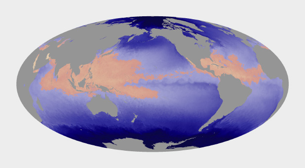
Hurricanes and other tropical cyclones are able to form and strengthen in waters over 82˚ Fahrenheit. This ocean temperature map uses rose and yellow to distinguish the warm waters that can sustain tropical cyclones from cool water, colored blue. (Map based on Microwave OI SST Data from Remote Sensing Systems.)
Use Color to Separate Data from Non-Data
Since color attracts the eye, lack of color can cause areas of a graphic to recede into the background. This is an extremely useful tool for creating hierarchy in a visualization. After all, you want viewers to focus on what’s important. Areas of no data are almost always less important than valid data points, but it’s still essential to include them in a visualization. Simply choosing not to color areas of no data, but assigning them a shade of gray (or even pure black and white) simultaneously de-emphasizes missing data and separates it from data. Just be careful to choose a shade of gray that’s distinct from the adjacent data.
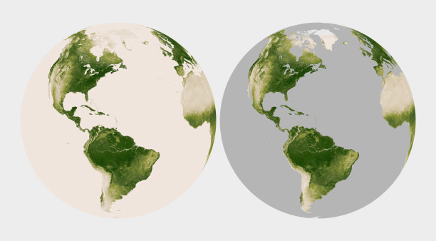
Missing or invalid data should be clearly separated from valid data. Simply replacing the light beige used to represent water in this map of land vegetation (left) with gray causes the land surfaces to stand out. (Vegetation maps adapted from the NOAA Environmental Visualization Laboratory.)
Figure-Ground
Sometimes it just comes down to a judgement call. I developed a special temperature map showing the hottest land temperatures over the course of a year, so the entire map had to feel “hot” but the merely warm areas were well over 40 degrees Celsius cooler than the hottest spots on Earth. Pale yellow to deep red felt like an obvious choice. It was reasonably intuitive, and the very hottest points stood out well from the lighter areas. The brain moves the bright red areas into the foreground, and pushes the pale yellows into the background.
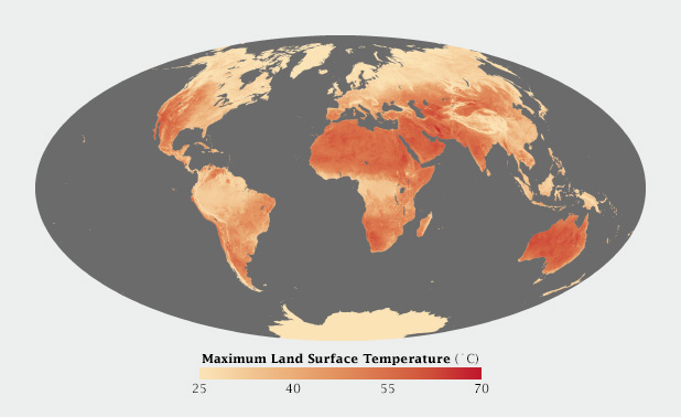
Warm colors, ranging from pale yellow to blood red, were most appropriate for this map of Earth’s hottest places.
When I applied the same color scale to a single day’s data, however, I was surprised to see that the coolest areas (irrigated fields) were subjectively hotter than their surroundings. The relatively small areas of pale yellow, surrounded by larger expanses of darker red, moved into the image foreground. (A combination of the compact areas of light color and very sharp boundaries, I think.) This subverted my intentions for the image. I ended up reverting to my standard blue-purple-red-yellow temperature palette, even though blue indicated temperatures of at least 30 degrees C (86 Fahrenheit)!
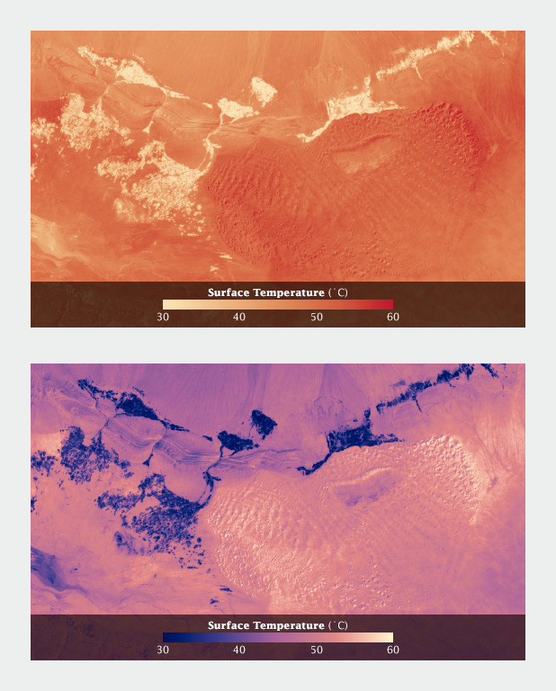
Using a yellow-red palette, cool irrigated fields appear warmer than the nearby dunes, inverting the true relationship. A palette that runs from blue through red to yellow reads more naturally.
Aesthetics
Aesthetics matter: attractive things work better.
Donald Norman, Emotional Design.
Most of these suggestions on the use of color are based on the principles of perception, which are derived from the neurological basis of how we see. They provide the foundation for accurate data visualization. But what separates “adequate” from “good” from “great” isn’t a matter of following rules—it’s a matter of aesthetics and judgement.
Follow good design practice as well as good visualization practice when developing imagery. In addition to color, consider the other aspects of design: typography, line, shape, alignment, etc. Be aware of the media you’re designing for. It may be trite, but a good visualization is better than the sum of its parts. Be aware of how the various elements of your design fit together. How do the colors used for the data interact with labels? With any nearby graphical elements? Are you designing for the web, television, or print? All of these considerations should inform your decisions.
Unfortunately I can’t provide any hard and fast rules to design visualizations that are aesthetically pleasing (or even beautiful). I can only encourage you to keep your eyes open. Look for good design, good art, and good visualization. Figure out why it works, and incorporate those elements into your own projects.
Subtleties of Color
Part 1: Introduction
Part 2: The “Perfect” Palette
Part 3: Different Data, Different Colors
Part 5: Tools & Techniques
Part 6: References & Resources for Visualization Professionals
(This series on the use of color in data visualization is being cross-posted on visual.ly. Thanks to Drew Skau at visual.ly for the invitation.)
Different Data, Different Colors
There are several types of data, each suited to different types of display. Continuously varying data, called sequential data, is the most familiar. In addition to sequential, Cynthia Brewer defines two additional types of data: divergent and qualitative. Divergent data has a “break point” in the center, often signifying a difference. For example, departure from average temperature, population change, or electric charge. Qualitative data is broken up into discrete classes or categories, as in land cover or political affiliation.
Sequential data (discussed in depth in my previous post, The “Perfect” Palette) is best represented by color palettes that vary evenly from light to dark, or dark to light, often with a simultaneous shift in hue and/or saturation.
Sequential data lies along a smooth continuum, and is suited to a palette with a linear change in lightness, augmented by simultaneous shifts in hue and saturation.
Divergent Data
Data that varies from a central value (or other breakpoint) is known as divergent or bipolar data. Examples include profits and losses in the stock market, differences from the norm (daily temperature compared to the monthly average), change over time, or magnetic polarity. In essence, there’s a qualitative change in the data (often a change in sign) as it crosses a threshold.
In divergent data, it’s usually more important to differentiate data on either side of the breakpoint—increase versus a decrease, acid versus base—than small variations in the data. Bipolar data is suited to a palette that uses two different hues that vary from a central neutral color. Essentially, two sequential palettes with equal variation in lightness and saturation are merged together. This type of palette works because it takes advantage of pre attentive processing: our visual systems can discriminate the different colors quickly and without conscious thought.
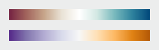
Divergent palettes, each composed of two sequential palettes merged with a neutral color. (Derived from the NASA Ames Color Tool (top) and Color Brewer.)
For the most part use white or light gray as the central shade. Although neutral, black or dark gray is typically a poor choice because the most extreme values will be light and desaturated, deemphasizing them. Central colors with a hue component, even a slight one, will tend to be associated with one end of the scale or the other.
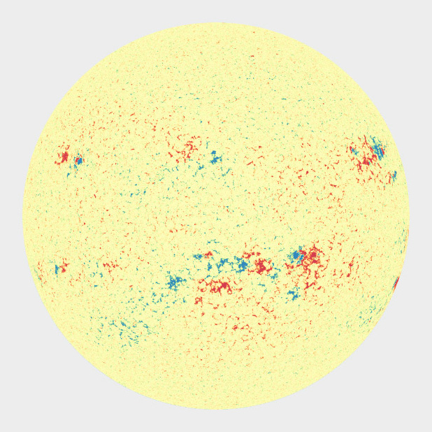
A magnetogram is a map of magnetic fields, in this case on the surface of the Sun. A divergent palette suits this data because the north polarity (red) and south polarity (blue) are both measurements of the same quantity (magnetism), just with opposite signs. SDO HMI image adapted from the Solar Data Analysis Center.
I find it much more difficult to design divergent palettes than sequential palettes. There’s a limited number of color pairs that allow strong contrast simultaneously in both hues. If the colors converge too abruptly, high-contrast “rivers” of white may appear in the visualization when quantities are near the transition point. Even worse, about 5 percent of people (almost all of them men) are color blind, and will have a difficult time seeing the difference in certain hue pairs, particularly red-green (more rarely blue-red).
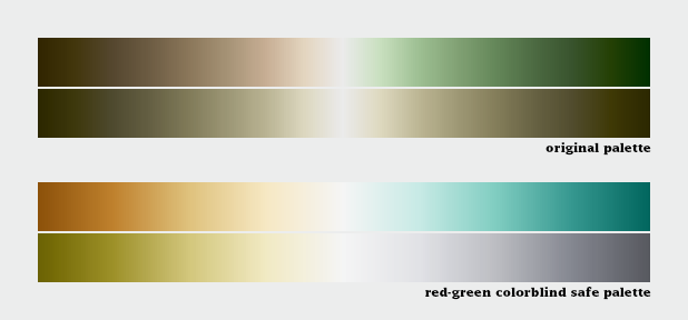
Despite our best intentions, the Earth Observatory long used a vegetation anomaly palette that was completely unreadable by color blind viewers. Compare the full color palettes to what a color deficient viewer would see (derived from Adobe Photoshop’s deuteranopia simulation).
A sequential palette that varies uniformly in lightness will still be readable by someone with color deficient vision (or a black and white print), regardless of the hue. But a divergent palette with matched lightness can be difficult or impossible to parse if the viewer can’t distinguish the hues. To ensure your designs are accessible, choose from the color blind safe palettes on Color Brewer, or one of the online color blindness simulators.
Despite these difficulties, divergent palettes are worth using. In many cases, especially for trends, a difference map using a divergent palette is much more effective than an animation or even a sequence of small multiples.
Categorical Data
Qualitative data (occasionally known as categorical or thematic data) is distinct from sequential and divergent data: instead of representing proportional relationships, color is used to separate areas into distinct categories. Instead of a range of related colors, the palette should consist of colors as distinct from one another as possible. Due to the limits of perception, especially simultaneous contrast, the maximum number of categories that can be displayed is about 12 (practically speaking, probably fewer).
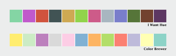
These two qualitative color schemes—from I Want Hue (top) and Color Brewer (lower)—each consist of 12 distinct colors.
If you need to display double-digit categories, it’s best to group similar classes together. This is how the United States Geological Survey presents the 16 classes of the National Land Cover Database. Four urban densities are shown in shades of red, 3 forest types in shades of green, and different types of cropland in yellow and brown.
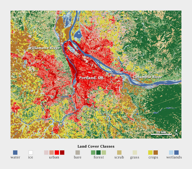
A grouped color scheme allows the USGS to simultaneously show 16 different land cover classes in a single map of the area surrounding Portland, Oregon.
For even larger numbers of categories, incorporate additional elements like symbols, hatching, stippling, or other patterns. Also, label each element directly. It’s impossible to distinguish dozens of colors and shapes simultaneously. Geological maps can have more than 100 categories yet remain (somewhat) readable.
Subtleties of Color
Part 1: Introduction
Part 2: The “Perfect” Palette
Part 4: Connecting Color to Meaning
Part 5: Tools & Techniques
Part 6: References & Resources for Visualization Professionals
(This series on the use of color in data visualization is being cross-posted on visual.ly. Thanks to Drew Skau at visual.ly for the invitation.)
The “Perfect” Palette
Despite the near-ubiquity of the rainbow palette—which distorts patterns in the underlying data—the basics of using color to represent numerical data are well-established.
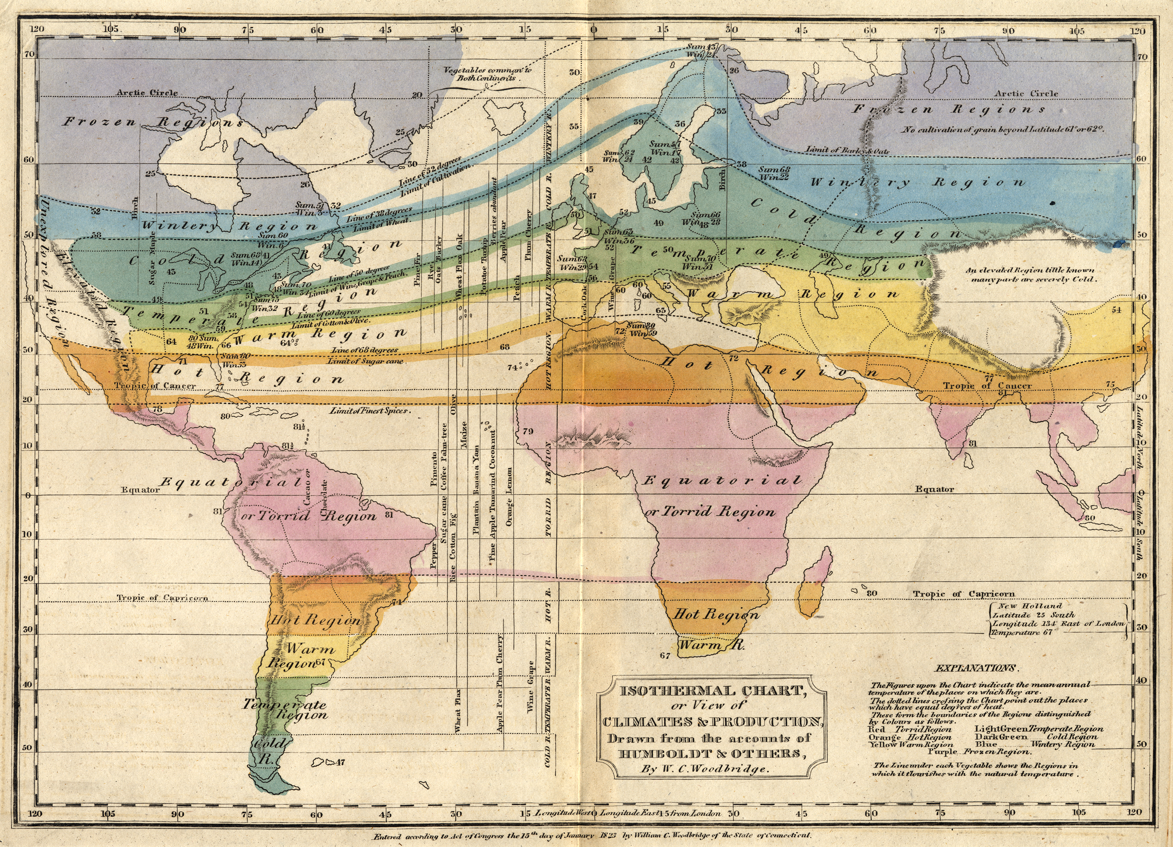
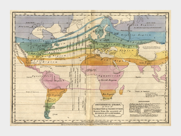 This 1823 map by W. C. Woodbridge is an early example of the use of colors to represent numbers—in this case more qualitative than quantitative. The rainbow palette is effective for this map because colors in the spectrum are perceived as “cool” and “warm,” and the colors clearly segment the climate zones. Map from the Historic Maps Collection, Princeton University Library.
By the mid-1960s cartographers had already established guidelines for the appropriate use of color in map-making. Jacques Bertin pointed out shortcomings of the rainbow palette in Sémiologie Graphique (The Semiology of Graphics), and Eduard Imhof was crafting harmonious color gradients for use in topographic maps [published in Kartographische Geländedarsellung (Cartographic Relief Presentation)].
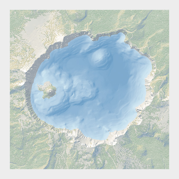 The subtle colors in this bathymetric map of Crater Lake are a direct descendent of the palettes created by Eduard Imhof. Map courtesy National Park Service Harper’s Ferry Center.
In the 1980s and 1990s researchers in perception and visualization were investigating the efficacy of palettes, based on the ways our brains and eyes physically respond to light. These color scales were crafted to achieve the principal goals of spatial displays: to show patterns and relationships in data, and to allow a viewer to accurately read individual values. [Colin Ware (1988) Color Sequences for Univariate Maps: Theory, Experiments, and Principles; Brewer (1994) Color Use Guidelines for Mapping and Visualization; Rogowitz and Treinish (1995) How NOT to Lie with Visualization; Tufte (1997) Visual Explanations; Spence et al. (1999) Using Color to Code Quantity in Spatial Displays.]
According to much of this research, a color scale should vary consistently across the entire range of values, so that each step is equivalent, regardless of its position on the scale. In other words, the difference between 1 and 2 should be perceived the same as the difference between 11 and 12, or 101 and 102, preserving patterns and relationships in the data. (For data with a wide range that is better displayed logarithmically, relative proportions should be maintained: the perceived difference between 1 and 10 should be the same as 1,000 and 10,000.) Consistent relationships between numbers—like in a grayscale palette—preserves the form of the data. Palettes with abrupt or uneven shifts can exaggerate contrast in some areas, and hide it others.
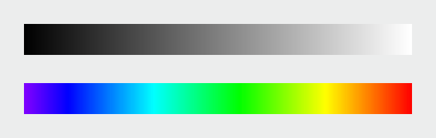 Compared to a monochromatic or grayscale palette the rainbow palette (IDL number 35) tends to accentuate contrast in the bright cyan and yellow regions, but blends together through a wide range of greens.
A palette should also minimize errors from the color shifts introduced by nearby areas of differing color or lightness, a phenomenon known as simultaneous contrast.
 Simultaneous contrast (a visual phenomenon that helps us interpret shapes through variations in brightness) shifts the appearance of colors and shades based on their surroundings. (After Ware (1988).)
Simultaneous contrast is most pronounced in monochromatic palettes, while sharp variations in hue minimize the effect. As a result variations of the rainbow palette are good for preserving exact quantities.
How to take advantage of the strengths of both the grayscale palette (preservation of form) and rainbow palette (preservation of quantity), while minimizing their weaknesses? Combine a linear, proportional change in lightness with a simultaneous change in hue and saturation. Colin Ware describes this type of palette as “a kind of spiral in color space that cycles through a variety of hues while continuously increasing in lightness” (Information Visualization: Perception for Design, Second Edition). The continuous, smooth increase in lightness preserves patterns, the shift in hue aids reading of exact quantities, and the change in saturation enhances contrast.
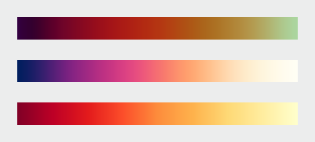 A color palette that combines a continuous increase in lightness with a shift in hue is a good compromise that preserves both form and quantity. These three palettes show the smooth, even gradations that result from color scales calculated in perceptual color spaces. Color scales with varied hues and contrast are suitable for representing different datasets. (After Spence et al. (1999), chroma.js, and Color Brewer.)
Of the three components of color—hue, saturation, and lightness—lightness is the strongest. As a result, accurate, one-way changes in lightness are more important than those in hue or saturation. For example, a color scale that goes from black to color to white can still be read accurately, even though the saturation is lower at both ends of the scale than in the middle. This allows a bit of flexibility in designing palettes, especially for datasets that benefit from high-contrast color ramps. You also don’t need to worry too much about color scales that drift a little bit out of gamut (the complete range of colors displayed on a particular device) for a portion of the ramp. Just make sure lightness is still changing smoothly.
 This palette differs from the ideal with saturation that increases from low-to-mid values, and decreases from mid-to-high values. It’s still readable because lightness, the component of color perceived most strongly, changes continuously. (Derived with the NASA Ames color tool).
All of these palettes are appropriate for sequential data. Data that varies continuously from a high to low value; such as temperature, elevation, or income. Different palettes are suited to other types of data, such as divergent and qualitative, which I’ll discuss next week.
Subtleties of Color
Part 1: Introduction
Part 3: Different Data, Different Colors
Part 4: Connecting Color to Meaning
Part 5: Tools & Techniques
Part 6: References & Resources for Visualization Professionals
(This series on the use of color in data visualization is being cross-posted on visual.ly. Thanks to Drew Skau at visual.ly for the invitation.)
Introduction
The use of color to display data is a solved problem, right? Just pick a palette from a drop-down menu (probably either a grayscale ramp or a rainbow), set start and end points, press “apply,” and you’re done. Although we all know it’s not that simple, that’s often how colors are chosen in the real world. As a result, many visualizations fail to represent the underlying data as well as they could.
The purpose of data visualization—any data visualization—is to illuminate data. To show patterns and relationships that are otherwise hidden in an impenetrable mass of numbers.
Encoding quantitative data with color is (sometimes literally) a simple matter of paint-by-numbers. In 1964 Richard Grumm and his team of engineers at NASA’s Jet Propulsion Laboratory hand-colored the first image of Mars taken from an interplanetary probe as they waited for computers to process the data.
In spatial datasets [datasets with at least two dimensions specifying position, and at least one additional dimension of quantity (a category that includes not only maps, but everything else ranging from individual atoms to cosmic background radiation)] color is probably the most effective means of accurately conveying quantity, and certainly the most widespread. Careful use of color enhances clarity, aids storytelling, and draws a viewer into your dataset. Poor use of color can obscure data, or even mislead.
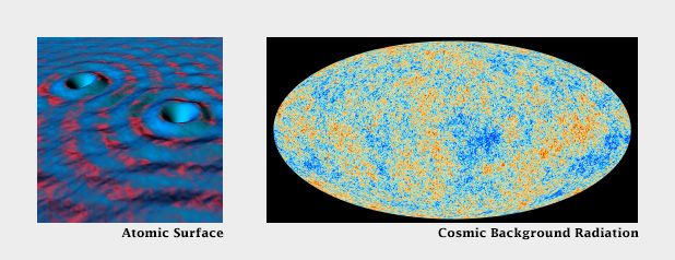
Color can be used to encode data from the atomic scale (left), to the universal (right). (Scanning tunneling microscope image originally created by IBM Corporation (left), cosmic background radiation image courtesy ESA and the Planck Collaboration (right)).
Fortunately, the principles behind the effective use of color to represent data are straightforward. They were developed over the course of more than a century of work by cartographers, and refined by researchers in perception, design, and visualization from the 1960s on.
Although the basics are straightforward, a number of issue complicate color choices in visualization. Among them:
The relationship between the light we see and the colors we perceive is extremely complicated.
There are multiple types of data, each suited to a different color scheme.
A significant number of people (mostly men), are color blind.
Arbitrary color choices can be confusing for viewers unfamiliar with a data set.
Light colors on a dark field are perceived differently than dark colors on a bright field, which can complicate some visualization tasks, such as target detection.
(Very) Basic Color Theory
Although our eyes see color through retinal cells that detect red, green, and blue light, we don’t think in RGB. Rather, we think about color in terms of lightness (black to white), hue (red, orange, yellow, green, blue, indigo, violet), and saturation (dull to brilliant). These three variables (originally defined by Albert H. Munsell) are the foundation of any color system based on human perception. Printers and painters use other color systems to describe the mixing of ink and pigment.
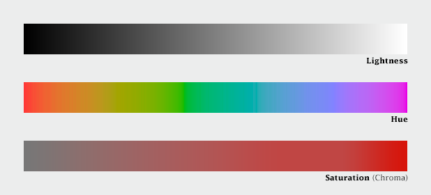
Lightness, hue, and saturation (sometimes called chroma) are the building blocks of color.
Computers (and computer programmers) on the other hand, do process colors in terms of red, green, and blue. Just not the same red, green, and blue that our eyes detect. Computer screens display colors that are a combination of very narrow frequency bands, while each type of cone in our eyes detect a relatively broad spectrum. Complicating things further, computers calculate light linearly, while humans perceive exponentially (we are more sensitive to changes at low light levels than high light levels), and we’re more sensitive to green light than red light, and even less sensitive to blue light.
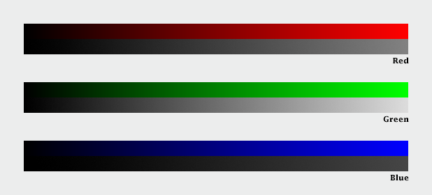
Computers calculate color using three primary colors—red, green, and blue. Unfortunately, we see green as brighter than red, which itself is brighter than blue, so colors specified in terms a computer understands (RGB intensities from 0-255) don’t always translate well to how we see.
The combined result of these nonlinearities in our vision is color perception that’s, well, lumpy. For example, the range of saturation we’re capable of seeing for a single hue is highly dependent on its lightness. In other words, there’s no such thing as a dark yellow. Near the center of the lightness range, blue and red shades can be very saturated, but green tones cannot. Very light and very dark colors are always dull.
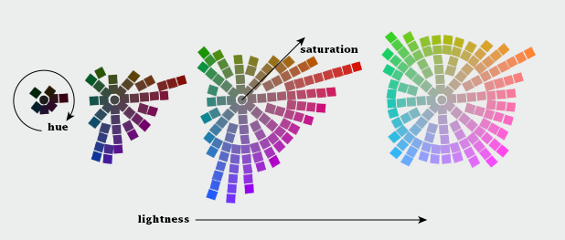
The range of colors perceived by humans is uneven. (Equiluminant colors from the NASA Ames Color Tool)
CIE Color Spaces
The unevenness of color perception was mapped by the International Commission on Illumination (Commission Internationale de l´Eclairage in French, hence “CIE”) in the 1930s. The CIE specified (and continues to refine) a series of color spaces that allow scientists, artists, and printers—anyone who works with light—to describe colors consistently, and accurately translate color between mediums. CIE L*a*b, for example, is used internally by Adobe Photoshop to interpolate color gradients and convert images from RGB (screen) to CMYK (print).
Another of these specifications: CIE L*C*h [lightness, chroma (saturation), hue] is my preferred tool for crafting color palettes for use in visualization. Because the three components of CIE L*C*h are straightforward, it’s simple to use. Because it’s based on studies of perception, color scales developed with L*C*h help accurately represent the underlying data. I say “help” because perfect accuracy is impossible—there are too many variables in play between the data and our brains. [Another option (used in Color Brewer) is the Munsell Color System, which is accurate in lightness and hue, but not in saturation.]
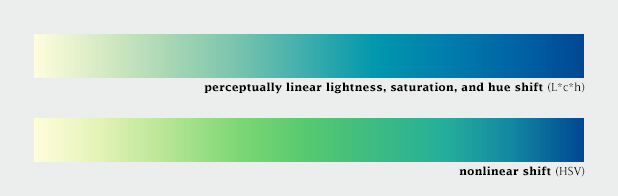
Choosing and interpolating colors in a perceptual space—CIE L*c*h—helps ensure consistent change across the entire palette. In this example, which varies from pale yellow to blue, the range of green shades is expanded, and blues are compressed in the nonlinear palette relative to the linear palette. Palettes generated via Gregor Aisch’s L*C*h color gradient picker and chroma.js
In short, people aren’t computers. Computer colors are linear and symmetrical, human color perception is non-linear and uneven. Yet many of the tools commonly used to create color schemes are designed more for computers than people. These include tools that calculate or specify colors in the red, green, blue (RGB) or hue, saturation, value (HSV) color spaces. A constant increase in brightness is not perceived as linear, and this response is different for red, green, and blue. Look for tools and color palettes that describe colors in a perceptual color space, like CIE L*C*h or Munsell.
In the rest of this series, I’ll outline the principles behind the “perfect” color palette, describe different types of data that require unique types of palettes, give some suggestions for mitigating color blindness, and illustrate some tricks enabled by careful use of colors.
Subtleties of Color
Part 2: The “Perfect” Palette
Part 3: Different Data, Different Colors
Part 4: Connecting Color to Meaning
Part 5: Tools & Techniques
Part 6: References & Resources for Visualization Professionals
(This series on the use of color in data visualization is being cross-posted on visual.ly. Thanks to Drew Skau at visual.ly for the invitation.)
