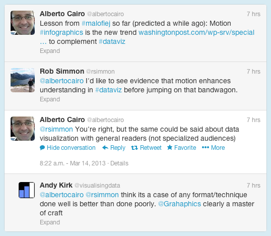
I (@rsimmon) had a brief exchange this morning about the use of motion graphics in data visualization with Alberto Cairo (@albertocairo) and Andy Kirk (@visualisingdata) which quickly outgrew Twitter’s 140-character limit:
The increasing use of animation (and 3D) in data and information visualization is definitely a trend, but I don’t think it’s a good one. My (possibly naïve) understanding is that motion in data visualization is great for engagement (nothing can capture the attention of the human visual system like motion), but can be a detriment to comprehension. Cognitive science researchers like Barbara Tversky and Richard Lowe discovered that animations—even “well designed” ones—were often less effective than static diagrams at communicating concepts like the inner workings of a British toilet (I’m not kidding) or the movements of a piano action. Motion may get more people to view a graphic, but they may learn less from it.
Don’t get me wrong: recent work by Graham Roberts (thanks Andy!) and many other designers is stunning, and I love working in compositing and 3D software. One of the best visualizations I’ve ever done—a satellite view of the terminator over the course of a year—is animated:
[youtube FmCJqykN2J0]
But animation is typically more difficult and time consuming to produce than static visualization. Even if it’s no worse than a static graphic, is an animation worth the extra expense?
Alberto also touched on the issue of audience: does the general public understand data visualization? On the web that may not be something we have to worry about. Anybody that clicks a link on the Interent is the member of an attentive public—they’re actively seeking information. An attentive person is already interested in a topic, and is usually willing to do the mental work to understand what they’re looking at. (Jon Miller pioneered the concept of attentive publics in his 1983 book, The American People and Science policy: The Role of Public Attitudes in the Policy Process.)
Data visualization is a young field, however, and perhaps we’ll learn how to make beautiful, effective animations quickly & inexpensively. Right now, however, perhaps we should focus on improving more pedestrian information displays.
