Last week I had the privilege of helping judge the 22nd Malofiej Awards. Presented by the Spanish Chapter of the Society for News Design, Malofiej 22 recognized the best news infographics of 2013. (For the uninitiated, infographics aren’t limited to those posters illustrating tenuously related facts with a handful of pie charts. A good infographic is an information-rich visual explanation; often incorporating illustration and text, but sometimes they’re as simple as a line graph.)
My fellow jurors for the online competition were an eclectic and brilliant bunch: Anatoly Bondarenko, interactive visualization designer for Texty (a Ukrainian guerrilla news site); Scott Klein, news applications editor at ProPublica, Golan Levin, artist & professor at Carnegie Mellon University; and Sérgio Lüdtke, journalist and professor of digital journalism at the International Institute of Social Sciences. (Good thing I didn’t read these bios before heading to Spain: I would have been more intimidated than I already was.)
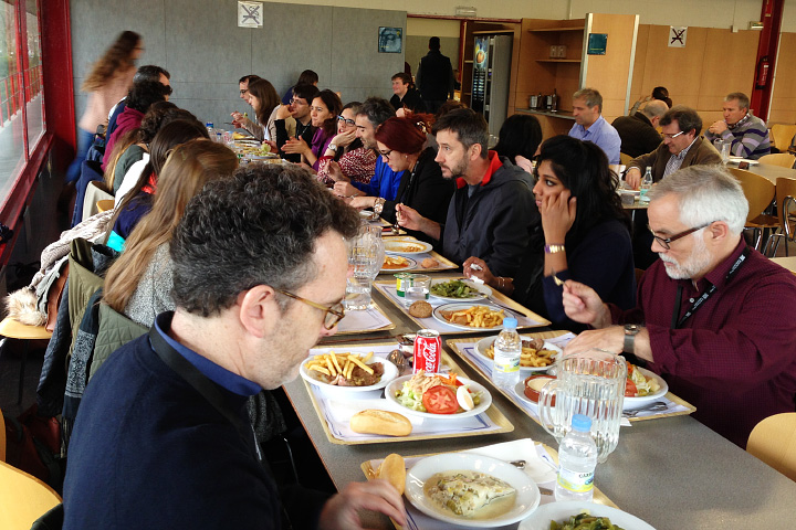
A traditional Spanish lunch for the Malofiej jurors and student volunteers.
For four days we evaluated, discussed, and sometimes argued about 400 or so online visualizations. We first narrowed the field down to about 100, then selected 8 gold, 24 silver, and 39 bronze medals (assuming I counted right). It was interesting to me that we largely liked (and disliked) the same entries, but often for different reasons. This led to several “ah ha” moments, when I suddenly appreciated a new perspective on a figure.
Instead of writing about the golds, which have already garnered their fair share of praise, here are some of my favorite silver and bronze winners.
Silver
China’s Memory Hole: The Images Erased From Sina Weibo (ProPublica)

The beauty of this piece is that the images are the data: images censored from Weibo, a Chinese service similar to Twitter.
Bronze
Electionland (Zeit Online)
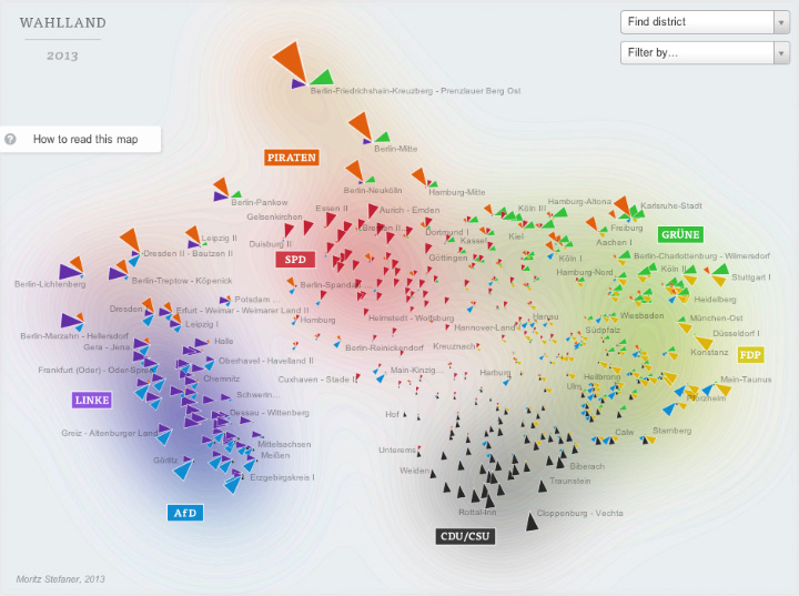
I have a few quibbles about this map of the 2013 German Bundestag elections, but it’s a brilliant bit of data crunching and abstraction. Voting districts are positioned based on the similarity of their voting patterns, rather than geography.
Bronze
The federal health-care exchange’s abysmal success rate (The Washington Post)
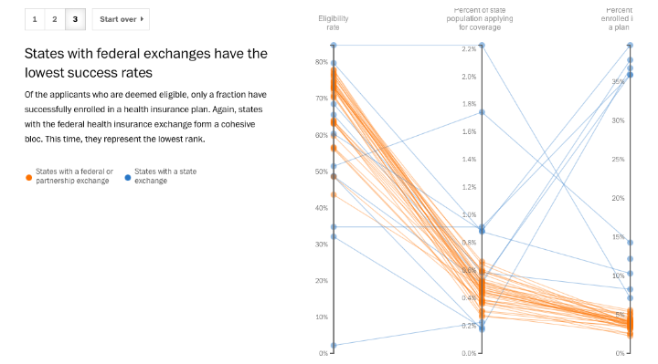
It’s a slope graph, what more do I need to say?
Of course, if you’re on the Malofiej jury picking awards is the easy part. You’re then on the hook to give a talk to some of the best designers and data visualizers in the world.
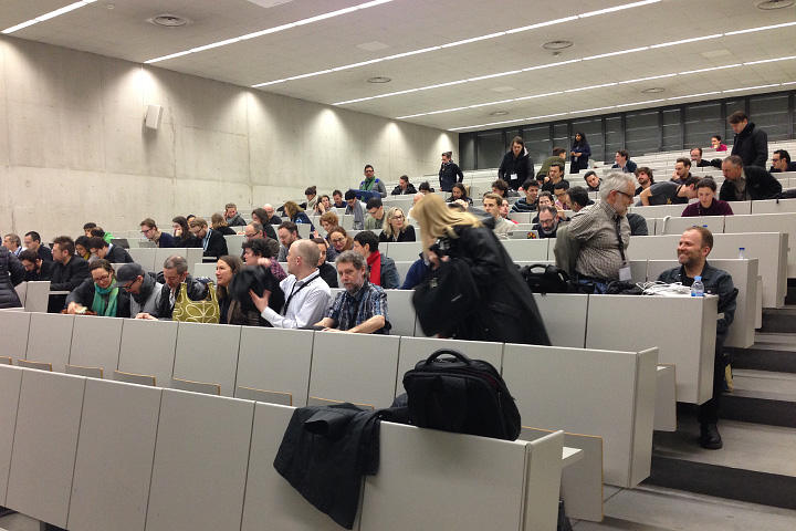
The Malofiej audience.
Jonathan Corum (Two Little Ducks) and Anatoly Bondarenko (Texty on Malofiej-22) gave two of the standouts.
Phew. What a long, exhausting, tremendously rewarding week.
Finally, I’d like to personally thank the student volunteers that functioned as tour guides, travel agents, translators, and personal assistants. They also made sure the online jury got our fair share of chocolate croissants, showed us the best pintxos bars in Pamplona, and even provided tips on surviving a run with the bulls [train, wear white, and run sober (which should’t be that hard, considering it starts at 8:00 a.m.!)]: Carmen Guitián, Alicia Arza, Ann Radjassamy, Beatriz Ciordia, Carmen Arroyo, Carmen Camey, Gabriela Suescum, Kristina Votrubová, Lucía Pérez, Andrés Juárez, Leire Emparanza, María Elena Quiñonero, Mariu Tena, and Alicia Alamillos.
Gracias.
