In addition to data visualization, satellite imagery, and case studies, I intend to occasionally discuss general topics in design and typography. In this case, the typeface* Comic Sans.
Seen at the entrance to the Gibson Ampitheatre, Los Angeles, California:
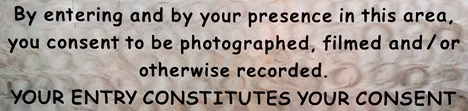
A legal warning (giving up all rights to your likeness once you pass the sign) written in Comic Sans bold. The problem? Comic Sans is an extremely informal typeface, and legal text is extremely formal. Not a good combination. It’s also not a particularly readable typeface, since it was designed for short snippets of text in word balloons, not prose. (I’ve even had the thought that the sign was in a difficult to read font on purpose, but that’s not likely.) Comic Sans is famously infamous, it’s even been featured by the Wall Street Journal: Typeface Inspired by Comic Books Has Become a Font of Ill Will.
I’m not out to ban comic sans, but there are plenty of better typefaces available for public signage; from the London Underground’s Johnston, to the ubiquitous Helvetica, to the Standard Alphabets for Traffic Control Devices. (Actually, those might not be the best choice in this case, since they’re designed for legibility, not readability, but that’s a different discussion.)
Comic Sans would be good for something like lettering in a storyboard, or even its original intended use in comics. Unfortunately it would be a pretty generic comic, since Comic Sans ships with Microsoft Windows and Microsoft Office, so almost everyone with a computer has a copy. There’s plenty of good (and free) alternatives out there. At this point the most appropriate use of comic sans is probably ironic.
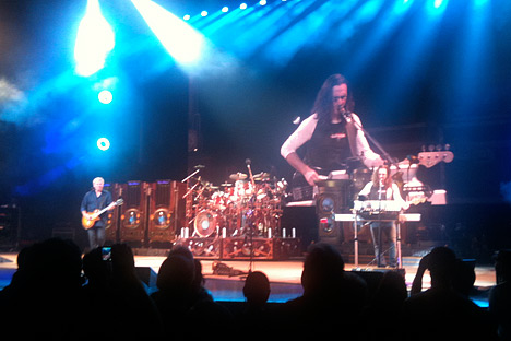
In case you’re wondering, we use 13-point Georgia for body text, 11-point Lucida Sans for captions & annotations, and 21 point Helvetica Neue Medium Condensed in the masthead. And how was the show? Awesome.
* Typefaces are colloquially referred to as fonts, but technically a font is a specific size of a specific font weight & style of a typeface. A typeface is all sizes a specific weight & style (bold, italic, etc.). A typeface family is the next step up in the hierarchy, including variant versions of a typeface, sometimes even as extreme as sans-serif and serif versions. I’m pedantic, so I usually use the precise terms.
