This post was originally published by the Society for News Design for the Malofiej Infographic World Summit.
Palettes aren’t the only important decision when visualizing data with color: you also need to consider scaling. Not only is the choice of start and end points (the lowest and highest values) critical, but the way intermediate values are stretched between them.
Note: these tips apply to scaling of smoothly varying, continuous palettes. For discrete palettes divided into distinct areas (countries or election districts, for example, technically called a choropleth map), read John Nelson’s authoritative post, Telling the Truth.
For most data simple linear scaling is appropriate. Each step in the data is represented by an equal step in the color palette. Choice is limited to the endpoints: the maximum and minimum values to be displayed. It’s important to include as much contrast as possible, while preventing high and low values from saturating (also called clipping). There should be detail in the entire range of data, like a properly exposed photograph.
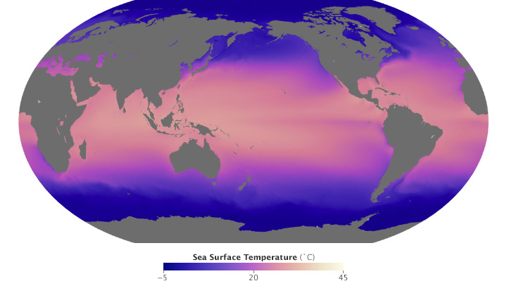
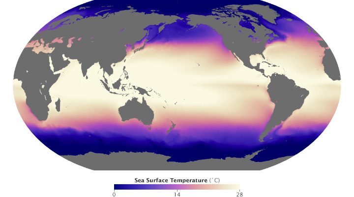
These maps of sea surface temperature (averaged from July 2002 through January 2014) demonstrate the importance of appropriately choosing the range of data in a map. The top image varies from -5˚ to 45˚ Celsius, a few degrees wider than the bounds of the data. Overall it lacks contrast, making it hard to see patterns. The lower image ranges from 0˚ to 28˚ Celsius, eliminating details in areas with very low or very high temperatures. (NASA/MODIS.)
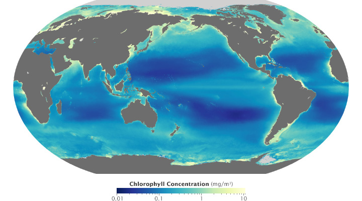
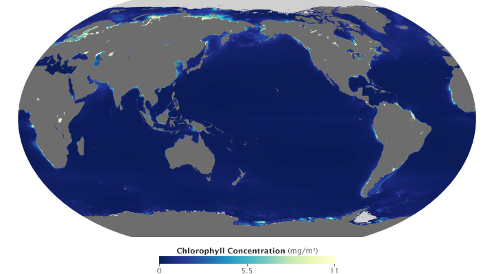
Ocean chlorophyll (a measure of plant life in the oceans) ranges from hundredths of a milligram per cubic meter to tens of milligrams per cubic meter, more than 3 orders of magnitude. Both of these maps use the almost same endpoints from near 0 (it’s impossible to start a logarithmic scale at exactly 0) to 11. Plotted linearly, the data show a simple pattern: narrow bands of chlorophyll along coastlines, and none in mid-ocean. A logarithmic base-10 scale reveals complex structures throughout the oceans, in both coastal and deep water. (NASA/MODIS.)
Some visualization applications support logarithmic scaling. If not, you’ll need to apply a little math to the data (for example calculate the square root or base 10 logarithm) before plotting the transformed data.
Appropriate decisions while scaling data are a complement to good use of color: they will aid in interpretation and minimize misunderstanding. Choose a minimum and maximum that reveal as much detail as possible, without saturating high or low values. If the data varies over a very wide range, consider a logarithmic scale. This may help patterns remain visible over the entire range of data.
Since its launch in February 2013, Landsat 8 has collected about 400 scenes of the Earth’s surface per day. Each of these scenes covers an area of about 185 by 185 kilometers (115 by 115 miles)—34,200 square km (13,200 square miles)—for a total of 13,690,000 square km (5,290,000 square miles) per day. An area about 40% larger than the united states. Every day.
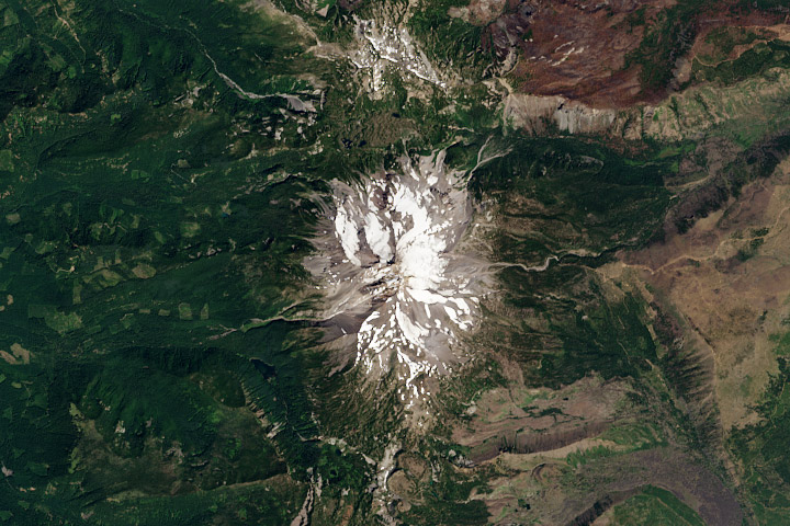
Mount Jefferson, Oregon. True-color Landsat 8 image collected August 13, 2013.
Although it’s possible to process all that data automatically, it’s best to process each scene individually to bring out the detail in a specific region. Believe it or not, this doesn’t require any tools more specialized than Photoshop (or any other image editing program that supports 16-bit TIFF images, along with curve and level adjustments).
The first step, of course, is to download some data. Either use this sample data (184 MB ZIP archive) of the Oregon Cascades, or dip into the Landsat archive with my tutorial for Earth Explorer. The data are comprised of 11 separate image files, along with a quality assurance file (BQA) and a text file with metadata (date and time, corner points—that sort of thing). These arrive in a ZIPped and TARred archive. (Windows does not natively support TAR, so you may need to use something like 7-Zip to unpack the files. OS X can automatically uncompress the files (with default settings) when the archive is downloaded—double-click to unpack the TAR.) Inexplicably, the TIFFs aren’t compressed. [The patent on the LZW lossless compression algorithm (which is transparently supported by Photoshop and many other TIFF readers) expired about a decade ago.]
After you’ve extracted the files, you’ll have a somewhat cryptically-named directory [i.e. “LC80450292013225LGN00” (download sample data) (184 MB ZIP archive)] with the three band files in it (B2, B3, B4):
LC80450292013225LGN00_B1.TIF
LC80450292013225LGN00_B2.TIF
LC80450292013225LGN00_B3.TIF
LC80450292013225LGN00_B4.TIF
LC80450292013225LGN00_B5.TIF
LC80450292013225LGN00_B6.TIF
LC80450292013225LGN00_B7.TIF
LC80450292013225LGN00_B8.TIF
LC80450292013225LGN00_B9.TIF
LC80450292013225LGN00_B10.TIF
LC80450292013225LGN00_B11.TIF
LC80450292013225LGN00_BQA.TIF
LC80450292013225LGN00_MTL.txt
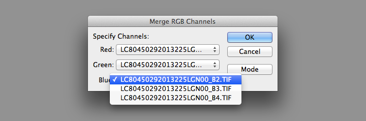
I’ve highlighted the three bands needed for natural-color (also called true-color, or photo-like) imagery: B4 is red (0.64–0.67 µm), B3 is green (0.53–0.59 µm), B2 is blue (0.45–0.51 µm). (The complete scene data can be downloaded using Earth Explorer.)
I prefer using the red, green, and blue bands because natural-color imagery takes advantage of what we already know about the natural world: trees are green, snow and clouds are white, water is (sorta) blue, etc. False-color images, which incorporate wavelengths of light invisible to humans, can reveal fascinating information—but they’re often misleading to people without formal training in remote sensing. The USGS also distributes imagery they call “natural color,” using shortwave infrared, near infrared, and green light. Although the USGS imagery superficially resembles an RGB picture, it is (in my opinion) inappropriate to call it natural-color. In particular, vegetation appears much greener than it actually is, and water is either black or a wholly unnatural electric blue.
Even natural-color satellite imagery can be deceptive due to the unfamiliar perspective. Eduard Imhof, a Swiss cartographer active in the mid Twentieth Century, wrote*:
(A)erial photographs from great heights, even in color, are often quite misleading, the Earth’s surface relief usually appearing too flat and the vegetation mosaic either full of contrasts and everchanging (sic) complexities, or else veiled in a gray-blue haze. Colors and color elements in vertical photographs taken from high altitudes vary by a greater or lesser extent from those that we perceive as natural from day to day visual experience at ground level.
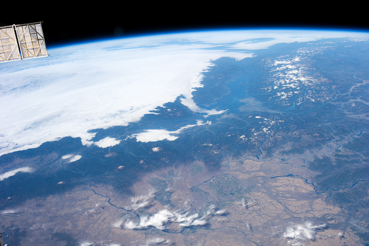
Seen from above, the Earth’s surface is made brighter and bluer by the atmosphere (compare the hue of the clouds to the hue of the panels on the International Space Station). (Astronaut Photograph ISS037-E-001180)
Because of this, satellite imagery needs to be processed with care. I try to create imagery that matches what I see in my mind’s eye, as much or more than a literal depiction of the data. Our eyes and brains are inextricably linked, after all, and what we see (or think we see) is shaped by context.
Enough theory. To build a natural-color image, open the three separate files in Photoshop:
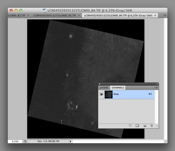
You’ll end up with three grayscale images, which need to be combined to make a color image. From the Channels Palette (accessed through Photoshop’s Windows menu item) select the Merge Channels command (click on the small downward-pointing triangle in the upper-right corner of the palette).
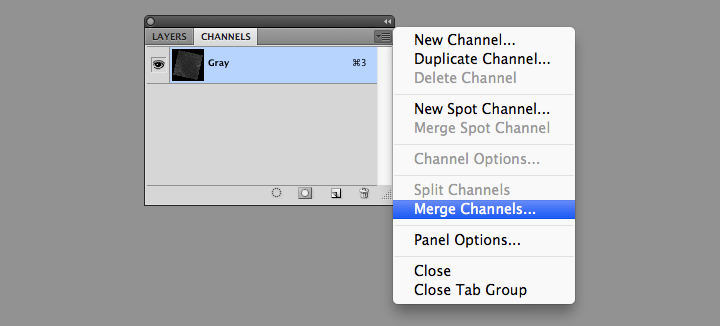
Then change the mode from Multichannel to RGB Color in the dialog box that appears. Set band B4 as red, B3 as green, and B2 as blue.
This will create a single RGB image, which will be dark. Very dark:
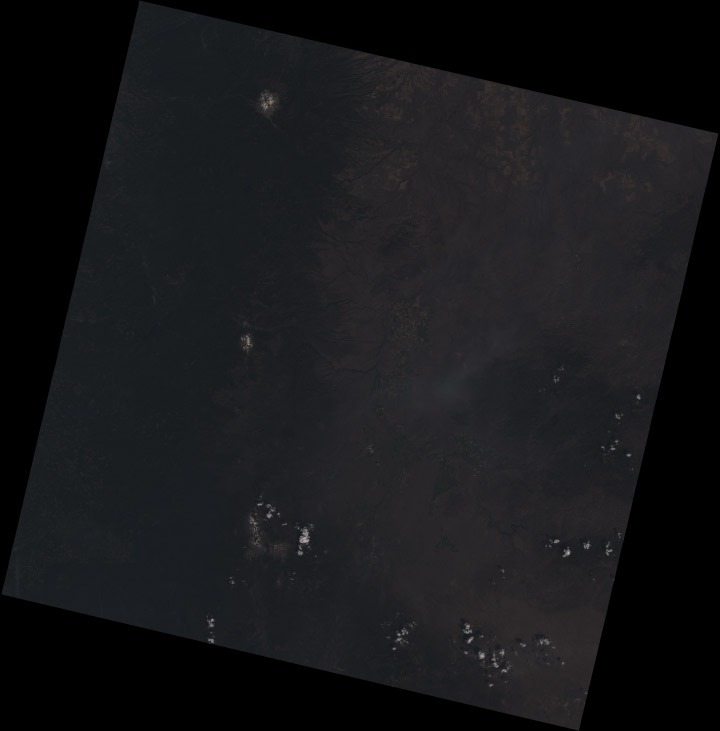
The raw Landsat 8 scene is so dark because it’s data, not merely an image: the numbers represent the precise amount of light reflected from the Earth’s surface (or a cloud) in each wavelength, a quantity called reflectance. To encode this information in an image format, the reflectance is scaled, and the range of values found in the data are smaller than the full range of values in a 16-bit image. As a result the images have low contrast, and only the brightest areas are visible (much of the Earth is also quite dark relative to snow or clouds—I’ll explain why that matters later).
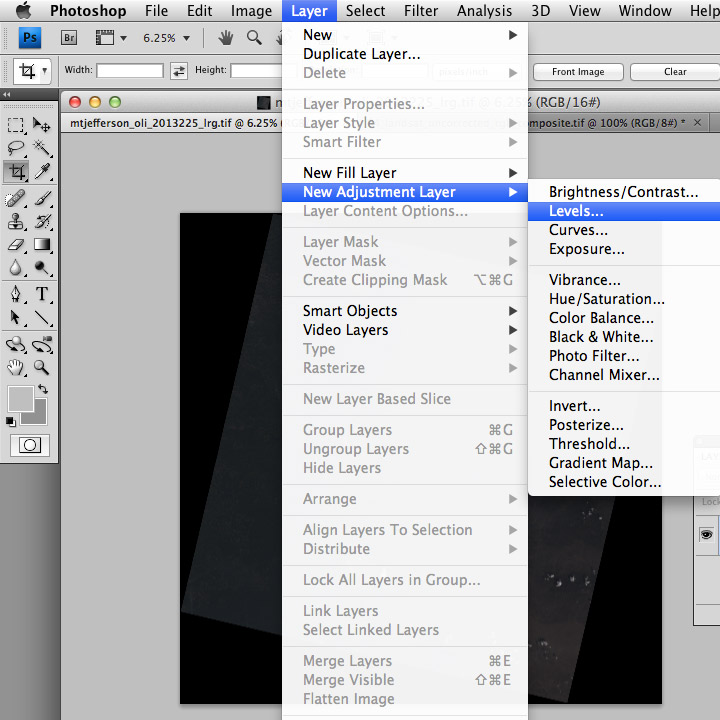
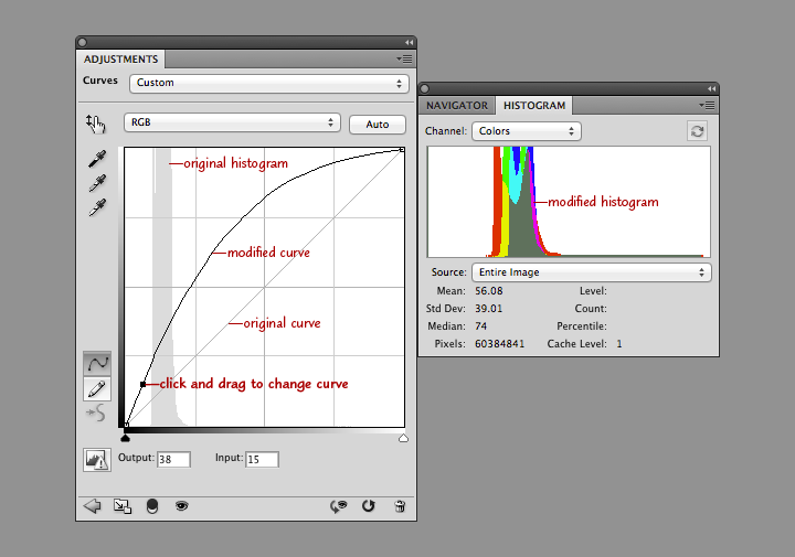
As a result, the images need to be contrast enhanced (or stretched) with Photoshop’s levels and curves functions. I use adjustment layers, a feature in Photoshop that applies enhancements to a displayed image without modifying the underlying data. This allows a flexible, iterative approach to contrast stretching.
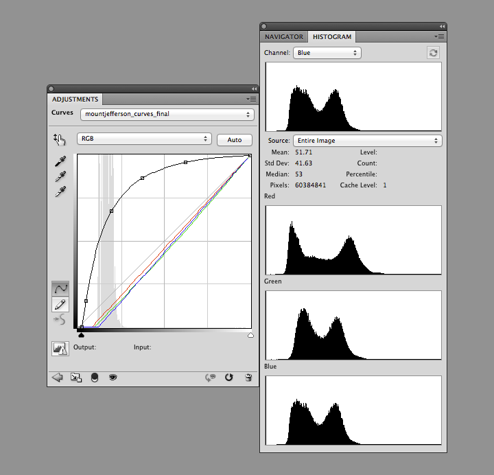
The first thing to do after creating the RGB composite (after saving the file, at least) is to add both a Levels adjustment layer, and a Curves adjustment layer. You add both adjustment layers from the Layer Menu (just hit OK to create the layer): Layer > New Adjustment Layer > Levels… and Layer > New Adjustment Layer > Curves…
Levels and curves adjustments both allow manipulation of the brightness and contrast of an image, just in slightly different ways. I use both together for 16-bit imagery since the combination gives maximum flexibility. Levels provides the initial stretch, expanding the data to use the full range of values. Then I use curves to fine-tune the image, matching it to our nonlinear perception of light.
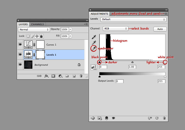
This screenshot shows Photoshop’s layers palette (on the left) and a levels adjustment layer (right). From top to bottom: the adjustment menu allows you to save and load presets; the channel menu allows you to select the individual red, green, and blue bands; the histogram shows the relative distribution of light and dark pixels (the higher the bar the more pixels share that specific brightness level); the white eyedropper sets the white point of the red, green, and blue channels to the values of a selected pixel (select a pixel by clicking on it); and the black point and white point sliders adjust the contrast of the image.
Move the black point slider right to make the image darker, move the white point slider left to make the image lighter. (Important: any parts of the histogram that lie to the left of the black point slider or to the right of the white point slider will be solid black or solid white. Large areas of solid color don’t look natural, so make sure only a small number of pixels are 100% black or white). Combined black point and white point adjustments make the dark parts of an image darker, and the light parts lighter. The process is called a “contrast stretch” or “histogram stretch” (since it spreads out the histogram).
With a Landsat image, we want to do a contrast stretch to make the image brighter and reveal detail. The first step is to select the white eyedropper (the bottom of the three eyedropper icons on the left edge of the Levels Palette), and find an area of the brightest area of the image that we know is white: a puffy cloud, or even better, pristine snow. In general the brightest side of a cloud (or mountain, if you have snow) will be facing southeast in the Northern Hemisphere, east in the tropics, and northeast in the Southern Hemisphere. (This is simply because Landsat collects imagery at about 10:30 in the morning, and the Sun is still slightly to the east of the satellite.) If there are no clouds or snow, a salt pan or even a white rooftop would be a good alternative.
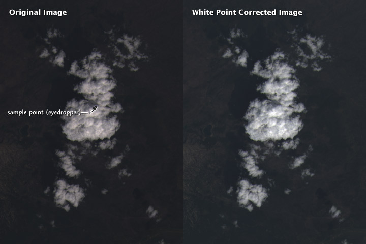
Setting the white point does two things: the brightest handful of pixels in the image are now as light as possible, and the scene is partially white balanced. This means that the white clouds appear pure white, and not slightly tinted. Slight differences in the characteristics of the different color bands, combined with scattering of blue light by the atmosphere, can add an overall tint to the image. Ordinarily our brain does this for us (a white piece of paper looks white whether it’s lit by the sun at noon, a fluorescent light, or a candle), but satellite imagery needs to be adjusted. As do photographs: digital cameras have white balance settings, and film type effects the white balance in an analog camera.
It’s possible to automate white balancing (Photoshop has a handful of algorithms, accessed by option-clicking the auto button in the levels and curves adjustment layer windows) but I find hand-selecting an appropriate area to work best.
After white balancing, the histograms of the red, green, and blue channels in the Mount Shasta image look like this:
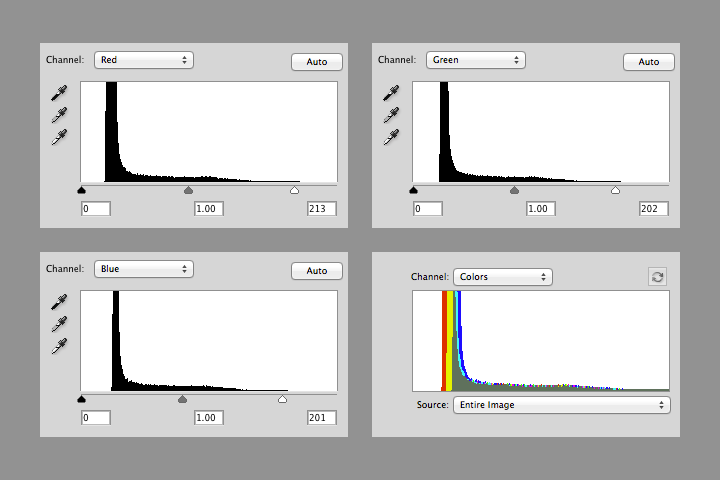
Notice that the value of white in each channel is slightly different (213, 202, and 201), and that there’s a small number of pixels above the white point in each channel. The combined RGB histogram makes it easier to see the differences between channels.
The histogram also shows that most of the image is still dark: there’s a sharp peak from about 10 to 20 percent brightness, with few values in the middle tones, and even fewer bright pixels. This is typical in a heavily forested region like the Cascades. The next step is to brighten the entire image (at least brighten it enough to make further adjustments).
In the curves adjustment layer, click near the center of the line that runs at a 45˚ angle from lower left to upper right. This will add an adjustment point with which to modify the curve. When it’s straight, no adjustments are made. When it’s above 45˚ the image will be brighter, and when it’s below it will be darker. Steeper parts of the line result in more contrast in those tones, while where the line is flatter it will compress the brightness range of the image. Dragging the curve to the left and down brightens the image overall, but dark areas are brightened more than lighter ones. This reveals details in the land surface, and makes clouds look properly white, instead of gray.
Take a look at the combined histogram (open the Histogram Palette by selecting Window > Histogram from Photoshop’s menu bar): it’s easy to see that the darkest areas of the image aren’t black, and that the minimum red values are lower than the minimum green values, which are lower than the minimum blue values.
There’s no true black in a Landsat 8 image for three reasons. First, Landsat reflectance data are offset—a pixel with zero reflectance is represented by a slightly higher 16-bit integer (details: Using the USGS Landsat 8 Product). That is, if there were any pixels with zero reflectance. Very little (if any at all) of the Earth’s surface is truly black. Even if there was, light scattered from the atmosphere would likely lighten the pixel, giving it some brightness. (Landsat 8 reflectance data are “top of atmosphere”—the effects of the atmosphere are included. It’s possible, but very difficult in practice, to remove all the influence of the atmosphere.)
Shorter wavelengths (blue) are scattered more strongly than longer wavelengths (red), so the satellite images have an overall blue cast. This is especially apparent in shadowed regions, where the atmosphere (i.e. blue light from the sky) is lighting the surface, not the sun. We think of shadows as black, however, so I think it’s best to remove most of the influence of scattered light (a little bit of the atmospheric influence was already removed by choosing a white point) by adjusting the black points in each channel.
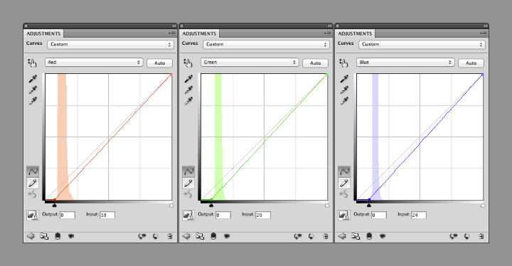
You can change the curves separately for each channel by selecting “Red”, “Green”, or “Blue” from a drop-down menu (initially labelled “RGB”) in the Curves adjustments palette. Starting with the red channel, drag the point at the lower-left towards the right, until it’s 2 or 3 pixels away from the base of the histogram. Repeat with green and blue, but leave a bit more space (an additional 1 or 2 pixels for green, and 3 or 4 for blue) between the black point and base of the histogram. This will prevent shadows from becoming pure black, with no visible details, and leave a slight blue cast, which appears natural.
Like so:
The image is now reasonably well color balanced, and the clouds look good, but the surface is (again) dark. At this point it’s a matter of iteration. Tweak the RGB curve, maybe with an additional point or three, then adjust the black points as necessary. Look at the image, repeat. I find it helpful to walk away every once in a while to let my eyes relax, and reset my innate color balance: if you stare at one image for too long it will begin to look “right”, even with a pronounced color cast.
I sometimes find it helpful to find photographs of a location to double-check my corrections, either with a generic image search or through a photography archive like flickr. It helps give me a sense of what the ground should look like, especially for places I’ve never been. Keep in mind, however, that things look different for above. In an arid, scrub-covered landscape, for example, a ground-level photograph will show what appears to be nearly continuous vegetation cover. From above, the spaces between individual bushes and trees are much more apparent.
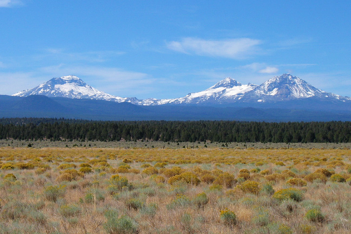
The Three Sisters Volcanoes from the ground. Scattering in the atmosphere between the photographer and the distant mountains causes them to appear lighter, bluer, and fuzzier than the brush in the foreground. In views from space, the entire image will be affected in a similar way. ©2006 Robert Tuck.
Try to end up with an RGB curve that forms a smooth arch: any abrupt changes in slope will cause discontinuities in the contrast of the image. Don’t be surprised if the curve is almost vertical near the black point, and almost flat near the white point. That stretches the values in the shadows and in dark regions, and compresses them in the highlights. This enhances details of the surface, and makes clouds look properly white. (If there’s too much contrast in clouds they’ll look gray.)
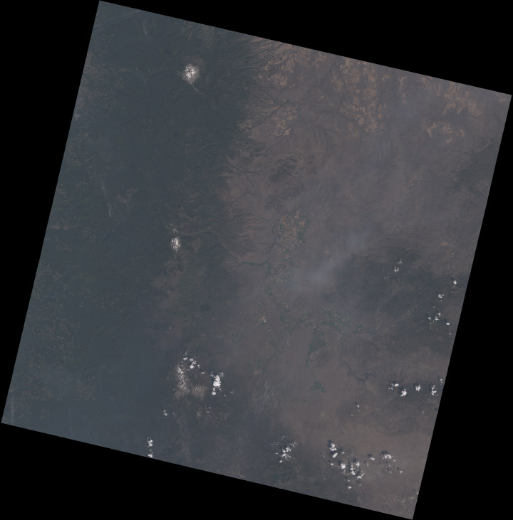
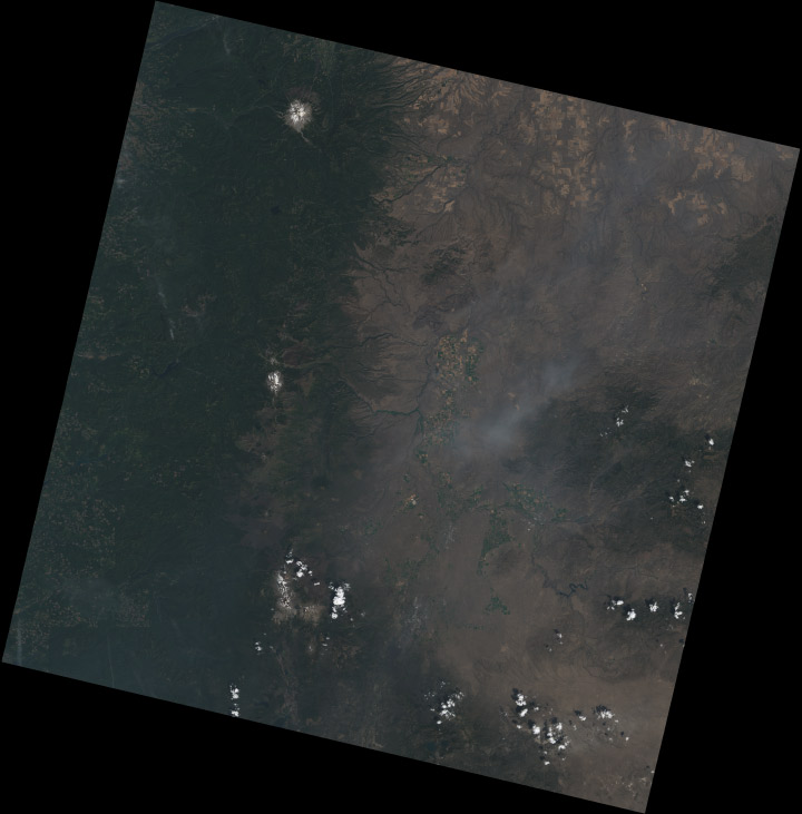
Notice how each of the bands have two distinct peaks, and most of the histogram (select All Channels View to see separate red, green, and blue channels) is packed into the lower half of the range. The bimodal distribution is a result of the eastern Oregon landscape being split into two distinct types: the dark green forests of the Cascades, and the lighter, high-altitude desert in the mountain’s rain shadow. The skew towards dark values is a compromise. I sacrificed some detail in the forest and left the desert a little dark, to bring out features in the clouds. If I was focusing exclusively on a cloud-free region, the peaks in the histogram would be more widely distributed. Fortunately Landsat 8’s 12-bit data provides a lot of flexibility—adjustments can be quite aggressive before there’s noticeable banding in the image.
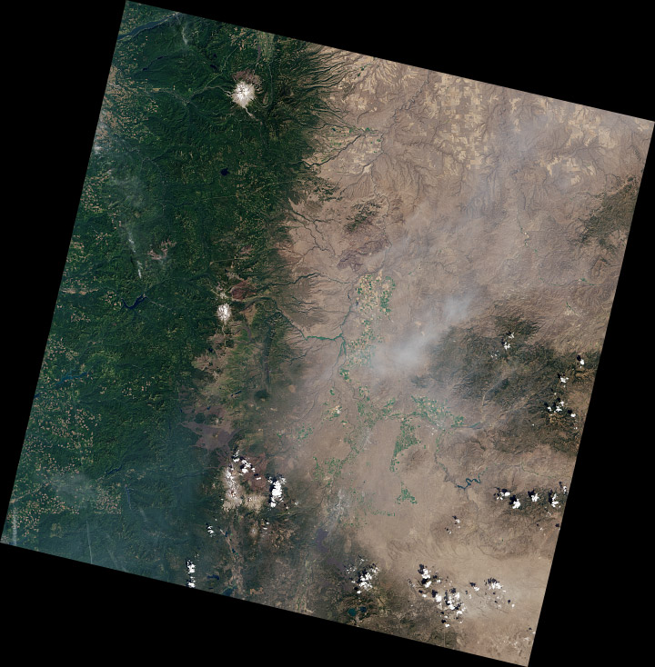
The full image has a challenging range of features: smoke, haze, water, irrigated fields (both crop-covered and fallow), clearcuts, snow, and barren lava flows, in addition to forest, desert, and clouds. The color adjustments are a compromise, my attempt to make the image as a whole look appealing.
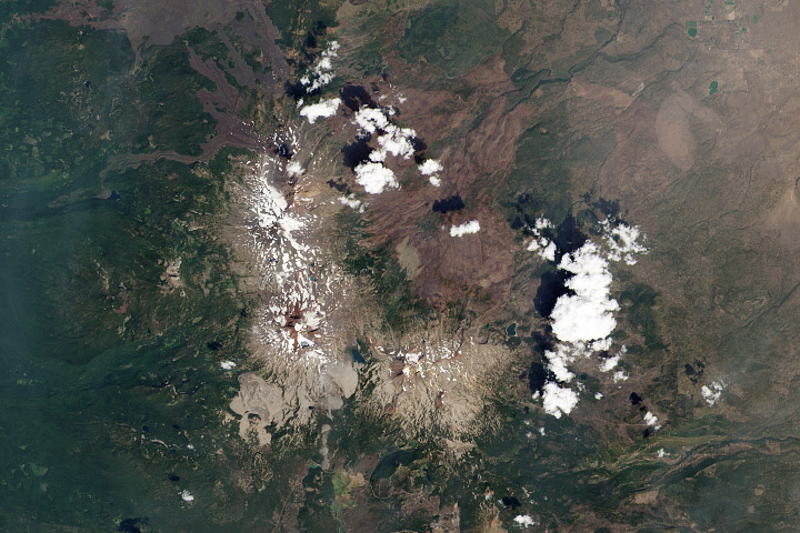
Some areas of the image (the Three Sisters) look good, even close up (half-resolution, in this case). But others are washed-out:
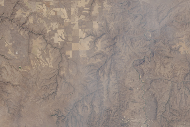
I’d use a different set of corrections if I was focused on this area (and probably select a scene without smoke, which is visible in the center of this crop).
These techniques can also be applied to data from other satellites: older Landsats, high-resolution commercial satellites, Terra and Aqua, even aerial photography and false-color imagery. Each sensor is slightly (or more than slightly) different, so you’ll probably use different techniques for each one.
To practice, download a true color TIFF of this Landsat scene [(450 MB) right-click to download, you do not want to open it in your browser] with my levels and curves, or pick your own scene from the USGS Earth Explorer (use my guide if you need help ordering the data).
If you’re interested in different perspectives on creating Landsat images, Tom Patterson, a cartographer with the National Park Service, has an excellent tutorial. Charlie Loyd, of MapBox, has a pair of posts detailing Landsat 8’s bands, and a method for using open-source tools to make Landsat images.
* Here’s the full Eduard Imhof quotation:
Complete fidelity to natural color can not be achieved in a map. Indeed, how can it be when there is no real consistency in the natural landscape, which offers endless variations of color? For example, one could consider the colors seen while looking straight down from an aircraft flying at great altitude as the model for a naturalistic map image. But aerial photographs from great heights, even in color, are often quite misleading, the Earth’s surface relief usually appearing too flat and the vegetation mosaic either full of contrasts and everchanging complexities, or else veiled in a gray-blue haze. Colors and color elements in vertical photographs taken from high altitudes vary by a greater or lesser extent from those that we perceive as natural from day to day visual experience at ground level.
The faces of nature are extremely variable, whether viewed from an aircraft or from the ground. They change with the seasons and the time of day, with the weather, the direction of views, and with the distance from which they are observed, etc. If the completely “lifelike” map were produced it would contain a class of ephemeral—even momentary—phenomena; it would have to account for seasonal variation, the time of day and those things which are influenced by changing weather conditions. Maps of this type have been produced on occasion and include excursion maps for tourists, which seek to reproduce the impression of a winter landscape by white and blue terrain and shading tones. Such seasonal maps catch a limited period of time in their colors.
—Eduard Imhof, Cartographic Relief Presentation, 1965 (English translation 1982).
The Landsat Data Continuity Mission is now Landsat 8, and that means images are now public (woohoo!). NASA handed control of the satellite to the USGS yesterday (May 30, 2013), and calibrated imagery is available through the Earth Explorer. Unfortunately, the Earth Explorer interface is a bit of a pain, so I’ve put together a guide to make it easier.
First, go to the Earth Explorer site: earthexplorer.usgs.gov
You can search, but not order data, without logging in—so register if you don’t have an account (don’t worry, it’s instant and free), or log in if you do.
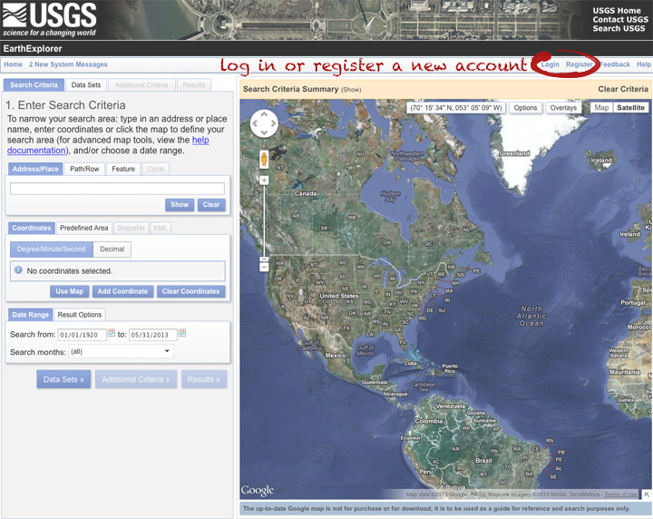
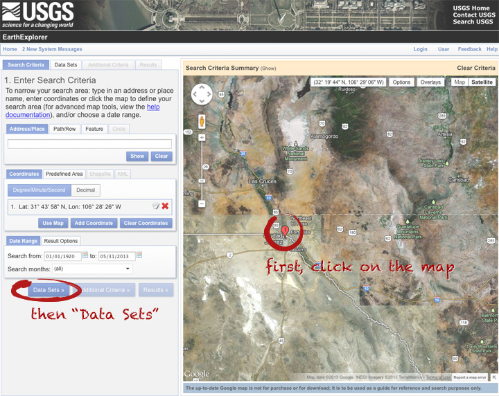
The simplest way to select a location is to simply pick a single point on the map. You can define a box or even a polygon, but that makes it more likely you’ll get images with only partial coverage. Navigate to the location you’re interested in, and click to enter the coordinates. You can choose a data range, but right now there are only 3 or 4 scenes for a given spot, so skip it and just click “Data Sets”.
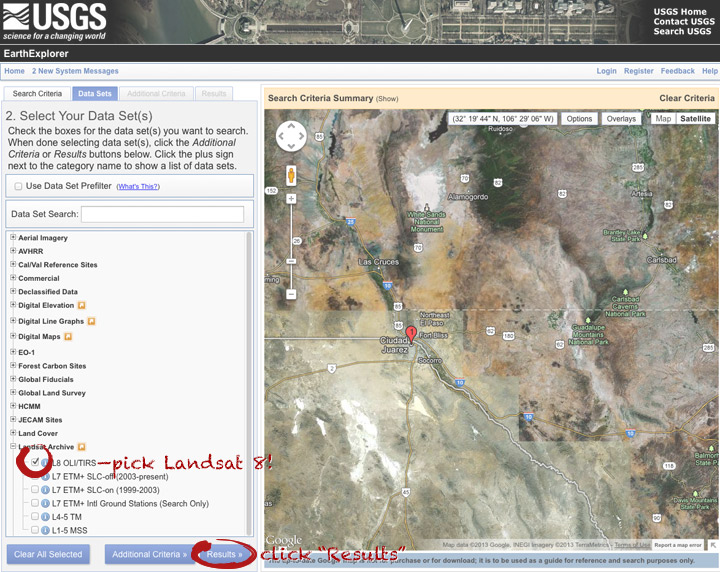
On the data sets page, you can search everything from Aerial Imagery to Vegetation Monitoring. Click the “+” symbol next to Landsat Archive, then the first check box that appears: “L8 OLI/TIRS” (which stands for Landsat 8 Operational Land Imager/Thermal Infrared Sensor (creative, no?)). Click “Results” to start a search.
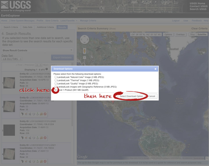
After a short wait, you’ll get a list of available images. The thumbnails aren’t big enough to show much, so click on one to see a slightly larger image. Close that window, and click the download icon: a green arrow pointing down towards a hard drive …
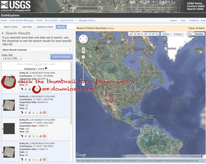
… which doesn’t actually download the data, just provides a list of download options. “LandsatLook” are full-resolution JPEGs, and are a quick way to check image quality (I’d prefer full-resolution browse images without a separate download, but I digress). The Level 1 Product is terrain-corrected, geolocated, calibrated data—a bundle of 16 bit, single-channel GeoTIFFs. Select the “Level 1 Product” radio button, then click “Select Download Option”.
Done! Oh, wait. Not done. You need to click one more button: “Download”.
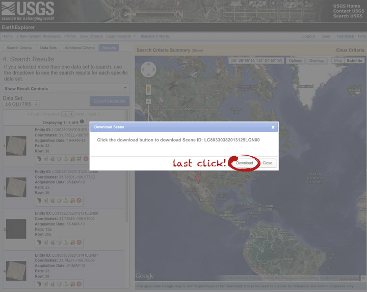
Now you’re done. The data should arrive in your browser’s designated download folder.
Drop a note in the comments section if I’ve skipped a step, or if you have any other questions. Next week I’ll explain what to do with the data once you’ve got it.
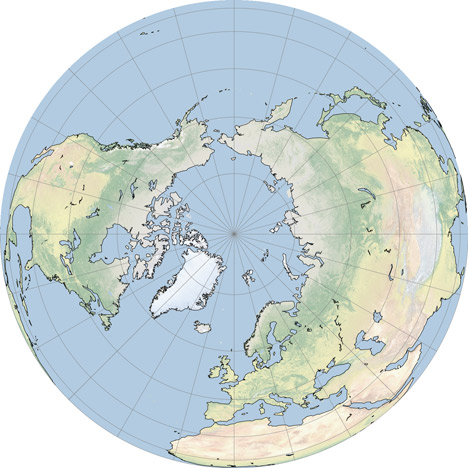
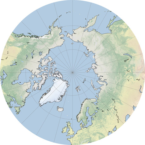
In the comments to my Natural Earth post Jim Meyer suggested I make copies of the global maps centered on the Poles. Rather than just making a few images I’ll mention G.Projector: the simplest map projection conversion software I know of. Developed by NASA Goddard Institute of Space Studies, it features 93 map projections, (assuming I didn’t lose count) decent customization options, and a good coastline database at multiple resolutions. Even better, it’s free.
The conversion process is straightforward: import an image in the equirectangualr map projection, pick a new projection, set options for coastlines and other overlays, then export. Very, very, simple (in contrast to many other remapping applications which seem to be written for people with GIS degrees). Here’s some examples:
The Elegant Figures blog will be a place for me (Robert Simmon, the Earth Observatory’s lead visualizer) to talk about some of the data visualization and information design we do on the Earth Observatory. I’m going to kick things off with the description of an image we made in May that showed ash from the Eyjafjallajökull Volcano using data from two satellites. The image benefits from a little science backstory, but feel free to skip down three paragraphs if you’re only interested in the infovis aspects.
For several days in April of 2010, air traffic in Europe was almost completely shut down by ash from Iceland’s Eyjafjallajökull volcano. The widespread flight cancellations weren’t caused by ash filling the skies all over Europe, but by uncertainty in the ash’s location. Without knowing exactly where the ash was, air traffic controllers couldn’t risk allowing passenger flights to embark.

Eyjafjallajökull erupting on May 18, 2010.
Currently, ash forecasts are based on computer models that predict the movement of volcanic ash based on its observed location and altitude, combined with wind speed and direction. In the case of Eyjafjallajökull, the initial location of the ash was known (the volcano’s summit), but not the altitude. This initial uncertainty grew as the ash blew towards Europe, dispersing and moving up and down in the atmosphere. The only way to constrain the computer model’s forecasts is to observe the ash—something that’s difficult to do from the ground (there is a network of instruments that measure aerosols (small atmospheric particles—volcanic ash is one type), AERONET, but they’re spread too sparsely to enable precise predictions), and it is difficult and dangerous to directly sample in the air. However: flying in space, far above the ash, some satellites can track ash, even as it spreads over long distances. Forecasters can use measurements from these satellites to improve predictions of ash movement, reducing the amount of airspace closed to flights.
The CALIPSO (the acronym is a bit more memorable & succinct than its formal name: the Cloud-Aerosol Lidar and Infrared Pathfinder Satellite Observation) satellite uses reflected light from a laser beam to measure cloud and aerosol particles in the atmosphere. Critically for ash forecasting, it measures both the location and altitude of particles. It can also see ash within clouds. There’s one catch: CALIPSO only measures aerosols in a line directly underneath the satellite.
On the Earth Observatory, we wanted to show CALIPSO data to complement the large number of visible light, photo-like images we’d acquired, and to advertise the data, which is considered experimental. The nature of the data presented an interesting visualization challenge: it’s a two-dimensional curtain stretching from the Earth’s surface to the stratosphere, along the satellite ground track. Simply displaying the data by itself isn’t very informative:

Vertical profile of ash from Eyjafjallajökull on May 16, 2010.
The data need context: a map of the area (just off the west coast of Ireland) & the location of the ash at the time CALIPSO passed overhead. Unfortunately, the data were acquired at night—so we couldn’t simply use a natural-color image. During the day ash is often pretty easy to spot:

Eyjafjallajökull ash mixed with clouds in the skies above Germany, April 16, 2010.
Our eyes can pick out the gray or brown plume, even if it’s mixed with clouds (at least if some of the ash is above the clouds). At night, however, satellites observe clouds with thermal infrared data, which is essentially a measure of temperature. Volcanic ash and clouds (at the same altitude) will almost always have the same temperature, and will look the same in thermal infrared imagery. In addition a thin ash plume may be completely invisible in thermal infrared wavelengths (data from MODIS, or more formally the Moderate resolution Imaging Spectroradiometer):

Thermal infrared image (inverted: cold clouds are white) of Eyjafjallajökull ash near Ireland and the U.K.
Ash, however, emits thermal infrared radiation slightly differently than water, so two images taken at different wavelengths (in this case 11µm and 12µm—both in the thermal infrared) will appear different from each other where there’s ash, but not where there are clouds. By subtracting the 11 and 12µm images from one another, you end up with an image that shows ash. Sortof:

Split window image of ash from Eyjafjallajökull.
It isn’t perfect, but the technique (called a split window) gives a qualitative picture of ash distribution.
By itself a split-window image isn’t very informative: for the most part ash appears slightly lighter than the background, whether it is ocean, cloud, or land. We needed to come up with a trick to better distinguish ash from the background. Our first attempt was to combine the split window image (12µm minus 11µm) in the red channel with the original bands, 11µm and 12µm in the green and blue channels. Next we combined two different split windows (using different wavelengths) and an inverted thermal infrared channel (so clouds would at least be lighter than water). Neither worked:


Both were unattractive and (even worse) neither showed the ash particularly well. They’re understandable if you’ve spent a career analyzing satellite images, but not if you’re a novice. The image needed to be somewhat familiar, and the ash needed to clearly stand out from the background. I ended up using an image compositing technique. With Photoshop (this would work in any good photo-editing program) I combined the split window image (which showed the ash) with an inverted copy of one of the thermal infrared channels using a layer mask. With a layer mask, bright areas in a grayscale image will be opaque, and dark areas will be transparent. By assigning the layer mask to a solid yellow image layer, the ash appeared as yellow areas on a background similar to the satellite images shown on every TV weather forecast:
Final image combining the ash with thermal infrared data.
The ash stands out from the background because the eye is actually highlighting the yellow areas of the image before the image even reaches the conscious brain. This is known as pre-attentive processing which I learned about in Colin Ware’s book Information Visualization: Perception for Design.
Here’s the final image, combined with the CALIPSO data showing the vertical profile of the ash:

CALIPSO ash profile and MODIS split window
