
Wow. 28 photographs from within the crater of Nyiragongo Volcano in the Democratic Republic of the Congo. (Thanks to Zuid Wal, commenting on the Eruptions blog.)
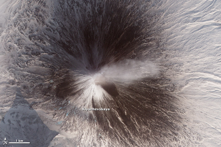
Russia’s Kamchatka Peninsula is perhaps the most volcanically active spot on the planet. Last week’s Global Volcanism Program weekly report (for February 16–22, 2011) listed three Kamchatkan volcanoes currently in eruption—Karymsky, Kizimen, and Shiveluch—and two others—Bezymianny and Klyuchevskaya—were mentioned earlier in February. In one overpass a NASA satellite captured four of these volcanoes in one narrow overpass, only 60 kilometers wide and 300 kilometers long. All of them exhibit plumes. I zoomed in on the most spectacular—Kizimen and Shiveluch—for our Natural Hazards section, but I’d like to share Klyuchevskaya (below) and the entire image—all 9,822 by 20,729 pixels of it (13 MB JPEG).

NASA Earth Observatory image by Robert Simmon, using data from the NASA/GSFC/METI/ERSDAC/JAROS, and U.S./Japan ASTER Science Team.
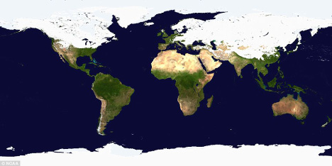
A few weeks ago I stumbled on this headline and image from the UK Daily Mail Online:
World of two halves! Map shows most of Northern Hemisphere is covered in snow and ice.

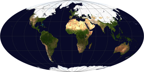
Most of the Northern Hemisphere was covered in snow and ice a few weeks ago? (The image dates from late January/early February—I couldn’t find the exact date.) Really? At first glance it’s a plausible claim, but there’s a problem. The map is in a cylindrical equirectangular projection, which distorts relative areas—regions north and south of the equator appear larger on the map than they are in reality. The higher the latitude, the larger the exaggeration. As a result, a much higher percentage of the Earth’s surface appears to be covered in snow or ice than really is.
After transforming the map to an equal-area projection (in this case Mollweide, which also preserves straight lines of latitude) it’s obvious that most of the Northern Hemisphere remains snow and ice free, even in mid-winter:

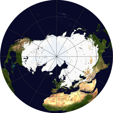
A map showing just the Northern Hemisphere (azimuthal equal area, centered on the North Pole) makes is yet more clear:

For maps of measured quantities on the Earth’s surface (like snow, temperature, rainfall, or vegetation) it’s important to choose a projection carefully, to minimize misunderstandings of the underlying data. It’s far too easy for a map to exaggerate one area at the expense of another. It’s also important to keep projections consistent when displaying a time series, or comparing datasets to one another.
Despite the major flaw of not being equal area, cylindrical equirectangular (which goes by many other names) is very useful: it’s the standard projection for importing into a 3D program and wrapping around a sphere, and it’s easy to define the corner points and scale for import into software to transform to other map projections. I did all the reprojections with the excellent tool G.Projector, which I’ve written about before.
For more information about map projections, see the USGS page Map Projections, the National Atlas’ Map Projections: From Spherical Earth to Flat Map, and the Wolfram Mathworld Map Projection site. For an in-depth discussion, read Map Projections—A Working Manual, (PDF) also from the USGS.
(As far as I can tell, the snow and ice map was originally from the NOAA Environmental Visualization Laboratory. Unfortunately, I couldn’t find archived images on their site, so I had to use the original low resolution and highly compressed image from the Daily Mail.)