
Sticking to the flood theme, here’s a recent map from the U.S. Army Corps of Engineers showing the predicted travel time for water in the Morganza Floodway.
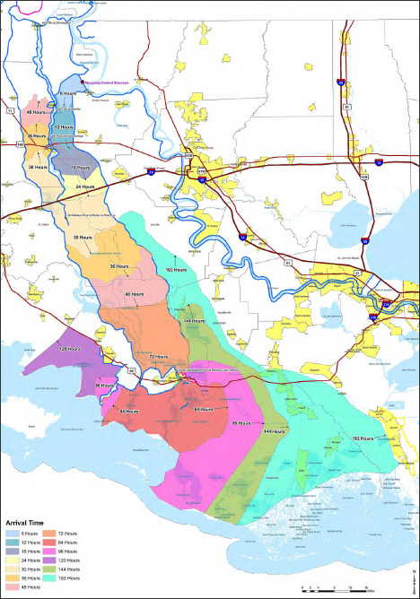
It’s a reasonably good map, with one big flaw: the colors are more appropriate for categorical data (such as a geological map of different rock types) rather than sequential data (like elapsed time). There’s no natural progression from one color to the next, so to work out the ordering one has to rely on the position of adjacent bands of color, or look repeatedly between the map and the key. A palette that varied from light to dark, dull to saturated, or both, would be easier to read at a glance. Like this:
![]()
Since I’m still not ready to do a long series of posts on colors, here’s a handout I wrote for the 2008 Access Data Workshop that covers more of the basics: Use of Color in Data Visualization. (PDF) If you’re really interested in the topic just skip what I wrote and go straight to the references:
- Brewer, Cynthia A. (2005) Designing Better Maps: A Guide for GIS Users. Redlands, CA: ESRI Press.
- MacEvoy, Bruce. (2008) Watercolors. Accessed April 28, 2008.
- Rogowitz, B.E.; Treinish, L.A. (1998) Data visualization: the end of the rainbow, Spectrum, IEEE , vol.35, no.12, pp.52-59.
- Tufte, Edward R. (1990) Envisioning Information. Cheshire, CT: Graphics Press.
- Ware, Colin. (2005) Information Visualization, Second Edition. San Francisco, CA: Morgan Kaufmann.
The link to the your PDF “Use of Color in Data Visualization” is not working.
Thanks Corey, it’s fixed now.
Furthermore, the Rogowitz PDF from the IEEE website is in black and white. The following alternative link might be helpful:
http://www.research.ibm.com/people/l/lloydt/color/color.HTM
My first questions are who is going to use this map and how are they going to use it. Whilst the data does not seem categorical, it may be to the user. Ordinal data, and particularly so in this case with travel time hours broken into 13 divisions, can be very like categorical data. If the user is looking at a specific part of the map to see how long the flood waters will take to get there then being able to allocate to a category is far more important than trying to estimate the number of hours based on the tone of what would almost appear to be continuous data when subdivided into 13 categories. Aesthetically more pleasing though that may be, it may make for a less useful product.