
I recently had the opportunity to attend & give a presentation at the 2011 International Symposium on Remote Sensing of the Environment in lovely Sydney, Australia. (OK, not so recently—the conference ended on the April 15th. I blame jetlag.) Just over 60 people turned up for the talk, which was mostly about our visualization of Eyjafjallajökull. (Which means I had to attempt to learn how to pronounce “Eyjafjallajökull.” Luckily I don’t think anybody made it from Iceland to Sydney to critique me.) If you’re interested, I’ve posted Keynote and PDF copies (originally prepared for last years’s fall AGU).
During sessions many of the talks were a bit on the technical side for me, so I ended up preparing material for NASA’s portable “hyperwall”—9 HDTV screens linked together. It’s useful for either high-res animations, or small multiples. With relatively thick bezels on the monitors, simultaneous display of 9 images worked particularly well:
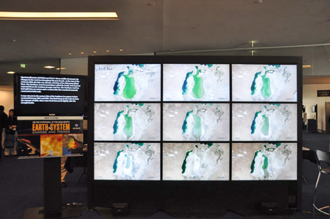
Compare the small multiples on the hyperwall with the sequential display of the same images from the Earth Observatory’s World of Change.
During my talk I promised the audience that I’d update the blog more frequently, so there should be more posts in the future. I sometimes struggle for good ideas, so if you have a suggestion, please drop a note in the comments.
>>so if you have a suggestion, please drop a note in the comments.
I’d be interested in some more design case studies similar those posted last year — take bad plots/maps and show how to make them better. For instance, the following from NOAA:
http://www.hpc.ncep.noaa.gov/sfc/90fbw.gif
Similarly, I feel color-enhanced GOES imagery is overly complicated and not clear or readable:
http://www.goes.noaa.gov/WCIR3.html
Given the same data and goals, how would you present it?
Corey:
Excellent idea. Do you know where (or if) the NOAA weather maps are available as postscript of PDF files? I’d be able to edit them for a before/after comparison.
Not exactly the the same, but the only ones I could find:
http://www.hpc.ncep.noaa.gov/dailywxmap/pdffiles.html
The same issue is happening within two of the most ecologically important lakes within Iran. One is located in the southern Fars Province named Bakhtegan lake (and the adjacent Tashk lake), and the other one, Urmia lake on the border between the Western and the Eastern Azerbayjan provinces. Bakhtengan and Tashk lakes has almost been dried out completely last year as the combined results of the dams built upstream on the rivers (i.e. Doroodzan Dam) carrying snowmelt water from Zagros Mountains into the lake, as well as drought which is the other highly influential factor.
However, regarding the Urmia lake the diverted river systems are the main accounting factor as drought and reduced rainfall has not essentially affected that part of the country. Once dried out, the salty basin of the lake would deteriorate the whole region’s climate, as the resulting effects have already been started, some southern parts of the lake turn red during summer as the result of high concentration of Magnesium salts.
I’ve been meaning to respond to this for a while (the call for suggestions at the end that is). I love the posts you did on ‘Qualitative v Sequential Colour Scales’ and A ‘Hierarchy of Perception’, so would really like to see some more in a similar vein.
Some ideas I had included:
How to select the appropriate visualisations (and/or perhaps some examples of when inappropriate choices have been made)
Statistical significance and how it relates to visualisation
And perhaps maybe a critique of some classic visualisations like the London Underground or the Periodic table (could even be some geographical or astronomical visualisations).
Just a few thoughts. I could try come up with some more.