The Elegant Figures blog will be a place for me (Robert Simmon, the Earth Observatory’s lead visualizer) to talk about some of the data visualization and information design we do on the Earth Observatory. I’m going to kick things off with the description of an image we made in May that showed ash from the Eyjafjallajökull Volcano using data from two satellites. The image benefits from a little science backstory, but feel free to skip down three paragraphs if you’re only interested in the infovis aspects.
For several days in April of 2010, air traffic in Europe was almost completely shut down by ash from Iceland’s Eyjafjallajökull volcano. The widespread flight cancellations weren’t caused by ash filling the skies all over Europe, but by uncertainty in the ash’s location. Without knowing exactly where the ash was, air traffic controllers couldn’t risk allowing passenger flights to embark.
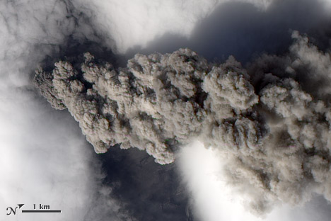
Eyjafjallajökull erupting on May 18, 2010.
Currently, ash forecasts are based on computer models that predict the movement of volcanic ash based on its observed location and altitude, combined with wind speed and direction. In the case of Eyjafjallajökull, the initial location of the ash was known (the volcano’s summit), but not the altitude. This initial uncertainty grew as the ash blew towards Europe, dispersing and moving up and down in the atmosphere. The only way to constrain the computer model’s forecasts is to observe the ash—something that’s difficult to do from the ground (there is a network of instruments that measure aerosols (small atmospheric particles—volcanic ash is one type), AERONET, but they’re spread too sparsely to enable precise predictions), and it is difficult and dangerous to directly sample in the air. However: flying in space, far above the ash, some satellites can track ash, even as it spreads over long distances. Forecasters can use measurements from these satellites to improve predictions of ash movement, reducing the amount of airspace closed to flights.
The CALIPSO (the acronym is a bit more memorable & succinct than its formal name: the Cloud-Aerosol Lidar and Infrared Pathfinder Satellite Observation) satellite uses reflected light from a laser beam to measure cloud and aerosol particles in the atmosphere. Critically for ash forecasting, it measures both the location and altitude of particles. It can also see ash within clouds. There’s one catch: CALIPSO only measures aerosols in a line directly underneath the satellite.
On the Earth Observatory, we wanted to show CALIPSO data to complement the large number of visible light, photo-like images we’d acquired, and to advertise the data, which is considered experimental. The nature of the data presented an interesting visualization challenge: it’s a two-dimensional curtain stretching from the Earth’s surface to the stratosphere, along the satellite ground track. Simply displaying the data by itself isn’t very informative:
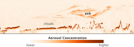
Vertical profile of ash from Eyjafjallajökull on May 16, 2010.
The data need context: a map of the area (just off the west coast of Ireland) & the location of the ash at the time CALIPSO passed overhead. Unfortunately, the data were acquired at night—so we couldn’t simply use a natural-color image. During the day ash is often pretty easy to spot:
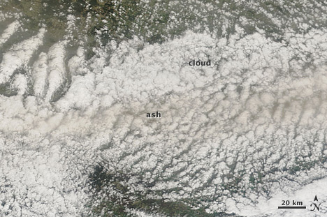
Eyjafjallajökull ash mixed with clouds in the skies above Germany, April 16, 2010.
Our eyes can pick out the gray or brown plume, even if it’s mixed with clouds (at least if some of the ash is above the clouds). At night, however, satellites observe clouds with thermal infrared data, which is essentially a measure of temperature. Volcanic ash and clouds (at the same altitude) will almost always have the same temperature, and will look the same in thermal infrared imagery. In addition a thin ash plume may be completely invisible in thermal infrared wavelengths (data from MODIS, or more formally the Moderate resolution Imaging Spectroradiometer):
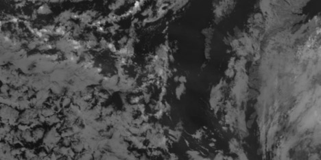
Thermal infrared image (inverted: cold clouds are white) of Eyjafjallajökull ash near Ireland and the U.K.
Ash, however, emits thermal infrared radiation slightly differently than water, so two images taken at different wavelengths (in this case 11µm and 12µm—both in the thermal infrared) will appear different from each other where there’s ash, but not where there are clouds. By subtracting the 11 and 12µm images from one another, you end up with an image that shows ash. Sortof:
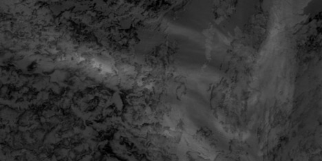
Split window image of ash from Eyjafjallajökull.
It isn’t perfect, but the technique (called a split window) gives a qualitative picture of ash distribution.
By itself a split-window image isn’t very informative: for the most part ash appears slightly lighter than the background, whether it is ocean, cloud, or land. We needed to come up with a trick to better distinguish ash from the background. Our first attempt was to combine the split window image (12µm minus 11µm) in the red channel with the original bands, 11µm and 12µm in the green and blue channels. Next we combined two different split windows (using different wavelengths) and an inverted thermal infrared channel (so clouds would at least be lighter than water). Neither worked:
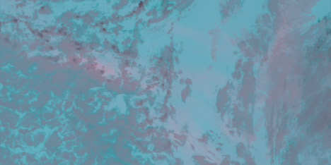
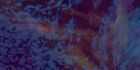
Both were unattractive and (even worse) neither showed the ash particularly well. They’re understandable if you’ve spent a career analyzing satellite images, but not if you’re a novice. The image needed to be somewhat familiar, and the ash needed to clearly stand out from the background. I ended up using an image compositing technique. With Photoshop (this would work in any good photo-editing program) I combined the split window image (which showed the ash) with an inverted copy of one of the thermal infrared channels using a layer mask. With a layer mask, bright areas in a grayscale image will be opaque, and dark areas will be transparent. By assigning the layer mask to a solid yellow image layer, the ash appeared as yellow areas on a background similar to the satellite images shown on every TV weather forecast:

Final image combining the ash with thermal infrared data.
The ash stands out from the background because the eye is actually highlighting the yellow areas of the image before the image even reaches the conscious brain. This is known as pre-attentive processing which I learned about in Colin Ware’s book Information Visualization: Perception for Design.
Here’s the final image, combined with the CALIPSO data showing the vertical profile of the ash:
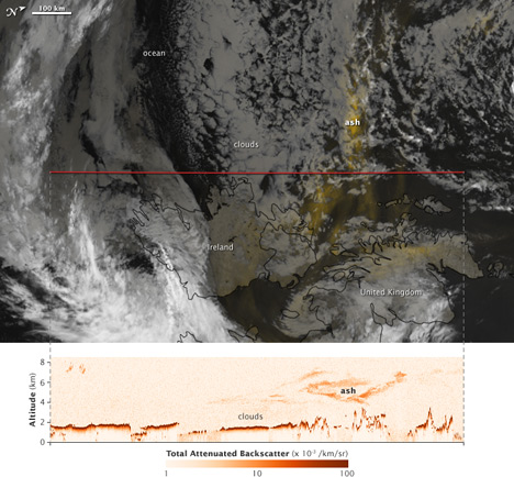
CALIPSO ash profile and MODIS split window
Tags: CALIPSO, Eyjafjallajökull, MODIS, volcanoes


This blog is a very nice idea, and you are very informative. I am continuously amazed by the creativity and enthusiasm of the EO team.
Thank you for all this info. I cannot get over how much information is shared with those of us who don’t always understand everything! But, I am trying & wanting more. Thank you for all the efforts of everyone on the EO team who contributes!
Robert, this is a great article. The way you describe your complete workflow, complete with false-starts, dead ends, and problem solving, helps to provide some idea of how much work goes into creating these beautiful images.
I have only a little blog where my art is posted but this blog is highly informative and I hope you will continue with it indefinitely. Understanding how the final “product” gets constructed and finalized is a fascinating series of steps. Thank you!
What a wonderful job NASA’s EO group are doing in bringing meteorological and oceanographic events/ phenomena to the Internet public via such a variety of satellite imagery. This article is especially well-presented. Thank you.
It was particularly interesting to hear of a graphics editing program being used to enhance certain features on satellite images – something I have found very useful.
Robert
I found your article documented your work flow and ideas well. It was easy to follow and demonstrated the benefits of imagery. As a high school teacher, it provides a depth of information for my students to review and comment on in their study on volcanology. Excellent work.
Robert,
A question on the “aquatic” or “marine” dead zones map – hard to tell which is which if one looks at the title and reads the text (freshwater included?); it has your name as co-author. On the text it mentions black dots as unknowns. When I zoom in, I see circles with black outline. Also many fall on land… can you explain? Thanks. Demetrio
Thank you Robert, great blog!
it is very helpful the way you describe all your steps in creating this really elegant scientific data and also making it very comprehensible to all the people.
One idea came into my mind, to use a HDR photo software and introduce 2 bands for surface cloud temperature (11 and 12µm) and 1 band for cloud top altitude (14µm).
Thanks for all the replies & compliments. I made the mistake of heading out on leave the morning after launching the blog, so I can’t respond in depth at the moment. The good news is that travel always gives me ideas, and I’ll have a new post up soon after I get back.
Demetrio:
The black dots are dead zones with unknown size. They’re rendered a bit differently (black outline with semi-transparent fill) in the large version because the high-resolution allowed me to use transparency to give a better indication of the precise location of dead zones where many are clustered together (i.e. Western Europe). Solid black dots simply merge together. I think locations that appear to be inland are on estuaries. I don’t have the data with me so I can’t check at the moment. In any case, that map will probably get its own post before too long.
Pablo:
I have never even considered using HDR (high dynamic range) techniques to merge multiple bands into a single channel, and have absolutely no idea how (or if) it would work. It’s certainly something to think about in the future.
Thank you for making, what is usually for me, incomprehensible stuff, comprehensible.
NASA is awesome. Such generosity. My sincere gratitude.
Welcome to the Goddard blogpodcastotwittersphere!
Great article — keep them coming.
I have been following E.O. for years and appreciate all the great stuff you publish. Such background information is an extra treat. Thank you for that. I learned about. BTW, often when I look at the published images I wonder how it has been made. Some secrets of these ash clouds have been revealed. I’m looking forward to the next insight report.