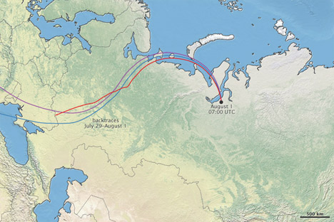
We just published a mini-feature on the recent forest fires in Russia—Russian Firestorm: Finding a Fire Cloud from Space—accompanied by this map of smoke movement (read the article for details, then come back):

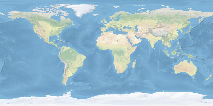
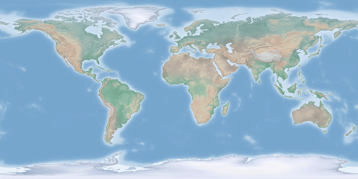
I’m reasonably happy with the map, largely due to the wonderful Natural Earth data I used as a base. Put together by Nathaniel Vaughn Kelso, Tom Patterson, and many others. It uses NASA’s Blue Marble imagery, but it’s lightened and desaturated, which works much better than the Blue Marble when combined with other data. The maps based on color imagery are complemented by another set: “Cross-blended Hypsometric Tints”. These are based on elevation data (SRTM 30 plus), but have the added twist that arid and temperate climates get separate color palettes, so deserts look like deserts and forested areas are green.


If that weren’t enough (I’m beginning to sound like a salesman) there’s a matching set of vector (resolution-independent) data for coastlines, country boundaries, rivers, roads, etc., optimized for three different scales (a low-resolution map needs less-detailed coastline data than a high-resolution map, otherwise areas of coastline with fine detail become a blobby mess). If you make maps, or even just like maps, they’re well worth checking out.


“Wounderful” that’s our first reaction is.
On appreciation of the complete “data availability” from single source , above is only enhanced.
We thank , appreciate, hope and wish that this is the start
of much more to come !!
THANKS – KEEP IT UP
This a good idea-I would like to see thid same data from a polar center mapping system for the area above 45N latitude because traditional maps distort the polar zones
Jim:
See my post on G.Projector.