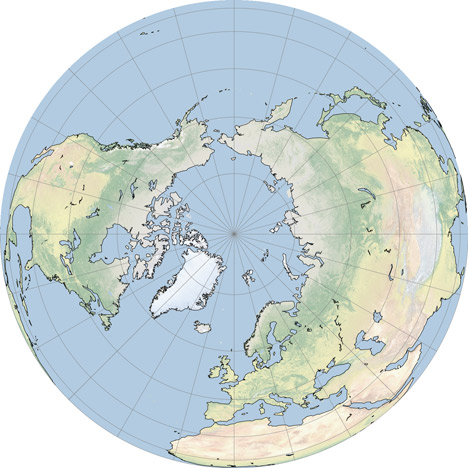
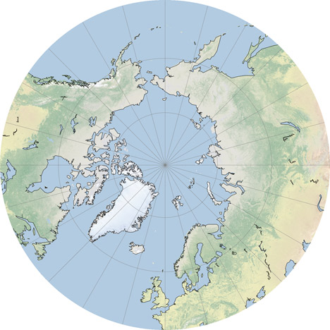
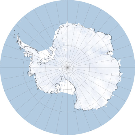
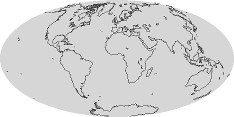
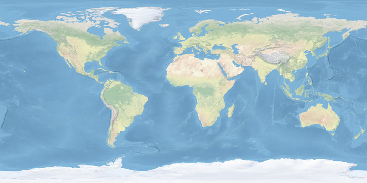
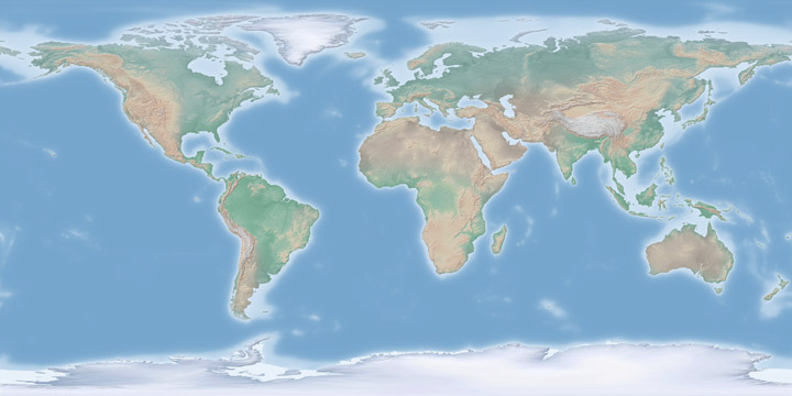
In the comments to my Natural Earth post Jim Meyer suggested I make copies of the global maps centered on the Poles. Rather than just making a few images I’ll mention G.Projector: the simplest map projection conversion software I know of. Developed by NASA Goddard Institute of Space Studies, it features 93 map projections, (assuming I didn’t lose count) decent customization options, and a good coastline database at multiple resolutions. Even better, it’s free.
The conversion process is straightforward: import an image in the equirectangualr map projection, pick a new projection, set options for coastlines and other overlays, then export. Very, very, simple (in contrast to many other remapping applications which seem to be written for people with GIS degrees). Here’s some examples:
The associated press took a pair of our satellite images (Devils Lake, North Dakota) and made a nice little tool to interactively sweep between the pictures acquired in 1984 and 2009: Expanding North Dakota lake swallows land and buildings. I think it works quite a bit better than stacked images, or a simply flipping between the two with a mouse rollover or button press.
One of the simplest ways to improve the look of graphics on a computer screen is to anti-alias them: i.e. smooth any curved or angled edges. At the relatively low resolution of a computer screen (nominally 72 dots per inch, although modern screens are often around 100 dots per inch) it’s easy to spot blocky pixels along any sharp edge that’s not perfectly vertical or horizontal. Here’s an example:
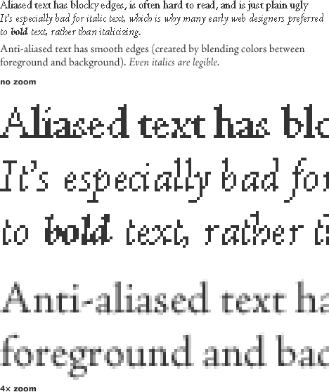
Most modern graphics software anti-aliases by default (and modern operating systems anti-alias text on the desktop, in browsers, and other applications), so text & graphics usually look pretty good. Unfortunately, a lot of scientific visualization software doesn’t (at least not by default)—so many of the graphics NASA produces (especially those that are generated automatically as data is processed) look chunky. Like this:
One quick fix is just to render out any graphic larger than it needs to be (4 times is fine) and shrink it using a resampling algorithm like bilinear or bicubic that blends pixels [nearest neighbor (also the default in many visualization packages) will not]. If your data has a vector overlay it’s often feasible to export a Postscript file, and then render the image in something like Illustrator, which will produce nice smooth lines:

As always in design there are exceptions and caveats. Horizontal and vertical lines, like the axes on a graph, look much better when they’re sharp, and anti-aliasing can blur them. I usually export any elements of a graphic that need to be as sharp as possible as a separate step, with anti-aliasing turned off. Likewise, printed material should not be anti-aliased. Most printers are high-enough resolution that curved edges look perfectly clean.
While poking around the Gateway to Astronaut Photography of Earth (tens of thousands of photos of Earth from space, dating back to the Mercury program) I found this photo of the Milky Way rising (setting?) above the Earth’s limb:
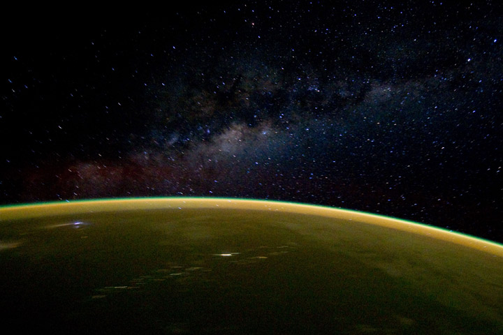
Taken from the Space Shuttle Discovery on April 18, 2010.
Really busy this week, so I’ll just post this slightly off-center satellite view of Mount St. Helens:
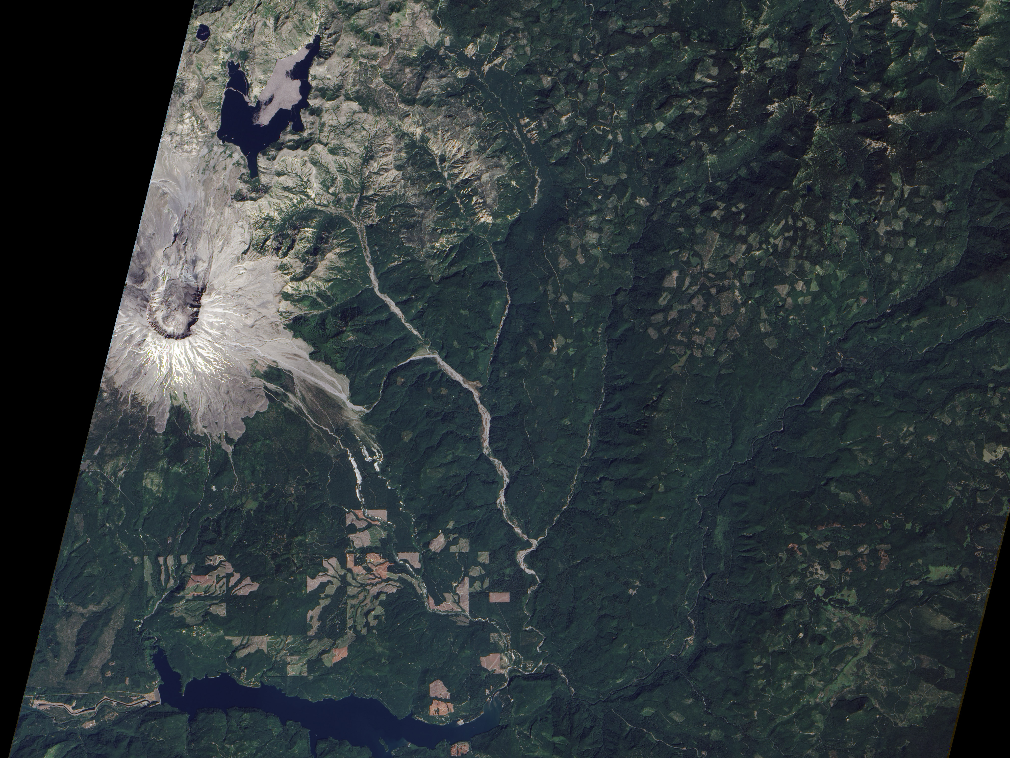
Click for the large version, and be sure to check out Devastation and Recovery at Mt. St. Helens to see the volcano and its surroundings every year from 1979 to 2009, including the immediate aftermath of the 1980 eruption. 2010 coming soon. (Image acquired by the Advanced Land Imager on board Earth Observing-1 on August 23, 2010.)
We just published a mini-feature on the recent forest fires in Russia—Russian Firestorm: Finding a Fire Cloud from Space—accompanied by this map of smoke movement (read the article for details, then come back):
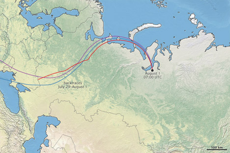
I’m reasonably happy with the map, largely due to the wonderful Natural Earth data I used as a base. Put together by Nathaniel Vaughn Kelso, Tom Patterson, and many others. It uses NASA’s Blue Marble imagery, but it’s lightened and desaturated, which works much better than the Blue Marble when combined with other data. The maps based on color imagery are complemented by another set: “Cross-blended Hypsometric Tints”. These are based on elevation data (SRTM 30 plus), but have the added twist that arid and temperate climates get separate color palettes, so deserts look like deserts and forested areas are green.
If that weren’t enough (I’m beginning to sound like a salesman) there’s a matching set of vector (resolution-independent) data for coastlines, country boundaries, rivers, roads, etc., optimized for three different scales (a low-resolution map needs less-detailed coastline data than a high-resolution map, otherwise areas of coastline with fine detail become a blobby mess). If you make maps, or even just like maps, they’re well worth checking out.
James Hrynyshyn over at Class M has an interesting post about a graph of net primary productivity (also, and perhaps more commonly, referred to as NPP—it’s a measure of the amount of carbon a plant takes from the atmosphere and uses to grow) anomaly (difference from normal) compared to the anomaly in the growth rate of carbon dioxide in the atmosphere. The graph is from the same paper as our recent image: Drought Slows Plant Growth, 2000–2009. The two variables are plotted together, but “carbon dioxide growth rate anomaly” (a somewhat complex concept in itself) is inverted. This gives the impression (unless you read the caption) that the growth rate of carbon dioxide in the atmosphere falls if net primary productivity falls, and rises if net primary productivity rises, when, in fact, the opposite is true.
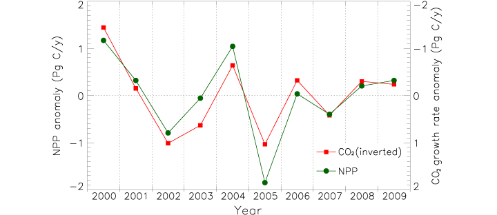
I agree with Class M: if the first impression a graph gives is the opposite of what the data shows, and a close reading of the caption and annotations is required for understanding, the graph is destined to cause misunderstandings. Just for the record, this is what I would have done:
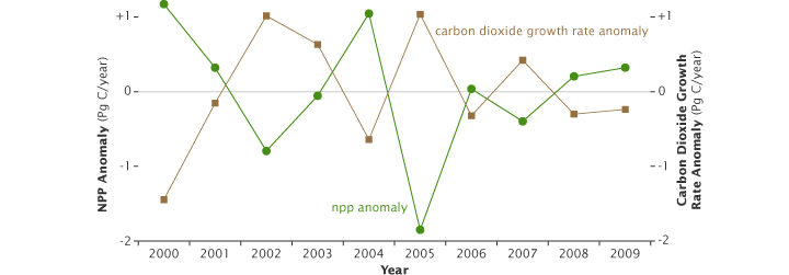
Reference: Zhao, M., Running, S.W. (2010). Drought-induced reduction in global terrestrial net primary production from 2000 through 2009. Science, 329(5994), 940–943.
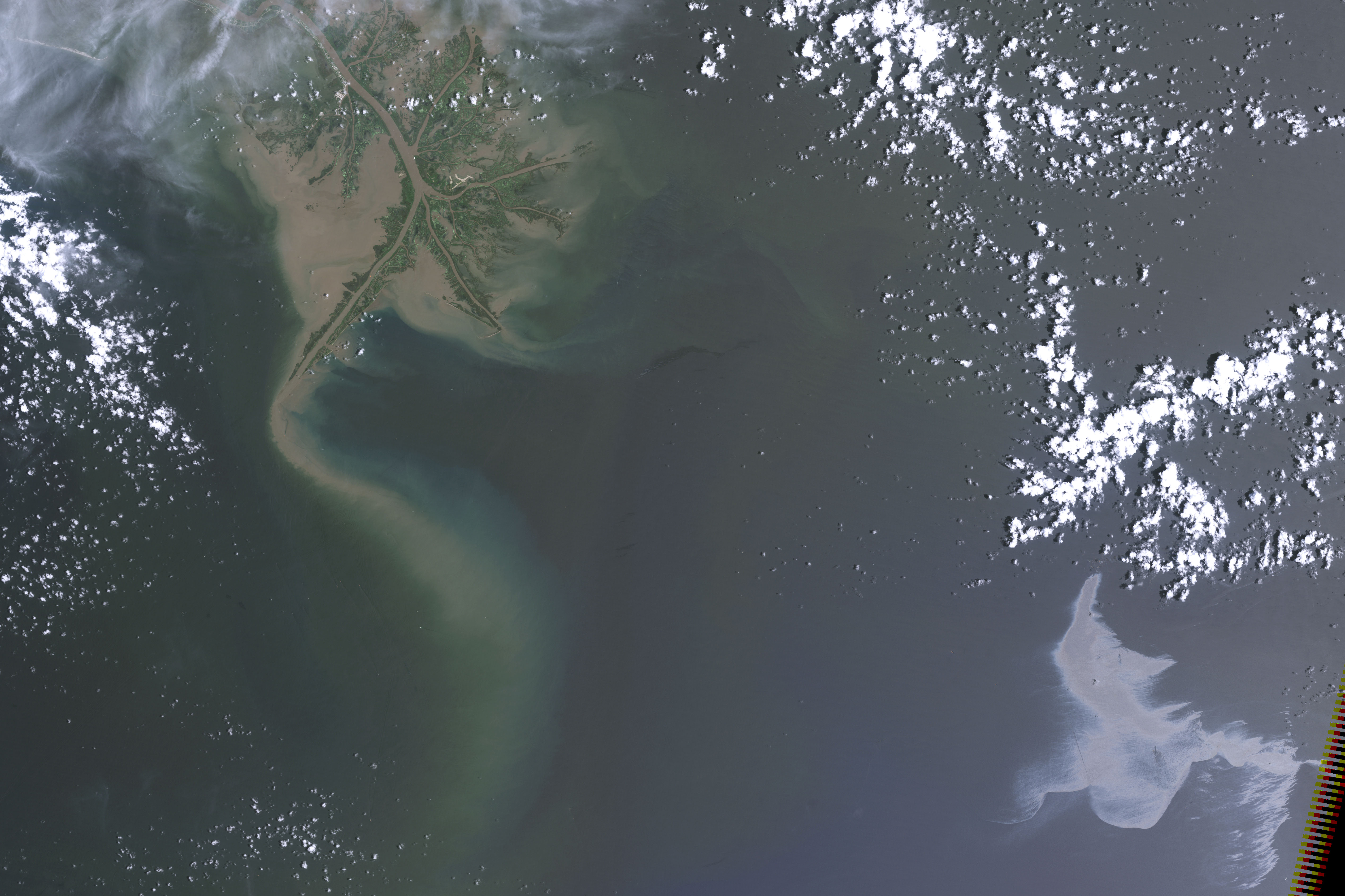
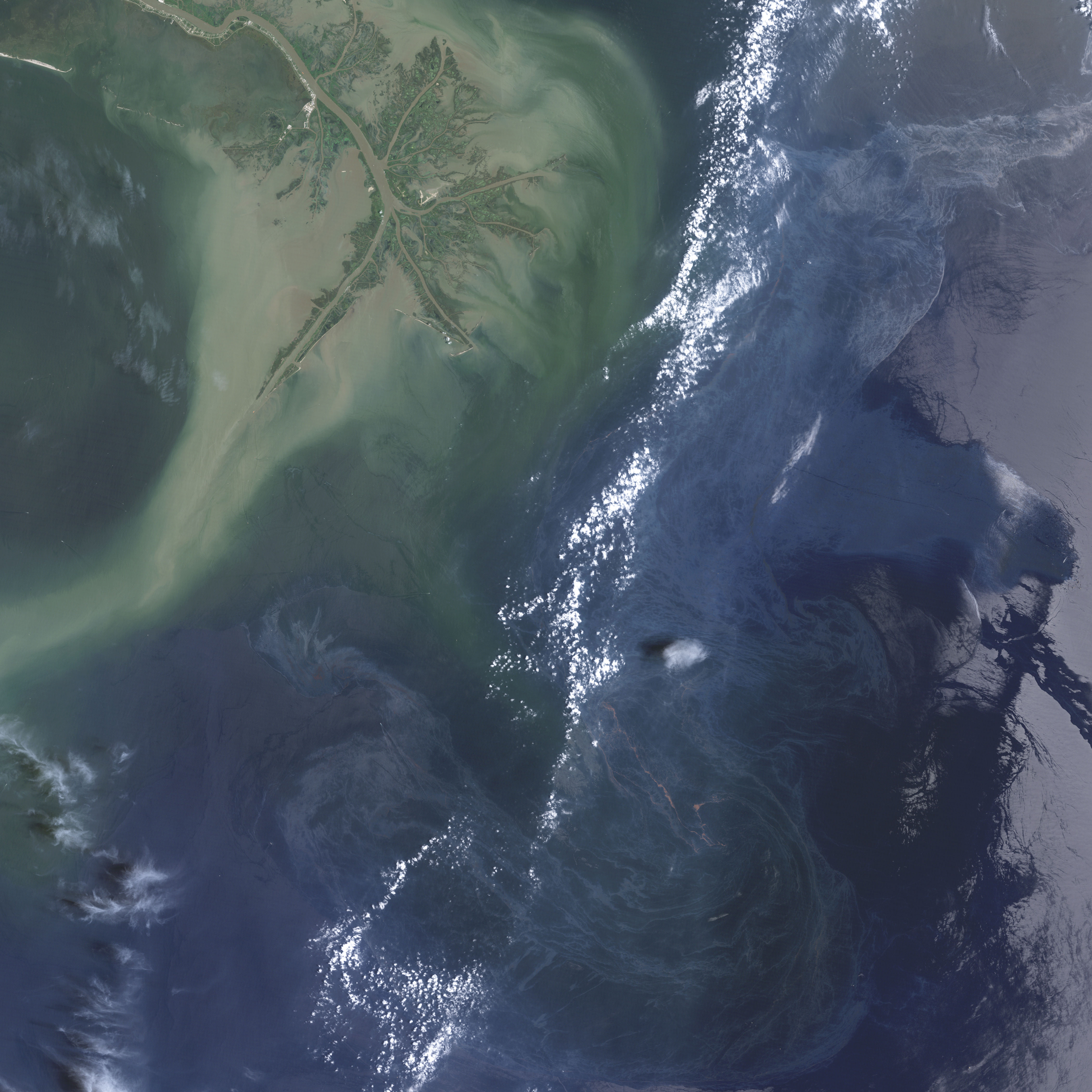
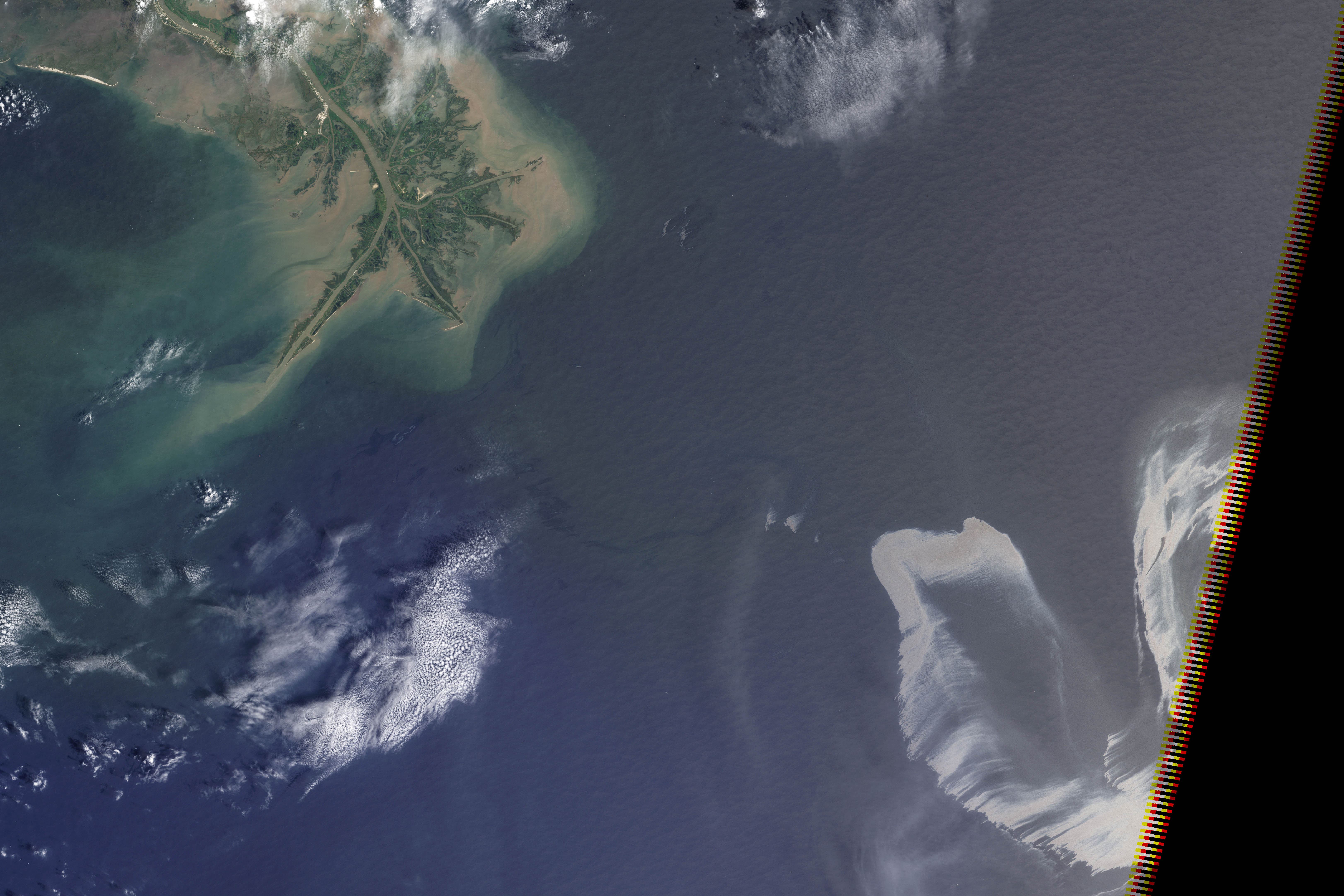
We sort through a lot of imagery at the Earth Observatory, and not all of it makes it onto the site. A picture might be cloudy, we might not be able to tell a good story about it, it’s not quite relevant, the quality might not be good enough, or—as in this case—we might find something after it’s no longer newsworthy. These three satellite images show oil slicks on the Gulf of Mexico after the Deepwater Horizon drilling rig explosion. All are from Landsat-5 in May and July. I found them earlier this month while looking for image ideas. (Click for large images.)
Whenever I invite someone to talk at our monthly “education and outreach” colloquia I seem to be out of town when the talk is scheduled. Sure enough, last Wednesday when Cynthia Brewer was here (at Goddard Space Flight Center, near Washington, DC) I was in Los Angeles.
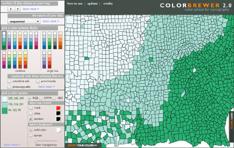
Dr. Brewer is a geography professor at Penn State (as well as an author of several books on design and cartography: Designed Maps: A Sourcebook for GIS Users and Designing Better Maps: A Guide for GIS Users) specializing in research on effective map design, especially the use of color in maps. Since we make a lot of maps, ColorBrewer, her on-line tool for selecting color schemes, has been an invaluable tool. By all accounts she gave an excellent talk, I’m sorry I missed it.
In addition to data visualization, satellite imagery, and case studies, I intend to occasionally discuss general topics in design and typography. In this case, the typeface* Comic Sans.
Seen at the entrance to the Gibson Ampitheatre, Los Angeles, California:
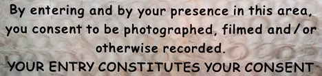
A legal warning (giving up all rights to your likeness once you pass the sign) written in Comic Sans bold. The problem? Comic Sans is an extremely informal typeface, and legal text is extremely formal. Not a good combination. It’s also not a particularly readable typeface, since it was designed for short snippets of text in word balloons, not prose. (I’ve even had the thought that the sign was in a difficult to read font on purpose, but that’s not likely.) Comic Sans is famously infamous, it’s even been featured by the Wall Street Journal: Typeface Inspired by Comic Books Has Become a Font of Ill Will.


I’m not out to ban comic sans, but there are plenty of better typefaces available for public signage; from the London Underground’s Johnston, to the ubiquitous Helvetica, to the Standard Alphabets for Traffic Control Devices. (Actually, those might not be the best choice in this case, since they’re designed for legibility, not readability, but that’s a different discussion.)
Comic Sans would be good for something like lettering in a storyboard, or even its original intended use in comics. Unfortunately it would be a pretty generic comic, since Comic Sans ships with Microsoft Windows and Microsoft Office, so almost everyone with a computer has a copy. There’s plenty of good (and free) alternatives out there. At this point the most appropriate use of comic sans is probably ironic.
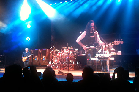
In case you’re wondering, we use 13-point Georgia for body text, 11-point Lucida Sans for captions & annotations, and 21 point Helvetica Neue Medium Condensed in the masthead. And how was the show? Awesome.
* Typefaces are colloquially referred to as fonts, but technically a font is a specific size of a specific font weight & style of a typeface. A typeface is all sizes a specific weight & style (bold, italic, etc.). A typeface family is the next step up in the hierarchy, including variant versions of a typeface, sometimes even as extreme as sans-serif and serif versions. I’m pedantic, so I usually use the precise terms.
