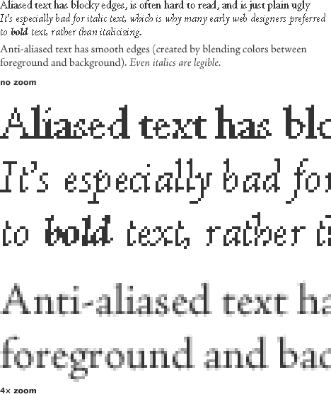
One of the simplest ways to improve the look of graphics on a computer screen is to anti-alias them: i.e. smooth any curved or angled edges. At the relatively low resolution of a computer screen (nominally 72 dots per inch, although modern screens are often around 100 dots per inch) it’s easy to spot blocky pixels along any sharp edge that’s not perfectly vertical or horizontal. Here’s an example:

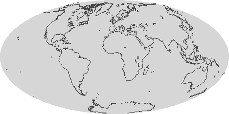
Most modern graphics software anti-aliases by default (and modern operating systems anti-alias text on the desktop, in browsers, and other applications), so text & graphics usually look pretty good. Unfortunately, a lot of scientific visualization software doesn’t (at least not by default)—so many of the graphics NASA produces (especially those that are generated automatically as data is processed) look chunky. Like this:

One quick fix is just to render out any graphic larger than it needs to be (4 times is fine) and shrink it using a resampling algorithm like bilinear or bicubic that blends pixels [nearest neighbor (also the default in many visualization packages) will not]. If your data has a vector overlay it’s often feasible to export a Postscript file, and then render the image in something like Illustrator, which will produce nice smooth lines:

As always in design there are exceptions and caveats. Horizontal and vertical lines, like the axes on a graph, look much better when they’re sharp, and anti-aliasing can blur them. I usually export any elements of a graphic that need to be as sharp as possible as a separate step, with anti-aliasing turned off. Likewise, printed material should not be anti-aliased. Most printers are high-enough resolution that curved edges look perfectly clean.


Thanks for that.
Aesthetic,Essential, Basic .Simple,Elegant with straight forward solutions for the better of all – originator, reader ,user -thanks a ton