
In addition to data visualization, satellite imagery, and case studies, I intend to occasionally discuss general topics in design and typography. In this case, the typeface* Comic Sans.
Seen at the entrance to the Gibson Ampitheatre, Los Angeles, California:
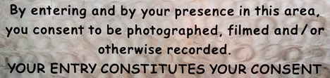
A legal warning (giving up all rights to your likeness once you pass the sign) written in Comic Sans bold. The problem? Comic Sans is an extremely informal typeface, and legal text is extremely formal. Not a good combination. It’s also not a particularly readable typeface, since it was designed for short snippets of text in word balloons, not prose. (I’ve even had the thought that the sign was in a difficult to read font on purpose, but that’s not likely.) Comic Sans is famously infamous, it’s even been featured by the Wall Street Journal: Typeface Inspired by Comic Books Has Become a Font of Ill Will.
I’m not out to ban comic sans, but there are plenty of better typefaces available for public signage; from the London Underground’s Johnston, to the ubiquitous Helvetica, to the Standard Alphabets for Traffic Control Devices. (Actually, those might not be the best choice in this case, since they’re designed for legibility, not readability, but that’s a different discussion.)
Comic Sans would be good for something like lettering in a storyboard, or even its original intended use in comics. Unfortunately it would be a pretty generic comic, since Comic Sans ships with Microsoft Windows and Microsoft Office, so almost everyone with a computer has a copy. There’s plenty of good (and free) alternatives out there. At this point the most appropriate use of comic sans is probably ironic.
In case you’re wondering, we use 13-point Georgia for body text, 11-point Lucida Sans for captions & annotations, and 21 point Helvetica Neue Medium Condensed in the masthead. And how was the show? Awesome.
* Typefaces are colloquially referred to as fonts, but technically a font is a specific size of a specific font weight & style of a typeface. A typeface is all sizes a specific weight & style (bold, italic, etc.). A typeface family is the next step up in the hierarchy, including variant versions of a typeface, sometimes even as extreme as sans-serif and serif versions. I’m pedantic, so I usually use the precise terms.
Tags: comic sans, Rush
Comic Sans was inappropriate for the above sign. It is too casual for such an important public comment/warning.
Thanks for the article on Comic Sans – I use this typeface for most of my computer reading I happen to like it personally, though I agree on the public signage aspect.
But most of all thanks for the succinct definition of “font” – when people at offices I was in started using computers, I took issue with their use of “font” when they meant typeface, and I see by this definition I was right! But it has become common parlance, and now if I have an issue with it I can quote this and feel better about it!
Comically yours,
Lou
I read this entry several times, attempting to identify where your “trigger” had popped up – you even reference a “show” which is not mentioned earlier in the piece.
I’m rarely one to comment publicly, but I love my Earth Observatory info and was actually startled to see a near rant on the perceived mis-use of a typeface.
If this use was in conjuction with an informal event – such as a live music concert – then the use might have been intentional. Not to prohibit easy reading of the posted information, but to be in keeping with the tone of the event.
If the event was a law enforcement convention, a gathering of engineers to discuss new concepts, or a symposium of scientists – then the use of the Comic Sans typeface might seem less than appropriate.
I’m truly perplexed that this use was important enough to warrant a long entry in a blog associated with an innovative and constantly fascinating site located at the NASA Goddard Space Flight Center.
The space is yours to use as you wish I suppose – but the subject matter presented in this bit was so unexpected, in the context of this site, that I am still surprised.
I appreciate your bringing new images forward for visitors enjoyment and education, plus your opinions on new technologies is valuable to me.
But, to be honest, I don’t want to read – here – a public condemnation of a one time use of one typeface.
Maria:
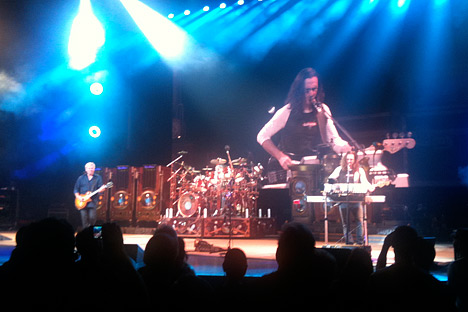
I’m sorry you didn’t like the post. The sign was in the Universal City Walk (I was in line on my way in to a Rush concert), one of the most highly designed spaces this side of Disneyland. The rest of the signage was obviously thoughtfully designed & coherent, so this one stood out (and is permanent, not ephemeral).
Why am I discussing my personal views on a typeface? Because this blog serves two purposes. One is to show some of the personality of the creators of the Earth Observatory (I hope the rest of the team will start complementary blogs). Part of that personality is that I’m somewhat of a prescriptivist (some may call me dogmatic)—I don’t like the use of a hyphen in place of an em dash, “irregardless” is not a word, I won’t take you seriously if you pronounce “nuclear” as nuke-you-lar, and I think typefaces have their proper place.
The other reason I’m writing this blog is to engender a discussion of good data visualization, and good data visualization requires good graphic design. One of the easiest ways to teach good design is to show examples of bad design, hence my picking on Comic Sans.
Robert:
My 1974 dictionary, ‘Webster’s New Collegiate Dictionary, a Merriam-Webster print, has on its page 612 the word ir-re-gard-less as an adverb [prob. blend of irrespective and regardless] nonstand : REGARDLESS
Eddie R.
Ed:
Webster’s is famously descriptivist, which is more or less the opposite of prescriptivism. Common use of a word doesn’t make it correct. The entry for irregardless in Garner’s A Dictionary of Modern American Usage begins: “irregardless, a semiliterate PORTMANTEAU WORD from irrespective and regardless, should have been stamped out long ago.”
And ends: “careful users of language must continually swat it when they encounter it.”
I understand exactly what you’re saying. You are just implying that they could of picked a better font for displaying the sign and you’re right certain fonts are only to use informally.
The font by itself is hard to read and a sign that I myself would not take serious or give a second eye too.
Even though a word is described as “a semiliterate PORTMANTEAU WORD from irrespective and regardless, should have been stamped out long ago.” and “careful users of language must continually swat it when they encounter it.” by another person, does not mean that this person is right.
Isn’t the point of communication as follows: someone says something and the person listening understands? If that is true, I think we all understand what it would mean if “irregardless” was a word.
I have many people in my life that mispronounce words, and say phrases incorrectly on a daily basis. This does not mean these people are unintelligent. It means they either, were not taught how to use these phrases correctly or just plain don’t care.
I am no better, I have terrible writing skills. But I am sure you at least know what message I am trying to spit out.
I also understand your frustration, I really hate people that don’t use there blinkers while driving. But I don’t think that people need to use their blinkers when no one is around.
Lee:
I agree the point of writing & speaking is communication, and I’m not going to call out someone who uses irregardless in casual conversation. On the other hand, if I see irregardless in formal communication, it will negatively affect my opinion of the communicator. It’s just part of my personality to think there are proper and improper ways of doing things, and prefer the proper ones. Hence my distaste for Comic Sans.
I do agree with you the sign above needs to be more formal since it shows a legal obligation to those who see it. Like in the state of Texas you don’t have to post No Trespassing signs to keep someone off of your property. All you have to do is paint a certain amount of post around the property with a special color purple paint and then everyone is legally obligated to stay off your property. If you know that law that’s fine and dandy, but a No Trespassing sign is obvious and its more formal, and it’s what you would expect if you are not wanted.
But with the sign above it might hold up in court and you probably won’t get a lot of complaints about it since most people would not stop and read it.
@Robert, regarding Maria’s comments: She clearly doesn’t get it.
I very much enjoyed your commentary regarding typefaces, etc. As a logo/advertising/publication designer I think I can speak for our industry when I say, “Yes. Typefaces matter.” –Maybe not to everyone, but to anyone with an eye for design.
It felt really good to me to read what you had to say. I thought, “somebody noticed; somebody cares” about readability and appropriateness of use. Thanks for your interesting commentary.
I learned to read in books, 100 000 of them, and as far as I can remember at least 95% of the text was in Times New Roman, or something very like it. So I get very frustrated when younger people, who seem to have learned to read on computer screens and learned to write on squared paper use sans fonts. I have set my favorite browser to show all text on the web in Times New Roman, normal, 14 points. Black text on slightly warm white, like normal book paper, background, because I get equally frustrated by people who use full blast whitest white as background, and use the same white for text, which makes the text invisible. Whitest white should only be used as a signal color for small parts of the screen. Using whitest white is like if a meeting car blinks with full head lights to point out to you that you are blinding him. I have a button, user mode versus author mode, so I can check out what that web designer chose, often comic font, dark blue on black, size 5, so I would need a very strong magnifier glass to have a chance to read it.